По-русски

​For the Sake of the View

The project of the elite residential complex “Z-House” was developed by the architectural firm ATRIUM for a closed competition that evaluated not only the quality and beauty of the project’s architecture but also the presence of solutions that are the most popular and expected at today’s real estate market.

26 March 2018
Object
mainImg

The closed competition was organized by the developer company Vesper in 2017, its winners becoming “Tsimailo, Lyashenko and Partners” in collaboration with the French company Antonini Darmon; currently, they are still working on this project. The project by ATRIUM, which is covered in this article, was one of the participants of the competition.

***


A Third Point

In Moscow, there are several areas that are commonly considered to be the most prestigious among the buyers of real property. Still quite recently, this list was topped by Ostozhenka, but then it was slowly pushed back off the leading position by the areas of Patriarshie Ponds and Khamovniki. The latter is currently rated as better than the others and at the same time having a better potential for further growth. Unlike the other two “points of invisible attraction”, the southeast bend of the Moskva River combines several customer-coveted factors at once: transport accessibility, highly developed infrastructure, relatively decent ecological situation, and the presence of recreational areas. Now add to this the quickly vacating industrial parks, including the ones that are situated along the Savvinskaya Embankment, and you will get a residential area that in all probability will attract, within the next five to ten years, the operation of all the Russia’s top architectural firms. Actually, the trend is already becoming obvious. And it comes as no surprise that a number of developers are already using the format of closed tenders or competitions to invite the nation’s leading architectural companies for choosing the concepts for building on this promising land.

"Z-House" residential complex © ATRIUM
zooming
"Z-House" residential complex © ATRIUM


Express Testing

Vesper, which belongs to the circle of developers who prefer to organize invite-only competitions, in 2016 invited a few architectural teams to find the optimum solution and test their preliminary marketing calculations. Having a general understanding of what kind of project could satisfy the needs of the city and at the same time be in market demand, Vesper decided to conduct a series of express tests of its perspective vision. Because there is always a chance that you will find a more effective and “selling” solution that will increase the return on investment. The invited participants had a month to come up with a concept that would provide for a rigorously stipulated yield of square meters and other parameters stipulated by the city. At the same time, the volumetric and planning solutions were up to the architects who were free to make any sorts of experiments.

"Z-House" residential complex. View of the future construction site © ATRIUM


The participants list of the competition included the architectural firm ATRIUM, quite familiar with the format of closed competitions. Anton Nadtochiy comments on this practice: “I suppose that the system of closed competitions is the most effective for the developer because it helps to achieve the best results in the shortest possible time. The client invites the best teams that will not only propose a high-quality idea but also will be able to implement it. In this case, the clients get the concepts that show various authors’ strategies that are sometimes even one step ahead of the hot trends of the market; they may come up with the next big thing. Taking part in such competitions, it is always interesting to us to show our vision, get our colleagues’ opinion about it, and struggle for the actual commission”.

Not an Accordion

The land site that the future elite residential complex got to be built upon was far from an easy one. It was far from easy both in terms of the history of the place and in terms of the mottled surroundings and various obstacles on the path to the perfect project.

zooming
"Z-House" residential complex. Location plan © ATRIUM


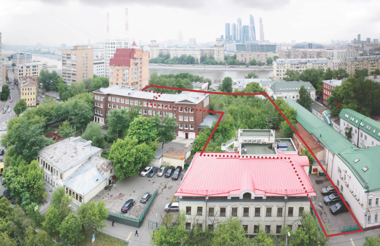
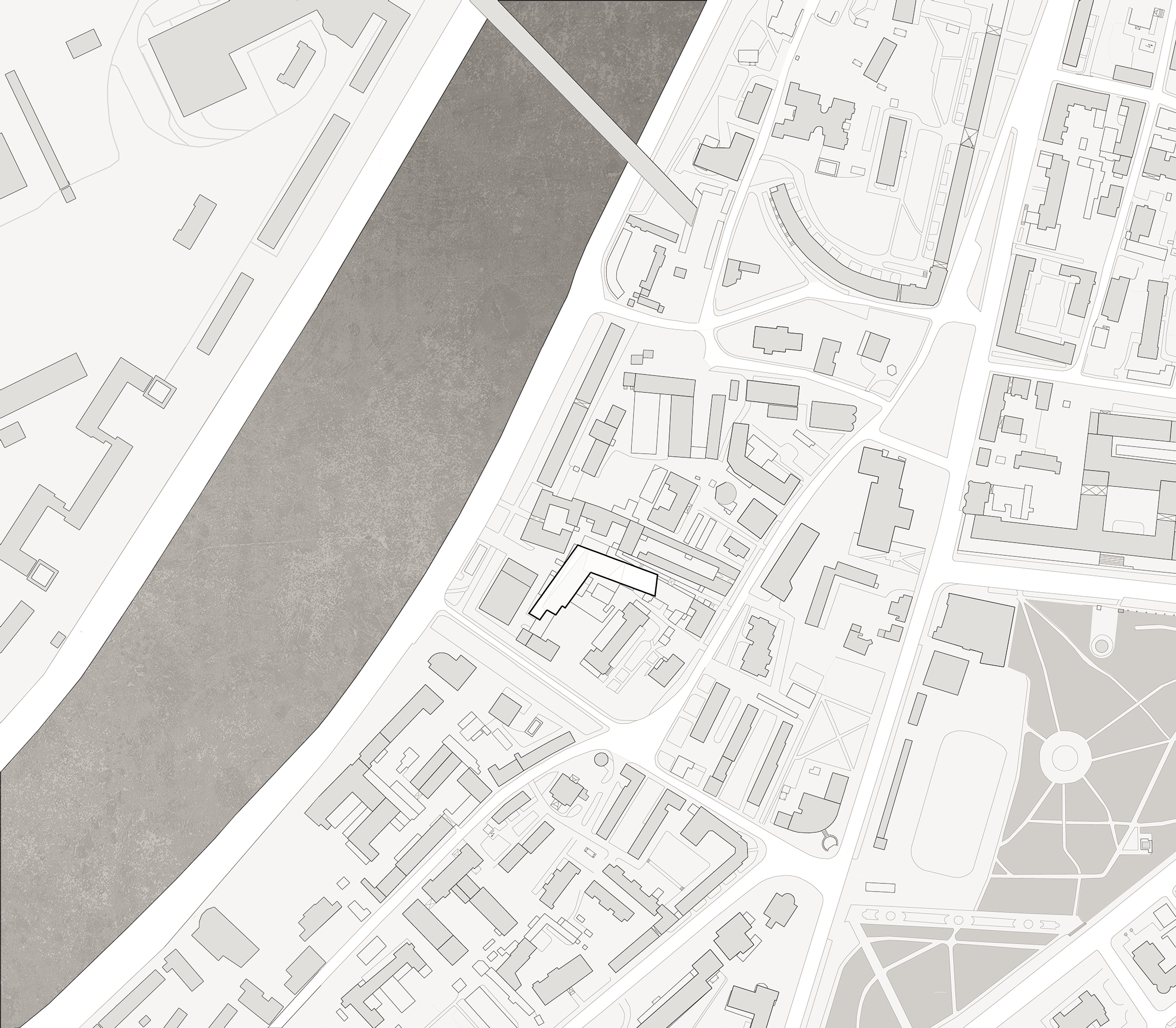
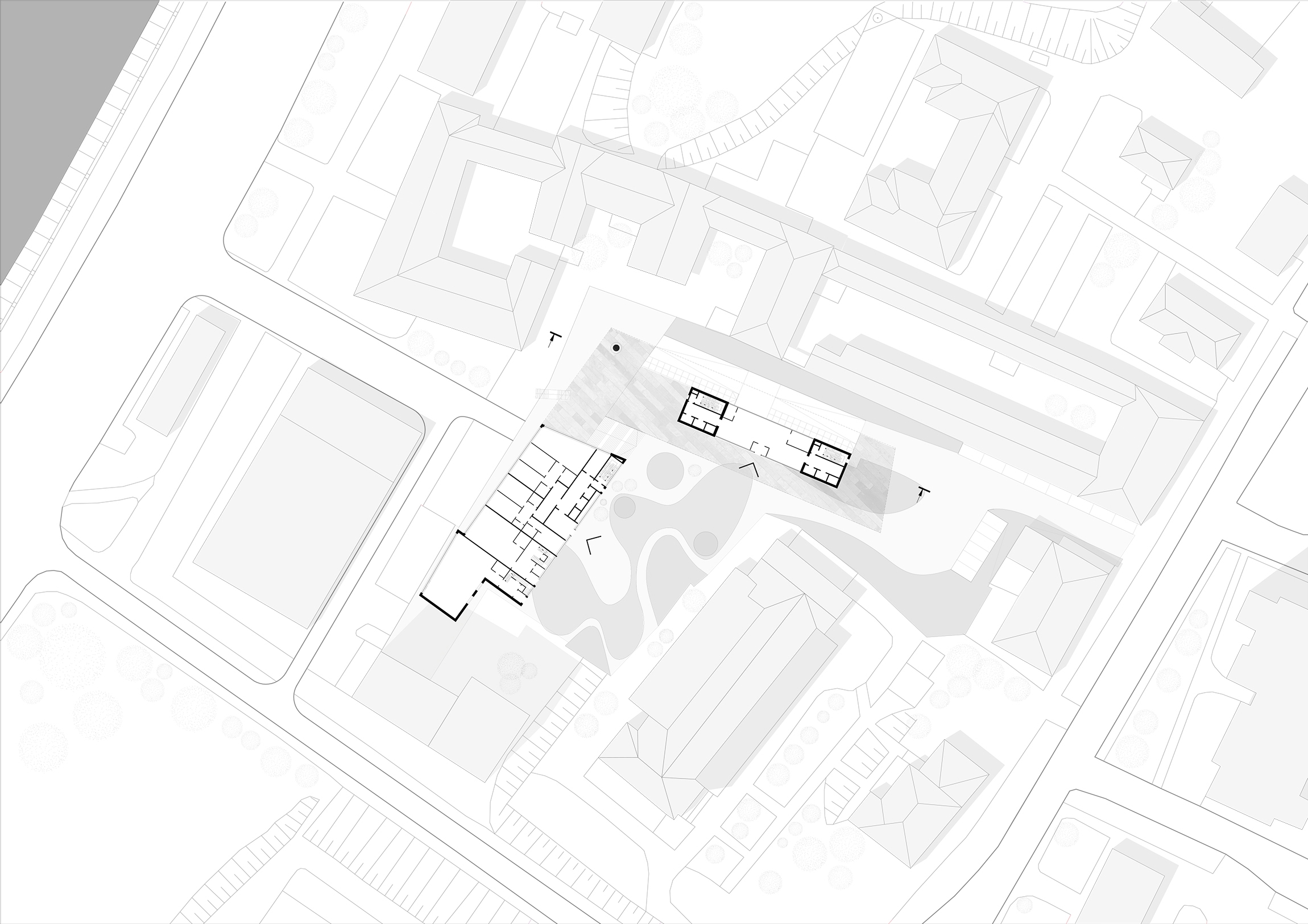
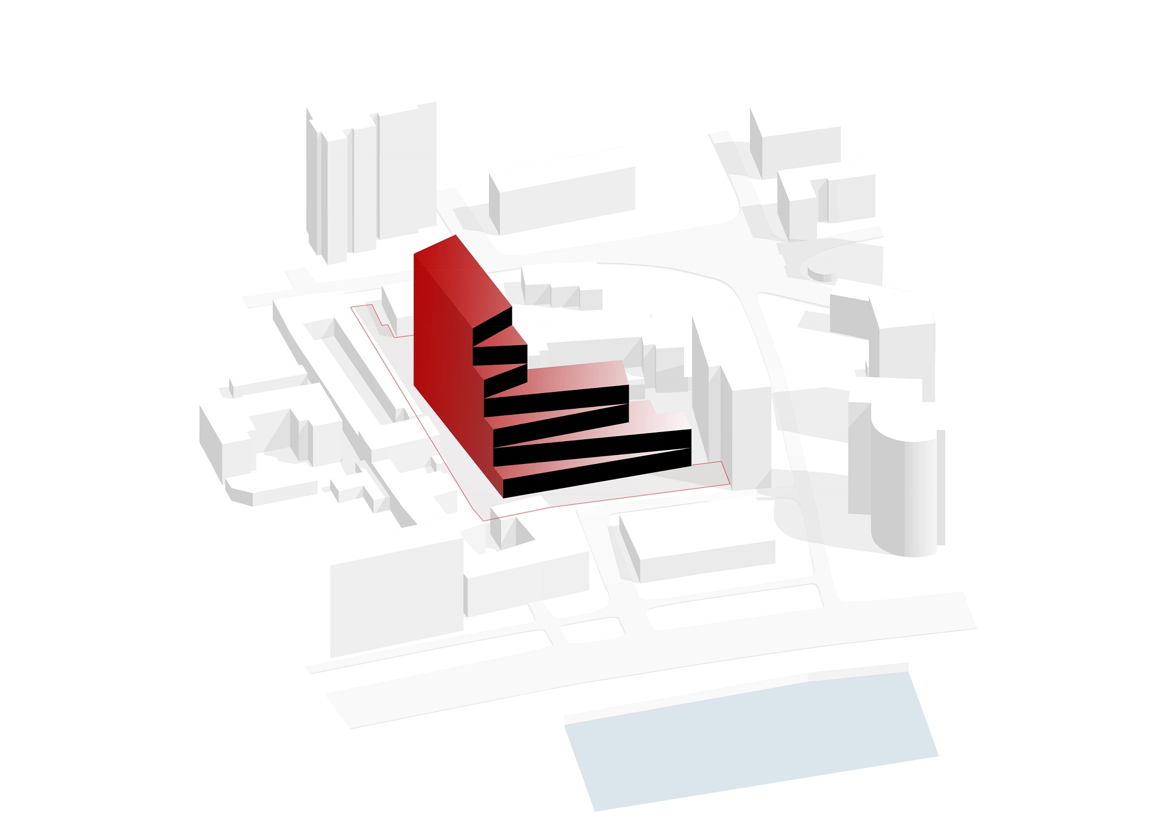
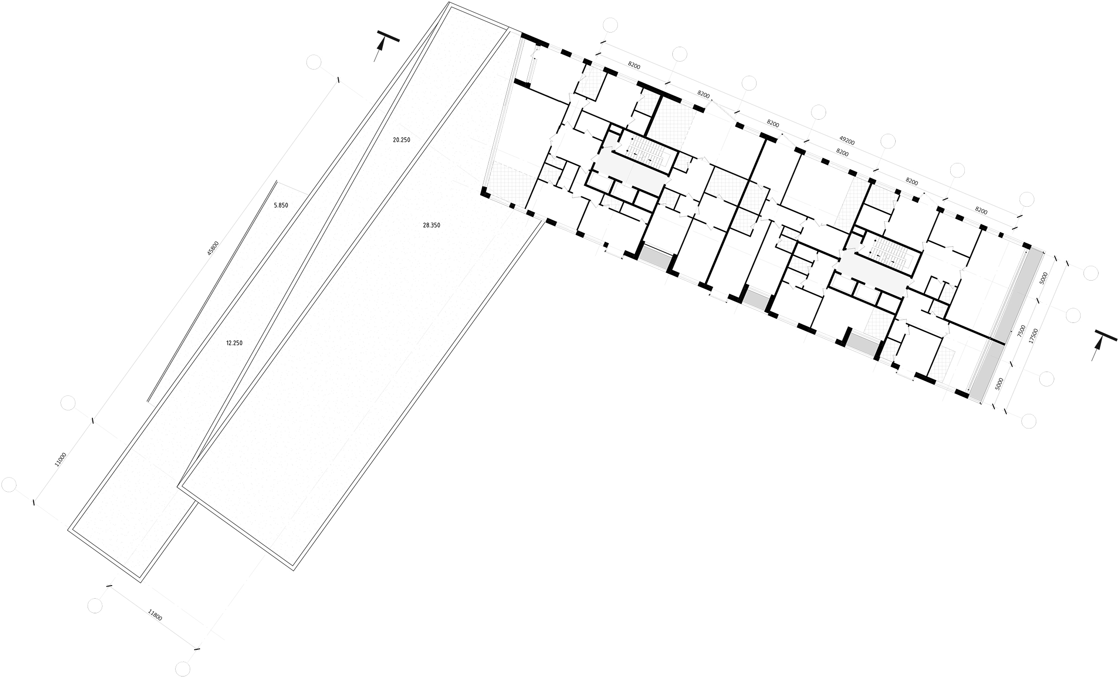
First of all, the architects had to find a way to inscribe the elite housing complex into a land site of challenging configuration, already cramped by already existing buildings, these being: a two-story building of Mosvodokanal and non-residential 4-story house that stood between the future housing complex and the waterfront, a 12-story brick tower built in the 1990’s and a four-story building of the “Correction and Development Center”, standing along the 2nd Truzhenikov Alley, and a whole scattering of other two and three story affairs of different purposes and in different conditions. This “gentleman set” of encumbrances was added by a more than 8 meters height difference. After the architects methodically stepped back from the site boundaries, considering the fire lanes and the insolation parameters, they got a construction blueprint forming an L-shaped building with wings of virtually equal length, one of which ran parallel to the embankment, and the other ran into the depth of the land. The inner territory was allotted for a small green yard. The underground parking garage was accessed from the top, from the side of the 1st Truzhenikov Alley.

zooming
"Z-House" residential complex. Plan at the ± 0.000 mark © ATRIUM


As for the history of the place, the main “theme” was set by... a local “Workers and Peasants Red Army” Russian accordion factory that once was there. Little was left of its facilities, and the all but derelict building gave little promise of any renovation possibility. On the other hand, the literary component opened up before the architects a great expanse of interpretations. This specialization, so rare these days, due to its sheer juiciness just had to be rejected in the architecture of the complex one way or another. The architects confess that the first attempts to convert the shape of this musical instrument into a volumetric solution were unsuccessful. Playing the accordion turned out to be much more of a trick than they originally thought.

Seaside Resort Style

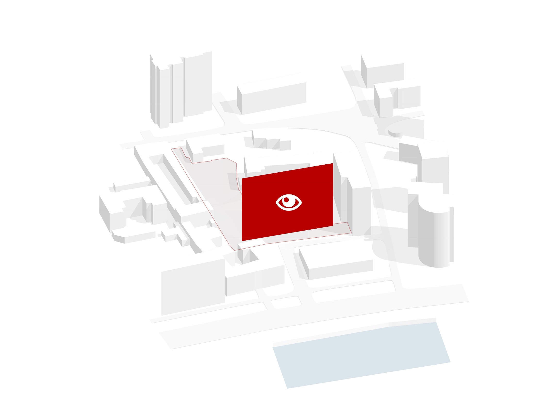
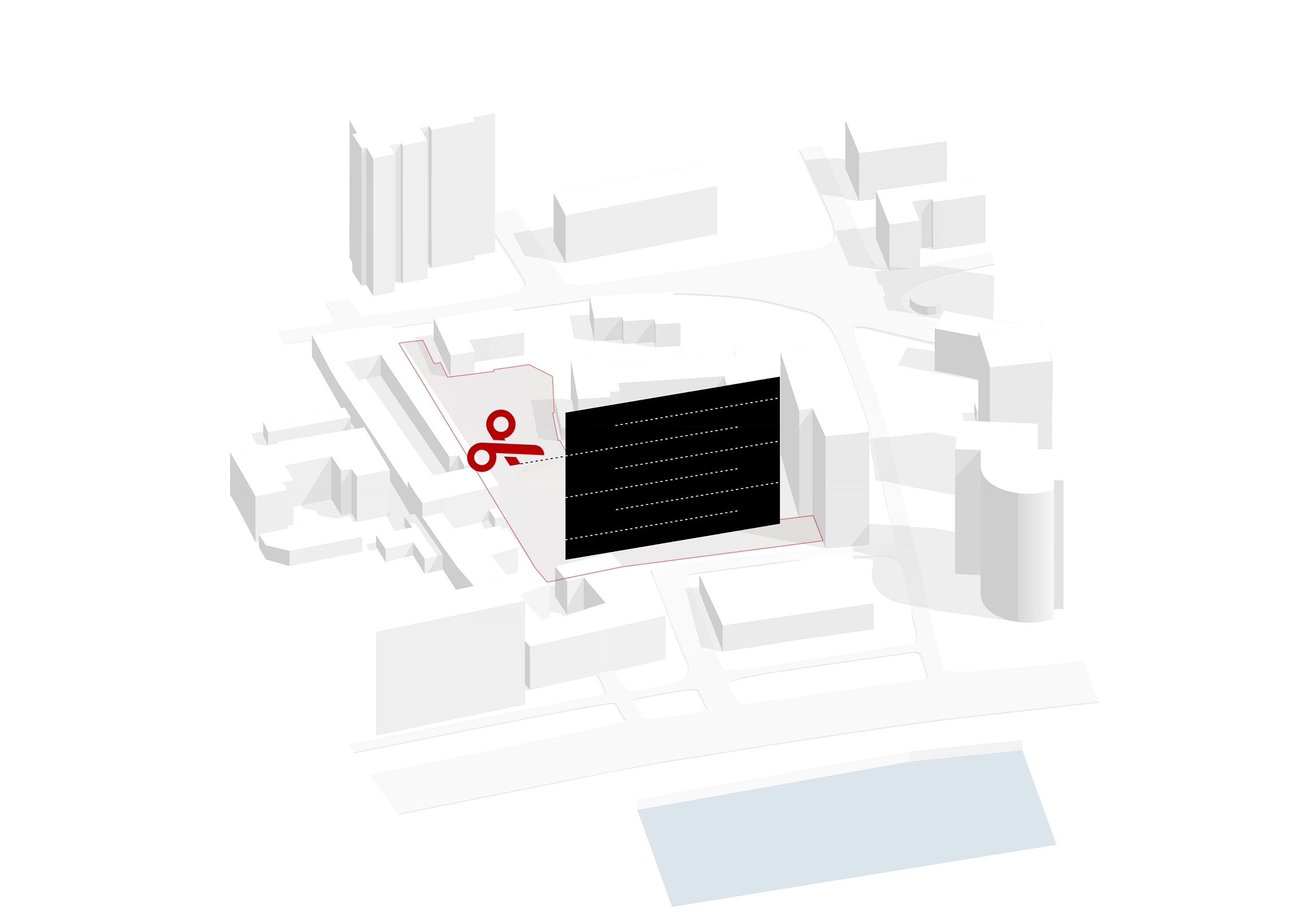
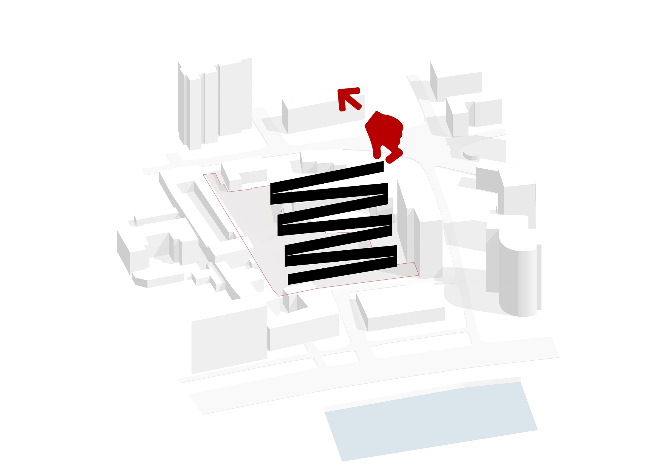
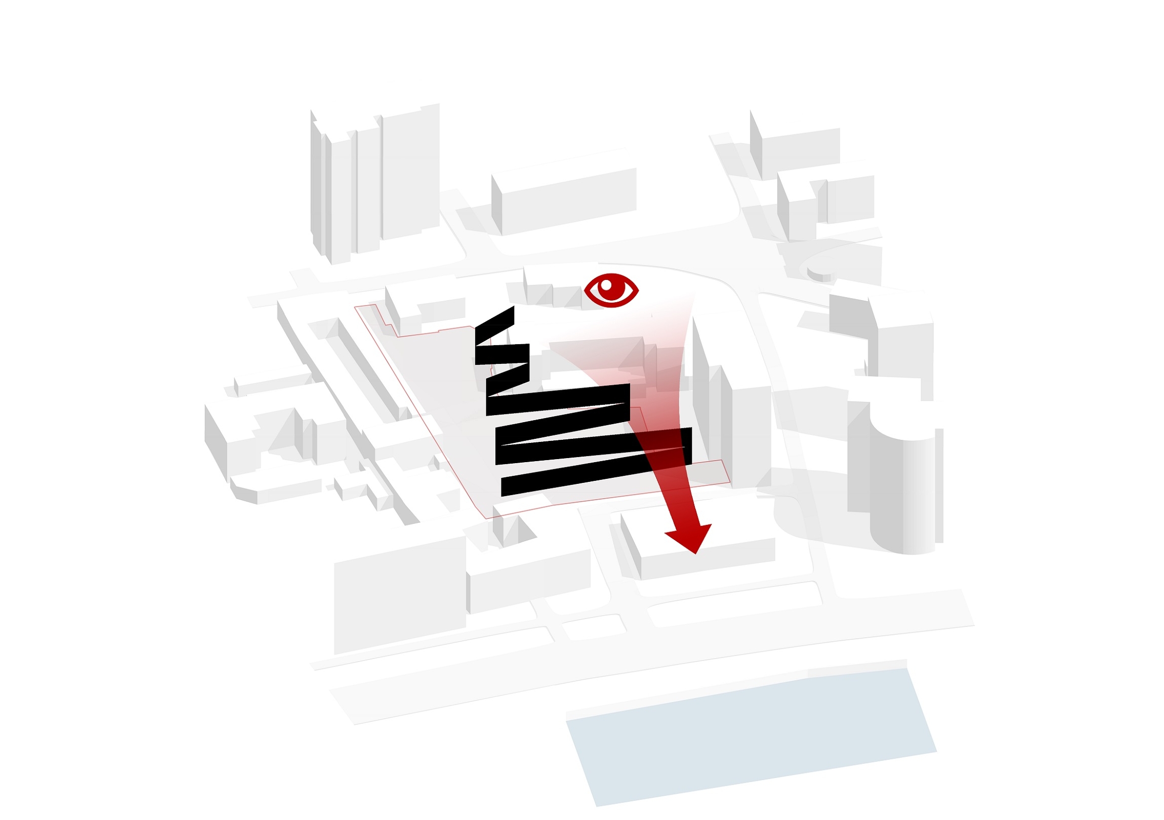
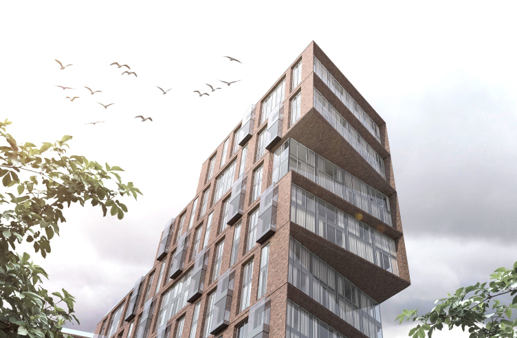
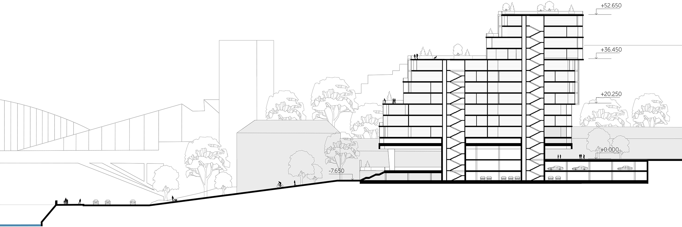
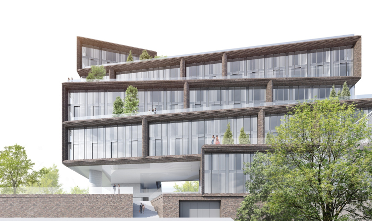
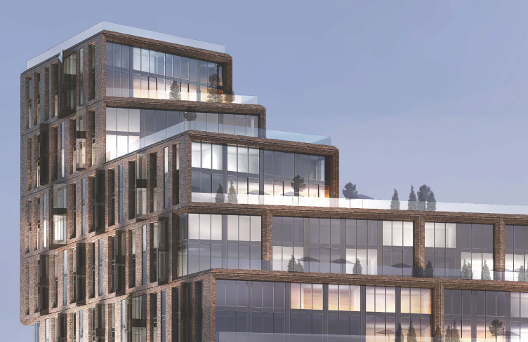
The solution was found thanks to yet another key feature of the place – its proximity to the river and an opportunity to make the river view one of the most valuable competitive edges to the potential buyers. In order to achieve that effect, the architects opted out of the traditional configuration of the building in favor of a composition that is more commonly spread in different latitudes, and with different views, too. Instead of a usual vertical façade, there came a stepping structure, receding in tiers into the depth of the site, thanks to which the architects got an opportunity to both open up the river views for the apartments of the lateral wings, and to create a system of open terraces, which could be used by the residents of the apartments opening up on them.

"Z-House" residential complex. © ATRIUM


Such structures are characteristic of seaside resorts. This is the way most seaside hotels are built, for whose guests it is important to spend part of their vacation time sitting on the terrace with a view of the boundless sea expanses. For the Moscow realities, the view of the grayish waves of the Moskva River and the perspective of the industrial parks lying along the Berezhkovskaya Embankment and beyond, with the giant of the Moscow City business center propping up the low clouds, is quite comparable and competitive to an imaginary sea view. Or so decided the ATRIUM architects who placed their bet on the seaside resort type of architecture, all the more so because in the non-rhythmic zigzags (hence the “Z-House” name of the complex) and the stairs of the terraced building one can see, with some desire and imagination, the analogy with the opening bellows of an accordion. Quod erat demonstrandum.

zooming
"Z-House" residential complex. Concept © ATRIUM


zooming
"Z-House" residential complex. Concept © ATRIUM


zooming
"Z-House" residential complex. Concept © ATRIUM


zooming
"Z-House" residential complex. Concept © ATRIUM


zooming
"Z-House" residential complex. Concept © ATRIUM


zooming
"Z-House" residential complex. Concept © ATRIUM


"Z-House" residential complex © ATRIUM


A Collection of Bonuses

As a result of superimposition of history and literature on the geology, with an extra pressure from the economics, the architects were able to crystallize a logic and living system of a tiered building, in which each of its elements, including the main volumetric, layout planning, and façade solutions are dictated by the desire to provide the future residents with a maximum set of preferences, connected with the complex’s situation and the views that it commands.

"Z-House" residential complex © ATRIUM


zooming
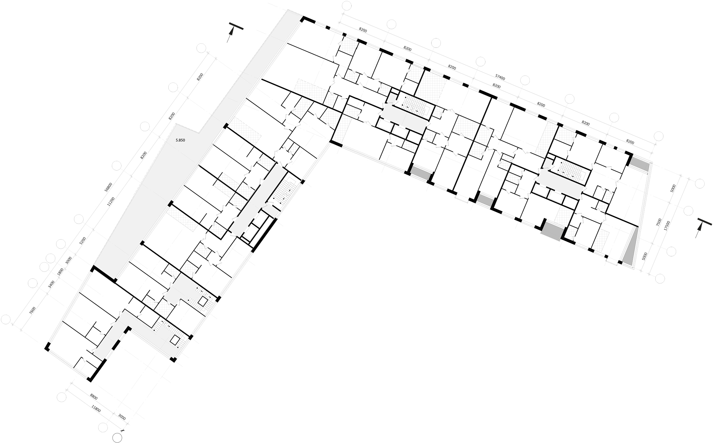
"Z-House" residential complex. Plan of the 2-3 floor © ATRIUM


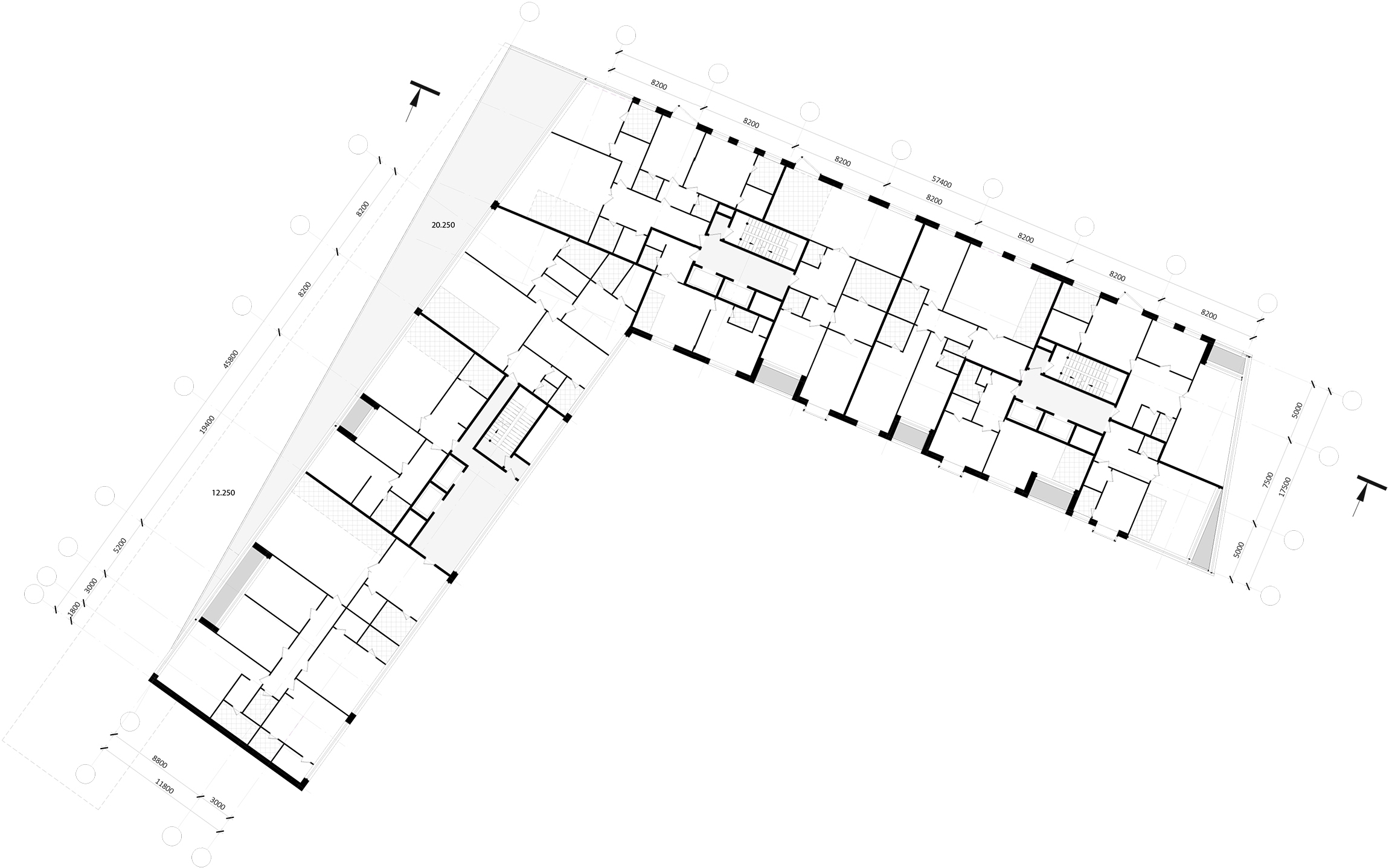
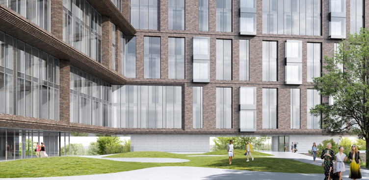
The wings of the complex are set and an angle that is slightly greater than 90 degrees – this was done to provide the residents of the lateral wing with a wider river view. This same purpose is served by small glass bay windows that stand out at a skewed angle beyond the façade surface on the inner and outer side of the lateral unit. On the inside, they appear on the bottom floors, where, above the lowered section of the longitudinal wing, the main panorama opens up.

"Z-House" residential complex © ATRIUM


"Z-House" residential complex © ATRIUM


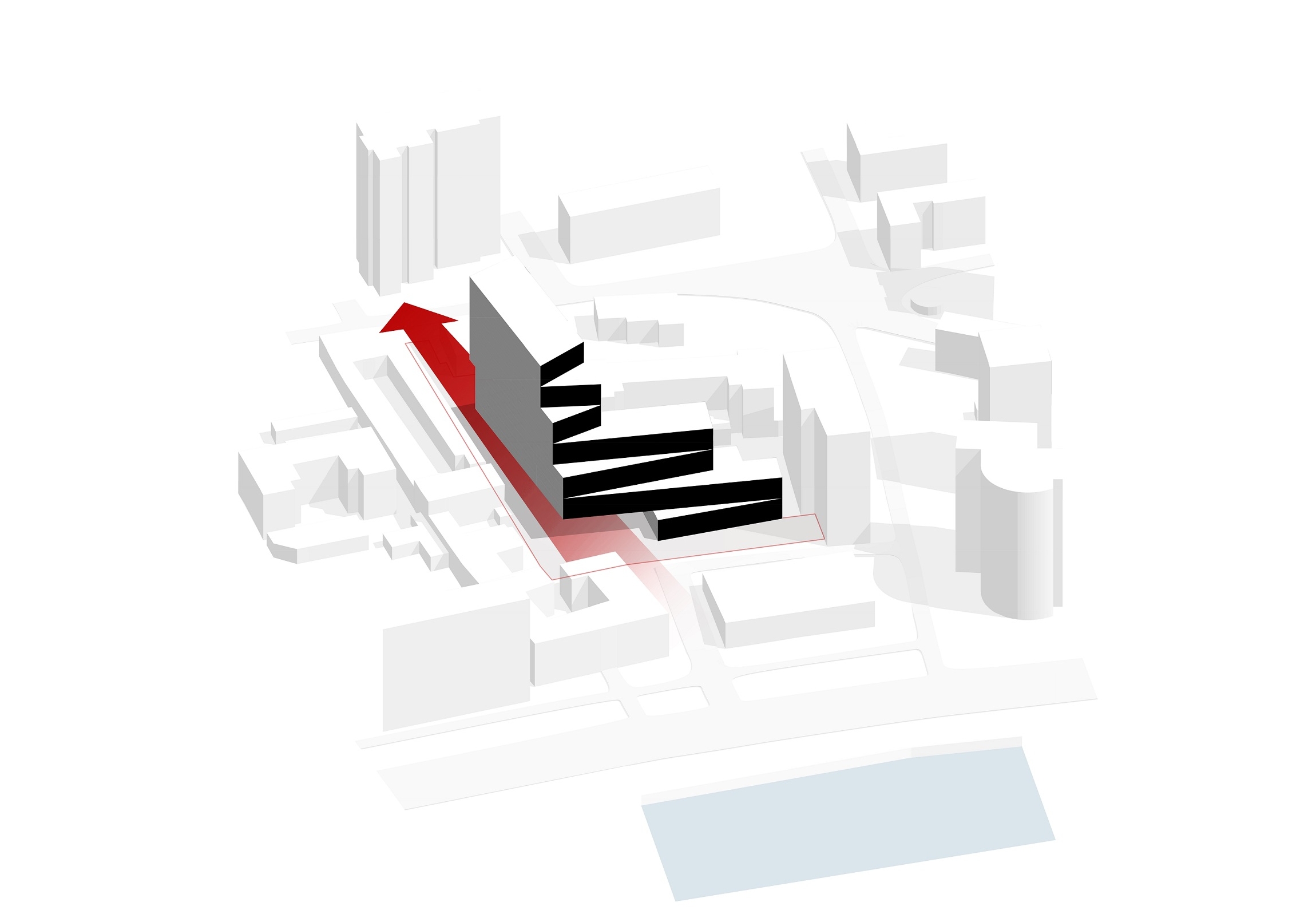
The staircase and elevator nuclei are concentrated along the inner façade. It is oriented southeast – in any other situation it would be left to residential properties but in this case the authors preferred to concentrate here the technical and utility zones in order to clear the outer “viewing” façade.

zooming
"Z-House" residential complex. Plan of the 6-7 floor © ATRIUM


zooming
"Z-House" residential complex. Plan of the 8-9 floor © ATRIUM


zooming
"Z-House" residential complex © ATRIUM


"Z-House" residential complex © ATRIUM


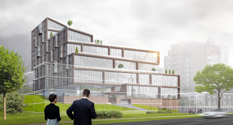
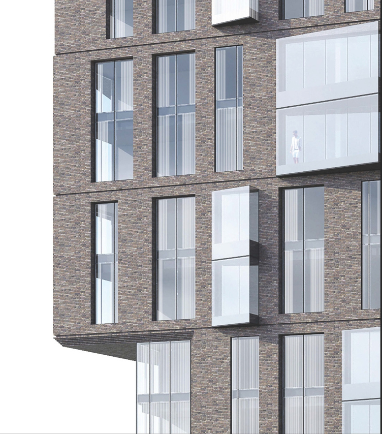
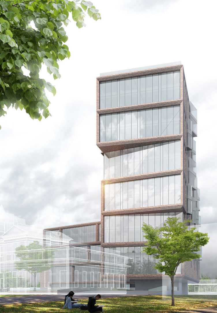
The façade decoration combines brick and stained glass windows. The balance between them is again determined by the view-commanding properties. The best views get maximum of glass. The façades that only command the views of the neighboring buildings have to settle for parity between the brick piers and two-story narrow stained glass windows, which are periodically replaced with glass bay windows.

"Z-House" residential complex © ATRIUM


As a compensation for the loss of the river view, the two side apartments on the bottom floors of the longitudinal unit are made in a format that is close to a townhouse. They have their own entrances from the street, two full-fledged floors, and individual terraces under the podium part.

"Z-House" residential complex © ATRIUM


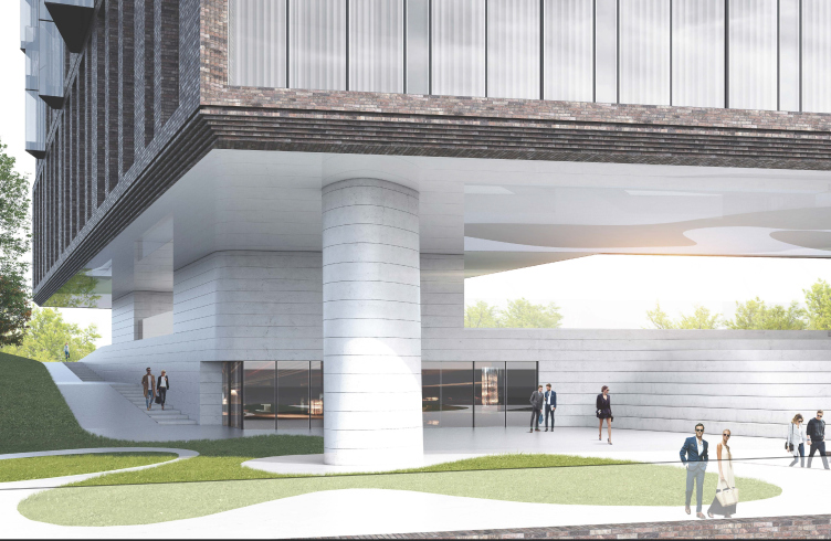
The base floor of the complex is designed in such a way as to visually tie the inner yard of the complex with the world outside, which commands the river and the embankment. Making the most out of the height difference, the architects raised the main volume of the complex above the ground level, leaving, as supports, the bigger part of the first floor of the main unit and a small communication block with a lobby and two staircase and elevator blocks of the lateral wing. The space between the main volume and the podium is used as the public and recreational venues. The immediate connection between the waterfront and the yard is provided by the broad staircase that looks imposing enough to claim the role of the background for memorable photos that new residents may make before they move in.

Here is how Vera Butko comments on the idea of the end-to-end passage through the building: “We wanted to bring light and air into the composition, and connect the yard to the river. Thanks to this passage running through the main wing, we got a space that is at once protected and open to the outside world. A person is walking under this roof with huge cantilevered structures, and then he can get down to the street by a staircase. From any vantage point, we can see the passages to the waterfront, thus avoiding a feeling of isolation, a feeling of being cut away from the waterfront”.

"Z-House" residential complex © ATRIUM


The load from the seemingly hovering outer corner of the complex comes to an only single column that is decorated with polished white stone, thanks to which it looks almost dissolved in the enormous space between the brick-clad podium and the intermediate floor decorated by high-gloss white panels. The unusual combination of brick and light-gray decoration materials on the façades makes the complex look light to the point of being exquisite, putting one on the mind of the London quarters with their inevitable white window sashes framed in brickwork. In this façade play of the materials an important role is also played by the stained glass windows. For them, the architects proposed lighted glass panes with a slight mirror effect.

"Z-House" residential complex © ATRIUM


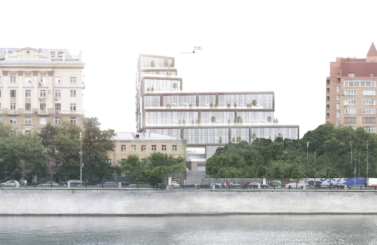
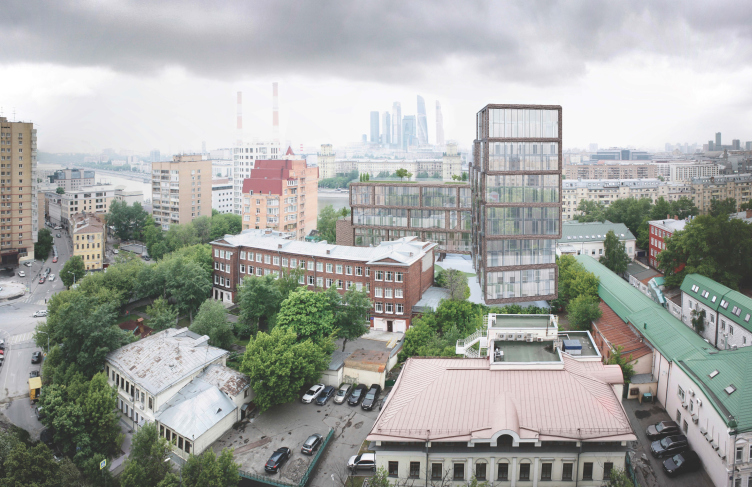
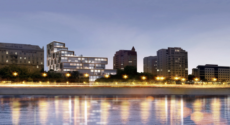
As one looks at the visualization of the complex, inscribed into the waterfront panorama, the first thing that meets the eye is the fact that the new building does not in the least violate the existing environment. The first line of the Savvinskaya Embankment consists of houses 9 to 12 stories high. Their variety and the absence of one single height standard does not allow us to speak about any sort of architectural ensemble comparable, for instance, with the architecture of the Frunzenskaya Embankment, but, still, one can see some certain architectural rhythm here. The solution proposed by ATRIUM supports this general rhythm, at the same time giving a still deeper development of the composition at the expense of the receding high-rise part and the lowering of the tiers towards the neighboring brick tower.

"Z-House" residential complex © ATRIUM


26 March 2018

Headlines now
The Golden Crown
The concept for a dental clinic in Yekaterinburg, developed by CNTR Studio, revolves around the idea of a “mouth full of gold”: pristine white porcelain stoneware walls are complemented by matte brass details. To avoid an overly literal interpretation, the architects focused on the building’s proportions, skillfully navigating between sunlight requirements and fire safety regulations.
Flexibility and Integration
Not long ago, we covered the project for the fourth phase of the ÁLIA residential complex, designed by APEX. Now, we’ve been shown different fence concepts they developed to enclose the complex’s private courtyards, incorporating a variety of public functions. We believe that the sheer fact that the complex’s architects were involved in such a detail as fencing speaks volumes.
A Step Forward
The HIDE residential complex represents a major milestone for ADM architects and their leaders Andrey Romanov and Ekaterina Kuznetsova in their quest for a fresh high-rise aesthetic – one that is flexible and layered, capable of bringing vibrancy to mass and silhouette while shaping form. Over recent years, this approach has become ADM’s “signature style”, with the golden HIDE tower playing a pivotal role in its evolution. Here, we delve into the project’s story, explore the details of the complex’s design, and uncover its core essence.
Gold in the Sands
A new office for a transcontinental company specializing in resource extraction and processing has opened in Dubai. Designed by T+T Architects, masters of creating spaces that are contemporary, diverse, flexible, and original, this project exemplifies their expertise. On the executive floor, a massive brass-clad partition dominates, while layered textures of compressed earth create a contextually resonant backdrop.
Layers and Levels of Flight
This project goes way back – Reserve Union won this architectural competition at the end of 2011, and the building was completed in 2018, so it’s practically “archival”. However, despite being relatively unknown, the building can hardly be considered “dated” and remains a prime example of architectural expression, particularly in the headquarters genre. And it’s especially fitting for an aviation company office. In some ways, it resembles the Aeroflot headquarters at Sheremetyevo but with its own unique identity, following the signature style of Vladimir Plotkin. In this article, we take an in-depth look at the United Aircraft Corporation (UAC) headquarters in the Moscow agglomeration town of Zhukovsky, supplemented by recent photographs from Alexey Naroditsky – a shoot that became only recently possible due to the fact that improvements were finally made in the surrounding area.
Light and Shadow
In this article, we delve into the architectural design of the “Chaika” house by DNK ag architects, which was recently completed in 2023 as part of the collection of signature designs at ZILArt. As is well-known, all the buildings in this complex follow a design code, yet each one is distinct. This particular building stands out not only for its whiteness and minimalism but also for the refined use of a limited number of techniques that, together, create what can confidently be called synergy.
Casus Novae
A master plan was developed for a large residential area with a name of “DNS City”, but now that its implementation began, the plan has been arbitrarily reformatted and replaced with something that, while similar on the surface, is actually quite different. This is not the first time such a thing happens, but it’s always frustrating. With permission from the author, we are sharing Maria Elkina’s post.
Treasure Hunting
The GAFA bureau, in collaboration with Tegola and Arkhitail, organized an expedition to the island of Kilpola in Karelia as part of Moskomarkhitektura’s “Open City” festival. There, amidst moss and rocks, the students sought answers to questions like: what is the sacred, where does it dwell, and what sustains it? Assisting the participants in this quest were landscape engineer Evgeny Levin, artist Nicholas Roerich, a moose, and the lack of cellular connection. Here’s how the story unfolded.
Depths of the Earth, Streams of Water
In the Malaya Okhta district, the Akzent building, designed by Stepan Liphart, was constructed. It follows a classic tripartite structure, yet it’s what you might call “hand-drawn”: each façade is unique in its form and details, some of which aren’t immediately noticeable. In this article, we explore the context and, together with the architect, delve into how the form was developed.
Fir Tree Dynamics
The “Airports of Region” holding is planning to build an airport in Karachay-Cherkessia, aiming to make the Arkhyz and Dombay resorts more accessible to travelers. The project that won in an invitation-only competition, submitted by Sergey Nikeshkin’s KPLN, blends natural imagery inspired by the shape of a conifer seed, open-air waiting spaces, majestic large trees, and a green roof elevated on needle-like columns. The result is both nature-inspired and WOW.
​A Brick Shell
In the process of designing a clubhouse situated among pine trees in a prestigious suburban area near Moscow, the architectural firm “A.Len” did the façade design part. The combination of different types of brick and masonry correlates with the volumetric and plastique solutions, further enhanced by the inclusion of wood-painted fragments and metal “glazing”.
Word Forms
ATRIUM architects love ambitious challenges, and for the firm’s thirtieth anniversary, they boldly play a game of words with an exhibition that dives deep into a self-created vocabulary. They immerse their projects – especially art installations – into this glossary, as if plunging into a current of their own. You feel as if you’re flowing through the veins of pure art, immersed in a universe of vertical cities, educational spaces – of which the architects are true masters – and the cultural codes of various locations. But what truly captivates is the bold statement that Vera Butko and Anton Nadtochy make, both through their work and this exhibition: architecture, above all, is art – the art of working with form and space.
Flexibility and Acuteness of Modernity
Luxurious, fluid, large “kokoshniks” and spiral barrel columns, as if made from colorful chewing gum: there seem to be no other mansion like this in Moscow, designed in the “Neo-Russian-Modern” style. And the “Teremok” on Malaya Kaluzhskaya, previously somewhat obscure, has “come alive with new colors” and gained visibility after its restoration for the office of the “architectural ecosystem” as the architects love to call themselves. It’s evident that Julius Borisov and the architects at UNK put their hearts into finding this new office and bringing it up to date. Let’s delve into the paradoxes of this mansion’s history and its plasticity. Spoiler: two versions of modernity meet here, both balancing on the razor’s edge of “what’s current”.
Yuri Vissarionov: “A modular house does not belong to the land”
It belongs to space, or to the air... It turns out that 3D printing is more effective when combined with a modular approach: the house is built in a workshop and then adapted to the site, including on uneven terrain. Yuri Vissarionov shares his latest experience in designing tourist complexes, both in central Russia and in the south. These include houseboats, homes printed from lightweight concrete using a 3D printer, and, of course, frame houses.
​Moscow’s First
“The quality of education largely depends on the quality of the educational environment”. This principle of the last decade has been realized by Sergey Skuratov in the project for the First Moscow Gymnasium on Rostovskaya Embankment in the Khamovniki district. The building seamlessly integrates into the complex urban landscape, responding both to the pedestrian flow of the city and the quiet alleyways. It skillfully takes advantage of the height differences and aligns with modern trends in educational space design. Let’s take a closer look.
Looking at the Water
The site of Villa Sonata stretches from the road to the water’s edge, offering its own shoreline, pier, and a picturesque river panorama. To reveal these sweeping views, Roman Leonidov “cut” the façade diagonally parallel to the river, thus getting two main axes for the house and, consequently, “two heads”. The internal core – two double-height spaces, a living room and a conservatory, with a “bridge” above them – makes the house both “transparent” and filled with light.
The White Wing
Well, it’s not exactly white. It’s more of a beige, white-stone structure that plays with the color of limestone – smoother surfaces are lighter, while rougher ones are darker. This wing unites various elements: it absorbs and interprets the surrounding themes. It responds to everything, yet maintains a cohesive expression – a challenging task! – while also incorporating recognizable features of its own, such as the dynamic cuts at the bottom, top, and middle.
Urban Dunes
The XSA Ramps team designed and built a three-part sports hub for a park in Rostov-on-Don, welcoming people of all ages and fitness levels. The skate plaza, pump track, and playground are all meticulously crafted with details that attract a diverse range of visitors. The technical execution of the shapes and slopes transforms this space into a kind of sculptural composition.
Proportional Growth
The project for the fourth phase of the ÁLIA residential area has been announced. The buildings are situated on an elongated plot – almost a “ray” that shoots out from the center of the area towards the river. Their layout reflects both a response to Moscow’s architectural preferences over the past 15 years, shifting “from blocks to towers”, and an interpretation of the neighboring business park designed by SOM. Additionally, the best apartments here are not located at the very top but closer to the middle, forming a glowing “waistline”.
The “Staircase” Building
In designing the “Details” residential complex in New Moscow, Rais Baishev spiced up the now-popular Moscow theme of a “courtyard” building with an idea drawn from the surrealist drawings by Maurits Escher. He envisioned the stepped silhouettes and descending slopes as a metaphysical mega-staircase, creating a key void within the courtyard that gave the project an internal “spine”. This concept is felt both in the building’s silhouette and on its façades.
Projection of the Quarter
No one doubted that the building that Vladimir Plotkin designed as part of the “Garden Quarters” would be the most modernist of all. And it turned out just that way: while adhering to the common design code, the building successfully combines brick and white stone, rhythmically responding to the neighboring building designed by Ostozhenka, yet tactfully and persistently making a few statements of its own. This includes the projection of the ideal urban development composition “14–9–6”, which can be found right next door, mathematical calculations, including those for various types of terraces (and perhaps the only reminder of the Soviet past of the Kauchuk rubber factory!), and the white “cross-stitch” pattern of the façade grid.
Domus Aurea
In this issue, we examine the “Tessinsky-1” house, designed by Sergey Skuratov and completed in 2023. Located in the middle of the Serebryanicheskaya Embankment district, at the intersection of its main streets, this house assumes a sort of “nodal” role: it not only responds to everything around it and preserves many memories of the former EMA factory within itself, but it weaves all this into a newly directed pattern, reconciling bright “gold” and dark-colored brick, largely with the help of the new, modern-yet-archaic Columba brick, which, come to think about it, is the most precious element here.
The Chimney of Nikola-Lenivets
In this issue, we are examining the “Obelisk House” designed by KATARSIS and built for the Arkhstoyanie 2023 festival. However, it was only finished later on, and this is why we are examining it now. It seems to us that after the “Obelisk House” appeared in Nikola-Lenivets, a dialogue and a few inner connections appeared between the temporary structures built here. These houses no longer look like “accidental neighbors”, more of which below.
​Periscope by the Bay
The jury awarded the second place in the competition for a public and cultural center in Petropavlovsk-Kamchatsky to the companies GORA (“Mountain”) and M4. In the consortium’s proposal, the building resembles a sperm whale with a calf swimming next to it or a periscope, whose lenses capture the most spectacular views from the surrounding landscape.
From Arcs to Dolmens
While working on the competition project for Petropavlovsk-Kamchatsky, ASADOV Architects prioritized the value of the natural and urban environment, aiming to preserve the balance of the location while minimizing the resemblance of the volume that they designed to a “traditional building”. The task was challenging, and the architects created three versions, one of which having been developed after the competition, where their main proposal took third place. However, the point of interest here is not the competition result but the continuity of creative thinking.
Hide and Seek
The ID Moskovskiy house, designed by Stepan Liphart in St. Petersburg, in the courtyards near Moskovskiy Avenue beyond the Obvodny Canal and recently completed, is notable for several reasons. Firstly, it has been realized with considerable accuracy, which is particularly significant as this is the first building where the architect was responsible not only for the facades but also for the layouts, allowing for better integration between the two. On the other hand, this building is interesting as an example of the “germination” of new architecture in the city: it draws on the best examples from the neighborhood and becomes an improved and developed sum of ideas found by the architect in the surrounding context.
The Big Twelve
Yesterday, the winners of the Moscow Mayor’s Architecture Award were announced and honored. Let’s take a look at what was awarded and, in some cases, even critique this esteemed award. After all, there is always room for improvement, right?
Above the Golden Horn
The residential complex “Philosophy” designed by T+T architects in Vladivostok, is one of the new projects in the “Golubinaya Pad” area, changing its development philosophy (pun intended) from single houses to a comprehensive approach. The buildings are organized along public streets, varying in height and format, with one house even executed in gallery typology, featuring a cantilever leaning on an art object.
Nuanced Alternative
How can you rhyme a square and space? Easily! But to do so, you need to rhyme everything you can possibly think of: weave everything together, like in a tensegrity structure, and find your own optics too. The new exhibition at GES-2 does just that, offering its visitor a new perspective on the history of art spanning 150 years, infused with the hope for endless multiplicity of worlds and art histories. Read on to see how this is achieved and how the exhibition design by Evgeny Ace contributes to it.
Blinds for Ice
An ice arena has been constructed in Domodedovo based on a project by Yuri Vissarionov Architects. To prevent the long façade, a technical requirement for winter sports facilities, from appearing monotonous, the architects proposed the use of suspended structures with multidirectional slats. This design protects the ice from direct sunlight while giving the wall texture and detail.