По-русски

David Leventhal. Kohn Pedersen Fox Associates (KPF). Interview and text by Vladimir Belogolovskiy

KPF is one more participant of an exposition of the Russian pavilion on XI Architectural biennial in Venice

28 July 2008
Report
mainImg
Kohn Pedersen Fox Associates, KPF was founded in 1976 in New York. The firm employs over 500 architects in New
York, London and Shanghai with a diverse portfolio of super tall skyscrapers, museums, universities, banks, hotels,
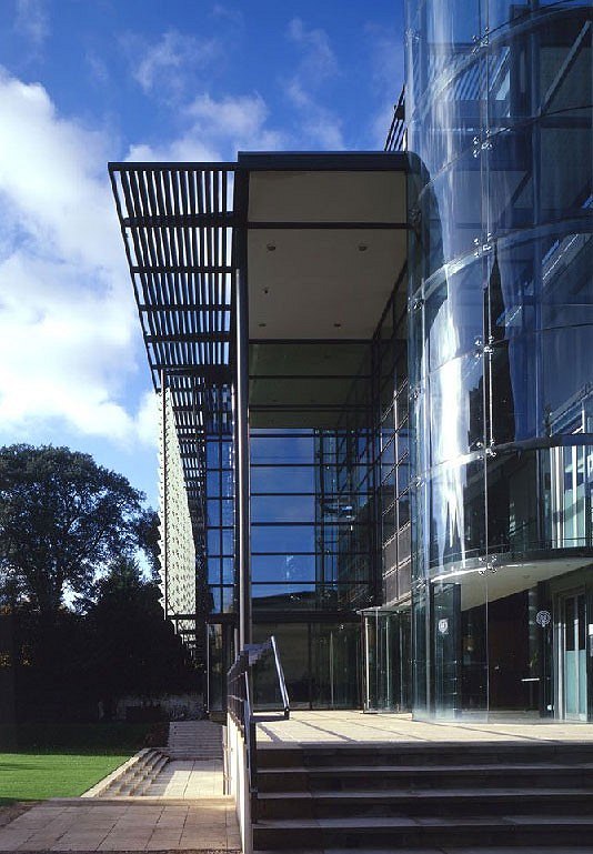
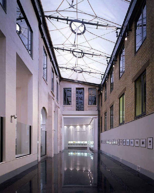
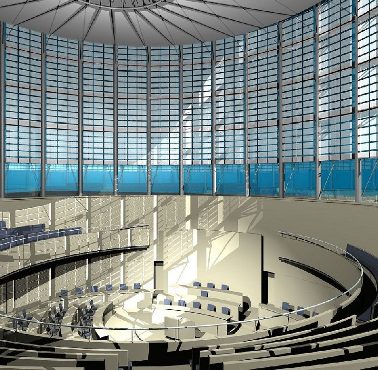
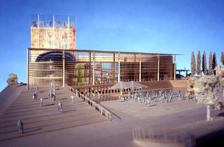
convention centers and airports all over the world. David Leventhal jointed KPF in 1979. He is a partner-in-charge of design at the London office, which he founded in 1989 together with Lee Polisano, now the president of the firm. David designed award-winning projects at Oxford University, the London School of Economics, the Parliament House and the National Theatre in Cyprus and high-rises in North America, Europe and the Middle East. These projects incorporate low-energy design strategies and exemplify the firm’s commitment to sustainable architecture.
KPF is now working on three projects in Moscow. In 2006, the firm was invited to take part in new Administrative
Business Complex competition in St. Petersburg for Gazprom, Russian energy giant. David expressed his amazement and
disappointment with Gazprom’s decision to build a 400-meter tall skyscraper in close proximity to the historical city center. Being familiar with the horizontal and historically cohesive urban character of St. Petersburg, it became a moral issue for KPF partners to decline the challenge to design a skyscraper in a place where it does not belong. We met with David Leventhal at his company’s multistory office in the Economist building, the home of the famous namesake.

You went to Harvard art school but graduated from architecture. What determined your choice?


I’m originally from Boston and if you live in Boston you are expected to go to Harvard. In my undergraduate program, I specialized in fine arts and was debating whether to become a museum curator or an architect. When I finished the undergraduate program I still didn’t know, so I went to work – first at the Metropolitan Museum of Art and then for
Pietro Belluschi, a famous Italian-American architect. I learned what it is like to be an architect and was much more excited about architecture, so I went back to Harvard. For me the best professor there was Michael McKinnell, a fantastic teacher and the architect of the City Hall in Boston, which I think is the best example of 20th century architecture in Boston. I graduated in 1978.

How did you hear about KPF?

I came to New York right after Harvard and saw the new ABC Television Studio on West 67th Street. I found out that it was a building designed by a company called KPF, so I went there and was interviewed by two KPF founders, Eugene Kohn and William Pedersen. They liked my work and we shared a great passion for Alvar Aalto’s architecture. They were not hiring then and asked me to come back in the future. I started working for Cain, Farrell & Bell, the successors to the famous beaux-arts firm of McKim, Mead and White. They had original drawings by Charles McKim, which attracted me to their office in the first place. I worked there for about 9 months. One day a professor from Columbia University came
to the office because he found out about these drawings. He asked the partners if he could have them and they gave these
priceless drawings away, just like that. At that point, I knew I had to leave since the office was not very passionate about
architecture. I called KPF and almost 30 years later, I am still here.

Do you ever contemplate about having your own firm?

Absolutely not! What is so great about KPF is that from the very beginning I knew that I was with the people who share my
thoughts and passions. My voice was heard, my opinions respected and whenever I was with the clients by myself I could speak for the firm. I could always say – “we”.

Do skyscrapers remain the main focus of KPF’s workload?

They are one of our focuses. We continue to work on very tall and exciting projects, such as Shanghai World Financial Center, a 101-story tower. It’s primary form is an intersection of a square plan extruded and two sweeping arcs, which taper to a single line at the apex. The top is pierced by a square opening to relieve wind pressure. It is under construction now and is expected to become a new icon on the Shanghai skyline. However, for us the real focus is not just producing tall iconic buildings, but working in cities. Of course, skyscrapers are now a big part of working in cities. It is important how our urban projects contribute to city life and how it is for the people to work inside of these buildings.

Let’s talk about your projects in Russia.

We have three major projects in Moscow. Two projects are direct commissions and one we won through a competition. The first project is with the development firm called Horus Capital. The second project is Park-City. It is located right across the river from the White House and next to the Ukraine Hotel on 36 acres (15 hectares) site. There we are working on the master plan and the design of several new buildings. The third project is several office towers along Kutuzovsky prospect for Alpha Bank and ZAO Inteco.

What are these projects like?


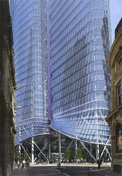
The Horus project is right on the Garden Ring. At first, we designed a tall building that featured horizontal planes rising gradually into vertical planes. The design was inspired by Russian architecture of the 1920s and 30s. When we presented this scheme, we were told that our site was not reserved for a highrise, so we went back to the drawing board. The second proposal is very different. It has a very hard edge on the outside protecting a curving, oasis-like interior space to the rear. Straight rays coming from an imaginary point deep down within the earth and form the basis for the façade. Dynamically angled glass panels evoke the impression of a great burst of energy and excitement. The lobby is very open and accessible to the public for restaurants and retail. We are working  with designer Ron Arad on a very expressive sculptural piece that will unify many architectural elements within.
At Park-City we proposed two main organizing urban gestures – a new boulevard, parallel to Kutuzovsky Prospekt and the diagonal axis, which picks up the angle from the late 19th century Badaevsky Beer Brewery building. This axis runs straight, past the water’s edge over a highway and terminates in a very dramatic 35-meter cantilever. This dynamic structure will have a spectacular viewing platform, restaurants and outdoor spaces along the river. The office complex on Kutuzovsky
prospect, near Victory Park, is a composition of organic towers and lower terraced buildings that merge with the landscape,
creating a public space with an underground retail link to the Metro.

What other architects work with you on the Park-City project?

Rafael Vinoly is designing three residential towers along the river. Other buildings are designed by a Beirut architect Nabil Gholam and young London-based Brisac Gonzalez, who apprenticed at our London studio many years ago.

Many major projects in Russia are being designed by foreign architects. Do you feel you have the advantage over the Russian architects?

I can only tell you about KPF. We have a great passion for working in cities and we have a tremendous respect for local
culture. Most importantly, we know how to interpret a local condition from an international perspective. We have a very
diverse international portfolio of successful projects.

How frequently do you go to Russia?


I’m very involved with the Horus project and now we are beginning to collaborate on a couple of new projects with them. We have meetings every two weeks, alternating between London and Moscow. I go to Moscow at least once a month. I have been there ten times. Moscow is a difficult city to say that one knows it well, but I think I am beginning to understand it more and more. Each time we go, we try to visit a museum, a local site, a train station or a monument. Our client is very passionate about architecture so whenever we have an hour between meetings, we go see something.

Have you seen anything interesting built there recently?

There is a lot being built, but to be honest,  much of what one sees just passing by is not incredibly exciting. I suspect there are some interesting projects there, but they are not at the forefront of the city. What interests me more are buildings from the 1920’s and 30’s by the constructivists. The ones that I liked most are by Melnikov – his house and the clubs. They are done with a fantastic imagination and a great sense of taking a program and making something very special. Also, I’ve been several times to the recent exhibit of Richard Pare photographs at MoMA, so I made a list of buildings and every time I go to Moscow I try to visit something new.

Is it difficult to work in Russia?

What is special about Russia is that so many things are constantly changing. Even the building codes are changing. The
notion of a tall building is always being reconsidered. Atria in tall buildings are not clearly defined. The fire codes are very conservative because there are no precedents for many types of construction. Even with our international experience, we have great difficulties to prove that our solutions are safe and valid.

How would you compare working in Russia to China or the Middle East?


Each place is different and it has a lot to do with where each country stands in the cycle of development. In the Middle East,
in places like Abu Dhabi or Qatar they are far ahead of Russia. China is right behind the Middle East and Russia is behind China. Recently these countries reissued their building codes, so they have, for example, real high-rise codes. In Russia, we still run into so many uncertainties.

Do you see any particular shifts in the demands of your clients for innovative ideas?


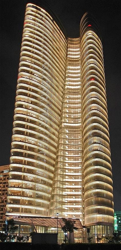
Interestingly, some of the countries in the Middle East are the ones that are pushing for new ideas. For example, our client in Abu-Dhabi for the ADIA Headquarters pushed us to come up with the workspace that would be the best in the world and actually encourage people to work together. Each floor has an open plan, zones for interaction and meetings  within a central landscaped atrium and a series of sky gardens. There was also a desire to fit this new building into the local context. The curved form of the tower is related to fluid forces of the waterfront site. The office floors are connected with convenience stairs, expressed in elevation as a slim glass tower. It breaks the bulk of the building and proportionally mimics
many tall minarets in the city, but in a very suggestive, abstract way. The building is wrapped in ribbon-like surface of doubleglazed curtain wall with horizontal shading devices, which is both economical and beautiful.

Do you foresee any particular changes in the way tall and super tall buildings are going to be used in the future?


The world’s densest cities like New York, Tokyo and Hong Kong are also its most energy efficient. For sustainable reasons alone, we must live more densely. More and more, tall buildings are used for mixeduse programs such as hotel, residential, commercial and offices. It is a very economical way to occupy a particular site. This strategy leads to substantial energy savings because an excess heat load, for example from an office user could be used to heat an apartment. Tall structures create new important social spaces, such as elevator transfer floors or sky-gardens. Many cities in the Middle East are very spread out and tall buildings make them feel very exciting and urban. Tall buildings are identified with progress and prestige and people are willing to pay a very high price to live or to work in them.

In other words, cities will grow upwards and Moscow is no exception.


 Sure. Tall buildings make economic sense in many parts of the world. When skyscrapers are grouped together and are supported by developed infrastructure and especially public transportation, they form very exciting dense city centers that identify the greatest cities around the world today. That is why Moscow needs to build high, but obviously, each building should be sensitive to its surrounding. There is another important point. A skyscraper is defined by an aspiration, one that intends to link earth and sky, the new dimension of the cities of this new century.
zooming


28 July 2008

Headlines now
The Golden Crown
The concept for a dental clinic in Yekaterinburg, developed by CNTR Studio, revolves around the idea of a “mouth full of gold”: pristine white porcelain stoneware walls are complemented by matte brass details. To avoid an overly literal interpretation, the architects focused on the building’s proportions, skillfully navigating between sunlight requirements and fire safety regulations.
Flexibility and Integration
Not long ago, we covered the project for the fourth phase of the ÁLIA residential complex, designed by APEX. Now, we’ve been shown different fence concepts they developed to enclose the complex’s private courtyards, incorporating a variety of public functions. We believe that the sheer fact that the complex’s architects were involved in such a detail as fencing speaks volumes.
A Step Forward
The HIDE residential complex represents a major milestone for ADM architects and their leaders Andrey Romanov and Ekaterina Kuznetsova in their quest for a fresh high-rise aesthetic – one that is flexible and layered, capable of bringing vibrancy to mass and silhouette while shaping form. Over recent years, this approach has become ADM’s “signature style”, with the golden HIDE tower playing a pivotal role in its evolution. Here, we delve into the project’s story, explore the details of the complex’s design, and uncover its core essence.
Gold in the Sands
A new office for a transcontinental company specializing in resource extraction and processing has opened in Dubai. Designed by T+T Architects, masters of creating spaces that are contemporary, diverse, flexible, and original, this project exemplifies their expertise. On the executive floor, a massive brass-clad partition dominates, while layered textures of compressed earth create a contextually resonant backdrop.
Layers and Levels of Flight
This project goes way back – Reserve Union won this architectural competition at the end of 2011, and the building was completed in 2018, so it’s practically “archival”. However, despite being relatively unknown, the building can hardly be considered “dated” and remains a prime example of architectural expression, particularly in the headquarters genre. And it’s especially fitting for an aviation company office. In some ways, it resembles the Aeroflot headquarters at Sheremetyevo but with its own unique identity, following the signature style of Vladimir Plotkin. In this article, we take an in-depth look at the United Aircraft Corporation (UAC) headquarters in the Moscow agglomeration town of Zhukovsky, supplemented by recent photographs from Alexey Naroditsky – a shoot that became only recently possible due to the fact that improvements were finally made in the surrounding area.
Light and Shadow
In this article, we delve into the architectural design of the “Chaika” house by DNK ag architects, which was recently completed in 2023 as part of the collection of signature designs at ZILArt. As is well-known, all the buildings in this complex follow a design code, yet each one is distinct. This particular building stands out not only for its whiteness and minimalism but also for the refined use of a limited number of techniques that, together, create what can confidently be called synergy.
Casus Novae
A master plan was developed for a large residential area with a name of “DNS City”, but now that its implementation began, the plan has been arbitrarily reformatted and replaced with something that, while similar on the surface, is actually quite different. This is not the first time such a thing happens, but it’s always frustrating. With permission from the author, we are sharing Maria Elkina’s post.
Treasure Hunting
The GAFA bureau, in collaboration with Tegola and Arkhitail, organized an expedition to the island of Kilpola in Karelia as part of Moskomarkhitektura’s “Open City” festival. There, amidst moss and rocks, the students sought answers to questions like: what is the sacred, where does it dwell, and what sustains it? Assisting the participants in this quest were landscape engineer Evgeny Levin, artist Nicholas Roerich, a moose, and the lack of cellular connection. Here’s how the story unfolded.
Depths of the Earth, Streams of Water
In the Malaya Okhta district, the Akzent building, designed by Stepan Liphart, was constructed. It follows a classic tripartite structure, yet it’s what you might call “hand-drawn”: each façade is unique in its form and details, some of which aren’t immediately noticeable. In this article, we explore the context and, together with the architect, delve into how the form was developed.
Fir Tree Dynamics
The “Airports of Region” holding is planning to build an airport in Karachay-Cherkessia, aiming to make the Arkhyz and Dombay resorts more accessible to travelers. The project that won in an invitation-only competition, submitted by Sergey Nikeshkin’s KPLN, blends natural imagery inspired by the shape of a conifer seed, open-air waiting spaces, majestic large trees, and a green roof elevated on needle-like columns. The result is both nature-inspired and WOW.
​A Brick Shell
In the process of designing a clubhouse situated among pine trees in a prestigious suburban area near Moscow, the architectural firm “A.Len” did the façade design part. The combination of different types of brick and masonry correlates with the volumetric and plastique solutions, further enhanced by the inclusion of wood-painted fragments and metal “glazing”.
Word Forms
ATRIUM architects love ambitious challenges, and for the firm’s thirtieth anniversary, they boldly play a game of words with an exhibition that dives deep into a self-created vocabulary. They immerse their projects – especially art installations – into this glossary, as if plunging into a current of their own. You feel as if you’re flowing through the veins of pure art, immersed in a universe of vertical cities, educational spaces – of which the architects are true masters – and the cultural codes of various locations. But what truly captivates is the bold statement that Vera Butko and Anton Nadtochy make, both through their work and this exhibition: architecture, above all, is art – the art of working with form and space.
Flexibility and Acuteness of Modernity
Luxurious, fluid, large “kokoshniks” and spiral barrel columns, as if made from colorful chewing gum: there seem to be no other mansion like this in Moscow, designed in the “Neo-Russian-Modern” style. And the “Teremok” on Malaya Kaluzhskaya, previously somewhat obscure, has “come alive with new colors” and gained visibility after its restoration for the office of the “architectural ecosystem” as the architects love to call themselves. It’s evident that Julius Borisov and the architects at UNK put their hearts into finding this new office and bringing it up to date. Let’s delve into the paradoxes of this mansion’s history and its plasticity. Spoiler: two versions of modernity meet here, both balancing on the razor’s edge of “what’s current”.
Yuri Vissarionov: “A modular house does not belong to the land”
It belongs to space, or to the air... It turns out that 3D printing is more effective when combined with a modular approach: the house is built in a workshop and then adapted to the site, including on uneven terrain. Yuri Vissarionov shares his latest experience in designing tourist complexes, both in central Russia and in the south. These include houseboats, homes printed from lightweight concrete using a 3D printer, and, of course, frame houses.
​Moscow’s First
“The quality of education largely depends on the quality of the educational environment”. This principle of the last decade has been realized by Sergey Skuratov in the project for the First Moscow Gymnasium on Rostovskaya Embankment in the Khamovniki district. The building seamlessly integrates into the complex urban landscape, responding both to the pedestrian flow of the city and the quiet alleyways. It skillfully takes advantage of the height differences and aligns with modern trends in educational space design. Let’s take a closer look.
Looking at the Water
The site of Villa Sonata stretches from the road to the water’s edge, offering its own shoreline, pier, and a picturesque river panorama. To reveal these sweeping views, Roman Leonidov “cut” the façade diagonally parallel to the river, thus getting two main axes for the house and, consequently, “two heads”. The internal core – two double-height spaces, a living room and a conservatory, with a “bridge” above them – makes the house both “transparent” and filled with light.
The White Wing
Well, it’s not exactly white. It’s more of a beige, white-stone structure that plays with the color of limestone – smoother surfaces are lighter, while rougher ones are darker. This wing unites various elements: it absorbs and interprets the surrounding themes. It responds to everything, yet maintains a cohesive expression – a challenging task! – while also incorporating recognizable features of its own, such as the dynamic cuts at the bottom, top, and middle.
Urban Dunes
The XSA Ramps team designed and built a three-part sports hub for a park in Rostov-on-Don, welcoming people of all ages and fitness levels. The skate plaza, pump track, and playground are all meticulously crafted with details that attract a diverse range of visitors. The technical execution of the shapes and slopes transforms this space into a kind of sculptural composition.
Proportional Growth
The project for the fourth phase of the ÁLIA residential area has been announced. The buildings are situated on an elongated plot – almost a “ray” that shoots out from the center of the area towards the river. Their layout reflects both a response to Moscow’s architectural preferences over the past 15 years, shifting “from blocks to towers”, and an interpretation of the neighboring business park designed by SOM. Additionally, the best apartments here are not located at the very top but closer to the middle, forming a glowing “waistline”.
The “Staircase” Building
In designing the “Details” residential complex in New Moscow, Rais Baishev spiced up the now-popular Moscow theme of a “courtyard” building with an idea drawn from the surrealist drawings by Maurits Escher. He envisioned the stepped silhouettes and descending slopes as a metaphysical mega-staircase, creating a key void within the courtyard that gave the project an internal “spine”. This concept is felt both in the building’s silhouette and on its façades.
Projection of the Quarter
No one doubted that the building that Vladimir Plotkin designed as part of the “Garden Quarters” would be the most modernist of all. And it turned out just that way: while adhering to the common design code, the building successfully combines brick and white stone, rhythmically responding to the neighboring building designed by Ostozhenka, yet tactfully and persistently making a few statements of its own. This includes the projection of the ideal urban development composition “14–9–6”, which can be found right next door, mathematical calculations, including those for various types of terraces (and perhaps the only reminder of the Soviet past of the Kauchuk rubber factory!), and the white “cross-stitch” pattern of the façade grid.
Domus Aurea
In this issue, we examine the “Tessinsky-1” house, designed by Sergey Skuratov and completed in 2023. Located in the middle of the Serebryanicheskaya Embankment district, at the intersection of its main streets, this house assumes a sort of “nodal” role: it not only responds to everything around it and preserves many memories of the former EMA factory within itself, but it weaves all this into a newly directed pattern, reconciling bright “gold” and dark-colored brick, largely with the help of the new, modern-yet-archaic Columba brick, which, come to think about it, is the most precious element here.
The Chimney of Nikola-Lenivets
In this issue, we are examining the “Obelisk House” designed by KATARSIS and built for the Arkhstoyanie 2023 festival. However, it was only finished later on, and this is why we are examining it now. It seems to us that after the “Obelisk House” appeared in Nikola-Lenivets, a dialogue and a few inner connections appeared between the temporary structures built here. These houses no longer look like “accidental neighbors”, more of which below.
​Periscope by the Bay
The jury awarded the second place in the competition for a public and cultural center in Petropavlovsk-Kamchatsky to the companies GORA (“Mountain”) and M4. In the consortium’s proposal, the building resembles a sperm whale with a calf swimming next to it or a periscope, whose lenses capture the most spectacular views from the surrounding landscape.
From Arcs to Dolmens
While working on the competition project for Petropavlovsk-Kamchatsky, ASADOV Architects prioritized the value of the natural and urban environment, aiming to preserve the balance of the location while minimizing the resemblance of the volume that they designed to a “traditional building”. The task was challenging, and the architects created three versions, one of which having been developed after the competition, where their main proposal took third place. However, the point of interest here is not the competition result but the continuity of creative thinking.
Hide and Seek
The ID Moskovskiy house, designed by Stepan Liphart in St. Petersburg, in the courtyards near Moskovskiy Avenue beyond the Obvodny Canal and recently completed, is notable for several reasons. Firstly, it has been realized with considerable accuracy, which is particularly significant as this is the first building where the architect was responsible not only for the facades but also for the layouts, allowing for better integration between the two. On the other hand, this building is interesting as an example of the “germination” of new architecture in the city: it draws on the best examples from the neighborhood and becomes an improved and developed sum of ideas found by the architect in the surrounding context.
The Big Twelve
Yesterday, the winners of the Moscow Mayor’s Architecture Award were announced and honored. Let’s take a look at what was awarded and, in some cases, even critique this esteemed award. After all, there is always room for improvement, right?
Above the Golden Horn
The residential complex “Philosophy” designed by T+T architects in Vladivostok, is one of the new projects in the “Golubinaya Pad” area, changing its development philosophy (pun intended) from single houses to a comprehensive approach. The buildings are organized along public streets, varying in height and format, with one house even executed in gallery typology, featuring a cantilever leaning on an art object.
Nuanced Alternative
How can you rhyme a square and space? Easily! But to do so, you need to rhyme everything you can possibly think of: weave everything together, like in a tensegrity structure, and find your own optics too. The new exhibition at GES-2 does just that, offering its visitor a new perspective on the history of art spanning 150 years, infused with the hope for endless multiplicity of worlds and art histories. Read on to see how this is achieved and how the exhibition design by Evgeny Ace contributes to it.
Blinds for Ice
An ice arena has been constructed in Domodedovo based on a project by Yuri Vissarionov Architects. To prevent the long façade, a technical requirement for winter sports facilities, from appearing monotonous, the architects proposed the use of suspended structures with multidirectional slats. This design protects the ice from direct sunlight while giving the wall texture and detail.