По-русски

Vladimir Plotkin: “We wanted to create a free and transparent space”

Monday, June 12, was the last opening day of “Ottepel” (“Thaw”) exhibition at the State Tretyakov Gallery on the Krymsky Val. For Vladimir Plotkin, it became the first experience of designing an exhibition space. We spoke to the architect about the background of this exhibition and its main ideas.

09 June 2017
Interview
mainImg
Architect:
Vladimir Plotkin

Archi.ru:
– How did it all begin?

Vladimir Plotkin:
– It all came together rather unexpected. In the beginning of the summer of 2016, at the break of May and June, in fact, they called me up and invited me to do this thing. At first, I was hesitant. Then, in a few days, I met Zelfira Tregulova, and she told me that I was recommended, and they were already familiar with my works.

– Who recommended you?

– Sergey Tchoban, primarily, but there were also other recommendations. I was recommended as an architect imbued with ideas of modernism, and hence, sort of close to the spirit of the Soviet Thaw epoch of the late 1950’s – early 1960’s. At first, I did not feel like doing this project because I had never done exhibition design before, apart from what I did for my own exhibitions. I at once went ahead and said that I had no experience in that whatsoever. But... anyway, somehow they were able to talk me into it. The idea kind of grew on me.

Then there was a 3-4 months’ hiatus. Still, however, I already started to do a brief survey of the examples of exposition design; hitherto, I did not give much thought to that subject, if at all. Visiting exhibitions and shows, I only used to pay attention to the content; now I started paying attention to how everything was organized.

– Were you ultimately inspired by anything? Did you find any positive examples?

– As a matter of fact, no! I just watched and gathered the design information visiting various museums, including modern ones. I was in New York and in Kalmar (Sweden), and just watched how these things are done. I visited a lot of museums.

In late September – early October, I met Zelfira Tregulova again, and they introduced me to the curators of that exhibition: Kirill Svetlyakov and two girls, Anastasia and Julia. We discussed their concept aimed at covering various aspects of the subject: the cultural, artistic, and social ones – different aspects of life, from which we form our idea of that epoch. Each of them is important, and each of them is represented by arts, science, and architecture, everyday household items, design, photography and cinema, various events and so on.

As far as the ideas of organizing space are concerned, I was only told that the exposition would consist of 7-8 sections, and that the section named “Forward to Communism” would be placed in the loft, which kind of suggests itself: the broad ramp that leads upwards in that building can really serve as the embodiment of the way up and forward. For my work on the exhibition I invited my colleague, Elena Kuznetsova. I expected that we were in for hard work on content and needs analysis, subject research, setting the task, generating the main idea, then the technical part... this is a precise and clear process, the architectural approach that can be applied to any creative or scientific activity. I thought that, because I was totally unfamiliar with the process on working on exhibition design, the work would take up a lot of time. However, it turned out that we got the whole thing going with just a few sketches. It became clear to me at once what I should do in order to organize the exposition in such a way that all of its aspects would be perceived simultaneously.

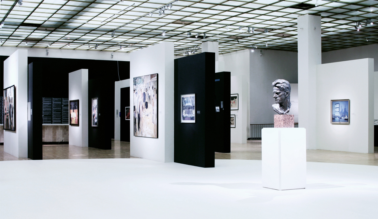
We proposed the idea of, let’s say, “stitched” or “staggered” transparent structure – not unlike the area plan of Moscow’s Cheremushki area. You find yourself in a space where you can see everything virtually from any given point. At first you get this general impression, and then you see the sections – you can come closer to examine any of them, in whatever order you choose. There isn’t any consequential idea; the visitors needn’t follow any rigid specific route. Besides, all the stands are pretty much the same, and they stand in a staggered order – and what we ultimately got was this kind of diagonal motion, like you make your moves from the center. There is also freehand planning and radial/circular effect – the stands are placed along the radial lines.

"Ottepel" Exhibition, the State Tretyakov Gallery, 2017. Design of the exposition: Vladimir Plotkin, Elena Kuznetsova. Photograph: Julia Tarabarina, Archi.ru


"Ottepel" Exhibition, the State Tretyakov Gallery, 2017. Design of the exposition: Vladimir Plotkin, Elena Kuznetsova. Photograph: Julia Tarabarina, Archi.ru


I have the very first sketch that I did almost instantly. Here is the central hall (drawing). From this vantage point, we can read virtually all the surfaces, almost everything. There is only one closed element, the closed part of the exposition, it is called “Prelude. A Talk to Father about Times Past”. This is part of the curator’s concept. A father shares with his son about the war, about the forced labor camp, and about everything he’d been through. Then you come out of this black box and – bang! – you find yourself in this free space, light and transparent.

Then there was this idea that in the center should be a section entitled “The Best City”. But I thought that this would be wrong because, since we think that all the sections are equally valuable, the center must be a free and open space that would also represent part of the culture of those days in some way: take the poetic readings in the Polytechnic Institute or on the Mayakovsky Square, to name but one example. Speaking of the Mayakovsky Square – it was not there in the original concept, but this is how the central circle of light came about, a conditional city square, and the architects happily adorned it with the bust of Mayakovsky by the sculptor Kibalbikov.

"Ottepel" Exhibition, the State Tretyakov Gallery, 2017. Design of the exposition: Vladimir Plotkin, Elena Kuznetsova. Photograph: Julia Tarabarina, Archi.ru


The third topic is the exhibition stands themselves. The idea is simple: it’s the thaw, the return to the routes of the Russian avant-garde and modernism after the years of Stalin’s totalitarian regime – pretty soon it became clear that we needed to make two-part compositions, very much like Lisitsky’s “Projects of Assering the New” (“Prone” in Russian for short). We ultimately came up with an interesting result: from above, you can easily read the exhibition’s layout because it consists of more or less equal elements.

About the black and white color code – initially, it was only white with occasional slanted black strokes meant to symbolize “July rain”. Then we decided that it would be too literal and too much.

"Ottepel" Exhibition, the State Tretyakov Gallery, 2017. Design of the exposition: Vladimir Plotkin, Elena Kuznetsova. Photograph: Julia Tarabarina, Archi.ru


– Did the curators accept your idea at once?

– Yes, practically without a doubt. They said that the idea should be read as easily as possible, that it should be clear to everyone. Of course, it will take a person lacking some appropriate background, say, a non-architect, or maybe even an architect, some time to realize that he is actually walking through a city block just being among these stands. But once he gets to the upper landing, he will see it for sure. Mind, we did not mean to be so literal. We wanted to inspire this inner feeling, and I think we succeeded. But we wouldn’t like it to be read in a literal sense. I even regretted mentioning this idea at the press conference.

– May I ask you about your attitude towards this thaw epoch in general? 

– My conscious childhood fell exactly on that period. All my school days are the 1960’s and a bit of the 1970’s. Yes, I do remember that time, all these movies of those days, and the spirit of the epoch. There were parties in my family going on, I remember the adults dancing twist and rock and roll, the works. Being too young to understand just what this whole “breath of fresh air” this was about, I, nevertheless, knew that a long-long time ago, practically in the Antique times of Homer, there was Stalin, there was the Great Patriotic War, and there were hard times. And now we were moving on to a happy communist future. Everything was brand-new, and every road lay open before us. These were my feelings as a child back in those days. 

Right about that time, somewhere in mid 1960’s, still as a child, I suddenly realized that I would become an architect. I started reading every architectural book and magazine I could lay my hands on, even though there were no architects in our family. My family was what you might call “cutting-edge”: we had magazines like “America” or “England” lying around the house. And I would avidly read them – not because I was a young dissident and worshipped the west but because I was really into contemporary design, architecture, cars, and everything that meant progress and new achievements. I was greatly impressed by the movies of those days – the Soviet and foreign movies that were out during that time because they showed elements of modern cities. I have the most trivial impressions of the thaw – these were my formative years.

Architect:
Vladimir Plotkin

09 June 2017

Headlines now
“Strangers” in the City
We asked Alexander Skokan for a comment on the results of 2025 – and he sent us a whole article, moreover one devoted to the discussion we recently began on the “appropriateness of high-rises” – or, more broadly speaking, “contrasting insertions into the urban fabric”. The result is a text that is essentially a question: why here? Why like this?
Dmitry Ostroumov: “To use the language of alchemy, we are involved in the process of “transmutation...
What we ended up having was an extremely unusual conversation with Dmitry Ostroumov. Why? At the very least, because he is not just an architect specializing in the construction of Orthodox churches. And not just – which is an extreme rarity – a proponent of developing contemporary stylistics within this still highly conservative field. Dmitry Ostroumov is a Master of Theology. So in addition to the history and specifics of the company, we speak about the very concept of the temple, about canon and tradition, about the living and the eternal, and even about the Russian Logos.
A Glazed Figurine
In searching for an image for a residential building near the Novodevichy Convent, GAFA architects turned to their own perception of the place: it evoked associations with antiquity, plein-air painting, and vintage artifacts. The two towers will be entirely clad in volumetric glazed ceramic – at present, there are no other buildings like this in Russia. The complex will also stand out thanks to its metabolic bay-window cells, streamlined surfaces, a ceremonial “hotel-style” driveway, and a lobby overlooking a lush garden.
A Knight’s Move via the Cour d’Honneur
Intercolumnium Architects presented to the City Planning Council a residential complex project that is set to replace the Aquatoria business center on Vyborgskaya Embankment. Experts praised the overall quality of the work, but expressed reservations about the three cour d’honneurs and suggested softening the contrast between the facades facing the embankment and the Kantemirovsky Bridge.
A Small Country
Mezonproekt is developing a long-term master plan for the MEPhI campus in Obninsk. Over the next ten years, an enclave territory of about 100 hectares, located in a forest on the northern edge of the city, is set to transform into a modern center for the development of the nuclear energy sector. The plan envisions attracting international students and specialists, as well as comprehensive territorial development: both through the contemporary realization of “frozen” plans from the 1980s and through the introduction of new trends – public spaces, an aquapark, a food court, a school, and even a nuclear medicine center. Public and sports facilities are intended to be accessible to city residents as well, and the campus is to be physically and functionally connected to Obninsk.
Pearl Divers
GAFA has designed an apartment complex for Derbent intended to switch people from a work mode to a resort mindset – and to give the surrounding area a much-needed jolt. The building offers two distinct faces: restrained and laconic on the city side, and a lushly ornate façade facing the sea. At the heart of the complex, a hidden pearl lies – an open-air pool with an arch, offering views of a starry sky, and providing direct access to the beach.
A Satellite Island
The Genplan Institute of Moscow has prepared a master plan for the development of the Sarpinsky and Golodny island system, located within the administrative boundaries of Volgograd and considered among the largest river islands in Russia. By 2045, the plan envisions the implementation of 15 large-scale investment projects, including sports and educational clusters, a congress center with a “Volgonarium”, a film production cluster, and twenty-one theme parks. We explain which engineering, environmental, and transportation challenges must be addressed to turn this vision into reality. The master plan solutions have already been approved and incorporated into the city’s general development plan.
The Amber Gate
The Amber City residential complex is one of the redevelopment projects in the former industrial area located beyond Moscow’s Third Ring Road near Begovaya metro station. Alexey Ilyin’s studio proposed an original master plan that transformed two clusters of towers into ceremonial propylaea, gave the complex a recognizable silhouette, and established visual connections with new high-rise developments on both right and left – thus integrating it into the scale of the growing metropolis. It is also marked by its own futuristic stylistic language, based on a reinterpreted streamline aesthetic.
A Theater Triangle
The architectural company “Chetvertoe Izmerenie” (“Fourth Dimension”) has developed the design for a new stage of the Magnitogorsk Musical Theater, rethinking not only theater architecture but also the role of the theater in the contemporary city.
Aleksei Ilyin: “I approach every task with genuine interest”
Aleksei Ilyin has been working on major urban projects for more than 30 years. He has all the necessary skills for high-rise construction in Moscow – yet he believes it’s essential to maintain variety in the typologies and scales represented in his portfolio. He is passionate about drawing – but only from life, and also in the process of working on a project. We talk about the structure and optimal size of an office, about his past and current projects, large and small tasks, and about creative priorities.
​A Golden Sunbeam
A compact brick-and-metal building in the growing Shukhov Park in Vyksa seems to absorb sunlight, transform it into yellow accents inside, and in the evening “give it back” as a warm golden glow streaming from its windows. It is, frankly, a very attractive building: both material and lightweight at the same time, with lightness inside and materiality outside. Its form is shaped by function – laconic, yet far from simple. Let’s take a closer look.
Architecton Awards
In 2025, the jury of the Architecton festival reviewed the finalist projects through live, open presentations held right in the exhibition hall – a rather engaging performance, and something rarely seen among Russian awards. It would be great if “Zodchestvo” adopted this format. Below, we present all the winning projects, including four special nominations.
Garden of Knowledge
UNK architects and UNK design created the interiors of the Letovo Junior campus, working together with NF Studio, which was responsible for developing the educational technology that takes into account the needs and perception of younger and middle school children.
The Silver Skates
The STONE Kaluzhskaya office quarter is accompanied by two residential towers, making the complex – for it is indeed a single ensemble – well balanced in functional terms. The architects at Kleinewelt gave the residential buildings a silvery finish to match the office blocks. How they are similar, how they differ, and what “Silver Skates” has to do with it – we explore in this article.
On the Dynastic Trail
The houses and townhouses of the “Tsarskaya Tropа” (“Czar’s Trail”) complex are being built in the village of Gaspra in Crimea – to the west and east of the palaces of the former grand-ducal residence “Ai-Todor”. One of the main challenges for the architects at KPLN, who developed the project, was to respond appropriately to this significant neighboring heritage. How this influenced the massing, the façades, and the way the authors work with the terrain is explored in our article.
A New Path
The main feature of the Yar Park project, designed by Sergey Skuratov for Kazan, is that it is organized along the “spine” of a multifunctional mall with an impressive multi-height atrium space in its middle. The entire site, both on the city side and the Kazanka River embankment, is open to the public. The complex is intended not to become “yet another fenced enclave” but, as urban planners say, a “polycenter” – a new point of attraction for the whole of Kazan, especially its northern part, made up of residential districts that until now have lacked such a vibrant public space. It represents a new urban planning approach to a high-density mixed-use development situated in the city center – in a sense, an “anti-quarter”. Even Moscow, one might say, doesn’t yet have anything quite like it. Well, lucky Kazan!
Beneath the Azure Sky
A depository designed by Studio 44 will soon be built in Kenozersky National Park to preserve and display the so-called “heavens” – ceiling structures characteristic of wooden churches in the Russian North, painted with biblical scenes. For each of these “heavens”, the architects created a volume corresponding in scale and dimensions to the original church interior. The result is a honeycomb-like composition, with modules derived directly from the historic monuments themselves, allowing visitors to view the icons from the historically accurate angle – from below, looking upward. How exactly this works is the subject of our story.
​The Power of Lines
The building at the very beginning of New Arbat is the result of long deliberations over how to replace the former House of Communication. Contemporary, dynamic, and even somewhat zoomorphic in character, it is structured around a large diagonal grid. The building has become a striking accent both in the perspective of the former Kalinin Avenue and in the panorama of Arbat Square. Yet, unfortunately, the original concept was not fully realized. In 2020, the Moscow ArchCouncil approved a design featuring an exoskeleton – an external load-bearing structure, which eventually turned into a purely decorative element. Still, the power of the supergraphic “holds” the building, giving it the qualities of a new urban landmark with iconic potential. How this concept took shape, what unexpected associations might underlie the grid’s form, and why the exoskeleton was never built – all this is explored in our article.
Resort on the Kama River
Wowhaus has developed a project for the reconstruction of Korabelnaya Roshcha (“Mast Grove”), a wellness resort located on the banks of the Kama River.
Nests in Primorye
The eco-park project “Nests”, designed by Aleksey Polishchuk and the company Power Technologies, received first prize at the Eco-Coast 2025 festival, organized by the Union of Architects of Russia. For a glamping site in Filinskaya Bay, the authors proposed bird-shaped houses, treehouses, and a nest-shaped observation platform, topping it all with an entrance pavilion executed in the shape of an owl.
The Angle of String Tension
The House of Music, designed by Vladimir Plotkin and the architects of TPO Reserve, resembles a harp, and when seen from above, even a bass clef. But if only it were that simple! The architecture of the complex fuses two distinct expressive languages: the lattice-like, transparent, permeable vocabulary of “classical” modernism and the sculptural, ribbon-like volumes so beloved by today’s neo-modernism. How it all works – where the catharsis lies, which compositional axes underpin the design, where the project resembles Zaryadye Concert Hall and where it does not – read in the article below.
How Historic Tobolsk Becomes a Portal to the Future
Over the past decade, the architectural company Wowhaus has developed urban strategies for several Russian cities – Vyksa, Tula, and Nizhnekamsk, to name but a few. Against this backdrop, the Tobolsk master plan stands out both for its scale – the territory under transformation covers more than 220 square kilometers – and for its complexity.
St. Petersburg vs Rome
The center of St. Petersburg is, as we know, sacred – but few people can say with certainty where this “sacred place” actually begins and ends. It’s not about the formal boundaries, “from the Obvodny Canal to the Bolshaya Nevka”, but about the vibe that feels true to the city center. With the Nevskaya Ratusha complex – built to a design that won an international competition – Evgeny Gerasimov and Sergei Tchoban created an “image of the center” within its territory. And not so much the image of St. Petersburg itself, as that of a global metropolis. This is something new, something that hasn’t appeared in the city for a long time. In this article, we study the atmosphere, recall precedents, and even reflect on who and when first called St. Petersburg the “new Rome”. Clearly, the idea is alive for a reason.
On the Wave
The project of transforming the river port and embankment in the city of Cheboksary, developed by the ATRIUM Architects, involves one of the city’s key areas. The Volga embankment is to be turned into a riverside boulevard – a multifunctional, comfortable, and expressive space for work and leisure activities. The authors propose creating a new link with the city’s main Krasnaya (“Red”) Square, as well as erecting several residential towers inspired by the shape of the traditional national women’s headdress – these towers are likely to become striking accents on the Volga panorama.
Valery Kanyashin: “We Were Given a Free Hand”
The Headliner residential complex, the main part of which was recently completed just across from Moscow City, is a kind of neighbor to the MIBC that doesn’t “play along” with it. On the contrary, the new complex is entirely built on contrast: like a city of differently scaled buildings that seems to have emerged naturally over the past 20 years – which is a hugely popular trend nowadays! And yet here – perhaps only here – such a project has been realized to its full potential. Yes, high-rises dominate, but all these slender, delicate profiles, all these exciting perspectives! And most importantly – how everything is mixed and composed together... We spoke with the project’s leader Valery Kanyashin.
​The Keystone
Until quite recently, premium residential and office complexes in Moscow were seen as the exclusive privilege of the city center. Today the situation is changing: high-quality architecture is moving beyond the confines of the Third Ring Road and appearing on the outskirts. The STONE Kaluzhskaya business center is one such example. Projects like this help decentralize the megalopolis, making life and work prestigious in any part of the city.
Perpetuum Mobile
The interior of the headquarters of Natsproektstroy, created by the IND studio team, vividly and effectively reflects the client’s field of activity – it is one of Russia’s largest infrastructure companies, responsible for logistics and transport communications of every kind you can possibly think of.
Water and Light
Church art is full of symbolism, and part of it is truly canonical, while another part is shaped by tradition and is perceived by some as obligatory. Because of this kind of “false conservatism”, contemporary church architecture develops slowly compared to other genres, and rarely looks contemporary. Nevertheless, there are enthusiasts in this field out there: the cemetery church of Archangel Michael in Apatity, designed by Dmitry Ostroumov and Prokhram bureau, combines tradition and experiment. This is not an experiment for its own sake, however – rather, the considered work of a contemporary architect with the symbolism of space, volume, and, above all, light.