По-русски

​Clothes for an Introvert

This building – sporting a hypnotically glittering façade of an almost ethereal quality – was an attempt to achieve the perfect marriage between a shopping mall and a city street. The mall prevailed; but the very shopping center – the implemented result of the competition organized by the city’s architectural council – is beautiful as it is.

23 August 2017
Object
mainImg

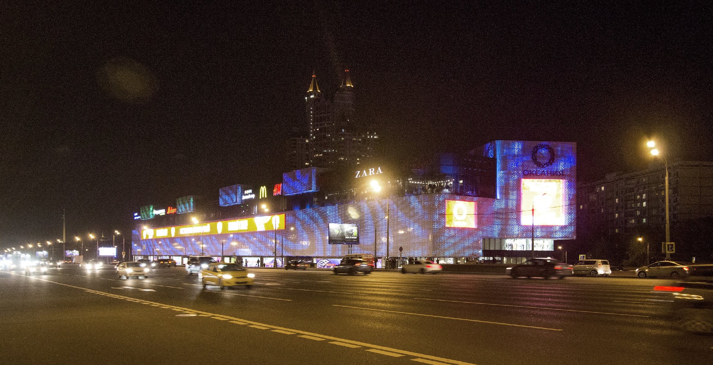
The shopping mall “Oceania” on the Kutuzovsky Avenue opened last fall, livening up with its presence part of the avenue in the neighborhood of the “Slavyansky Bulvar” metro station. While back in the day the only thing that the bleak background of a string of multi-apartment buildings had to offer to please the eye was the pseudo-gothic turrets of the still-unbuilt “new ring” of high-rises – “Edelweiss” housing complex – now getting stuck in a traffic jam near the elongated building of a new shopping center is definitely a better prospect. The play of metallic ripples, the huge aquariums of LED screens, sophisticated plastique of the façades – all this creates an intriguing visual amusement ride, a new high-profile project situated on the main thoroughfare of federal importance.

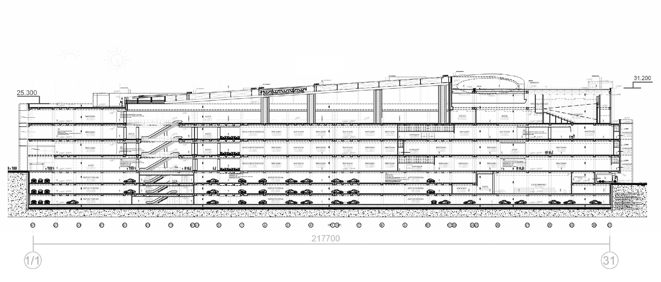
There are quite a few shopping centers in Moscow but what sets this one apart is the fact that this building is in fact the result of implementation of the project that won in one of the first competitions organized by the city’s architectural council. In 2013, the council initially turned down the project proposal by ASP company, and then it organized a completion that was ultimately won by the proposal of Asadov Architectural Bureau that inherited from its predecessor the volume solution and the measurements, including the three-level underground parking garage and the idea of endowing one of the atriums with a gorgeous cylindrical aquarium four stories high. The idea was proposed by the client – it defined the “oceanic” theme of the shopping center, and called for changing its name as well: in 2013, the complex was called “Slavyanka” (in accordance with the name or the neighboring boulevard), and now it is called “Oceania”. “The town-planning parameters were already approved of, and our task was to design a shell that would be adequate to the location and the surroundings – Andrei Asadov shares – The massive volume of the building was, of course, beyond our control but we could optimize its look by giving it a feel of ethereal lightness”.

What became the main tool for solving this task was the façade – and not just a façade in the general sense of this term but a voluminous two-layer shell mounted on a system of metallic fastenings, standing from two to (at some places) ten meters away from the main “box” of the building, in some sense a sculpture enshrouding the shopping mall, forming its shape, setting the accents and the imagery, and inspiring the impressions of pedestrians and drivers alike.

"Oceania" multifunctional center (facade solution) © Asadov Architectural Bureau
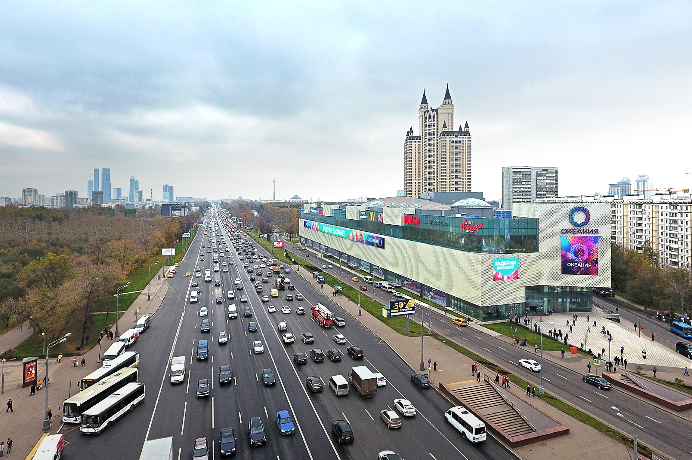


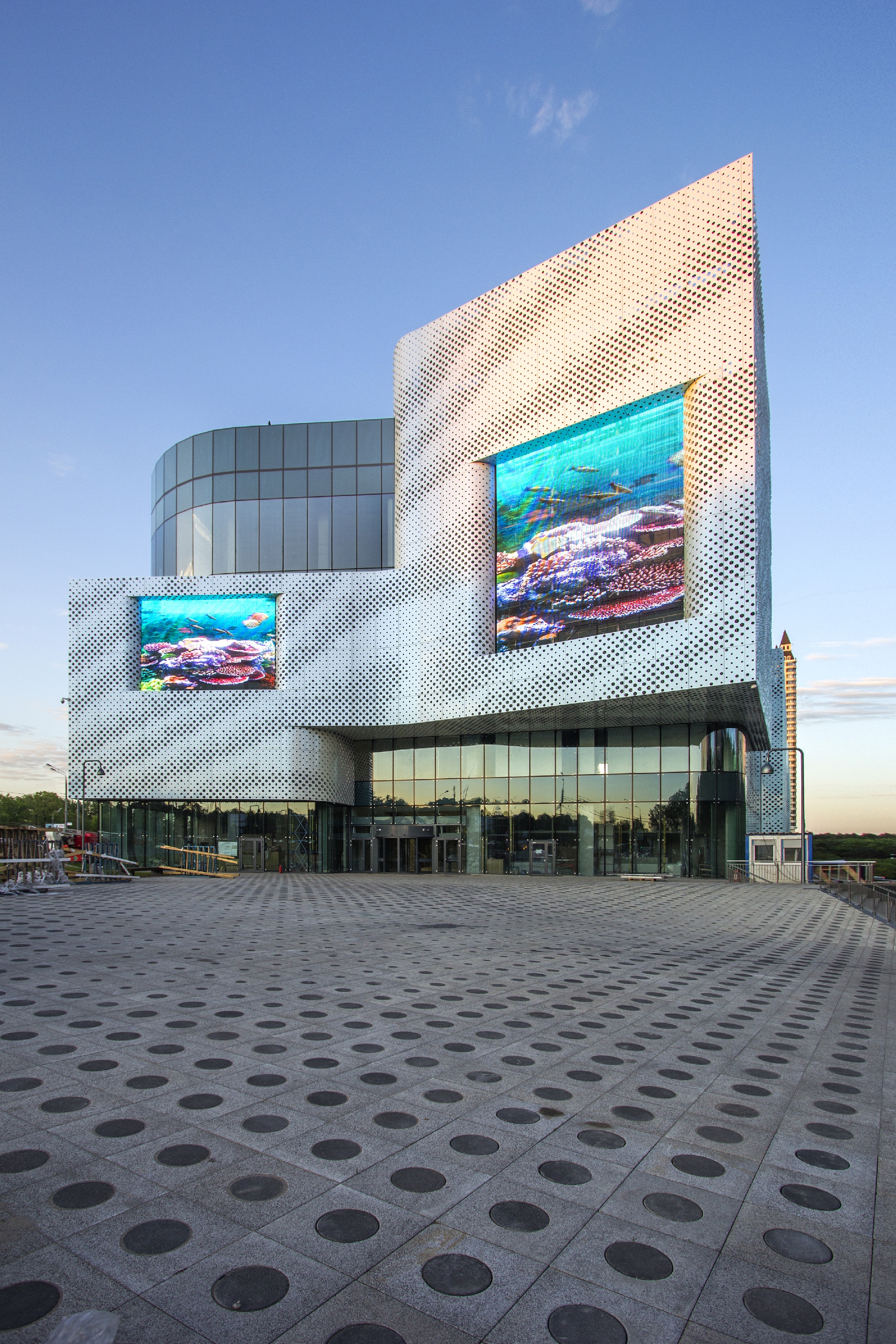
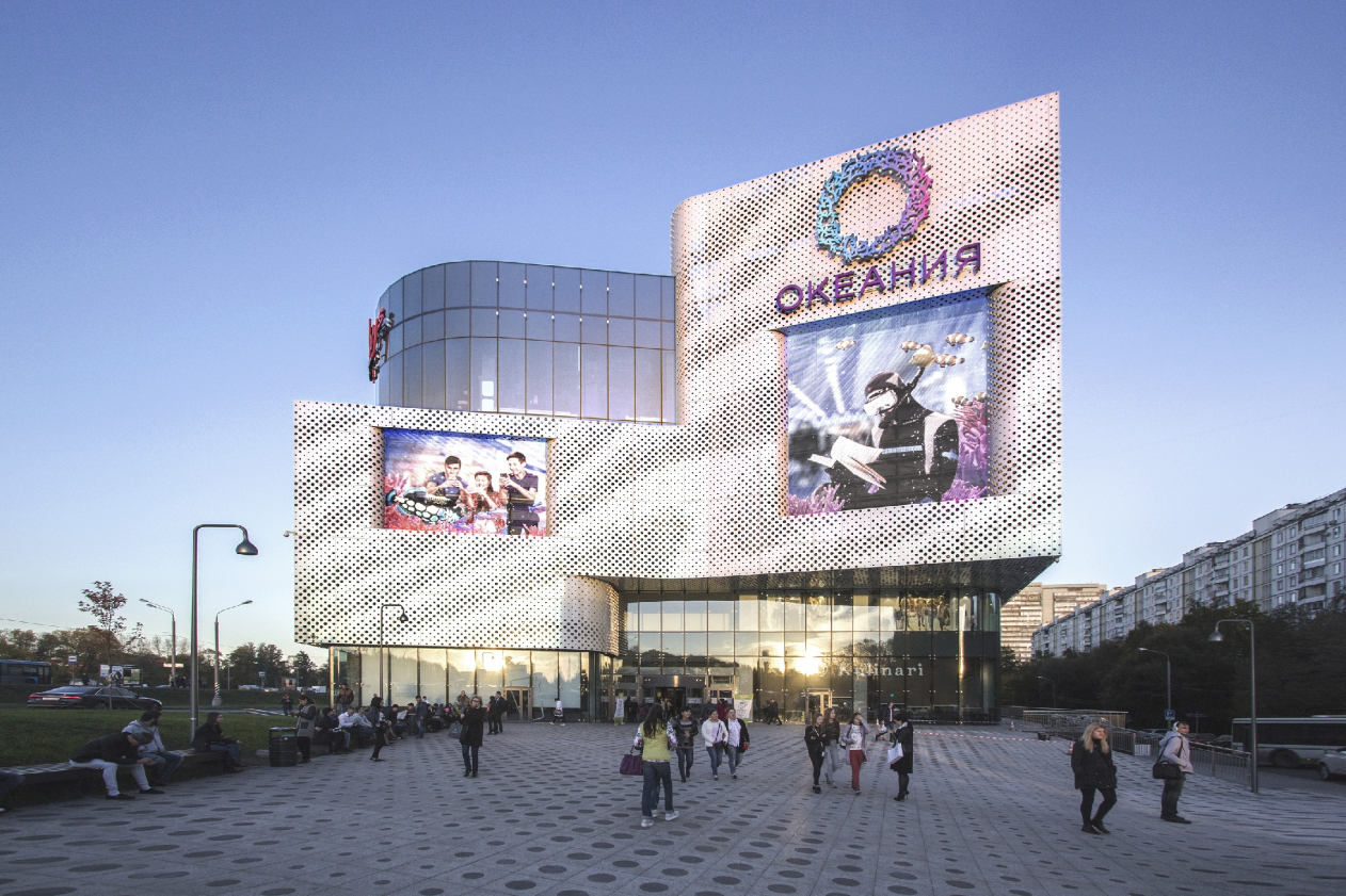
The broad band of perforated aluminum runs without breaks over the three sides viewable from the avenue. The façade that is parallel to the thoroughfare, has an elongated band of a media screen installed upon it; the other three are installed in the depressions and are surrounded with a semblance of perspective frames turning them into pictures or “television sets”. Two screens above the small triangular square before the main entrance even look like two huge eyes in rectangular glasses watching the people driving downtown. The surfaces are turned at a wide angle here, the line is concave and it looks as if it were “embracing” the square; at the same time, the right “eye” of the screen (the larger one) is turned to the people that exit the metro underpass – it “welcomes” people enticing them to come into the shopping mall or at least to the cafe whose tall glass showcase is situated beneath the triangular cantilever.
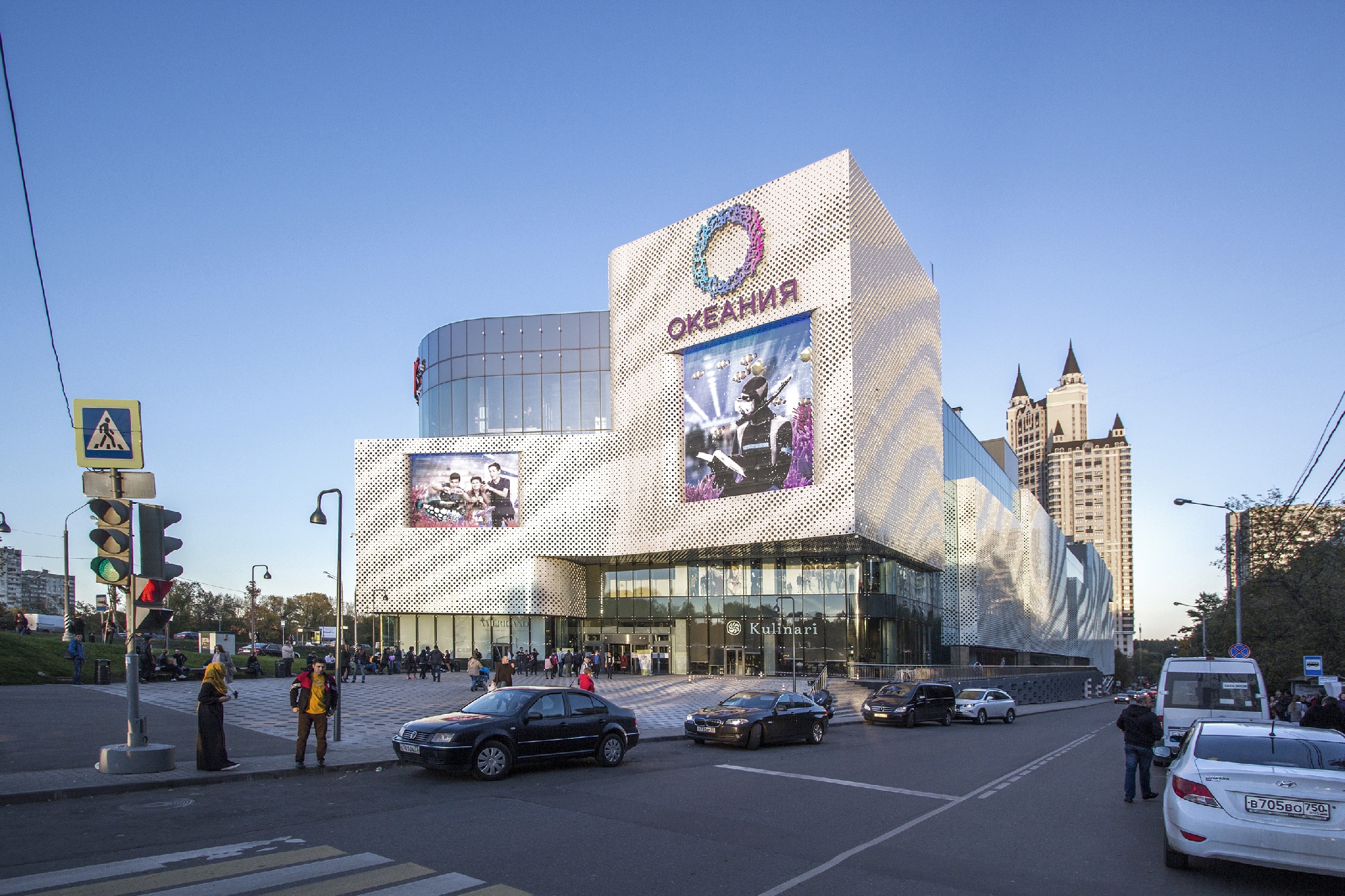
The main facade and the square before the metro station exit. "Oceania" multifunctional center (facade solution) © Asadov Architectural Bureau


"Oceania" multifunctional center (concept of facade solution) © Asadov Architectural Bureau


"Oceania" multifunctional center (facade solution) © Asadov Architectural Bureau


"Oceania" multifunctional center (facade solution) © Asadov Architectural Bureau


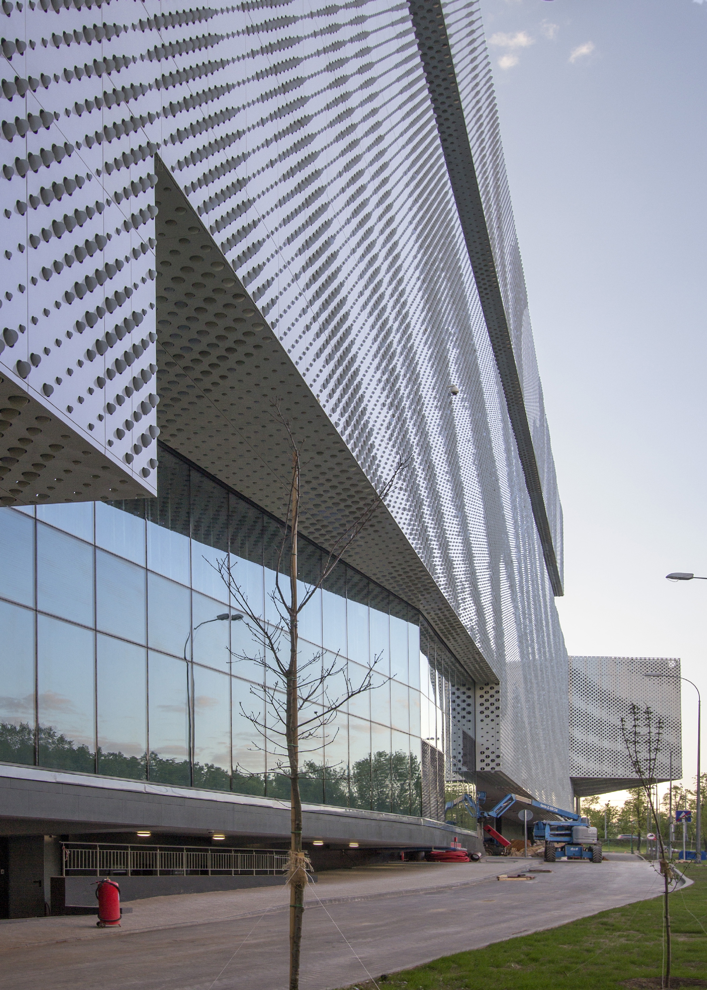
By using the aluminum shell, the architects also corrected the form of the rear loading bay façade that is turned to the park and the housing complex “Edelweiss”: it is here that the distance between the main volume and the outside panels reaches 10 meters, and the sophisticated system of the bearing structures shows through the horizontal slit as if allowing people to take a sneaky peek at the technical insides of the building.
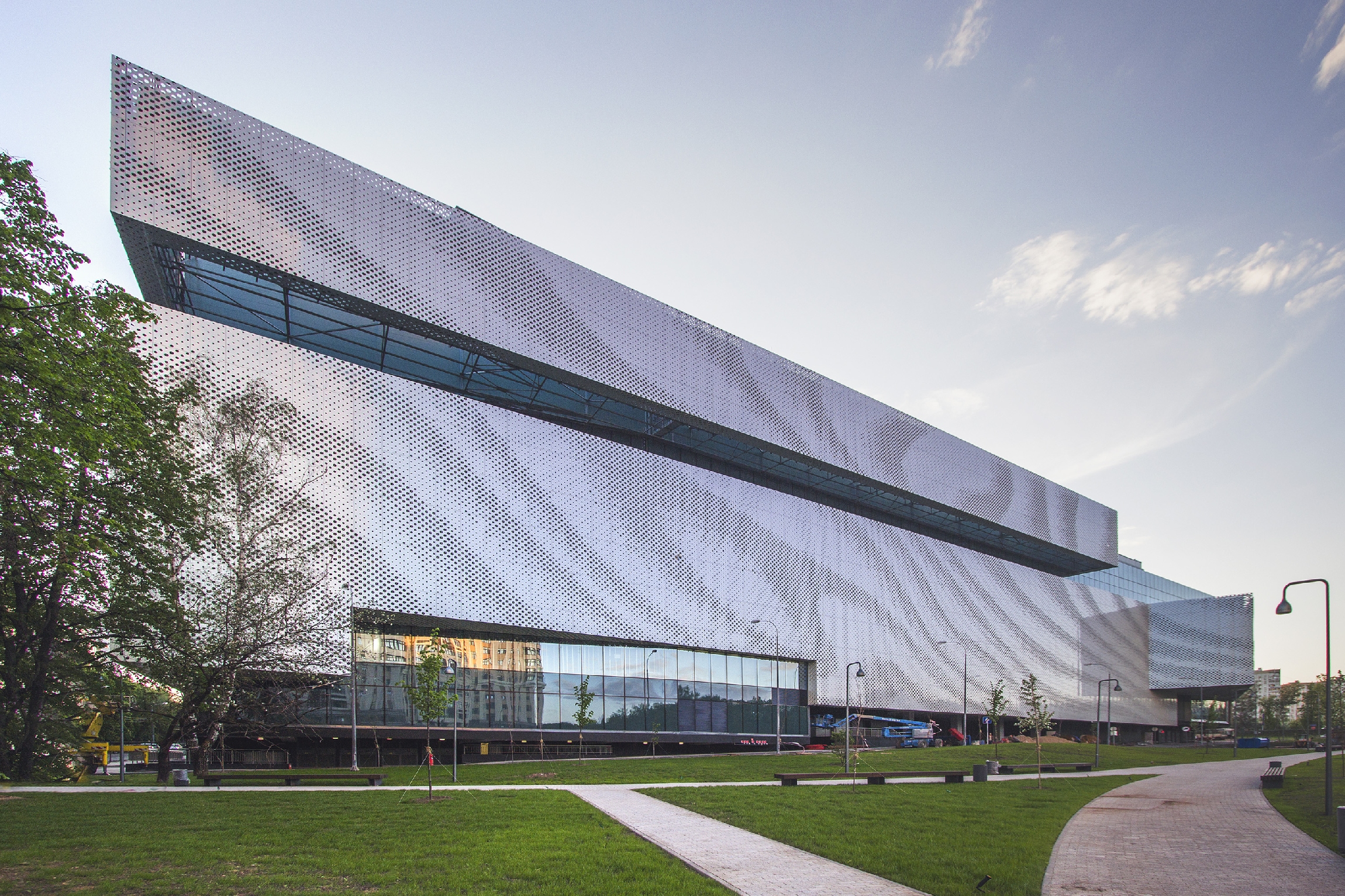
"Oceania" multifunctional center (concept of facade solution) © Asadov Architectural Bureau
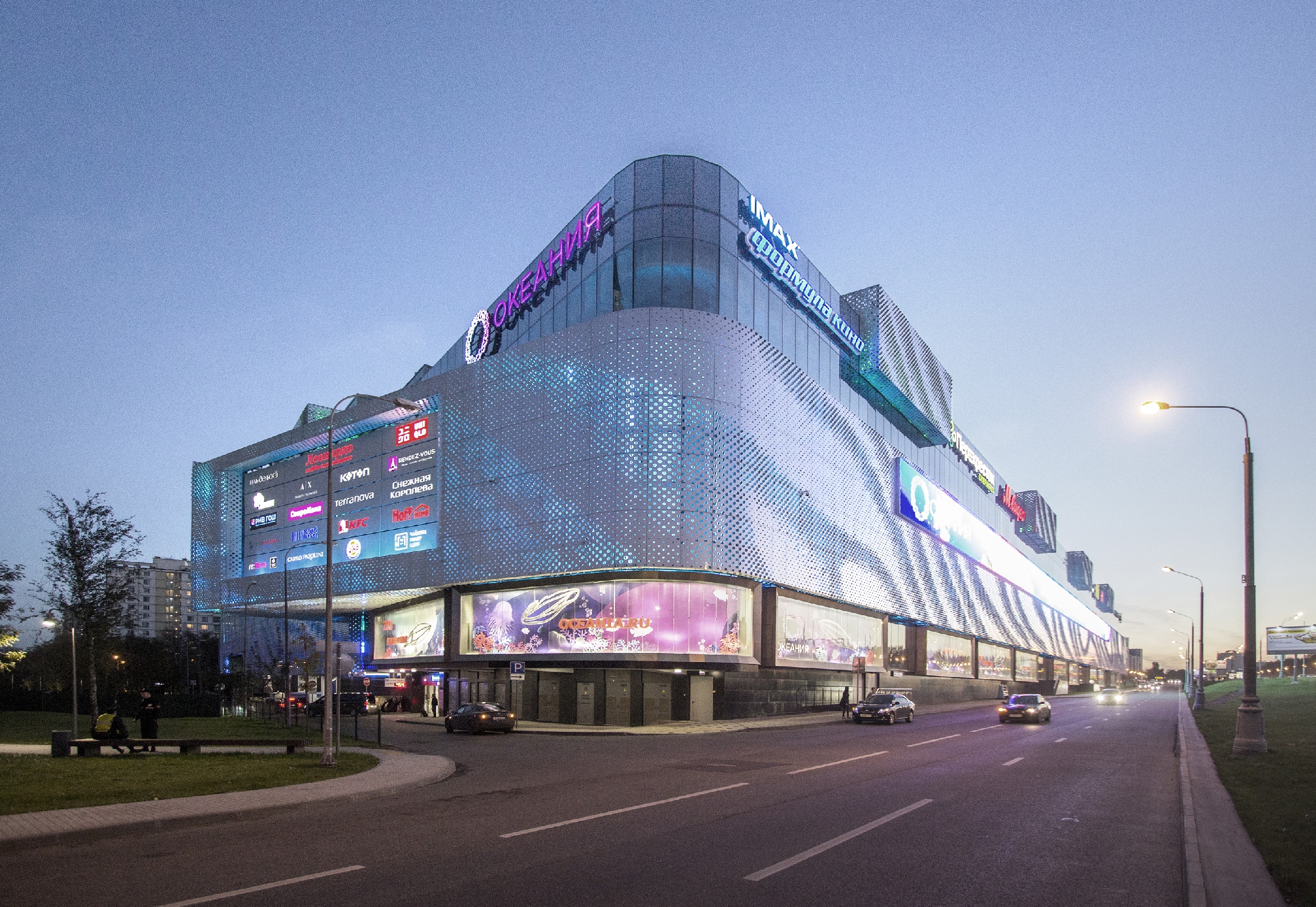

"Oceania" multifunctional center (facade solution) © Asadov Architectural Bureau


But then again, the aluminum doesn’t cover everything here: on the rear façade – the one that is turned to the Slavyansky Boulevard and the vis-à-vis of a 12-story residential building – it is broken into four rectangles standing out from the glass background surface. However, the glass in this case is not a window but a partition that fences off the technical premises – let’s not forget that we are dealing with the shopping mall here, an “introvert” building, as Andrei Asadov aptly named it. On the avenue side, the top part of the façade also shows additional aluminum volumes that look as if they were “torn away” from the main maternal spot to embark on a journey of their own.

"Oceania" multifunctional center (facade solution) © Asadov Architectural Bureau


The shell is made from the Novalis shipboard-type aluminum panels that are corrosion and splotch-resistant, and is punctured with round openings of three different diameters forming a wavy pattern. The perforation is of a voluminous type: the punctured elements are kept inside the openings but are turned strictly perpendicular to them, and look somewhat like fish-scales stroked against the grain. The mother-of-pearl coating of the metal changes the color at daylight depending on the angle of the sun rays – from beige and gray to greenish and blue. At night, on the other hand, the openings start glowing different colors thanks to the dynamic LED’s hidden inside.

"Oceania" multifunctional center (facade solution) © Asadov Architectural Bureau
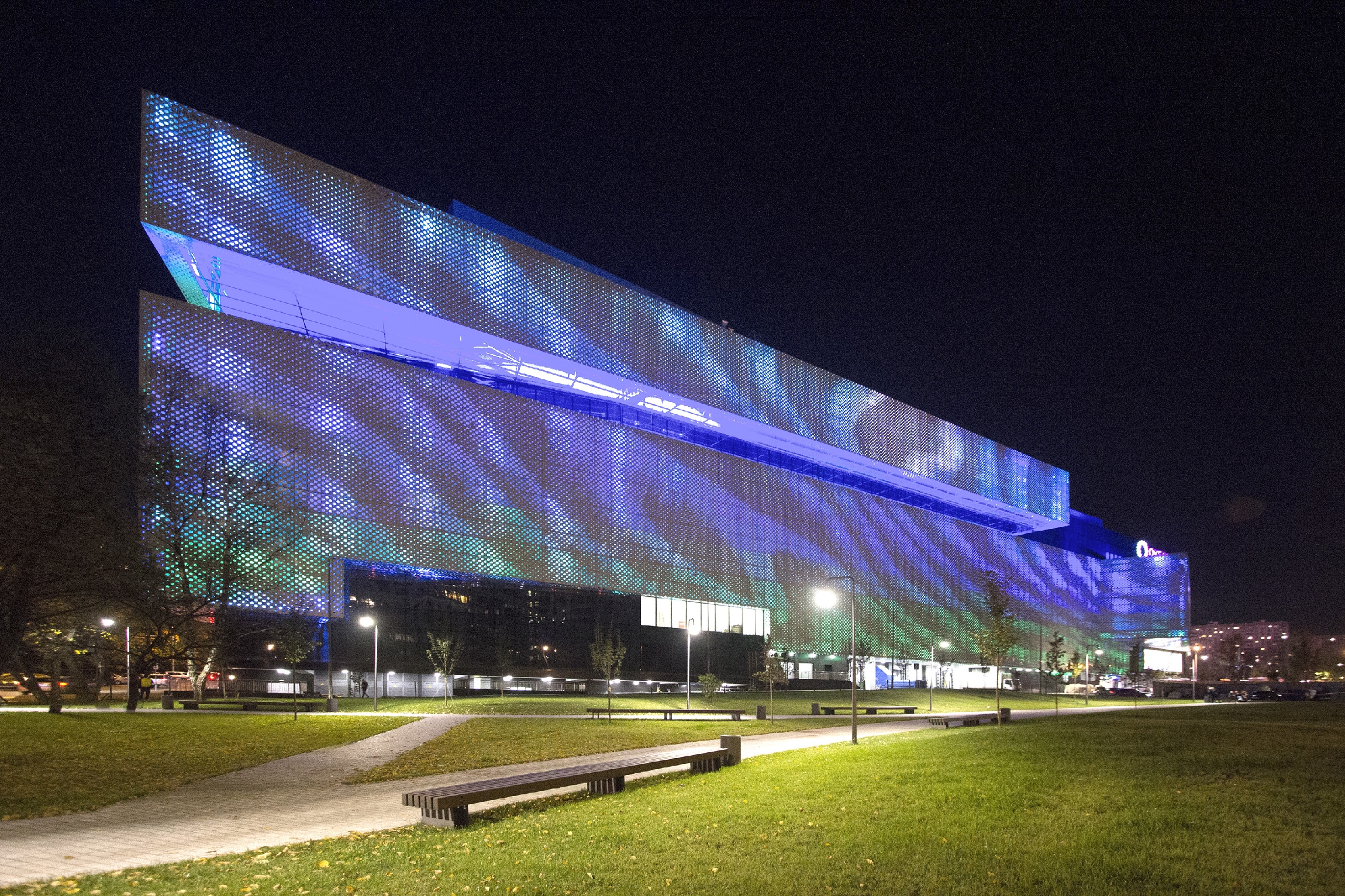

"Oceania" multifunctional center (facade solution) © Asadov Architectural Bureau


"Oceania" multifunctional center (facade solution) © Asadov Architectural Bureau

For a casual observer, the metal (which often turns pale-blue and shows a pattern of large wavy swirls) may seem to be a metaphor of waves on a sea. Meanwhile, according to the architect, they are not meant to symbolize the ocean at all, but, again, according to the architect, Andrei Asadov, are in fact “the metaphysical wood, the most “Slavonic” material, which is an homage to the former name of this shopping center [“Slavyanka”]”. This is a fragment of the real texture of wood stretched to a hyper-scale, digitalized and superimposed by way of parametric modeling on the entire aluminum surface. But then again, ultimately it looks as if the two ideas – the “wooden” and the “aquatic” one – meet and penetrate into each other, leaving to the observer two versions of interpretation: from the wood grain to fish-scales. What matters is the fact that the ever-changing texture of the metal functions as a doubtless “hook” that attracts people’s attention.

"Oceania" multifunctional center (facade solution) © Asadov Architectural Bureau


"Oceania" multifunctional center (facade solutions) © Asadov Architectural Bureau


"Oceania" multifunctional center (facade solutions) © Asadov Architectural Bureau


This solution was to a large extent inspired by a dialogue with the neighboring shopping gallery called “Seasons of the Year”, built upon the project by Vladimir Plotkin on the opposite side of the avenue, less than a kilometer away from “Oceania”. Andrei Asadov calls it “the paragon of stylish and aesthetic architecture” and confesses that he was looking to “set this project off with something different. Just as rational as that building is, I wanted to create something irrational. That building is clear-cut and geometrical, and I wanted to come up with something soft, plastic and indefinite”.

A similar perforation idea was used by Herzog & de Meuron for the De Young Memorial Museum in San-Francisco but it is simpler in the San-Francisco project: the perforation is devoid of volume, and the panels are copper. “I am very much inspired by the works of Herzog & de Meuron – Andrei Asadov says – Each of their projects is about some bright and memorable idea”.

After the perforated aluminum, the second element of the “clothes for the introvert”, as Andrei Asadov aptly calls the shell of the shopping mall, is glass. When viewed from aside, it seems that the glass core of the mall carries the aluminum ledges that, in turn, hold the media screens. In actuality, this, of course, is not the case. The upper band of glass forms panoramic windows of the restaurants, and still higher up it serves as the neutral background for the tenants’ logos. And, while on top the glazing is structural, the first floor (which is closer to the observers) displays the spider-type with curved glass at the corners. The two important façade corners are occupied by cafes – their tall panoramic showcases let in a lot of ambient light.

Otherwise, the development of the public territories around the “Slavyanka-Oceania”, on which the architectural council insisted in 2013, presented a number of difficulties. The architects came up with a whole number of narratives turning the shopping mall into a mini-town not only on the inside but also on the outside but not all of them were to be implemented – the interests of the shopping center (which, come right down to it, has no other goal than that of enticing the customers inside and then getting them confused making them wander among the showcases as long as possible) – these interests prevailed. However, some traces of the city spaces that the architects designed remained and can potentially work in the future.

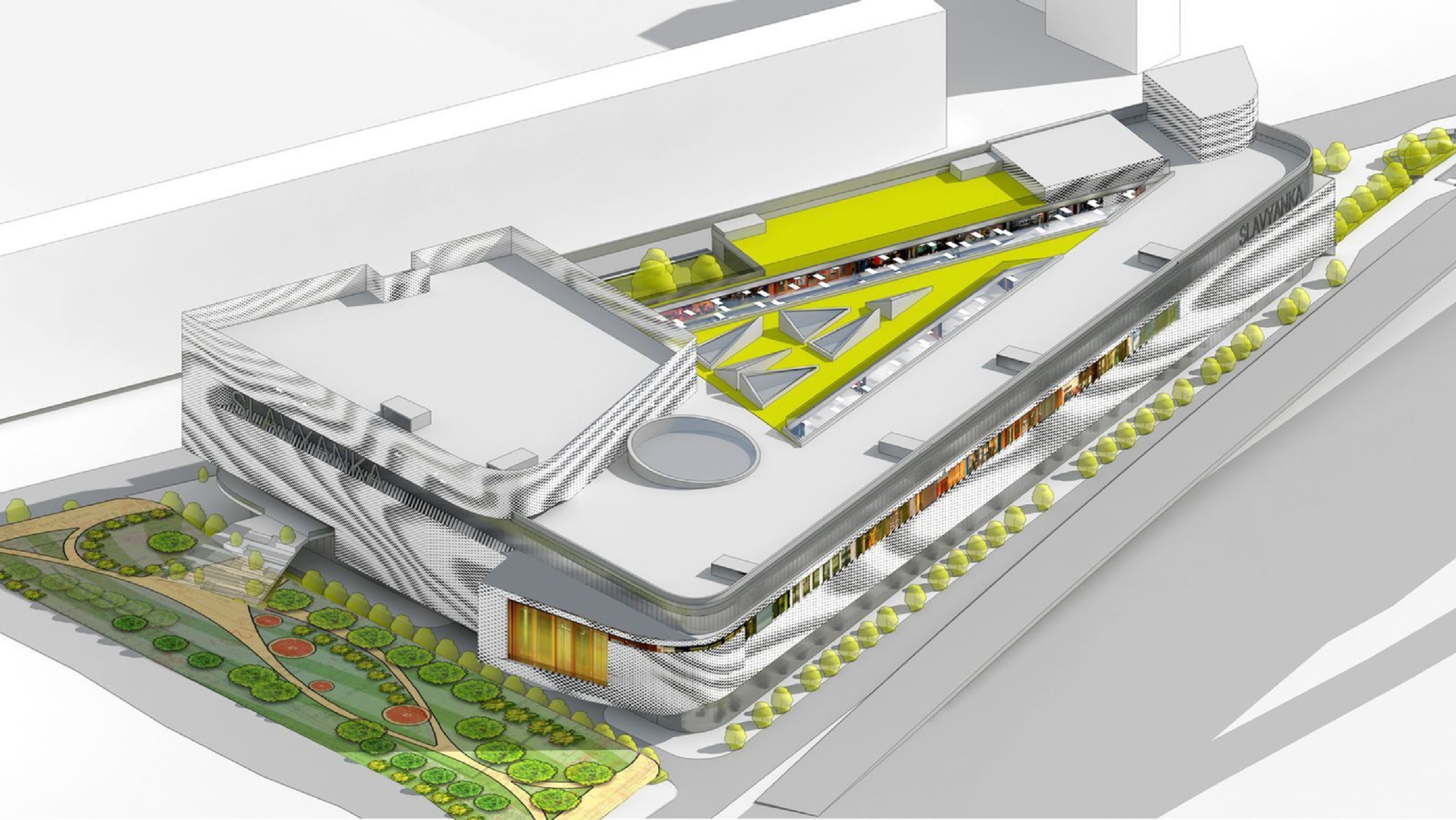
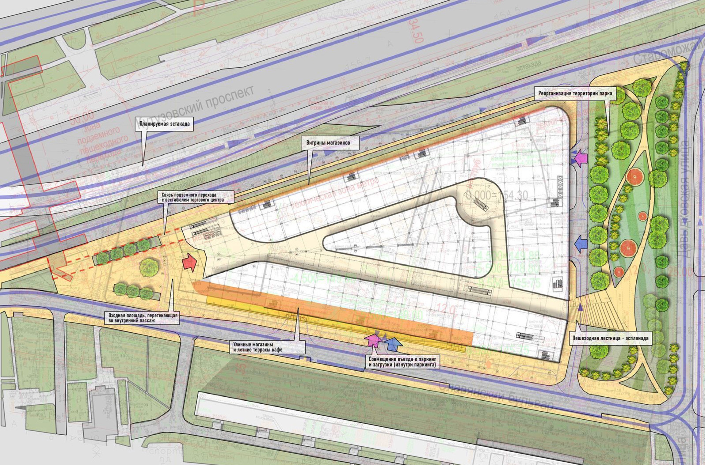
Due to the fact that the “Oceania” is situated on a busy pedestrian path – alighting the metro, people change here for suburban busses or go deeper inside the residential area – the architects initially provided for three pass-through routes, addressing every façade and a considerable elevation difference, the latter being as much as 8 meters from one end of the building to the other along the avenue. The first pass-through route – which would allow people to pass through the mall as a passage from the triangular square near the metro station to the little park on the other side along the esplanade above the cars driving out of the parking garage – was not implemented, even though the little park was indeed organized and landscaped.

Project. On the left: the unbuilt esplanade leading to the park. "Oceania" multifunctional center (facade solutions) © Asadov Architectural Bureau


The second route is a conditional one – an array of pseudo-showcases standing along the avenue on the first-floor level serves for organizing the facade of a shopping street doubling the city one; the stores do not make any use of these showcases, but then again, walking down the avenue and window shopping is not really convenient here because of the traffic noise, so the array of windows in large frames echoing the frames around the LED screens only keeps up the conceptual and compositional meaning of the overall design.

"Shop windows" along the backup street of the Kutuzovsky Avenue. "Oceania" multifunctional center (facade solutions) © Asadov Architectural Bureau. Photograph © Julia Tarabarina, Archi.ru


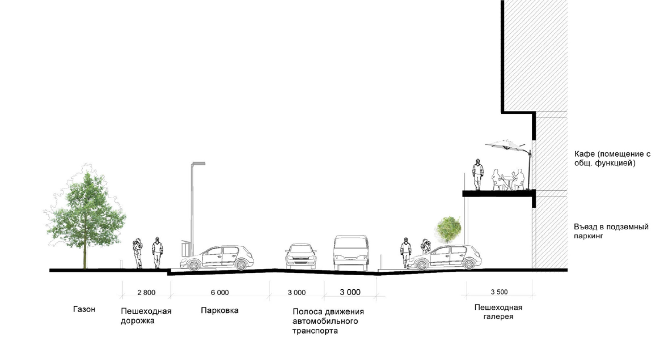
The third route – running along the Slavyansky Boulevard – has indeed been implemented. The main façade (to which, as we remember, exit the commuters) is not only organized around the triangular square, but its right-hand part is specially accentuated by the architects – which serves as an unobtrusive sign of the “city path”. If, without entering the shopping mall, we decide to bypass it from the right, we will find ourselves on a 3.5-meter-wide gallery – the street smoothly lowers here, while the gallery is horizontal (i.e. gradually takes off the ground turning into a balcony). It runs along the façade two thirds of its width, letting beneath itself the cars driving into the underground parking garage, thus offering the pedestrians a path that does not cross the traffic flow at any point. The pedestrians can, if they choose to, walk below as well: there is a route running along the base side of the façade (which does not look like the others but consists of ribbed triangular panels of aluminum “rockface”). The gallery was devised as the place where the terraces of the cafés would hover above the comparatively quiet Slavyansky Boulevard – for which it was made rather spacious, 3.5 meters wide; but the cafes did not come about. The first-floor premises are the most expensive ones, because it is obviously more profitable to have retail stores there; but then again, the gallery serves as the pedestrian path even now as it is, making the street a two-level one, and making the mall a little bit more open to the city, but just a little bit.

Gallery running along the Slavyansky Boulevard. "Oceania" multifunctional center (facade solutions) © Asadov Architectural Bureau. Photograph © Julia Tarabarina, Archi.ru


"Oceania" multifunctional center (facade solution) © Asadov Architectural Bureau


"Oceania" multifunctional center (facade solution) © Asadov Architectural Bureau


Entrance to the parking garage beneath the pedestrian gallery. "Oceania" multifunctional center (facade solution) © Asadov Architectural Bureau


All the territories around the shopping mall are unified by a single landscaping design – rather reserved, without any grand fountains, but with neat pavement tiles that echo the main theme of the façades. “We tried to spread this “façade perforation” theme over the surrounding territory – for the paving job, we used concrete tiles consisting of two elements: a light-colored quadrant and a round dark-colored core. These are also of three diameters, and they repeat the pattern of the wooden on the façade, only on a larger scale” – Andrei Asadov explains.

"Oceania" multifunctional center (facade solution) © Asadov Architectural Bureau


As we can see, the task posed by the authors of the project by the architectural council (namely, that of reconciling two antagonists – a large shopping mall and a large chunk of the city space) was quite a tall order. In such a duality, the battle is to the strong, and in this case it was the shopping mall that came out the winner, which, by the laws of marketing, becomes a city within a city, warping the space inside itself. Still, the project wasn’t designed solely for the city space; the main task for the design project of any shopping mall is to make a bright and intriguing building by putting a creative spin on the advertising super-task, make it look appropriate and not irritating, or, better yet, turn it into a valuable addition to the already existing surroundings – and this task has been successfully solved. It even seems that Andrei Asadov architectural bureau was able to make use of the proverbial “Gruen transfer” - a state of slight disorientation in space that marketing experts try to evoke in the potential customers inside shopping malls or even as they approach the trap. The building came out very dramatic and expressive; it causes emotional response triggering a trail of associations connected with water or otherwise; it stirs one’s imagination and looks more than appropriate in this place.
"Oceania" multifunctional center (facade solution). Project, traffic flow diagram. The picture also shows the ramp in the eastern part leading to the park © Asadov Architectural Bureau
"Oceania" multifunctional center (facade solution). Plan of the first floor © Asadov Architectural Bureau
"Oceania" multifunctional center (facade solution) © Asadov Architectural Bureau


23 August 2017

Headlines now
The Soft Forms of a New Enlightenment
The school that will rise amid the new high-rise neighborhoods of Set and Veer can fairly be called a landmark of the future district. The educational environment was designed by IMAGO, a firm specializing in learning spaces, while the façade concept was selected through a competition. The winner, GAFA, proposed a regular grid of three-dimensional modules that creates an intriguing effect of “soft” architecture. The imagery of this solution appeals to children of different ages and suits the stature of the educational complex, which will be handed over to the highly rated School No. 1329 upon completion.
Projection of a Spiral, Projection of a Wave
Architects from Mezonsproekt have designed a high-rise residential complex of four towers near the intersection of Novaya Riga Highway and the Moskva River. Its landmark status is motivated both by the proximity of Rublyovo-Arkhangelskoye and its SberCity development, and by the theme of two intersecting flows: water and traffic. The architects have organized the façade pattern around the supergraphic image of a pixelated spiral, intended to animate – and perhaps even transform – the perception of the buildings’ prismatic volumes.
​The Ever-Changing Mist
T+T Architects has developed a concept for a premium business center featuring “living” façades that change their configuration depending on weather conditions, time of day, and the occupants’ needs, transforming the building into an urban-scale installation. The idea of endless variability continues inside, with interiors designed to accommodate different scenarios of use. Some of the engineering solutions proposed for the project are being introduced to the Russian commercial real estate market for the first time.
​A Small Book of Farewell
The book dedicated to Valery Kanyashin, published by his colleagues at Ostozhenka Architects, is remarkably small. It fits comfortably in the palm of your hand, more like sketchbook than an actual architectural monograph. Combined with its tiny print run, the result is an intentionally unglamorous, decidedly non-representational publication – one that is made “for friends”. Yet the way it weaves together projects, texts, photographs, and drawings is remarkably subtle. Perhaps this is precisely how one comes to understand a person, at least a little, by tracing the course of their creative life.
Win-Win
For Perm, the opening of the new home for its Art Gallery – guardian of the famous collection of Perm wooden sculpture – marks the end of a 35-year search for a building worthy of a collection that had long outgrown the city cathedral that had served as its only home. Sergey Tchoban considers the project one of the most important of his career in Russia and emphasizes that it deliberately avoids “iconic” architecture in favor of contextual appropriateness. We traveled to Perm to explore both the building and its extensive new exhibition, and found that, much like Tchoban’s other museum projects, it is conceived in a distinctly contemporary way: the old and the new do not merely coexist but reinforce one another through contrast, sharpening the visitor’s perception of the museum.
A Score for 12th Line
“Amo”, a residential complex designed by Stepan Liphart on Vasilyevsky Island, brings together three architectural ideas: the cour d’honneur, a piazzetta-like courtyard, and imagery borrowed from Renaissance architecture. Together, these elements make a contemporary apartment complex feel more humane, extending the theme of individuality in residential design. The effect is achieved through a carefully calibrated vocabulary of moderately standardized components: recessed façade panels enriched with sgraffito ornament, a disciplined hierarchy of cornices and moldings, and a series of bespoke decorative details. The development combines residential and hotel sections that frame the restored wooden mansion of the Brömme brothers.
Riverfront Façade
The Premium residential complex, designed by KPLN, has been built in the town of Pushkino, just outside Moscow, on the banks of the Serebryanka River. Its two towers reinforce the scale of the high-rise development that emerged here in the 2000s, while introducing a bolder architectural form that reads more effectively from a distance, along with a system of contrasts and design strategies responding to the site’s waterfront setting. One of the project’s distinctive features is a series of metal discs that conceal air-conditioning units while serving as an additional decorative layer.
A Construction Set for Adult Life
In the project by Atrium, the new building for Moscow’s School No. 2107, designed to accommodate 1,100 students, is above all a carefully organized system of learning and recreational spaces. On the one hand, it is complex and highly articulated; on the other, it remains intuitive, safe, and conducive to personal growth. In a sense, it serves as a model of life in the city – a place where one must communicate, make decisions, plan ahead, and find a balance between work and leisure. All of these scenarios are reflected, to varying degrees, in the building’s architecture.
Axis of Rotation
One of the installations in the Masters exhibition at Arch Moscow featured a futuristic yet entirely feasible project by Vladimir Plotkin and TPO Reserve – a tower that could be assembled from prefabricated factory-made modules. The concept even incorporates the possibility of slow rotation (!). Using the same module, one could create a residential block, a giant cantilevered “arrow”, or virtually any other configuration you could possibly think of. Let us take a closer look at the module itself.
A New Magazine and a New Ranking
The magazine Expert.Urban has only just appeared, apparently timed to coincide with Arch Moscow. It is published with the support of VEB.RF and Strelka KB. We have not yet had time to read it cover to cover, but the impression so far is that it consists of about eighty percent interviews. It also features a distinctly “Strelka-style” initiative: a ranking of the “Best Architect of Moscow in the 21st Century”. So, who came out on top? Sergey Skuratov. Yuri Grigoryan took second place, and Sergei Tchoban came third.
Oleg Shapiro: “We design life as a whole, in all of its diversity”
Wowhaus has long since outgrown its association with “urban improvement” projects alone. One of its newer directions is neo-industrialization. Another is large-scale master planning. Yet work on Gorky Park is once again underway – only now on a more systematic and far-reaching level. In this interview, we simultaneously revisit Rem Koolhaas, Strelka, and the history of attention to the “urban environment”, while also exploring what exactly Wowhaus is working on today and how the company operates – with its nine divisions and approximately 160 employees.
Red Card for Copyright
The development concept for the territory of Shinnik Stadium in Yaroslavl, prepared by PI ARENA, took second place in an open call competition. The architects proposed a unified structure combining a football arena, a hotel, and the headquarters of PSB Bank, with carefully considered usage scenarios. However, the competition was organized in such a way that the team ultimately chose to forgo the prize money in order to retain their copyright.
CinemaHologram
Not long ago, the Moscow authorities approved the project for a new House of Cinema complex by Kleinewelt Architekten. The original 1968 building could not be preserved – yet the architects managed to save its stained-glass panels, metal reliefs, and even the volumetric parameters of the structure, which will continue to house the Union of Cinematographers and cinema halls. The project’s main focal point, however, will be a residential tower. We examine its sculptural qualities and its allusions within the Moscow context.
Form as Method: TPO Reserve
At the core of the concept developed by Vladimir Plotkin and TPO Reserve lies an unconventional morphology that addresses functional challenges beyond purely formal concerns. Above all, however, it serves expressiveness and creates a rare kind of spatial and emotional experience, as becomes evident when examining the project’s key solutions. We studied it in detail, and it was all worth it. Our interpretation is that what drives this project is neither style nor even metaphor, but rather a method.
Mound of Memory
The competition proposal for a memorial complex on the Pulkovo Heights by Studio 44 will not be realized, yet it deserves attention as an intriguing example of how architecture can symbolize traumatic events and thereby contribute to their processing and integration into human experience. The architects also succeed in combining memorial and recreational functions without slipping either into excessive dramatization or oversimplification. The project develops ideas explored in two earlier competition entries that likewise remained unbuilt – the Museum of the Siege of Leningrad and the Tuchkov Buyan park. It also recalls the mound-like hill that Alexander Nikolsky embodied in the form of the now-lost stadium on Krestovsky Island.
Home Base
Working on the new building for Letovo Junior School – opened to students in autumn 2025 in the MSU Valley – the architects of UNK, following the client’s vision, subordinated both façades and interiors to the theme of “home”. Multiple variations of pitched roofs, a city skyline traced across glass balustrades, wooden textures, and a whole series of micro-spaces for retreat within public areas are all at the disposal of primary and middle school students. We take a closer look at the new school building – and at how it interprets current trends in educational environments.
Doubles Match
The architecture of the Tennis Palace built in Luzhniki Olympic Complex, designed by Arena Design Institute, was shaped by three factors: the proximity of the brutalist Druzhba Arena, the closeness of the Moskva River and the metro bridge overpass, as well as the specifics of the function – tennis courts require large spans, abundant light, yet at the same time protection from direct sunlight. The architects divided the building into several blocks, playing on contrast, which is further emphasized by the façades developed in collaboration with TPO Reserve and Vladimir Plotkin.
Microdynamics of Macroprocesses
Given the proximity of the multifunctional complex SOLOS to Sokolniki Park and to a major transport hub, Kleinewelt Architekten embedded in the design of the two high-rise towers a sense of dynamism more characteristic of natural phenomena than of man-made objects. Without the authors’ diagrams, this logic is not easy to decipher, although the eye immediately detects a pattern and tries to grasp it. It seems to us that one tower contains the impulse of a bud about to open, while the other evokes the movement of a lithospheric plate. Let us try to unravel it together.
The Space of Post-Cubism
Sergei Tchoban and Alexandra Sheiner, of Studio CHART, created for the exhibition of “post-cubist” sculpture by Beatrice Sandomirskaya – a talented and even “mainstream” artist, yet almost unknown even to art historians – a space akin to her sculptural language: solidly built, confidently stereometric, and subtly expressive. It curves, emphasizing the mass of the sculpture, envelops the viewer, and guides them from one perspective to another, from a generic “shrine” to a “Madonna”.
The Value of Open Space
For the site near the Barrikadnaya Metro Station, Sergey Skuratov developed five projects between 2020 and 2025. Two of them were ones that won the client’s invitation-only competitions. The fifth was recently selected by the Mayor of Moscow for implementation. The project is vivid and sculptural, expressive, eye-catching, and engaging – very much in line with the spirit of our time. And yet, this project is mid-rise rather than tall. In its northwestern part, near the metro and Druzhinnikovskaya Street, it shapes a comfortable urban environment. On the opposite side, it opens up, allowing sunlight into the courtyard and creating a spatial pause within the dense city fabric. How it is organized, what geometric principles underlie it, and why it takes this form – all this is explored in our article.
Coming From the Cold
The ArchBukhta Festival remains one of the few events in Russia where participants go through the entire process of creating an architectural object – from concept to construction. And they do so on the shores of Lake Baikal, in dedication to it. This year, GAFA took part and shared its experience: a local legend, a team-specific design code, friendship, as well as ice skating and endurance in freezing temperatures all contributed to gaining something more than just an award.
Symphony of Water and Brick
The Alter residential complex, designed by Stepan Liphart and built on a bend of the Okhta River, is an example of a “drawn house”: the number of original architectural details is virtually immeasurable. As a result, ribs, projections, and recesses create a picturesque silhouette even without a significant variation in height. Both composition and material respond to the proximity of the river and to the red-brick factory building dating back to the early 20th century. The project was also significantly shaped by recommendations from the city’s chief architect. More details in our article.
The Penguin House
The building with a curved façade on Brestskaya Street is one of the manifestos of Russian neomodernism of the early 2000s, a sculpture – this is how Anatoly Belov interprets it, speaking of “breaking from the modernist canon and the contextual approach”. We do not fully agree with the author, but his perspective is an interesting one.
Wave and Vertical
The premium residential complex designed by GAFA for a site in the Khoroshevsky District responds to multiple constraints – the arc of a planned roadway, the water protection zone of the Khodynka River, and insolation requirements – through inventive massing. The composition is built on the interplay of two spatial layers: an elongated perimeter block and three towers concealed behind it generate the silhouette and key viewpoints, while also adding semantic depth reinforced by the façade solutions. Another defining feature is a large private courtyard, complemented by a citywide linear park.
Office on Trubnaya
We continue publishing projects by Valery Kanyashin. A building once described, a quarter century ago, as an example of “quiet modernism” has remained just that in some people’s memory. According to Anatoly Belov, its main quality is its unobtrusiveness. The architects from Ostozhenka say the leading role here is played by context and landscape – the change in elevation. Yet is it really so inconspicuous?
The First International
With this publication, we begin a series of texts dedicated to works by the late Valery Kanyashin, one of the founders of Ostozhenka Architects. As it happens, the projects he was involved in largely illustrate our understanding of the firm and its history. The first project in this series is the International Moscow Bank on Prechistenskaya Embankment.
In Memory of Valery Kanyashin
On Friday, February 27, architect Valery Kanyashin passed away – co-founder of Ostozhenka Architects and the author of many significant buildings in Moscow. We publish a text by Anatoly Belov in memory of Valery Kanyashin.
Hypertext in Space
As part of the exhibition “What We Have We (Do Not) Keep”, Sergey Tchoban, the Museum of Architecture, and the CHART studio experiment with an eco-conscious approach to exhibition design, with thematic cross-references and even with publicistic reflections on the necessity of preserving modernism, the roots of contemporary architecture, and the birth of ideas. All of this makes the exhibition, with its light and transparent design, look quite innovative. The elements – both “material” and conceptual – are familiar, yet their combination is far from conventional.
The Outline of “Foundation”
In their competition proposal for the Fili transport hub, the consortium led by Alexey Ilyin proposed an “inhabited arch” – a form that is simple yet complex. The architects emphasize that even at the competition stage, the project’s feasibility was fully calculated, taking into account the minimal nighttime closures of Bagration Avenue. How was this achieved? With what functions? Let us take a closer look. In our view, the building would have suited the heroes of Isaac Asimov’s Foundation novels perfectly.
The Flying Horizontal
“A house in the spirit of Wright”, as architect Roman Leonidov describes it, pointing to his source of inspiration, was built on a challenging wedge-shaped site. To achieve a sense of intimacy and secure good views from the windows, the entire volume had to be shifted toward the far boundary, turning the house “back” to the neighboring mansions. The main façade demonstrates time-tested techniques often employed by the company: articulated horizontals, a weightless roofline, and a triad of materials – light plaster, dark slate, and warm wood.