
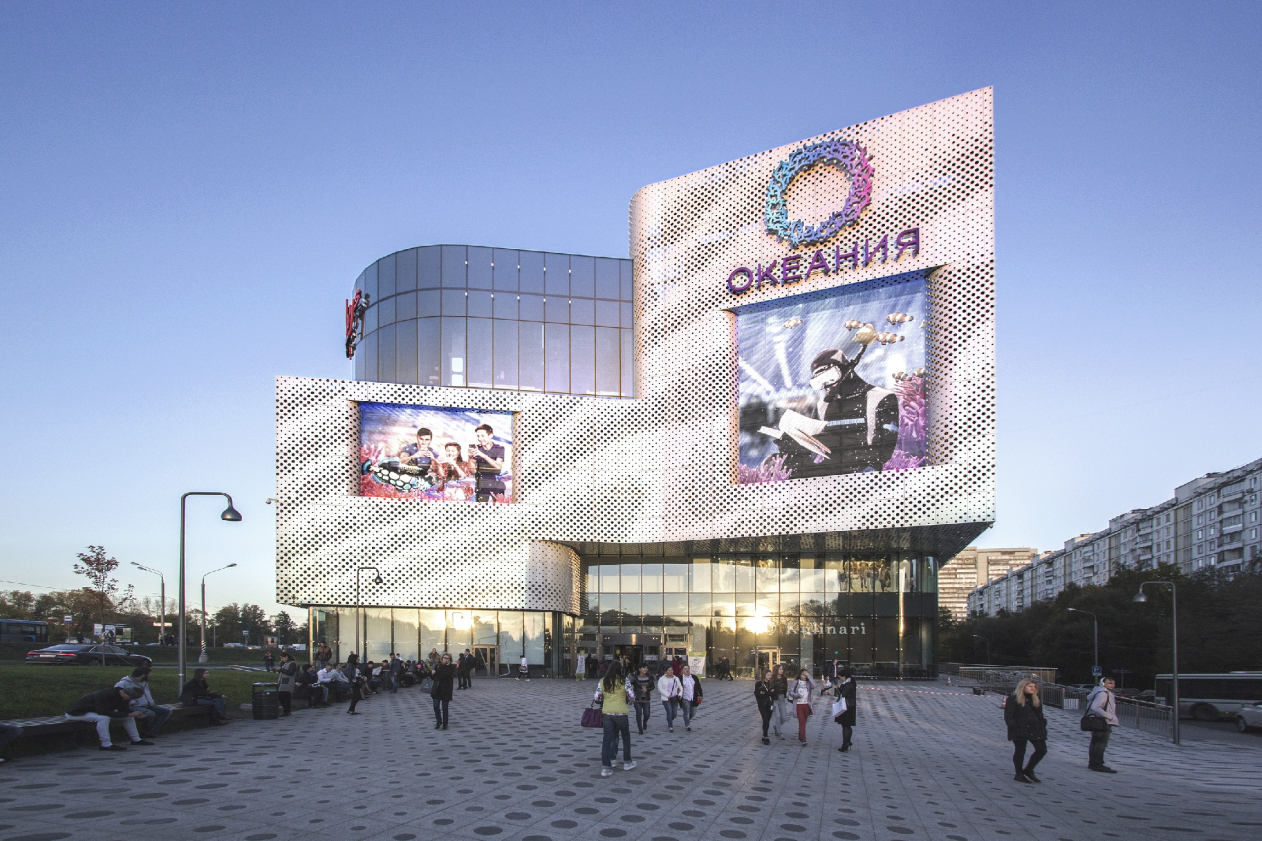

The shopping mall “Oceania” on the Kutuzovsky Avenue opened last fall, livening up with its presence part of the avenue in the neighborhood of the “Slavyansky Bulvar” metro station. While back in the day the only thing that the bleak background of a string of multi-apartment buildings had to offer to please the eye was the pseudo-gothic turrets of the still-unbuilt “new ring” of high-rises – “Edelweiss” housing complex – now getting stuck in a traffic jam near the elongated building of a new shopping center is definitely a better prospect. The play of metallic ripples, the huge aquariums of LED screens, sophisticated plastique of the façades – all this creates an intriguing visual amusement ride, a new high-profile project situated on the main thoroughfare of federal importance.
There are quite a few shopping centers in Moscow but what sets this one apart is the fact that this building is in fact the result of implementation of the project that won in one of the first competitions organized by the city’s architectural council. In 2013, the council initially turned down the project proposal by ASP company, and then it organized a completion that was ultimately won by the proposal of Asadov Architectural Bureau that inherited from its predecessor the volume solution and the measurements, including the three-level underground parking garage and the idea of endowing one of the atriums with a gorgeous cylindrical aquarium four stories high. The idea was proposed by the client – it defined the “oceanic” theme of the shopping center, and called for changing its name as well: in 2013, the complex was called “Slavyanka” (in accordance with the name or the neighboring boulevard), and now it is called “Oceania”. “The town-planning parameters were already approved of, and our task was to design a shell that would be adequate to the location and the surroundings – Andrei Asadov shares – The massive volume of the building was, of course, beyond our control but we could optimize its look by giving it a feel of ethereal lightness”.
What became the main tool for solving this task was the façade – and not just a façade in the general sense of this term but a voluminous two-layer shell mounted on a system of metallic fastenings, standing from two to (at some places) ten meters away from the main “box” of the building, in some sense a sculpture enshrouding the shopping mall, forming its shape, setting the accents and the imagery, and inspiring the impressions of pedestrians and drivers alike.
 © Asadov Architectural Bureau")

"Oceania" multifunctional center (facade solution) © Asadov Architectural Bureau
 © Asadov Architectural Bureau")

"Oceania" multifunctional center (facade solution) © Asadov Architectural Bureau
The broad band of perforated aluminum runs without breaks over the three sides viewable from the avenue. The façade that is parallel to the thoroughfare, has an elongated band of a media screen installed upon it; the other three are installed in the depressions and are surrounded with a semblance of perspective frames turning them into pictures or “television sets”. Two screens above the small triangular square before the main entrance even look like two huge eyes in rectangular glasses watching the people driving downtown. The surfaces are turned at a wide angle here, the line is concave and it looks as if it were “embracing” the square; at the same time, the right “eye” of the screen (the larger one) is turned to the people that exit the metro underpass – it “welcomes” people enticing them to come into the shopping mall or at least to the cafe whose tall glass showcase is situated beneath the triangular cantilever.
 © Asadov Architectural Bureau")

The main facade and the square before the metro station exit. "Oceania" multifunctional center (facade solution) © Asadov Architectural Bureau
 © Asadov Architectural Bureau")

"Oceania" multifunctional center (concept of facade solution) © Asadov Architectural Bureau
 © Asadov Architectural Bureau")

"Oceania" multifunctional center (facade solution) © Asadov Architectural Bureau
 © Asadov Architectural Bureau")

"Oceania" multifunctional center (facade solution) © Asadov Architectural Bureau
By using the aluminum shell, the architects also corrected the form of the rear loading bay façade that is turned to the park and the housing complex “Edelweiss”: it is here that the distance between the main volume and the outside panels reaches 10 meters, and the sophisticated system of the bearing structures shows through the horizontal slit as if allowing people to take a sneaky peek at the technical insides of the building.
 © Asadov Architectural Bureau")

"Oceania" multifunctional center (concept of facade solution) © Asadov Architectural Bureau
 © Asadov Architectural Bureau")

"Oceania" multifunctional center (facade solution) © Asadov Architectural Bureau
But then again, the aluminum doesn’t cover everything here: on the rear façade – the one that is turned to the Slavyansky Boulevard and the vis-à-vis of a 12-story residential building – it is broken into four rectangles standing out from the glass background surface. However, the glass in this case is not a window but a partition that fences off the technical premises – let’s not forget that we are dealing with the shopping mall here, an “introvert” building, as Andrei Asadov aptly named it. On the avenue side, the top part of the façade also shows additional aluminum volumes that look as if they were “torn away” from the main maternal spot to embark on a journey of their own.
 © Asadov Architectural Bureau")

"Oceania" multifunctional center (facade solution) © Asadov Architectural Bureau
The shell is made from the Novalis shipboard-type aluminum panels that are corrosion and splotch-resistant, and is punctured with round openings of three different diameters forming a wavy pattern. The perforation is of a voluminous type: the punctured elements are kept inside the openings but are turned strictly perpendicular to them, and look somewhat like fish-scales stroked against the grain. The mother-of-pearl coating of the metal changes the color at daylight depending on the angle of the sun rays – from beige and gray to greenish and blue. At night, on the other hand, the openings start glowing different colors thanks to the dynamic LED’s hidden inside.
 © Asadov Architectural Bureau")

"Oceania" multifunctional center (facade solution) © Asadov Architectural Bureau
 © Asadov Architectural Bureau")

"Oceania" multifunctional center (facade solution) © Asadov Architectural Bureau
 © Asadov Architectural Bureau")

"Oceania" multifunctional center (facade solution) © Asadov Architectural Bureau
For a casual observer, the metal (which often turns pale-blue and shows a pattern of large wavy swirls) may seem to be a metaphor of waves on a sea. Meanwhile, according to the architect, they are not meant to symbolize the ocean at all, but, again, according to the architect, Andrei Asadov, are in fact “the metaphysical wood, the most “Slavonic” material, which is an homage to the former name of this shopping center [“Slavyanka”]”. This is a fragment of the real texture of wood stretched to a hyper-scale, digitalized and superimposed by way of parametric modeling on the entire aluminum surface. But then again, ultimately it looks as if the two ideas – the “wooden” and the “aquatic” one – meet and penetrate into each other, leaving to the observer two versions of interpretation: from the wood grain to fish-scales. What matters is the fact that the ever-changing texture of the metal functions as a doubtless “hook” that attracts people’s attention.
 © Asadov Architectural Bureau")

"Oceania" multifunctional center (facade solution) © Asadov Architectural Bureau
 © Asadov Architectural Bureau")

"Oceania" multifunctional center (facade solutions) © Asadov Architectural Bureau
 © Asadov Architectural Bureau")

"Oceania" multifunctional center (facade solutions) © Asadov Architectural Bureau
This solution was to a large extent inspired by a dialogue with the neighboring shopping gallery called “Seasons of the Year”, built upon the project by Vladimir Plotkin on the opposite side of the avenue, less than a kilometer away from “Oceania”. Andrei Asadov calls it “the paragon of stylish and aesthetic architecture” and confesses that he was looking to “set this project off with something different. Just as rational as that building is, I wanted to create something irrational. That building is clear-cut and geometrical, and I wanted to come up with something soft, plastic and indefinite”.
A similar perforation idea was used by Herzog & de Meuron for the De Young Memorial Museum in San-Francisco but it is simpler in the San-Francisco project: the perforation is devoid of volume, and the panels are copper. “I am very much inspired by the works of Herzog & de Meuron – Andrei Asadov says – Each of their projects is about some bright and memorable idea”.
After the perforated aluminum, the second element of the “clothes for the introvert”, as Andrei Asadov aptly calls the shell of the shopping mall, is glass. When viewed from aside, it seems that the glass core of the mall carries the aluminum ledges that, in turn, hold the media screens. In actuality, this, of course, is not the case. The upper band of glass forms panoramic windows of the restaurants, and still higher up it serves as the neutral background for the tenants’ logos. And, while on top the glazing is structural, the first floor (which is closer to the observers) displays the spider-type with curved glass at the corners. The two important façade corners are occupied by cafes – their tall panoramic showcases let in a lot of ambient light.
Otherwise, the development of the public territories around the “Slavyanka-Oceania”, on which the architectural council insisted in 2013, presented a number of difficulties. The architects came up with a whole number of narratives turning the shopping mall into a mini-town not only on the inside but also on the outside but not all of them were to be implemented – the interests of the shopping center (which, come right down to it, has no other goal than that of enticing the customers inside and then getting them confused making them wander among the showcases as long as possible) – these interests prevailed. However, some traces of the city spaces that the architects designed remained and can potentially work in the future.
Due to the fact that the “Oceania” is situated on a busy pedestrian path – alighting the metro, people change here for suburban busses or go deeper inside the residential area – the architects initially provided for three pass-through routes, addressing every façade and a considerable elevation difference, the latter being as much as 8 meters from one end of the building to the other along the avenue. The first pass-through route – which would allow people to pass through the mall as a passage from the triangular square near the metro station to the little park on the other side along the esplanade above the cars driving out of the parking garage – was not implemented, even though the little park was indeed organized and landscaped.
 © Asadov Architectural Bureau")

Project. On the left: the unbuilt esplanade leading to the park. "Oceania" multifunctional center (facade solutions) © Asadov Architectural Bureau
The second route is a conditional one – an array of pseudo-showcases standing along the avenue on the first-floor level serves for organizing the facade of a shopping street doubling the city one; the stores do not make any use of these showcases, but then again, walking down the avenue and window shopping is not really convenient here because of the traffic noise, so the array of windows in large frames echoing the frames around the LED screens only keeps up the conceptual and compositional meaning of the overall design.
 © Asadov Architectural Bureau. Photograph © Julia Tarabarina, Archi.ru")

"Shop windows" along the backup street of the Kutuzovsky Avenue. "Oceania" multifunctional center (facade solutions) © Asadov Architectural Bureau. Photograph © Julia Tarabarina, Archi.ru
The third route – running along the Slavyansky Boulevard – has indeed been implemented. The main façade (to which, as we remember, exit the commuters) is not only organized around the triangular square, but its right-hand part is specially accentuated by the architects – which serves as an unobtrusive sign of the “city path”. If, without entering the shopping mall, we decide to bypass it from the right, we will find ourselves on a 3.5-meter-wide gallery – the street smoothly lowers here, while the gallery is horizontal (i.e. gradually takes off the ground turning into a balcony). It runs along the façade two thirds of its width, letting beneath itself the cars driving into the underground parking garage, thus offering the pedestrians a path that does not cross the traffic flow at any point. The pedestrians can, if they choose to, walk below as well: there is a route running along the base side of the façade (which does not look like the others but consists of ribbed triangular panels of aluminum “rockface”). The gallery was devised as the place where the terraces of the cafés would hover above the comparatively quiet Slavyansky Boulevard – for which it was made rather spacious, 3.5 meters wide; but the cafes did not come about. The first-floor premises are the most expensive ones, because it is obviously more profitable to have retail stores there; but then again, the gallery serves as the pedestrian path even now as it is, making the street a two-level one, and making the mall a little bit more open to the city, but just a little bit.
 © Asadov Architectural Bureau. Photograph © Julia Tarabarina, Archi.ru")

Gallery running along the Slavyansky Boulevard. "Oceania" multifunctional center (facade solutions) © Asadov Architectural Bureau. Photograph © Julia Tarabarina, Archi.ru
 © Asadov Architectural Bureau")

"Oceania" multifunctional center (facade solution) © Asadov Architectural Bureau
 © Asadov Architectural Bureau")

"Oceania" multifunctional center (facade solution) © Asadov Architectural Bureau
 © Asadov Architectural Bureau")

Entrance to the parking garage beneath the pedestrian gallery. "Oceania" multifunctional center (facade solution) © Asadov Architectural Bureau
All the territories around the shopping mall are unified by a single landscaping design – rather reserved, without any grand fountains, but with neat pavement tiles that echo the main theme of the façades. “We tried to spread this “façade perforation” theme over the surrounding territory – for the paving job, we used concrete tiles consisting of two elements: a light-colored quadrant and a round dark-colored core. These are also of three diameters, and they repeat the pattern of the wooden on the façade, only on a larger scale” – Andrei Asadov explains.
 © Asadov Architectural Bureau")

"Oceania" multifunctional center (facade solution) © Asadov Architectural Bureau
As we can see, the task posed by the authors of the project by the architectural council (namely, that of reconciling two antagonists – a large shopping mall and a large chunk of the city space) was quite a tall order. In such a duality, the battle is to the strong, and in this case it was the shopping mall that came out the winner, which, by the laws of marketing, becomes a city within a city, warping the space inside itself. Still, the project wasn’t designed solely for the city space; the main task for the design project of any shopping mall is to make a bright and intriguing building by putting a creative spin on the advertising super-task, make it look appropriate and not irritating, or, better yet, turn it into a valuable addition to the already existing surroundings – and this task has been successfully solved. It even seems that Andrei Asadov architectural bureau was able to make use of the proverbial “Gruen transfer” - a state of slight disorientation in space that marketing experts try to evoke in the potential customers inside shopping malls or even as they approach the trap. The building came out very dramatic and expressive; it causes emotional response triggering a trail of associations connected with water or otherwise; it stirs one’s imagination and looks more than appropriate in this place.
. Project, traffic flow diagram. The picture also shows the ramp in the eastern part leading to the park © Asadov Architectural Bureau")

"Oceania" multifunctional center (facade solution). Project, traffic flow diagram. The picture also shows the ramp in the eastern part leading to the park © Asadov Architectural Bureau
. Plan of the first floor © Asadov Architectural Bureau")

"Oceania" multifunctional center (facade solution). Plan of the first floor © Asadov Architectural Bureau
 © Asadov Architectural Bureau")

"Oceania" multifunctional center (facade solution) © Asadov Architectural Bureau
 © Asadov Architectural Bureau")

"Oceania" multifunctional center (facade solution) © Asadov Architectural Bureau


