Archi.ru:
– It seems that you are the pacer in the field of affordable housing in this region and perhaps even in the U.S. How have you picked this uneasy field?
David Baker:
– You know, I think that was kind of accidental. Together with a couple of college classmates, I won a competition way back in the 1970’s for an energy-efficient office building with an affordable housing component. Eventually we built just the affordable housing part. Then it turned into a job.
- Could you please briefly explain how the affordable market works in the U.S.? Who pays for the affordable housing here?
– There are many financing sources. Affordable housing is basically subsidized. Architects used to work for the government. Now the companies in the affordable housing sector can be either for profit or non-profit. They are more non-profits, as affordable housing is a fairly mission-driven and difficult field. Our first jobs were working for nonprofits.
The Department of Housing and Urban Development (HUD) used to build all the affordable housing. Governments are really great sometimes, but I think it’s probably good when they do as little as possible since whatever they do will not be that efficient. Unfortunately, HUD was quite bad at building affordable housing. They didn't think about the customer, they thought about regulations. They were really good for the architect, because they had really great fees. But they wanted the buildings to be ugly and look cheap so that people would not criticize the government for spending too much money on poor people. So the building’s had to look really awful, and some people hated them.
Strangely enough, conservative president Ronald Reagan basically got the government out of the housing business. He and the other Republicans invented a notion of having tax credits. As an affordable developer if you met certain criteria you would sell tax credits against your taxes to people who need to pay taxes. They would sell a dollar of tax credit for about fifty cents because everybody thought there was a risk and nobody would want to buy them. Now, for reasons I don't understand, they can sell a dollar tax credit for a dollar fifty, so there are other benefits obviously that these companies get.
A lot of the social problems in the United States came from private enterprises. Private enterprises don’t want to insure people who might get sick and they want to take areas of the city where they think the poor people might cause problems and make it impossible for them to get a loan. If you do that then you get real problems because there is no investment and the area becomes a slum.
David Baker © Anne Hamersky
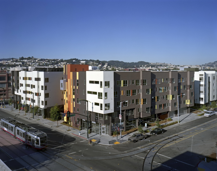
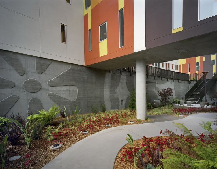
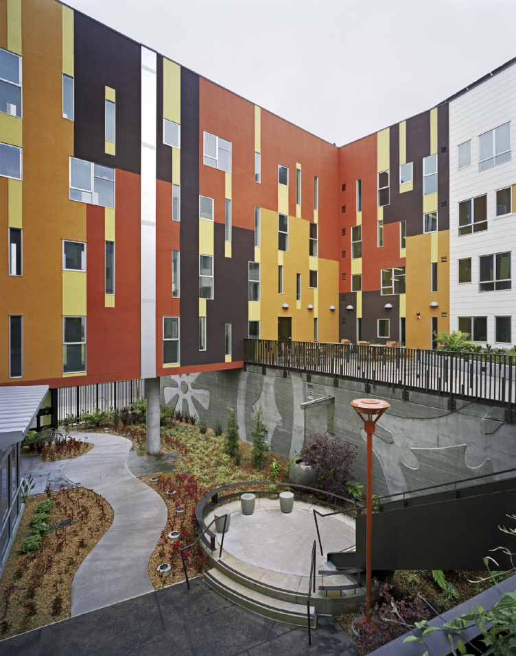
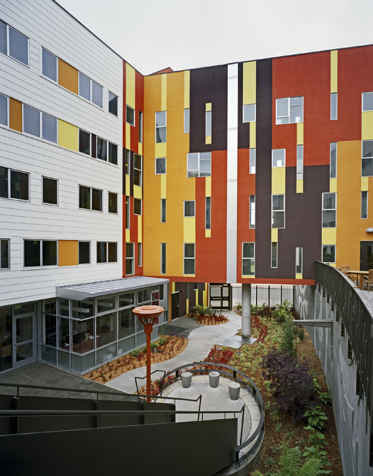
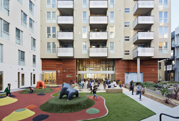
Armstrong Senior affordable housing © Brian Rose
Armstrong Senior affordable housing © Brian Rose
Armstrong Senior affordable housing © Brian Rose
Armstrong Senior affordable housing © Brian Rose
Armstrong Senior affordable housing © Brian Rose
Armstrong Senior affordable housing © Brian Rose
- How do you usually get invited to affordable housing projects? When do you usually start being involved?
– That's changed over the years. In the private sector there used to be very close relationship between the business customer and the architect: the former would have a group of architects who they work with. More recently it has become competition-based. So now you pursue the site, then you go through the first stage which is qualifications, then you submit a complete proposal, which includes a cost proposal and a means of financing. In San Francisco they're very interested in very comprehensive proposals, so you're not just building a building, you're providing everything, including social services.
Now we're pursuing one site, which we may or may not win, for a Chinese community. Our client has a whole system of social services in mind, including child and elderly care and a private Chinese restaurant where any senior can buy a very inexpensive subsidized lunch. The restaurant will employ youth, creating opportunities as well as a multi-generational connection. It's really quite amazing that part of winning the competition is what you are proposing to do.
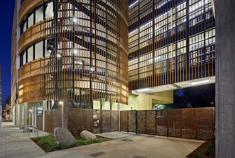
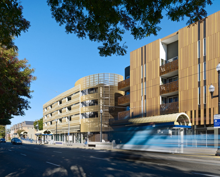
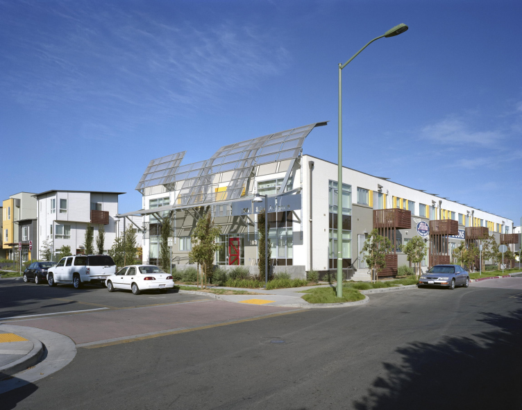
La Valentina Station affordable housing © Bruce Damonte
La Valentina Station affordable housing © Bruce Damonte
La Valentina Station affordable housing © Bruce Damonte
- How is it possible to work with such limited budgets in such interesting and diverse ways as you do?
– I think at some point nonprofits figured out that if they made a really ugly, cheap building, the neighbors would oppose the next one, saying “I don't want one of those affordable housing projects anywhere near me because they are awful and full of crime.” So they realized that they have to serve the customer and to sustain a reputation for having clean, beautiful buildings that are well-managed. When we take people on a tour of our projects, they say “Wow, I didn't know that was affordable housing, that's so nice. It's better than the market-rate housing!”
- How do you do that?
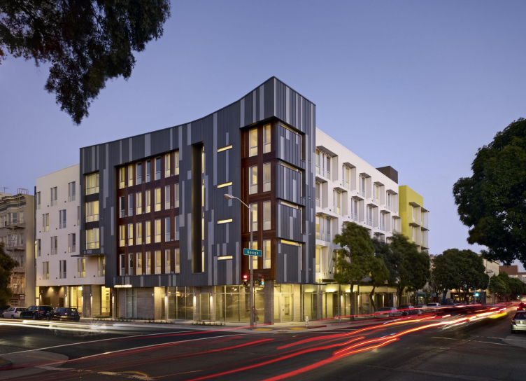
– We make it our goal for each project. We want to make a building that is a good neighbor, because it matters for next projects – it’s part of our portfolio. Market-rate housing has become competitive now, as all these luxury housing developers have figured out that people want to live in a beautiful building with all kinds of services. Gradually some affordable housing developers decided they want to honor the residents too. So do we. We want affordable housing to look great, to look better then market-rate housing. So having the building to be as good-looking as possible within the budget is one of competition criteria. If everybody has a great developer, a great contractor, and a great social-service program, what is the differentiator? It is how good the building design is. Everything else being equal, the person with the nicer building wins a competition.
- Courtyards are quite central in your work. How do you usually approach them when constructing affordable housing?
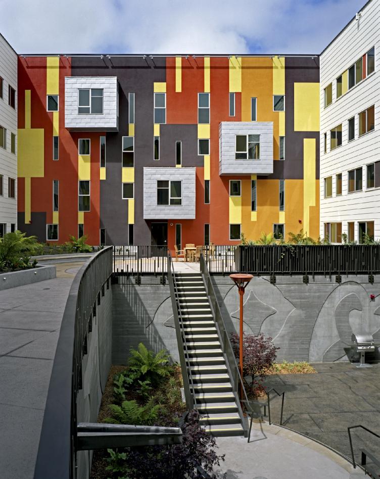
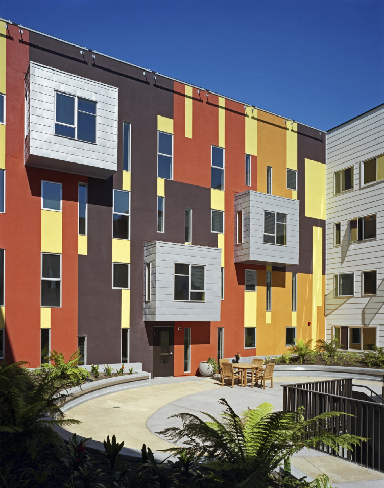
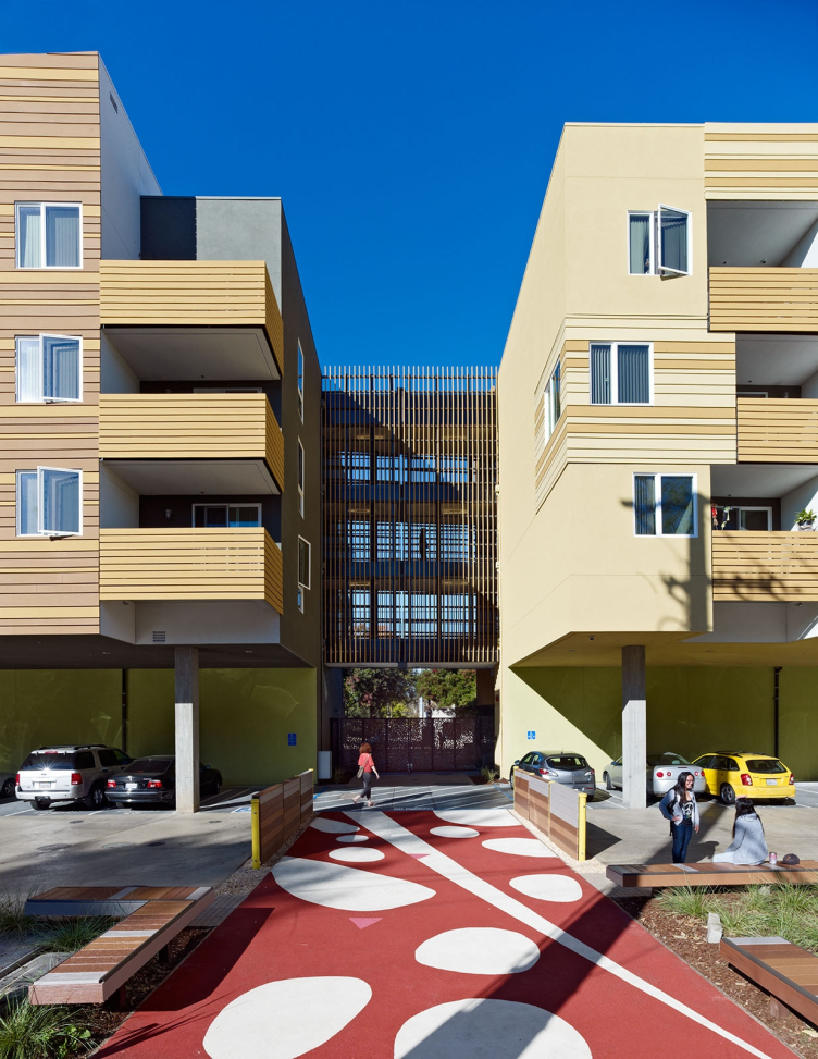
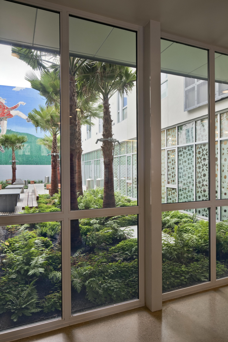
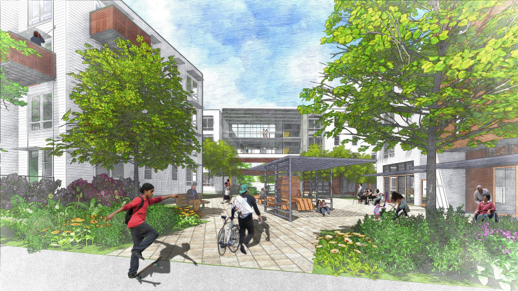
– Courtyards are really important here in Northern California, where we have pretty nice weather, kind of a maritime mild climate. We can do things outdoors. Over time we've got more focused on courtyards. We plant them so they are really nice, and you can pick fruit and hear birds when you're walking around. It’s great to put windows that look onto the courtyard, it’s really nice for people. Additionally, we started doing open-air stairs, so you are outdoors and you can see the courtyard when you go up and down. These are healthy, because they encourage people to walk around the building instead of taking the elevator.
Now we try to have the courtyard be visible from the street. It’s great if people from outside can see into the courtyard – just a glimpse of green is enough. This visibility from the public realm is really good for the urban environment. So we started taking the courtyards and turning them inside out.
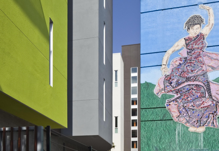
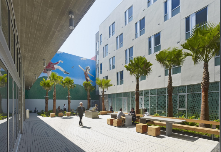
Richardson Apartments affordable housing with «Dancers» mural © Bruce Damonte
Richardson Apartments affordable housing with «Dancers» mural © Bruce Damonte
Richardson Apartments affordable housing with «Dancers» mural © Bruce Damonte
Richardson Apartments affordable housing with «Dancers» mural © Bruce Damonte
- You have incorporated several art projects – like murals and sculptures – into your housing.
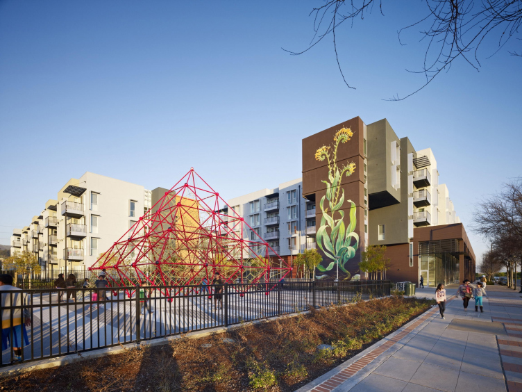
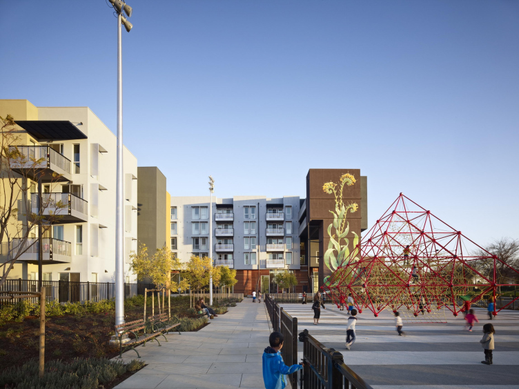
– We have various experience of working with art. At Richardson Apartments, which is housing for homeless individuals, there was a mosaic mural with giant dancers on the adjacent parking garage. We just set up the building to frame the piece, which became the central part of the courtyard. For “Taking Root”, a mural on Station Center Family Housing in Union City, California, an artist named Mona Caron proposed a design inspired by a weed on the building site, and then worked with the community to make a mural that told some of their story as well. It’s five-stories tall and visible to the whole neighborhood.
Station Center Family Housing with «Taking Root» mural © Bruce Damonte
Station Center Family Housing with «Taking Root» mural © Bruce Damonte
Station Center Family Housing with «Taking Root» mural © Bruce Damonte
Station Center Family Housing with «Taking Root» mural © Bruce Damonte
Station Center Family Housing with «Taking Root» mural © Bruce Damonte
Another thing we do is partner with local art non-profits. There is a gallery in San Francisco called Creativity Explored that supports developmentally disabled artists. We license art from these artists, so they can get some money for their work, and then we are able to enlarge the paintings and print them at a large scale, so we can get big pieces within our budget. With affordable housing, you don't have hundreds of thousands of dollars. You hope you have some money so you’ll be able to add some art as a part of the interiors.
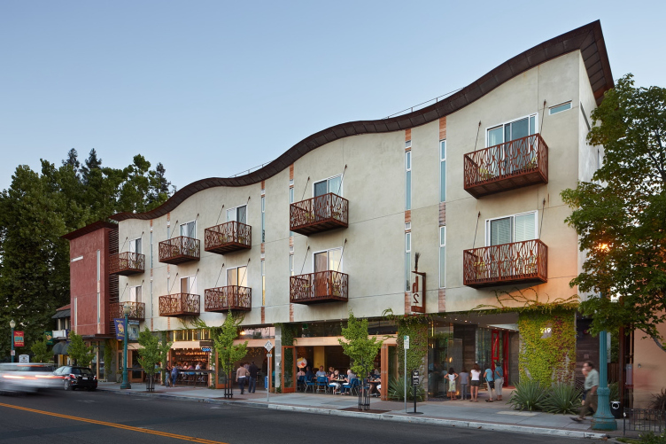
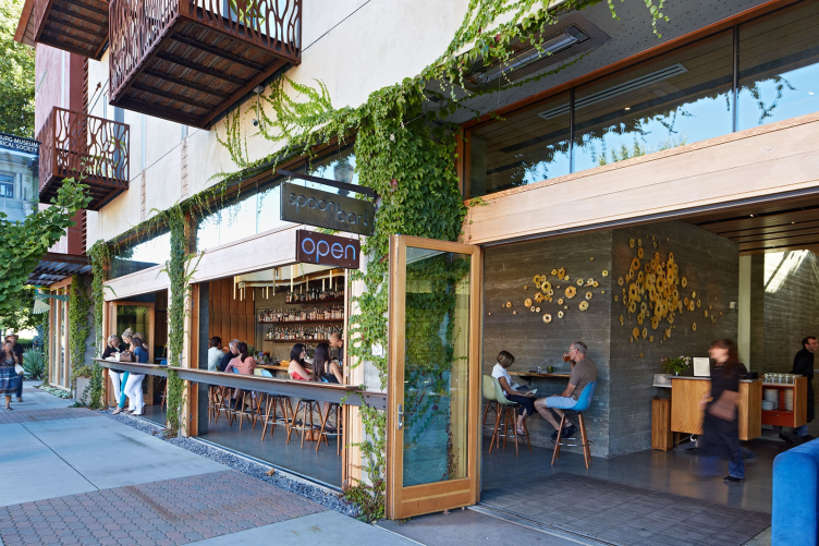
h2 Hotel in Healdsburg, California © Bruce Damonte
h2 Hotel in Healdsburg, California © Bruce Damonte
We designed two small boutique hotels in Healdsburg, a little town north of here in the wine country, where a lot of wealthy people have cottages. There we had a much more significant art budget. So we got to work with a whole bunch of local artists on original pieces.
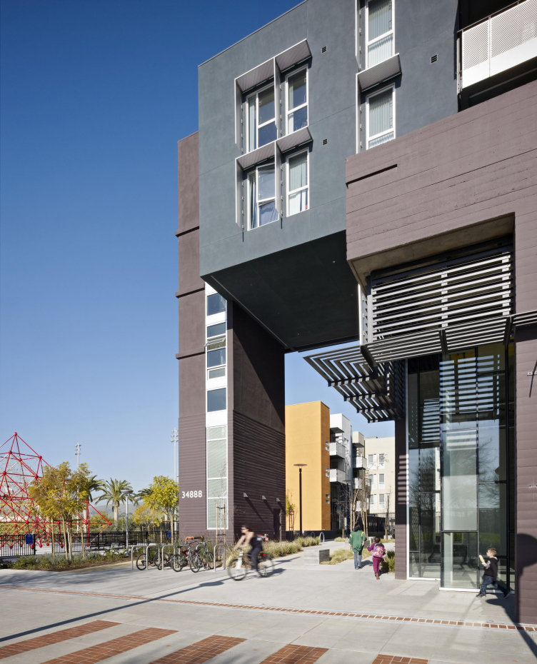
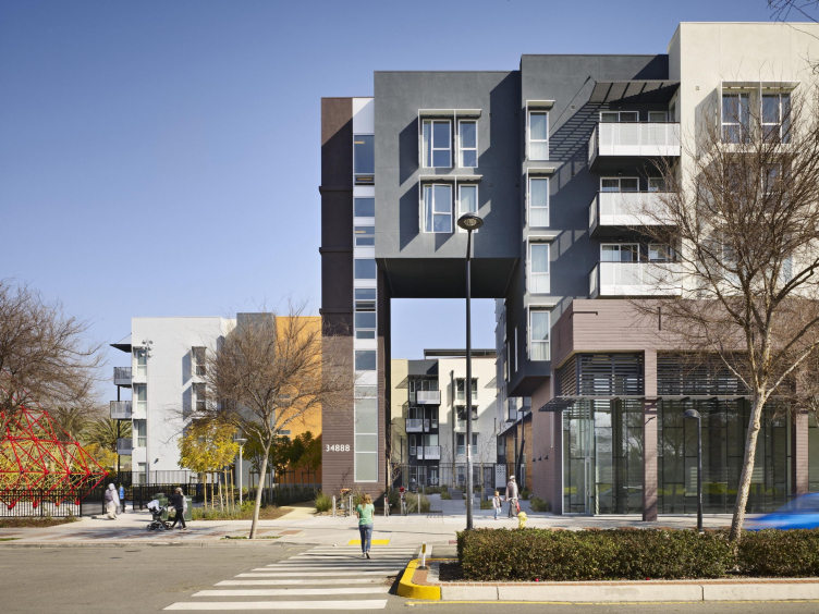
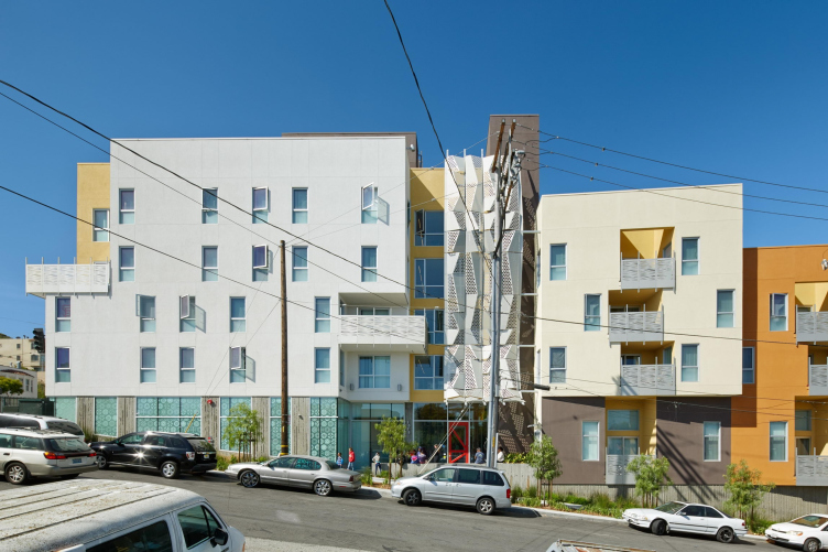
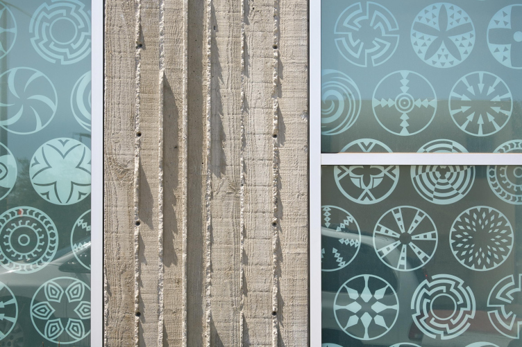
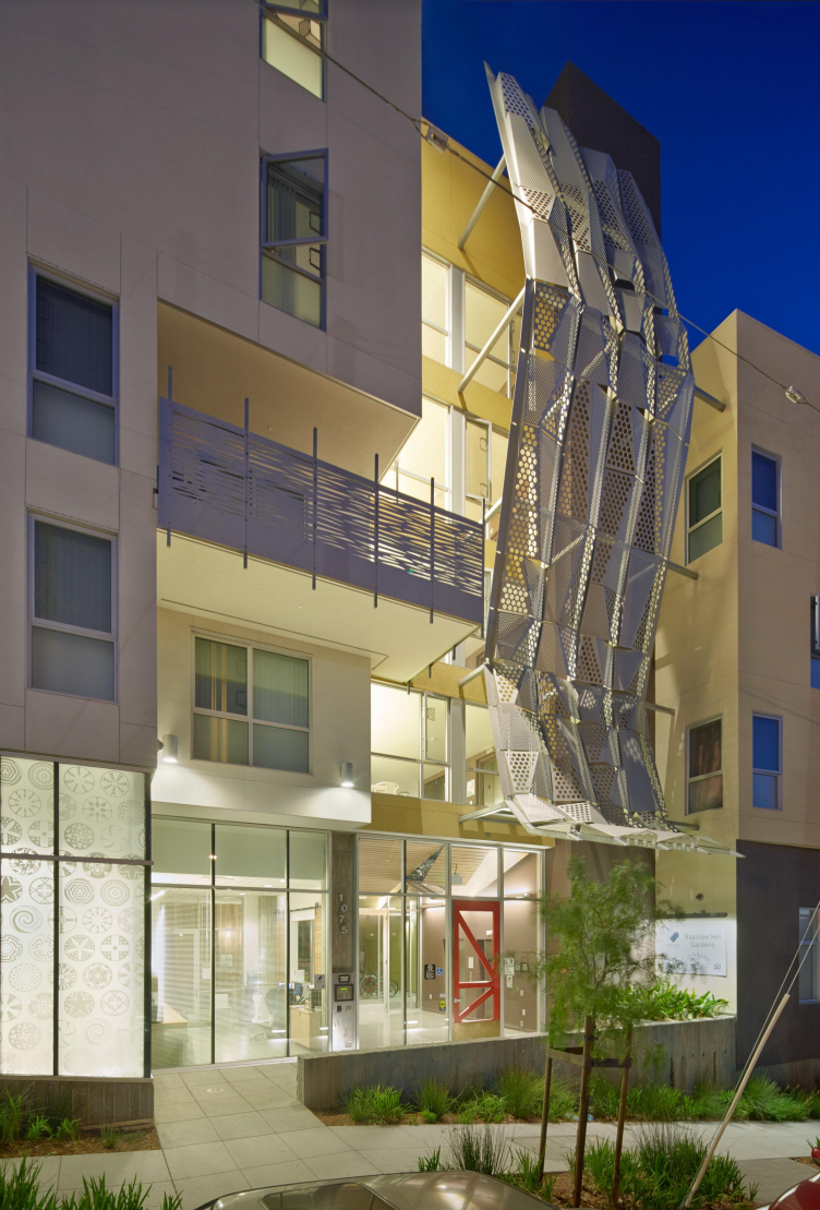
Bayview Hill Gardens affordable housing with Botswanan pattern © Bruce Damonte
Bayview Hill Gardens affordable housing with Botswanan pattern © Bruce Damonte
Bayview Hill Gardens affordable housing with Botswanan pattern © Bruce Damonte
- In one of your projects you have been using a Botswanan pattern.
– We were designing a building in a neighborhood that has a historically African-American population. We worked with the community advisory committee, who they wanted to honor the African-American community. We did a lot of research and developed a set of Afrocentric design components – colors, symbols, and patterns – which worked to give the building a particular sense of place. The basket pattern appears in the window screens and adds a character to the building.
- Besides building from scratch you also reclaim the buildings – turning a pasta factory into affordable housing.
– The pasta factory building is part of a new neighborhood called Tassafaronga Village that we designed to bridge a residential-industrial divide. The new neighborhood has apartments and townhouses, and the abandoned pasta factory on the site was originally supposed to be torn down. We thought it would be great to keep the building and turn it into housing. We kept that building and recycled most of it. It really helped with the character of the new neighborhood, because when you're doing a large site the big challenge is not to tear everything down, scrape it, and then make something new but superficial. That can turn out really boring. It's much more interesting to have a palimpsest, a layering or collage. These traces make for great cities.
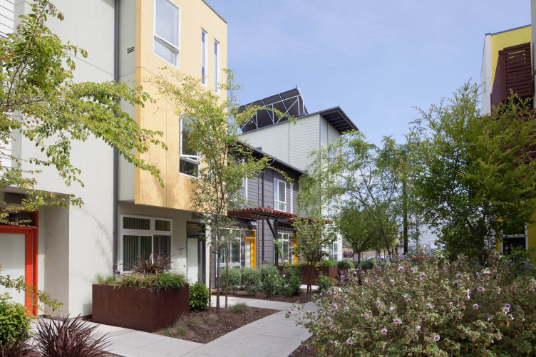
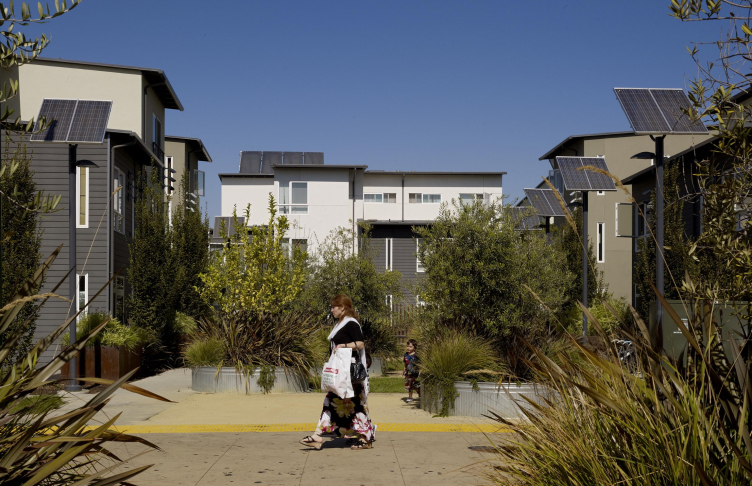
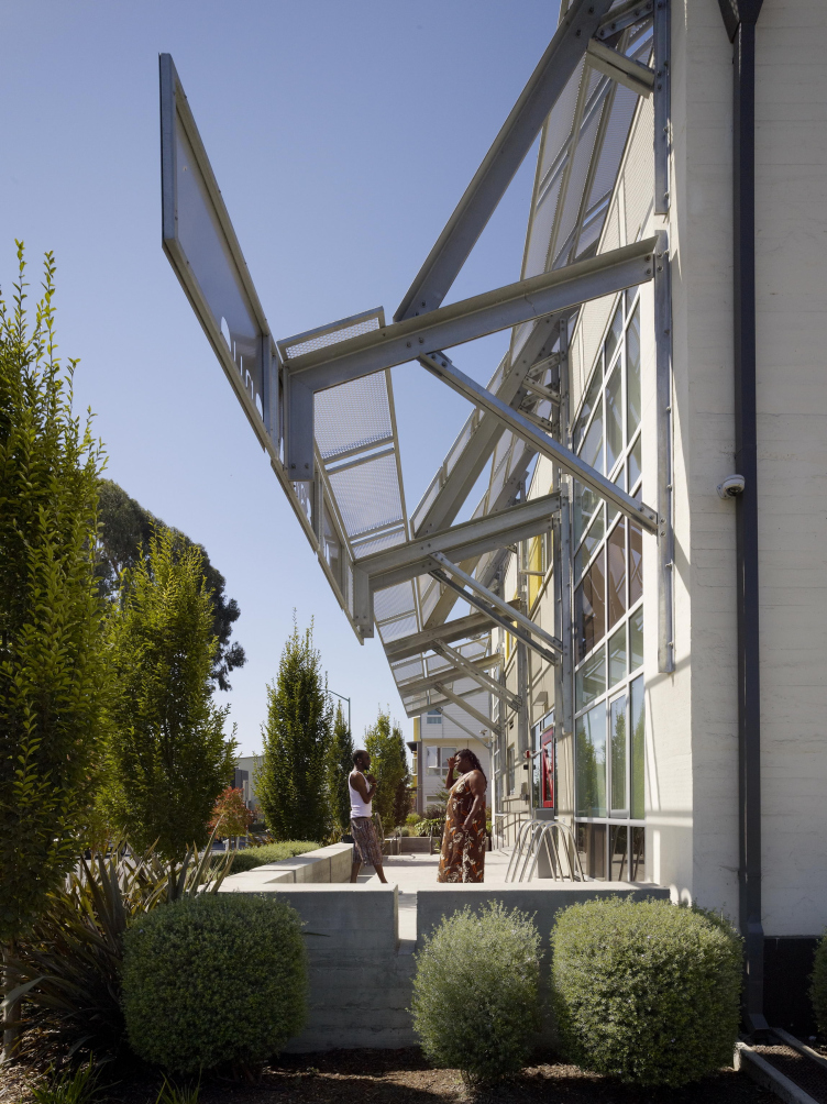
Tassafaronga Village including the Pasta Factory supportive housing © Bruce Damonte
Tassafaronga Village including the Pasta Factory supportive housing © Bruce Damonte
Tassafaronga Village including the Pasta Factory supportive housing © Bruce Damonte
Tassafaronga Village including the Pasta Factory supportive housing © Bruce Damonte
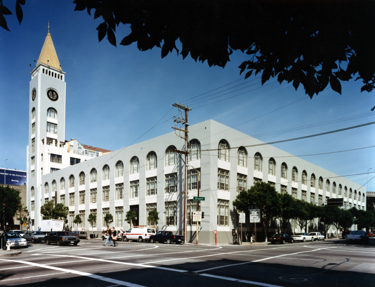
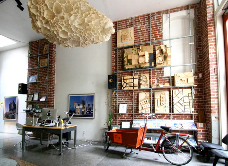
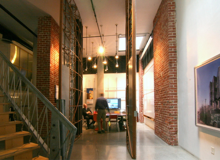
We adapted our office building about 25 years ago. Parts of this building are over 100 years old. It used to be a factory where they designed and printed fruit-crate labels in the 30's-50’s. The location of factories used to be chosen in a way that the workers could walk to work, but now industry has left the city centers and most of such buildings have been reclaimed.
David Baker Architects office © David Baker Architects
David Baker Architects office © David Baker Architects
David Baker Architects office © David Baker Architects
David Baker Architects office © David Baker Architects
Then you have historic sites, which are a whole other issue. In San Francisco there is much more of a desire to keep the historic fabric, so there are many buildings that are difficult to buy and tear down. That’s why reclaiming buildings is pretty wide-spread here.
- It seems you are using quite a big range of materials in your projects. Do you have a favorite one?
– Most of our buildings are combination of cement plaster and composite siding made out of post-industrial waste and sawdust mixed with concrete. In the United States, we tend to use it instead of wood. We paint it just like we made it out of wood, but it is actually better than wood because it doesn't rot and it's a very green, durable, and stable material.
We would love to use luxury materials everywhere, but when you have a limited budget it’s not possible. We follow the principle “a little goes a long way.” That is, we use 20 % premium materials in the places it really matters, and 80 % inexpensive, durable materials. However, we make sure we don't use really cheap materials, just ones that are practical. Then we use metal, for example, zinc, or ipe, which is a tropical hardwood, for accents that convey character and a sense of place. The premium materials we use are tile and redwood. Redwood is really expensive, but we can get the deadfall, older trees that are falling down.
- Working on affordable housing, do you believe that beautiful architecture can change people?
– I think it's our duty to respect the user by trying to make the building as nice as we can. Some architects think “Well, this is for a homeless guy. What does he know about architecture?” I think the signs of respect and the feeling of caring can be communicated through the building. People are nicer to the building – there’s less vandalism and destruction – if people feel honored.
Ultimately the people who run the building are more important than the architecture. You can take the most beautiful building in the world, and if you manage it poorly, you can make it into a horrible place. So I think architecture is important, though it’s not as important as other factors.
- We are wondering what the situation with affordable housing is in California in general. Is it possible to say that it is one of the most advanced states in this respect?
– Well, California is practically a country unto itself. If you just take the Bay Area, it has the same number of people as Denmark and a G.D.P. that would rank fairly high up in the nation and in the world. We have a bunch of people who are basically quite progressive, they do things like start Google and Apple. There's an immense wealth that has been created here, mostly by tech. So we can afford to be more progressive here. California is an amazing place, Northern California in particular.
- Taking into account the thirty-year history of your practice, how have things been changing – your clients and users of your buildings?
– It has become much more sophisticated in every way, both aesthetically and technically. There's been an increase in wealth and decrease in the middle class in the Bay Area. We are part of the rest of the country, so we also have a $15 US dollar minimum wage in San Francisco and all these small businesses are going bankrupt. Fifteen dollars per hour in the Bay Area means basically you either live with your parents or rent a corner in your friends’ apartment’s living room. There is this disconnect between what people at the bottom are earning and what it takes to live a reasonable lifestyle. That’s a bit troubling.
The other change is that the Bay Area had been a regional center of business, that stuff all left and for a while we were considering ourselves as a second or third tier city. In the last fifteen years – with the latest tech boom – there's been a tremendous resurgence. All these companies that didn't exist have emerged and skyrocketed economically. That’s how the Bay Area has become an international economic center. San Francisco now is one of the most interesting cities in the world. There's so much money here, which always helps architecture. Think about Frank Gehry’s building for Facebook – you don't do such things if you're going broke.
- Most of your buildings follow the green standards. How difficult is it to manage the green buildings that you’ve constructed?
– The difficulty depends on the client. Our non-profit housing clients have quite a commitment to doing better in terms of buildings actual performance. Now being a green architect just means getting your building certified. There's a tendency to go “Oh my God, there's global warming! The city will really love us if we make a green building!” And then five years later the same developer says “Why do we have to make a green building? We've already done that. That's old, that's no longer hip or useful.” We're trying to resist that.
We're doing some really interesting buildings with non-profits right now using different certification approaches. Passive House Certification is a thermally based program originating in Austria, and the Living Building Challenge is the most extreme energy standard, which comes out of the Pacific Northwest. You actually have to measure the performance of the building to get your certifications.
Unlike the rest of the United States, where you have the Republican chairman of the Environment Committee denying the existence of global warming, in California we recognized that global warming is a real thing that we really need to address it. We have a national goal of net zero by 2020, which is pretty aspirational but worth striving for. The American Institute of Architects has introduced a 2030 Challenge, which is trying to get all firms to track building performance – versus performance projections – by 2030. We are one of the firms who signed the commitment, so we're trying to track all our buildings and get their actual performance, which is not an easy thing.
- How do you track performance of your buildings?
– We design multifamily buildings. The difficulty has been that you couldn't get the energy use of the individual residences because it was considered private information. Now it’s included in tenants’ leases that they must provide energy bill data to the building owner. There has been a revolution in metering, and there are a lot of smart meters now. So we’re starting to track actual performance of overall buildings. Before, we could only track the common areas, which do not give a complete picture of the building.
- We noticed that you receive over a dozen awards annually – from national and regional associations, from governmental organizations, professional journals, etc. Which of them are most important for you?
– We don't really live for awards. Awards are a validation, which is really great, but I think it isn't our passion to win design awards. The awards that national rather than local are more meaningful for us, like the Urban Land Institute award, which is actually a global award. We received three of those competing with projects all over the world. That award considers the whole project, not just the design: the impact of the building, how it was financed, how it is functioning, as well as how wonderful the building looks.
- I saw you are running fundraiser parties from time to time. What does it mean?
– We have a few parties a year to raise money for various non-profits. We pick a cause – organizations that support city bicycling, or safer streets, or housing advocacy, or urban farming – and invite everybody. We have a party at our office and raise the money by selling tickets, having a raffle, and taking donations for a signature cocktail.
- Could you please describe us in a few words what are your projects besides affordable housing?
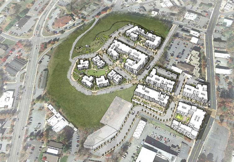
– We do a few luxury hotels, some interiors. For example, we have artisan coffee client for whom we have designed a café and a coffee stand. Now we just finished a space for them in Frank Gehry’s Facebook building. We're also doing more urban planning, which is really centered around affordable buildings. We are taking on larger areas, for instance, a 12-acre neighborhood in Asheville, North Carolina. Larger projects have a lot of community involvement, which is fun to do.
Lee Walker Heights Master plan. Ashville, North Carolina © David Baker Architects
Lee Walker Heights Master plan. Ashville, North Carolina © David Baker Architects
Lee Walker Heights Master plan. Ashville, North Carolina © David Baker Architects
- Could you please tell us your personal story? How did you know that you wanted to become an architect?
– I think my Dad really inspired me. He was a farmworker who dropped out of school in the ninth grade. He lived in Michigan and he had to ride a horse ten miles to the high school. It was like Russia – you had to take a sleigh because the snow was so deep, you couldn't ride a horse. He was self-educated and he did pretty well. At some point after reading the autobiography of Frank Lloyd Wright he started designing Usonian houses – a passive sort of modern house in the early fifties that were Frank Lloyd Wright’s idea. These houses were quite wonderful. So I grew up in a very modern house. My Mom and my Dad encouraged me to do architecture, I think that got me started. I kind of always wanted to be an architect.
I was a hippie and an anti-Vietnam War radical for a while, and I worked as a graphic designer at an underground newspaper. I hitchhiked to California after the Summer of Love. After I recovered from being a hippie, I went to a free school in Michigan and built a house. Then I applied to the architecture school in UC Berkeley, got in and moved back to California.
