По-русски

An Imposing Addition

Grouped together to form an architectural ensemble of the medical center of the 1980's - 2000's, several hospital buildings maintain a contextual connection with the surrounding volumes, at the same time suggesting a much more integral and laconic solution.

07 September 2016
Object
mainImg

The three new buildings, the construction of which was completed by Studio 44 in 2015, made an addition to the ensemble of medical complex, the building of which (in the former place of the Komendantsky airfield, north of the Udelny Park in the Primorsky district of Saint Petersburg) began with the government decree issued in mid-1980's. Originally, the medical center was a cardiological one, and later on it was granted a status of "Federal Center for Heart, Blood, and Endocrinology Research". This 1980's style building that occupies the central part of the territory in question was in the process of construction for more than fifteen years – from 1988 to 2006, with occasional hiatuses caused by lack of financing. Its intricate plan looks like a winged insect, while several of its volumes of different height alternate in a sophisticated fashion and are coated with ceramic granite – obviously, this was done at the close of the construction saga in late 2000's. Later on, in 2010, the north point of the trapeze got a curved volume of a perinatal center, strung on a circular tower.

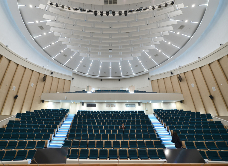
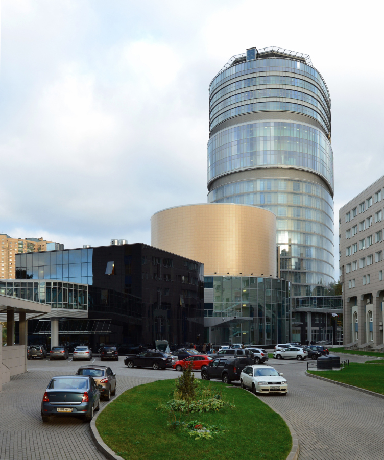
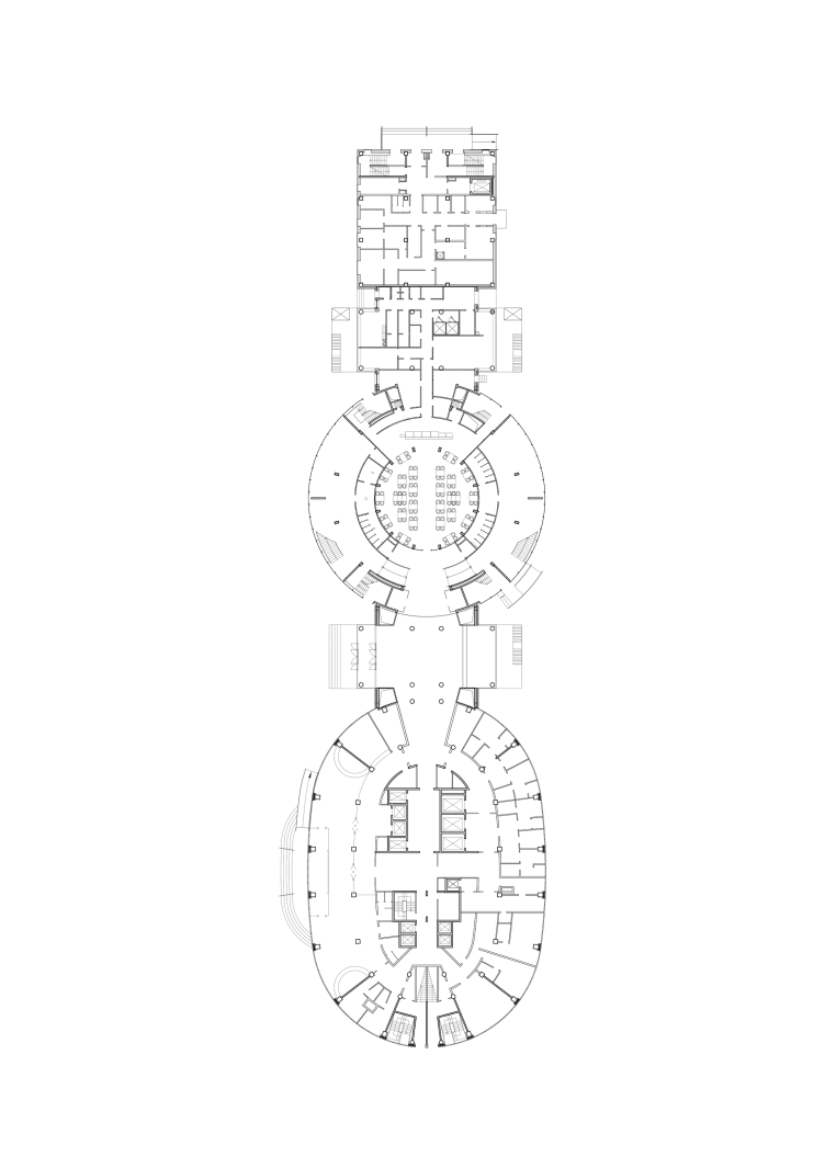
The three buildings built by Studio 44 are meant for the major medical treatment facility. They stretch along the northeast border of the territory of the medical center that has now a status of a research one and beard the name of Vladimir Almazov. The new complex has only been allotted 3.6 hectares – which is a fifth of the territory that had already been densely packed with buildings by the moment the architects started the design work. Initially, the architects were required to design a building with a whopping height of one hundred meters, high-capacity, with wards enough to house three hundred patients, operating theaters, intensive care units, a diagnostic department, a cryogenic reservoir for umbilical blood, and, furthermore, a cafe for one hundred seats, and a conference hall for six hundred people. The first tender for designing this monster was won by a company that proposed to position the high-rise closer to the center of the territory, adjoining the main old building. Then the project was handed over to Studio 44 that made significant changes to the concept: calculations proved that it was impossible to position the tower at the place that was originally picked because this would violate insolation regulations. So it was shifted towards the eastern corner of the site. In addition, the architects of Studio 44 made an independent unit for the conference hall. Ultimately, what they got was two laconic volumes: an oval-plan hundred-meter-high tower and a round conference hall thirty meters high – on the one hand, they echo the rounded corners of the old building, and, on the other hand, they look integral, simple, and more laconic than their predecessors. An idea of adding a third unit – a black two-story cube that would house a cryogenic reservoir of umbilical blood and a department of high-technology diagnostics - came about later on down the line when the architects learned that, in order to function properly, the high-precision apparatuses would need to be isolated as much as possible from any vibrations or mechanical interference. As a result, along the red line of the Tbilisskaya Street, there appeared a chain of three simple geometric volumes: an oval, a cylinder, and a cube. Their height proportionately decreases: the cylinder's height is a little less than one third of the height of the hospital tower, and the cubic block is, respectively, half of the cylinder's height.

Treatment and rehabilitation facility "Federal Center for Heart, Blood, and Endocrinology Research named after Vladimir Almazov". Construction, 2015 © Studio 44
Copyright: © Studio 44


Treatment and rehabilitation facility "Federal Center for Heart, Blood, and Endocrinology Research named after Vladimir Almazov". Section view © Studio 44


Treatment and rehabilitation facility "Federal Center for Heart, Blood, and Endocrinology Research named after Vladimir Almazov". Plan © Studio 44


The starting point of the vertical zoning of the hospital tower was suggested to the architects by the fire safety regulations. Floors 1 to 12 contain wards for the patients – this is exactly the height of maximum reach of the rescue equipment that is available for a quick response time in this area of the city. Higher up, there are three floors with operating theaters and intensive care units – different evacuation rules apply for the hospital employees and immobile patients, hence, these premises can be placed at a greater height. Due to the fact that it is these specific floors that are most technologically advanced of all – they have lots of sophisticated equipment and antiseptic rooms in them – the thirteenth and the seventeenth floors perform the maintenance functions and include the climate and ventilation systems. This way, the intensive care and operating units are separated from the lower floors by tiers they are marked on the outside by stripes of yellowish ceramic granite. The two top floors – nineteenth and twentieth – are occupied by the administration offices and research laboratories. The roof had a helicopter landing upon it for evacuating and receiving the donor organs. 

Treatment and rehabilitation facility "Federal Center for Heart, Blood, and Endocrinology Research named after Vladimir Almazov". Construction, 2015 © Studio 44


Treatment and rehabilitation facility "Federal Center for Heart, Blood, and Endocrinology Research named after Vladimir Almazov". Construction, 2015 © Studio 44
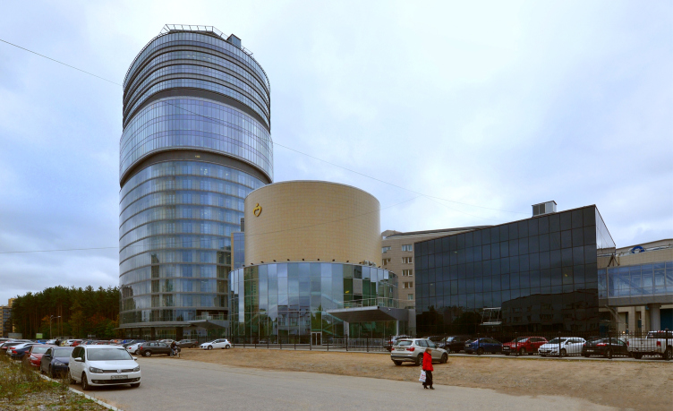

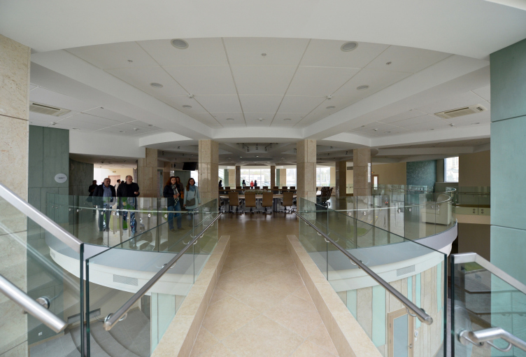
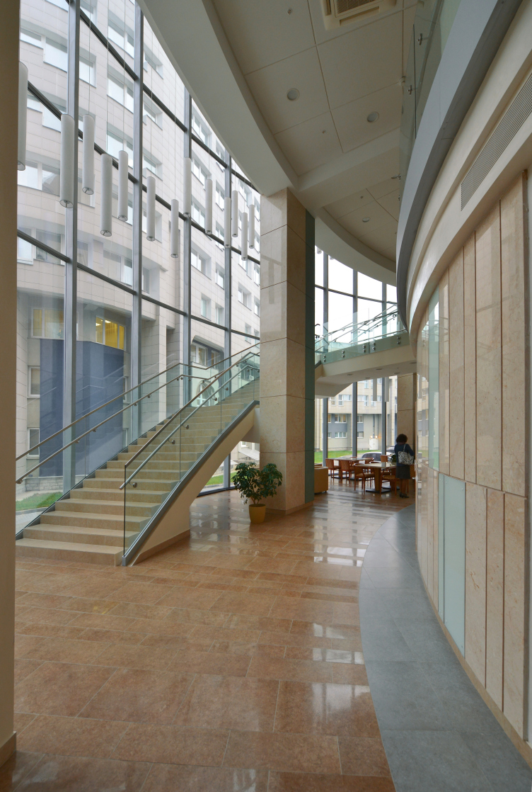
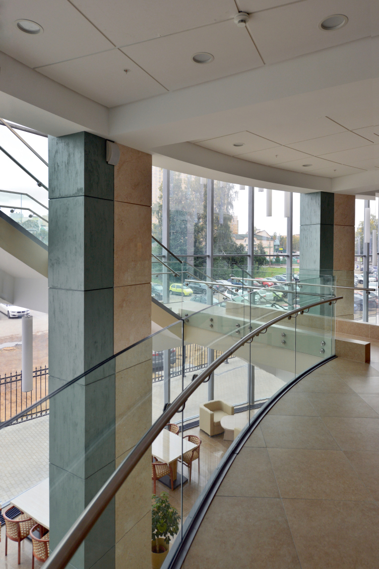
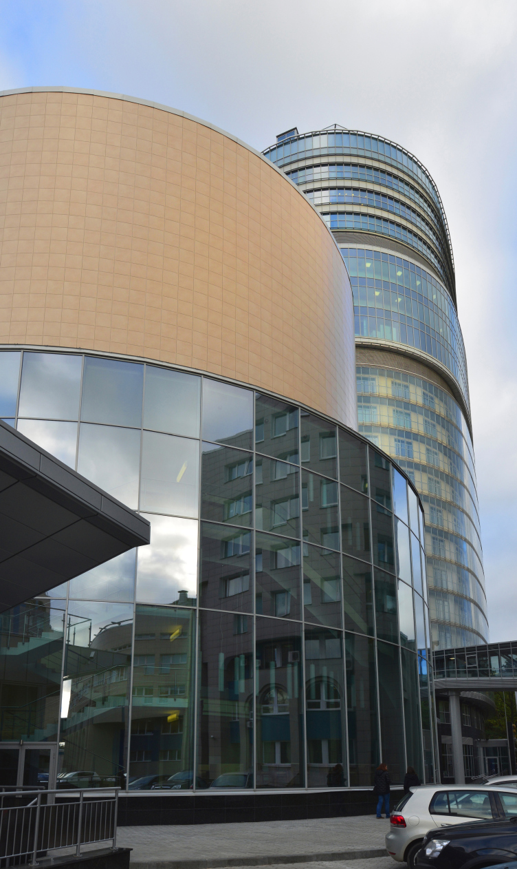
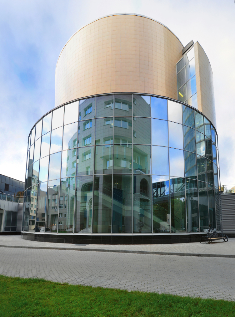
The second volume of the complex, occupied by a conference hall, consists in fact not of one but two cylinders: the two bottom floors are about eight meters wider than the upper ones, and this way the upper tiers get some sort of a "base" underneath them that includes an entrance lobby, a café, and bypassing corridors for entering the hall and going up on stage. The lower circle is made of glass, while the upper one is coated with yellow ceramic granite – the color is set by the first building of the medical center that is also of a somewhat yellowish color. The fact that the hall has blind façades is conditioned by its very function: should such need arise the hall can be lit by "clear-stories" or "roof-lights" that are curtain-covered during the movie screenings. 

Treatment and rehabilitation facility "Federal Center for Heart, Blood, and Endocrinology Research named after Vladimir Almazov". Construction, 2015 © Studio 44


Treatment and rehabilitation facility "Federal Center for Heart, Blood, and Endocrinology Research named after Vladimir Almazov". Construction, 2015 © Studio 44

Treatment and rehabilitation facility "Federal Center for Heart, Blood, and Endocrinology Research named after Vladimir Almazov". Construction, 2015 © Studio 44
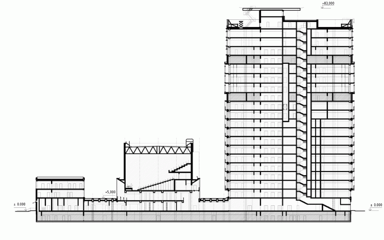

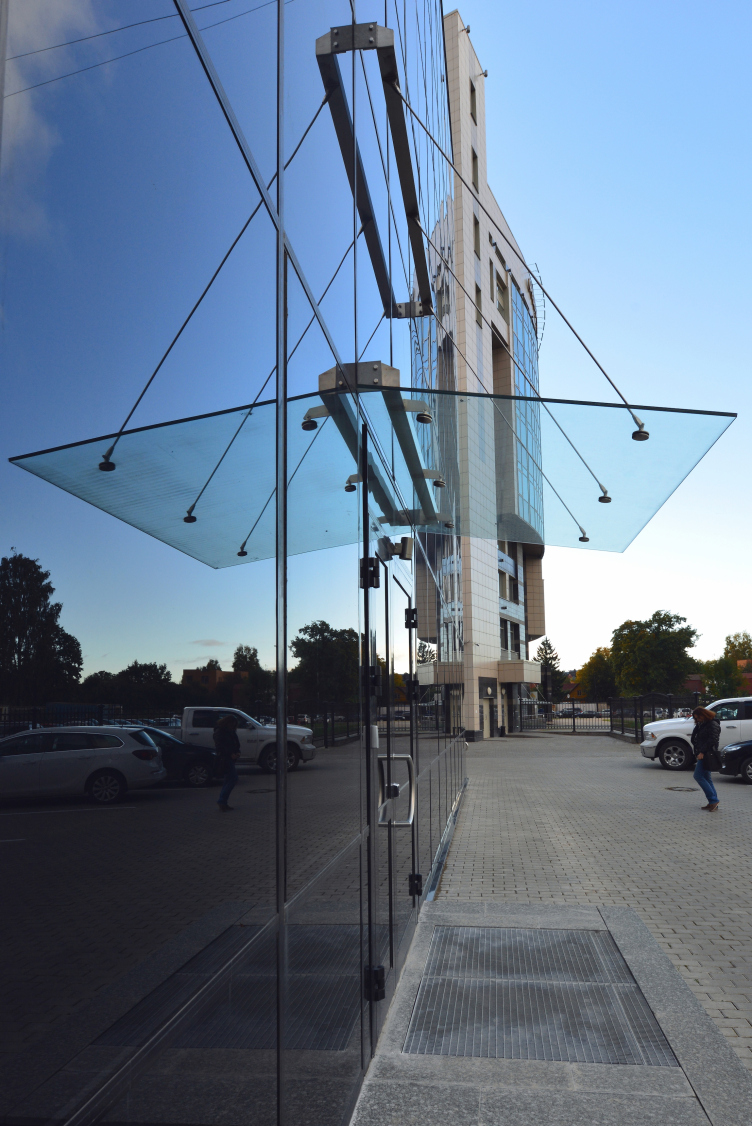
The volume of the hall rests on supports hidden inside the glass part, and this way the space underneath them is completely vacant – which increased the size of the café. One can get from the first floor up to the hall by two open-air staircases or by elevators. The roof of the entrance group that serves at the same time as a lintel between the middle and the third blocks is usable: it has green plants on it, it is accessible from the café, and one can through it to the third unit - but only in the warm seasons.

Treatment and rehabilitation facility "Federal Center for Heart, Blood, and Endocrinology Research named after Vladimir Almazov". Construction, 2015 © Studio 44

Treatment and rehabilitation facility "Federal Center for Heart, Blood, and Endocrinology Research named after Vladimir Almazov". Construction, 2015 © Studio 44
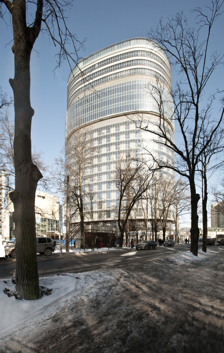

Treatment and rehabilitation facility "Federal Center for Heart, Blood, and Endocrinology Research named after Vladimir Almazov". Construction, 2015 © Studio 44
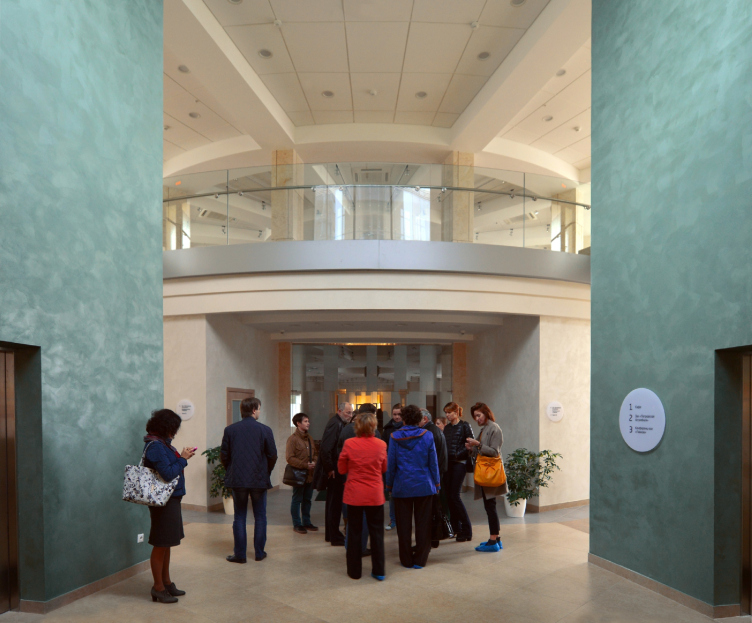

The third black cubic block obviously stands out against the background of all the buildings of the center, old and new alike. This way, there is an interesting game going on among the three buildings, a game of geometric forms of different matter and texture: the "black box" stands next to a stepping cylinder, part of it being glittering glass, and part being yellowish rock. This theme is picked up by the hundred meter tower of the hospital which is also two-layer and transparent, its surface being of a more complex nature: the double shell of the balconies of the hospital ward floors neighbor on the grilles of the maintenance floors and the ethereal glass of the operating rooms that lets in as much ambient light as possible.

Treatment and rehabilitation facility "Federal Center for Heart, Blood, and Endocrinology Research named after Vladimir Almazov". Construction, 2015 © Studio 44
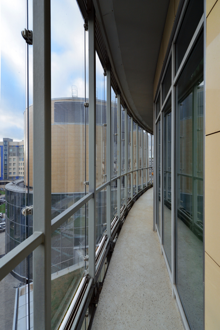

The choice in favor of the high-rise tower of the first unit also appears as the optimum: from a compositional standpoint, the tower livens up the generally flat cityscape and sets the vertical this place has always been in need of. The three new blocks did fit in nicely with the already-dense ensemble of the complex. On the one hand, they are quite self-sufficient, modern, laconic, and clear-cut. On the other hand, they do not conflict at all with the old buildings of the center. Rather, what they do is they take the themes that these old buildings started and bring them to an imposing geometric absolute, almost megalithic, as is often the case with Nikita Yavein projects.

Treatment and rehabilitation facility "Federal Center for Heart, Blood, and Endocrinology Research named after Vladimir Almazov". Construction, 2015 © Studio 44

07 September 2016

Headlines now
The Golden Crown
The concept for a dental clinic in Yekaterinburg, developed by CNTR Studio, revolves around the idea of a “mouth full of gold”: pristine white porcelain stoneware walls are complemented by matte brass details. To avoid an overly literal interpretation, the architects focused on the building’s proportions, skillfully navigating between sunlight requirements and fire safety regulations.
Flexibility and Integration
Not long ago, we covered the project for the fourth phase of the ÁLIA residential complex, designed by APEX. Now, we’ve been shown different fence concepts they developed to enclose the complex’s private courtyards, incorporating a variety of public functions. We believe that the sheer fact that the complex’s architects were involved in such a detail as fencing speaks volumes.
A Step Forward
The HIDE residential complex represents a major milestone for ADM architects and their leaders Andrey Romanov and Ekaterina Kuznetsova in their quest for a fresh high-rise aesthetic – one that is flexible and layered, capable of bringing vibrancy to mass and silhouette while shaping form. Over recent years, this approach has become ADM’s “signature style”, with the golden HIDE tower playing a pivotal role in its evolution. Here, we delve into the project’s story, explore the details of the complex’s design, and uncover its core essence.
Gold in the Sands
A new office for a transcontinental company specializing in resource extraction and processing has opened in Dubai. Designed by T+T Architects, masters of creating spaces that are contemporary, diverse, flexible, and original, this project exemplifies their expertise. On the executive floor, a massive brass-clad partition dominates, while layered textures of compressed earth create a contextually resonant backdrop.
Layers and Levels of Flight
This project goes way back – Reserve Union won this architectural competition at the end of 2011, and the building was completed in 2018, so it’s practically “archival”. However, despite being relatively unknown, the building can hardly be considered “dated” and remains a prime example of architectural expression, particularly in the headquarters genre. And it’s especially fitting for an aviation company office. In some ways, it resembles the Aeroflot headquarters at Sheremetyevo but with its own unique identity, following the signature style of Vladimir Plotkin. In this article, we take an in-depth look at the United Aircraft Corporation (UAC) headquarters in the Moscow agglomeration town of Zhukovsky, supplemented by recent photographs from Alexey Naroditsky – a shoot that became only recently possible due to the fact that improvements were finally made in the surrounding area.
Light and Shadow
In this article, we delve into the architectural design of the “Chaika” house by DNK ag architects, which was recently completed in 2023 as part of the collection of signature designs at ZILArt. As is well-known, all the buildings in this complex follow a design code, yet each one is distinct. This particular building stands out not only for its whiteness and minimalism but also for the refined use of a limited number of techniques that, together, create what can confidently be called synergy.
Casus Novae
A master plan was developed for a large residential area with a name of “DNS City”, but now that its implementation began, the plan has been arbitrarily reformatted and replaced with something that, while similar on the surface, is actually quite different. This is not the first time such a thing happens, but it’s always frustrating. With permission from the author, we are sharing Maria Elkina’s post.
Treasure Hunting
The GAFA bureau, in collaboration with Tegola and Arkhitail, organized an expedition to the island of Kilpola in Karelia as part of Moskomarkhitektura’s “Open City” festival. There, amidst moss and rocks, the students sought answers to questions like: what is the sacred, where does it dwell, and what sustains it? Assisting the participants in this quest were landscape engineer Evgeny Levin, artist Nicholas Roerich, a moose, and the lack of cellular connection. Here’s how the story unfolded.
Depths of the Earth, Streams of Water
In the Malaya Okhta district, the Akzent building, designed by Stepan Liphart, was constructed. It follows a classic tripartite structure, yet it’s what you might call “hand-drawn”: each façade is unique in its form and details, some of which aren’t immediately noticeable. In this article, we explore the context and, together with the architect, delve into how the form was developed.
Fir Tree Dynamics
The “Airports of Region” holding is planning to build an airport in Karachay-Cherkessia, aiming to make the Arkhyz and Dombay resorts more accessible to travelers. The project that won in an invitation-only competition, submitted by Sergey Nikeshkin’s KPLN, blends natural imagery inspired by the shape of a conifer seed, open-air waiting spaces, majestic large trees, and a green roof elevated on needle-like columns. The result is both nature-inspired and WOW.
​A Brick Shell
In the process of designing a clubhouse situated among pine trees in a prestigious suburban area near Moscow, the architectural firm “A.Len” did the façade design part. The combination of different types of brick and masonry correlates with the volumetric and plastique solutions, further enhanced by the inclusion of wood-painted fragments and metal “glazing”.
Word Forms
ATRIUM architects love ambitious challenges, and for the firm’s thirtieth anniversary, they boldly play a game of words with an exhibition that dives deep into a self-created vocabulary. They immerse their projects – especially art installations – into this glossary, as if plunging into a current of their own. You feel as if you’re flowing through the veins of pure art, immersed in a universe of vertical cities, educational spaces – of which the architects are true masters – and the cultural codes of various locations. But what truly captivates is the bold statement that Vera Butko and Anton Nadtochy make, both through their work and this exhibition: architecture, above all, is art – the art of working with form and space.
Flexibility and Acuteness of Modernity
Luxurious, fluid, large “kokoshniks” and spiral barrel columns, as if made from colorful chewing gum: there seem to be no other mansion like this in Moscow, designed in the “Neo-Russian-Modern” style. And the “Teremok” on Malaya Kaluzhskaya, previously somewhat obscure, has “come alive with new colors” and gained visibility after its restoration for the office of the “architectural ecosystem” as the architects love to call themselves. It’s evident that Julius Borisov and the architects at UNK put their hearts into finding this new office and bringing it up to date. Let’s delve into the paradoxes of this mansion’s history and its plasticity. Spoiler: two versions of modernity meet here, both balancing on the razor’s edge of “what’s current”.
Yuri Vissarionov: “A modular house does not belong to the land”
It belongs to space, or to the air... It turns out that 3D printing is more effective when combined with a modular approach: the house is built in a workshop and then adapted to the site, including on uneven terrain. Yuri Vissarionov shares his latest experience in designing tourist complexes, both in central Russia and in the south. These include houseboats, homes printed from lightweight concrete using a 3D printer, and, of course, frame houses.
​Moscow’s First
“The quality of education largely depends on the quality of the educational environment”. This principle of the last decade has been realized by Sergey Skuratov in the project for the First Moscow Gymnasium on Rostovskaya Embankment in the Khamovniki district. The building seamlessly integrates into the complex urban landscape, responding both to the pedestrian flow of the city and the quiet alleyways. It skillfully takes advantage of the height differences and aligns with modern trends in educational space design. Let’s take a closer look.
Looking at the Water
The site of Villa Sonata stretches from the road to the water’s edge, offering its own shoreline, pier, and a picturesque river panorama. To reveal these sweeping views, Roman Leonidov “cut” the façade diagonally parallel to the river, thus getting two main axes for the house and, consequently, “two heads”. The internal core – two double-height spaces, a living room and a conservatory, with a “bridge” above them – makes the house both “transparent” and filled with light.
The White Wing
Well, it’s not exactly white. It’s more of a beige, white-stone structure that plays with the color of limestone – smoother surfaces are lighter, while rougher ones are darker. This wing unites various elements: it absorbs and interprets the surrounding themes. It responds to everything, yet maintains a cohesive expression – a challenging task! – while also incorporating recognizable features of its own, such as the dynamic cuts at the bottom, top, and middle.
Urban Dunes
The XSA Ramps team designed and built a three-part sports hub for a park in Rostov-on-Don, welcoming people of all ages and fitness levels. The skate plaza, pump track, and playground are all meticulously crafted with details that attract a diverse range of visitors. The technical execution of the shapes and slopes transforms this space into a kind of sculptural composition.
Proportional Growth
The project for the fourth phase of the ÁLIA residential area has been announced. The buildings are situated on an elongated plot – almost a “ray” that shoots out from the center of the area towards the river. Their layout reflects both a response to Moscow’s architectural preferences over the past 15 years, shifting “from blocks to towers”, and an interpretation of the neighboring business park designed by SOM. Additionally, the best apartments here are not located at the very top but closer to the middle, forming a glowing “waistline”.
The “Staircase” Building
In designing the “Details” residential complex in New Moscow, Rais Baishev spiced up the now-popular Moscow theme of a “courtyard” building with an idea drawn from the surrealist drawings by Maurits Escher. He envisioned the stepped silhouettes and descending slopes as a metaphysical mega-staircase, creating a key void within the courtyard that gave the project an internal “spine”. This concept is felt both in the building’s silhouette and on its façades.
Projection of the Quarter
No one doubted that the building that Vladimir Plotkin designed as part of the “Garden Quarters” would be the most modernist of all. And it turned out just that way: while adhering to the common design code, the building successfully combines brick and white stone, rhythmically responding to the neighboring building designed by Ostozhenka, yet tactfully and persistently making a few statements of its own. This includes the projection of the ideal urban development composition “14–9–6”, which can be found right next door, mathematical calculations, including those for various types of terraces (and perhaps the only reminder of the Soviet past of the Kauchuk rubber factory!), and the white “cross-stitch” pattern of the façade grid.
Domus Aurea
In this issue, we examine the “Tessinsky-1” house, designed by Sergey Skuratov and completed in 2023. Located in the middle of the Serebryanicheskaya Embankment district, at the intersection of its main streets, this house assumes a sort of “nodal” role: it not only responds to everything around it and preserves many memories of the former EMA factory within itself, but it weaves all this into a newly directed pattern, reconciling bright “gold” and dark-colored brick, largely with the help of the new, modern-yet-archaic Columba brick, which, come to think about it, is the most precious element here.
The Chimney of Nikola-Lenivets
In this issue, we are examining the “Obelisk House” designed by KATARSIS and built for the Arkhstoyanie 2023 festival. However, it was only finished later on, and this is why we are examining it now. It seems to us that after the “Obelisk House” appeared in Nikola-Lenivets, a dialogue and a few inner connections appeared between the temporary structures built here. These houses no longer look like “accidental neighbors”, more of which below.
​Periscope by the Bay
The jury awarded the second place in the competition for a public and cultural center in Petropavlovsk-Kamchatsky to the companies GORA (“Mountain”) and M4. In the consortium’s proposal, the building resembles a sperm whale with a calf swimming next to it or a periscope, whose lenses capture the most spectacular views from the surrounding landscape.
From Arcs to Dolmens
While working on the competition project for Petropavlovsk-Kamchatsky, ASADOV Architects prioritized the value of the natural and urban environment, aiming to preserve the balance of the location while minimizing the resemblance of the volume that they designed to a “traditional building”. The task was challenging, and the architects created three versions, one of which having been developed after the competition, where their main proposal took third place. However, the point of interest here is not the competition result but the continuity of creative thinking.
Hide and Seek
The ID Moskovskiy house, designed by Stepan Liphart in St. Petersburg, in the courtyards near Moskovskiy Avenue beyond the Obvodny Canal and recently completed, is notable for several reasons. Firstly, it has been realized with considerable accuracy, which is particularly significant as this is the first building where the architect was responsible not only for the facades but also for the layouts, allowing for better integration between the two. On the other hand, this building is interesting as an example of the “germination” of new architecture in the city: it draws on the best examples from the neighborhood and becomes an improved and developed sum of ideas found by the architect in the surrounding context.
The Big Twelve
Yesterday, the winners of the Moscow Mayor’s Architecture Award were announced and honored. Let’s take a look at what was awarded and, in some cases, even critique this esteemed award. After all, there is always room for improvement, right?
Above the Golden Horn
The residential complex “Philosophy” designed by T+T architects in Vladivostok, is one of the new projects in the “Golubinaya Pad” area, changing its development philosophy (pun intended) from single houses to a comprehensive approach. The buildings are organized along public streets, varying in height and format, with one house even executed in gallery typology, featuring a cantilever leaning on an art object.
Nuanced Alternative
How can you rhyme a square and space? Easily! But to do so, you need to rhyme everything you can possibly think of: weave everything together, like in a tensegrity structure, and find your own optics too. The new exhibition at GES-2 does just that, offering its visitor a new perspective on the history of art spanning 150 years, infused with the hope for endless multiplicity of worlds and art histories. Read on to see how this is achieved and how the exhibition design by Evgeny Ace contributes to it.
Blinds for Ice
An ice arena has been constructed in Domodedovo based on a project by Yuri Vissarionov Architects. To prevent the long façade, a technical requirement for winter sports facilities, from appearing monotonous, the architects proposed the use of suspended structures with multidirectional slats. This design protects the ice from direct sunlight while giving the wall texture and detail.