По-русски

From Kaliningrad to London

An article about two contest projects done by Anatoly Stolyarchuk architectural studio, his work during the time of economic recession, and his attitude towards stylization.

15 March 2016
Object
mainImg
During the economic crisis, different people behave differently. Some people just turn on the "economy mode" and lie low, trying to make ends meet. Some, on the other hand, use the void to excel and grow. 

For example, the leader of his company Anatoly Stolyarchuk successfully combines his "put-food-on-the-table" work with contest initiatives of his young creative talent. And, although it is always a great risk of getting a negative return on investment, you can by no means describe this work as detrimental: this is exactly where your young talent base grows and matures. In this article, we are bringing to your attention two contest projects done by Anatoliy Stolyarchuk studio in the recent months. 

One of them was prepared for Kaliningrad, the city that in September of 2015 hosted an open architectural competition named "Heart of the City" for the best concept of the historical, cultural, and governmental complex. The contest was organized by the non-profit partnership «Town-planning Bureau "Heart of the City"» that acted upon the commission of the government of the Kaliningrad region supported by the city administration. 

The other contest - London Nursery a School - took place in December in London. It was organized by a privately owned Italian company "AWR Competetions". 
 
***

The project of the governmental, historical, and cultural complex in Kaliningrad

The designed land site is located next to Kaliningrad's historical center, the contest for the best development project of which was won in 2014 by "Studio-44". The status of the land site in question is still more "high-responsibility" because it is exactly here that the old Koenigsberg Castle of the XIII-XIX centuries used to be situated. In other words, it is indeed the heart of the city. During the World War II, the castle suffered a lot of damage, although its walls and towers survived. Nevertheless, in the sixties, the city council made a decision to take them down, in spite of the protests of the city conservation activists. Next to the wasteland that conceals the basements of the castle, in the seventies, the construction of the "House of Soviets" was started - this building was to become the city's new centerpiece instead of the lost castle. As it turned out in the long run, however, the building became for the city people a symbol of delayed construction, incomplete up to the present day, and without any clear prospects for the future. 

According to the contest task, it was up to the contestants to decide on the fate of the "House of Soviets", as well as on the question of recreating/not recreating the castle in its original form. One way or another, this place was supposed to get a residence of the city council, plus a historical and cultural complex. From the very start, Anatoliy Stolyarchuk Studio decisively discarded the idea of a "mock-up" recreation of the castle: instead, the authors proposed a building that follows the irregular outline of the inside perimeter of the castle but on the outside takes on an aspect of a regular square. 

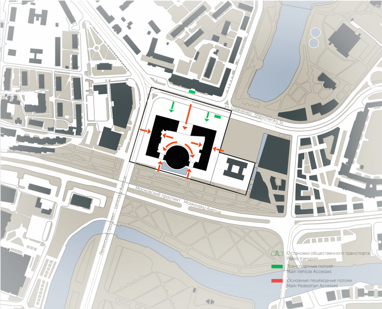
A project of historical and cultural center in Kaliningrad. Location plan. Project, 2015 © Anatoly Stolyarchuk Architectural Studio


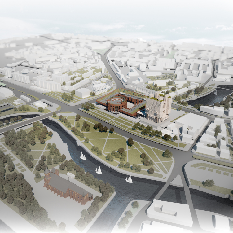
A project of historical and cultural center in Kaliningrad. Bird's eye view. Project, 2015 © Anatoly Stolyarchuk Architectural Studio


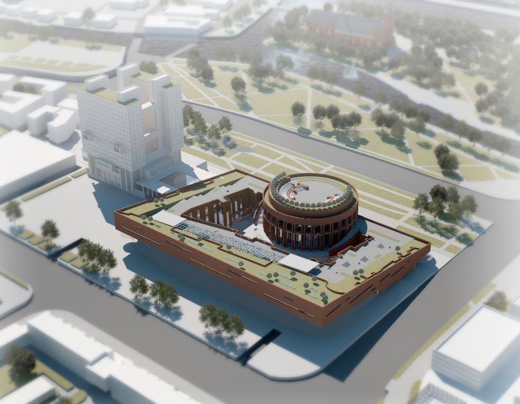
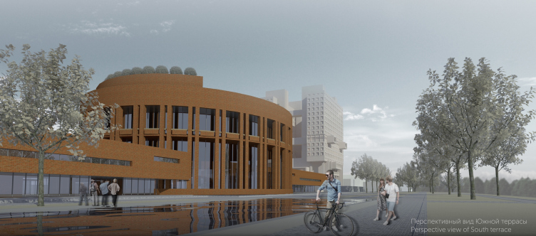
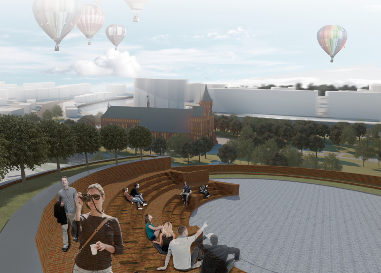
A massive rectangle is cut off on top in a slanted line in the direction of the south terrace and the Island of Kant; into its bottommost part, exactly along the central axis, the architects cut a monumental cylindrical volume with a conference hall and an open-air amphitheater on the roof. 

A project of historical and cultural center in Kaliningrad. Bird's eye view. Project, 2015 © Anatoly Stolyarchuk Architectural Studio


A project of historical and cultural center in Kaliningrad. Project, 2015 © Anatoly Stolyarchuk Architectural Studio


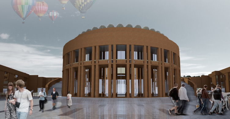
A project of historical and cultural center in Kaliningrad. View of the South Terrace. Project, 2015 © Anatoly Stolyarchuk Architectural Studio


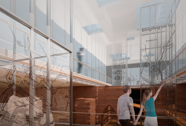
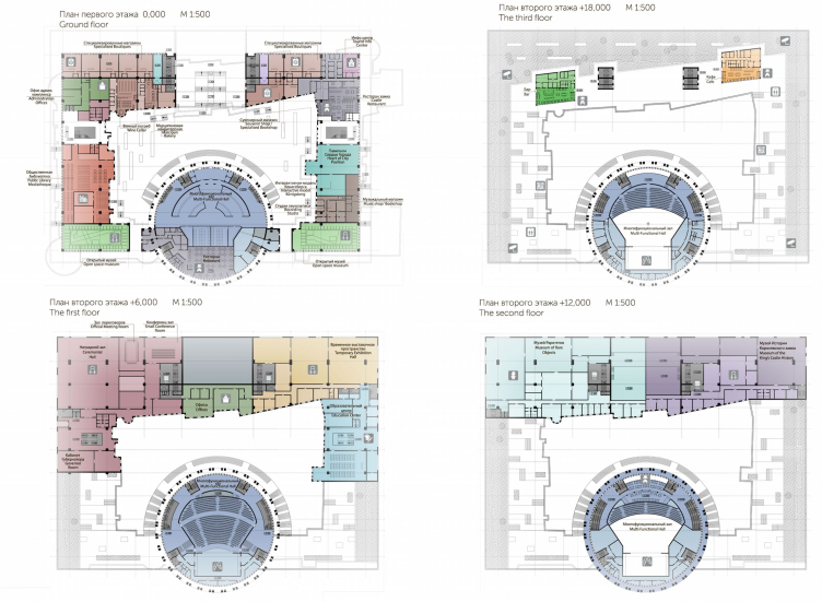
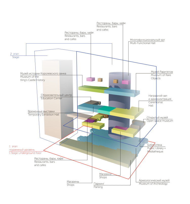
The main entrance to the complex (executed in the form of a broad arch) is located on one of Kaliningrad's key streets - Ulitsa Shevchenko. Entering it, the visitor finds himself in a sunken-in space of the museum lobby, getting immediately involved in the live contact with the artifacts of the Teutonic Order castle. From this point, one can get up to each of the four floors, as well as to the green landscaped roof. Ascending to the "mark zero", the visitor can get inside the "Heart of the City" pavilion, an open-air museum where one can get acquainted with the archeological findings of the castle, as well as get to the tourist information center, souvenir stores, restaurants and cafes. This place also includes the management office of the complex and the municipal hybrid library. All the functional zones have independent entrances either from the outside or from the inside yard. 

A project of historical and cultural center in Kaliningrad. Interior of the museum. Project, 2015 © Anatoly Stolyarchuk Architectural Studio


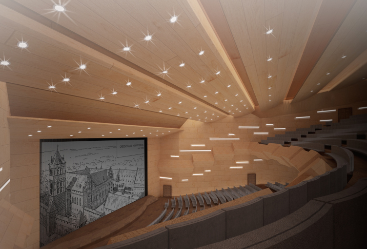
The second floor (+6.000) will be predominantly occupied by the governor's residence. This place will include his office, an official negotiations room, a conference hall, an awarding hall, administrative premises, as well as the educational center and the Museum of the history of the king's castle.

A project of historical and cultural center in Kaliningrad. The inside of the multifuctional hall. Project, 2015 © Anatoly Stolyarchuk Architectural Studio


The third floor (+12.000) hosts the temporary expositions and the Museum of Rarities. The fourth level (+18.000) is in fact a usable roof with restaurants and a public recreation area that includes sightseeing platforms from which "cyberspace" guided tours into the past will be organized. Here the visitors will see a virtual 3D model of the Koenigsberg Castle, recreated by the drawings of the German architect Friedrich Lars - it will be possible to examine this model from various points on the roof by using special optical devices. 

A project of historical and cultural center in Kaliningrad. Project, 2015 © Anatoly Stolyarchuk Architectural Studio


The square-shaped composition, the central "citadel tower", the red-brick colors - all this refers us to a generalized image of a medieval castle. At the same time, because it was decided that the House of Soviets would not be taken down, the "Post-Castle" also got some features of the late-soviet style: the grand monumentality, rigorous symmetry, and austere laconism. Finally, a "friendly contemporary" level stands towering above all this - the green roof turned into a sightseeing platform, the laser shows in the yard, the glass walls and the inserts in the yard pavement that open the remains of the old basements that are now part of the museum exposition. 

This contest project made the top-ten list. It must be said that most of the finalists took the path or more or less accurate recreation of the historical castle. Of course, both of the approaches have the right to exist but, as Nina Landysheva, the chief architect of the project, stressed, the author team is completely unanimous on this point: the studio has been looking for ways to start a dialogue with the past without copying it verbatim.

A project of historical and cultural center in Kaliningrad. Plans of the floors. Project, 2015 © Anatoly Stolyarchuk Architectural Studio


A project of historical and cultural center in Kaliningrad. Plan of functional zones. Project, 2015 © Anatoly Stolyarchuk Architectural Studio


zooming
A project of historical and cultural center in Kaliningrad. Facades. Project, 2015 © Anatoly Stolyarchuk Architectural Studio


zooming
A project of historical and cultural center in Kaliningrad. Facades. Project, 2015 © Anatoly Stolyarchuk Architectural Studio
***
Nursery school on the bank of the Deptford Canal in London

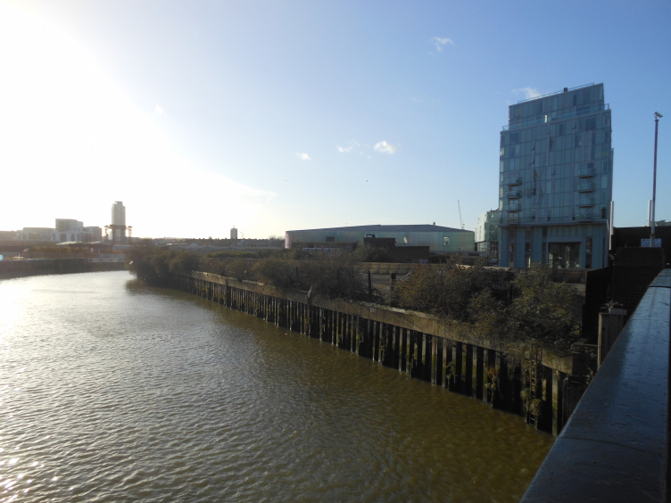
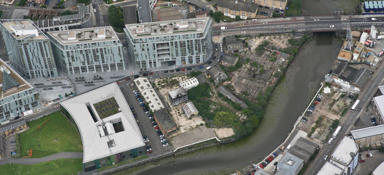
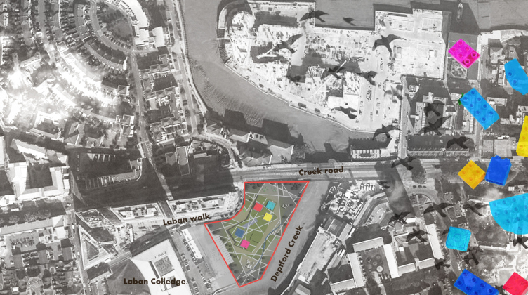
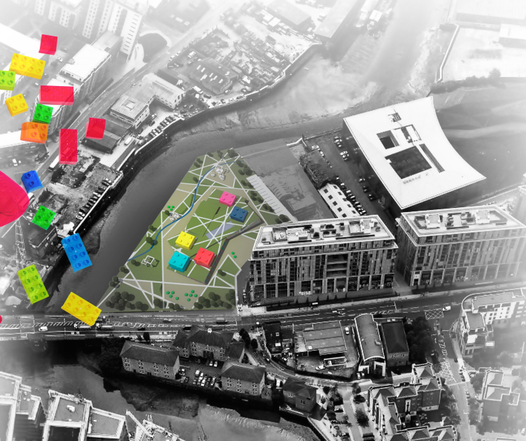
Yet another contest project was developed for a picturesque place in a former industrial park in London. The construction site looks a bit like a cape, bordering on one side on a flyover, and on the other side - on the Deptford Canal. Fragments of high-quality living environment alternate here with wastelands, garages, and squatter parking lots.

Nursery school in London. The current situation. Project, 2015 © 2010-2015 AWR – Architecture Workshop in Rome


Right next to it is the modern apartment complex "Creekside Village" and the dance and music college "Trinity Laban", a work of Herzog & de Meuron that won its authors a Pritzker Prize in 2001. Not far away the Greenwich Park with its famous observatory is situated. This place is an interesting and promising one, related to history but at the same time devoid of any historical architectural context of its own. 

Nursery school in London. The current situation. Project, 2015 © 2010-2015 AWR – Architecture Workshop in Rome


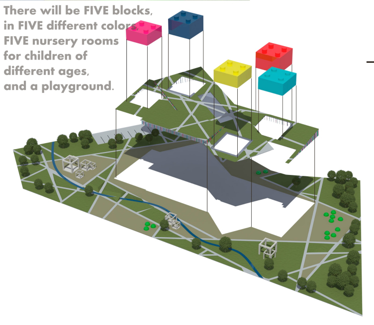
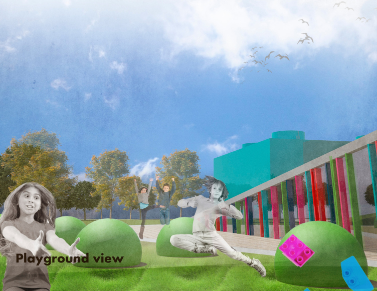
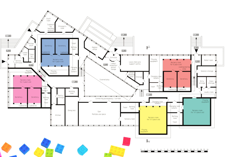
In these conditions, the authors set before themselves a task of tying in the principles of green architecture with their own vision of how a modern playground should look like in a large modern city. As Nina Landysheva shares, the prime vision was that of a bunch of Lego cubes scattered around in the grass. This is how the idea came about of five independent differently colored pavilions with upper-tier lights for the children of all ages to play in. The playground that connects them is cut by straight trails crossing at various angles. But this playground is not just any playground - it is a green roof that covers the zero level of the complex. 

Nursery school in London. Location plan. Project, 2015 © Anatoly Stolyarchuk Architectural Studio


Nursery school in London. Location plan. Project, 2015 © Anatoly Stolyarchuk Architectural Studio


Nursery school in London. The plan of locating the units. Project, 2015 © Anatoly Stolyarchuk Architectural Studio


The latter is in fact a large public zone that includes a lobby, administration offices, a medical service room, a conference hall, bedrooms, and a large multifunctional space of the cafeteria that also includes a kitchen, a laundromat, a storage facility, and a staff room. 

Nursery school in London. View of the playground. Project, 2015 © Anatoly Stolyarchuk Architectural Studio


zooming
Nursery school in London. Open-air park zones. Project, 2015 © Anatoly Stolyarchuk Architectural Studio


Nursery school in London. Plan. Project, 2015 © Anatoly Stolyarchuk Architectural Studio


zooming
Nursery school in London. Section view. Project, 2015 © Anatoly Stolyarchuk Architectural Studio


The large multicolored window of the children's cafeteria commands a fine view of the Deptford Canal. In the very heart of the complex, there is a common-access playroom with a glass roof where kids from all the groups can play together. The main entrance is situated on the side of the college and Laban Walk Road - which also continues the theme of upbringing and education. This project did not get shortlisted as the prize-winning one but it still gave its young authors a European contest experience that we hope will be useful for them in the future. 


15 March 2016

Headlines now
The Golden Crown
The concept for a dental clinic in Yekaterinburg, developed by CNTR Studio, revolves around the idea of a “mouth full of gold”: pristine white porcelain stoneware walls are complemented by matte brass details. To avoid an overly literal interpretation, the architects focused on the building’s proportions, skillfully navigating between sunlight requirements and fire safety regulations.
Flexibility and Integration
Not long ago, we covered the project for the fourth phase of the ÁLIA residential complex, designed by APEX. Now, we’ve been shown different fence concepts they developed to enclose the complex’s private courtyards, incorporating a variety of public functions. We believe that the sheer fact that the complex’s architects were involved in such a detail as fencing speaks volumes.
A Step Forward
The HIDE residential complex represents a major milestone for ADM architects and their leaders Andrey Romanov and Ekaterina Kuznetsova in their quest for a fresh high-rise aesthetic – one that is flexible and layered, capable of bringing vibrancy to mass and silhouette while shaping form. Over recent years, this approach has become ADM’s “signature style”, with the golden HIDE tower playing a pivotal role in its evolution. Here, we delve into the project’s story, explore the details of the complex’s design, and uncover its core essence.
Gold in the Sands
A new office for a transcontinental company specializing in resource extraction and processing has opened in Dubai. Designed by T+T Architects, masters of creating spaces that are contemporary, diverse, flexible, and original, this project exemplifies their expertise. On the executive floor, a massive brass-clad partition dominates, while layered textures of compressed earth create a contextually resonant backdrop.
Layers and Levels of Flight
This project goes way back – Reserve Union won this architectural competition at the end of 2011, and the building was completed in 2018, so it’s practically “archival”. However, despite being relatively unknown, the building can hardly be considered “dated” and remains a prime example of architectural expression, particularly in the headquarters genre. And it’s especially fitting for an aviation company office. In some ways, it resembles the Aeroflot headquarters at Sheremetyevo but with its own unique identity, following the signature style of Vladimir Plotkin. In this article, we take an in-depth look at the United Aircraft Corporation (UAC) headquarters in the Moscow agglomeration town of Zhukovsky, supplemented by recent photographs from Alexey Naroditsky – a shoot that became only recently possible due to the fact that improvements were finally made in the surrounding area.
Light and Shadow
In this article, we delve into the architectural design of the “Chaika” house by DNK ag architects, which was recently completed in 2023 as part of the collection of signature designs at ZILArt. As is well-known, all the buildings in this complex follow a design code, yet each one is distinct. This particular building stands out not only for its whiteness and minimalism but also for the refined use of a limited number of techniques that, together, create what can confidently be called synergy.
Casus Novae
A master plan was developed for a large residential area with a name of “DNS City”, but now that its implementation began, the plan has been arbitrarily reformatted and replaced with something that, while similar on the surface, is actually quite different. This is not the first time such a thing happens, but it’s always frustrating. With permission from the author, we are sharing Maria Elkina’s post.
Treasure Hunting
The GAFA bureau, in collaboration with Tegola and Arkhitail, organized an expedition to the island of Kilpola in Karelia as part of Moskomarkhitektura’s “Open City” festival. There, amidst moss and rocks, the students sought answers to questions like: what is the sacred, where does it dwell, and what sustains it? Assisting the participants in this quest were landscape engineer Evgeny Levin, artist Nicholas Roerich, a moose, and the lack of cellular connection. Here’s how the story unfolded.
Depths of the Earth, Streams of Water
In the Malaya Okhta district, the Akzent building, designed by Stepan Liphart, was constructed. It follows a classic tripartite structure, yet it’s what you might call “hand-drawn”: each façade is unique in its form and details, some of which aren’t immediately noticeable. In this article, we explore the context and, together with the architect, delve into how the form was developed.
Fir Tree Dynamics
The “Airports of Region” holding is planning to build an airport in Karachay-Cherkessia, aiming to make the Arkhyz and Dombay resorts more accessible to travelers. The project that won in an invitation-only competition, submitted by Sergey Nikeshkin’s KPLN, blends natural imagery inspired by the shape of a conifer seed, open-air waiting spaces, majestic large trees, and a green roof elevated on needle-like columns. The result is both nature-inspired and WOW.
​A Brick Shell
In the process of designing a clubhouse situated among pine trees in a prestigious suburban area near Moscow, the architectural firm “A.Len” did the façade design part. The combination of different types of brick and masonry correlates with the volumetric and plastique solutions, further enhanced by the inclusion of wood-painted fragments and metal “glazing”.
Word Forms
ATRIUM architects love ambitious challenges, and for the firm’s thirtieth anniversary, they boldly play a game of words with an exhibition that dives deep into a self-created vocabulary. They immerse their projects – especially art installations – into this glossary, as if plunging into a current of their own. You feel as if you’re flowing through the veins of pure art, immersed in a universe of vertical cities, educational spaces – of which the architects are true masters – and the cultural codes of various locations. But what truly captivates is the bold statement that Vera Butko and Anton Nadtochy make, both through their work and this exhibition: architecture, above all, is art – the art of working with form and space.
Flexibility and Acuteness of Modernity
Luxurious, fluid, large “kokoshniks” and spiral barrel columns, as if made from colorful chewing gum: there seem to be no other mansion like this in Moscow, designed in the “Neo-Russian-Modern” style. And the “Teremok” on Malaya Kaluzhskaya, previously somewhat obscure, has “come alive with new colors” and gained visibility after its restoration for the office of the “architectural ecosystem” as the architects love to call themselves. It’s evident that Julius Borisov and the architects at UNK put their hearts into finding this new office and bringing it up to date. Let’s delve into the paradoxes of this mansion’s history and its plasticity. Spoiler: two versions of modernity meet here, both balancing on the razor’s edge of “what’s current”.
Yuri Vissarionov: “A modular house does not belong to the land”
It belongs to space, or to the air... It turns out that 3D printing is more effective when combined with a modular approach: the house is built in a workshop and then adapted to the site, including on uneven terrain. Yuri Vissarionov shares his latest experience in designing tourist complexes, both in central Russia and in the south. These include houseboats, homes printed from lightweight concrete using a 3D printer, and, of course, frame houses.
​Moscow’s First
“The quality of education largely depends on the quality of the educational environment”. This principle of the last decade has been realized by Sergey Skuratov in the project for the First Moscow Gymnasium on Rostovskaya Embankment in the Khamovniki district. The building seamlessly integrates into the complex urban landscape, responding both to the pedestrian flow of the city and the quiet alleyways. It skillfully takes advantage of the height differences and aligns with modern trends in educational space design. Let’s take a closer look.
Looking at the Water
The site of Villa Sonata stretches from the road to the water’s edge, offering its own shoreline, pier, and a picturesque river panorama. To reveal these sweeping views, Roman Leonidov “cut” the façade diagonally parallel to the river, thus getting two main axes for the house and, consequently, “two heads”. The internal core – two double-height spaces, a living room and a conservatory, with a “bridge” above them – makes the house both “transparent” and filled with light.
The White Wing
Well, it’s not exactly white. It’s more of a beige, white-stone structure that plays with the color of limestone – smoother surfaces are lighter, while rougher ones are darker. This wing unites various elements: it absorbs and interprets the surrounding themes. It responds to everything, yet maintains a cohesive expression – a challenging task! – while also incorporating recognizable features of its own, such as the dynamic cuts at the bottom, top, and middle.
Urban Dunes
The XSA Ramps team designed and built a three-part sports hub for a park in Rostov-on-Don, welcoming people of all ages and fitness levels. The skate plaza, pump track, and playground are all meticulously crafted with details that attract a diverse range of visitors. The technical execution of the shapes and slopes transforms this space into a kind of sculptural composition.
Proportional Growth
The project for the fourth phase of the ÁLIA residential area has been announced. The buildings are situated on an elongated plot – almost a “ray” that shoots out from the center of the area towards the river. Their layout reflects both a response to Moscow’s architectural preferences over the past 15 years, shifting “from blocks to towers”, and an interpretation of the neighboring business park designed by SOM. Additionally, the best apartments here are not located at the very top but closer to the middle, forming a glowing “waistline”.
The “Staircase” Building
In designing the “Details” residential complex in New Moscow, Rais Baishev spiced up the now-popular Moscow theme of a “courtyard” building with an idea drawn from the surrealist drawings by Maurits Escher. He envisioned the stepped silhouettes and descending slopes as a metaphysical mega-staircase, creating a key void within the courtyard that gave the project an internal “spine”. This concept is felt both in the building’s silhouette and on its façades.
Projection of the Quarter
No one doubted that the building that Vladimir Plotkin designed as part of the “Garden Quarters” would be the most modernist of all. And it turned out just that way: while adhering to the common design code, the building successfully combines brick and white stone, rhythmically responding to the neighboring building designed by Ostozhenka, yet tactfully and persistently making a few statements of its own. This includes the projection of the ideal urban development composition “14–9–6”, which can be found right next door, mathematical calculations, including those for various types of terraces (and perhaps the only reminder of the Soviet past of the Kauchuk rubber factory!), and the white “cross-stitch” pattern of the façade grid.
Domus Aurea
In this issue, we examine the “Tessinsky-1” house, designed by Sergey Skuratov and completed in 2023. Located in the middle of the Serebryanicheskaya Embankment district, at the intersection of its main streets, this house assumes a sort of “nodal” role: it not only responds to everything around it and preserves many memories of the former EMA factory within itself, but it weaves all this into a newly directed pattern, reconciling bright “gold” and dark-colored brick, largely with the help of the new, modern-yet-archaic Columba brick, which, come to think about it, is the most precious element here.
The Chimney of Nikola-Lenivets
In this issue, we are examining the “Obelisk House” designed by KATARSIS and built for the Arkhstoyanie 2023 festival. However, it was only finished later on, and this is why we are examining it now. It seems to us that after the “Obelisk House” appeared in Nikola-Lenivets, a dialogue and a few inner connections appeared between the temporary structures built here. These houses no longer look like “accidental neighbors”, more of which below.
​Periscope by the Bay
The jury awarded the second place in the competition for a public and cultural center in Petropavlovsk-Kamchatsky to the companies GORA (“Mountain”) and M4. In the consortium’s proposal, the building resembles a sperm whale with a calf swimming next to it or a periscope, whose lenses capture the most spectacular views from the surrounding landscape.
From Arcs to Dolmens
While working on the competition project for Petropavlovsk-Kamchatsky, ASADOV Architects prioritized the value of the natural and urban environment, aiming to preserve the balance of the location while minimizing the resemblance of the volume that they designed to a “traditional building”. The task was challenging, and the architects created three versions, one of which having been developed after the competition, where their main proposal took third place. However, the point of interest here is not the competition result but the continuity of creative thinking.
Hide and Seek
The ID Moskovskiy house, designed by Stepan Liphart in St. Petersburg, in the courtyards near Moskovskiy Avenue beyond the Obvodny Canal and recently completed, is notable for several reasons. Firstly, it has been realized with considerable accuracy, which is particularly significant as this is the first building where the architect was responsible not only for the facades but also for the layouts, allowing for better integration between the two. On the other hand, this building is interesting as an example of the “germination” of new architecture in the city: it draws on the best examples from the neighborhood and becomes an improved and developed sum of ideas found by the architect in the surrounding context.
The Big Twelve
Yesterday, the winners of the Moscow Mayor’s Architecture Award were announced and honored. Let’s take a look at what was awarded and, in some cases, even critique this esteemed award. After all, there is always room for improvement, right?
Above the Golden Horn
The residential complex “Philosophy” designed by T+T architects in Vladivostok, is one of the new projects in the “Golubinaya Pad” area, changing its development philosophy (pun intended) from single houses to a comprehensive approach. The buildings are organized along public streets, varying in height and format, with one house even executed in gallery typology, featuring a cantilever leaning on an art object.
Nuanced Alternative
How can you rhyme a square and space? Easily! But to do so, you need to rhyme everything you can possibly think of: weave everything together, like in a tensegrity structure, and find your own optics too. The new exhibition at GES-2 does just that, offering its visitor a new perspective on the history of art spanning 150 years, infused with the hope for endless multiplicity of worlds and art histories. Read on to see how this is achieved and how the exhibition design by Evgeny Ace contributes to it.
Blinds for Ice
An ice arena has been constructed in Domodedovo based on a project by Yuri Vissarionov Architects. To prevent the long façade, a technical requirement for winter sports facilities, from appearing monotonous, the architects proposed the use of suspended structures with multidirectional slats. This design protects the ice from direct sunlight while giving the wall texture and detail.