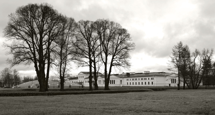
The Mikhailovka Estate (or "Mikhailovskaya Dacha") that got its name from the emperor Nicolas the First's fourth son Mikhail, is located between the tourist site of Peterhof and the governmental Strelnaya. Since the days of Peter the Great, its territory has been occupied - sometimes consecutively, sometimes simultaneously - by the various residences of people established near the royal family: from Menshikov to the Razumovsky brothers, until in the mid XIX century the architects Stackenschneider, Charlemagne, and Bosse turned this place into a rather large and intricate, as was the fashion those days, country residence of the Great Prince. In the XX century, the building had a streak of bad luck - few people considered the architecture of the period of eclecticism to be of any value, and the building housed first a school for delinquent children, then a poultry farm, and, finally, a health and recreation center of Saint Petersburg's Kirovsky Plant; while the two former owners would first "rob the palaces" and then simply leave them to fall apart, the recreation center started by rebuilding the complex, and in the 1960's its buildings underwent the most significant changes. In the 1990's, the ensemble got neglected, and in 2003, together with Strelnaya, it went over to the competence of a management company that in 2006 handed Mikhailovka over to Saint Petersburg University, the latter using it to house its Higher School of Management.
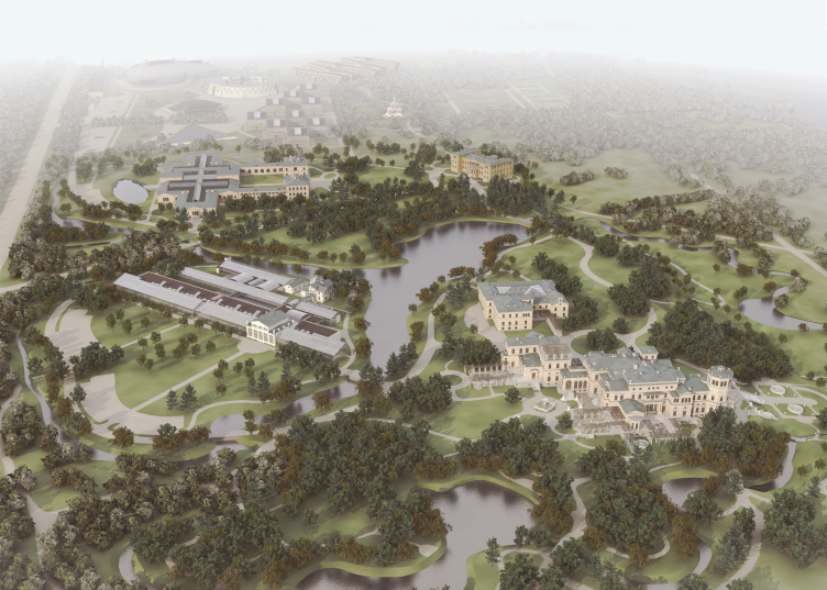
Headed by Nikita Yavein, Studio 44 developed a grand-scale project of turning the considerably battered-up facilities of the prince's dacha into an elite management school by the year of 2010. We have already covered this project: it proposed restoring and remodeling six buildings of the estate in the eastern part of its territory, and building new ones in the western part that historically belongs not to Mikhailovskaya Dacha but to the village of Korkuli and a few other settlements. Presently, two important parts of work have been completed: the company has completely reconstructed and put into operation the Main Educational Facility situated in Mikhailovka's largest historical building (this being not the palace itself but the horse stalls). Also, the student cafe/club has been built. Dormitories for bachelors and postgraduate students are also under construction now; meanwhile, the management school is already operating in the new premises, takes in the students enrolling for the MBA programs; the buildings are functioning, and there are lots of things to share about.
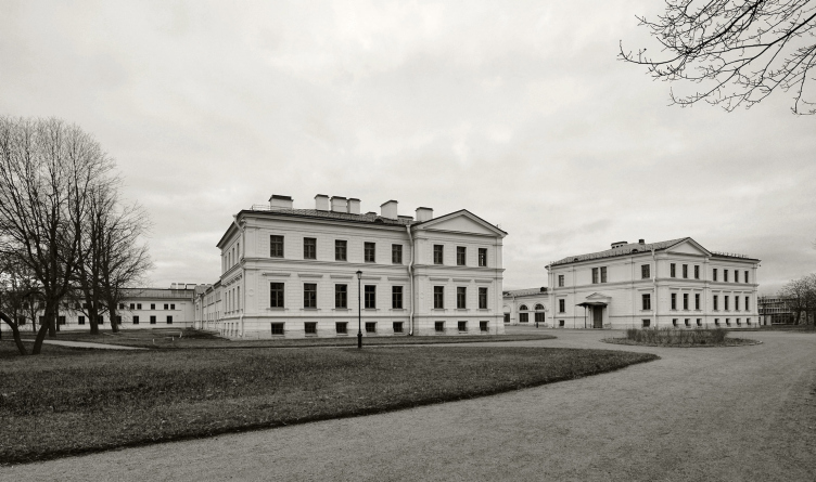
Let us start with the reconstruction of the Livery that became the main educational facility. This spacious building was built later than the palace of the Great Prince, in 1859-1861, by the prolific architect Gerald Bosse in the spirit of reserved neo renaissance. The stalls, the carriage shed, the bathhouse, and other usable premises no more than two stories high were all grouped into elongated units and arranged in a symmetrical, even pristine, way that consisted in dividing the rectangles into equal parts placed around five courtyards. The large northern yard opens up in the direction of the Finnish Gulf, its entrance flanked by two respectable-looking units with triangular frontons. The southern half was divided into two minor courtyards closed by a unit stretching along the central axis, while from the outer side of the major rectangle it was adjoined by two identical yards, also "semi-open", meaning, with outside entrances - the bathhouse yard and the smithery yard. During the time when this place used to be a health resort, these two yards got two large two-story volumes - the public functions hall and the cafeteria, both of these later-on additions being designed in the style of the historical building by what Nikita Yavein called a "method of mechanical addition while observing stylistic semblance".
For Studio 44, the task of transforming the complex simultaneously clearing it from later-on additions is anything but new - the portfolio of Nikita Yavein bureau has in it a whole range of large-scale reconstruction projects with different degrees of renewal that allowed the architect to develop his own approach and even his own recognizable trademark style that is also to be clearly seen in Mikhailovka.
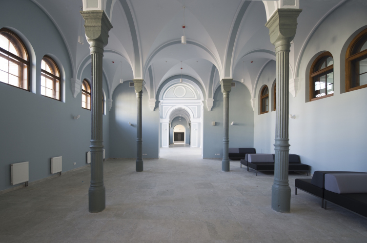
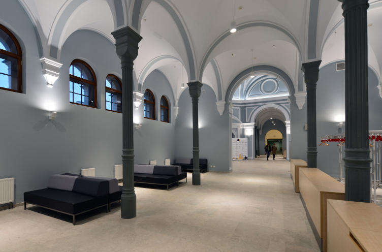
First of all, the architects removed the redundant towering elements of the soviet additions that even the conservation activists recognized as being dissonant, thus giving the livery complex the original "prostrate" silhouette. After that, they carefully planned and performed the restoration of all the surviving elements of the XIX century - the stuccoed rockface façades, fielded panels and stone detailing, and the elements of interior, out of which particularly good are the halls with cast-iron pillars: two of them are situated on either side of the octagon of the entrance lobby, and three - in the southern part of the building, closer to the Saint Petersburg Highway. The slim, exquisitely fluted columns with cubic column caps remind at once of the industrial architecture of this city of the period when Mikhailovka was being built and - quite unexpectedly - the late Byzantine "four-upright" temples (by the standard of our times, this comparison sound a bit on the daring side but it was in fact the strong point of architecture of the XIX century: wherever possible it referred to the elevated prototypes of the past, and one cannot rule out the possibility that Bosse also thought about one of such prototypes directly or indirectly). The upright columns inside echo the impressive open work grille of the stained glass of the entrance arch of the central axial building.
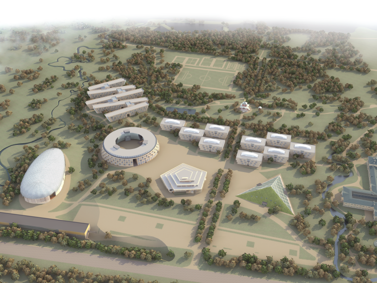
The campus of the Higher Management School of Saint Petersburg State University. Axonometry. Reconstruction zone © Studio 44
The main building of the Higher Management School of Saint Petersburg State University. Restoration and adjustment, 2014. Photo © Margarita Yavein, Tatyana Strekalova
The campus of the Higher Management School of Saint Petersburg State University. Axonometry. The stalls. Facade. Restoration and adjustment, 2014 © Studio 44
The main building of the Higher Management School of Saint Petersburg State University. Restoration and adjustment, 2014. Photo © Margarita Yavein, Tatyana Strekalova
The architects simply could not limit themselves with the operation of clearance and restoration: the school of management required extra space. For this reason, after they were done with the soviet-time additions, the architects of Studio 44 threw roofs on four yards out of five including these yards into the volume of the warm school building whose usable space - no question about that - has considerably grown in comparison with the historical stalls. It is only the northern yard that was left open - it made a great "court of honor" of an almost regal aspect turned in the direction of the Finnish Gulf: it is here that the main entrance to the building is situated. On this side, the inclusions are but minimal, and it is all mostly about restoration: a person that comes in through the grand entrance is met by the original building set back to order. The habitable cells along the perimeter of the yard are occupied by the teachers' recreation rooms.
The main building of the Higher Management School of Saint Petersburg State University. Restoration and adjustment, 2014. Photo © Margarita Yavein, Tatyana Strekalova
The main building of the Higher Management School of Saint Petersburg State University. Restoration and adjustment, 2014. Photo © Margarita Yavein, Tatyana Strekalova
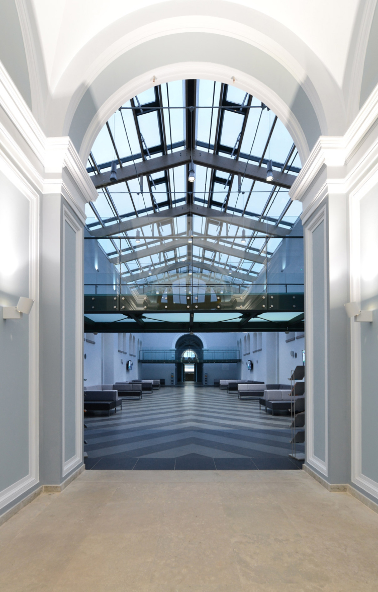
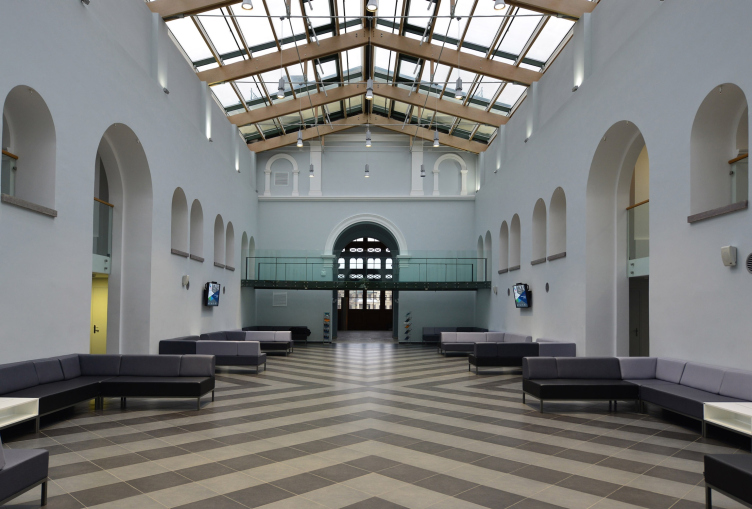
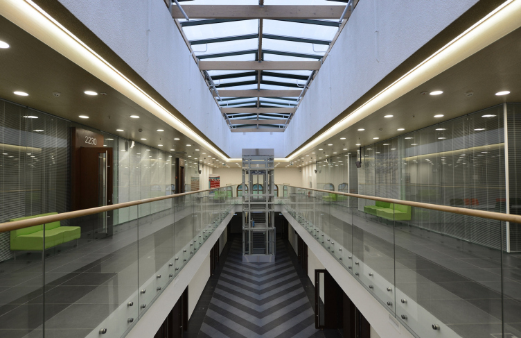
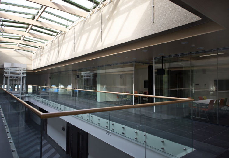
The whole inside reconstruction work was based on a few fundamentals. The planning makes perfect sense; the classes are grouped around the atriums lit by the ambient light. The central axial unit got a glass roof, its elongated inside space turning into an atrium as well - here we see a curious paradox because historically it never was a yard but this is exactly the impression that an entering person gets: what he sees is a courtyard covered with a glass roof, supported by an array of mullioned windows on the sides. This light hall with a pitched ceiling completely made of glass plays the role of the distribution nucleus and the public center of the school building. It must be said at this point that the "cloister" effect is very important here because it endows the school with a distant but still discernible resemblance to a European university for which such a courtyard is the indispensable part of its image. It is remarkable how Nikita Yavein was able to see and develop this "Hogwarts" theme in the pragmatic building of the horse stalls - but he ultimately was, and the idea turned out to be quite a success.
The main building of the Higher Management School of Saint Petersburg State University. Restoration and adjustment, 2014. Photo © Margarita Yavein, Tatyana Strekalova
The main building of the Higher Management School of Saint Petersburg State University. Restoration and adjustment, 2014. Photo © Margarita Yavein, Tatyana Strekalova
It must be noted that Nikita Yavein has a gift for taking the building that he reconstructs and finding in it new meanings that overlap with the old ones, thus transforming the building into something that it wasn't without having to give up what it was: once upon a time, Gregory Revzin wrote that the architect was actually able to take the renovated building of Promstroibank and place a Roman aqueduct inside of it. A more recent example is the perspective enfilade that "Studio 44" discovered inside the eastern wing of the Hermitage's Joint Staff building that the company was reconstructing.
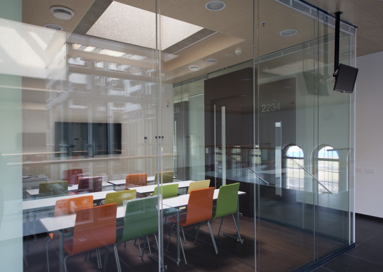
The two southern closed yards (the ones that used to be open) are housing three mid-sized auditoriums (these are for the bachelors) without losing the daylight: along the axis of each volume, between the auditoriums, there is a glass roof (also pitched) that provides light for the space the above the staircases - a small elongated atrium stretching at 90 degrees to the main axis. A similar design approach is applied to the atriums in the outside lateral yards (the ones where the cafeteria and the resort's public events hall were taken apart), only here these yards connect/separate auditoriums of a smaller size, ones with glass walls and looking more like meeting rooms; this is the place where MIB and MBA students will study.
The main building of the Higher Management School of Saint Petersburg State University. Restoration and adjustment, 2014. Photo © Margarita Yavein, Tatyana Strekalova
The main building of the Higher Management School of Saint Petersburg State University. Restoration and adjustment, 2014. Photo © Margarita Yavein, Tatyana Strekalova
The main building of the Higher Management School of Saint Petersburg State University. Restoration and adjustment, 2014. Photo © Margarita Yavein, Tatyana Strekalova
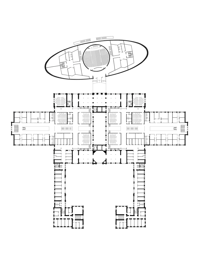
The campus of the Higher Management School of Saint Petersburg State University. Axonometry. The stalls. Plan. Reconstruction, 2014 © Studio 44
Yet another peculiarly of Nikita's approach: all his inclusions look ostentatiously modern and they enter into a dialogue with the elements of the historical building - no, he does not do this everywhere based on contrastive comparison but everywhere on the modernist principles of transparency, reflection, and large laconic forms.
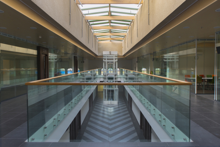
Besides, in the spaces between the atriums - the transitions between the inner and outer ones - the elements of "interior coziness" neighbor on the façades that used to be outside but have now found themselves inside - such a combination possessed the traits of respectability of a palace lobby where you have sort of entered some place that's already under a roof, yet the magnitude of the edifice does not let you feel quite indoors. You get similar feelings in the lobby of Saint Petersburg's Admiralty with its interior rockface decoration or on the grand staircase of the Grand Kremlin Palace. In this particular case, in the school's atriums it is dictated not only by the author's vision but also by the circumstances of the reconstruction when the outside facade becomes part of the interior of the atrium.
The main building of the Higher Management School of Saint Petersburg State University. Restoration and adjustment, 2014. Photo © Margarita Yavein, Tatyana Strekalova
The main building of the Higher Management School of Saint Petersburg State University. Restoration and adjustment, 2014. Photo © Margarita Yavein, Tatyana Strekalova
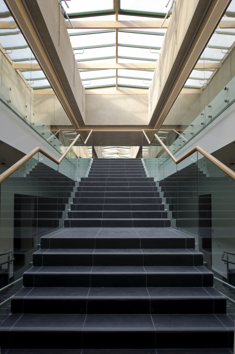
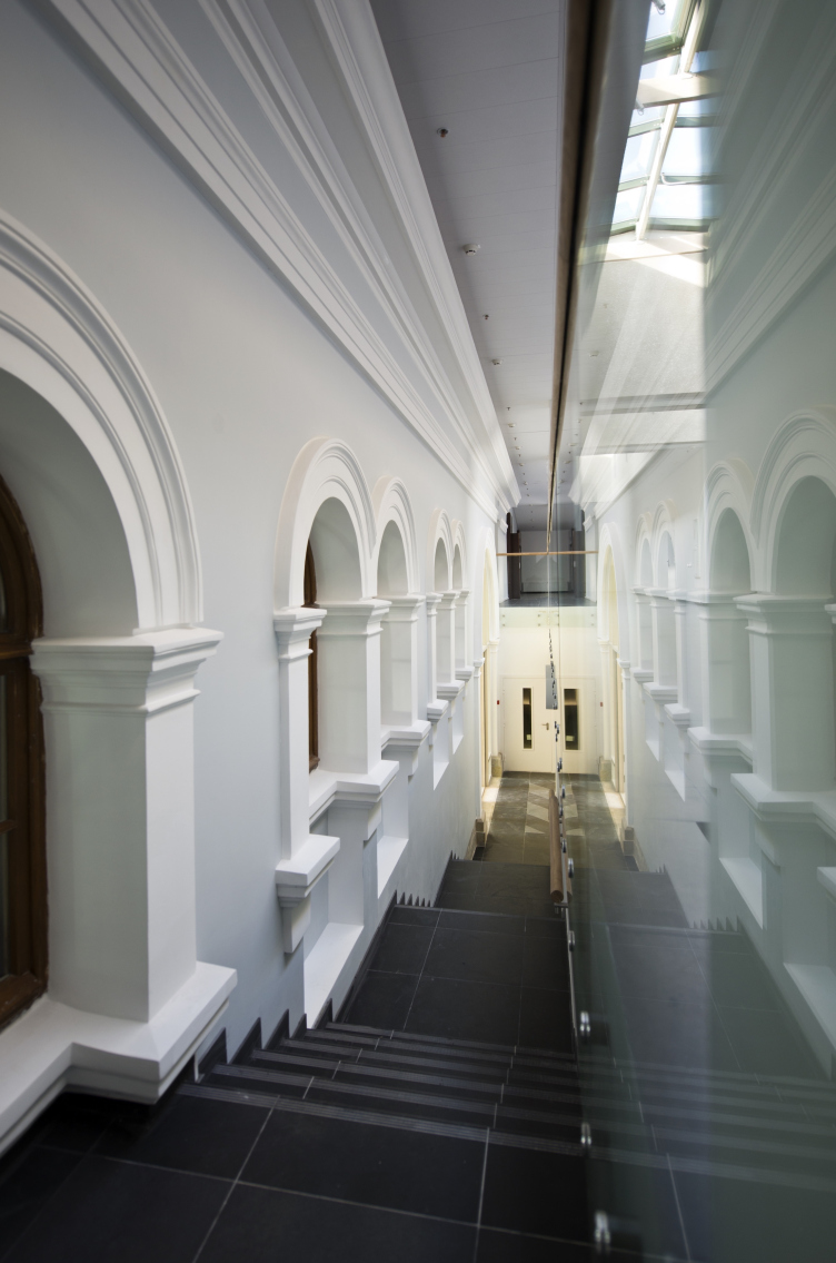
The immanent contrasts of the transition zone are highlighted: the representatives properties (that make the person who enters the complex inwardly collect himself) are enhanced not only by the decor of the yesterday's facade walls and the double-height magnitude but also by the open extended staircases, and particularly - by their black color. The floors on the upper tiers of the atriums are pitch-black, while the floors of the first floors are dissected by a large gray-black zigzag pattern. The latter is, of course, not the classic checkered pattern but it still immediately puts you in the mind of the classic Ge painting that shows Peter the Great interrogating his son.
The effect is maximized by the cool transparent green glass reflecting the details. On the long staircases standing along the walls of the southern building where on the one side there is a Gerald Bosse façade, and on the other side - an auditorium wall covered up by structured glass, the architects were able if not to duplicate this reflection (let's be honest here, this is an impossible thing to do), then at least to psychologically push the limits of the narrow space.
The main building of the Higher Management School of Saint Petersburg State University. Restoration and adjustment, 2014. Photo © Margarita Yavein, Tatyana Strekalova
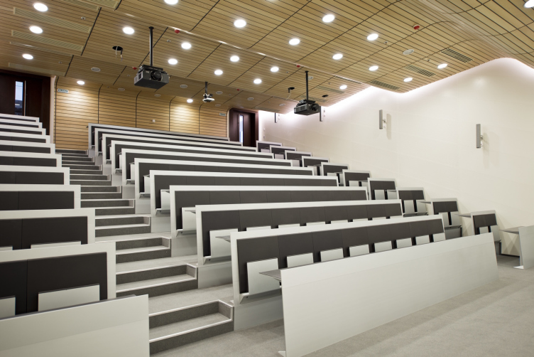
This "representative seriousness" of the atriums is quite appropriate here - if anything, this a place where people get trained for MBA - gets offset by the techniques that are reassuring to the human eye: the abundance of wood, from the roof beams to the railings of the glass balustrades; the light-colored gray-white paint on the walls, this paint being of the special interior type, different from the plaster simulating pale paint used on the outside. Meanwhile, in the rooms that are unquestionably "interior" - the auditoriums, for example - this "cold" geometry steps aside to give way to the techniques that are more modern and relaxed: suffice it to mention the wave-shaped ceiling made of wooden plaques above the contrasting black-and-white rows of seats.
The main building of the Higher Management School of Saint Petersburg State University. Restoration and adjustment, 2014. Photo © Margarita Yavein, Tatyana Strekalova
Thus, the reconstruction looks rather bold and large-scale: the architects made the building over by changing its function and volume and adding a lot of new details to it. The feelings that will overcome a person entering this building will hardly let him guess, unassisted and without a clue, that the complex actually used to be in fact horse stalls - such a mental leap will not be possible for just any visitor. A lot of things have been revived and restored but, at the same time, a lot of new things have been introduced - the building changed to become something completely different than what it used to be. The resulting complex pays not that much homage to the old Livery that once was here; nobody "doted" on the monument, although nobody was trying to deliberately defeat it. This is a common issue with reconstructions: if we expect from them nothing but conservation, we are in for a serious disenchantment. No, folks - the resulting building is the new growing from the old.
If we are to speak with exactitude, here we see a perfect balance of three constituent parts. Everything that could be fixed - the walls and their decor on the inside and outside (wherever it survived) the cast-iron columns and the cast-iron grille of the arch stained glass - the architects did fix. This is the authentic historical part of the building; it constitutes as much as half of the complex, and it is (now) in a great condition. What is important is the fact that after the ten years of neglect the former livery was almost a ruin. The second part is all about the new things; these are numerous because four yards have been roofed to become in fact parts of the building while the middle building became an atrium; the structure of the building radically changed, and not only the structure but also the very impression that the interior produces, now filled with the texture of the modern things - cool, transparent, and metallic. Even the wood here is not the way that the XIX century saw it. The third part is about the silhouette and proportions. They are both new and old: due to the fact that the architects took apart the units built in the sixties, the complex returned to its original "prostrate" condition, and, besides, the roofs did not get any extra "lofts" - they are still of the gable type, even if made of glass here and there. There is also the restoration of the silhouette that did not, however, prevent the architects from adding quite a lot of useful floor space. All the three constituents - the old, the new, and the "dictatorship" of compositional justice that made the architects remove the dissonant buildings - fall in together, and this is what the idea of reconstruction is all about - because now the building has been revised and transformed to live a different life now.
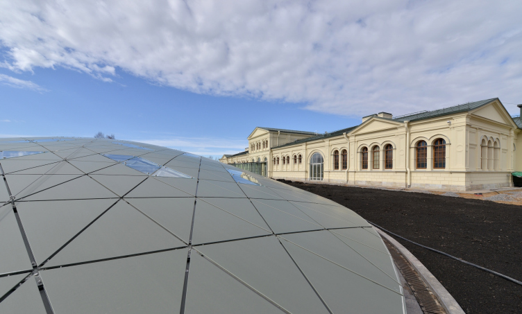
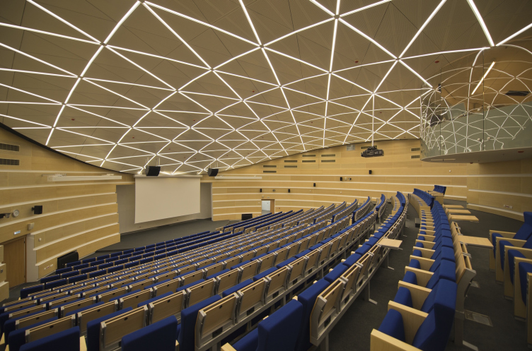
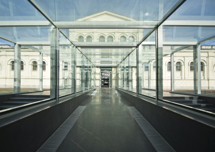
The largest element of the modern part of the reconstruction "grows" on the outside, beyond the contours of the historical building, between the southern part of the former stalls and the Saint Petersburg highway. This a large 450-seat conference hall for which there was just no room in the historical building. Its pointed oval volume, with more than a half of it sunken into the ground, is topped with a simplified dome covered from the outside with triangles of geodesic appearance. It has been carried over twenty meters to the south, and placed deliberately at a slight angle as if to offset the rigid planning of the main complex, and is connected to the latter with an overpass completely made of glass. The whole picture produces 100% impression of a flying saucer that has space-linked to the orbital station of the instruction building. This volume is totally and unreservedly alien to the neo-renaissance historicism of Bosse, of which it makes no secret, even though it makes an attempt to partially hide underground "shrinking its head into its shoulders. The interior of the conference hall matches its outside look: the decorative panels on the ceiling are just as triangular as the outside cover of the dome, working to create a single image which is enhanced by the grid of strips of light reflected in the mirror metal of the VIP balcony. Meanwhile, as far as the conference hall itself is concerned, it turns out that it does not occupy the entire space under the dome at all - the lateral parts of the oval house the IT services and the computer classes.
The main building of the Higher Management School of Saint Petersburg State University. Restoration and adjustment, 2014. Photo © Margarita Yavein, Tatyana Strekalova
The main building of the Higher Management School of Saint Petersburg State University. Restoration and adjustment, 2014. Photo © Margarita Yavein, Tatyana Strekalova
The main building of the Higher Management School of Saint Petersburg State University. Complete building, 2014. Photo © Margarita Yavein, Tatyana Strekalova
The campus of the Higher Management School of Saint Petersburg State University. Axonometry. The stalls. Section view. Reconstruction, 2014 © Studio 44
The campus of the Higher Management School of Saint Petersburg State University. Axonometry. The stalls. Section view. Reconstruction, 2014 © Studio 44
The accentuated difference between the historical complex of the main educational building and the "flying saucer" of its conference hall became the nucleus of the entire concept of the campus of this management school as a whole. The tension of the contrast manifests itself here the strongest because the historical and the modern buildings stand literally next to each other. But, curiously, they still look like they are a perfect match. One of the buildings designed in the western part of the campus - the cafe/club - has already been completed and launched into operation. It deserves a special article which we will be sure to do a little bit later.
The campus of the Higher Management School of Saint Petersburg State University. Axonometry. Reconstruction zone © Studio 44


