По-русски

Nikita Yavein: "At WAF, our projects were accepted with interest".

The winner of two nominations at WAF-2015 speaks about the right way of showcasing your projects to an international award judging panel, what this international contest is all about and why it is worth taking part in.

18 November 2015
Interview
mainImg

- Nikita, my congratulations! If I am not mistaken, your works became Russia's first projects to be ever shortlisted as the winners of WAF nominations. What are your impressions? How did it all work out for you? 

My impressions are great, we got a very warm reception. A lot of things were going on simultaneously there, people would go around with the schedule slips marking just which events they wanted to visit, choosing, say, between a Jencks or Cooke lecture or one of a dozen project presentations. So, ultimately, people got interested in us; our first showcase of Kaliningrad was visited by about ten people, then our Hermitage project drew a little over fifty, and, when we were showcasing our school, the room was already filled to capacity. At our last showcase in the major hall, eight hundred or so people turned up.

It was not me who did our presentations - it was the young architects of our company who contributed to these projects and whose English is excellent. I guess we would have gotten shortlisted even last year had I known English better but I have a great command of French, and, this contest being organized by the British, French is of little use there. The official language of the conference is English, the presenter speaks fast, and you have to react and answer quickly, you must be prepared to do that. A lot of presentations were stopped at the 20-minute limit but, as I say, we were received with interest, and our Kaliningrad showcase went on for 25 minutes or so; we were asked a lot of questions.

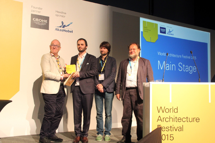
Nikita Yavein and his colleagues from "Studio 44" are being awarded the WAF prize. Photo courtesy by "Studio 44"
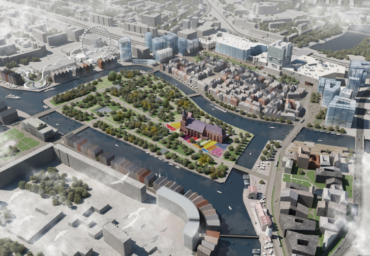
Concept of the developing the downtown area of Kaliningrad (Russia). "Studio 44". © Architectural bureau "Studio 44" and Institute of Territorial Development of Saint Petersburg.


And, besides, last year we presented the Sochi Olympics Central Railway Station - it was right about the time of the Ukrainian crisis, and politics got in the way. 

- As far as the Kaliningrad master plan is concerned, were you well ahead of your competition in the nomination

It was clear from the start that we were winning with Kaliningrad, the project made it in flying colors. Our project was accepted at once and our approach was also understood: it is not about recreating the old buildings and it is not about building new ones from scratch either - it is about one merging with the other in a smart way. The judging panel was also impressed by the diversity of the types of urban planning that we proposed within the framework of the master plan. But then again, I am not sure - if it hadn't been for Altstadt, we might have not won the master plan nomination at WAF. 

We had some serious competition there: there was this master plan Battersea Power Station in London by Rafael Vinoli - a high-profile project, these guys were pretty sure of their victory because, I mean, come on, let's be real, it is a British contest, it is the British that set its vectors of development, and, of course, they are interested in their countrymen winning. And, when the questions were asked, they did try to catch us off-guard. This method was quite unexpected for us. 

- And how is the Kaliningrad master plan getting along now? 

The local architects made a sketch there, some sort of a cross between our proposal and the French project done by the company Devillers et Associés that took the second place. As for Altstadt, it retains our main points; in other areas of the city the project is closer to the French master plan with the city broken into little residential quadrants. There was yet another contest for the castle - we seem to be getting some work there. But everything is in a state of suspended animation because of the lack of finance. The municipality of Kaliningrad counted on some sort of federal subsidies as they do not have their own funds to do that: the crisis is doing things to the city's economy that is generally based on export and import. 

- Boris Eifmann Academy of Dance also won in the nomination of schools - how was it received at the presentation? 

We were not so sure of it as we were of the master plan but the school building project won it by the sum total of its features. Besides, we showcased it just right, with a small video that allowed people to see how everything operated; we approached that project rather seriously. Judging by how everyone woke up and got interested we realized that we could indeed win, and then we were almost sure of it. And this, considering the fact that the nominee list included Brentwood Academy that got a Stirling Prize this year. 

- And did you show your Dance Academy to the judging panel? 

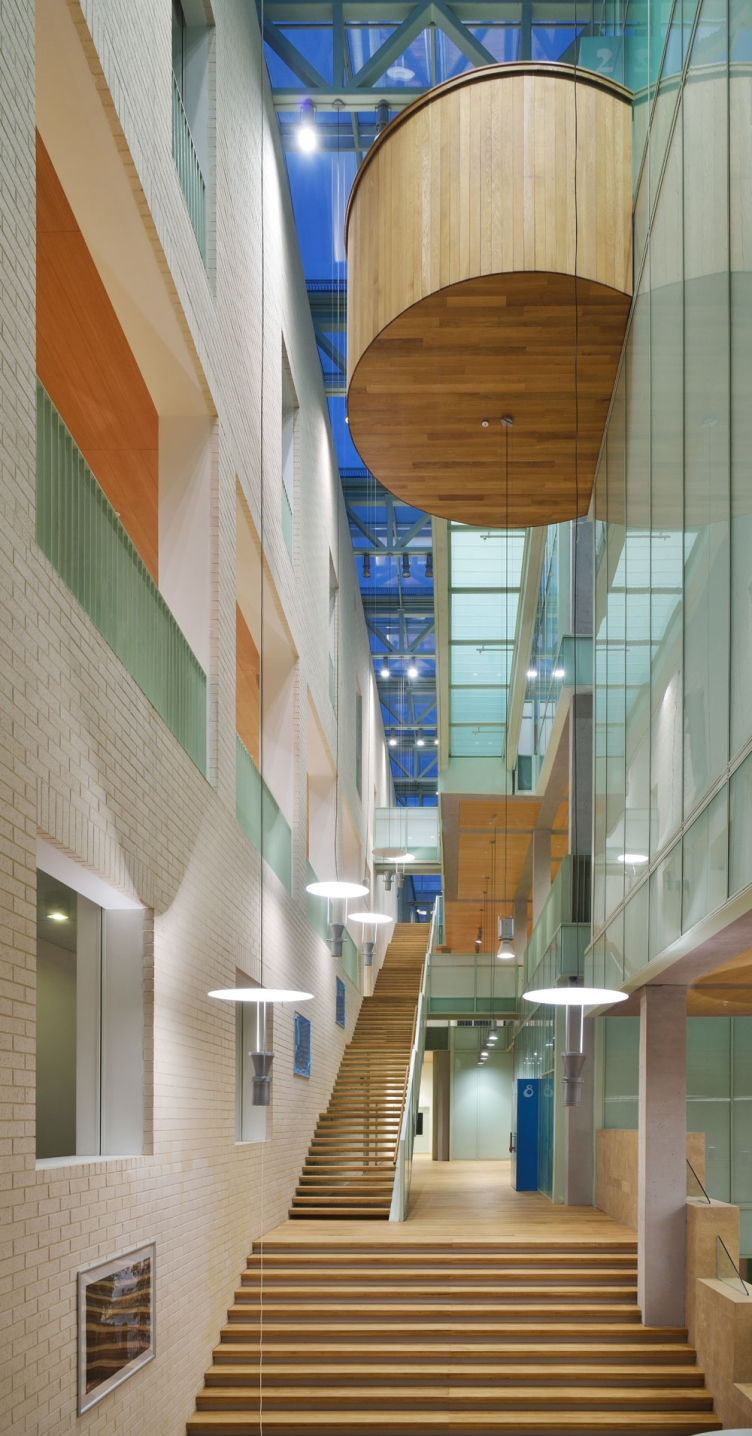
We spoke about the idea of the vertical yard. Regular schools have a yard for the children to troop out to during the recess. And, in our project, this vertical yard is a space for dancing, recreation, and lots of other things. This is like a soup with a lot of meat in it. That space is very saturated, a lot of objects are suspended in it, the ballet classes, first of all. And children run around there too... We made a movie about it to show that this vertical connection is something that really works, even better than the "traditional" horizontal one.

And, secondly, the ballet halls are ruled by an atmosphere of detachment. These halls are like a theater of shadows; a space that is totally isolated joins the absolutely open vertical cloister. And you go from one space to the other through a portal, like through some sort of gateway. We deliberately tried to highlight this feature of the building at our WAF presentation. 

Boris Eifman Dance Academy © Studio 44


Generally, the overall level of this event is very high - the level of the projects submitted, as well as the level of the major and minor judging panels. Although I would say that in "Culture" nomination the judging board was somewhat strange...

- Was that the judging panel that judged the culture monuments where you showcased your restoration of the Joint Staff that you did for the new wing of the Hermitage

I think that our Hermitage project was the strongest project in its nomination; it could even stand up to fighting for the Grand Prix but, first of all, it is not quite a "festival-type" project - it is too complex, too integrated, and too sophisticated for a festival. And, second of all, we had a bit of bad luck with the judging panel - there were almost no architects on it. True, there was the editor-in-chief of "Architectural Review" but somebody else was on sick leave, and somebody else came to sit in for them. Either they did not quite understand us or maybe we were unable to get our point across. In the nomination of cultural institutions there was very little competition, I would even say. The winning project - Soma City "home for everyone" took the first place thanks to its social value, compassion for the homeless, and not because of its architectural merits. 

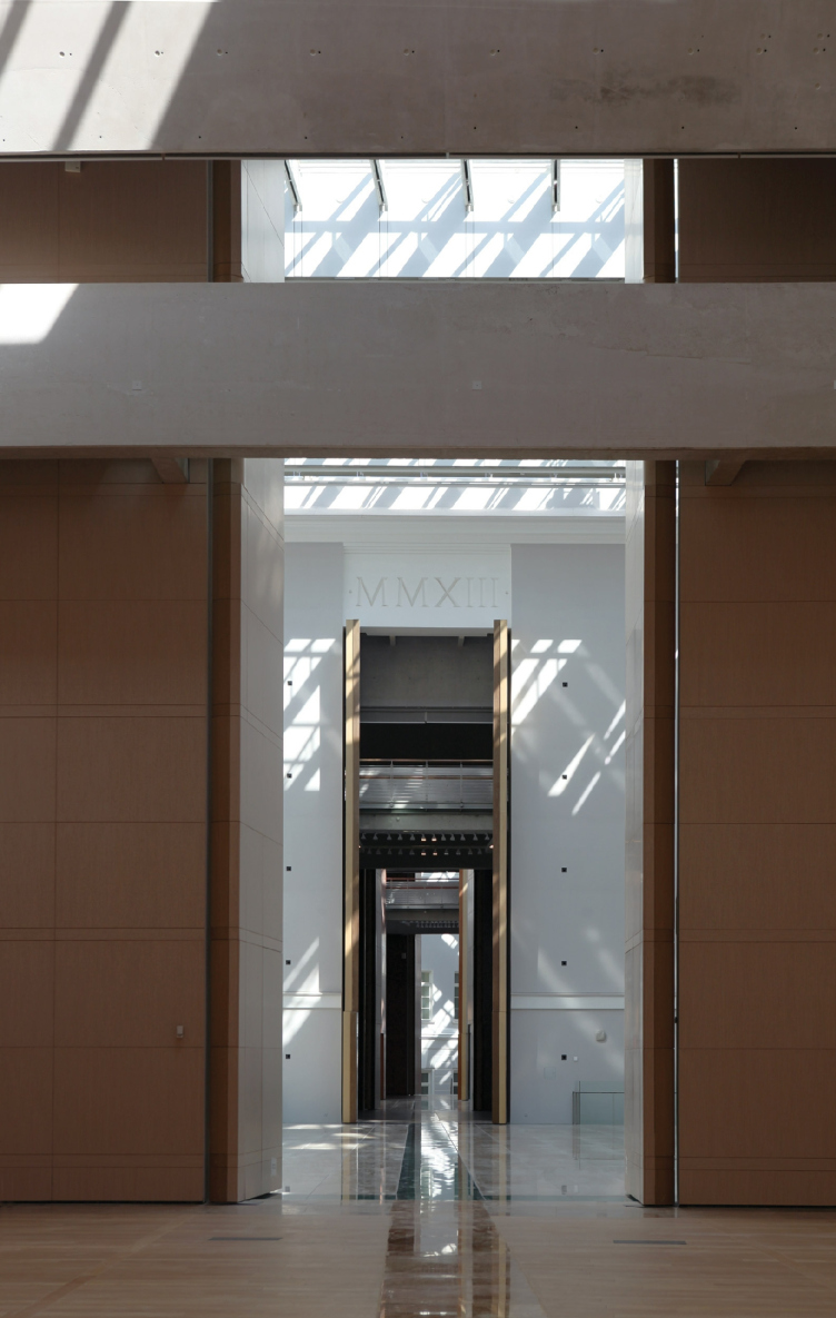
State Hermitage, the new Major Enfilade in the east wing of the Joint Staff building, Saint Petersburg © Studio 44


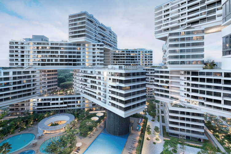
- Do you agree with the judging panel's decision to award the Grand Prix to the residential complex "Interlace" in Singapore? Did you like this project? 

In the "Construction" section, it was an obvious leader for a number of reasons. The project is interesting, it's got space about it; I would even say - it "reloads" your perception of space. What matters is that it is about going back to the roots, to the "horizontal skyscrapers", some constructivist basics - they are to be traced especially clearly there. And this project is a very curious one in general; for example, all these angular joints do not give any front views at all. And, at the same time, this is not a "wood stack" either - you maybe remember, there was such a project with blocks in a rectangular grid? In a word, I don't have any questions to the Grand Prix; this is a high-profile constructivist thing that got an award it truly deserves. 

Residential cluster "Interlace" (Singapore") OMA / Ole Scheeren. Photo courtesy by WAF


Besides, Interlace is a Singapore building, and WAF was conducted in Singapore this year. Next year, they will move back to Europe, to Berlin. Then they will go someplace else, probably, to somewhere in America. So, predicting the panel's decision wasn't much of a stretch, given the quality of the complex and the political considerations. You do realize that there is a lot of politics in any of such prizes. But, still, today, WAF is the world's most important competition of such kind - not ruled by realtors and developers, and not the kind where all the results are known in advance. In Europe, there is yet another similar contest - Mies van der Rohe Award - it is based on the WAF mechanism, there are slight differences, but generally it's about the same: nominees, constructions, projects, and things... But only countries from the European Union are admitted, so, for us this award is inaccessible. This year, by the way, at WAF there were laureates of Mies, and Stirling - the lineup was very strong. 

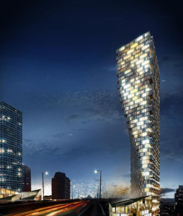
- And what about BIG's Vancouver House that named "Best Project of the Future"?

- Well, I suppose BIG got the super-prize not because of its architecture - this project is rather controversial - but thanks to the professionalism of its presentation. Our master plan of Kaliningrad, it must be said, was also one of the candidates for the Grand Prix in the "projects" category; we were coming second or maybe third... As for the ideas that were there in this project, we perhaps were even stronger but our presentation fell short - it should have had more vivid imagery to it. We took our old images, and you need to prepare things specifically for WAF. As for BIG, they won at the expense of their consummate mastery of presentation of their material, in this area they are second to nobody, and they turn their every presentation into a theatrical performance. 

Vancouver House (Canada). BIG – Bjarke Ingels Group. Photo courtesy by WAF


- How did their mastery specifically manifest itself? 

Every element of their project was presented as a solution to some certain global issue. The whole thing is accompanied by the appropriate video sequence. Just before going to Singapore, I went to see "Hamlet" - well, BIG's artists stand up to the world-class professional level. BIG's whole presentation concept is based on such theatrical acts; in fact, they think about how the project will be presented while still in the design stage.

So, as far as the presentation skills are concerned, we are in a different league so far, even though we are getting closer. 

- What was the most interesting thing for you at WAF? The presentations, the communication, or the exhibition itself? 

The exhibition was a curious thing. It's like a giant open magazine, posters with projects hang all around like bedclothes drying on a line, and people walk among them. Also, the very environment was interesting because there are always like a dozen presentations going on. You simply choose the events that are interesting to you and run from hall to hall. 

- For how long have you been taking part in international competitions? 

As for WAF, it was our second time there. We didn't win anything last year but I vowed to myself that we would make it this time around. And this year, all the three projects that we submitted got shortlisted, two of them being nominated. I even did more than I committed myself to do. 

- Based on your own experience, how would you define the criteria of such victory? We have already spoken about the theater-like presentation; what else do you need to do?

You need to take some very serious ideas that are at the same time current with what is big in the world's architecture right now, and tie them in with the world's processes and books. And you must elaborate on them not with words but with meaningful images. But your ideas must be unconventional and unexpected; you must surprise people with something so that they would get distracted and pay attention to what you're doing. By definition, this whole thing is guaranteed against any kind of provincialism.

- What does participating in such international contests give you? 

There are no customers there, there are critics. It is not about getting customers and making money anyway. I do not get that many customers specifically thanks to my awards and prizes, although they may still be instrumental in entering the international markets - this is, for example how I started working in Astana. 

It is about the professional growth, of course! And the opportunity to compare what you're doing to what your colleagues and recognized professionals are doing. All the 200–250 projects showcased at WAF were really decent, which is what I like about this contest. In our domestic contests, I often make bets as to who will win and I never lose - all you need to know is the lineup of the judging panel. And here it feels great just not to know in advance who will win.

18 November 2015

Headlines now
The Golden Crown
The concept for a dental clinic in Yekaterinburg, developed by CNTR Studio, revolves around the idea of a “mouth full of gold”: pristine white porcelain stoneware walls are complemented by matte brass details. To avoid an overly literal interpretation, the architects focused on the building’s proportions, skillfully navigating between sunlight requirements and fire safety regulations.
Flexibility and Integration
Not long ago, we covered the project for the fourth phase of the ÁLIA residential complex, designed by APEX. Now, we’ve been shown different fence concepts they developed to enclose the complex’s private courtyards, incorporating a variety of public functions. We believe that the sheer fact that the complex’s architects were involved in such a detail as fencing speaks volumes.
A Step Forward
The HIDE residential complex represents a major milestone for ADM architects and their leaders Andrey Romanov and Ekaterina Kuznetsova in their quest for a fresh high-rise aesthetic – one that is flexible and layered, capable of bringing vibrancy to mass and silhouette while shaping form. Over recent years, this approach has become ADM’s “signature style”, with the golden HIDE tower playing a pivotal role in its evolution. Here, we delve into the project’s story, explore the details of the complex’s design, and uncover its core essence.
Gold in the Sands
A new office for a transcontinental company specializing in resource extraction and processing has opened in Dubai. Designed by T+T Architects, masters of creating spaces that are contemporary, diverse, flexible, and original, this project exemplifies their expertise. On the executive floor, a massive brass-clad partition dominates, while layered textures of compressed earth create a contextually resonant backdrop.
Layers and Levels of Flight
This project goes way back – Reserve Union won this architectural competition at the end of 2011, and the building was completed in 2018, so it’s practically “archival”. However, despite being relatively unknown, the building can hardly be considered “dated” and remains a prime example of architectural expression, particularly in the headquarters genre. And it’s especially fitting for an aviation company office. In some ways, it resembles the Aeroflot headquarters at Sheremetyevo but with its own unique identity, following the signature style of Vladimir Plotkin. In this article, we take an in-depth look at the United Aircraft Corporation (UAC) headquarters in the Moscow agglomeration town of Zhukovsky, supplemented by recent photographs from Alexey Naroditsky – a shoot that became only recently possible due to the fact that improvements were finally made in the surrounding area.
Light and Shadow
In this article, we delve into the architectural design of the “Chaika” house by DNK ag architects, which was recently completed in 2023 as part of the collection of signature designs at ZILArt. As is well-known, all the buildings in this complex follow a design code, yet each one is distinct. This particular building stands out not only for its whiteness and minimalism but also for the refined use of a limited number of techniques that, together, create what can confidently be called synergy.
Casus Novae
A master plan was developed for a large residential area with a name of “DNS City”, but now that its implementation began, the plan has been arbitrarily reformatted and replaced with something that, while similar on the surface, is actually quite different. This is not the first time such a thing happens, but it’s always frustrating. With permission from the author, we are sharing Maria Elkina’s post.
Treasure Hunting
The GAFA bureau, in collaboration with Tegola and Arkhitail, organized an expedition to the island of Kilpola in Karelia as part of Moskomarkhitektura’s “Open City” festival. There, amidst moss and rocks, the students sought answers to questions like: what is the sacred, where does it dwell, and what sustains it? Assisting the participants in this quest were landscape engineer Evgeny Levin, artist Nicholas Roerich, a moose, and the lack of cellular connection. Here’s how the story unfolded.
Depths of the Earth, Streams of Water
In the Malaya Okhta district, the Akzent building, designed by Stepan Liphart, was constructed. It follows a classic tripartite structure, yet it’s what you might call “hand-drawn”: each façade is unique in its form and details, some of which aren’t immediately noticeable. In this article, we explore the context and, together with the architect, delve into how the form was developed.
Fir Tree Dynamics
The “Airports of Region” holding is planning to build an airport in Karachay-Cherkessia, aiming to make the Arkhyz and Dombay resorts more accessible to travelers. The project that won in an invitation-only competition, submitted by Sergey Nikeshkin’s KPLN, blends natural imagery inspired by the shape of a conifer seed, open-air waiting spaces, majestic large trees, and a green roof elevated on needle-like columns. The result is both nature-inspired and WOW.
​A Brick Shell
In the process of designing a clubhouse situated among pine trees in a prestigious suburban area near Moscow, the architectural firm “A.Len” did the façade design part. The combination of different types of brick and masonry correlates with the volumetric and plastique solutions, further enhanced by the inclusion of wood-painted fragments and metal “glazing”.
Word Forms
ATRIUM architects love ambitious challenges, and for the firm’s thirtieth anniversary, they boldly play a game of words with an exhibition that dives deep into a self-created vocabulary. They immerse their projects – especially art installations – into this glossary, as if plunging into a current of their own. You feel as if you’re flowing through the veins of pure art, immersed in a universe of vertical cities, educational spaces – of which the architects are true masters – and the cultural codes of various locations. But what truly captivates is the bold statement that Vera Butko and Anton Nadtochy make, both through their work and this exhibition: architecture, above all, is art – the art of working with form and space.
Flexibility and Acuteness of Modernity
Luxurious, fluid, large “kokoshniks” and spiral barrel columns, as if made from colorful chewing gum: there seem to be no other mansion like this in Moscow, designed in the “Neo-Russian-Modern” style. And the “Teremok” on Malaya Kaluzhskaya, previously somewhat obscure, has “come alive with new colors” and gained visibility after its restoration for the office of the “architectural ecosystem” as the architects love to call themselves. It’s evident that Julius Borisov and the architects at UNK put their hearts into finding this new office and bringing it up to date. Let’s delve into the paradoxes of this mansion’s history and its plasticity. Spoiler: two versions of modernity meet here, both balancing on the razor’s edge of “what’s current”.
Yuri Vissarionov: “A modular house does not belong to the land”
It belongs to space, or to the air... It turns out that 3D printing is more effective when combined with a modular approach: the house is built in a workshop and then adapted to the site, including on uneven terrain. Yuri Vissarionov shares his latest experience in designing tourist complexes, both in central Russia and in the south. These include houseboats, homes printed from lightweight concrete using a 3D printer, and, of course, frame houses.
​Moscow’s First
“The quality of education largely depends on the quality of the educational environment”. This principle of the last decade has been realized by Sergey Skuratov in the project for the First Moscow Gymnasium on Rostovskaya Embankment in the Khamovniki district. The building seamlessly integrates into the complex urban landscape, responding both to the pedestrian flow of the city and the quiet alleyways. It skillfully takes advantage of the height differences and aligns with modern trends in educational space design. Let’s take a closer look.
Looking at the Water
The site of Villa Sonata stretches from the road to the water’s edge, offering its own shoreline, pier, and a picturesque river panorama. To reveal these sweeping views, Roman Leonidov “cut” the façade diagonally parallel to the river, thus getting two main axes for the house and, consequently, “two heads”. The internal core – two double-height spaces, a living room and a conservatory, with a “bridge” above them – makes the house both “transparent” and filled with light.
The White Wing
Well, it’s not exactly white. It’s more of a beige, white-stone structure that plays with the color of limestone – smoother surfaces are lighter, while rougher ones are darker. This wing unites various elements: it absorbs and interprets the surrounding themes. It responds to everything, yet maintains a cohesive expression – a challenging task! – while also incorporating recognizable features of its own, such as the dynamic cuts at the bottom, top, and middle.
Urban Dunes
The XSA Ramps team designed and built a three-part sports hub for a park in Rostov-on-Don, welcoming people of all ages and fitness levels. The skate plaza, pump track, and playground are all meticulously crafted with details that attract a diverse range of visitors. The technical execution of the shapes and slopes transforms this space into a kind of sculptural composition.
Proportional Growth
The project for the fourth phase of the ÁLIA residential area has been announced. The buildings are situated on an elongated plot – almost a “ray” that shoots out from the center of the area towards the river. Their layout reflects both a response to Moscow’s architectural preferences over the past 15 years, shifting “from blocks to towers”, and an interpretation of the neighboring business park designed by SOM. Additionally, the best apartments here are not located at the very top but closer to the middle, forming a glowing “waistline”.
The “Staircase” Building
In designing the “Details” residential complex in New Moscow, Rais Baishev spiced up the now-popular Moscow theme of a “courtyard” building with an idea drawn from the surrealist drawings by Maurits Escher. He envisioned the stepped silhouettes and descending slopes as a metaphysical mega-staircase, creating a key void within the courtyard that gave the project an internal “spine”. This concept is felt both in the building’s silhouette and on its façades.
Projection of the Quarter
No one doubted that the building that Vladimir Plotkin designed as part of the “Garden Quarters” would be the most modernist of all. And it turned out just that way: while adhering to the common design code, the building successfully combines brick and white stone, rhythmically responding to the neighboring building designed by Ostozhenka, yet tactfully and persistently making a few statements of its own. This includes the projection of the ideal urban development composition “14–9–6”, which can be found right next door, mathematical calculations, including those for various types of terraces (and perhaps the only reminder of the Soviet past of the Kauchuk rubber factory!), and the white “cross-stitch” pattern of the façade grid.
Domus Aurea
In this issue, we examine the “Tessinsky-1” house, designed by Sergey Skuratov and completed in 2023. Located in the middle of the Serebryanicheskaya Embankment district, at the intersection of its main streets, this house assumes a sort of “nodal” role: it not only responds to everything around it and preserves many memories of the former EMA factory within itself, but it weaves all this into a newly directed pattern, reconciling bright “gold” and dark-colored brick, largely with the help of the new, modern-yet-archaic Columba brick, which, come to think about it, is the most precious element here.
The Chimney of Nikola-Lenivets
In this issue, we are examining the “Obelisk House” designed by KATARSIS and built for the Arkhstoyanie 2023 festival. However, it was only finished later on, and this is why we are examining it now. It seems to us that after the “Obelisk House” appeared in Nikola-Lenivets, a dialogue and a few inner connections appeared between the temporary structures built here. These houses no longer look like “accidental neighbors”, more of which below.
​Periscope by the Bay
The jury awarded the second place in the competition for a public and cultural center in Petropavlovsk-Kamchatsky to the companies GORA (“Mountain”) and M4. In the consortium’s proposal, the building resembles a sperm whale with a calf swimming next to it or a periscope, whose lenses capture the most spectacular views from the surrounding landscape.
From Arcs to Dolmens
While working on the competition project for Petropavlovsk-Kamchatsky, ASADOV Architects prioritized the value of the natural and urban environment, aiming to preserve the balance of the location while minimizing the resemblance of the volume that they designed to a “traditional building”. The task was challenging, and the architects created three versions, one of which having been developed after the competition, where their main proposal took third place. However, the point of interest here is not the competition result but the continuity of creative thinking.
Hide and Seek
The ID Moskovskiy house, designed by Stepan Liphart in St. Petersburg, in the courtyards near Moskovskiy Avenue beyond the Obvodny Canal and recently completed, is notable for several reasons. Firstly, it has been realized with considerable accuracy, which is particularly significant as this is the first building where the architect was responsible not only for the facades but also for the layouts, allowing for better integration between the two. On the other hand, this building is interesting as an example of the “germination” of new architecture in the city: it draws on the best examples from the neighborhood and becomes an improved and developed sum of ideas found by the architect in the surrounding context.
The Big Twelve
Yesterday, the winners of the Moscow Mayor’s Architecture Award were announced and honored. Let’s take a look at what was awarded and, in some cases, even critique this esteemed award. After all, there is always room for improvement, right?
Above the Golden Horn
The residential complex “Philosophy” designed by T+T architects in Vladivostok, is one of the new projects in the “Golubinaya Pad” area, changing its development philosophy (pun intended) from single houses to a comprehensive approach. The buildings are organized along public streets, varying in height and format, with one house even executed in gallery typology, featuring a cantilever leaning on an art object.
Nuanced Alternative
How can you rhyme a square and space? Easily! But to do so, you need to rhyme everything you can possibly think of: weave everything together, like in a tensegrity structure, and find your own optics too. The new exhibition at GES-2 does just that, offering its visitor a new perspective on the history of art spanning 150 years, infused with the hope for endless multiplicity of worlds and art histories. Read on to see how this is achieved and how the exhibition design by Evgeny Ace contributes to it.
Blinds for Ice
An ice arena has been constructed in Domodedovo based on a project by Yuri Vissarionov Architects. To prevent the long façade, a technical requirement for winter sports facilities, from appearing monotonous, the architects proposed the use of suspended structures with multidirectional slats. This design protects the ice from direct sunlight while giving the wall texture and detail.