Arch.ru:
- Why did you decide to participate in this contest?
Yuri Vissarionov:
- We always like participating in various contests and we like winning - which is often the case. The contest for the best housing project of "Ilinskoe-Usovo" was appealing to us, first of all, because of its very subject that we wanted to make a statement about. We liked the challenge, and we particularly liked the place. Lately, we have worked a lot in Moscow suburbs. This is a "living branch" that is quick to yield fruit. Generally speaking, you have a lot more chances to have your project implemented in the Moscow area that in the city itself. It was also interesting for us to analyze the type of recreational housing. I've been into recreational housing for the better part of my life. This is something that I started my career from when I was working in KurortProject. Already at that time, I had an opportunity to do some experimental design - we tried to develop ecological settlements, and tried to come up with the principles of what is now known as carpet housing. In the project of "Ilinskoe-Usovo", an attempt was made to implement different types of recreational buildings; we also tried to single out the ones that were more attractive to the potential customers. Today, fewer and fewer people are interested in buying flats in these huge "anthill" residential buildings; people are more interested in something that is proportional to the human scale, and something that is situated in a less aggressive environment. So it is not by chance that these giant residential high-rises stand half-vacant - the developers simply can't sell them.
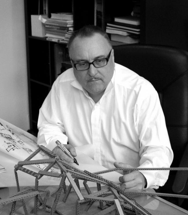
Yuri Vissarionov
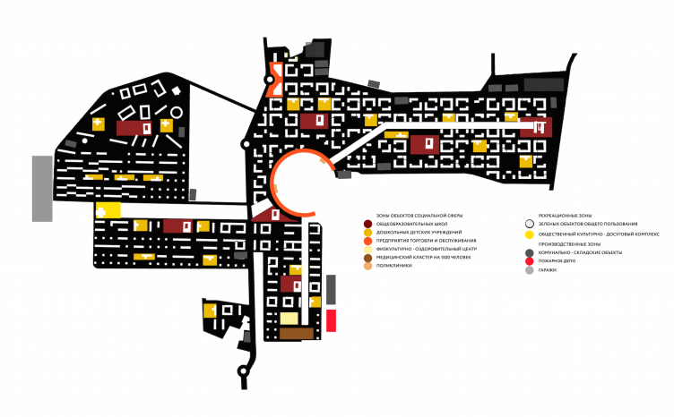
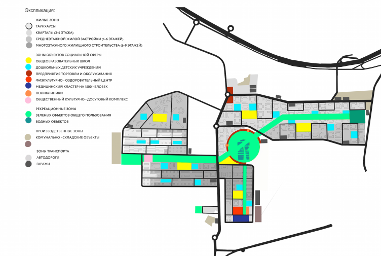
Architectural and engineering proposal on the housing project in Ilinskoe. Functional zone layout © Vissarionov Studio
- What were the benchmark data for your design there? What did the customer want? Initially, the project was several times turned down by the expert board. What was wrong with it?
- The construction site is situated in Moscow area between two such unique monuments of history and architecture as the estates of Arkhangelskoe and Usovo. The customer bought a large share of land there and he decided to build a standard residential area of panel houses without so much as a giving a slight consideration to its surroundings. Not to mention the fact that the very would-be construction site is a landscape monument, a place that was for centuries owned by the Russian royal family. This is a very special territory that is surrounded by monuments of culture and unique natural objects, so it came as no surprise that the whole local community stood up against this construction. The project was several times considered by the public council and the town-planning board of the Moscow area only to be turned down again and again. The local community was categorically opposed to any kind of construction here. For this reason, actually, the customer agreed to conduct the contest in the first place.
Architectural and engineering proposal on the housing project in Ilinskoe. View of the "quadrant" planning © Vissarionov Studio
Architectural and engineering proposal on the housing project in Ilinskoe © Vissarionov Studio
- But the conditions set before the participants of the contest did not really contradict (in fact, did not contradict at all) the initial project of building in Ilinskoe-Usovo, so, what's the deal?
- Yes, when we were getting the contest specifications, they let us know that the target number of floors was nine. We were also told that this "conforms to the requirements of the landscape and visual survey". According to my estimates and my colleagues', however, the benchmark data did not at all provide for all the viewing points. The customer's desire to see the cheap panel houses also did not go. It was clear that such construction in such a place was clearly inadmissible. It would have inevitably destroyed the panoramas of the great architectural ensembles located nearby. Besides, one must note the transport constituent part of this project which is also far from perfect. The site has neither transport infrastructure in it nor a decent driving access. As the main transport, they proposed the tram that proceeds in the direction of the Krasnogorskaya Square. I am not sure, however, that one tram line will be enough to solve the transportation problem there.
Architectural and engineering proposal on the housing project in Ilinskoe © Vissarionov Studio
- What did you do to handle this controversy between the contest specifications and the real design conditions?
- We did not really care whether or not our project conformed to these specifications. We seriously believe that these specifications are incorrectly formulated, to put it mildly. However, it was important for us to reconcile the customer, the architects, and the city community, and still more important - not to do any harm to the historically valuable surroundings. This is why we came up with an alternative version that could please everybody. Here is the thing - you cannot blame the developer for wanting to capitalize on the land site that he bought. In my opinion, this is not his personal mistake - rather a "system" one.
- Please share more about your proposal. Why is your project special? What makes it different?
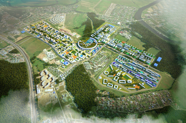
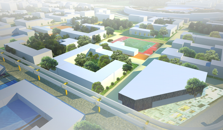
- We came up with a solution that is different and that has integrity to it. In our project, those nine-story houses are few and far between. Predominantly, it is about medium and low-rise structures. These nine stories only come up on one side, thanks to a significant relief drop of about 20 meters. Situated in the lowland, these buildings go practically unnoticed in the overall panorama; they merge with the horizon line. As for the topmost point of the site, we designed two and three-story nice little houses that do not at all get in the way of the viewer's perception of the historical estate complexes. This is the so-called "carpet" type of planning that, in my opinion, deserves close attention today. Such houses have a very high density; you can build them without any lifting cranes in fact, virtually, with your bare hands, significantly reducing the costs. Insisting on the large number of floors the developer looks to get a great output of usable square footage. However, this is a common mistake because, today, the high-density carpet housing is oftentimes a lot more cost-efficient. We cut down on the number of floors at the same time keeping the required housing density. This is what sets our project apart from the others that provided for the usual rank-and-file nine-story things, however in conformity with the contest specifications.
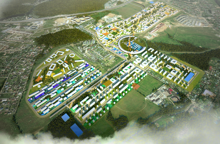
Architectural and engineering proposal on the housing project in Ilinskoe. Master plan © Vissarionov Studio
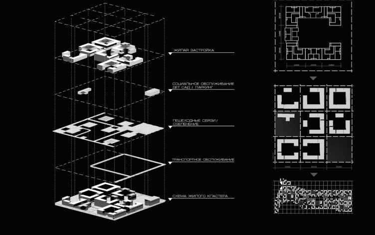
Architectural and engineering proposal on the housing project in Ilinskoe. The diagram of building typology and the functional zoning © Vissarionov Studio
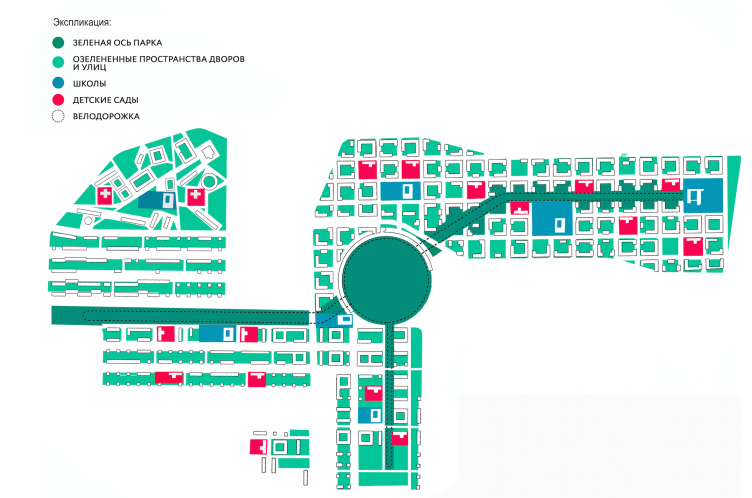
Architectural and engineering proposal on the housing project in Ilinskoe. Lanscaping plan © Vissarionov Studio
- What were the crucial differences between your proposal and the contest specifications then, if you're saying that the square footage figures turned out to be even better than what was initially required?
- The customer was not only interested in the square footage alone. He was looking to overbuild the site with the typical panel nine-stories, and, the way I see it, did not want to consider any alternatives whatsoever.
- Which ideas of your project do you consider to be the most important and interesting?
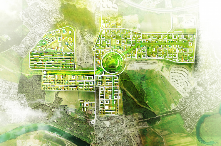
- We worked first of all with the landscape and we wanted to consider all of its peculiarities as much as possible. In such places, the natural scenery is not an obstacle - rather, it's a helper. As a result, the whole territory was conditionally divided into four parts including the central one, each part representing a certain construction archetype. The center was designed as a circle but the shape does not really matter here, it could have been anything. Designing the center is the easier part, designing the edges is always far more challenging. On one of the plans, we represented practically the entire history of this area's town-planning - from the early XX century up to the present day. Yesterday was represented by Corbusier buildings, a reinvented linear city with five and six-story houses.
We even tried to look into the future by proposing a design option that, as it seems to me, will be next big thing: a contemporary version of the "garden" city, a morph-type that we ourselves developed. It contains, among other things, sport facilities and the housing for the athletes. Thus, the project represents all the epochs of town-planning - yesterday, today, and tomorrow.
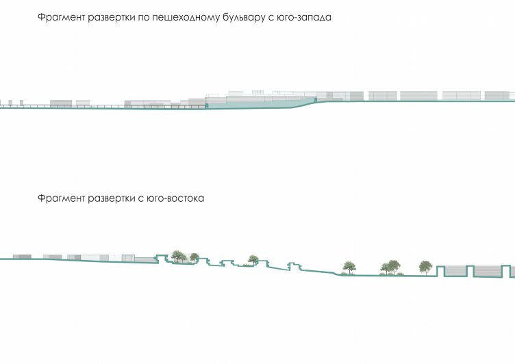
Architectural and engineering proposal on the housing project in Ilinskoe. Development drawings © Vissarionov Studio
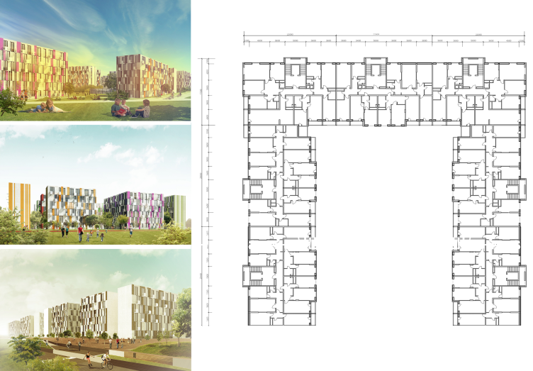
Architectural and engineering proposal on the housing project in Ilinskoe. View of the "quadrant" planning © Vissarionov Studio
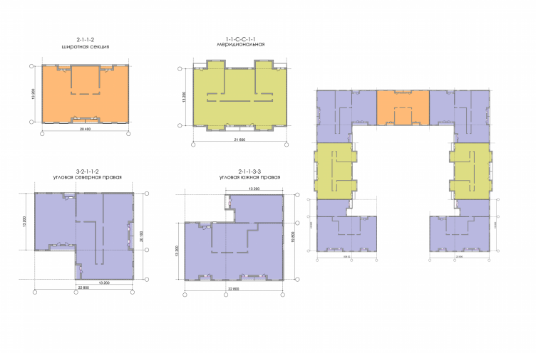
Architectural and engineering proposal on the housing project in Ilinskoe. Archetype of the residential construction © Vissarionov Studio
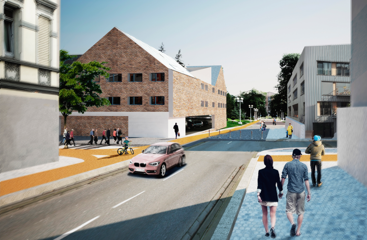
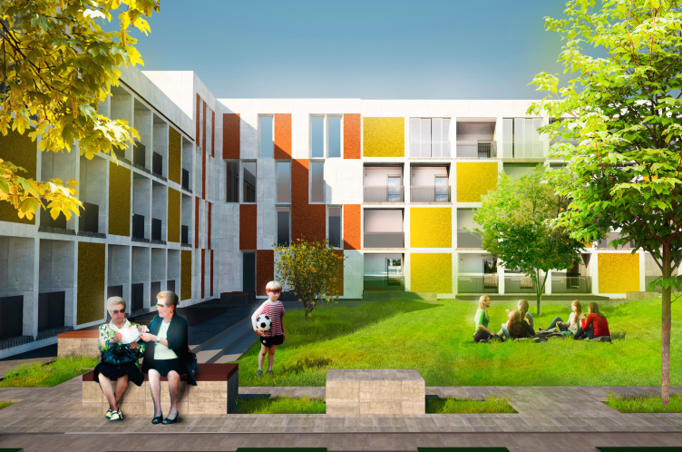
But the most interesting type is the dense carpet plan of the top part of the slope. This is like returning to the medieval harmonious function. As a matter of fact, the medieval building was still more interesting and complex. And in our case we've got more organized planning. The buildings are arranged in such a way that they form a "block within a block" with an exit to the recreation areas, green half-open yards and courtyards, and a chain of interflowing public territories. But, to my mind, it is today that these ideas become ever more vital. These three and four-story buildings give a great housing density. What is interesting is the fact that each part of this territory, regardless of the specific district, has the same housing density. Chances are, the judging panel of the contest did not even notice that.
Architectural and engineering proposal on the housing project in Ilinskoe. Archetype of the residential construction © Vissarionov Studio
Architectural and engineering proposal on the housing project in Ilinskoe © Vissarionov Studio
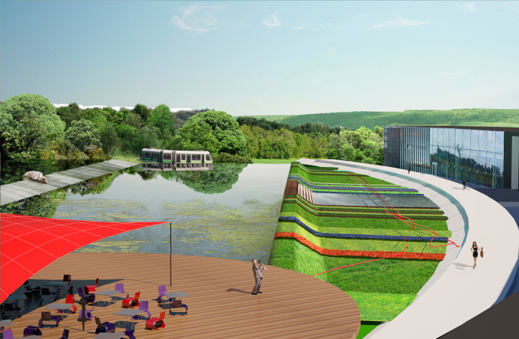
There is a tram line that runs through the entire area and connects its parts. Besides this main tram line that goes outside this area, we proposed to add an internal express streetcar here.
- Which housing typologies are represented in the project?
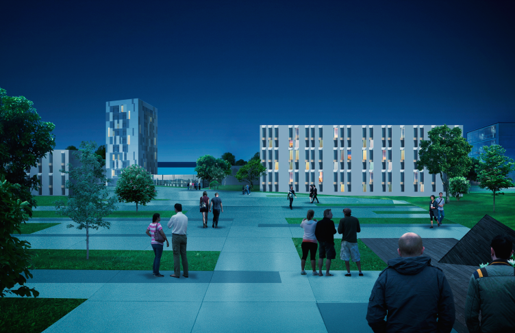
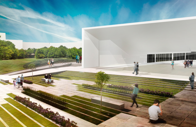
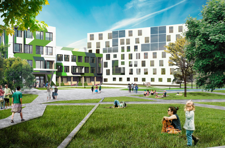
- We came up with unconventional solutions just by using conventional sections. Two thirds of the territory are occupied by the low-rise housing. This is the type of housing of tomorrow with large apartments for large families. We also provided for the longitudinal housing, hotels, youth hostels, and students' dormitories. Thus, our project realizes the principle of coexistence of different typologies. In one part of the city, different age groups of people with different life views can live in comfort. And, what is remarkable, we created such environment that will make one want to come to stay. While a person is young he can afford to have lodging that is less expensive and smaller in size - say, living in a dorm or a studio apartment. After he starts a family and has some kids he can find a house more suited to his circumstances in this same neighborhood. And, as he gets old, he can move closer to the nature, say, to the "garden" city. Apart from that, our project provides for the construction of a medical, educational, and administrative centers, educational facilities for children, and a school of prospective development. In effect, this is a project of a perfect city that you cannot build but you can try to get as close to it as possible. The only thing that our city does not provide for is the place of application of labor. Still, however, nearby, in the Zakharkovskaya river basin, on the territory of Moscow, as a matter of fact, there is the International Financial Center where, hopefully, a lot of people who are going to live here will be able to find work.
- And the contest specifications - did they provide for any place of labor application?
- They did not. And this is yet another serious limitation.
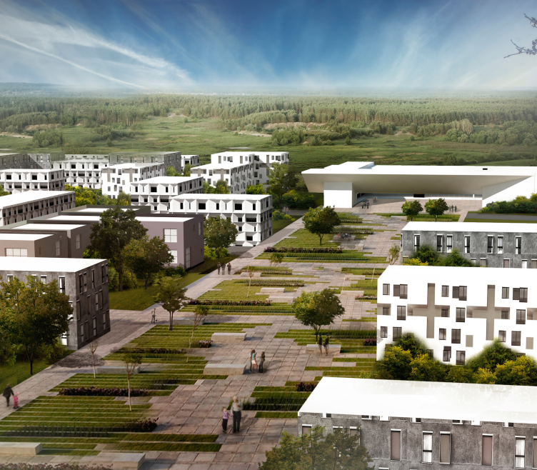
Architectural and engineering proposal on the housing project in Ilinskoe. View from the central boulevard © Vissarionov Studio
Architectural and engineering proposal on the housing project in Ilinskoe. View of the entertainment center from the central boulevard © Vissarionov Studio
- What is your general opinion of the district of "Ilinkskoe-Usovo"?
- I think that this is a dead-end situation. The standard approach would be misplaced here; this is a barbarian and destructive handling of the environment. If the whole world built like that we will soon have neither architecture nor historical legacy. This is why we from the very start decided to run this risk and take this chance breaking away from the technical specifications.
Architectural and engineering proposal on the housing project in Ilinskoe. View of the block housing © Vissarionov Studio
- If you had not been bound by the contest specifications how would you have handled this territory?
- If you're building something you must observe the architectural and town planning rules and regulations. Hiding the tall buildings underneath and leaving the smaller ones at the topmost part was the right solution. Besides, what's more important, it did not encroach in the least on the investor's interests. Quite the contrary, if he had implemented this project he would have gained a lot more. The interesting cluster type housing, the buildings commanding fine views - all this is a very attractive environment for the contemporary buyer. This "river basin", eco-friendly, and very neat principle of urban planning would be exactly in its place here. A cluster grows from its environment and a cluster must not contradict it - otherwise it will destroy everything around it like a cancer cell. The construction devised by the investor was very much like these dangerous cells. But it's not how it's supposed to be. It's not only about making money short-term or building a monument to the architect's ambitions. This is about forming an environment that will be comfortable for the people to live in, long term, for decades to come. Of course, there are different approaches to designing things. There is a scientific aspect just as there is the artistic and the commercial ones. An architect must be able to combine all these ideas, at the same time pushing the interests of people on top of everything. For us, it was from the very start not so much a contest project as an attempt to create our own methodology.
Architectural and engineering proposal on the housing project in Ilinskoe. View of the city center © Vissarionov Studio
- So, do you think the contest winning project cannot be implemented at this place?
- Well, that would not be a good idea. Of course I wouldn't like to talk down the work of my colleagues. Still, however, in this situation the architect must not be at the developer's beck and call. It was specifically noted that the contest winning project provided for atrium-like planning but if you placed tall buildings according to such a principle, to my mind, this is a very ambiguous and double-sided solution. Generally, today people tend to take the profession lightly. And I think it's a crying shame. And I think this situation must be improved. The profession must only welcome the professionals. If the contests failed to improve the situation then this means that you have to look for other ways to solve the problem. A few years ago there was an attempt to create the chamber of architects but still it was a no go. And soon this will lead to a situation when there will be no architects left that are capable of doing any independent thinking - we will only have the people that will be able to fulfill the developers' orders.
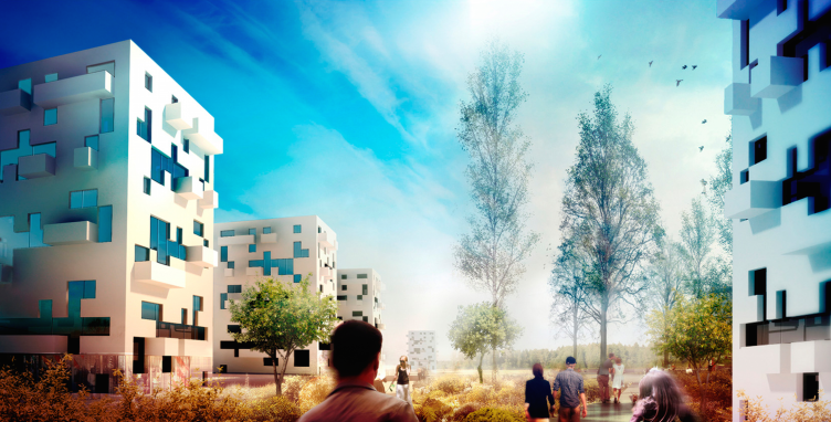
Architectural and engineering proposal on the housing project in Ilinskoe. View of the "dot-dash" housing © Vissarionov Studio
Architectural and engineering proposal on the housing project in Ilinskoe. View of the block part © Vissarionov Studio
- Do you know the further destiny of this project? Will the customer attract you to further work on this project as the finalists of the contest?
- I don't know anything about how this project is getting along now. We asked the same question at the discussion with the judging panel and with the developer but we did not get any definite answer. Of course, we would like to hope that we would be at least included in the author list. It would be fair to divide this area between the three architectural studios that took the top three places. We would be happy to handle the section with the carpet design. In my opinion this project would be better off if they handed it over to the Institute of General Plan of Moscow region.
Architectural and engineering proposal on the housing project in Ilinskoe. View of the high-rise part © Vissarionov Studio


