По-русски

Noblesse Oblige

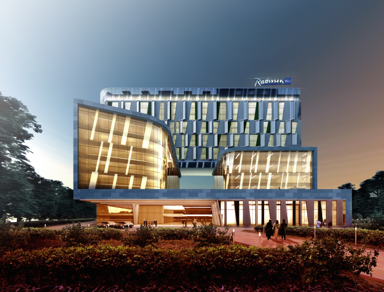
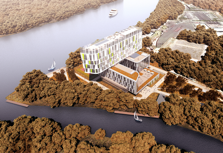
For the best proposal contest for Radisson Blue Moscow Riverside Hotel, the team of Alexander and Andrew Asadov and Karen Saprichyan, designed a multivolume complex composition that changes beyond recognition with the shifting of its viewing angle. A cyberspace guided tour will allow for joining the pictures into a single whole.

12 October 2015
Object
mainImg
Architect:
Alexander Asadov
Andrey Asadov
Karen Saprichyan
Firm:
ASADOV architects
GrandProektCity
MAHPI
Object:
Radisson Blu Moscow Riverside Hotel&Spa
Russia, Moscow

2015 — 2015

Continuing the review of the results of the best concept contest for Radisson Blue Moscow Riverside Hotel, we are featuring the joint project of Polyansky Institute of Architecture, GrandProjectCity, and Asadov Architectural Bureau. The judging panel did not include it into the leading three list - but the dramatic architectural image proposed by the consortium could have easily become an impressive centerpiece of this picturesque land, advantageous in all respect, lying in the confluence of the Moskva and Skhodnya rivers.

According to the rules and conditions of the contest, one of the main evaluation criteria was "conformity to the requirements of Radisson Blu chain". And this is by no means a formality: Carlson Rezidor Group that owns the brand traditionally sets forth the most rigorous requirements to the architecture and design of its hotels, be that a reconstruction or building something from scratch. Enumerating all these world-famous hotels of this chain would result in a quite a long list, so here are but a few names that immediately come to mind: Copenhagen's Radisson Blu, for instance, was designed by Arne Jacobsen, in Berlin - by Sergey Tchoban, in Moscow and Chelyabinsk - by Christian Lundwall, in Batumi - by Michele De Lucchi, in Belgrade, "Graft Architects" did a brilliant project of renovating a XIX century factory building, the hotel in Nant was done by Jean-Phillip Nouelle... Nobody is talking about any stylistic unity here - just about the level to which the bar has been raised. Just another reason not to limit oneself in the means of plastic expression in order to create a truly interesting project. 

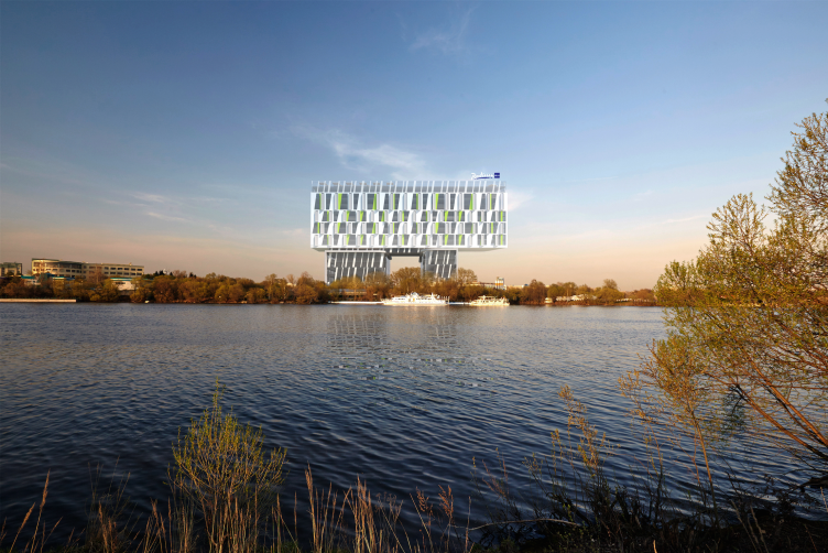
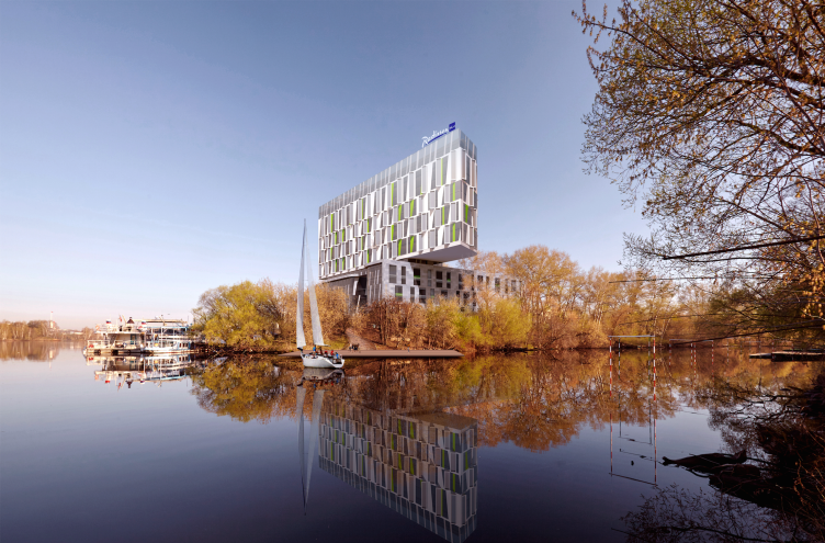
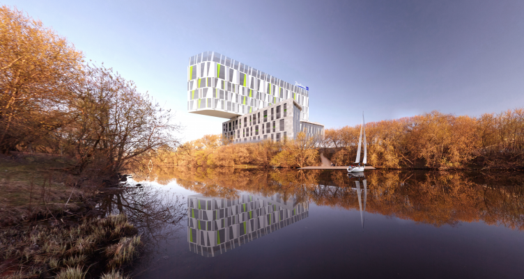
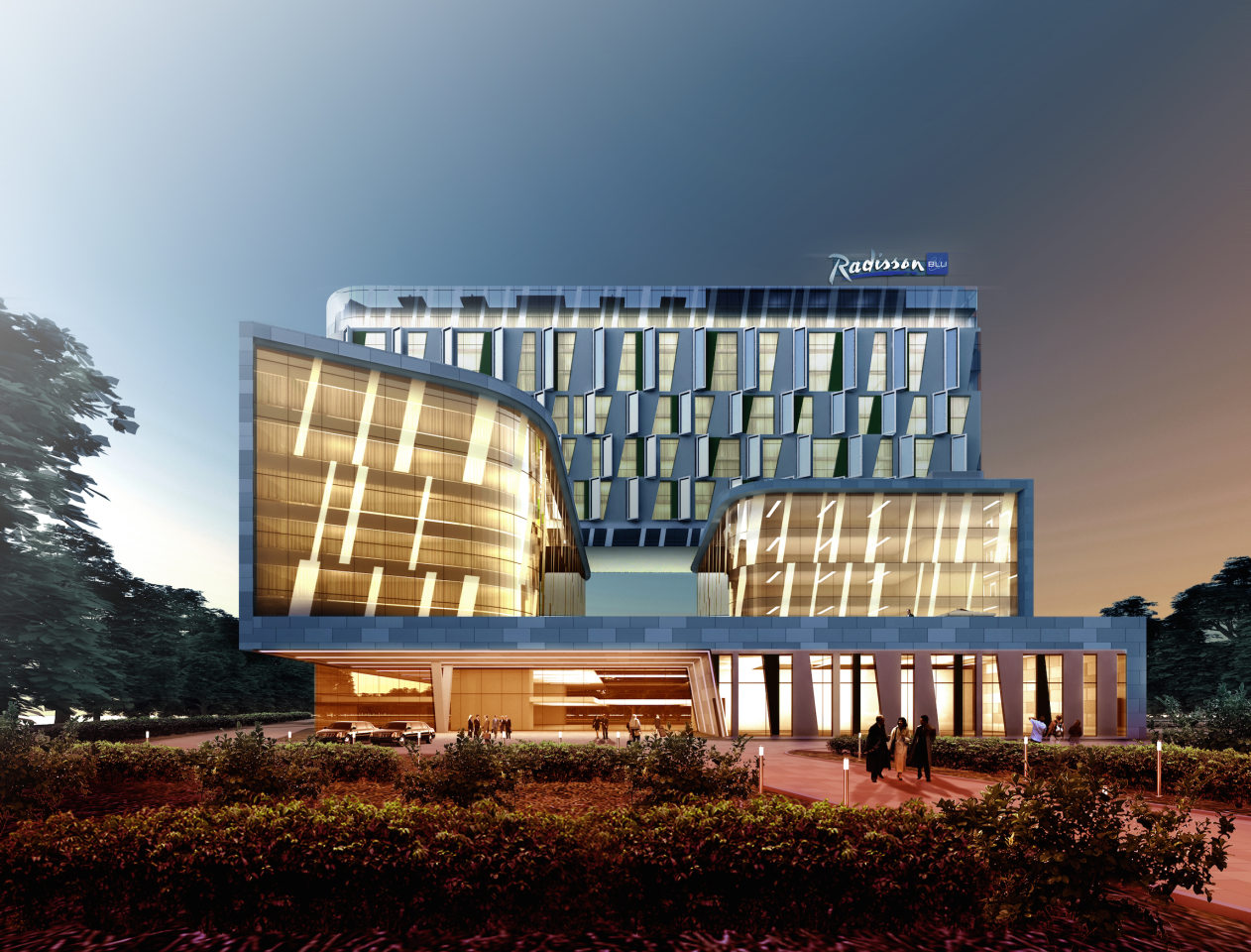
The hotel - the only tall building for miles around - will be perfectly viewable from lots of different angles - which provides for the architects a rare-for-urban-environment opportunity to play with these angles. The authors of this project used this opportunity to the fullest: depending on the viewing angle, the building looks so different that combining these pictures in one's mind's eye might be quite a stretch. "The basic screen of the main building is oriented to the Moskva River and its farther vantage points" - Karen Saprichyan explains. From the opposite bank, across the river's great wide open, the building resembles a giant megalith that was brought to the nation's capital by winds unknown and then all covered with a mysterious barcode. Then we pass around (or swim around, or, better yet, fly around the cape) - and the complex gradually takes shape, the shadow from the giant cantilever falling down askew on the "supporting" block adding diagonals to the array of elongated window apertures (yet another barcode, only monochrome this time). Continuing this imaginary tour, we find ourselves in front of the eastern facade - only at this point the trees step to the sides allowing us to see the main entrance and the roofed area in front of it, the rounded corners of the side volumes sucking us inside the complex like a giant whirlpool, and then even further through it - where through the square opening one can finally see "a piece of heaven".

RADISSON BLU MOSCOW RIVERSIDE HOTEL&SPA © Asadov Architectural Bureau; GrandProjectCity; Polyansky Institute of Architecture


RADISSON BLU MOSCOW RIVERSIDE HOTEL&SPA © Asadov Architectural Bureau; GrandProjectCity; Polyansky Institute of Architecture


RADISSON BLU MOSCOW RIVERSIDE HOTEL&SPA © Asadov Architectural Bureau; GrandProjectCity; Polyansky Institute of Architecture


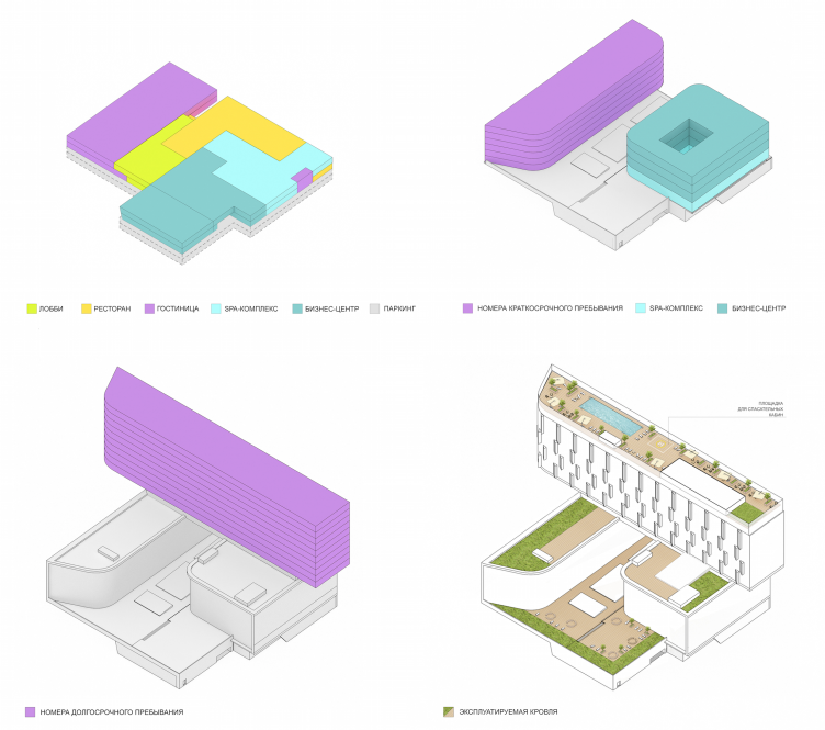
If we are to examine the complex building by building, there are four of them, the main one being a broad rectangular slab that rests in an even somewhat sloppy fashion on two others, these two resting on a broad two-story stylobate. The stylobate is also not quite "solid body", though: from the direction of the main entrance part of the volume is "taken away", which results in a spacious covered square. Practically invisible from any more or less significant distance because of its disadvantageous proportions and the surrounding verdure, the stylobate plays the crucial part of the "invisible hero": it not only serves as the basis for the "pyramid" holding its flashier brothers on its shoulders but also provides a whole lot of other key functions. 

RADISSON BLU MOSCOW RIVERSIDE HOTEL&SPA © Asadov Architectural Bureau; GrandProjectCity; Polyansky Institute of Architecture


RADISSON BLU MOSCOW RIVERSIDE HOTEL&SPA © Asadov Architectural Bureau; GrandProjectCity; Polyansky Institute of Architecture


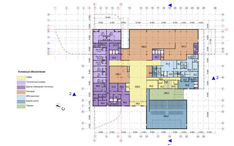
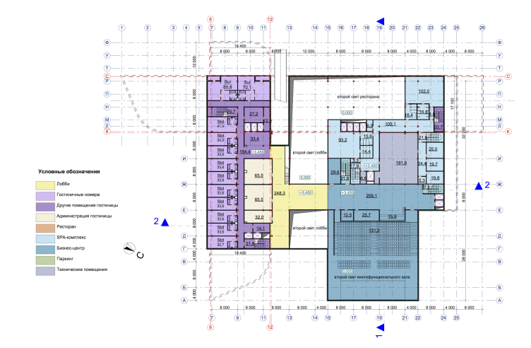
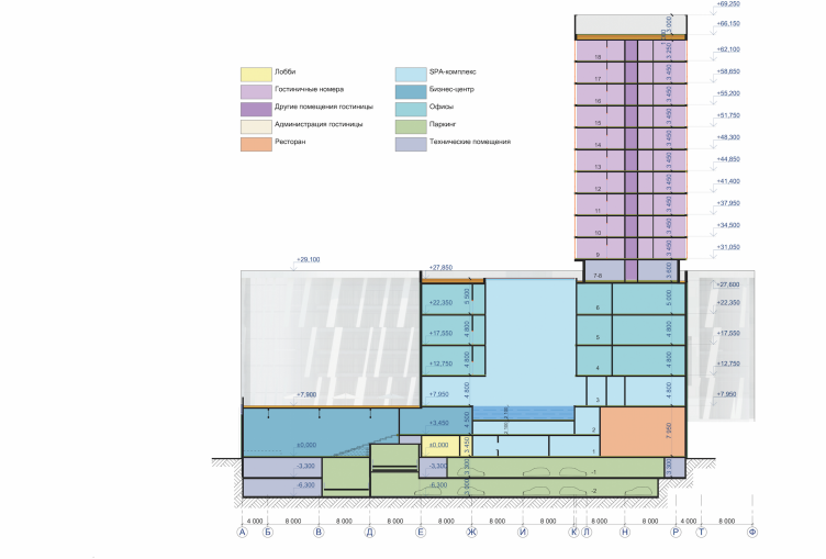
If we are to look at the plans of the first two floors, we will see that, besides a double-height lobby, it also includes a business center, a multifunctional hall, a restaurant (also double-height, commanding a fine view of the Moskva River), a spa center, numerous services, and even some of the hotel rooms. The swimming pool of the spa center is an important composition center: it gets surrounded by the walls of a four-story glazed atrium, along the perimeter of which offices are situated while on its eastern side it opens up to the roof of the stylobate, this roof performing, besides its direct function, a number of other responsible tasks: it carries a rather large public zone, along its ramp located at the back facade, emergency vehicles can ascend it, while on its southeast corner the roof blends into the marquee overhanging above the entrance square.

RADISSON BLU MOSCOW RIVERSIDE HOTEL&SPA. Plan of the first floor © Asadov Architectural Bureau; GrandProjectCity; Polyansky Institute of Architecture


RADISSON BLU MOSCOW RIVERSIDE HOTEL&SPA. Plan of the second floor © Asadov Architectural Bureau; GrandProjectCity; Polyansky Institute of Architecture


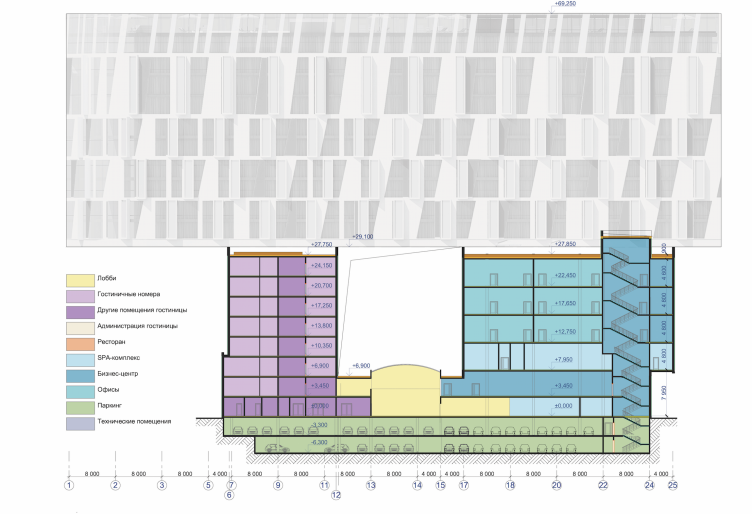
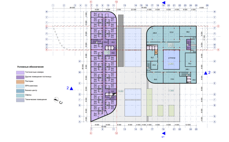
The building that is turned southward, to the Skhodnya River, on the plan looks like an elongated rectangle with one of its corners rounded out. This block contains the short-stay hotel rooms that take up all the six floors (counting from the ground level, from the third to the eighth). The other "support" given to the offices and the spa center is closer to a quadrant on the plan; by elevating the floors, with the same absolute height, the number of floors here is it four, and they all are placed around the already-mentioned atrium. 

The main block - a ten-story slab, also rounded at its southeast corner - contains the apartments. For all its massiveness, it does not look "heavyweight" at all: the arch window between 21x21 meter supports makes the structure look almost ethereal. Besides, the trapeze-shaped windows and the bay windows with colored inserts create quite a convincing optical effect curtailing the number of floors from ten to four (experimenting with color is one of the signature techniques of Asadov Bureau). Such a solution, different from the more reserved lines of the stylobate part, was deliberately chosen: this allowed the architects to play on the contrasts of different architectural techniques.

RADISSON BLU MOSCOW RIVERSIDE HOTEL&SPA. Section view © Asadov Architectural Bureau; GrandProjectCity; Polyansky Institute of Architecture


RADISSON BLU MOSCOW RIVERSIDE HOTEL&SPA © Asadov Architectural Bureau; GrandProjectCity; Polyansky Institute of Architecture


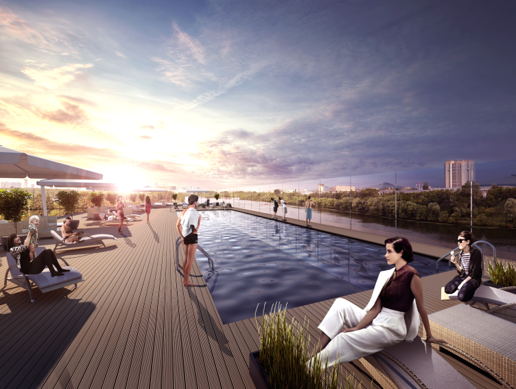
The authors of the project elaborated in great detail (even, according to Karen Saprichyan, in too much detail by contest project standards) the design of the inside premises - both hotel rooms and offices. As for the latter, they are planned at four different levels: the entrance square, some areas on the roof of the stylobate and the hotel block, and the most striking one commanding magnificent views - on the roof of the main building with a swimming pool, a recreation area, and a helicopter landing. Oh, by the way, about the "cyber circular flight" around the complex - if we are to go through with unleashing our fantasy, you cannot think of a better place to end the guided tour.
RADISSON BLU MOSCOW RIVERSIDE HOTEL&SPA. Section view © Asadov Architectural Bureau; GrandProjectCity; Polyansky Institute of Architecture
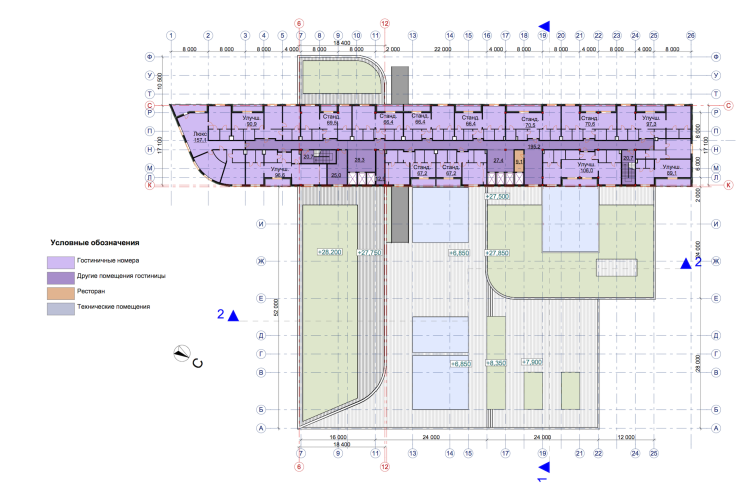
RADISSON BLU MOSCOW RIVERSIDE HOTEL&SPA. Plan of the 4-6 floors © Asadov Architectural Bureau; GrandProjectCity; Polyansky Institute of Architecture
RADISSON BLU MOSCOW RIVERSIDE HOTEL&SPA. Plan of the 9-18 floors © Asadov Architectural Bureau; GrandProjectCity; Polyansky Institute of Architecture

Architect:
Alexander Asadov
Andrey Asadov
Karen Saprichyan
Firm:
ASADOV architects
GrandProektCity
MAHPI
Object:
Radisson Blu Moscow Riverside Hotel&Spa
Russia, Moscow

2015 — 2015

12 October 2015

Headlines now
The Golden Crown
The concept for a dental clinic in Yekaterinburg, developed by CNTR Studio, revolves around the idea of a “mouth full of gold”: pristine white porcelain stoneware walls are complemented by matte brass details. To avoid an overly literal interpretation, the architects focused on the building’s proportions, skillfully navigating between sunlight requirements and fire safety regulations.
Flexibility and Integration
Not long ago, we covered the project for the fourth phase of the ÁLIA residential complex, designed by APEX. Now, we’ve been shown different fence concepts they developed to enclose the complex’s private courtyards, incorporating a variety of public functions. We believe that the sheer fact that the complex’s architects were involved in such a detail as fencing speaks volumes.
A Step Forward
The HIDE residential complex represents a major milestone for ADM architects and their leaders Andrey Romanov and Ekaterina Kuznetsova in their quest for a fresh high-rise aesthetic – one that is flexible and layered, capable of bringing vibrancy to mass and silhouette while shaping form. Over recent years, this approach has become ADM’s “signature style”, with the golden HIDE tower playing a pivotal role in its evolution. Here, we delve into the project’s story, explore the details of the complex’s design, and uncover its core essence.
Gold in the Sands
A new office for a transcontinental company specializing in resource extraction and processing has opened in Dubai. Designed by T+T Architects, masters of creating spaces that are contemporary, diverse, flexible, and original, this project exemplifies their expertise. On the executive floor, a massive brass-clad partition dominates, while layered textures of compressed earth create a contextually resonant backdrop.
Layers and Levels of Flight
This project goes way back – Reserve Union won this architectural competition at the end of 2011, and the building was completed in 2018, so it’s practically “archival”. However, despite being relatively unknown, the building can hardly be considered “dated” and remains a prime example of architectural expression, particularly in the headquarters genre. And it’s especially fitting for an aviation company office. In some ways, it resembles the Aeroflot headquarters at Sheremetyevo but with its own unique identity, following the signature style of Vladimir Plotkin. In this article, we take an in-depth look at the United Aircraft Corporation (UAC) headquarters in the Moscow agglomeration town of Zhukovsky, supplemented by recent photographs from Alexey Naroditsky – a shoot that became only recently possible due to the fact that improvements were finally made in the surrounding area.
Light and Shadow
In this article, we delve into the architectural design of the “Chaika” house by DNK ag architects, which was recently completed in 2023 as part of the collection of signature designs at ZILArt. As is well-known, all the buildings in this complex follow a design code, yet each one is distinct. This particular building stands out not only for its whiteness and minimalism but also for the refined use of a limited number of techniques that, together, create what can confidently be called synergy.
Casus Novae
A master plan was developed for a large residential area with a name of “DNS City”, but now that its implementation began, the plan has been arbitrarily reformatted and replaced with something that, while similar on the surface, is actually quite different. This is not the first time such a thing happens, but it’s always frustrating. With permission from the author, we are sharing Maria Elkina’s post.
Treasure Hunting
The GAFA bureau, in collaboration with Tegola and Arkhitail, organized an expedition to the island of Kilpola in Karelia as part of Moskomarkhitektura’s “Open City” festival. There, amidst moss and rocks, the students sought answers to questions like: what is the sacred, where does it dwell, and what sustains it? Assisting the participants in this quest were landscape engineer Evgeny Levin, artist Nicholas Roerich, a moose, and the lack of cellular connection. Here’s how the story unfolded.
Depths of the Earth, Streams of Water
In the Malaya Okhta district, the Akzent building, designed by Stepan Liphart, was constructed. It follows a classic tripartite structure, yet it’s what you might call “hand-drawn”: each façade is unique in its form and details, some of which aren’t immediately noticeable. In this article, we explore the context and, together with the architect, delve into how the form was developed.
Fir Tree Dynamics
The “Airports of Region” holding is planning to build an airport in Karachay-Cherkessia, aiming to make the Arkhyz and Dombay resorts more accessible to travelers. The project that won in an invitation-only competition, submitted by Sergey Nikeshkin’s KPLN, blends natural imagery inspired by the shape of a conifer seed, open-air waiting spaces, majestic large trees, and a green roof elevated on needle-like columns. The result is both nature-inspired and WOW.
​A Brick Shell
In the process of designing a clubhouse situated among pine trees in a prestigious suburban area near Moscow, the architectural firm “A.Len” did the façade design part. The combination of different types of brick and masonry correlates with the volumetric and plastique solutions, further enhanced by the inclusion of wood-painted fragments and metal “glazing”.
Word Forms
ATRIUM architects love ambitious challenges, and for the firm’s thirtieth anniversary, they boldly play a game of words with an exhibition that dives deep into a self-created vocabulary. They immerse their projects – especially art installations – into this glossary, as if plunging into a current of their own. You feel as if you’re flowing through the veins of pure art, immersed in a universe of vertical cities, educational spaces – of which the architects are true masters – and the cultural codes of various locations. But what truly captivates is the bold statement that Vera Butko and Anton Nadtochy make, both through their work and this exhibition: architecture, above all, is art – the art of working with form and space.
Flexibility and Acuteness of Modernity
Luxurious, fluid, large “kokoshniks” and spiral barrel columns, as if made from colorful chewing gum: there seem to be no other mansion like this in Moscow, designed in the “Neo-Russian-Modern” style. And the “Teremok” on Malaya Kaluzhskaya, previously somewhat obscure, has “come alive with new colors” and gained visibility after its restoration for the office of the “architectural ecosystem” as the architects love to call themselves. It’s evident that Julius Borisov and the architects at UNK put their hearts into finding this new office and bringing it up to date. Let’s delve into the paradoxes of this mansion’s history and its plasticity. Spoiler: two versions of modernity meet here, both balancing on the razor’s edge of “what’s current”.
Yuri Vissarionov: “A modular house does not belong to the land”
It belongs to space, or to the air... It turns out that 3D printing is more effective when combined with a modular approach: the house is built in a workshop and then adapted to the site, including on uneven terrain. Yuri Vissarionov shares his latest experience in designing tourist complexes, both in central Russia and in the south. These include houseboats, homes printed from lightweight concrete using a 3D printer, and, of course, frame houses.
​Moscow’s First
“The quality of education largely depends on the quality of the educational environment”. This principle of the last decade has been realized by Sergey Skuratov in the project for the First Moscow Gymnasium on Rostovskaya Embankment in the Khamovniki district. The building seamlessly integrates into the complex urban landscape, responding both to the pedestrian flow of the city and the quiet alleyways. It skillfully takes advantage of the height differences and aligns with modern trends in educational space design. Let’s take a closer look.
Looking at the Water
The site of Villa Sonata stretches from the road to the water’s edge, offering its own shoreline, pier, and a picturesque river panorama. To reveal these sweeping views, Roman Leonidov “cut” the façade diagonally parallel to the river, thus getting two main axes for the house and, consequently, “two heads”. The internal core – two double-height spaces, a living room and a conservatory, with a “bridge” above them – makes the house both “transparent” and filled with light.
The White Wing
Well, it’s not exactly white. It’s more of a beige, white-stone structure that plays with the color of limestone – smoother surfaces are lighter, while rougher ones are darker. This wing unites various elements: it absorbs and interprets the surrounding themes. It responds to everything, yet maintains a cohesive expression – a challenging task! – while also incorporating recognizable features of its own, such as the dynamic cuts at the bottom, top, and middle.
Urban Dunes
The XSA Ramps team designed and built a three-part sports hub for a park in Rostov-on-Don, welcoming people of all ages and fitness levels. The skate plaza, pump track, and playground are all meticulously crafted with details that attract a diverse range of visitors. The technical execution of the shapes and slopes transforms this space into a kind of sculptural composition.
Proportional Growth
The project for the fourth phase of the ÁLIA residential area has been announced. The buildings are situated on an elongated plot – almost a “ray” that shoots out from the center of the area towards the river. Their layout reflects both a response to Moscow’s architectural preferences over the past 15 years, shifting “from blocks to towers”, and an interpretation of the neighboring business park designed by SOM. Additionally, the best apartments here are not located at the very top but closer to the middle, forming a glowing “waistline”.
The “Staircase” Building
In designing the “Details” residential complex in New Moscow, Rais Baishev spiced up the now-popular Moscow theme of a “courtyard” building with an idea drawn from the surrealist drawings by Maurits Escher. He envisioned the stepped silhouettes and descending slopes as a metaphysical mega-staircase, creating a key void within the courtyard that gave the project an internal “spine”. This concept is felt both in the building’s silhouette and on its façades.
Projection of the Quarter
No one doubted that the building that Vladimir Plotkin designed as part of the “Garden Quarters” would be the most modernist of all. And it turned out just that way: while adhering to the common design code, the building successfully combines brick and white stone, rhythmically responding to the neighboring building designed by Ostozhenka, yet tactfully and persistently making a few statements of its own. This includes the projection of the ideal urban development composition “14–9–6”, which can be found right next door, mathematical calculations, including those for various types of terraces (and perhaps the only reminder of the Soviet past of the Kauchuk rubber factory!), and the white “cross-stitch” pattern of the façade grid.
Domus Aurea
In this issue, we examine the “Tessinsky-1” house, designed by Sergey Skuratov and completed in 2023. Located in the middle of the Serebryanicheskaya Embankment district, at the intersection of its main streets, this house assumes a sort of “nodal” role: it not only responds to everything around it and preserves many memories of the former EMA factory within itself, but it weaves all this into a newly directed pattern, reconciling bright “gold” and dark-colored brick, largely with the help of the new, modern-yet-archaic Columba brick, which, come to think about it, is the most precious element here.
The Chimney of Nikola-Lenivets
In this issue, we are examining the “Obelisk House” designed by KATARSIS and built for the Arkhstoyanie 2023 festival. However, it was only finished later on, and this is why we are examining it now. It seems to us that after the “Obelisk House” appeared in Nikola-Lenivets, a dialogue and a few inner connections appeared between the temporary structures built here. These houses no longer look like “accidental neighbors”, more of which below.
​Periscope by the Bay
The jury awarded the second place in the competition for a public and cultural center in Petropavlovsk-Kamchatsky to the companies GORA (“Mountain”) and M4. In the consortium’s proposal, the building resembles a sperm whale with a calf swimming next to it or a periscope, whose lenses capture the most spectacular views from the surrounding landscape.
From Arcs to Dolmens
While working on the competition project for Petropavlovsk-Kamchatsky, ASADOV Architects prioritized the value of the natural and urban environment, aiming to preserve the balance of the location while minimizing the resemblance of the volume that they designed to a “traditional building”. The task was challenging, and the architects created three versions, one of which having been developed after the competition, where their main proposal took third place. However, the point of interest here is not the competition result but the continuity of creative thinking.
Hide and Seek
The ID Moskovskiy house, designed by Stepan Liphart in St. Petersburg, in the courtyards near Moskovskiy Avenue beyond the Obvodny Canal and recently completed, is notable for several reasons. Firstly, it has been realized with considerable accuracy, which is particularly significant as this is the first building where the architect was responsible not only for the facades but also for the layouts, allowing for better integration between the two. On the other hand, this building is interesting as an example of the “germination” of new architecture in the city: it draws on the best examples from the neighborhood and becomes an improved and developed sum of ideas found by the architect in the surrounding context.
The Big Twelve
Yesterday, the winners of the Moscow Mayor’s Architecture Award were announced and honored. Let’s take a look at what was awarded and, in some cases, even critique this esteemed award. After all, there is always room for improvement, right?
Above the Golden Horn
The residential complex “Philosophy” designed by T+T architects in Vladivostok, is one of the new projects in the “Golubinaya Pad” area, changing its development philosophy (pun intended) from single houses to a comprehensive approach. The buildings are organized along public streets, varying in height and format, with one house even executed in gallery typology, featuring a cantilever leaning on an art object.
Nuanced Alternative
How can you rhyme a square and space? Easily! But to do so, you need to rhyme everything you can possibly think of: weave everything together, like in a tensegrity structure, and find your own optics too. The new exhibition at GES-2 does just that, offering its visitor a new perspective on the history of art spanning 150 years, infused with the hope for endless multiplicity of worlds and art histories. Read on to see how this is achieved and how the exhibition design by Evgeny Ace contributes to it.
Blinds for Ice
An ice arena has been constructed in Domodedovo based on a project by Yuri Vissarionov Architects. To prevent the long façade, a technical requirement for winter sports facilities, from appearing monotonous, the architects proposed the use of suspended structures with multidirectional slats. This design protects the ice from direct sunlight while giving the wall texture and detail.