По-русски

The Facade of Modern Medicine

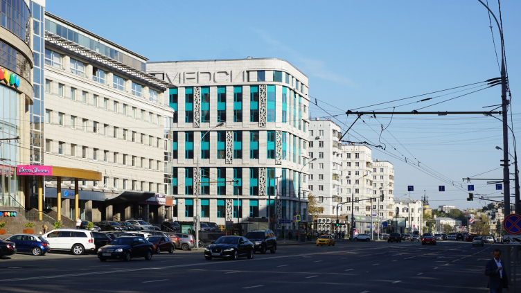
At Moscow's Krasnaya Presnya, the construction of a multi profile diagnostic and treatment center of MEDCI Group is being completed.

24 September 2015
Object
mainImg

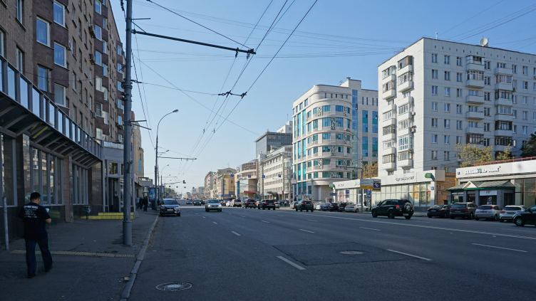
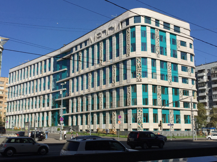
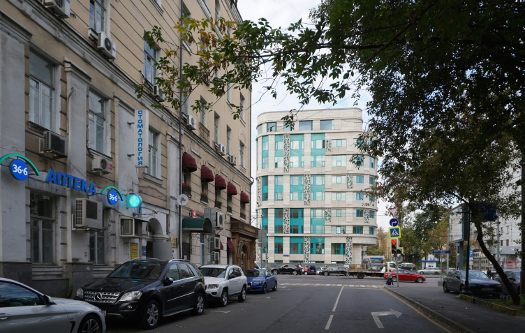
The new building of the medical center is situated not far away from the Moscow Zoo and the Krasnaya Presnya high-rise, at the crossing of the Krasnaya Presnya and Malaya Gruzinskaya streets, in the spot of the former "communal kitchen" built in the late twenties by the architect Sergey Kurabtsev. The building of the "kitchen", just like a few adjacent facilities, for a long time belonged to City Hospital №32. Then since 2006 it stood empty gradually falling into decay until in November of 2013, after long negotiations between MEDCI GROUP and Moscow municipality, the controversial decision to take down the old constructivist building was made. Instead, a new state-of-the-art private medical center was built. The customer committed to allot a share of it the city hospital and design the new building in the vein of Soviet constructivism - in memory of its predecessor. 

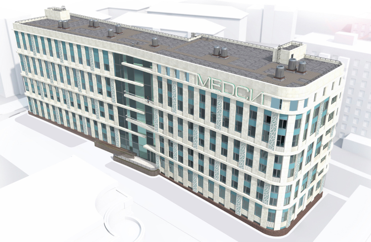
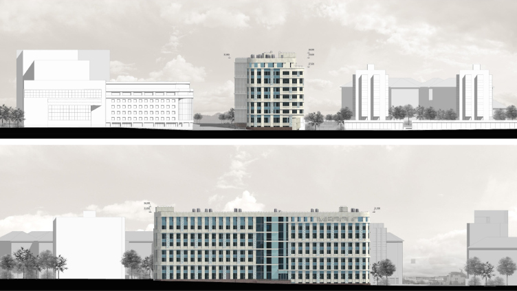
Architectural solution of the facades of the diagnostic and treatment center © GrandProjectCity


As the master designer, the company KAPSTROYPROJECT was invited that did the implementation of the project and developed its planning structure. As for the authors of the architecture of this new building, and its facades in particular, they were chosen at a closed contest that included not only Russian but also foreign companies. Karen Saprichyan, the leader of "GrandProjectCity", together with Alexander Asadov, came up with a "compromise" proposal for this contest based on today's interpretation of the motifs of late constructivism. "We wanted to keep the spirit of the place intact - Karen Saprichyan shares - and pay homage to the existing urban environment of Krasnaya Presnya area where construction was underway from the 1930's to 1980's. Today, the most high-profile edifice of this area is the 1928 building of "Gostorg" department store built upon the project of Vesnin brothers. Besides, the style of the late constructivism seemed to us to be the most appropriate for a medical institution: it is in this particular style that, say, the Kremlin health center on the Vozdvizhenka is designed of the Russian Railways health center". The contest was won, and the authors got down to the design work. 

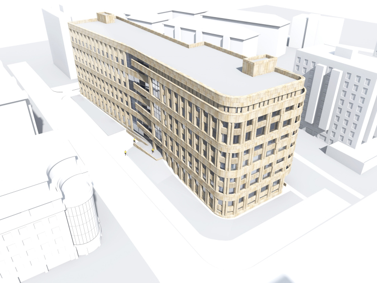
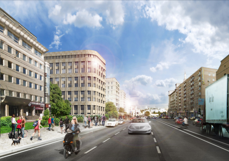
In the first version proposed by the architects, the allusions to the late constructivism were rather strong: a rounded bay window overlooking Krasnaya Presnya, large windows and doubled semi-columns, and the horizontal belts of the cornices - all reminded, among other things, the Ivan Fomin buildings. The city council gave the project its approval. The customer, however, did not go for this proposal that was not only approved but also got the "architectural and urban planning solution" certificate: the customer reasoned that the task connected with the quality health care of the new millennium was not to look like the Soviet architecture but, quite the opposite, was to belong to the new age and bring associations with today's technologies. The customer even thought of implementing a different project with fully glazed facades. 

Architectural solution of the facades of the diagnostic and treatment center. Project proposal © GrandProjectCity


Architectural solution of the facades of the diagnostic and treatment center. Concept © GrandProjectCity


However, as Karen Saprichyan shares, "thanks to the firm attitude of the main architect of Moscow Sergey Kuznetsov, it was our version that was ultimately chosen, in the spirit of Moscow constructivism". The architecture, however, had to be transformed to a large extent to answer the preferences of MEDCI GROUP. A solution that could satisfy everybody - the city, the customer, the people living in this area that also cared, and the authors as well - was long searched for, in spite of the time constraints, the building had to be built (and actually was built) very quickly - within less than two years, from autumn 2013 to summer 2015.

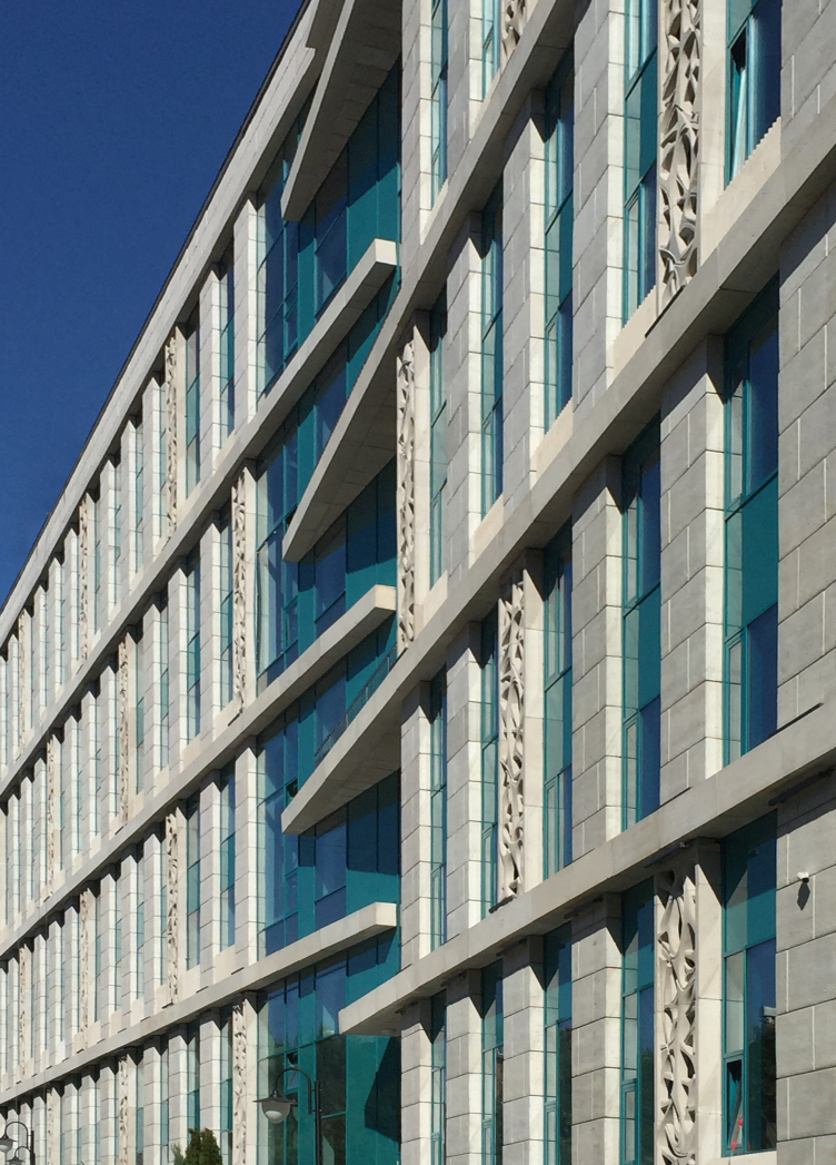
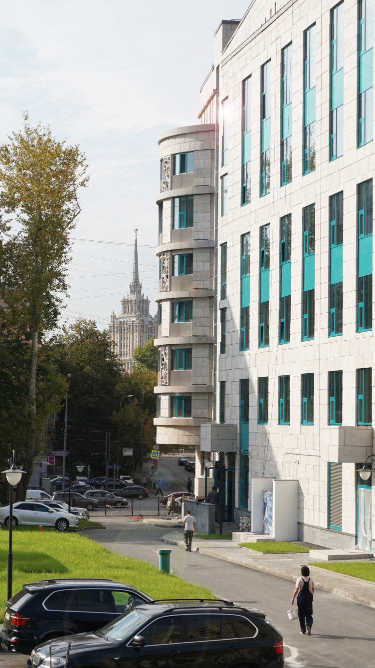
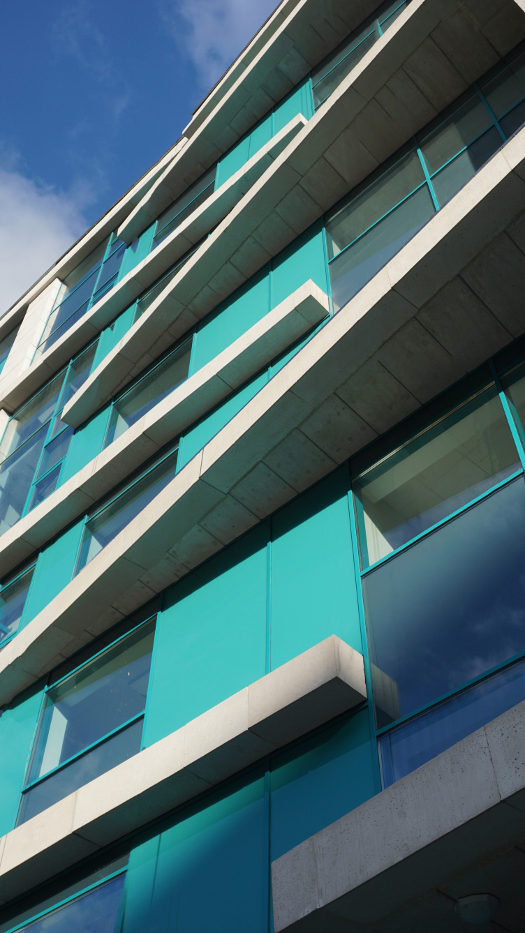
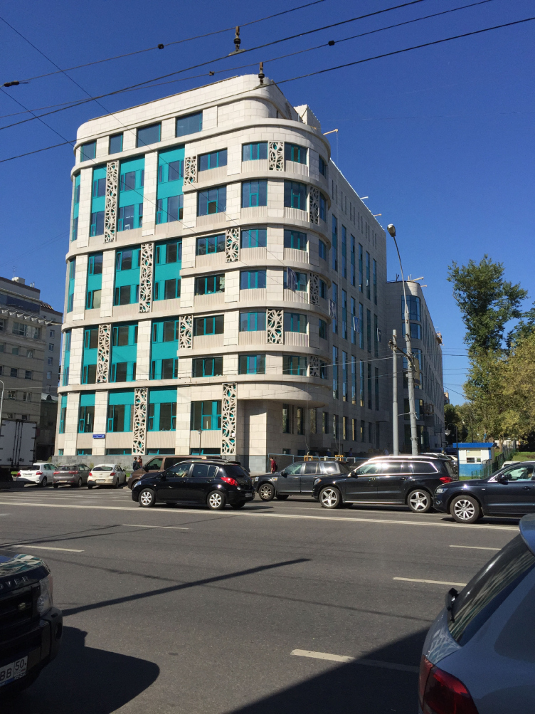
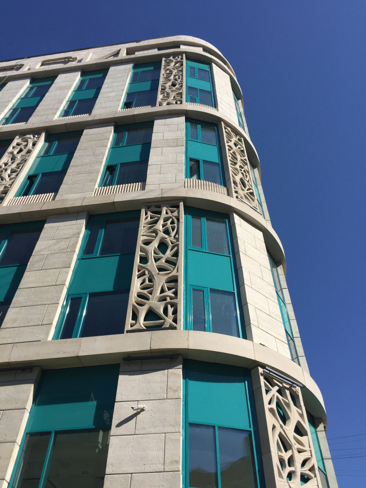
The second and final version that suited all the parties looks less than the architectural avant-garde and early neoclassic - but the architects added to it some allusions to the "Azure House" on the Leningrad Avenue built by Andrew Burov. We can see here the same concrete grid that stands out from the glass background mounted on metal framework; the difference is that glass is even more abundant here, and the cells of the grid are wider; at some places they unite, as is the custom nowadays, two floors within one cell. We see here the same dominance of verticalls, but here they are spaced more apart and are covered not with imitation Venetian marble as in the Andrew Burov house but with thin rockface panels. Incidentally, the rockface, the blades, and the layered structure of the facade with sunken-in ribbed horizontals are the actually the building's reaction its nearest surroundings; they visually resonate with the Posokhin-Mndoyants Krasnaya Presnya high-rise viewable from here in the perspective. 

Architectural solution of the facades of the diagnostic and treatment center. Project proposal © GrandProjectCity


Architectural solution of the facades of the diagnostic and treatment center © GrandProjectCity


Architectural solution of the facades of the diagnostic and treatment center © GrandProjectCity


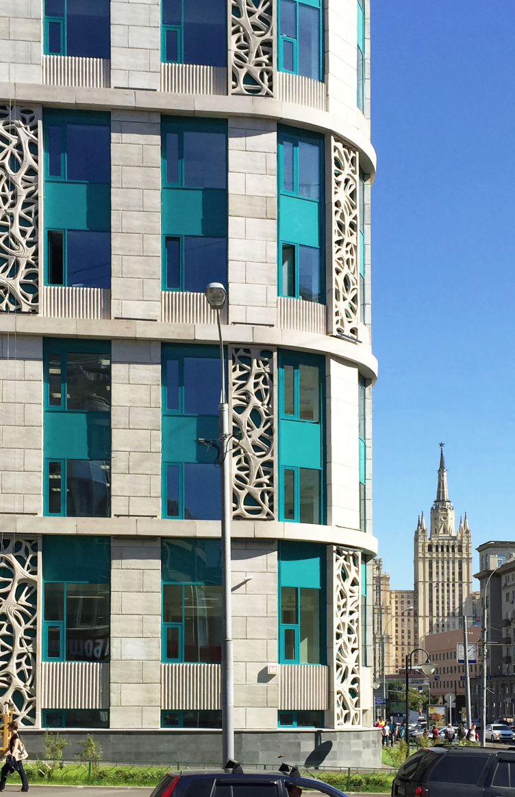
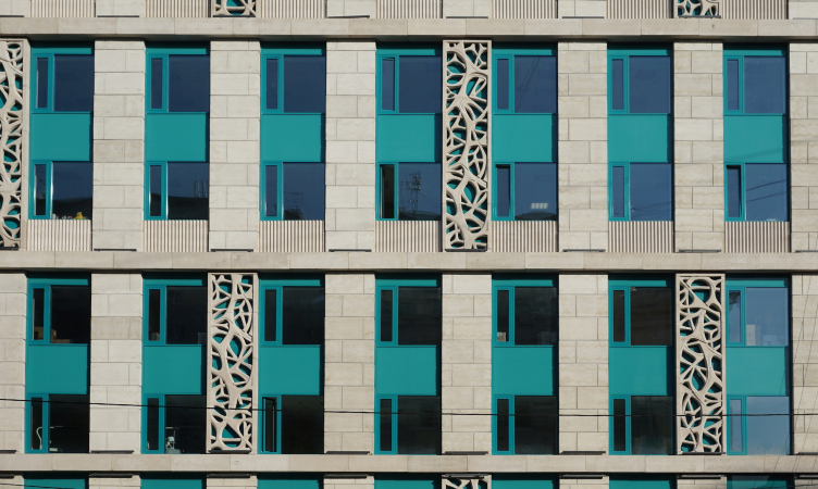
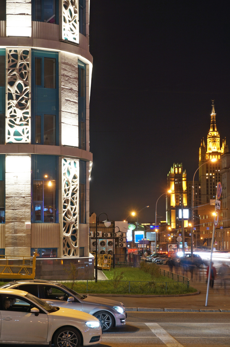
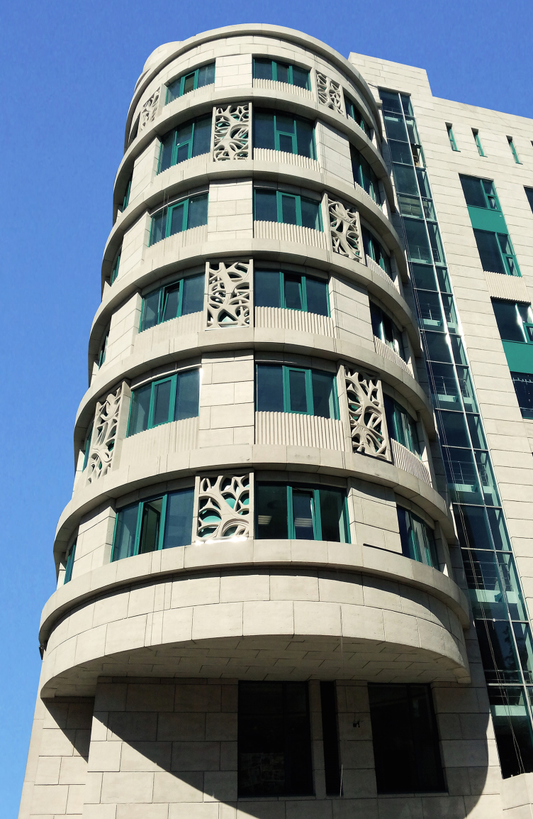
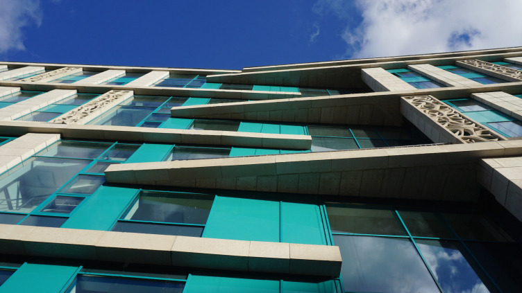
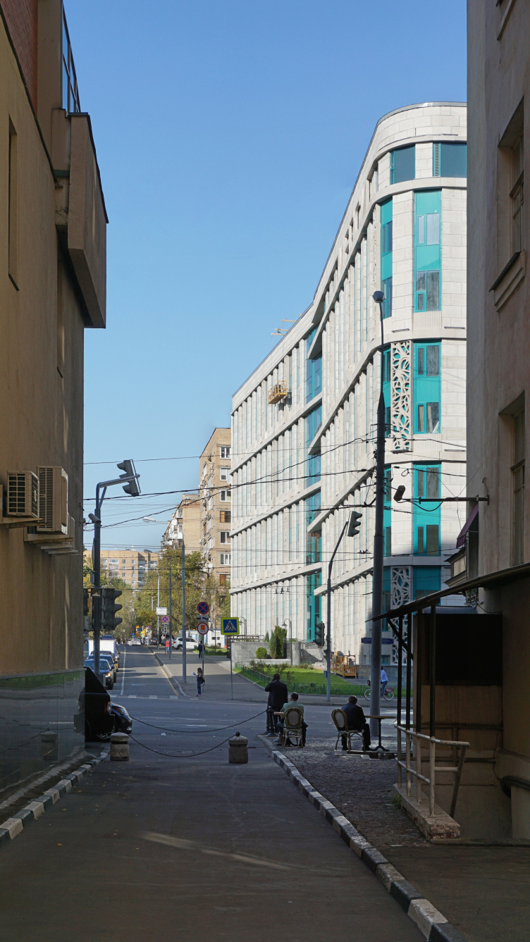
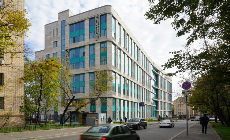
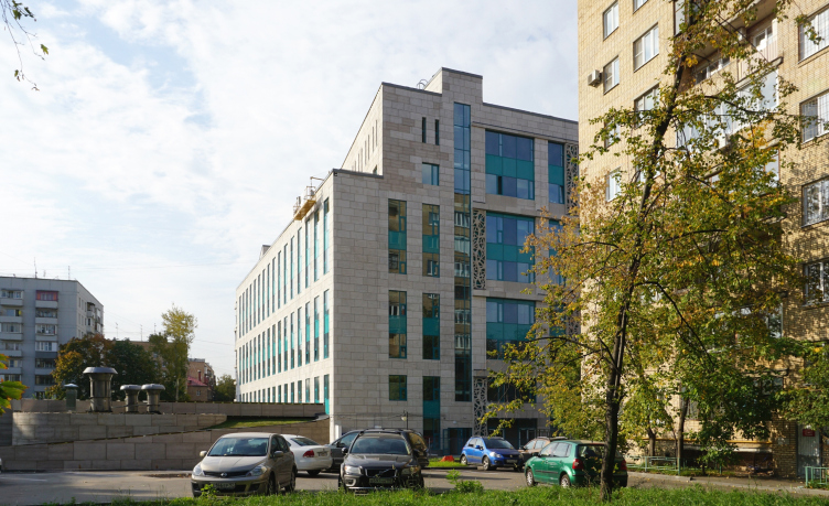
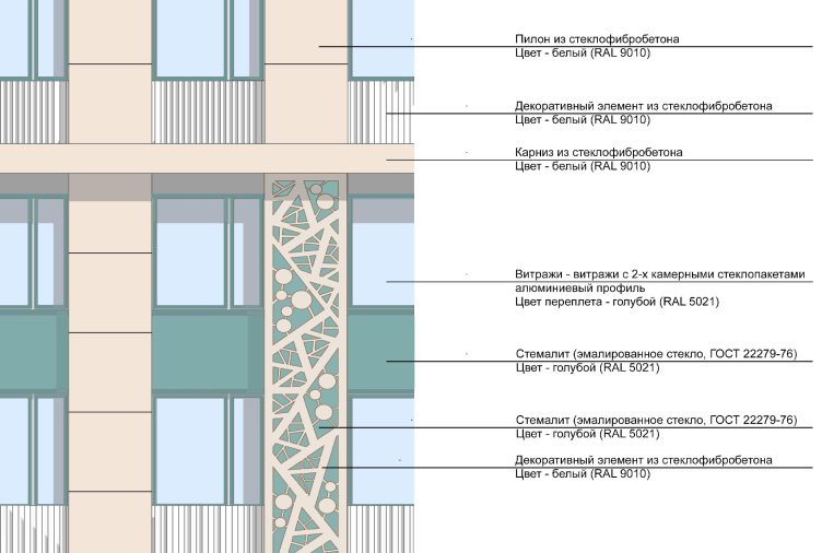
But the main thing here is the openwork panels. Their pattern is generalized and looks something like gothic spider web with a plastique that is abstract and subjected to the arch-shaped lines, even though still not completely detached from the floral motifs.

The bas-reliefs are executed from sculptural clay full-size: from 3.5 to 8 meters on Karen Saprichyan's author sketches. They were molded and produced also by the team of "GrandProjectCity". "There were many options for these drawings - the author shares: the abstract, echoing the design of the portals of the railroad tracks in the city of Adler, executed by me for the Olympics 2014; floral ornament, simple geometric kind, and others". The openwork reliefs, it must be noted, turned out to be virtually the perfect solution for the problem of reconciling the historical contextualism within the boundaries of which the architects wanted to stay, and the conformity to the expectations of today on which the customer insisted - as is known, probably the "hottest" thing in the architecture of today is the moderately abstract ornament. In other words, the panels made the building look modern and historical at the same time. For the works by the bureau of Karen Saprichyan who is both an architect and a sculptor this solution is also quite characteristic - one can say that in this case the peculiarity of the author's trademark style went a long way to quickly overcome a whole number of contradictions, at the same time endowing the building with a character of its own. 

Architectural solution of the facades of the diagnostic and treatment center © GrandProjectCity


Architectural solution of the facades of the diagnostic and treatment center © GrandProjectCity


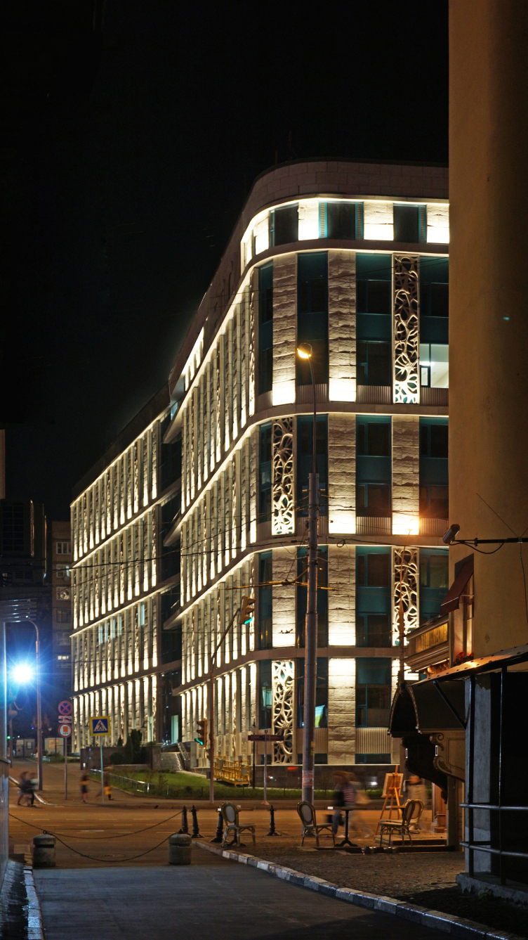
As far as the overall picture is concerned, the architectural solution is based on the combination of greenish glass - this is MEDCI trademark brand book color which allowed the authors to use this color as an "argument" and to a large degree pushed forward the process of getting the customer's approval - with light stone-looking glass fiber concrete that forms on the facades a textured grid that on the longitudinal facades United the floors into pairs changing its rhythm on the street facade, outlining of the floors. According to the architects, they deliberately varied the different architectural elements using them "to different capacities": in a more reserved way in the yard and more actively at the "visual points of importance" on the street side - this technique was meant to help create the necessary contrast and help form the accents within the framework of a certain homogeneity of the stylistic devices employed.

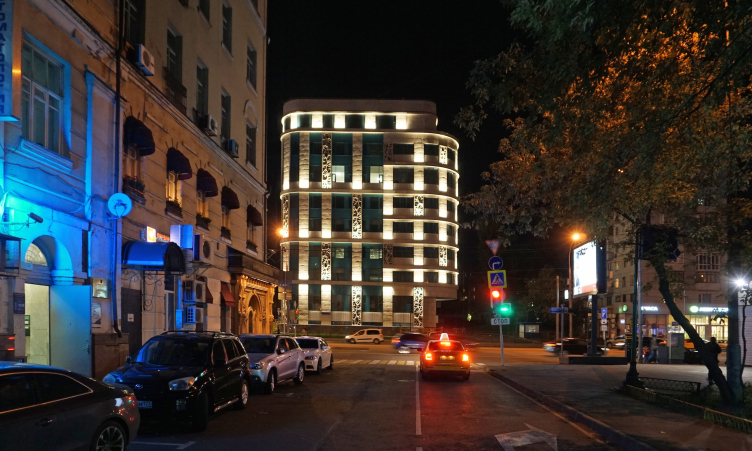
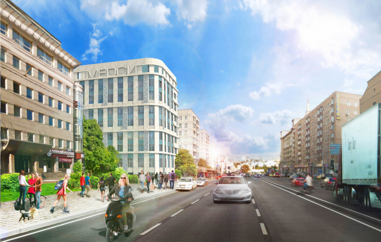
One of the most noticeable plastic techniques is inherited from the original version - this is a semicircular bay window turned into the direction of the high-rise and hanging in a neat cantilever; the architects deliberately did not stretch it up to the roof level leaving it as a recognizable quotation. The corner at the crossroads side echoes this bay window with a smooth rounding. 

Architectural solution of the facades of the diagnostic and treatment center © GrandProjectCity


Architectural solution of the facades of the diagnostic and treatment center © GrandProjectCity


Architectural solution of the facades of the diagnostic and treatment center © GrandProjectCity


The main entrance located in the middle of the slab of the building on the side of the Malaya Gruzinskaya Street, on the other hand, is accentuated by a slight cavity - the facade gets broken in a wide angle resembling an "open book" very much like the New Arbat buildings, even though the resemblance here is less obvious. At the place of the break, the facade gets predominantly glass, while the thin textured interfloor cornices of the left and right parts of the building stop short meeting like clenched fingers of a human hand - in a odd and even formula. Thus, through the difference in the rhythm and the alternation of the two-stores bands, the architects were able to visually break the elongated building into two volumes, as if growing into each other on the pivot of the entrance lobby. On the yard side, there is a cavity in this key place. 

Architectural solution of the facades of the diagnostic and treatment center. View from Krasnaya Presnya © GrandProjectCity


Besides, the new building fits in perfectly with the array of the soviet nine-story high-rises at Krasnaya Presnya - its tallness and color make it look like it really belongs here. 

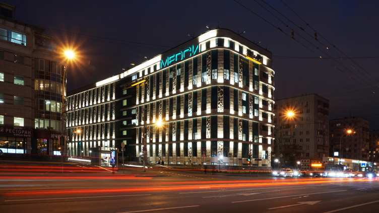
An important part in creating the individual image of the building is played by the architectural backlighting that helps to reveal the structure of the facades and enhance the individuality of the plastic techniques. The openwork panels got a special "bonus" - RGB backlight in the full color range; it delicately accentuates the inserts without violating the integrity of the facade structure. 


The complex at the Krasnaya Presnya was built really fast, in spite of the complexity of the land site and the issues having to do with the demolition of the old building. The construction began in 2014, and as early as before 2016 the center should open for the patients. The clinic will cover all the medical branches from general therapy to immunology and allergy research. The clinic will also include the day patient facility, the operational, and the diagnostic block. For the nation's capital, this is a great step in the development of its health care system, however payable, while for the city environment it is something like a vitamin injection, an example of almost literal "alloy" of reflections of the days past with the new ideas of tomorrow. 
Architectural solution of the facades of the diagnostic and treatment center © GrandProjectCity
Architectural solution of the facades of the diagnostic and treatment center. Concept © GrandProjectCity
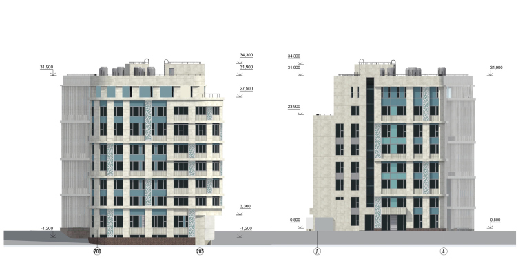
Architectural solution of the facades of the diagnostic and treatment center. Facades © GrandProjectCity
Architectural solution of the facades of the diagnostic and treatment center. Facade © GrandProjectCity
Architectural solution of the facades of the diagnostic and treatment center. Fragment of the facade with the marks of finishing materials © GrandProjectCity


24 September 2015

Headlines now
The Golden Crown
The concept for a dental clinic in Yekaterinburg, developed by CNTR Studio, revolves around the idea of a “mouth full of gold”: pristine white porcelain stoneware walls are complemented by matte brass details. To avoid an overly literal interpretation, the architects focused on the building’s proportions, skillfully navigating between sunlight requirements and fire safety regulations.
Flexibility and Integration
Not long ago, we covered the project for the fourth phase of the ÁLIA residential complex, designed by APEX. Now, we’ve been shown different fence concepts they developed to enclose the complex’s private courtyards, incorporating a variety of public functions. We believe that the sheer fact that the complex’s architects were involved in such a detail as fencing speaks volumes.
A Step Forward
The HIDE residential complex represents a major milestone for ADM architects and their leaders Andrey Romanov and Ekaterina Kuznetsova in their quest for a fresh high-rise aesthetic – one that is flexible and layered, capable of bringing vibrancy to mass and silhouette while shaping form. Over recent years, this approach has become ADM’s “signature style”, with the golden HIDE tower playing a pivotal role in its evolution. Here, we delve into the project’s story, explore the details of the complex’s design, and uncover its core essence.
Gold in the Sands
A new office for a transcontinental company specializing in resource extraction and processing has opened in Dubai. Designed by T+T Architects, masters of creating spaces that are contemporary, diverse, flexible, and original, this project exemplifies their expertise. On the executive floor, a massive brass-clad partition dominates, while layered textures of compressed earth create a contextually resonant backdrop.
Layers and Levels of Flight
This project goes way back – Reserve Union won this architectural competition at the end of 2011, and the building was completed in 2018, so it’s practically “archival”. However, despite being relatively unknown, the building can hardly be considered “dated” and remains a prime example of architectural expression, particularly in the headquarters genre. And it’s especially fitting for an aviation company office. In some ways, it resembles the Aeroflot headquarters at Sheremetyevo but with its own unique identity, following the signature style of Vladimir Plotkin. In this article, we take an in-depth look at the United Aircraft Corporation (UAC) headquarters in the Moscow agglomeration town of Zhukovsky, supplemented by recent photographs from Alexey Naroditsky – a shoot that became only recently possible due to the fact that improvements were finally made in the surrounding area.
Light and Shadow
In this article, we delve into the architectural design of the “Chaika” house by DNK ag architects, which was recently completed in 2023 as part of the collection of signature designs at ZILArt. As is well-known, all the buildings in this complex follow a design code, yet each one is distinct. This particular building stands out not only for its whiteness and minimalism but also for the refined use of a limited number of techniques that, together, create what can confidently be called synergy.
Casus Novae
A master plan was developed for a large residential area with a name of “DNS City”, but now that its implementation began, the plan has been arbitrarily reformatted and replaced with something that, while similar on the surface, is actually quite different. This is not the first time such a thing happens, but it’s always frustrating. With permission from the author, we are sharing Maria Elkina’s post.
Treasure Hunting
The GAFA bureau, in collaboration with Tegola and Arkhitail, organized an expedition to the island of Kilpola in Karelia as part of Moskomarkhitektura’s “Open City” festival. There, amidst moss and rocks, the students sought answers to questions like: what is the sacred, where does it dwell, and what sustains it? Assisting the participants in this quest were landscape engineer Evgeny Levin, artist Nicholas Roerich, a moose, and the lack of cellular connection. Here’s how the story unfolded.
Depths of the Earth, Streams of Water
In the Malaya Okhta district, the Akzent building, designed by Stepan Liphart, was constructed. It follows a classic tripartite structure, yet it’s what you might call “hand-drawn”: each façade is unique in its form and details, some of which aren’t immediately noticeable. In this article, we explore the context and, together with the architect, delve into how the form was developed.
Fir Tree Dynamics
The “Airports of Region” holding is planning to build an airport in Karachay-Cherkessia, aiming to make the Arkhyz and Dombay resorts more accessible to travelers. The project that won in an invitation-only competition, submitted by Sergey Nikeshkin’s KPLN, blends natural imagery inspired by the shape of a conifer seed, open-air waiting spaces, majestic large trees, and a green roof elevated on needle-like columns. The result is both nature-inspired and WOW.
​A Brick Shell
In the process of designing a clubhouse situated among pine trees in a prestigious suburban area near Moscow, the architectural firm “A.Len” did the façade design part. The combination of different types of brick and masonry correlates with the volumetric and plastique solutions, further enhanced by the inclusion of wood-painted fragments and metal “glazing”.
Word Forms
ATRIUM architects love ambitious challenges, and for the firm’s thirtieth anniversary, they boldly play a game of words with an exhibition that dives deep into a self-created vocabulary. They immerse their projects – especially art installations – into this glossary, as if plunging into a current of their own. You feel as if you’re flowing through the veins of pure art, immersed in a universe of vertical cities, educational spaces – of which the architects are true masters – and the cultural codes of various locations. But what truly captivates is the bold statement that Vera Butko and Anton Nadtochy make, both through their work and this exhibition: architecture, above all, is art – the art of working with form and space.
Flexibility and Acuteness of Modernity
Luxurious, fluid, large “kokoshniks” and spiral barrel columns, as if made from colorful chewing gum: there seem to be no other mansion like this in Moscow, designed in the “Neo-Russian-Modern” style. And the “Teremok” on Malaya Kaluzhskaya, previously somewhat obscure, has “come alive with new colors” and gained visibility after its restoration for the office of the “architectural ecosystem” as the architects love to call themselves. It’s evident that Julius Borisov and the architects at UNK put their hearts into finding this new office and bringing it up to date. Let’s delve into the paradoxes of this mansion’s history and its plasticity. Spoiler: two versions of modernity meet here, both balancing on the razor’s edge of “what’s current”.
Yuri Vissarionov: “A modular house does not belong to the land”
It belongs to space, or to the air... It turns out that 3D printing is more effective when combined with a modular approach: the house is built in a workshop and then adapted to the site, including on uneven terrain. Yuri Vissarionov shares his latest experience in designing tourist complexes, both in central Russia and in the south. These include houseboats, homes printed from lightweight concrete using a 3D printer, and, of course, frame houses.
​Moscow’s First
“The quality of education largely depends on the quality of the educational environment”. This principle of the last decade has been realized by Sergey Skuratov in the project for the First Moscow Gymnasium on Rostovskaya Embankment in the Khamovniki district. The building seamlessly integrates into the complex urban landscape, responding both to the pedestrian flow of the city and the quiet alleyways. It skillfully takes advantage of the height differences and aligns with modern trends in educational space design. Let’s take a closer look.
Looking at the Water
The site of Villa Sonata stretches from the road to the water’s edge, offering its own shoreline, pier, and a picturesque river panorama. To reveal these sweeping views, Roman Leonidov “cut” the façade diagonally parallel to the river, thus getting two main axes for the house and, consequently, “two heads”. The internal core – two double-height spaces, a living room and a conservatory, with a “bridge” above them – makes the house both “transparent” and filled with light.
The White Wing
Well, it’s not exactly white. It’s more of a beige, white-stone structure that plays with the color of limestone – smoother surfaces are lighter, while rougher ones are darker. This wing unites various elements: it absorbs and interprets the surrounding themes. It responds to everything, yet maintains a cohesive expression – a challenging task! – while also incorporating recognizable features of its own, such as the dynamic cuts at the bottom, top, and middle.
Urban Dunes
The XSA Ramps team designed and built a three-part sports hub for a park in Rostov-on-Don, welcoming people of all ages and fitness levels. The skate plaza, pump track, and playground are all meticulously crafted with details that attract a diverse range of visitors. The technical execution of the shapes and slopes transforms this space into a kind of sculptural composition.
Proportional Growth
The project for the fourth phase of the ÁLIA residential area has been announced. The buildings are situated on an elongated plot – almost a “ray” that shoots out from the center of the area towards the river. Their layout reflects both a response to Moscow’s architectural preferences over the past 15 years, shifting “from blocks to towers”, and an interpretation of the neighboring business park designed by SOM. Additionally, the best apartments here are not located at the very top but closer to the middle, forming a glowing “waistline”.
The “Staircase” Building
In designing the “Details” residential complex in New Moscow, Rais Baishev spiced up the now-popular Moscow theme of a “courtyard” building with an idea drawn from the surrealist drawings by Maurits Escher. He envisioned the stepped silhouettes and descending slopes as a metaphysical mega-staircase, creating a key void within the courtyard that gave the project an internal “spine”. This concept is felt both in the building’s silhouette and on its façades.
Projection of the Quarter
No one doubted that the building that Vladimir Plotkin designed as part of the “Garden Quarters” would be the most modernist of all. And it turned out just that way: while adhering to the common design code, the building successfully combines brick and white stone, rhythmically responding to the neighboring building designed by Ostozhenka, yet tactfully and persistently making a few statements of its own. This includes the projection of the ideal urban development composition “14–9–6”, which can be found right next door, mathematical calculations, including those for various types of terraces (and perhaps the only reminder of the Soviet past of the Kauchuk rubber factory!), and the white “cross-stitch” pattern of the façade grid.
Domus Aurea
In this issue, we examine the “Tessinsky-1” house, designed by Sergey Skuratov and completed in 2023. Located in the middle of the Serebryanicheskaya Embankment district, at the intersection of its main streets, this house assumes a sort of “nodal” role: it not only responds to everything around it and preserves many memories of the former EMA factory within itself, but it weaves all this into a newly directed pattern, reconciling bright “gold” and dark-colored brick, largely with the help of the new, modern-yet-archaic Columba brick, which, come to think about it, is the most precious element here.
The Chimney of Nikola-Lenivets
In this issue, we are examining the “Obelisk House” designed by KATARSIS and built for the Arkhstoyanie 2023 festival. However, it was only finished later on, and this is why we are examining it now. It seems to us that after the “Obelisk House” appeared in Nikola-Lenivets, a dialogue and a few inner connections appeared between the temporary structures built here. These houses no longer look like “accidental neighbors”, more of which below.
​Periscope by the Bay
The jury awarded the second place in the competition for a public and cultural center in Petropavlovsk-Kamchatsky to the companies GORA (“Mountain”) and M4. In the consortium’s proposal, the building resembles a sperm whale with a calf swimming next to it or a periscope, whose lenses capture the most spectacular views from the surrounding landscape.
From Arcs to Dolmens
While working on the competition project for Petropavlovsk-Kamchatsky, ASADOV Architects prioritized the value of the natural and urban environment, aiming to preserve the balance of the location while minimizing the resemblance of the volume that they designed to a “traditional building”. The task was challenging, and the architects created three versions, one of which having been developed after the competition, where their main proposal took third place. However, the point of interest here is not the competition result but the continuity of creative thinking.
Hide and Seek
The ID Moskovskiy house, designed by Stepan Liphart in St. Petersburg, in the courtyards near Moskovskiy Avenue beyond the Obvodny Canal and recently completed, is notable for several reasons. Firstly, it has been realized with considerable accuracy, which is particularly significant as this is the first building where the architect was responsible not only for the facades but also for the layouts, allowing for better integration between the two. On the other hand, this building is interesting as an example of the “germination” of new architecture in the city: it draws on the best examples from the neighborhood and becomes an improved and developed sum of ideas found by the architect in the surrounding context.
The Big Twelve
Yesterday, the winners of the Moscow Mayor’s Architecture Award were announced and honored. Let’s take a look at what was awarded and, in some cases, even critique this esteemed award. After all, there is always room for improvement, right?
Above the Golden Horn
The residential complex “Philosophy” designed by T+T architects in Vladivostok, is one of the new projects in the “Golubinaya Pad” area, changing its development philosophy (pun intended) from single houses to a comprehensive approach. The buildings are organized along public streets, varying in height and format, with one house even executed in gallery typology, featuring a cantilever leaning on an art object.
Nuanced Alternative
How can you rhyme a square and space? Easily! But to do so, you need to rhyme everything you can possibly think of: weave everything together, like in a tensegrity structure, and find your own optics too. The new exhibition at GES-2 does just that, offering its visitor a new perspective on the history of art spanning 150 years, infused with the hope for endless multiplicity of worlds and art histories. Read on to see how this is achieved and how the exhibition design by Evgeny Ace contributes to it.
Blinds for Ice
An ice arena has been constructed in Domodedovo based on a project by Yuri Vissarionov Architects. To prevent the long façade, a technical requirement for winter sports facilities, from appearing monotonous, the architects proposed the use of suspended structures with multidirectional slats. This design protects the ice from direct sunlight while giving the wall texture and detail.