По-русски

Man of Letters

The construction of "Literator" ("Man of Letters") residential complex has been completed: the architects made it ostentatiously modern, abandoning, among other things, the idea of the grand façade in favor of revisiting the immanent peculiarities of red and white brickwork.

11 September 2015
Object
mainImg
Object:
Residential Cluster on Leo Tolstoy Street (′Litterateur′)
Russia, Moscow, Leo Tolstoy St., 27/3

Project Team:
Architects: A.Medvedev, M.B. Serebryanikov, T. Gruzdeva. Engineering: I.Z.Schwartzman, K.A. Spiridonov, A.A. Korshunov, S.A.Arenina

2009 — 2010 / 2010 — 2011

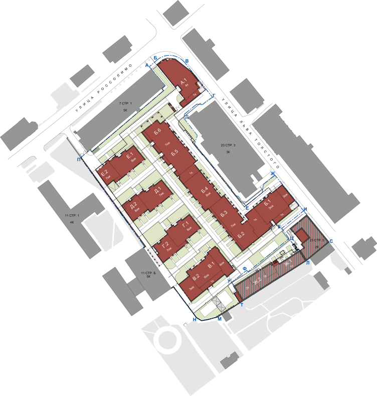
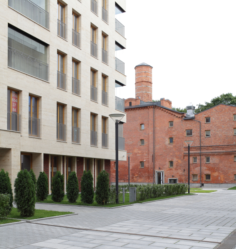
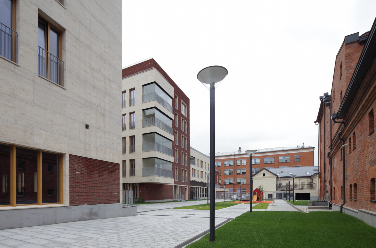
We have already covered the project of "Literator" residential complex in Moscow's district of Khamovniki: "Sergey Kiselev and Partners" designed it on commission by "Gals Development" in the stead of a former brewery at the crossing of Rossolimo and Leo Tolstoy streets. The land site is rather large by Moscow standards - around two hectares - but is sunken into the yards and surrounded with protected buildings practically from all sides: one building of the brewery, the oldest one, low-rise, the one with a chimney, separates the complex of the park that belongs to Leo Tolstoy museum; another - a three-story building of the late XIX century, stretches along the street that bears the great writer's name; the third one - the Institute of Drinks built in the late seventies and now looking rather on the shabby side forms the line of the Rossolimo Street. The appearance, against this motley backdrop, of a new elite residential complex is almost unfelt: on the red line, it only manifests itself by two small buildings neatly inscribe into the breaks in the city matter. 

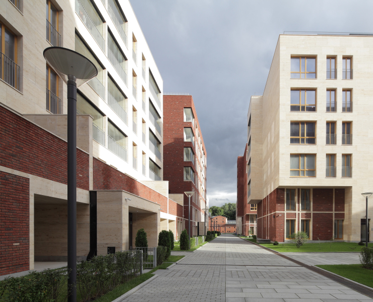
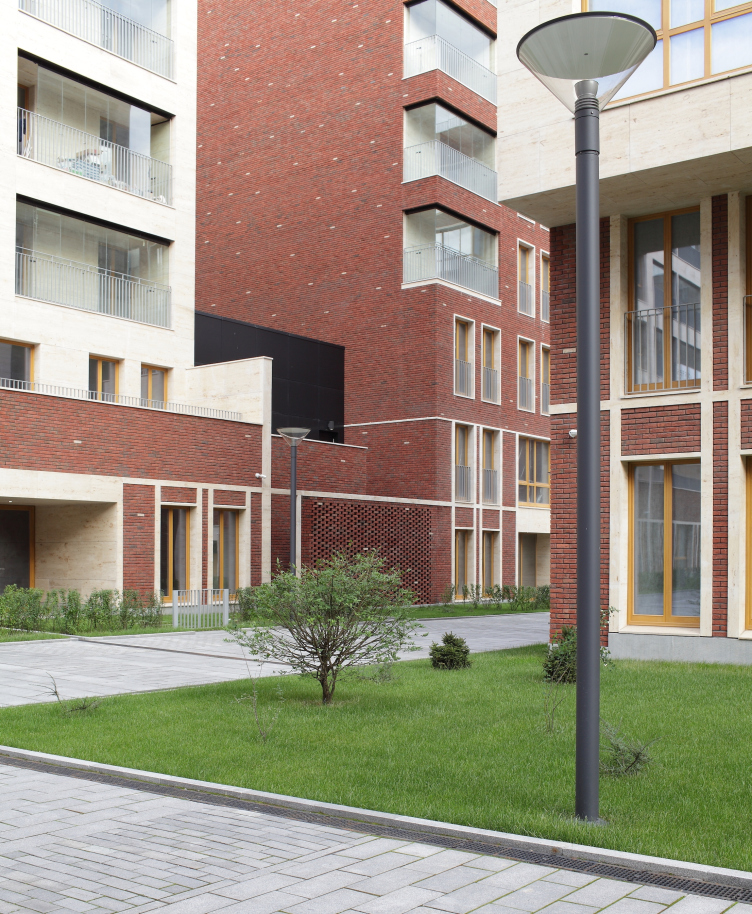
Residetial complex at the Leo Tolstoy Street. Photograph © Mikhail Serebryakov, "Sergey Kiselev and Partners"
Residetial complex at the Leo Tolstoy Street. Master plan © "Sergey Kiselev and Partners"


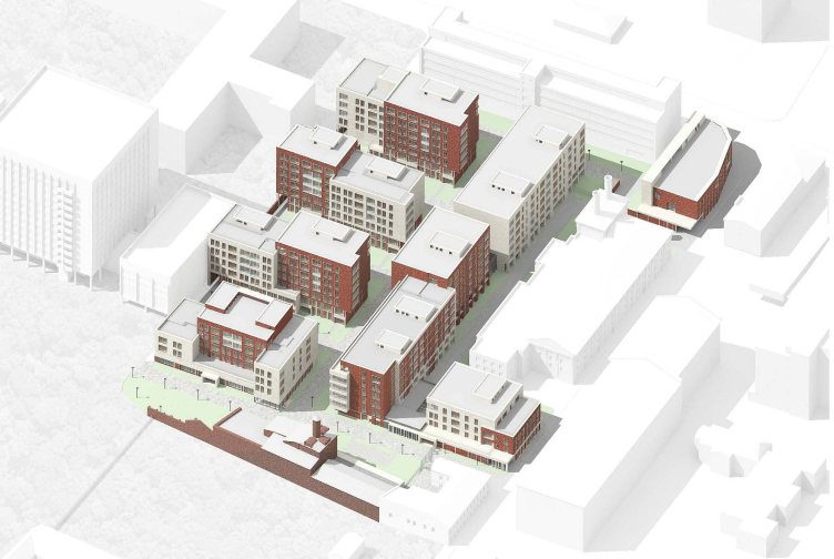
Residetial complex at the Leo Tolstoy Street © "Sergey Kiselev and Partners"


Residetial complex at the Leo Tolstoy Street. View of the yard from the direction of the brewery. Photograph © Mikhail Serebryakov, "Sergey Kiselev and Partners"


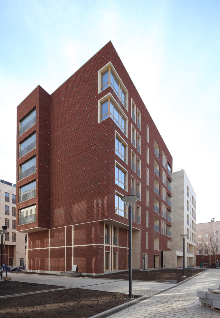
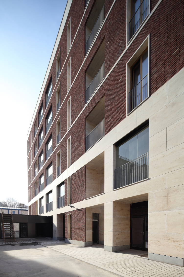
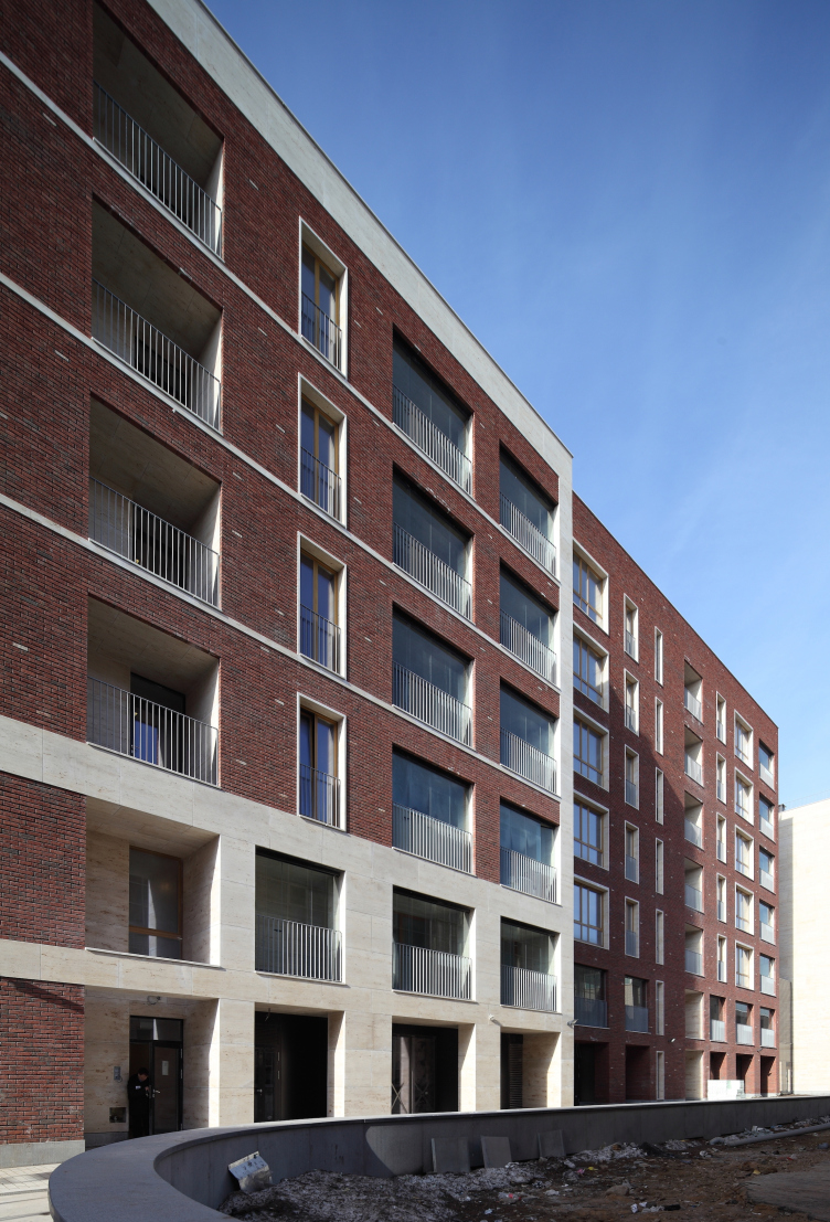
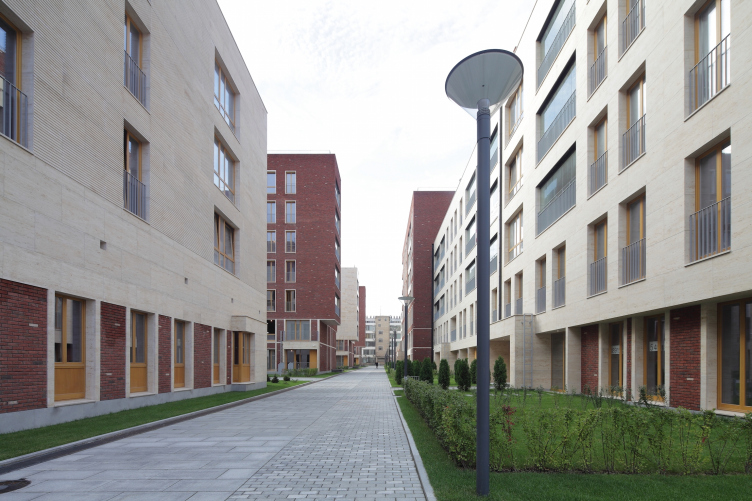
According to the chief architect of the project Aleksey Medvedev, the authors' two main tasks were: to squeeze as much as possible of usable floor space within the existing limits - and here, in the proximity of Leo Tolstoy estate, these limits are rather strict - and to "avoid vulgarity" that was suggested by the elite central location and, again, the proximity of the museum. And, indeed, the architecture of the project is all about austere geometry and is reserved when it comes to details. Meanwhile, at the developer's website, the "modern classic" term is used anyway. But then again, one could also agree with this definition for a number of reasons: although completely devoid of so much as a hint at historical decor, this complex is in fact part of the red-brick tradition that came to Moscow from Berlin and over the last ten-fifteen years has become the recognized standard of filling in the spaces in the historical districts. Such buildings, as a rule, combine the plaster coating - a favorite with the city architecture of the 2000's - with different types of unusual bricks, the peculiar thing being that while the Jurassic stone can merely function as backdrop material, it is the brick that actually defines the identity of the building, sometimes black, sometimes gray, sometimes rugged, sometimes textured. In "Literator" buildings, this is precisely the case: the architects deliberately chose not the brown brick (the kind that Moscow got tired of as early as in the late 2000's) but the saturated red. The resulting color is still a little on the brown side but it is picturesque enough to fit in with the street's color palette formed by the factory buildings of the late XIX century.

Furthermore, the most curious themes of "Literator" architecture are built specifically on variations of red-brick coating. The brick is rugged, the introductions of sand and clay are clearly traceable; the brickwork is evenly diluted by "burned-out" violet fractions that are meant, just as everything else mentioned above, to give the wall a handmade look, akin to historical. The architects, however, do not limit themselves to the basic rank-and-file set of techniques here.

Residetial complex at the Leo Tolstoy Street. Photograph © Mikhail Serebryakov, "Sergey Kiselev and Partners"


Residetial complex at the Leo Tolstoy Street. Photograph © Mikhail Serebryakov, "Sergey Kiselev and Partners"


Because of the fact that the complex is inscribed - or, as the architects say, literally "squeezed" into the yards - it is completely devoid of the traditional main pride of any such establishment: the grand facade. Try as you might, there is just no place for it. But, since one of the goals was staying within the limits of the "image of today", instead of the proud representational composition, the complex exits to the street with a few driveways and two quite small buildings. One of them, turned to "Stroganoff" office center, is minimalist and simple: it is only livened up by the inserts of whitish bricks that look like flecks of sunlight (their surface is sandblasted with some light substance). The strokes of the light-colored bricks reminding one of the spring sun are to be seen on the inside buildings as well.

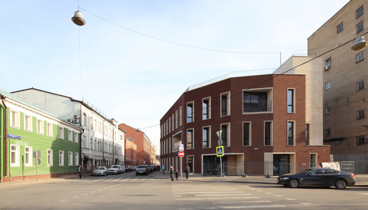
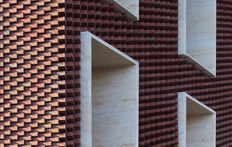
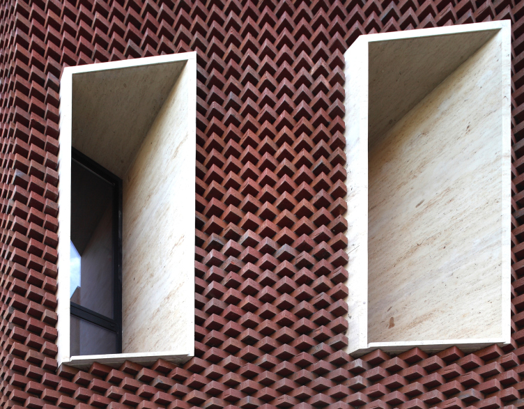
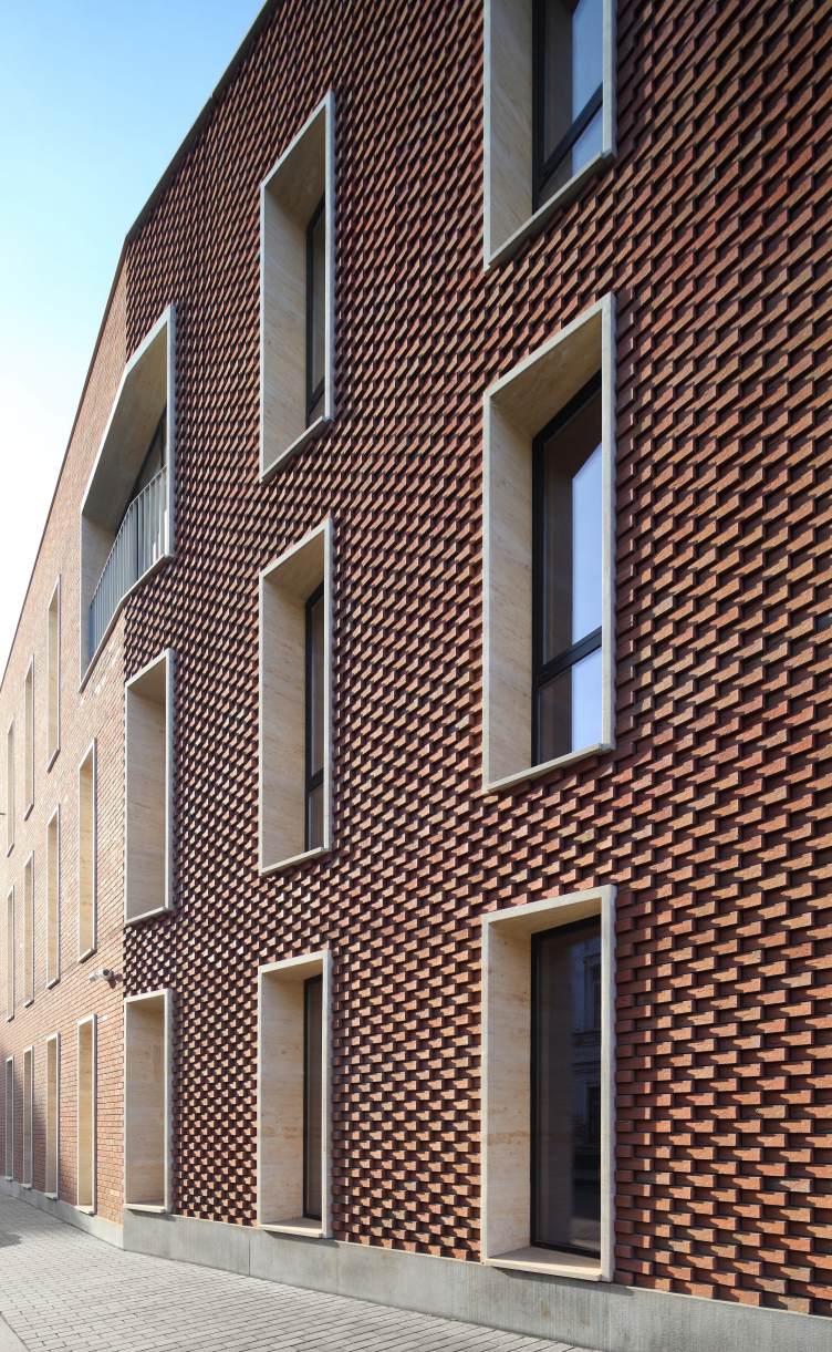
Another building that exits out to the street is the corner Building A; it takes on the role of the main accent because it is the most curious of all. The building overlooks the crossing of Leo Tolstoy and Rossolimo streets, spacious and almost undecorated, and the new building sensitively reacts to its urban incompleteness. Its corner facade turns along a parabola but its shape is not exactly rounded but faceted, and, what's more, the bricks do not change their direction in accordance with the wall surfaces: they line up as a "saw", showing their jagged edges first tentatively then at full force clearly stating that they are not at all the facing sommer and not even rock-bar but the noble plinthiform bricks. Which, of course, is an illusion: for the textured part, special brick is used, and in all the other places it is sommer.

Residetial complex at the Leo Tolstoy Street. The non-residential building at the corner of Leo Tolstoy and Rosolimo streets. Photograph © Mikhail Serebryakov, "Sergey Kiselev and Partners"


Residetial complex at the Leo Tolstoy Street. Corner building. Fragment. Photograph © Mikhail Serebryakov, "Sergey Kiselev and Partners"


Residetial complex at the Leo Tolstoy Street. Corner building. Fragment. Photograph © Mikhail Serebryakov, "Sergey Kiselev and Partners"


Anyway, in the places where the walls are slanted, the brick does not trace their surface but bristles in saw teeth. This is the way some columns might look in a derelict manor estate - but in the case of this derelict major estate they are truly in a neglected state while here it is meant to look this way. In fact, in the corner building, the architects did something that can be called deconstruction of the facade: they left the facade deliberately unfinished as if it - like many Italian temples, Saint Lorenzo in Florence, for example - never got its facing work. The theme is picked up by the slim boxes of the white stone window frames inserted in the rough thickness of the brick - as if waiting to be decorated. But alas - it is destined to remain skinless forever. 

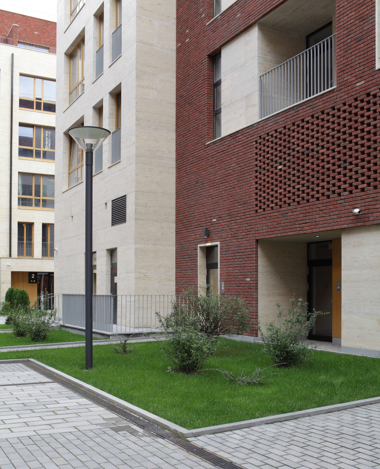
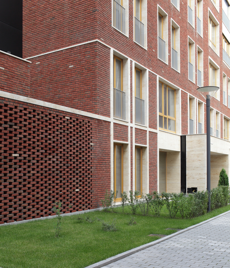
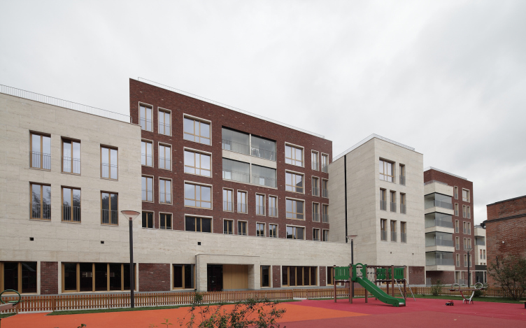
These bristling bricks - the ultimate antithesis to the grand facade - practically become the manifesto of "Literator" architecture. This "sign facade" is executed with a fair share of incompleteness, not devoid of artistry. On the southern side wall of Building B, turned to the playground and the old building of the brewery, the theme of incompleteness continues: here the wall is designed as a softly drawn indenting of the brickwork. This texture appears at a few more side walls signifying the internal "breaks" between the buildings; the stripes rhyme with the spots of the brick grilles - this is also an environment element borrowed from the neighboring Eyesight Research Institute (the fence may be taken down in the future but the reflected motif will remain).

Residetial complex at the Leo Tolstoy Street. Fragment with the brickwork grid. Photograph © Mikhail Serebryakov, "Sergey Kiselev and Partners"


Residetial complex at the Leo Tolstoy Street. Photograph © Mikhail Serebryakov, "Sergey Kiselev and Partners"


Residetial complex at the Leo Tolstoy Street. facade with indented strips. Photograph © Mikhail Serebryakov, "Sergey Kiselev and Partners"


This incompleteness of the joints turned outward looks like a declarative gesture having to do with considering the place of this complex within this city: its being at once skin and alien to the territory that it occupies. The buildings look like "wanderers" - as if they had been severed from somewhere, then brought in here, and the jagged edges of the breaks remained. The message is encoded, though: if, while passing by, one simply glances along the building he can enjoy the play of light and shade on the unusual brick texture.

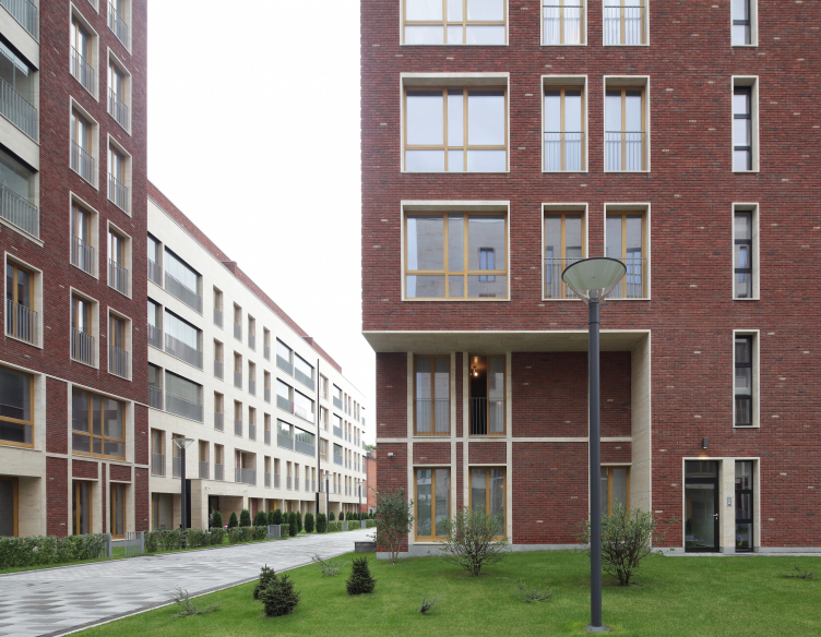
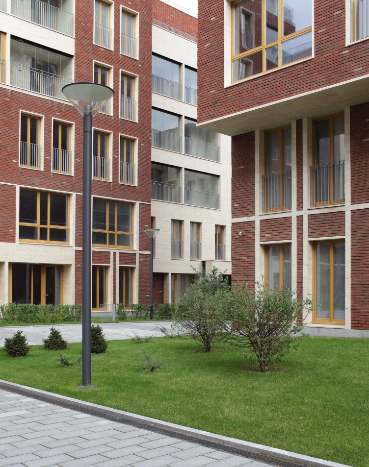
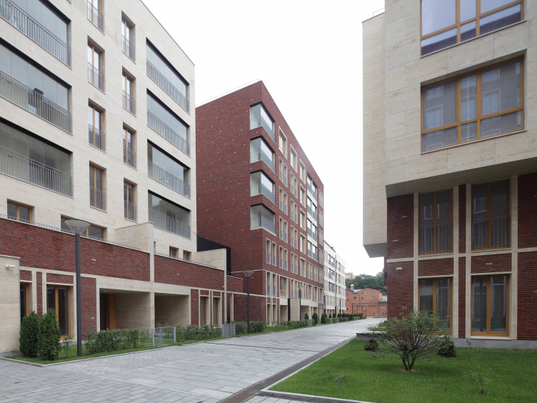
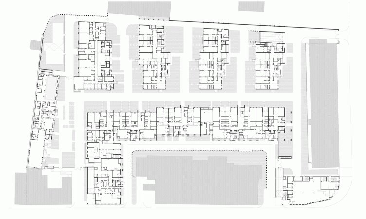
But still the complex is an elite housing establishment - it has penthouses with terraces on their roof, and two-level apartments. The subtleties of the contextual meanings are not the most important thing for it, and on the inside, where the city's restrictions are less strong, the buildings grow considerably larger, taller, and more respectable-looking. The white stone and the red-brick volumes alternate and grow into one another forming sometimes projections, sometimes indents, livening up in groups of deep stanzas and arrays of transparent balconies. The beam of the long Building "B" stretches along the red line of an inside street parallel to Leo Tolstoy. Livened up by asymmetric projections, its facade is clearly visible in the breaks in the building front, and it also plays the "representation" part - in its own way, even if from the back row. The long house works as a fence that protects the space of the inner yards with three short buildings whose first floors are slit with an enfilade of tall driveways on long "legs" clearly viewable from the Rossolimo street. The architects say that it might have been easier to simply set another long building inside the yard but they took a different path, fracturing the yards and stringing not a material but a "territorial" axis through them. There is getting inside: the security guards are watching over the peace of the future inhabitants of the elite complex, it is only the street running along Building B that is accessible to the general public. 

Residetial complex at the Leo Tolstoy Street. Photograph © Mikhail Serebryakov, "Sergey Kiselev and Partners"


Residetial complex at the Leo Tolstoy Street. facade of the "beam" building. Photograph © Mikhail Serebryakov, "Sergey Kiselev and Partners"


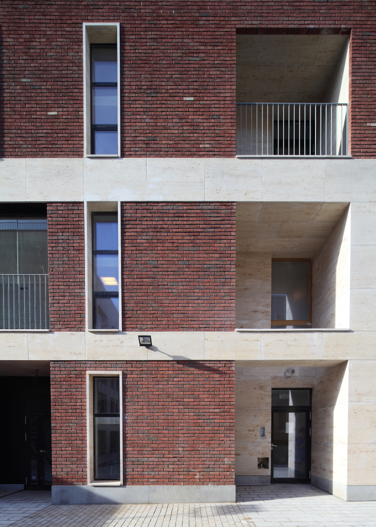
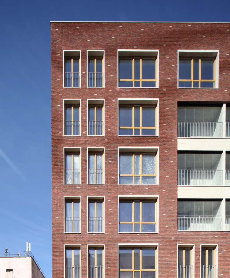
The architecture inside the complex is also not devoid of a note of deconstruction that livens up the masses of bricks and stones. First of all, the windows in the brick walls are framed by slender white stone frames that do anything but try to merge with the wall surface - instead, they look like stone slab "boxes" inserted into the wall mass with similar slabs of windowsills. Second of all, the brick masses are sometimes streaked with broad stone bands, and sometimes with relief lines of slender grid that turns, when it reaches the bottom floor, into a large-cell grid filled with bricks, provoking a play of associations - it all looks as if the shop windows or even the Corbusier "legs" of the house were stuffed with bricks now. In a word, the stone-and-brick stylistic of recent years blends in this complex with earlier, though not completely exhausted yet, modernist deconstruction variations of the nineties, strokes that go a long way to lighten up the hefty stone volumes. 

Residetial complex at the Leo Tolstoy Street. Photograph © Mikhail Serebryakov, "Sergey Kiselev and Partners"


Residetial complex at the Leo Tolstoy Street. Photograph © Mikhail Serebryakov, "Sergey Kiselev and Partners"


Residetial complex at the Leo Tolstoy Street. Photograph © Mikhail Serebryakov, "Sergey Kiselev and Partners"


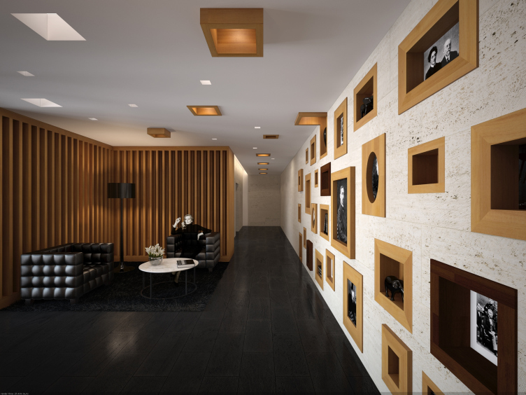
The architects of "Sergey Kiselev and Partners" also came up with the design of the entrance lobbies - initially laconic, from wood and stone, but later on, at the customer's request, the architects added a "literary" twist to it, although also to rather a moderate degree. The reception desk is decorated with italic characters, the walls are made of the same stone as the facades, and are covered with picturesquely scattered niches with wooden frames, the filling of which - flowers, photographs, and whatnot - is left to the discretion of the people who will live here. The darkish color of the wood echoes the window frames in the entire building while the leather of the armchairs enhances the "literature" quality, reminding of the furniture of Leo Tolstoy estate nearby. 

Interiors of the public and residential zones of "Literator" complex © "Sergey Kiselev and Partners"


However, the exquisite laconism of the cultural codes seemed to the customer to be not dramatic enough - and the architects painted a picture on the wall of the institute building turned into the yard of the complex, a picture bearing a spiritually patriotic message, showing a Russ guy in straw shoes and with a wolf by his side. Some of the future inhabitants of the complex, just as the architects, sincerely hope that later on thus masterpiece will be taken away. 

Back to the architecture of the complex, though! It turned out to be both laconic and up-to-date, and contextual as well. The district of Khamovniki is a place that is elite but historically discreet; it never did form the homogeneous city fabric, just like most of Moscow which, as everyone knows, is a "big village". This place used to have in it manor estates, wooden houses, and brick factory buildings later on. There is even one chamber remaining from the "Khamovniki Yard" of the XVII century; now it is surrounded by a park with American maple, imitation historical houses, and a couple of diagonally standing Brezhnev high-rises. The buildings of "Literator" neatly grow into its queasy surroundings strengthening their character towards the nucleus of the complex and "dissolving" at the edges. Besides, quite nearby, on the opposite side of the Leo Tolstoy Street, "Krasnaya Rosa" ("Red Rose") factory stands renovated into an office center also by the architects, though different ones, of "Sergey Kiselev and Partners": the facades of "Literator", although not quite perceptibly, but still echo the asymmetry of "Morozov" office building, forming, in addition to the contextual discourse, the ties that could be classified as the blood type - between different projects done by the same studio. Yes, "Sergey Kiselev and Partners" have built enough in Moscow to self-react to their own works as well. 
Residetial complex at the Leo Tolstoy Street. Corner building. Photograph © Mikhail Serebryakov, "Sergey Kiselev and Partners"
Residetial complex at the Leo Tolstoy Street. Photograph © Mikhail Serebryakov, "Sergey Kiselev and Partners"
Residetial complex at the Leo Tolstoy Street. Plan of the first floor © "Sergey Kiselev and Partners"
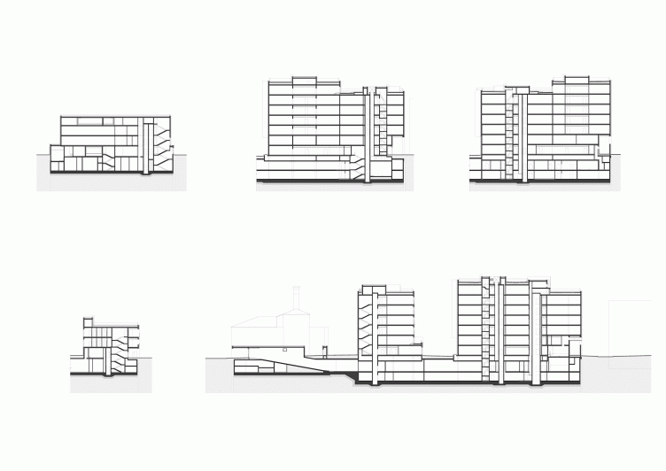
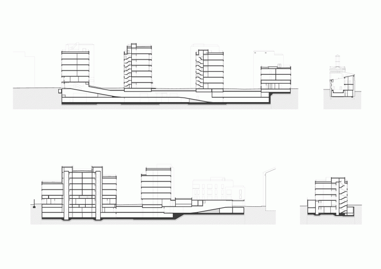
Residetial complex at the Leo Tolstoy Street. Section views © "Sergey Kiselev and Partners"


Object:
Residential Cluster on Leo Tolstoy Street (′Litterateur′)
Russia, Moscow, Leo Tolstoy St., 27/3

Project Team:
Architects: A.Medvedev, M.B. Serebryanikov, T. Gruzdeva. Engineering: I.Z.Schwartzman, K.A. Spiridonov, A.A. Korshunov, S.A.Arenina

2009 — 2010 / 2010 — 2011

11 September 2015

Headlines now
Gold in the Sands
A new office for a transcontinental company specializing in resource extraction and processing has opened in Dubai. Designed by T+T Architects, masters of creating spaces that are contemporary, diverse, flexible, and original, this project exemplifies their expertise. On the executive floor, a massive brass-clad partition dominates, while layered textures of compressed earth create a contextually resonant backdrop.
Layers and Levels of Flight
This project goes way back – Reserve Union won this architectural competition at the end of 2011, and the building was completed in 2018, so it’s practically “archival”. However, despite being relatively unknown, the building can hardly be considered “dated” and remains a prime example of architectural expression, particularly in the headquarters genre. And it’s especially fitting for an aviation company office. In some ways, it resembles the Aeroflot headquarters at Sheremetyevo but with its own unique identity, following the signature style of Vladimir Plotkin. In this article, we take an in-depth look at the United Aircraft Corporation (UAC) headquarters in the Moscow agglomeration town of Zhukovsky, supplemented by recent photographs from Alexey Naroditsky – a shoot that became only recently possible due to the fact that improvements were finally made in the surrounding area.
Light and Shadow
In this article, we delve into the architectural design of the “Chaika” house by DNK ag architects, which was recently completed in 2023 as part of the collection of signature designs at ZILArt. As is well-known, all the buildings in this complex follow a design code, yet each one is distinct. This particular building stands out not only for its whiteness and minimalism but also for the refined use of a limited number of techniques that, together, create what can confidently be called synergy.
Casus Novae
A master plan was developed for a large residential area with a name of “DNS City”, but now that its implementation began, the plan has been arbitrarily reformatted and replaced with something that, while similar on the surface, is actually quite different. This is not the first time such a thing happens, but it’s always frustrating. With permission from the author, we are sharing Maria Elkina’s post.
Treasure Hunting
The GAFA bureau, in collaboration with Tegola and Arkhitail, organized an expedition to the island of Kilpola in Karelia as part of Moskomarkhitektura’s “Open City” festival. There, amidst moss and rocks, the students sought answers to questions like: what is the sacred, where does it dwell, and what sustains it? Assisting the participants in this quest were landscape engineer Evgeny Levin, artist Nicholas Roerich, a moose, and the lack of cellular connection. Here’s how the story unfolded.
Depths of the Earth, Streams of Water
In the Malaya Okhta district, the Akzent building, designed by Stepan Liphart, was constructed. It follows a classic tripartite structure, yet it’s what you might call “hand-drawn”: each façade is unique in its form and details, some of which aren’t immediately noticeable. In this article, we explore the context and, together with the architect, delve into how the form was developed.
Fir Tree Dynamics
The “Airports of Region” holding is planning to build an airport in Karachay-Cherkessia, aiming to make the Arkhyz and Dombay resorts more accessible to travelers. The project that won in an invitation-only competition, submitted by Sergey Nikeshkin’s KPLN, blends natural imagery inspired by the shape of a conifer seed, open-air waiting spaces, majestic large trees, and a green roof elevated on needle-like columns. The result is both nature-inspired and WOW.
​A Brick Shell
In the process of designing a clubhouse situated among pine trees in a prestigious suburban area near Moscow, the architectural firm “A.Len” did the façade design part. The combination of different types of brick and masonry correlates with the volumetric and plastique solutions, further enhanced by the inclusion of wood-painted fragments and metal “glazing”.
Word Forms
ATRIUM architects love ambitious challenges, and for the firm’s thirtieth anniversary, they boldly play a game of words with an exhibition that dives deep into a self-created vocabulary. They immerse their projects – especially art installations – into this glossary, as if plunging into a current of their own. You feel as if you’re flowing through the veins of pure art, immersed in a universe of vertical cities, educational spaces – of which the architects are true masters – and the cultural codes of various locations. But what truly captivates is the bold statement that Vera Butko and Anton Nadtochy make, both through their work and this exhibition: architecture, above all, is art – the art of working with form and space.
Flexibility and Acuteness of Modernity
Luxurious, fluid, large “kokoshniks” and spiral barrel columns, as if made from colorful chewing gum: there seem to be no other mansion like this in Moscow, designed in the “Neo-Russian-Modern” style. And the “Teremok” on Malaya Kaluzhskaya, previously somewhat obscure, has “come alive with new colors” and gained visibility after its restoration for the office of the “architectural ecosystem” as the architects love to call themselves. It’s evident that Julius Borisov and the architects at UNK put their hearts into finding this new office and bringing it up to date. Let’s delve into the paradoxes of this mansion’s history and its plasticity. Spoiler: two versions of modernity meet here, both balancing on the razor’s edge of “what’s current”.
Yuri Vissarionov: “A modular house does not belong to the land”
It belongs to space, or to the air... It turns out that 3D printing is more effective when combined with a modular approach: the house is built in a workshop and then adapted to the site, including on uneven terrain. Yuri Vissarionov shares his latest experience in designing tourist complexes, both in central Russia and in the south. These include houseboats, homes printed from lightweight concrete using a 3D printer, and, of course, frame houses.
​Moscow’s First
“The quality of education largely depends on the quality of the educational environment”. This principle of the last decade has been realized by Sergey Skuratov in the project for the First Moscow Gymnasium on Rostovskaya Embankment in the Khamovniki district. The building seamlessly integrates into the complex urban landscape, responding both to the pedestrian flow of the city and the quiet alleyways. It skillfully takes advantage of the height differences and aligns with modern trends in educational space design. Let’s take a closer look.
Looking at the Water
The site of Villa Sonata stretches from the road to the water’s edge, offering its own shoreline, pier, and a picturesque river panorama. To reveal these sweeping views, Roman Leonidov “cut” the façade diagonally parallel to the river, thus getting two main axes for the house and, consequently, “two heads”. The internal core – two double-height spaces, a living room and a conservatory, with a “bridge” above them – makes the house both “transparent” and filled with light.
The White Wing
Well, it’s not exactly white. It’s more of a beige, white-stone structure that plays with the color of limestone – smoother surfaces are lighter, while rougher ones are darker. This wing unites various elements: it absorbs and interprets the surrounding themes. It responds to everything, yet maintains a cohesive expression – a challenging task! – while also incorporating recognizable features of its own, such as the dynamic cuts at the bottom, top, and middle.
Urban Dunes
The XSA Ramps team designed and built a three-part sports hub for a park in Rostov-on-Don, welcoming people of all ages and fitness levels. The skate plaza, pump track, and playground are all meticulously crafted with details that attract a diverse range of visitors. The technical execution of the shapes and slopes transforms this space into a kind of sculptural composition.
Proportional Growth
The project for the fourth phase of the ÁLIA residential area has been announced. The buildings are situated on an elongated plot – almost a “ray” that shoots out from the center of the area towards the river. Their layout reflects both a response to Moscow’s architectural preferences over the past 15 years, shifting “from blocks to towers”, and an interpretation of the neighboring business park designed by SOM. Additionally, the best apartments here are not located at the very top but closer to the middle, forming a glowing “waistline”.
The “Staircase” Building
In designing the “Details” residential complex in New Moscow, Rais Baishev spiced up the now-popular Moscow theme of a “courtyard” building with an idea drawn from the surrealist drawings by Maurits Escher. He envisioned the stepped silhouettes and descending slopes as a metaphysical mega-staircase, creating a key void within the courtyard that gave the project an internal “spine”. This concept is felt both in the building’s silhouette and on its façades.
Projection of the Quarter
No one doubted that the building that Vladimir Plotkin designed as part of the “Garden Quarters” would be the most modernist of all. And it turned out just that way: while adhering to the common design code, the building successfully combines brick and white stone, rhythmically responding to the neighboring building designed by Ostozhenka, yet tactfully and persistently making a few statements of its own. This includes the projection of the ideal urban development composition “14–9–6”, which can be found right next door, mathematical calculations, including those for various types of terraces (and perhaps the only reminder of the Soviet past of the Kauchuk rubber factory!), and the white “cross-stitch” pattern of the façade grid.
Domus Aurea
In this issue, we examine the “Tessinsky-1” house, designed by Sergey Skuratov and completed in 2023. Located in the middle of the Serebryanicheskaya Embankment district, at the intersection of its main streets, this house assumes a sort of “nodal” role: it not only responds to everything around it and preserves many memories of the former EMA factory within itself, but it weaves all this into a newly directed pattern, reconciling bright “gold” and dark-colored brick, largely with the help of the new, modern-yet-archaic Columba brick, which, come to think about it, is the most precious element here.
The Chimney of Nikola-Lenivets
In this issue, we are examining the “Obelisk House” designed by KATARSIS and built for the Arkhstoyanie 2023 festival. However, it was only finished later on, and this is why we are examining it now. It seems to us that after the “Obelisk House” appeared in Nikola-Lenivets, a dialogue and a few inner connections appeared between the temporary structures built here. These houses no longer look like “accidental neighbors”, more of which below.
​Periscope by the Bay
The jury awarded the second place in the competition for a public and cultural center in Petropavlovsk-Kamchatsky to the companies GORA (“Mountain”) and M4. In the consortium’s proposal, the building resembles a sperm whale with a calf swimming next to it or a periscope, whose lenses capture the most spectacular views from the surrounding landscape.
From Arcs to Dolmens
While working on the competition project for Petropavlovsk-Kamchatsky, ASADOV Architects prioritized the value of the natural and urban environment, aiming to preserve the balance of the location while minimizing the resemblance of the volume that they designed to a “traditional building”. The task was challenging, and the architects created three versions, one of which having been developed after the competition, where their main proposal took third place. However, the point of interest here is not the competition result but the continuity of creative thinking.
Hide and Seek
The ID Moskovskiy house, designed by Stepan Liphart in St. Petersburg, in the courtyards near Moskovskiy Avenue beyond the Obvodny Canal and recently completed, is notable for several reasons. Firstly, it has been realized with considerable accuracy, which is particularly significant as this is the first building where the architect was responsible not only for the facades but also for the layouts, allowing for better integration between the two. On the other hand, this building is interesting as an example of the “germination” of new architecture in the city: it draws on the best examples from the neighborhood and becomes an improved and developed sum of ideas found by the architect in the surrounding context.
The Big Twelve
Yesterday, the winners of the Moscow Mayor’s Architecture Award were announced and honored. Let’s take a look at what was awarded and, in some cases, even critique this esteemed award. After all, there is always room for improvement, right?
Above the Golden Horn
The residential complex “Philosophy” designed by T+T architects in Vladivostok, is one of the new projects in the “Golubinaya Pad” area, changing its development philosophy (pun intended) from single houses to a comprehensive approach. The buildings are organized along public streets, varying in height and format, with one house even executed in gallery typology, featuring a cantilever leaning on an art object.
Nuanced Alternative
How can you rhyme a square and space? Easily! But to do so, you need to rhyme everything you can possibly think of: weave everything together, like in a tensegrity structure, and find your own optics too. The new exhibition at GES-2 does just that, offering its visitor a new perspective on the history of art spanning 150 years, infused with the hope for endless multiplicity of worlds and art histories. Read on to see how this is achieved and how the exhibition design by Evgeny Ace contributes to it.
Blinds for Ice
An ice arena has been constructed in Domodedovo based on a project by Yuri Vissarionov Architects. To prevent the long façade, a technical requirement for winter sports facilities, from appearing monotonous, the architects proposed the use of suspended structures with multidirectional slats. This design protects the ice from direct sunlight while giving the wall texture and detail.
Frozen Magma
A competition for the creation of a public and cultural center was held in Petropavlovsk-Kamchatsky. Three architectural companies made it to the final, and we consider it important to share about the work of each. Let’s start with the winner – the consortium led by Wowhaus.
Campus within a Day
In this article, we talk about what the participants of Genplan Institute of Moscow’s hackathon were doing at the MosComArchitecture booth at the “ArchMoscow” exhibition. We also discuss who won the prize and why, and what can be done with the territory of a small university on the outskirts of Moscow.
Vertical Civilization
Genpro considered the development of the vertical city concept and made it the theme of their pavilion at the “ArchMoscow” exhibition.