По-русски

Filled with Gold

Within a contest project of the Creative Union “Reserve” the gold for victories is almost literally represented – it turns into a shiny ingot enclosed into orderly grate of bright stone. It is however just one of the many themes that the architecture of the building contains.

24 August 2015
Object
mainImg

At the end of July, the Creative Union “Reserve” was declared winner of the contest on the concept of the new Russian Olympic Committee building. Seven workshops took part in the contest (see projects of other participants here).

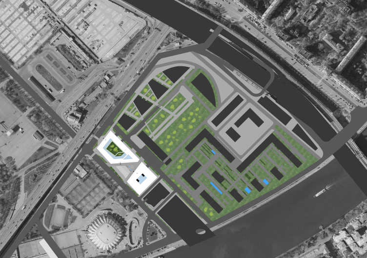
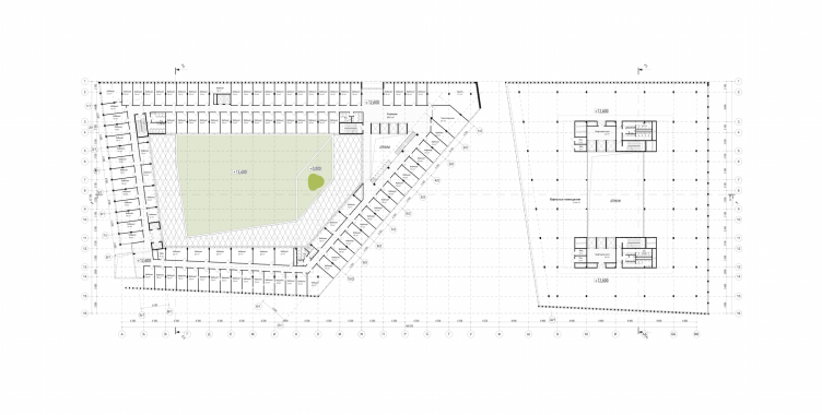
The new building is planned to be built in place of the old one, constructed for the 1980 Olympics – its low-rise block is now stretched along Novoluzhnetskiy proyezd, from the flyover of the Komsomolsky avenue towards the river. The new ROC building will take up the whole rectangular lot but will be taller than its predecessor: ten floors instead of four, the total area of 860 000 square feet. The building is planned to be paid for by an investor who will obtain half of the working premises, that is why it has been logically divided into two parts, which has determined at least two distinctive features. First – its plan: the Committee prefers a corridor-office-type arrangement, so according to the design assignment the architects have divided the spaces into rather spacious rooms – 193 sq. ft. each; and the plan of investor’s area has been inspired by the popular “open space”. Yet the design assignment required the committee and the investor’s blocks “equal but separate”, on the one hand, and on the other – combined in “a single building with a common space”. Having justly estimated the task as contradictive (see author’s description), the architects, however, fulfilled it quite successfully.

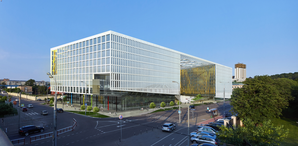
Rusian Olympic Committee HQ © "Reserve"
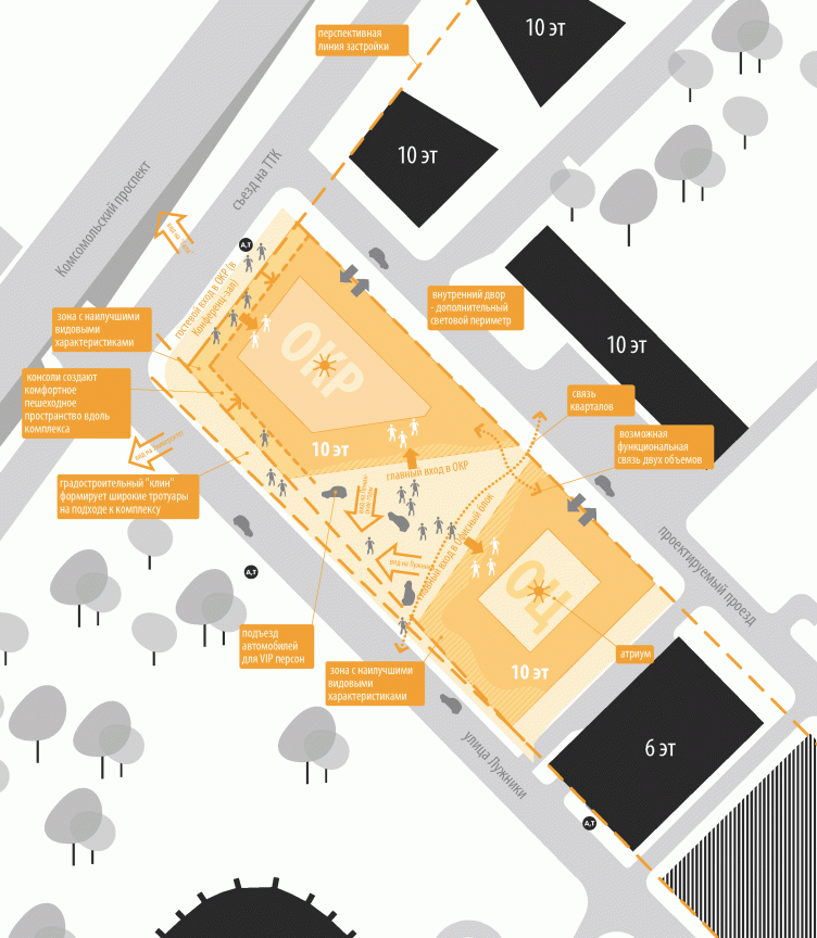
Rusian Olympic Committee HQ. Master plan © "Reserve"


Rusian Olympic Committee HQ. Plan of the 4th floor. The committee offices on the left, the future investor's open space on the right © "Reserve"


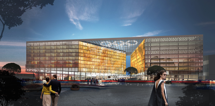
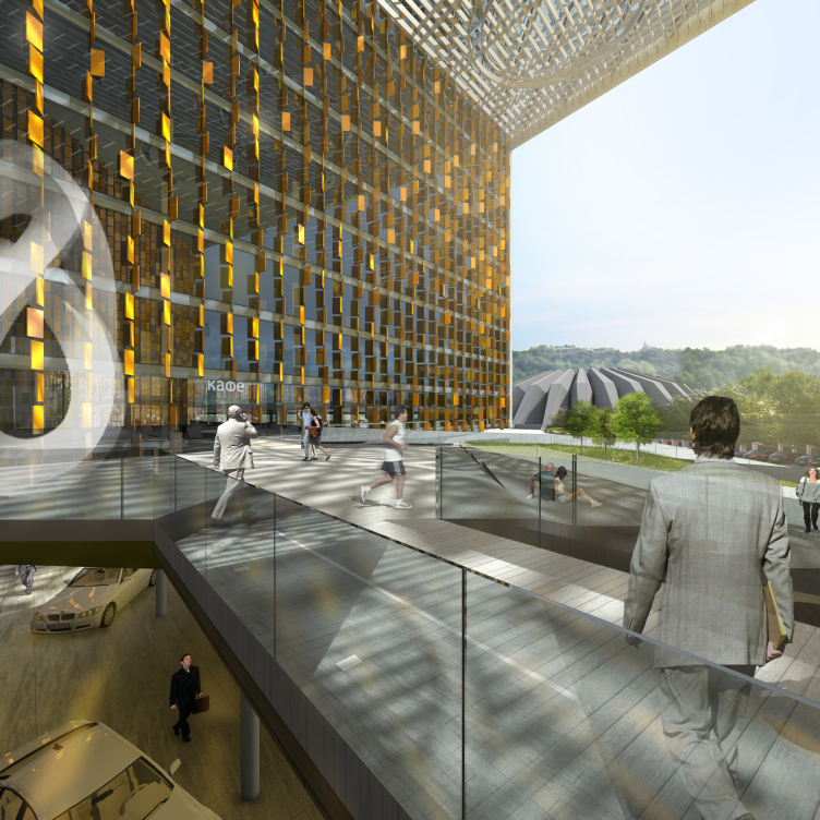
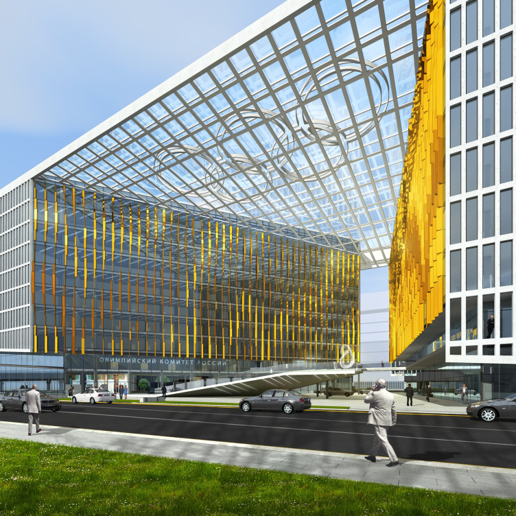
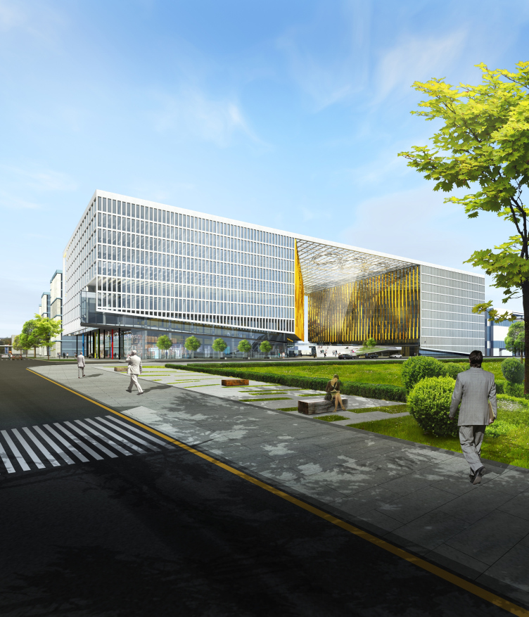
Both blocks are inscribed into the contours of a simple figure, close to a parallelepiped, and are divided with a spacious yard area, the wide funnel-shaped golden opening of which faces the Moskva river and the MSU high-rise on Sparrow Hills – the authors have thoroughly designed the asymmetrically slanted walls to achieve the best possible panorama. The yard both divides and unites the blocks, and coherence and unity of the volume altogether are emphasized by the grid signboard-roof: five rings built in its surface will light up at night.

Rusian Olympic Committee HQ. View from the yard southward © "Reserve"


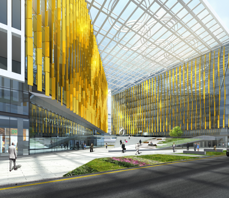
Rusian Olympic Committee HQ. Golden Square © "Reserve"


The module of the thin white net of the facades is expressly simple: the checks on the end walls are square, and vertically split in half on the longtitudinal walls – the result is rather fractionary, but even and calm, as a tribute to classical modernism and hence – to the memory of the old building. Strangely enough, the clear floor by floor check looks fresh in its simplicity: in recent years it has become popular in Moscow to hide the sizes of the buildings combining two or three floors in one, but here it is unexpectedly straight forward, like a notebook sheet. Although there is still one optical trick: the vertical division of checks in two parts makes our eyes see as if there are twice as many module pitches, and that the “parallelepiped” of the building is longer and thinner than it really is.

Rusian Olympic Committee HQ © "Reserve"

    
All of this together forms a simple and airy image with several ideas. The first one is easy and clear to make out: we see an ingot of Olympic gold enclosed in a structured material of white facades like an amethyst cluster inside a lime stone carcass. Simple and practical from the outside, and intriguingly shining inside, revealing the preciousness of the content. The grate of the facades can be seen as a visual expression of the administrative work of the committee: papers, offices, accounting, a routine but strictly organized process. The golden yard cut out in the checked volume reflects its essence and the goal alluding to the winners’ victories. It should be, however, mentioned that it would not be Vladimir Plotkin, if the gold of the yard looked like a melted ingot – its shine is composed of separate lamellas beaded on the vertical axes and turned like figuratively drawn medal-flags at different angles. In close-up it forms a tridimensional hatch, a pictural image of plastic gold: light, glitter and shades; and from afar, for example if you look through binoculars from the View point, it will fuse into a golden cave. But the building is meant to be transparent, permeable, with practically no weight; like a complex but rationally planned dimentional drawing – this structural lightness, that makes the building look almost like molecular structure with scarce inclusions of mass, is one of Vladimir Plotkin’s signature characteristics.  

Rusian Olympic Committee HQ. Golden Square © "Reserve"
            

The second theme is contextual. Looking forward along Novoluzhnetskiy proyezd one can see the high-rise of the Presidium of the Academy of Sciences constructed by Yuriy Platonov in the 70s: a white tower with a golden top, clearly noticeable in the landscape. The building of ROC in the project of Vladimir Plotkin echoes to the Academy, enters into a dialog creating, according to the authors’ words, “a golden massif of similar sizes”, in a way, however, alternative – a horizontal instead of a vertical, a cavity instead of a volume. A longitudinal, reasonable architectural axis has appeared between the buildings – and the distance between them is a long one.  

Rusian Olympic Committee HQ © "Reserve"
 

And finally the triangular yard between the blocks not only plays a role of a spectacular frame for viewing the Sparrow Hills, but also creates another perpendicular axis, parallel to the Komsomolsky avenue: a narrow gorge formed by the funnel-shaped yard on the North-East will become a passway towards the territory that will soon become a new construction site in the place of the Institute of Helium – so the new district will gain access to the Luzhniki Stadium. 

Transport and pedestrian flows diagram. Rusian Olympic Committee HQ © "Reserve"


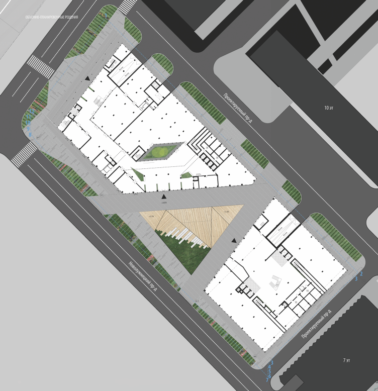
Rusian Olympic Committee HQ. Plan © "Reserve"


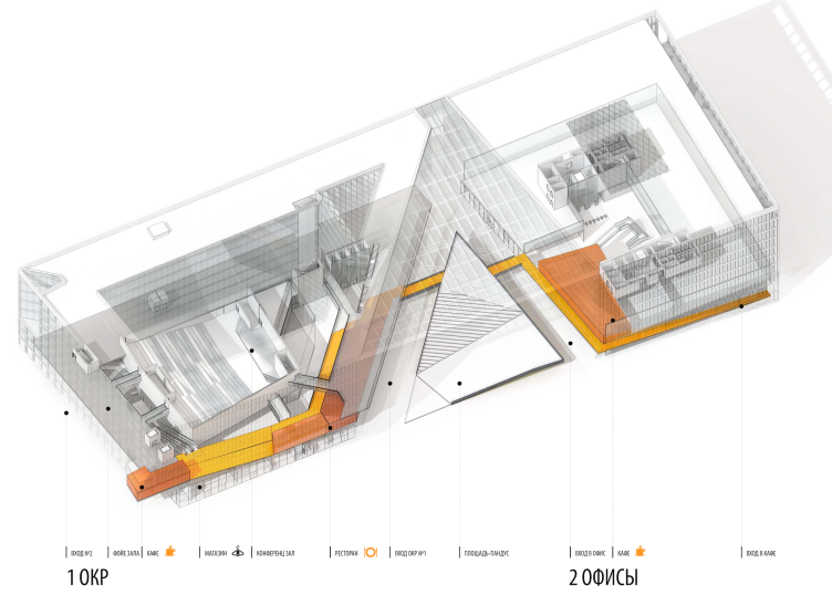
“The Golden Square” is to become a public urban space: the authors have planned to place shops and cafes on the ground floor. More than that, appealing to the open, uniting role of the Olympic movement itself, the architects have suggested connecting the two blocks with a “footpath”  made up of a line of rampants: it runs along the street façade on the ground floor of the investor’s part, turns right, crosses the yard and gradually rising continues along the ROC facades on the first floor level and winds up as a small platform  – a kind of viewing point facing the Luzhniki Stadium. The footpath is the author’s plot addition, it can become a way for a tour devoted to the committee activity.

Rusian Olympic Committee HQ. Axonometry with the path of guided tours (marked orange) © "Reserve"


The viewing platform on the end façade is echoed by the golden exedra – a setback as a pendant to a projection, it emphasizes once again that any cut-out from the grate volume reveals a golden filling. The North-West façade – is the second main one. It is the nearest entrance to a subway station and it leads into the ROC meeting room. It is also a place where light accents and elegant details have been collected: the platform, the exedra and four thin rainbow-colored columns. It means that the best view of the building – from the Komsomolsky avenue and Novoluzhnetskiy proyezd – allows to see the two main facades in one time.

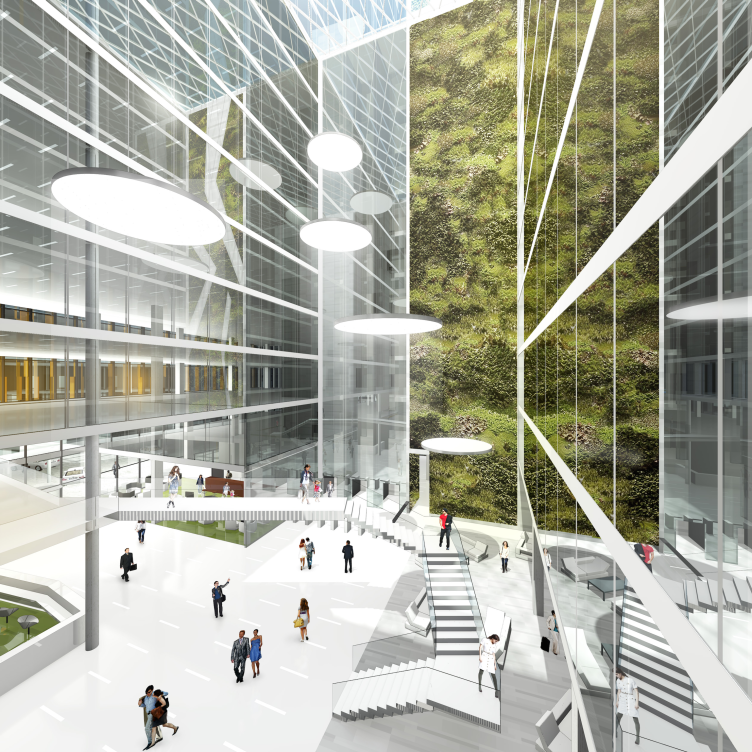
On the inside, the blocks are filled with atriums – however, it has not yet been decided whether they should be glazed or stay open. The central part of the ROC block is occupied by a large congress hall – its roof is planned to be all green with a large inner yard placed on it; a rhombic atrium is arranged behind the stage, and then comes a triangular one with lifts. The multilayered space with multiple scales is filled with hanging bridges; on the other hand, the atrium of the investor’s part is furnished with a wide entrance lobby facing the “Golden Square” and a stairs – not exactly spiral but it does turn twisting the yard around itself. The atriums of the blocks, same as the laconic grate of the facades, remind of the old ROC building: a simple parallelepiped with two square yards – and consequently build up another level of meanings, putting the building not only into the architectural, but also into the historical context. However, if we compare idea of “Reserve” with the plain ordered yards of the older building it will become clear, that even though modern architecture has inherited the inevitable atriums from the 70s modernism, the direction of the interior plastic has become much more complex, emotional and flexible. This inner spatial layer of the project is filled with architectural scenography, starting from the excursion path up to the clerks path in the multilayer yards. In contrast with the graphic facades and picturesque gold, it is plastic and nimble: for someone moving around the inner area of the blocks with their bridges, stairs and voids inside - here vertical and there spacious, alternating all kinds of angles – it must seem dynamic and theatrical.        

Rusian Olympic Committee HQ. Atrium of the investor's office building with a ten-story wall of vertical green plants © "Reserve"


Rusian Olympic Committee HQ. Section view © "Reserve"


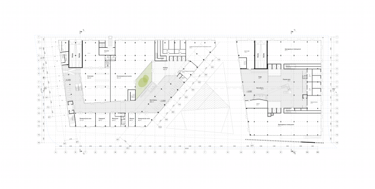
Rusian Olympic Committee HQ. Plan of the first floor © "Reserve"


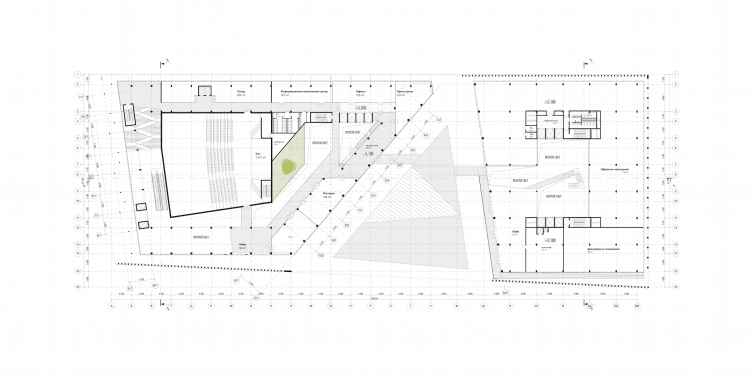
Rusian Olympic Committee HQ. Plan of the second floor © "Reserve"


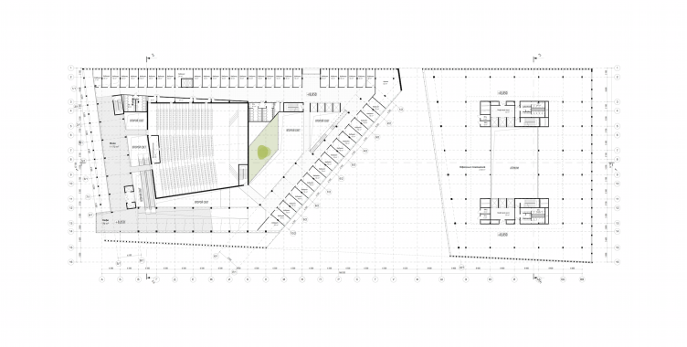
Rusian Olympic Committee HQ. Plan of the third floor © "Reserve"


Yet the described layering of architectural ideas and impressions is supposed to be implemented by modest means. “Realizing the economic difficulties of our time we have scrutinized the topic of imports phase-out, - sais Vladimir Plotkin, - in particular, we have found a number of Russian manufacturers of stone that could be suitable for façade cladding”. 

As a result, the project fits the context exactly, and this most globally speaking: from the economic context, with consideration of the crisis, to historic and urban contexts, appealing to the former ROC building of the 70s, to the Presidium of Yuriy Platonov’s Academy, and up to the very main context, more specifically – the building’s office function: the Olympic movement is reminded by the almost tangible gold of victories hanging like flags in front of the entrance; but there are some more abstract allusions, such as the public, uniting, peace-bringing role of the movement. The main “golden” Olympic theme – tricky in itself by its obviousness – has been brought to the edge plastic purity and lightness where its clarity is not frightening, but joyous, and the whole building becomes its own signboard when you look at it from afar. If the construction is successful, then in a couple of years standing on the viewing point one could say: there is the Academy, and here, on the right from the Big Sporting Arena, shines the Olympic Committee. It could be a nice company.      
zooming
Rusian Olympic Committee HQ. Panoramic view from the Sparrow Hills © "Reserve"


24 August 2015

Headlines now
The Golden Crown
The concept for a dental clinic in Yekaterinburg, developed by CNTR Studio, revolves around the idea of a “mouth full of gold”: pristine white porcelain stoneware walls are complemented by matte brass details. To avoid an overly literal interpretation, the architects focused on the building’s proportions, skillfully navigating between sunlight requirements and fire safety regulations.
Flexibility and Integration
Not long ago, we covered the project for the fourth phase of the ÁLIA residential complex, designed by APEX. Now, we’ve been shown different fence concepts they developed to enclose the complex’s private courtyards, incorporating a variety of public functions. We believe that the sheer fact that the complex’s architects were involved in such a detail as fencing speaks volumes.
A Step Forward
The HIDE residential complex represents a major milestone for ADM architects and their leaders Andrey Romanov and Ekaterina Kuznetsova in their quest for a fresh high-rise aesthetic – one that is flexible and layered, capable of bringing vibrancy to mass and silhouette while shaping form. Over recent years, this approach has become ADM’s “signature style”, with the golden HIDE tower playing a pivotal role in its evolution. Here, we delve into the project’s story, explore the details of the complex’s design, and uncover its core essence.
Gold in the Sands
A new office for a transcontinental company specializing in resource extraction and processing has opened in Dubai. Designed by T+T Architects, masters of creating spaces that are contemporary, diverse, flexible, and original, this project exemplifies their expertise. On the executive floor, a massive brass-clad partition dominates, while layered textures of compressed earth create a contextually resonant backdrop.
Layers and Levels of Flight
This project goes way back – Reserve Union won this architectural competition at the end of 2011, and the building was completed in 2018, so it’s practically “archival”. However, despite being relatively unknown, the building can hardly be considered “dated” and remains a prime example of architectural expression, particularly in the headquarters genre. And it’s especially fitting for an aviation company office. In some ways, it resembles the Aeroflot headquarters at Sheremetyevo but with its own unique identity, following the signature style of Vladimir Plotkin. In this article, we take an in-depth look at the United Aircraft Corporation (UAC) headquarters in the Moscow agglomeration town of Zhukovsky, supplemented by recent photographs from Alexey Naroditsky – a shoot that became only recently possible due to the fact that improvements were finally made in the surrounding area.
Light and Shadow
In this article, we delve into the architectural design of the “Chaika” house by DNK ag architects, which was recently completed in 2023 as part of the collection of signature designs at ZILArt. As is well-known, all the buildings in this complex follow a design code, yet each one is distinct. This particular building stands out not only for its whiteness and minimalism but also for the refined use of a limited number of techniques that, together, create what can confidently be called synergy.
Casus Novae
A master plan was developed for a large residential area with a name of “DNS City”, but now that its implementation began, the plan has been arbitrarily reformatted and replaced with something that, while similar on the surface, is actually quite different. This is not the first time such a thing happens, but it’s always frustrating. With permission from the author, we are sharing Maria Elkina’s post.
Treasure Hunting
The GAFA bureau, in collaboration with Tegola and Arkhitail, organized an expedition to the island of Kilpola in Karelia as part of Moskomarkhitektura’s “Open City” festival. There, amidst moss and rocks, the students sought answers to questions like: what is the sacred, where does it dwell, and what sustains it? Assisting the participants in this quest were landscape engineer Evgeny Levin, artist Nicholas Roerich, a moose, and the lack of cellular connection. Here’s how the story unfolded.
Depths of the Earth, Streams of Water
In the Malaya Okhta district, the Akzent building, designed by Stepan Liphart, was constructed. It follows a classic tripartite structure, yet it’s what you might call “hand-drawn”: each façade is unique in its form and details, some of which aren’t immediately noticeable. In this article, we explore the context and, together with the architect, delve into how the form was developed.
Fir Tree Dynamics
The “Airports of Region” holding is planning to build an airport in Karachay-Cherkessia, aiming to make the Arkhyz and Dombay resorts more accessible to travelers. The project that won in an invitation-only competition, submitted by Sergey Nikeshkin’s KPLN, blends natural imagery inspired by the shape of a conifer seed, open-air waiting spaces, majestic large trees, and a green roof elevated on needle-like columns. The result is both nature-inspired and WOW.
​A Brick Shell
In the process of designing a clubhouse situated among pine trees in a prestigious suburban area near Moscow, the architectural firm “A.Len” did the façade design part. The combination of different types of brick and masonry correlates with the volumetric and plastique solutions, further enhanced by the inclusion of wood-painted fragments and metal “glazing”.
Word Forms
ATRIUM architects love ambitious challenges, and for the firm’s thirtieth anniversary, they boldly play a game of words with an exhibition that dives deep into a self-created vocabulary. They immerse their projects – especially art installations – into this glossary, as if plunging into a current of their own. You feel as if you’re flowing through the veins of pure art, immersed in a universe of vertical cities, educational spaces – of which the architects are true masters – and the cultural codes of various locations. But what truly captivates is the bold statement that Vera Butko and Anton Nadtochy make, both through their work and this exhibition: architecture, above all, is art – the art of working with form and space.
Flexibility and Acuteness of Modernity
Luxurious, fluid, large “kokoshniks” and spiral barrel columns, as if made from colorful chewing gum: there seem to be no other mansion like this in Moscow, designed in the “Neo-Russian-Modern” style. And the “Teremok” on Malaya Kaluzhskaya, previously somewhat obscure, has “come alive with new colors” and gained visibility after its restoration for the office of the “architectural ecosystem” as the architects love to call themselves. It’s evident that Julius Borisov and the architects at UNK put their hearts into finding this new office and bringing it up to date. Let’s delve into the paradoxes of this mansion’s history and its plasticity. Spoiler: two versions of modernity meet here, both balancing on the razor’s edge of “what’s current”.
Yuri Vissarionov: “A modular house does not belong to the land”
It belongs to space, or to the air... It turns out that 3D printing is more effective when combined with a modular approach: the house is built in a workshop and then adapted to the site, including on uneven terrain. Yuri Vissarionov shares his latest experience in designing tourist complexes, both in central Russia and in the south. These include houseboats, homes printed from lightweight concrete using a 3D printer, and, of course, frame houses.
​Moscow’s First
“The quality of education largely depends on the quality of the educational environment”. This principle of the last decade has been realized by Sergey Skuratov in the project for the First Moscow Gymnasium on Rostovskaya Embankment in the Khamovniki district. The building seamlessly integrates into the complex urban landscape, responding both to the pedestrian flow of the city and the quiet alleyways. It skillfully takes advantage of the height differences and aligns with modern trends in educational space design. Let’s take a closer look.
Looking at the Water
The site of Villa Sonata stretches from the road to the water’s edge, offering its own shoreline, pier, and a picturesque river panorama. To reveal these sweeping views, Roman Leonidov “cut” the façade diagonally parallel to the river, thus getting two main axes for the house and, consequently, “two heads”. The internal core – two double-height spaces, a living room and a conservatory, with a “bridge” above them – makes the house both “transparent” and filled with light.
The White Wing
Well, it’s not exactly white. It’s more of a beige, white-stone structure that plays with the color of limestone – smoother surfaces are lighter, while rougher ones are darker. This wing unites various elements: it absorbs and interprets the surrounding themes. It responds to everything, yet maintains a cohesive expression – a challenging task! – while also incorporating recognizable features of its own, such as the dynamic cuts at the bottom, top, and middle.
Urban Dunes
The XSA Ramps team designed and built a three-part sports hub for a park in Rostov-on-Don, welcoming people of all ages and fitness levels. The skate plaza, pump track, and playground are all meticulously crafted with details that attract a diverse range of visitors. The technical execution of the shapes and slopes transforms this space into a kind of sculptural composition.
Proportional Growth
The project for the fourth phase of the ÁLIA residential area has been announced. The buildings are situated on an elongated plot – almost a “ray” that shoots out from the center of the area towards the river. Their layout reflects both a response to Moscow’s architectural preferences over the past 15 years, shifting “from blocks to towers”, and an interpretation of the neighboring business park designed by SOM. Additionally, the best apartments here are not located at the very top but closer to the middle, forming a glowing “waistline”.
The “Staircase” Building
In designing the “Details” residential complex in New Moscow, Rais Baishev spiced up the now-popular Moscow theme of a “courtyard” building with an idea drawn from the surrealist drawings by Maurits Escher. He envisioned the stepped silhouettes and descending slopes as a metaphysical mega-staircase, creating a key void within the courtyard that gave the project an internal “spine”. This concept is felt both in the building’s silhouette and on its façades.
Projection of the Quarter
No one doubted that the building that Vladimir Plotkin designed as part of the “Garden Quarters” would be the most modernist of all. And it turned out just that way: while adhering to the common design code, the building successfully combines brick and white stone, rhythmically responding to the neighboring building designed by Ostozhenka, yet tactfully and persistently making a few statements of its own. This includes the projection of the ideal urban development composition “14–9–6”, which can be found right next door, mathematical calculations, including those for various types of terraces (and perhaps the only reminder of the Soviet past of the Kauchuk rubber factory!), and the white “cross-stitch” pattern of the façade grid.
Domus Aurea
In this issue, we examine the “Tessinsky-1” house, designed by Sergey Skuratov and completed in 2023. Located in the middle of the Serebryanicheskaya Embankment district, at the intersection of its main streets, this house assumes a sort of “nodal” role: it not only responds to everything around it and preserves many memories of the former EMA factory within itself, but it weaves all this into a newly directed pattern, reconciling bright “gold” and dark-colored brick, largely with the help of the new, modern-yet-archaic Columba brick, which, come to think about it, is the most precious element here.
The Chimney of Nikola-Lenivets
In this issue, we are examining the “Obelisk House” designed by KATARSIS and built for the Arkhstoyanie 2023 festival. However, it was only finished later on, and this is why we are examining it now. It seems to us that after the “Obelisk House” appeared in Nikola-Lenivets, a dialogue and a few inner connections appeared between the temporary structures built here. These houses no longer look like “accidental neighbors”, more of which below.
​Periscope by the Bay
The jury awarded the second place in the competition for a public and cultural center in Petropavlovsk-Kamchatsky to the companies GORA (“Mountain”) and M4. In the consortium’s proposal, the building resembles a sperm whale with a calf swimming next to it or a periscope, whose lenses capture the most spectacular views from the surrounding landscape.
From Arcs to Dolmens
While working on the competition project for Petropavlovsk-Kamchatsky, ASADOV Architects prioritized the value of the natural and urban environment, aiming to preserve the balance of the location while minimizing the resemblance of the volume that they designed to a “traditional building”. The task was challenging, and the architects created three versions, one of which having been developed after the competition, where their main proposal took third place. However, the point of interest here is not the competition result but the continuity of creative thinking.
Hide and Seek
The ID Moskovskiy house, designed by Stepan Liphart in St. Petersburg, in the courtyards near Moskovskiy Avenue beyond the Obvodny Canal and recently completed, is notable for several reasons. Firstly, it has been realized with considerable accuracy, which is particularly significant as this is the first building where the architect was responsible not only for the facades but also for the layouts, allowing for better integration between the two. On the other hand, this building is interesting as an example of the “germination” of new architecture in the city: it draws on the best examples from the neighborhood and becomes an improved and developed sum of ideas found by the architect in the surrounding context.
The Big Twelve
Yesterday, the winners of the Moscow Mayor’s Architecture Award were announced and honored. Let’s take a look at what was awarded and, in some cases, even critique this esteemed award. After all, there is always room for improvement, right?
Above the Golden Horn
The residential complex “Philosophy” designed by T+T architects in Vladivostok, is one of the new projects in the “Golubinaya Pad” area, changing its development philosophy (pun intended) from single houses to a comprehensive approach. The buildings are organized along public streets, varying in height and format, with one house even executed in gallery typology, featuring a cantilever leaning on an art object.
Nuanced Alternative
How can you rhyme a square and space? Easily! But to do so, you need to rhyme everything you can possibly think of: weave everything together, like in a tensegrity structure, and find your own optics too. The new exhibition at GES-2 does just that, offering its visitor a new perspective on the history of art spanning 150 years, infused with the hope for endless multiplicity of worlds and art histories. Read on to see how this is achieved and how the exhibition design by Evgeny Ace contributes to it.
Blinds for Ice
An ice arena has been constructed in Domodedovo based on a project by Yuri Vissarionov Architects. To prevent the long façade, a technical requirement for winter sports facilities, from appearing monotonous, the architects proposed the use of suspended structures with multidirectional slats. This design protects the ice from direct sunlight while giving the wall texture and detail.