По-русски

Nikita Biryukov: "I will fight for my project myself!"

OOO "Architectural studio Group ABV" lead by Nikita Biryukov is planning to sue its contracting developer company for distorting its architectural concept at the stage of implementing its projects.

21 September 2015
Interview
mainImg

It is about two projects whose construction is due to be completed this year - the residential and administrative center located at Moscow, Malaya Pirogovskaya, 8, Buildings 1, 2, and 3 (the developer being OAO "Moskovskaya Shelkokrurilnaya Fabrika Mosnitki"), as well as about a multifunctional complex located at Moscow, Smolensky Alley, 19-21 (the developer being ZAO "SK Donstroi"). The projects of both buildings were developed by OOO "Architectural studio Group ABV" whose leader is Nikita Biryukov. 

Work on both projects began before the world economic crisis of 2008; right about that time the projects got all the necessary approvals of the "project" stage. After the two developer companies changed the project managers the newcomers asked for comparatively insignificant corrections to be made to the projects. However, when the construction work entered the stage of implementing the facades the developers stopped taking into consideration the architects' opinion altogether, making changes to the project on the fly and ignoring the comments and records in the author supervision journal. 

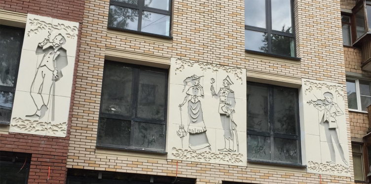
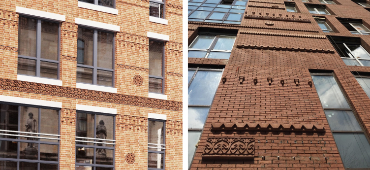
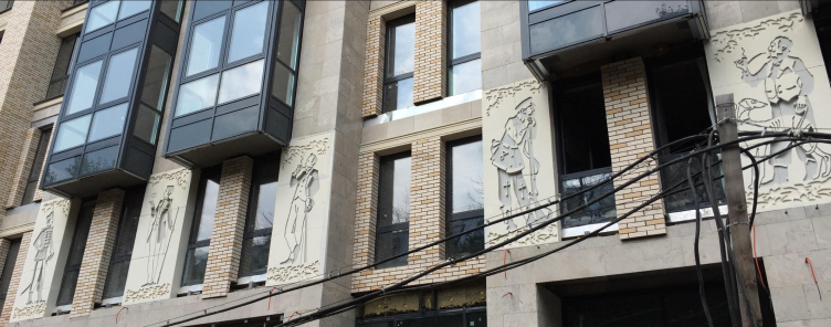
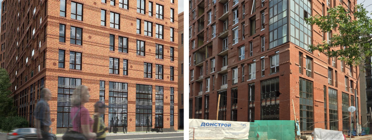
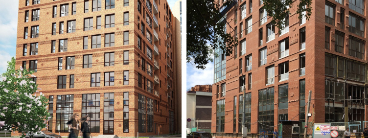
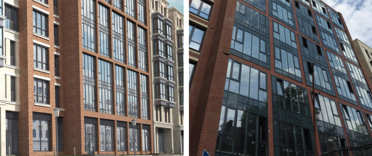
In the case of the Malaya Pirogovskaya project (consists of four different parts) such intrusion resulted in the fact that one of the facades got unapproved by the architects giant concave reliefs showing images of Empire dames and cavaliers: what makes them different from the antique or Egyptian genre prototypes is the complete absence of any plasticity - the contours of the figures are roughly cut out in the concrete slabs. The same building on Malaya Pirogovskaya got a facade pasted onto the brickwork instead of the facade that was meant to be thrust into the brace of the brick structure, and also, instead of the brick ornaments of the facade brickwork, the customer simply glued on an enormous quantity of Styrofoam parts. During the period when the unsanctioned work was being done on the project, the developer's interests were represented by Alena Deryabina who acted on behalf of the developer on the basis of a proxy and, regretfully, would not listen to the architects' opinion on this matter. 

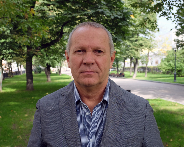
Nikita Biryukov. Photo courtesy by "Group ABV"
Malaya Pirogovskaya, 8. The pannels unapproved by "Group ABV" and Moskomarkhitektura. Image courtesy by "Group ABV"


Malaya Pirogovskaya, 8. The pannels unapproved by "Group ABV" and Moskomarkhitektura. Image courtesy by "Group ABV"


Malaya Pirogovskaya, 8. On the left: facade upon the project by "Group ABV". On the right: the implemented facade with arbitrary substandard elements. Image courtesy by "Group ABV"


Malaya Pirogovskaya, 8. On the left: facade upon the project by "Group ABV". On the right: the implemented facade with arbitrary substandard elements. Image courtesy by "Group ABV"


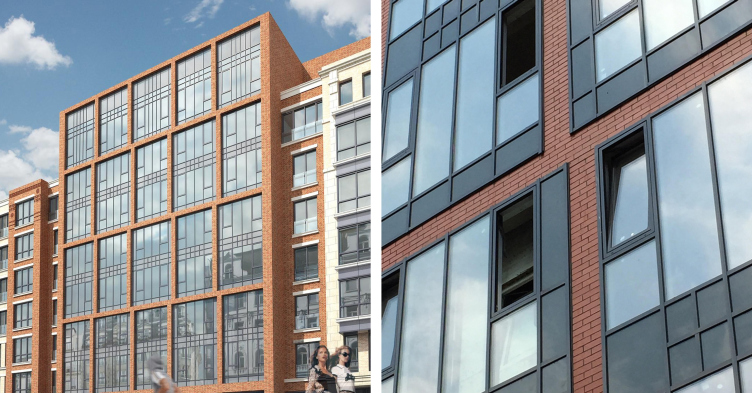
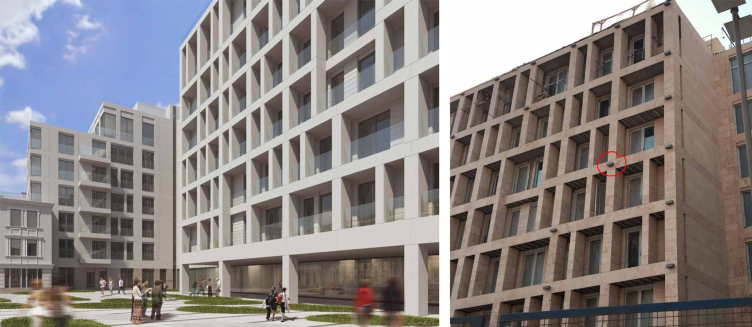
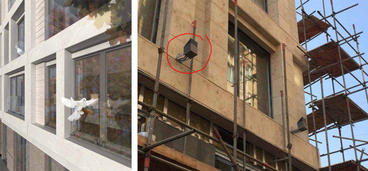
The facades of the building in the Smolensky Alley, according to Nikita Biryukov, "suffered less but were still mangled". In this instance, "instead of white, almost crystal dolomite stone, the developer arbitrarily used rusty-yellow and beige-brown stone which made the facades look depressing" - claims the author. The picture was completed by large backlight posts made plainly visible: the backlighting project proposed by OOO "Architectural studio Group ABV" was ignored by the developers as well.

Smolensky Alley 19-21. On the left: facade upon the project by "Group ABV". On the right: the implemented facades with lements of arbitrarily chosen materials.Image courtesy by "Group ABV"


Smolensky Alley 19-21. On the left: fragment of the facade upon the project by "Group ABV".On the right: fragment of the facade with an arbitrarily installed spotlight unapproved by "Group ABV" and violating the aesthetics of the building.


zooming
Smolensky Alley 19-21. On the left: backlighting concept upon the project by "Group ABV".On the right: unapproved backighting concept. Image courtesy by "Group ABV"


Presently, OOO "Architectural studio Group ABV" has lodged a complaint with Moscow Federal Construction Supervision Board, as well as filed claims to the developer companies. Also, OOO "Architectural studio Group ABV" is prepared to seek damages for the copyright violation that will be forwarded to court upon the company getting the developer's official answer to the above-mentioned claims.

As of the moment of the publication of this article, we have not been able to get any comments from the representatives of "Donstroy".

We spoke to Nikita Biryukov about the details of this story. 

Archi.ru:
- Russian architects are always complaining that this or that project of theirs was ruined at the implementation stage - but they never take this problem to court and they never stand for their rights. At least I cannot recall such a case - you are the first one on my personal record. What did it take to make such a decision? 

Nikita Biryukov:
- In my case it was a lot more than just ruining the house, it's different. I really believe that these people crossed the line. I have never been in a situation where the architect's opinion would be so cynically and studiously ignored. 

What they ultimately got at Malaya Pirogovskaya I cannot classify as anything but vulgarity. Everyone who knows us as architects is laughing when looking at that house and thinks that we completely lost our minds. I do not want to throw rocks at the author of the concave reliefs - but such three-meter panels with "magazine" graphics are something that just cannot be there at the facade. 

- How did the idea of concave reliefs come about at all? Who was the prime mover?

- In one of our earlier versions of that project, there indeed was this concave relief idea; then we gave it up altogether and forgot about it. In our final version, we did bas-reliefs, professional and dramatic. There is a great number of examples of great architectural plastics, in Moscow alone you can take the Stalin architecture with lots of great sculptural elements - bas-reliefs and haut-reliefs.

We were categorically opposed to the idea of concave reliefs - as the authors we did not prescribe anything of the sort. We refused to participate in that but our opinion was completely ignored by the developers. 

- What is your end game in court? 

- First of all, we want the facades taken apart and then put together again in full accordance with our original project. We handed over to our customer all the working documents on the facades, and we have high-quality renders that we can put in court next to the photographs of the built houses. Everyone will be able to make a comparison and see just how different they are. Besides, we want to make a public statement, loud and clear: these are not our houses and this is not our architecture. We want to stand up for our rights; nobody in the architectural community does that, and I can't blame them - they are afraid of losing their job. 

- Do you expect any pressure from the developers' side? 

- Of course, they will try to pressure me, and for me this is not going to be a walkover. But the thing is that now they really feel that they can get away with it. 

- Do you count on the support of the professional community? Did your colleagues support you? As far as I recall, this spring at "Arch Moscow" a lot was said about the architectural copyright...

- I tried to speak to my colleagues about that; many companies have similar problems with their developers but this never went anywhere beyond conversation. Strictly speaking, there's no community as such; a bunch personal interests is all there is. Because I am not what you would call a "refined" architect, but rather a fighter - and I've always been one - I do not really fit in with this architectural crowd; I meet few people and I live in a rather solitary way. I do not really care for what they call "public life". What I like about the Anglo-Saxon people is that they have unity - they line up in a boar's snout and go to fight for their rights. And as for the Russian architects, taken independently, they all are great people but there is no real architectural community in this country and I don't think there will be any time soon. This is why I stopped thinking about getting any kind of support and decided to take care of myself. My customer has overstepped the mark and I must react to it.
Malaya Pirogovskaya, 8. The pannels unapproved by "Group ABV" and Moskomarkhitektura. Image courtesy by "Group ABV"
zooming
The project implemented by "DONSTROY". Malaya Pirogovskaya, 8. On the left: facades upon the project by "Group ABV". On the right: facade with arbitrarily self-produced elements of substandard quality, unapproved by "Group ABV" and violating the aesthetic
The project implemented by "DONSTROY". Malaya Pirogovskaya, 8. On the left: facades upon the project by "Group ABV". On the right: facade with arbitrarily self-produced elements of substandard quality installed in the wrong way, unapproved by "Group ABV"
The project implemented by "DONSTROY". Malaya Pirogovskaya, 8. On the left: facades upon the project by "Group ABV". On the right: facade with arbitrarily self-produced elements of substandard quality, unapproved by "Group ABV" and violating the aesthetic


21 September 2015

Headlines now
A Step Forward
The HIDE residential complex represents a major milestone for ADM architects and their leaders Andrey Romanov and Ekaterina Kuznetsova in their quest for a fresh high-rise aesthetic – one that is flexible and layered, capable of bringing vibrancy to mass and silhouette while shaping form. Over recent years, this approach has become ADM’s “signature style”, with the golden HIDE tower playing a pivotal role in its evolution. Here, we delve into the project’s story, explore the details of the complex’s design, and uncover its core essence.
Gold in the Sands
A new office for a transcontinental company specializing in resource extraction and processing has opened in Dubai. Designed by T+T Architects, masters of creating spaces that are contemporary, diverse, flexible, and original, this project exemplifies their expertise. On the executive floor, a massive brass-clad partition dominates, while layered textures of compressed earth create a contextually resonant backdrop.
Layers and Levels of Flight
This project goes way back – Reserve Union won this architectural competition at the end of 2011, and the building was completed in 2018, so it’s practically “archival”. However, despite being relatively unknown, the building can hardly be considered “dated” and remains a prime example of architectural expression, particularly in the headquarters genre. And it’s especially fitting for an aviation company office. In some ways, it resembles the Aeroflot headquarters at Sheremetyevo but with its own unique identity, following the signature style of Vladimir Plotkin. In this article, we take an in-depth look at the United Aircraft Corporation (UAC) headquarters in the Moscow agglomeration town of Zhukovsky, supplemented by recent photographs from Alexey Naroditsky – a shoot that became only recently possible due to the fact that improvements were finally made in the surrounding area.
Light and Shadow
In this article, we delve into the architectural design of the “Chaika” house by DNK ag architects, which was recently completed in 2023 as part of the collection of signature designs at ZILArt. As is well-known, all the buildings in this complex follow a design code, yet each one is distinct. This particular building stands out not only for its whiteness and minimalism but also for the refined use of a limited number of techniques that, together, create what can confidently be called synergy.
Casus Novae
A master plan was developed for a large residential area with a name of “DNS City”, but now that its implementation began, the plan has been arbitrarily reformatted and replaced with something that, while similar on the surface, is actually quite different. This is not the first time such a thing happens, but it’s always frustrating. With permission from the author, we are sharing Maria Elkina’s post.
Treasure Hunting
The GAFA bureau, in collaboration with Tegola and Arkhitail, organized an expedition to the island of Kilpola in Karelia as part of Moskomarkhitektura’s “Open City” festival. There, amidst moss and rocks, the students sought answers to questions like: what is the sacred, where does it dwell, and what sustains it? Assisting the participants in this quest were landscape engineer Evgeny Levin, artist Nicholas Roerich, a moose, and the lack of cellular connection. Here’s how the story unfolded.
Depths of the Earth, Streams of Water
In the Malaya Okhta district, the Akzent building, designed by Stepan Liphart, was constructed. It follows a classic tripartite structure, yet it’s what you might call “hand-drawn”: each façade is unique in its form and details, some of which aren’t immediately noticeable. In this article, we explore the context and, together with the architect, delve into how the form was developed.
Fir Tree Dynamics
The “Airports of Region” holding is planning to build an airport in Karachay-Cherkessia, aiming to make the Arkhyz and Dombay resorts more accessible to travelers. The project that won in an invitation-only competition, submitted by Sergey Nikeshkin’s KPLN, blends natural imagery inspired by the shape of a conifer seed, open-air waiting spaces, majestic large trees, and a green roof elevated on needle-like columns. The result is both nature-inspired and WOW.
​A Brick Shell
In the process of designing a clubhouse situated among pine trees in a prestigious suburban area near Moscow, the architectural firm “A.Len” did the façade design part. The combination of different types of brick and masonry correlates with the volumetric and plastique solutions, further enhanced by the inclusion of wood-painted fragments and metal “glazing”.
Word Forms
ATRIUM architects love ambitious challenges, and for the firm’s thirtieth anniversary, they boldly play a game of words with an exhibition that dives deep into a self-created vocabulary. They immerse their projects – especially art installations – into this glossary, as if plunging into a current of their own. You feel as if you’re flowing through the veins of pure art, immersed in a universe of vertical cities, educational spaces – of which the architects are true masters – and the cultural codes of various locations. But what truly captivates is the bold statement that Vera Butko and Anton Nadtochy make, both through their work and this exhibition: architecture, above all, is art – the art of working with form and space.
Flexibility and Acuteness of Modernity
Luxurious, fluid, large “kokoshniks” and spiral barrel columns, as if made from colorful chewing gum: there seem to be no other mansion like this in Moscow, designed in the “Neo-Russian-Modern” style. And the “Teremok” on Malaya Kaluzhskaya, previously somewhat obscure, has “come alive with new colors” and gained visibility after its restoration for the office of the “architectural ecosystem” as the architects love to call themselves. It’s evident that Julius Borisov and the architects at UNK put their hearts into finding this new office and bringing it up to date. Let’s delve into the paradoxes of this mansion’s history and its plasticity. Spoiler: two versions of modernity meet here, both balancing on the razor’s edge of “what’s current”.
Yuri Vissarionov: “A modular house does not belong to the land”
It belongs to space, or to the air... It turns out that 3D printing is more effective when combined with a modular approach: the house is built in a workshop and then adapted to the site, including on uneven terrain. Yuri Vissarionov shares his latest experience in designing tourist complexes, both in central Russia and in the south. These include houseboats, homes printed from lightweight concrete using a 3D printer, and, of course, frame houses.
​Moscow’s First
“The quality of education largely depends on the quality of the educational environment”. This principle of the last decade has been realized by Sergey Skuratov in the project for the First Moscow Gymnasium on Rostovskaya Embankment in the Khamovniki district. The building seamlessly integrates into the complex urban landscape, responding both to the pedestrian flow of the city and the quiet alleyways. It skillfully takes advantage of the height differences and aligns with modern trends in educational space design. Let’s take a closer look.
Looking at the Water
The site of Villa Sonata stretches from the road to the water’s edge, offering its own shoreline, pier, and a picturesque river panorama. To reveal these sweeping views, Roman Leonidov “cut” the façade diagonally parallel to the river, thus getting two main axes for the house and, consequently, “two heads”. The internal core – two double-height spaces, a living room and a conservatory, with a “bridge” above them – makes the house both “transparent” and filled with light.
The White Wing
Well, it’s not exactly white. It’s more of a beige, white-stone structure that plays with the color of limestone – smoother surfaces are lighter, while rougher ones are darker. This wing unites various elements: it absorbs and interprets the surrounding themes. It responds to everything, yet maintains a cohesive expression – a challenging task! – while also incorporating recognizable features of its own, such as the dynamic cuts at the bottom, top, and middle.
Urban Dunes
The XSA Ramps team designed and built a three-part sports hub for a park in Rostov-on-Don, welcoming people of all ages and fitness levels. The skate plaza, pump track, and playground are all meticulously crafted with details that attract a diverse range of visitors. The technical execution of the shapes and slopes transforms this space into a kind of sculptural composition.
Proportional Growth
The project for the fourth phase of the ÁLIA residential area has been announced. The buildings are situated on an elongated plot – almost a “ray” that shoots out from the center of the area towards the river. Their layout reflects both a response to Moscow’s architectural preferences over the past 15 years, shifting “from blocks to towers”, and an interpretation of the neighboring business park designed by SOM. Additionally, the best apartments here are not located at the very top but closer to the middle, forming a glowing “waistline”.
The “Staircase” Building
In designing the “Details” residential complex in New Moscow, Rais Baishev spiced up the now-popular Moscow theme of a “courtyard” building with an idea drawn from the surrealist drawings by Maurits Escher. He envisioned the stepped silhouettes and descending slopes as a metaphysical mega-staircase, creating a key void within the courtyard that gave the project an internal “spine”. This concept is felt both in the building’s silhouette and on its façades.
Projection of the Quarter
No one doubted that the building that Vladimir Plotkin designed as part of the “Garden Quarters” would be the most modernist of all. And it turned out just that way: while adhering to the common design code, the building successfully combines brick and white stone, rhythmically responding to the neighboring building designed by Ostozhenka, yet tactfully and persistently making a few statements of its own. This includes the projection of the ideal urban development composition “14–9–6”, which can be found right next door, mathematical calculations, including those for various types of terraces (and perhaps the only reminder of the Soviet past of the Kauchuk rubber factory!), and the white “cross-stitch” pattern of the façade grid.
Domus Aurea
In this issue, we examine the “Tessinsky-1” house, designed by Sergey Skuratov and completed in 2023. Located in the middle of the Serebryanicheskaya Embankment district, at the intersection of its main streets, this house assumes a sort of “nodal” role: it not only responds to everything around it and preserves many memories of the former EMA factory within itself, but it weaves all this into a newly directed pattern, reconciling bright “gold” and dark-colored brick, largely with the help of the new, modern-yet-archaic Columba brick, which, come to think about it, is the most precious element here.
The Chimney of Nikola-Lenivets
In this issue, we are examining the “Obelisk House” designed by KATARSIS and built for the Arkhstoyanie 2023 festival. However, it was only finished later on, and this is why we are examining it now. It seems to us that after the “Obelisk House” appeared in Nikola-Lenivets, a dialogue and a few inner connections appeared between the temporary structures built here. These houses no longer look like “accidental neighbors”, more of which below.
​Periscope by the Bay
The jury awarded the second place in the competition for a public and cultural center in Petropavlovsk-Kamchatsky to the companies GORA (“Mountain”) and M4. In the consortium’s proposal, the building resembles a sperm whale with a calf swimming next to it or a periscope, whose lenses capture the most spectacular views from the surrounding landscape.
From Arcs to Dolmens
While working on the competition project for Petropavlovsk-Kamchatsky, ASADOV Architects prioritized the value of the natural and urban environment, aiming to preserve the balance of the location while minimizing the resemblance of the volume that they designed to a “traditional building”. The task was challenging, and the architects created three versions, one of which having been developed after the competition, where their main proposal took third place. However, the point of interest here is not the competition result but the continuity of creative thinking.
Hide and Seek
The ID Moskovskiy house, designed by Stepan Liphart in St. Petersburg, in the courtyards near Moskovskiy Avenue beyond the Obvodny Canal and recently completed, is notable for several reasons. Firstly, it has been realized with considerable accuracy, which is particularly significant as this is the first building where the architect was responsible not only for the facades but also for the layouts, allowing for better integration between the two. On the other hand, this building is interesting as an example of the “germination” of new architecture in the city: it draws on the best examples from the neighborhood and becomes an improved and developed sum of ideas found by the architect in the surrounding context.
The Big Twelve
Yesterday, the winners of the Moscow Mayor’s Architecture Award were announced and honored. Let’s take a look at what was awarded and, in some cases, even critique this esteemed award. After all, there is always room for improvement, right?
Above the Golden Horn
The residential complex “Philosophy” designed by T+T architects in Vladivostok, is one of the new projects in the “Golubinaya Pad” area, changing its development philosophy (pun intended) from single houses to a comprehensive approach. The buildings are organized along public streets, varying in height and format, with one house even executed in gallery typology, featuring a cantilever leaning on an art object.
Nuanced Alternative
How can you rhyme a square and space? Easily! But to do so, you need to rhyme everything you can possibly think of: weave everything together, like in a tensegrity structure, and find your own optics too. The new exhibition at GES-2 does just that, offering its visitor a new perspective on the history of art spanning 150 years, infused with the hope for endless multiplicity of worlds and art histories. Read on to see how this is achieved and how the exhibition design by Evgeny Ace contributes to it.
Blinds for Ice
An ice arena has been constructed in Domodedovo based on a project by Yuri Vissarionov Architects. To prevent the long façade, a technical requirement for winter sports facilities, from appearing monotonous, the architects proposed the use of suspended structures with multidirectional slats. This design protects the ice from direct sunlight while giving the wall texture and detail.
Frozen Magma
A competition for the creation of a public and cultural center was held in Petropavlovsk-Kamchatsky. Three architectural companies made it to the final, and we consider it important to share about the work of each. Let’s start with the winner – the consortium led by Wowhaus.
Campus within a Day
In this article, we talk about what the participants of Genplan Institute of Moscow’s hackathon were doing at the MosComArchitecture booth at the “ArchMoscow” exhibition. We also discuss who won the prize and why, and what can be done with the territory of a small university on the outskirts of Moscow.