Archi.ru:
Your company was founded back in 1999, after a serious economic crisis shook this country. Why did you make such a courageous decision? How difficult was it starting a new company back in those days?
Karen Saprichyan:
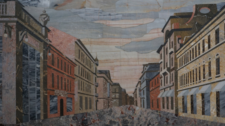
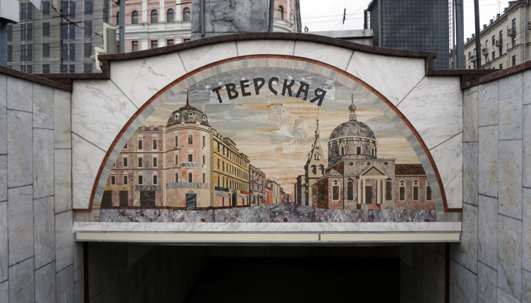
I decided to start my own company while I was at the top of my activity. At that time, I was doing the mosaics for the decoration of the underground crossings at the Pushkin Square in Moscow. This work was scheduled to coincide with the celebration of the 850th anniversary of Moscow. And it was also at that time that I was introduced to Alexander Asadov with whom we immediately started working together on the project for the Central Election Committee of Russia. For its central hall, I created Florence-style mosaic patterns from granite and polished brass. It was an exciting time, crisis or no crisis.
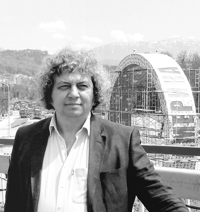
Karen Saprichyan © Grand Project City
Mosaic on the Pushkin Square. Author: Karen Saprichyan
Mosaic on the Pushkin Square. Author: Karen Saprichyan
How did your company develop from then on? Which moments would you mark as important ones?
There were important moments still before I founded the bureau. I graduated from the Stroganov College. However, my very first works were already connected with architecture. One of the most notable events for me was my participating in the project of reconstructing the Gorky Street, now Tverskaya. It was back in 1987. The studio of "Mosproject" under the leadership of Victor Gostev, was responsible for forming the outward appearance of the street, while I, in cooperation with the company "Mosinzh" developed the solutions for all the underground spaces. The reconstruction was to cover the Pushkin, Tverskaya, and Manezh squares. The latter was given special attention: it was planned to create there a lot of pedestrian zones, restaurants, museums, and shops - but still in numbers significantly smaller than there are now. The project was approved by the authorities and it got all the required permissions. But, sadly and quite unexpectedly, Victor Gostev died. The project was handed over to another group of architects and then it was implemented in quite a different way.
The next serious stage in my career was the large project that was arranged to coincide with the four hundredth anniversary of the city of Surgut. Then there was a whole layer of work in the city of Khanty-Mansiysk. And still after that, a milestone for me was my participation in designing the Olympic objects.
You designed a lot for the Western Siberia and Khanty-Mansiysk. How valuable was that experience?
It was tremendous. Back in those days, I would not have been able to implement anything of such magnitude in any other Russian city. Later on down the line, a lot of motifs and techniques that I tried out in Khanty-Mansiysk - I used them on my Olympic projects. But the most important thing that work gave to me is the great partners, designers, and manufacturers with whom I've been working up to the present day. To me, implementing a project is as important as designing it - because very often the architectural ideas suffer from the poor-quality construction.
Which projects became your favorite or maybe "milestone" ones for you?
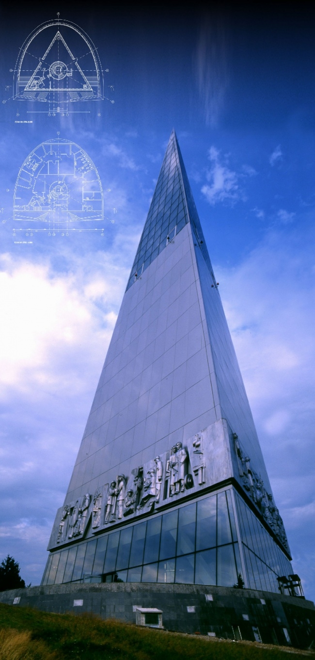
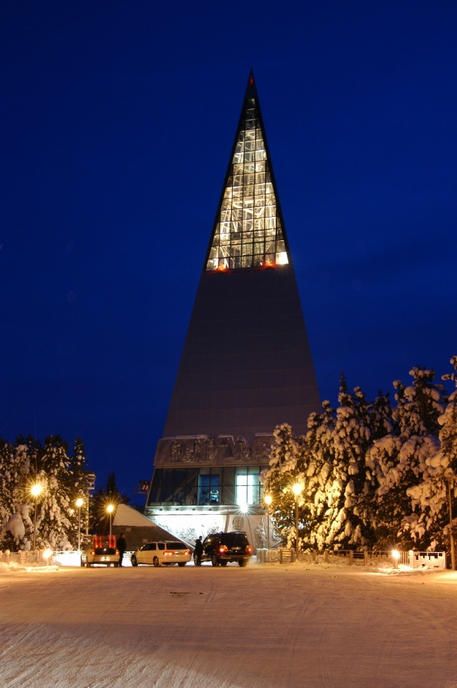
First of all, this is the monument to the pioneers of Yugra in the shape of a tall three-facet pyramid and the square of Slavonic Writing in Khanty-Mansiysk. The pyramid was indeed a unique project for its day and age. Standing atop of a high mountain, on the edge of a steep precipice, it required a great deal of effort to implement. It was at that time that I was lucky to meet Nodar Kancheli, who did a great deal for this project to become a reality. Later on, together with him we built in Khanty-Mansiysk five more projects of such great complexity that other designers were even afraid to start working with them. The shape of the pyramid is also very symbolic. Each of its three facets shares about the conquering this land: first by its native population, then by the Cossacks, and, finally, by the oil miners who came to Siberia. The pyramid looks absolutely sculptural, especially together with the dynamic backlight, but it's also functional, too: in its central part there is an interactive museum, its second floor has a restaurant in it, and on top of it there is a sightseeing platform that commands the view of the whole city. Many times, this tower hosted various international meetings, and even summits of the European Union.
Stella monument "To the Pioneers of Yugra" © Project by Karen Saprichyan
Stella monument "To the Pioneers of Yugra" © Project by Karen Saprichyan
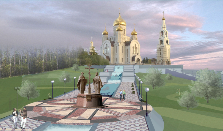
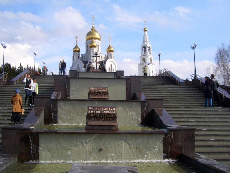
For the Slavonic Writing Square, I came up with the integrated territorial solution: in that project, a land plot with a height difference of 24 meters got a cascade of backlit fountains with sculptural elements. On its very top, we installed the monument to Cyril and Methodius that was executed by me and my team of sculptors, and, as you ascend the temple stairs, we put up the signs with the Bible commandments inscribed on them. The construction work was also done by my construction company here.
Stella monument "To the Pioneers of Yugra" © Project by Karen Saprichyan
Slavonic Writing Square in Khanty-Mansiysk © Project by Karen Saprichyan
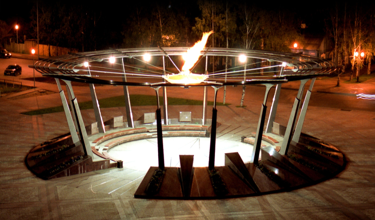
Out of my objects that were designed in the contemporary styles or in the style of "hi-tech", I would note the Sport Fame Square where unusual architectural techniques are combined with exceptional functionality. This project was implemented in 2002. Back then, the idea of hanging a glowing torch above the visitors' heads looked very daring.
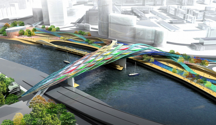
However, the most interesting project for me was the multifunctional recreation complex on the embankment of the Moskva River. It was our joint project with Alexander Asadov that we did for "Mirax" Company. We proposed to throw over the river a beautiful pedestrian bridge with a hotel on its top floors that grows from a large recreation area organized along the embankment. And, at the customer's request, when still in the concept phase, we, together with the Central Research and Development Project Institute of Metallic Building Structures, developed all the necessary units, proving that building such a bridge was quite realistic but, regretfully, it was never built.
Sport Fame Square in Khanty-Mansiysk © Project by Karen Saprichyan
Multifunctional recreation complex "Mirax Garden" © Project by Karen Saprichyan
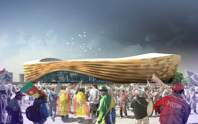
Also, I cannot help but mention the project proposal on the reconstruction of the Pushkin Museum in Moscow, where we proposed to recreate the lost buildings. Or the project of the stadium in the city of Nizhny Novgorod that reacts to the vicinity with the nearby church and at the same evoked associations with the colorful fairs that this city has always been famous for. All these ideas were really interesting but they were still left unimplemented. As far as the implemented projects are concerned, I would mention the Sochi ones.
45000-seat stadium for the World Championship 2018 in the city of Nizhny Novgorod © "Mosproject 2", Studio 19, Mikhail Posokhin, Alexander Asadov, Karen Saprichyan
Please share more about the single concept for the Olympic Sochi. How was it developed?
This concept was all about developing the motorway network on the territory starting from the Sochi Tunnel to Adler Airport and further on to Krasnaya Polyana. At the same time, the project provided not only for building the road junctions and portals of the tunnels but also the buildings adjoining the highway. For example, the roofs of all the houses standing along the road were substituted with approximately identical ones, designed in a single style - which made the surroundings look like a cozy southern town. We also installed new fences and public transportation stops; landscaping work was done.
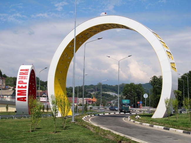
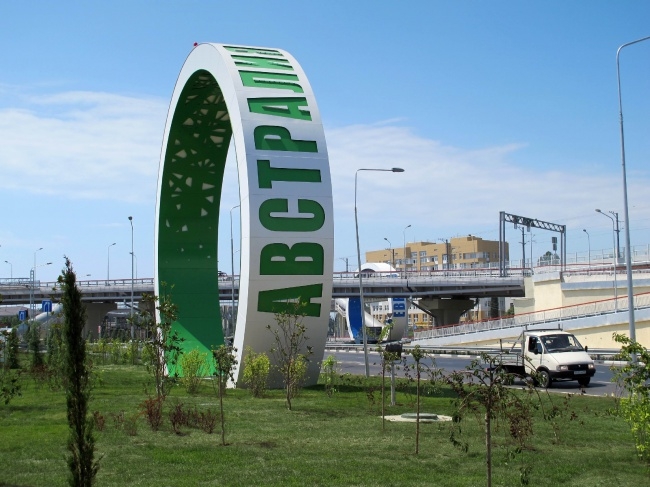
Architectural proposal and concept of the "Rings" composition at the Adler junction in Sochi © Grand Project City
Architectural proposal and concept of the "Rings" composition at the Adler junction in Sochi © Grand Project City
We were also able to implement the Olympic Rings. Essentially, they are not even rings but sculptural compositions mounted on a metallic framework and fastened with specially chamfered aluminum panels without so much as a hint at a seam. Inside the rings, there are the beautiful openwork constructions that echo the decoration of the tunnels. Initially, the rings were meant to serve as giant arches through which the roads might actually meander. Later on, however, because of their proximity to the airport runways, we had to significantly diminish them in size - from 22 to 16 meters - and change their location. As a result, it was only the yellow ring named "Asia" that remained an arch - the entrance to the airport's VIP zone. All the other rings remained to be just decorative elements.
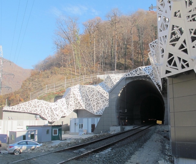
Portal of a railroad tunnel in the city of Adler © Grand Project City
As for the entrance portals to the tunnels, I proposed to decorate them with a sophisticated snow-white structure that looked like a cobweb or maybe a hoarfrost. Such "irregular" structure has no analogues in the world, and implementing this project required not just a great designer but the best in the world. We did find a practical solution but we were not able to ultimately implement all of our ideas. Even though it got all the necessary approvals in the highest circles, our concept was drastically curtailed when it came to implementation, shattered to pieces, in fact. Regretfully, in this country you always need to be prepared for this: once it comes to implementation, especially of such large-scale projects as the Sochi one, the original idea is often changed beyond recognition.
How did the idea of decorating the tunnels with such sophisticated structures come about?
The idea came about long before the Olympic building, back in those days when I was working in Sochi with "Avtodor". Back then, I proposed a similar solution but my customer refrained from implementing it. It was only two years later that I got the opportunity to get back to the solution that I had come up with and use it in the Olympic concept. I was only able to implement my sophisticated ideas thanks to my cooperation with Russian Railways but, alas, the project did not go any further.
Portal of a railroad tunnel in the city of Adler © Grand Project City
You said several times that a lot of your projects were done in collaboration with Alexander Asadov. How and why did this creative union come about? Do you work together today?
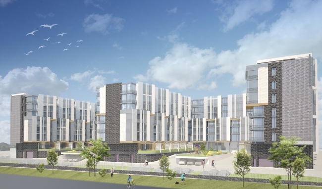
Like I already said, I met Alexander Asadov a long time ago when I was working on the project of the Central Election Committee of Russia. We found common ground at once, and our further collaboration came naturally. Over the years of our friendship we've done about fifty collaboration projects. We keep working together today as well. For example, we work on the projects of "Spartak" Stadium, the residential building on the 2nd Samarskaya Street, and "Landyshi" hotel.
"Landyshi" hotel complex © Grand Project City
Who does what in your consortium? Who is ultimately responsible for the concept? For its implementation?
It's always different. Sometimes one of us comes up with the concept and the other one embellishes on it. Inside, we are very similar, we think big, and our perception of the architectural space is similar, too. And, on top of that, we know how to yield to one another, which is, probably, the most important thing.
What is on your studio's agenda today?
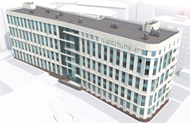
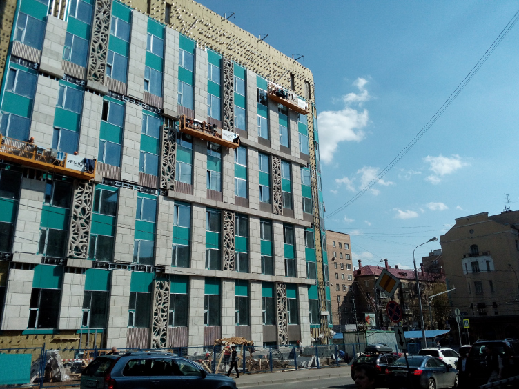
Presently, our top priority is finishing the decoration of the building of the MEDCI Clinic at the Malaya Gruzinskaya Street. Our main task was designing the decorative elements of the building's facades that were developed from my sketches. And, yet again, I must say that this building - which is practically finished now - looked totally different in the original version. This was a house designed in the constructivist spirit - very simple, balanced and wholesome. However, the customer did not approve of that building, so I had to come up with another version.
MEDSI Clinic and Diagnosis Center © Grand Project City
MEDSI Clinic and Diagnosis Center © Grand Project City
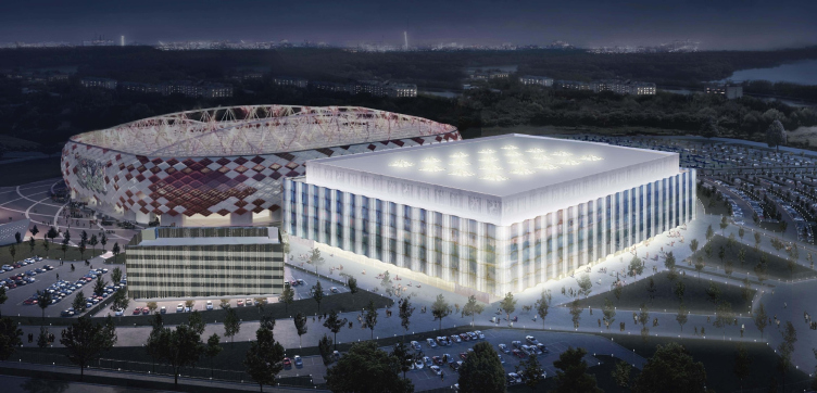
Just as much effort we are putting now into the project of "Spartak" stadium. This stadium is very interesting for its multifunctionality. Apart from its direct sport function, it can also be used as the all-purpose concert hall for organizing shows of various complexity, up to the performance of Circus du Soleil.
Multifunctional complex of a football stadium © Grand Project City
Do you have any architectural preferences or maybe your favorite architectural style?
Regretfully, the contemporary Russian architecture mostly follows the current trends, copying the existing techniques. This is why I have a lot of issues with the contemporary architecture. There was a time when I was saying that the architecture will in fact turn into sculpture, that its plastique will be coming first, and the function will become secondary. And this is the way it happened, actually. Just think of the works by Frank Gehry or Zaha Hadid. Lately, this trend has started to abate. No one can tell what will be hot tomorrow. This, however, only holds true for the big architecture. As far as day-to-day life is concerned, things are a lot more on the grassroots level here. Our freedom of choice is very limited: if you see an opportunity to do a project, you just jump at it. And as for the "free creation", it is only possible on paper. It is hard for me to define my style because it all depends on the situation and on the specific project. And each project required a specific approach with its style varying from classic to hi-tech.
It is known that, aside from architecture, you are a well-known artist...
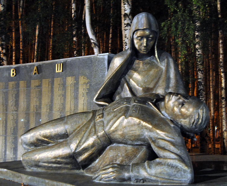
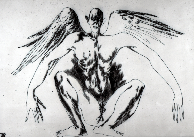
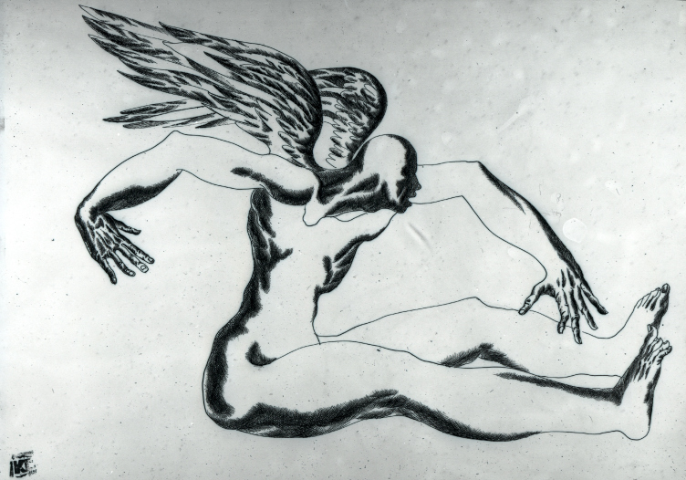
Yes, I have done a lot of drawing and painting, and took part in exhibitions. My works were sold successfully. Most of my drawings were done without any sketches or studies. For example, "Unable to Fly" that was exhibited at Art-Manezh in 1996. In ways, it became a symbol of those days: you have wings but you still are earthbound. Then I was into sculpture. Again, this all started in Khanty-Mansiysk where we created Russia's first Pieta for the Victory Park. There were also many of my other sculptural works, down to my custom-designed wrought-iron fence. Further on, we, together with Nikolai Lyubimov, did the sculptures of Cyril and Methodius. I also worked with Andrew Kovalchuk creating the large sculptural composition named "Yugra".
After you graduated from the Stroganov College you actively participated in Russian and the world's contests and exhibitions. What achievement of those days is the most important for you?
My main reward and achievement is the fact that over 150 of my drawings were bought by the leading galleries of America, Europe, and Japan. Although today I would happily have those drawings back because today I cannot draw the way I could back in those days. In the late eighties, there were a lot of foreigners in Moscow who were interested in my art. Lots of art shows and exhibitions were organized in Europe and America as well. Gradually, however, I put this all by to fully dedicate myself to architecture. Today, I create my works solely for my architectural projects - mosaics, sculptures, and bas-reliefs.
Pieta in the Victory Park, Khanty-Mansiysk © Grand Project City
Still, having become predominantly an architect, you do not give up on the fine arts altogether. Is it difficult combining them all?
Back in the soviet times, it was all divided into sections, the monumental artists, the drawing artists, the sculptors, and so on. To me, an artist is a very broad notion that covers such profession as an architect, a sculptor, a painter, and many others. For example, two months ago at the Pushkin Square seven of my mosaics were put up. At the same time, Moscow is now building three buildings upon my projects. These are, in fact, quite different fields of endeavor. But it seems to me that I am somehow able to combine all these activities, not to mention the fact that I implement my projects myself down to the last detail.
"Unable to Fly", 1992. Author: Karen Saprichyan
"Unable to Fly", 1991. Author: Karen Saprichyan
Probably, the most vivid example of such "gesamkunstwerk" in your portfolio is the Khanty-Mansiysk pyramid?
Yes, it obviously combines architectural and artistic techniques and means of expression. Under my supervision, the Kaluga Sculptural Factory produced for it over three hundred meters of bas-reliefs, the construction being also supervised by the Academy of Fine Arts. The plastic language of the Sochi tunnel portals is more contemporary; I think it has to do with my early paintings; this is especially true for the shape that is born from the intertwining structures.
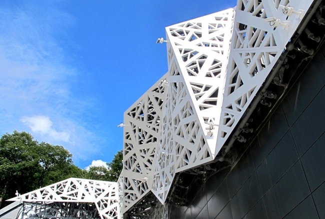
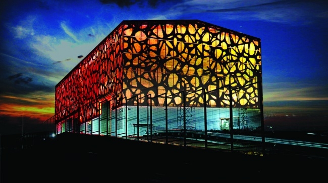
The same can be said about the restoration of the substation in Sochi: in that project I, for the first time in Russia, actually, was able to employ perforated facades. Now they are very popular with a lot of architects. There is also a "dark" side to it: both in painting and in drawing I have a lot of "architecture".
Presentation of Karen Saprichyan projects:
http://gp-city.ru/Saprichian%20Karen%20portfolio%20(start&wait%20for1min).pps
"Poselkovaya" and "Rosa-Khutor" substations in the neighborhood of Krasnaya Polyana, Sochi © Grand Project City


