По-русски

Sergey Kiselev. Interview by Yuliya Tarabarina

Archi.ru is the official information partner of the Russian pavilion on XI Venetian biennial. This material begins a series of interview to architects-participants of an exposition of the Russian pavilion which will be published in "the Venetian" catalogue. So it has turned out that the exhibition of the architectural company "Sergey Kiselyov and partners" which have been named by "architects of year" last summer becomes a part of "Arh-Moskvy" starting in the nearest Monday.

23 May 2008
mainImg
You founded one of the first private architectural studios during perestroika, and it subsequently grew into a large architectural firm. How did you begin?

An important factor was a trip to America made by the first delegation of Soviet architects to visit the USA since 1935. The party included: Yury Platonov, who had recently been elected Chairman of the Union of Architects ‘from the floor’; Aleksandr Kudryavtsev, Rector of the Moscow Institute of Architecture; Academician Dzhim Torosyan; and myself (representing the country’s young architects). We were literally given the red-carpet treatment from New York to San Francisco and received with great honour. This trip literally revolutionized my outlook on life. It was then that I met the architect Sydney Gilbert, who was Vice-chairman of Architects, Designers, and Planners for Social Responsibility, our host organization. This acquaintance had a great impact on me.

American architecture of that time really influenced you?

No, not architecture, but how the process was organized. Sydney was no ‘star’, and at the time the big names in architecture paid us Russians no attention. But he was a brilliant organizer. Everything in his office was beautifully arranged, and we subsequently used this experience in our own work. And the second important thing was that he brought us commissions. We organized a kind of exchange of delegations between our offices. Subsequently, we signed an agreement by which we undertook to work only with Gilbert’s firm in America and were in turn his only partner in Russia. He began supplying us with commissions to design Russian offices for foreign companies (it was at that time that they began setting up operations here). Mainly, this was interior design. It was a good start and it allowed us to gain experience. Then we stopped being interested in interior design, and in 1996 we passed all these contacts to Boris Levyant, who retains an interior-design department to this day.

So you started specializing?

Yes, in the end we specialized. Like many, though, we started with interiors, and did a great number of them. For the joint-stock enterprise Burda Moden alone – which at the end of the 1980s was curated by Raisa Gorbachev in person – we designed offices in Moscow and another 16 cities. Then in 1992 we did the urban-planning concept for the development of Mosfilmovsky district. The concept went before a session of the Government of Moscow. Subsequently, we had the heads of other municipal districts queuing at our doors, so to speak. This was followed by reconstruction and even restoration projects, including the restoration project for the Senate in the Kremlin. Then came contextual construction projects and restoration of historical buildings, including of the building which contains our office. At the time, in the mid 1990s, we invested our labour by doing several projects free of charge in exchange for the chance to have our own office in the city centre. Our logo still contains the words ‘architecture, design, planning’, implying that we are a large universal company. However, it’s now extremely rare for us to take on interior-design jobs, and only in buildings which we have designed ourselves. And ‘two-dimensional’ planning, i.e. urban planning, is something we’ve likewise not done for a long time, although Vyacheslav Bogachkin, one of my colleagues from the 90s, and I graduated from the Department of Urban Planning at MARCHI. We gradually realized that urban planning is another type of activity: it is management, zoning laws, and regulation. So, even though we design street blocks of 10-15 hectares, I don’t regard this as urban planning, but as building design on a large scale. Ours is ‘box’ architecture. We design only for the city. Single-family houses and out-of-town settlements are not our thing. In the final analysis, we specialize in large architectural objects that are financially independent from the authorities.

Why?

At the beginning of the 1990s we made an attempt to work for public money. The civil servant who was responsible for allocating the commission suggested that we return to him part of the money for this commission. We thought him a thief, turned the job down, and decided, as far as possible, to have nothing more to do with such officials. We decided we should work with people who have their own money or borrow it, rather than for public money.

Have you had any desire to change or expand your established area of specialization?


I have said repeatedly that we’re a little tired of commercial commissions. Of course, we want to do non-commercial architecture – or, at the very least, architecture that prioritizes image. Currently, what we mainly do is satisfy the client’s objectives, and clients usually want the maximum – to spend as little as possible on construction and sell for as high a price as possible. We would like to design a building with a cultural function – one where profit is not the main criterion of success. But no one has approached us with such a proposal. Probably, we’re too dry, too far from art. Perhaps it’s in vain that we have created this image for ourselves, refraining from emphasizing the aesthetic aspects of our work for fear of being told that we won’t be able to cope. Perhaps this is from fright. Unjustified fright.

Nonetheless, in 2007 you were named ‘Architect of the Year’ at Arch Moscow and, what’s more, picked up all possible awards for best buildings for the same year.

I was surprised when we were honoured as best architects. When we were awarded the prize for best project from the point of view of developers for Avant-garde a year earlier, that was more comprehensible.

You often talk in this vein – emphasizing the pragmatic side of things while leaving aesthetics to art critics. At the same time your work clearly shows rules and principles – with regard to both style and behaviour – to which you adhere quite strictly. Could you say a few words about these principles?


There are two of them and they both begin with ‘u’ in Russian – appropriateness and ability. Appropriateness means ‘don’t harm’ the site or the city. It’s the social responsibility that the architect should feel with respect to the city in which he works. And ability is that which makes it possible for architects to satisfy their clients’ requirements.

But these are opposites: everything for the city and everything for the client!

Yes, and there’s a third principle: compromise, the ability to find a balance between the above two principles. My ‘sworn friends’ are often ironic on this subject. Kiselev, they say, can find his way between the raindrops; he’s an affectionate calf sucking two mothers. But I’m absolutely sure that an urban architect should have a talent for finding a compromise between the greed of the client and the constraints imposed by the city. The better the balance he can find, the better the buildings that he designs for the city. The ability to reach agreement, to explain why certain things cannot be done, to satisfy the client materially and spiritually, and at the same time not to behave offensively in the city: these have been the main principles that have governed us when building in the historical city centre. Currently, we’re trying to do exactly the same in our large projects, but they are on a different level of technical complexity. Here a different philosophy and different aesthetic apply: you have to create an absolutely rational building. This in itself entails an aesthetic component.

What do you mean by rationalism?


Nothing should happen without good reason. As a student, I read a textbook on formal logic for teaching colleges. I really liked it. It made clear that everything flows from and follows something else. This makes it difficult for me to accept from my colleagues arguments such as ‘That’s the way I see it’. There have even been conflicts, and gradually we’ve been left only with architects who can explain their decisions and formulate why they have drawn something this way and no other – why there’s a projection here, why green is the colour used here and red the colour here. This can be difficult; solutions occur intuitively, but at the same time I think it very important to think through the result, to make it well-considered – rather than an automatic movement of the hand. Architecture, as I see it, is a more complex species of activity than simply art. It involves organizing life, functions, flows, and movements of people and vehicles. Note that in Vitruvius’s triad of ‘benefit, strength, beauty’, beauty comes last. A great many of my colleagues and many art critics read this triad in reverse order, emphasizing the aesthetic component. There’s reason for this: art is higher and it’s art that moves culture forwards. The two other components are self-evident. But I think it’s very important in the city to see the other components as well as the aesthetic. A city is something more complex than simply the sum of its buildings. It’s an organism that has to be managed. Its processes need to be organized by means of laws and rules, written and unwritten. For me, for example, the environment as a whole is very important – the potholes on the roads, advertising banners strung across houses, and dirty rubbish bins. Not to mention the crumbling facades.

You have created a large architectural firm with a large number of projects and several leading architects. At the same time, your scrupulousness is well-known: some time ago, you even refrained from having your surname necessarily put first in the list of members of the creative team – so as to show the degree to which you had taken part in a project. Why?

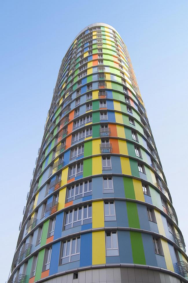
There are traditions and rules of decency. At a certain moment there gets to be so much work and so many helpers are involved that it becomes more their project than yours. In general, having a project in production is awful. It ought to be your project, but you’ve lost control of it, and it becomes more someone else’s than yours. So I refrained from putting my own surname first on buildings which seemed to me to have been conceived by other people. This concerned Skuratov and Bogachkin, above all. They were self-sufficient. These guys have set up their own offices and now have every right to put their names at the top. At the same time, my ‘complexes’ in this regard have been largely eliminated by a whole series of buildings which have likewise won acclaim and in which the main melody and idea have been mine. They are: the oval block in the Central Telegraph project, Subaru Centre, Avantgarde, Ermitazh Plaza, and other structures where it was I who determined the main principles. In the case of Avantgarde I proposed making the building multihued, of three types of panels, proposed correcting the tension in the lines of its rounded outline, and proposed putting it on legs like a cupboard… On the other hand, in large foreign companies it’s accepted procedure for the owner always to write his name first. It’s like the artistic director of a theatre – who may not direct every production, but nevertheless determines the main themes. We espouse certain aesthetic principles. It’s unlikely, for instance, that something decorated with capitals will ever come out of this office.

You don’t do Classicism. To design the Neoclassical house in Levshinsky pereulok, you called on Il’ya Utkin. What else defines your aesthetics?


As Okuzhava said, ‘everyone writes as he breathes.’ I’m of the firm opinion that all architecture is a portrait not just of its author, but also of the age and the country in which it is created. A civilization should be reflected in architecture that matches its degree of progress. If the idea of appropriateness is extended to include position in time, then I sincerely think that Classical architecture is absolutely inappropriate when we have other technical capabilities, another language, and another mentality. There are, of course, specific tasks that make it necessary to use traditional techniques, but this is mainly for restoration work.

So for you Classicism is conservatism?

Yes. It goes without saying that the different types of architecture may be talented or the reverse, but still I think it strange to create Classical architecture in this day and age. It’s something I just cannot understand.

To return to principles, what was your motivation in leaving design institute in the 1980s to set up your own architectural office?

First, there is such a thing as honesty. It is impossible to sit for eight hours a day earning 150 rubles and then earn 800 during the evenings. It just doesn’t make sense. Clearly, your main working day will be less intense and you’ll begin using these less busy eight hours to do what you should be doing in the evening after work. This is one such principle. There was another interesting point, though. I had always been apolitical and even took pride in the fact that till the age of 27 I hadn’t even read the Komsomol charter. Then I was invited to join the Communist Party. I categorically refused until Yury Platonov, who had become a member of the Party’s Central Committee, talked me into it by arguing that as Communists we should reconstruct the country. I joined, but then, as soon as I realized I’d made a mistake, I quickly left of my own accord. You could say these were acts of the same order – to leave the Party and to resign from design institute. This was in the spring of 1988. At the time this was a serious matter: I was taken aside and asked how I’d dare return my Party membership card.

All for the sake of being honest?


Strictly speaking, yes. There are colleagues of mine of whom it’s said at planning-approval sessions, for instance, that their figures need to be checked. Whereas my figures never have to be checked. Reputation is the most valuable capital there is; this is our slogan to this day.

Is this a help or a hindrance?


A help. I think this was wise – to stake our money on reputation from the very beginning. This is our principle, you could say. Why was I awarded ‘Architect of the Year’? I really don’t know! I suppose that over the years we have earned ourselves a reputation which has led both the architectural authorities and clients to think highly of us. Judging by the number of commissions we have, our reputation is well-deserved. Now it works in our favour, and all we have to do is maintain it.

23 May 2008

Headlines now
The Golden Crown
The concept for a dental clinic in Yekaterinburg, developed by CNTR Studio, revolves around the idea of a “mouth full of gold”: pristine white porcelain stoneware walls are complemented by matte brass details. To avoid an overly literal interpretation, the architects focused on the building’s proportions, skillfully navigating between sunlight requirements and fire safety regulations.
Flexibility and Integration
Not long ago, we covered the project for the fourth phase of the ÁLIA residential complex, designed by APEX. Now, we’ve been shown different fence concepts they developed to enclose the complex’s private courtyards, incorporating a variety of public functions. We believe that the sheer fact that the complex’s architects were involved in such a detail as fencing speaks volumes.
A Step Forward
The HIDE residential complex represents a major milestone for ADM architects and their leaders Andrey Romanov and Ekaterina Kuznetsova in their quest for a fresh high-rise aesthetic – one that is flexible and layered, capable of bringing vibrancy to mass and silhouette while shaping form. Over recent years, this approach has become ADM’s “signature style”, with the golden HIDE tower playing a pivotal role in its evolution. Here, we delve into the project’s story, explore the details of the complex’s design, and uncover its core essence.
Gold in the Sands
A new office for a transcontinental company specializing in resource extraction and processing has opened in Dubai. Designed by T+T Architects, masters of creating spaces that are contemporary, diverse, flexible, and original, this project exemplifies their expertise. On the executive floor, a massive brass-clad partition dominates, while layered textures of compressed earth create a contextually resonant backdrop.
Layers and Levels of Flight
This project goes way back – Reserve Union won this architectural competition at the end of 2011, and the building was completed in 2018, so it’s practically “archival”. However, despite being relatively unknown, the building can hardly be considered “dated” and remains a prime example of architectural expression, particularly in the headquarters genre. And it’s especially fitting for an aviation company office. In some ways, it resembles the Aeroflot headquarters at Sheremetyevo but with its own unique identity, following the signature style of Vladimir Plotkin. In this article, we take an in-depth look at the United Aircraft Corporation (UAC) headquarters in the Moscow agglomeration town of Zhukovsky, supplemented by recent photographs from Alexey Naroditsky – a shoot that became only recently possible due to the fact that improvements were finally made in the surrounding area.
Light and Shadow
In this article, we delve into the architectural design of the “Chaika” house by DNK ag architects, which was recently completed in 2023 as part of the collection of signature designs at ZILArt. As is well-known, all the buildings in this complex follow a design code, yet each one is distinct. This particular building stands out not only for its whiteness and minimalism but also for the refined use of a limited number of techniques that, together, create what can confidently be called synergy.
Casus Novae
A master plan was developed for a large residential area with a name of “DNS City”, but now that its implementation began, the plan has been arbitrarily reformatted and replaced with something that, while similar on the surface, is actually quite different. This is not the first time such a thing happens, but it’s always frustrating. With permission from the author, we are sharing Maria Elkina’s post.
Treasure Hunting
The GAFA bureau, in collaboration with Tegola and Arkhitail, organized an expedition to the island of Kilpola in Karelia as part of Moskomarkhitektura’s “Open City” festival. There, amidst moss and rocks, the students sought answers to questions like: what is the sacred, where does it dwell, and what sustains it? Assisting the participants in this quest were landscape engineer Evgeny Levin, artist Nicholas Roerich, a moose, and the lack of cellular connection. Here’s how the story unfolded.
Depths of the Earth, Streams of Water
In the Malaya Okhta district, the Akzent building, designed by Stepan Liphart, was constructed. It follows a classic tripartite structure, yet it’s what you might call “hand-drawn”: each façade is unique in its form and details, some of which aren’t immediately noticeable. In this article, we explore the context and, together with the architect, delve into how the form was developed.
Fir Tree Dynamics
The “Airports of Region” holding is planning to build an airport in Karachay-Cherkessia, aiming to make the Arkhyz and Dombay resorts more accessible to travelers. The project that won in an invitation-only competition, submitted by Sergey Nikeshkin’s KPLN, blends natural imagery inspired by the shape of a conifer seed, open-air waiting spaces, majestic large trees, and a green roof elevated on needle-like columns. The result is both nature-inspired and WOW.
​A Brick Shell
In the process of designing a clubhouse situated among pine trees in a prestigious suburban area near Moscow, the architectural firm “A.Len” did the façade design part. The combination of different types of brick and masonry correlates with the volumetric and plastique solutions, further enhanced by the inclusion of wood-painted fragments and metal “glazing”.
Word Forms
ATRIUM architects love ambitious challenges, and for the firm’s thirtieth anniversary, they boldly play a game of words with an exhibition that dives deep into a self-created vocabulary. They immerse their projects – especially art installations – into this glossary, as if plunging into a current of their own. You feel as if you’re flowing through the veins of pure art, immersed in a universe of vertical cities, educational spaces – of which the architects are true masters – and the cultural codes of various locations. But what truly captivates is the bold statement that Vera Butko and Anton Nadtochy make, both through their work and this exhibition: architecture, above all, is art – the art of working with form and space.
Flexibility and Acuteness of Modernity
Luxurious, fluid, large “kokoshniks” and spiral barrel columns, as if made from colorful chewing gum: there seem to be no other mansion like this in Moscow, designed in the “Neo-Russian-Modern” style. And the “Teremok” on Malaya Kaluzhskaya, previously somewhat obscure, has “come alive with new colors” and gained visibility after its restoration for the office of the “architectural ecosystem” as the architects love to call themselves. It’s evident that Julius Borisov and the architects at UNK put their hearts into finding this new office and bringing it up to date. Let’s delve into the paradoxes of this mansion’s history and its plasticity. Spoiler: two versions of modernity meet here, both balancing on the razor’s edge of “what’s current”.
Yuri Vissarionov: “A modular house does not belong to the land”
It belongs to space, or to the air... It turns out that 3D printing is more effective when combined with a modular approach: the house is built in a workshop and then adapted to the site, including on uneven terrain. Yuri Vissarionov shares his latest experience in designing tourist complexes, both in central Russia and in the south. These include houseboats, homes printed from lightweight concrete using a 3D printer, and, of course, frame houses.
​Moscow’s First
“The quality of education largely depends on the quality of the educational environment”. This principle of the last decade has been realized by Sergey Skuratov in the project for the First Moscow Gymnasium on Rostovskaya Embankment in the Khamovniki district. The building seamlessly integrates into the complex urban landscape, responding both to the pedestrian flow of the city and the quiet alleyways. It skillfully takes advantage of the height differences and aligns with modern trends in educational space design. Let’s take a closer look.
Looking at the Water
The site of Villa Sonata stretches from the road to the water’s edge, offering its own shoreline, pier, and a picturesque river panorama. To reveal these sweeping views, Roman Leonidov “cut” the façade diagonally parallel to the river, thus getting two main axes for the house and, consequently, “two heads”. The internal core – two double-height spaces, a living room and a conservatory, with a “bridge” above them – makes the house both “transparent” and filled with light.
The White Wing
Well, it’s not exactly white. It’s more of a beige, white-stone structure that plays with the color of limestone – smoother surfaces are lighter, while rougher ones are darker. This wing unites various elements: it absorbs and interprets the surrounding themes. It responds to everything, yet maintains a cohesive expression – a challenging task! – while also incorporating recognizable features of its own, such as the dynamic cuts at the bottom, top, and middle.
Urban Dunes
The XSA Ramps team designed and built a three-part sports hub for a park in Rostov-on-Don, welcoming people of all ages and fitness levels. The skate plaza, pump track, and playground are all meticulously crafted with details that attract a diverse range of visitors. The technical execution of the shapes and slopes transforms this space into a kind of sculptural composition.
Proportional Growth
The project for the fourth phase of the ÁLIA residential area has been announced. The buildings are situated on an elongated plot – almost a “ray” that shoots out from the center of the area towards the river. Their layout reflects both a response to Moscow’s architectural preferences over the past 15 years, shifting “from blocks to towers”, and an interpretation of the neighboring business park designed by SOM. Additionally, the best apartments here are not located at the very top but closer to the middle, forming a glowing “waistline”.
The “Staircase” Building
In designing the “Details” residential complex in New Moscow, Rais Baishev spiced up the now-popular Moscow theme of a “courtyard” building with an idea drawn from the surrealist drawings by Maurits Escher. He envisioned the stepped silhouettes and descending slopes as a metaphysical mega-staircase, creating a key void within the courtyard that gave the project an internal “spine”. This concept is felt both in the building’s silhouette and on its façades.
Projection of the Quarter
No one doubted that the building that Vladimir Plotkin designed as part of the “Garden Quarters” would be the most modernist of all. And it turned out just that way: while adhering to the common design code, the building successfully combines brick and white stone, rhythmically responding to the neighboring building designed by Ostozhenka, yet tactfully and persistently making a few statements of its own. This includes the projection of the ideal urban development composition “14–9–6”, which can be found right next door, mathematical calculations, including those for various types of terraces (and perhaps the only reminder of the Soviet past of the Kauchuk rubber factory!), and the white “cross-stitch” pattern of the façade grid.
Domus Aurea
In this issue, we examine the “Tessinsky-1” house, designed by Sergey Skuratov and completed in 2023. Located in the middle of the Serebryanicheskaya Embankment district, at the intersection of its main streets, this house assumes a sort of “nodal” role: it not only responds to everything around it and preserves many memories of the former EMA factory within itself, but it weaves all this into a newly directed pattern, reconciling bright “gold” and dark-colored brick, largely with the help of the new, modern-yet-archaic Columba brick, which, come to think about it, is the most precious element here.
The Chimney of Nikola-Lenivets
In this issue, we are examining the “Obelisk House” designed by KATARSIS and built for the Arkhstoyanie 2023 festival. However, it was only finished later on, and this is why we are examining it now. It seems to us that after the “Obelisk House” appeared in Nikola-Lenivets, a dialogue and a few inner connections appeared between the temporary structures built here. These houses no longer look like “accidental neighbors”, more of which below.
​Periscope by the Bay
The jury awarded the second place in the competition for a public and cultural center in Petropavlovsk-Kamchatsky to the companies GORA (“Mountain”) and M4. In the consortium’s proposal, the building resembles a sperm whale with a calf swimming next to it or a periscope, whose lenses capture the most spectacular views from the surrounding landscape.
From Arcs to Dolmens
While working on the competition project for Petropavlovsk-Kamchatsky, ASADOV Architects prioritized the value of the natural and urban environment, aiming to preserve the balance of the location while minimizing the resemblance of the volume that they designed to a “traditional building”. The task was challenging, and the architects created three versions, one of which having been developed after the competition, where their main proposal took third place. However, the point of interest here is not the competition result but the continuity of creative thinking.
Hide and Seek
The ID Moskovskiy house, designed by Stepan Liphart in St. Petersburg, in the courtyards near Moskovskiy Avenue beyond the Obvodny Canal and recently completed, is notable for several reasons. Firstly, it has been realized with considerable accuracy, which is particularly significant as this is the first building where the architect was responsible not only for the facades but also for the layouts, allowing for better integration between the two. On the other hand, this building is interesting as an example of the “germination” of new architecture in the city: it draws on the best examples from the neighborhood and becomes an improved and developed sum of ideas found by the architect in the surrounding context.
The Big Twelve
Yesterday, the winners of the Moscow Mayor’s Architecture Award were announced and honored. Let’s take a look at what was awarded and, in some cases, even critique this esteemed award. After all, there is always room for improvement, right?
Above the Golden Horn
The residential complex “Philosophy” designed by T+T architects in Vladivostok, is one of the new projects in the “Golubinaya Pad” area, changing its development philosophy (pun intended) from single houses to a comprehensive approach. The buildings are organized along public streets, varying in height and format, with one house even executed in gallery typology, featuring a cantilever leaning on an art object.
Nuanced Alternative
How can you rhyme a square and space? Easily! But to do so, you need to rhyme everything you can possibly think of: weave everything together, like in a tensegrity structure, and find your own optics too. The new exhibition at GES-2 does just that, offering its visitor a new perspective on the history of art spanning 150 years, infused with the hope for endless multiplicity of worlds and art histories. Read on to see how this is achieved and how the exhibition design by Evgeny Ace contributes to it.
Blinds for Ice
An ice arena has been constructed in Domodedovo based on a project by Yuri Vissarionov Architects. To prevent the long façade, a technical requirement for winter sports facilities, from appearing monotonous, the architects proposed the use of suspended structures with multidirectional slats. This design protects the ice from direct sunlight while giving the wall texture and detail.