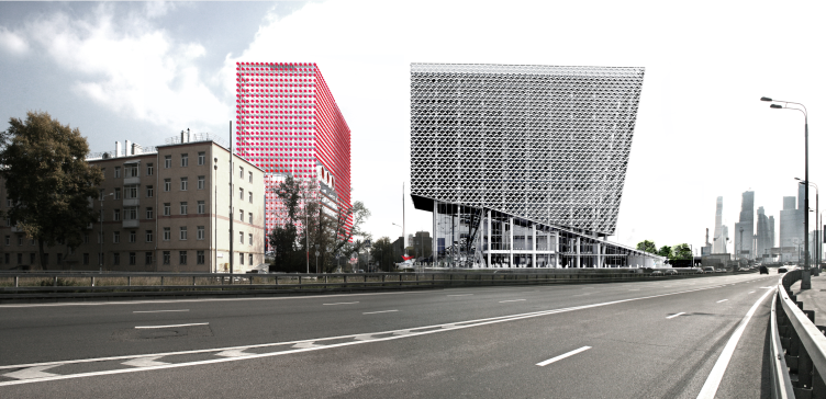
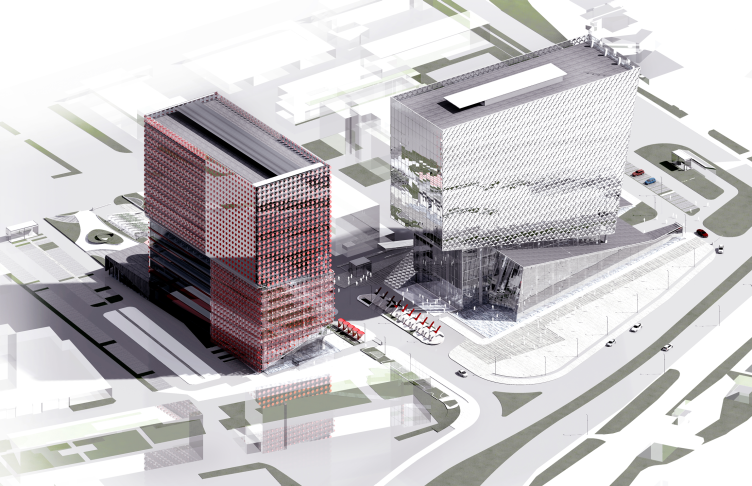
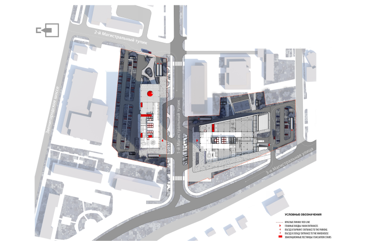
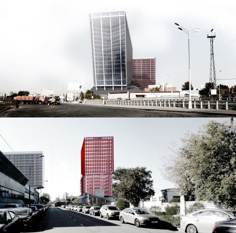
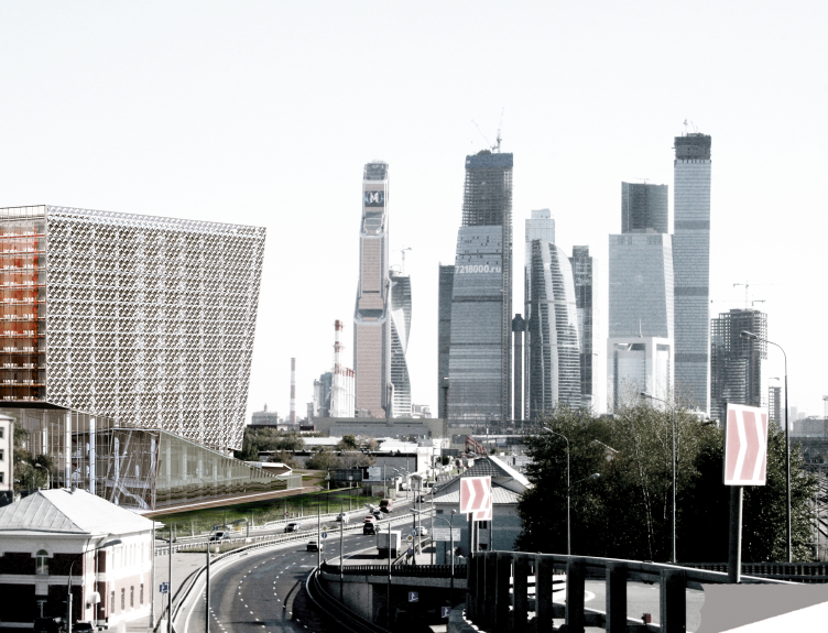
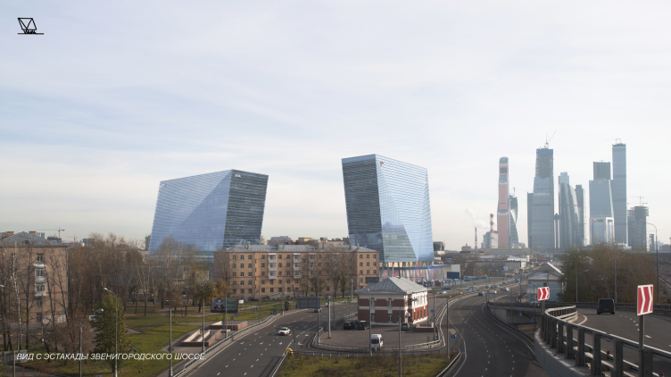
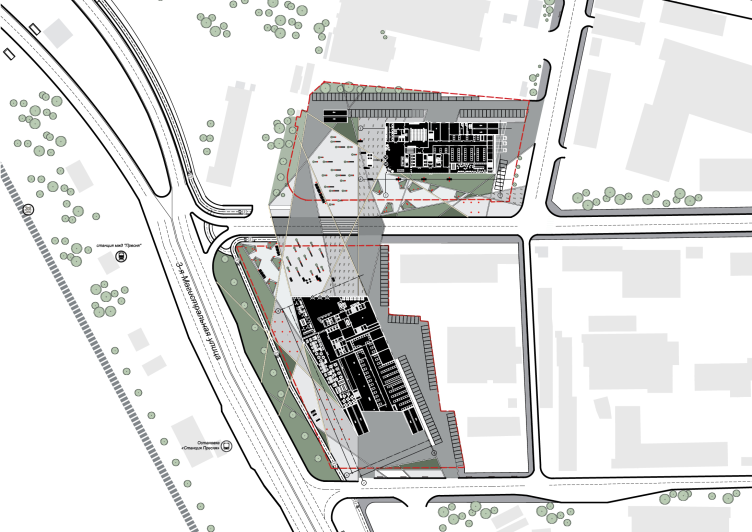
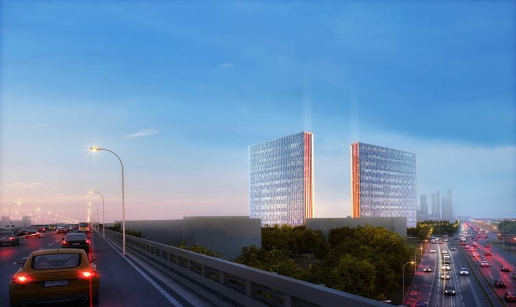
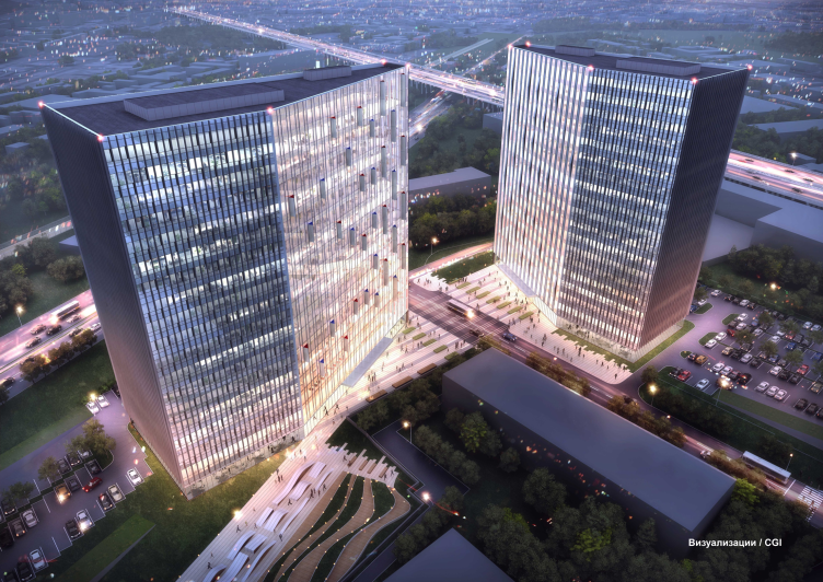
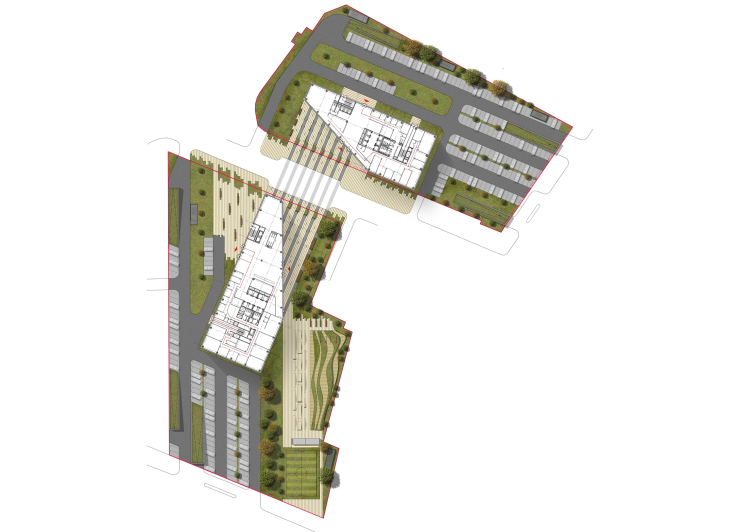
The construction site (18, 3rd Magistralnaya Street) is located about a mile away from the Moscow City complex, next to the Zvenigorodskoe Highway, and is surrounded by an industrial park. Nearby, there is the railroad station "Presnya-Tovarnaya".
***
First place
"Reserve" (Russia)
Author team:
Vladimir Plotkin, Elena Kuznetsova, Yuri Fadeev, Alexandra Dogadkina, Dmitry Masakov
Project manager: Vadim Semenov. Modeling: Eugenia Mikhailova
Concepts of the HQ's of "Sportmaster" and "O'Stin". Authors: "Reserve"
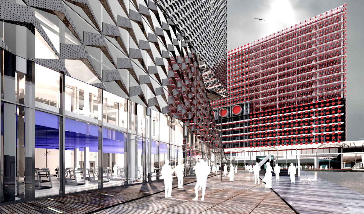
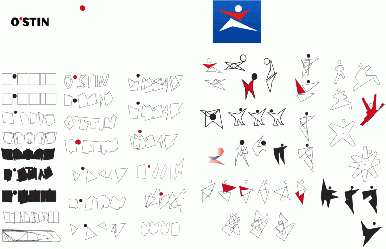
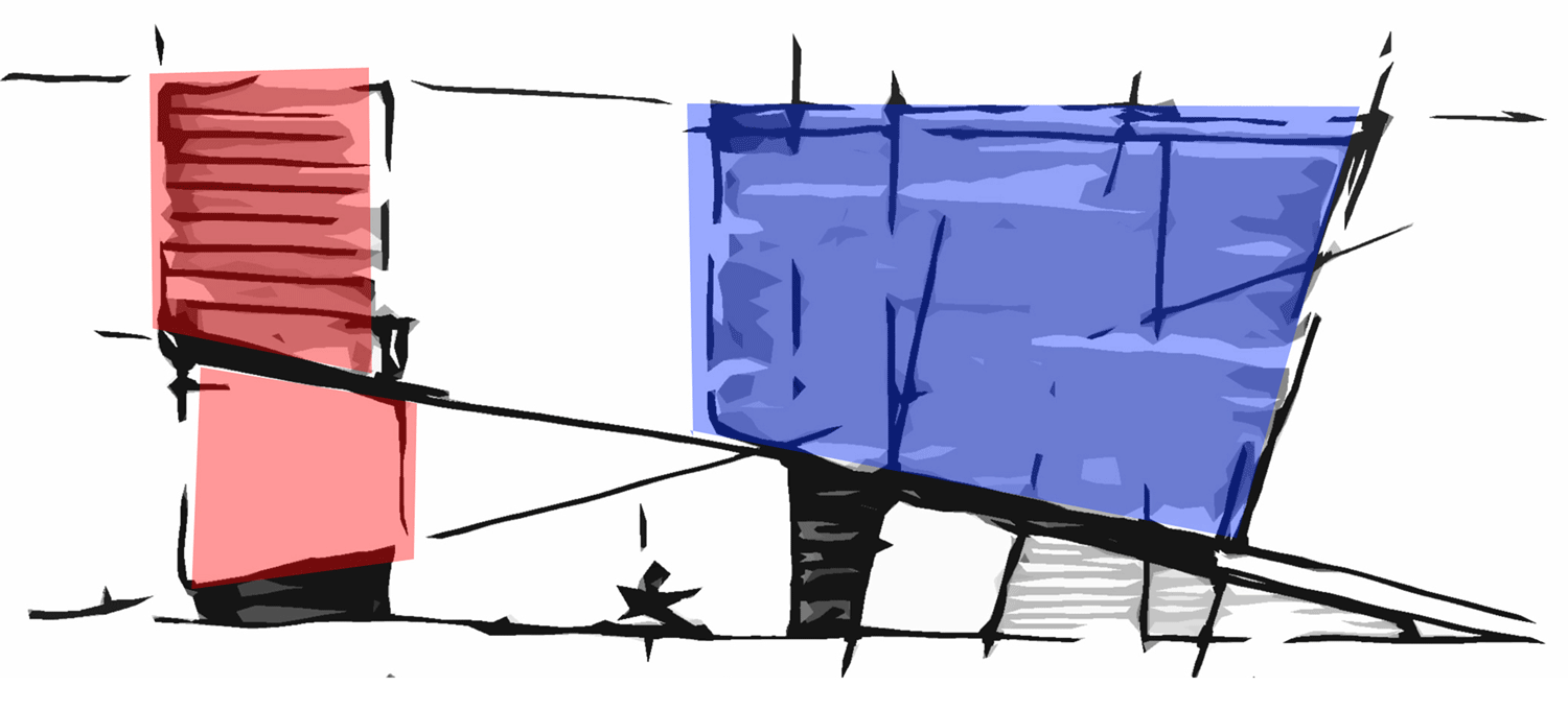
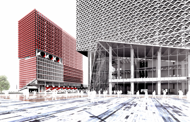
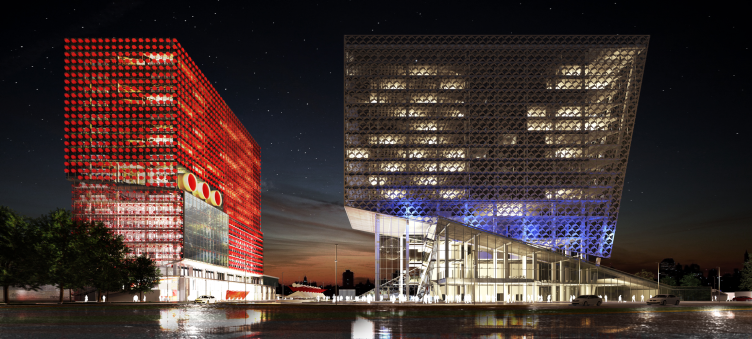
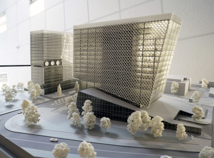
The idea to use the logos of "Sportmaster" and "O'stin" as the prototypes of both the volume/space solution of their offices and their facade patterns is simple, laconic, and graceful. It only takes one look at the sketches of searching for the "shape and image" to understand it all: the dynamics of the volumes, the repetition of the elements, and the subtly thought-out rhythmic accents. The icon of the man on the run set the frame of reference for the "soaring" volumes of "Sportmaster", and, as for the trademark letters of "O'stin" logo, they formed the austere rectangular volume of the second block that looks like it stops in midair the dash of its vis-à-vis. It is easy to notice that in comparison to the draft submitted for the first round the volume of the "Sportmaster" office changed a little: while formerly in its lower part one could see a figure that looked almost exactly like the company's logo, now the image of a running man affects the entire building: it looks as though the framed top is sliding down the ramp of the glass bottom.
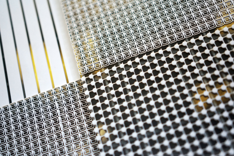
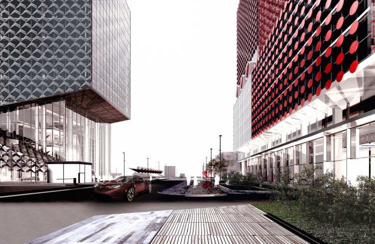
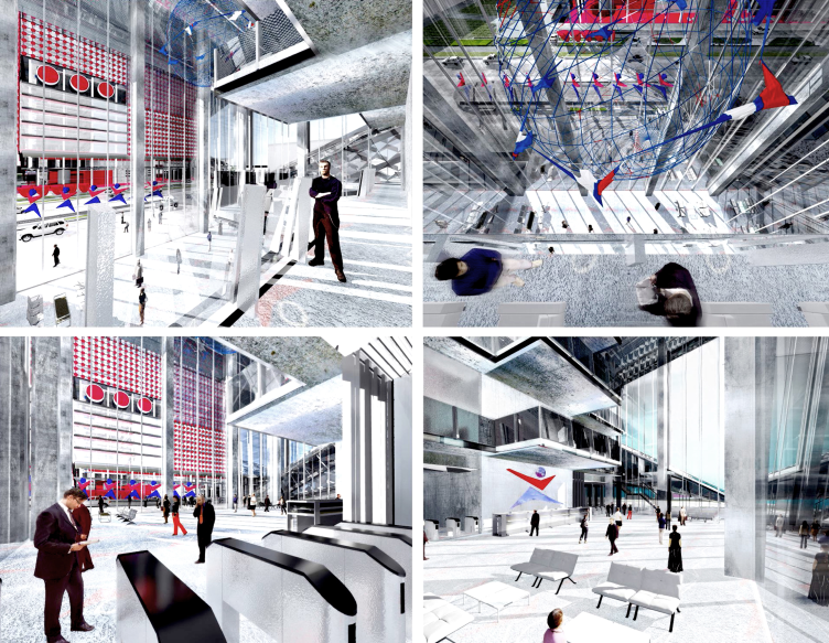
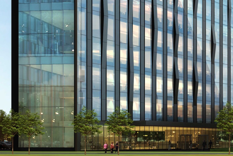
The same basic shapes borrowed from the logos - the conditional legs of the "Sportmaster" running man and the "O'stin" red dot - became the basis for the facade ornament. The patterns interact with each other and reflect each other turning the walls into a shifting decoration that changes as people move part it. The brand book style, as is usually the case with such projects, is also extensively used in designing the interiors of the offices.
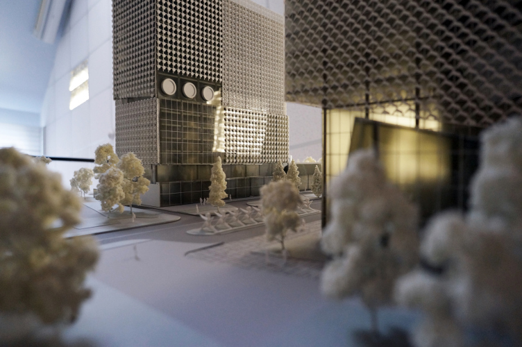
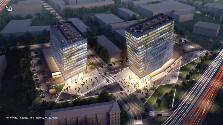
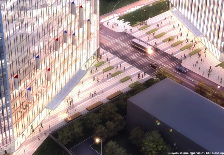
The two buildings are separated by a driveway, the main entrances situated opposite to each other some sixty meters apart. The heavy truck transport drop-offs, on the other hand, are hidden away and do not spoil the impression from the facades.
Definition of the brand's associative array. Concept of the HQ's of "Sportmaster" and "O'Stin". Authors: "Reserve"
The opening sketch clearly demonstrates the interconnection of the two volumes. Concept of the HQ's of "Sportmaster" and "O'Stin". Authors: "Reserve"
Concepts of the HQ's of "Sportmaster" and "O'Stin". Authors: "Reserve"
Concepts of the HQ's of "Sportmaster" and "O'Stin". Authors: "Reserve"
Concepts of the HQ's of "Sportmaster" and "O'Stin". Authors: "Reserve"
Concepts of the HQ's of "Sportmaster" and "O'Stin". Authors: "Reserve"
Concepts of the HQ's of "Sportmaster" and "O'Stin". Authors: "Reserve"
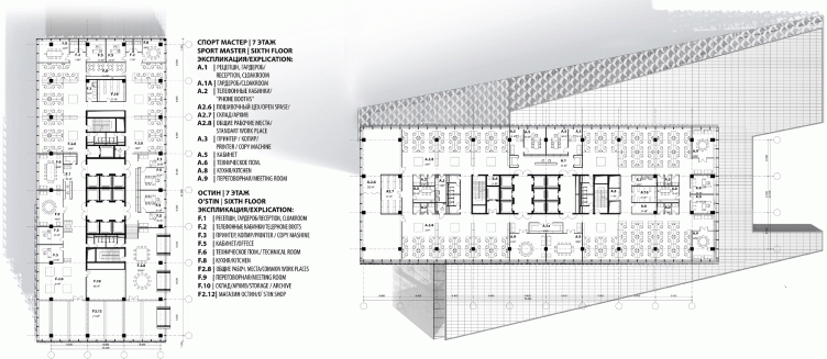
Plans of the typical office floors (Floor 7). Concepts of the HQ's of "Sportmaster" and "O'Stin". Authors: "Reserve"
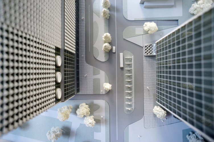
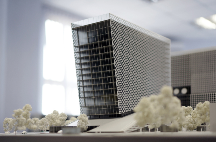
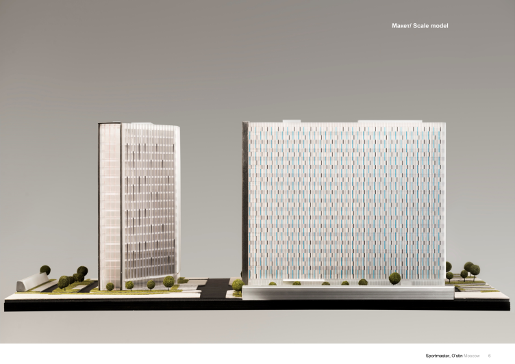
The judging panel was particularly impressed by the model of the complex. Concepts of the HQ's of "Sportmaster" and "O'Stin". © "Reserve", Yuri Fadeev
Model. Concepts of the HQ's of "Sportmaster" and "O'Stin". © "Reserve", Yuri Fadeev
Model. Concepts of the HQ's of "Sportmaster" and "O'Stin". © "Reserve", Yuri Fadeev
Model. Concepts of the HQ's of "Sportmaster" and "O'Stin". © "Reserve", Yuri Fadeev
Model. Concepts of the HQ's of "Sportmaster" and "O'Stin". © "Reserve", Yuri Fadeev
Concepts of the HQ's of "Sportmaster" and "O'Stin". Authors: "Reserve"
Concepts of the HQ's of "Sportmaster" and "O'Stin". Authors: "Reserve"
Concepts of the HQ's of "Sportmaster" and "O'Stin". Authors: "Reserve"
Concepts of the HQ's of "Sportmaster" and "O'Stin". Authors: "Reserve"
***
Second place
UNK project (Russia)
Leader of the author team: Julius Borisov, Chief Architect of the Project: A.Shmelev, project manager: K.Akatov; architects: T.Shmeleva, G.Khamzina, N.Saks, O.Poletkina, L.Mattana, A.Lukonskaya; 3D visualizations: S.Dyukarev, A.Yuresko
Concepts of the HQ's of "Sportmaster" and "O'Stin". Authors: UNK Project
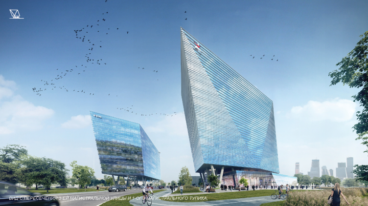
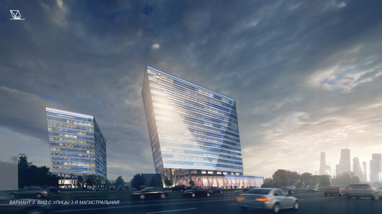
The two tilted and slightly faceted parallelepipeds became, according to the architects' idea, the figurative embodiment of the successful development of the two companies and their synergetic progress.
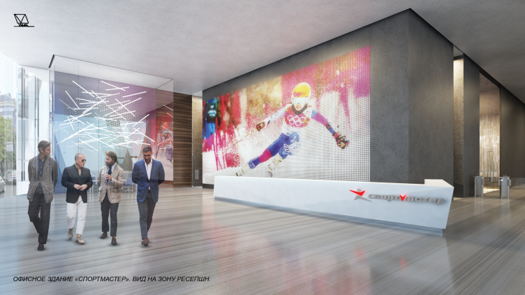
The expressiveness of the composition is enhanced by the fact that the office blocks, with their clear-cut internal and external structure, are elevated on the V-shaped supports not to the stylobate part but still higher - which forms extra panoramic views that help to intensively integrate the new complex in the city environment. This same idea is also boosted by the panoramic windows that, on the one hand, dissolve the newly-built volumes in the habitual cityscape and, on the other hand, pulls this cityscape into the office interiors - according to the authors' idea, the ensemble must set the vector for the further development of this area.
Concepts of the HQ's of "Sportmaster" and "O'Stin". Authors: UNK Project
Concepts of the HQ's of "Sportmaster" and "O'Stin". Authors: UNK Project
Concepts of the HQ's of "Sportmaster" and "O'Stin". Authors: UNK Project
Concepts of the HQ's of "Sportmaster" and "O'Stin". Authors: UNK Project
Concepts of the HQ's of "Sportmaster" and "O'Stin". Authors: UNK Project
***
Third place
Aukett Swanke (Great Britain, Moscow Branch)
Author team: George Tyugaev, Alexander Nikulshin
Concepts of the HQ's of "Sportmaster" and "O'Stin". Authors: Aukett Swanke
Two thin slabs flank the panorama of Moscow City. When the evening light come on, the impression is enhanced: the face surfaces of the slabs remain cold-gray while the side walls start shining a warm pink-yellow glow.
As one approaches the complex it becomes clear that the complex consists not of two slabs but of a couple of almost identical trapeze-section volumes designed as two halves of a single whole. This is how the architects express the visual image of the single business divided in two parts for better management. As for the key elements of the concept, they are the narrowed side-walls, the ones that turn into a glowing frame of the dusk and dawn panoramas, and the inside "showcase" facades whose corners are backlit. This allows to avoid the unpleasant effect of the buildings looking like giant "crates" or "boxes" and hide the true volume of the buildings behind the narrow facets.
***
The judging panel of the contest:
- Sergey Kuznetsov, Chief architect of Moscow, deputy chairman of the Moscow Committee for Architecture and Town-planning;
- Andrew Gnezdilov, chief architect of "General Plan Institute of Moscow";
- Sergey Tchoban, managing partner of "SPEECH" architectural bureau;
- Anton Nadtochy, chief architect of "Atrium" Bureau;
- Nikolai Lyashenko, C.E.O and co-founder of "Tsimailo, Lyashenko & Partners";
- Oleg Artemyev, President of "Vysota Engineering";
- Dmitry Deuchen, chairman of the board of directors of "Sportmaster";
- Nikolai Fartushnyak, president of "Sportmaster"
Concepts of the HQ's of "Sportmaster" and "O'Stin". Authors: Aukett Swanke
Concepts of the HQ's of "Sportmaster" and "O'Stin". Authors: Aukett Swanke
Concepts of the HQ's of "Sportmaster" and "O'Stin". Authors: Aukett Swanke
Concepts of the HQ's of "Sportmaster" and "O'Stin". Authors: Aukett Swanke
Concepts of the HQ's of "Sportmaster" and "O'Stin". Authors: Aukett Swanke
