On the 26th of January, Moscow saw the inauguration of "Electrotheater Stanislavsky". Wowhaus Architectural Bureau reconstructed for the theater a group of buildings at 23, Tverskaya Street on a really tight schedule - approximately within a year since Stanislavsky Drama Theater got a new art director - Boris Yukhananov who at once started rebranding the theater and remodeling its premises. The first part of the new name that Yukhananov came up with is borrowed from "Electrotheater ARC" that had been organized in this very building in 1915 by the jeweler Abraham Gechtman - as a matter of fact, back in those days "electrotheater" was a common term for a movie theater. In the new name, the word "electrotheater" sounds not so much high-profile, as it did back in those days, as playful; just as mysterious an impression is produced by the new logo with the image of Stanislavsky inside an electric bulb - according to Yukhananov, it means that the renovated theater is "a ray of light in the realm of darkness". One of the theater's main tasks is "the synthesis of a radical search with the classical theater tradition", and the renovation "does not violate but tactfully preserves the spirit of the place", as the new press release says. These words refer not only to the troupe that nobody quit but also to the architectural project.
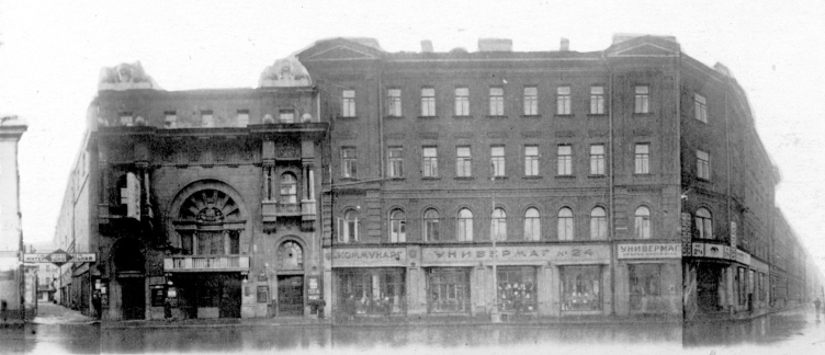
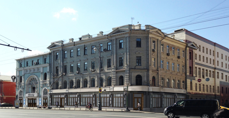
The edifice was built in 1874 and initially had "furnished accommodations" in it. In 1915-1916, the architect Pavel Zabolotsky rebuilt it in the new empire style for Gechtman's "electrotheater": the facade of that time has come to us almost fully intact, while the interiors of the foyers were remodeled in the 1950's when the entire building was moved over in order to broaden the Tverskaya Street. Today, the theater occupies several buildings: House N23 built in 1915 with a later addition of an elongated annex going deeper into the yard, House N25 on the Tverskaya Street, and a few smaller buildings of an auxiliary aspect inside the yard.
Foyer. "Electrotheater Stanislavsky". Photo © Ilia Ivanov, 2014
Buildings of the Stanislavsky Theater (Tverskaya Street 23-25). Photo courtesy of the authors of the project.
Main facade. "Electrotheater Stanislavsky". Photo © Wowhaus
All of these structures, joined together in a rather chaotic fashion, by the moment the renovation started, were in a pretty shaky state - the architects and designers, after the work had already started, had to make corrections to the project making extra reinforcements to the historical structures that at some places were holding on a prayer. Again, in the course of work, it became obvious that the heating mains running through the yard needed to be routed underground but that needed the approval of the city council which also impeded the implementation of the project - organizing the yard and the minor stage was to be put off till the second stage of the construction. Meanwhile, the reconstruction process turned out be challenging but nonetheless exciting, as the architects confess: for example, they ran into one of the rails that were used to move the building when the Tverskaya Street was broadened. The architects were able to do the reconstruction work on a short notice through the effort of everybody who was working on the project, as well as because of the fact that it was privately financed.
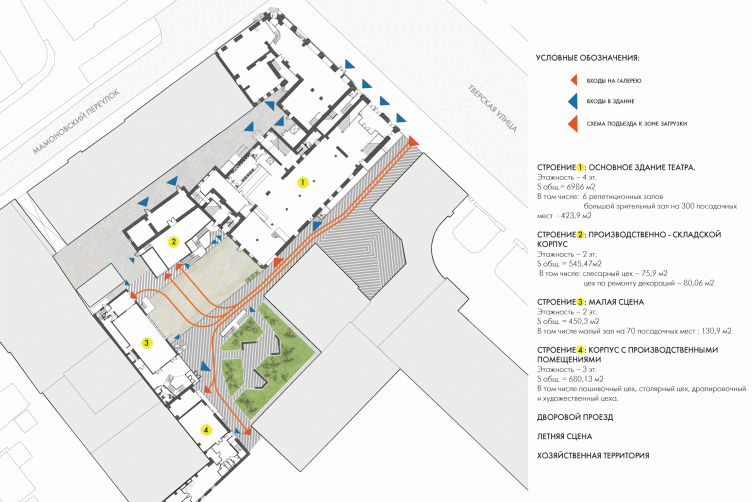
Plan. "Electrotheater Stanislavsky". Photo © Wowhaus
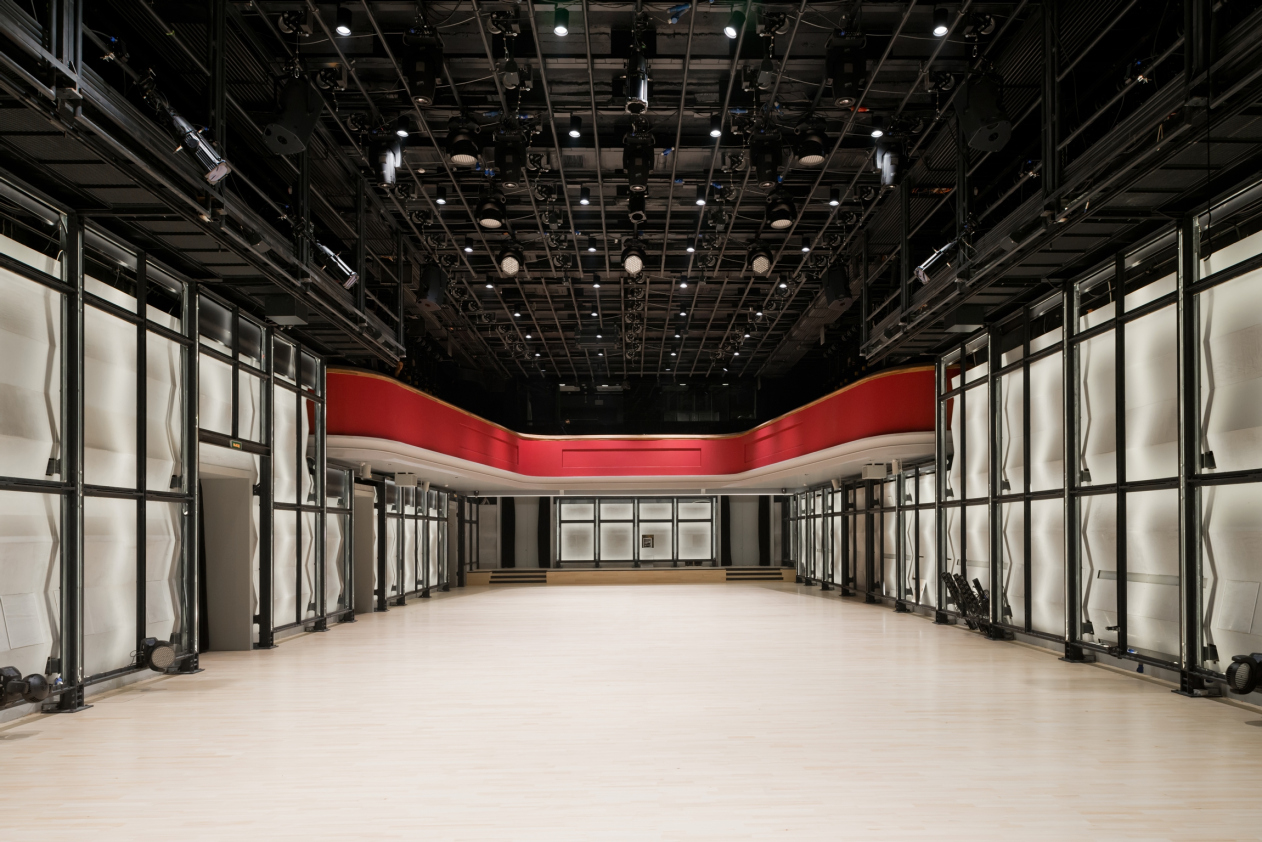
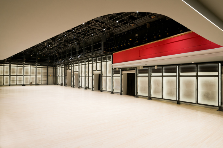
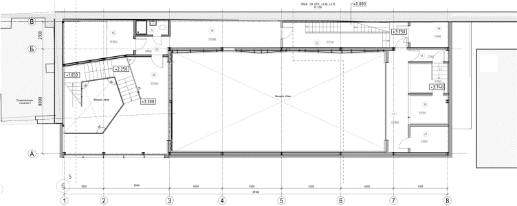
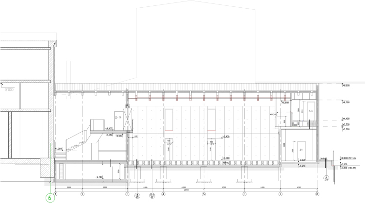
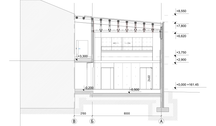
The main subject of the reconstruction, due to the fact that it was an experimental theater that the architects were dealing with, was, of course, the theater stage. From the box of the main stage, the architects deleted all the spectator seats, turning it into a space that is completely empty, or, to be more exact, open to various transformations. The spectator seats can now be arranged in any possible way you can think of; the spectators can even sit on the wooden floor.
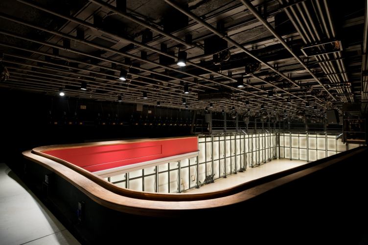
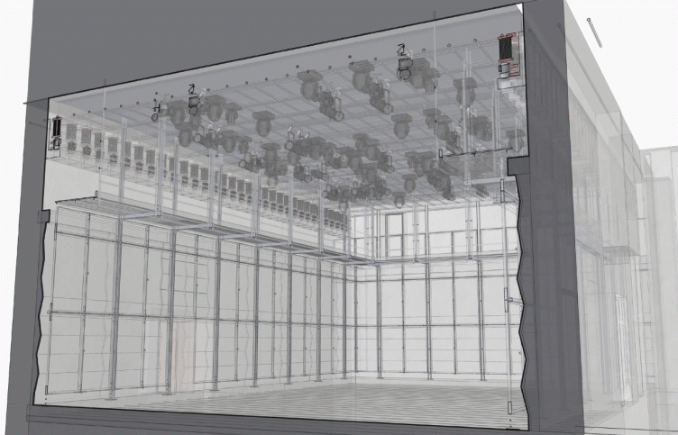
"The auditorium is sort of hovering in space - shares Oleg Shapiro - It has no fly-gallery: up above, there is the rehearsal room and the management offices, and below, there are the foyers and cafes. This is why we placed all the structures that are necessary for suspending the decorations in the upper part of the existing volume of the stage; specifically, the 120 winches installed on the sides of the auditorium box allow for placing the stage structures and decorations virtually in any part of the space. This same framework can have video, audio, and other equipment mounted upon it" - this stage has a lot of possibilities in terms of the modern theater that presupposes a variety of unconventional techniques among which the spectator's participation in the performance is probably the most obvious thing that comes to mind.
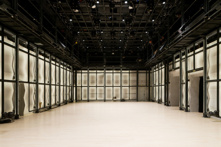
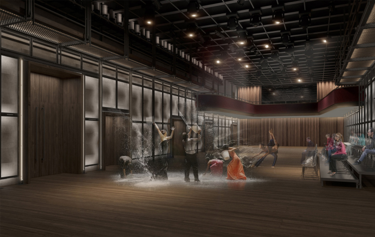
The floor space of the box of the main stage is 423,9 square metes, it is long and tall. The walls are covered with white plaster panels of a zigzag shape that is perfect for great acoustic properties; in front of it, with a slight backlash, there is a rectangular grid of slender black pillars; visually it supports the theme of the just as checkered structure of the ceiling, and, from the practical standpoint it serves for mounting the lights turned on to the white walls whose ribbed shape adds to the ethereal light network a palpable note of eccentricity (the project provides for more than three hundred lighting options, including ones with different colors and different dynamics of changing the backlighting).
Main hall. "Electrotheater Stanislavsky". Photo © Ilia Ivanov, 2014
Main hall, project. "Electrotheater Stanislavsky". 2014 © Wowhaus
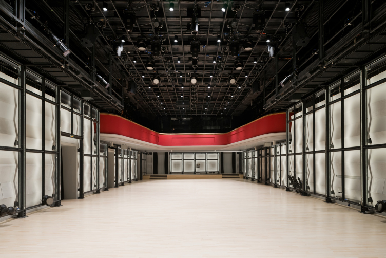
Main stage (main hall) with the restored balcony. "Electrotheater Stanislavsky". Photo © Ilia Ivanov, 2014
Main hall. View from the balcony. "Electrotheater Stanislavsky". Photo © Ilia Ivanov, 2014
In other words, the "other-worldliness" of the space of the main stage will be felt by the spectator once he gets inside the auditorium. On entering the hall, we find ourselves inside a giant theater machine: while Meyerhold, for example, placed his turning table (or "drum revolve") in the middle of the stage, in this theater both the spectators and the actors are in the middle, and the revolving machine is actually around them, each of them playing a part of their own in accordance with the director's plan. It's not that this technique is groundbreaking - rather, it follows in the footsteps of today's theater tradition; the mechanization of the theater space around people can resemble, for example, the circus on the Vernadskogo Avenue. And, it's not that all of the machinery is viewable - this will probably depend on the specifics of each particular performance - but the black grille as such, together with the backlit corrugated walls, goes a long way to create the impression of terminal openness and minimum of decoration, to a large extent opposed to the classic theater that is all about the notion of mask per se. It is common knowledge, for example, that the recently-restored baroque plaster decoration in the Bolshoi Theater also served to improve the acoustic properties of the auditorium, while in our case, instead of the golden ringlets and scrolls, we have a space of whiteness, a geometrically simple, although lit in a sophisticated way, structure in front of it, that bears a distant resemblance to the building works, or maybe the guides of a perspective drawing left untouched, that are ultimately the essence of any theater that is inevitably tied to the grid of space structures. Getting into the auditorium, alias stage, the audience finds itself inside a space that, being dissected and prepared for the show in the world imagined by human mind, looks very much like a perspective sketch of a picture. More than that: the spectators get inside this structure once they enter the theater at all but first things first.
The only classical element in the auditorium is the balcony that is officially protected; it is a red thing with an elegant wooden railing.
Main hall. View from the balcony. The ceiling structures are perfectly viewable. "Electrotheater Stanislavsky". Photo © Ilia Ivanov, 2014
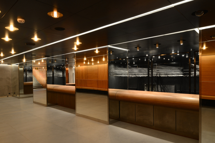
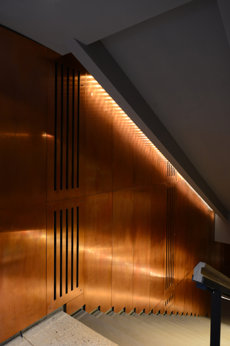
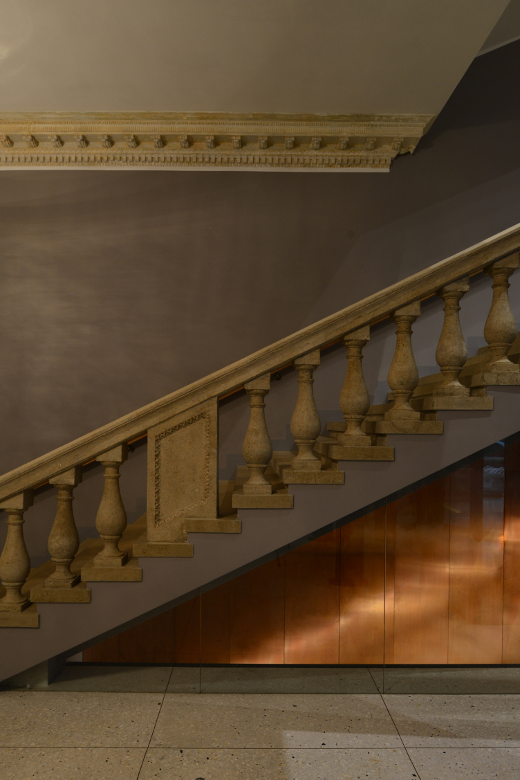
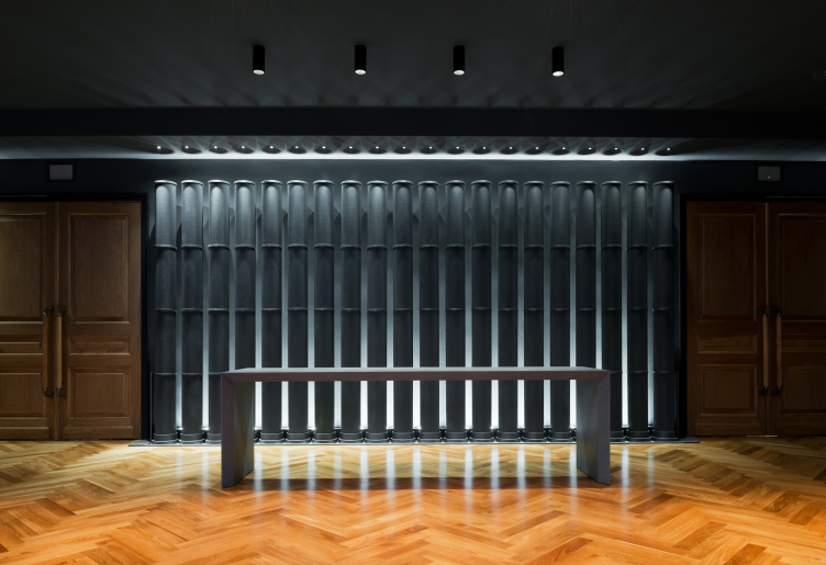
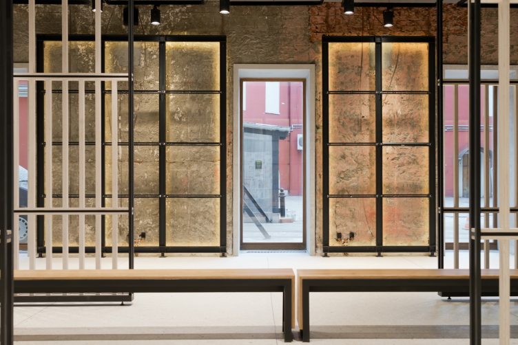
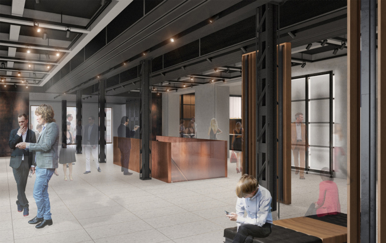
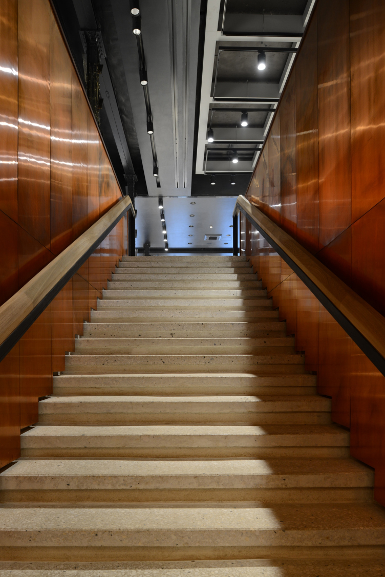
The rest of the building or, rather the several buildings situated around the nucleus of the stage exist in the following way. The facade has, of course, been carefully restored, including the new doors that still imitate the historical ones; the double glass panes are encased in wooden frames. Inside, on the one side, there is an ongoing interaction between the carefully cleared elements of the "old architecture" and the ostentatiously neat modern inclusions. On the other side, the architects, according to their own words, tried to look at this building through the eyes of the actors that have a habit of calling the lower cloakrooms "hell", and the stage "heaven". Indeed, arranged in the hitherto empty basement, the cloakroom is not devoid of the "hellfire" flavor: the walls are covered with polished copper panels (putting one in the mind of hell's frying pans) and the spotlights are of an unmistakable "warm glow" hue. Still, the subtle humor will only be discerned by an informed or really keen observer; besides, it is hardly appropriate in a theater, after all. Taking this comparison still further, one might imagine black plastic tubes before the theater entrance as a reminder of the archangels' trumpets, even though these tubes look more like a pan flute - which also, strictly speaking, is not quite alien to the theater that is looking to join the classic and the modern under one roof. It cannot be by chance that the first performance that was staged in this building was "The Bacchae" by Euripides - in Annensky's translation and directed by the Greek Theodoros Thersopoulos.
Cloakroom, basement floor. "Electrotheater Stanislavsky". Photo © Ilia Ivanov, 2014
Descent to the cloakroom, basement floor. The walls are covered with copper panels. "Electrotheater Stanislavsky". Photo © Ilia Ivanov, 2014
Foyer. "Electrotheater Stanislavsky". Photo © Ilia Ivanov, 2014
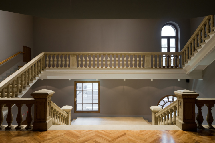
Stairway leading from the first floor (level of the street and he foyer) to the second floor (stage level). "Electrotheater Stanislavsky". Photo © Ilia Ivanov, 2014
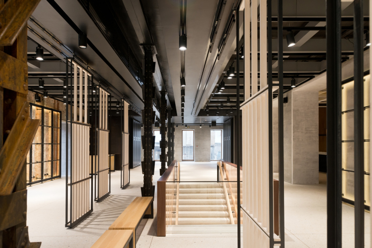
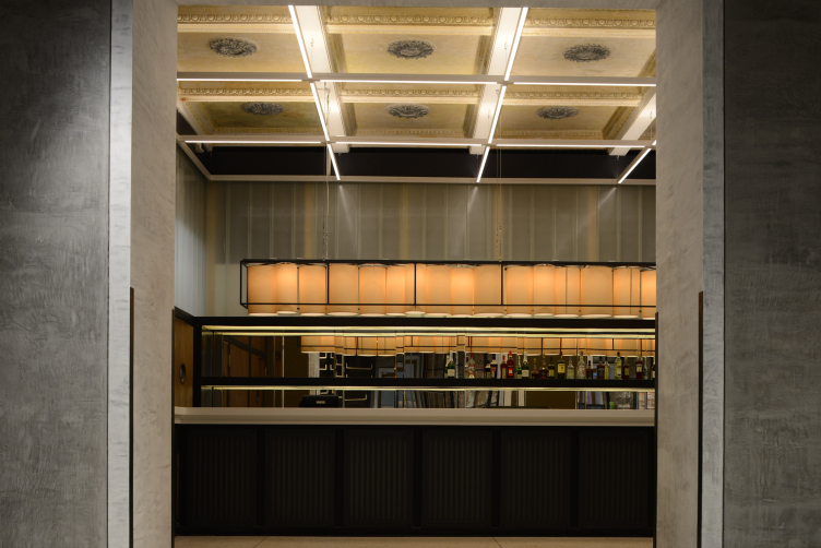
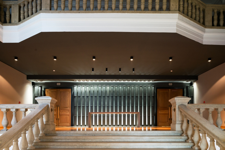
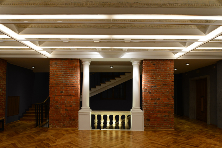
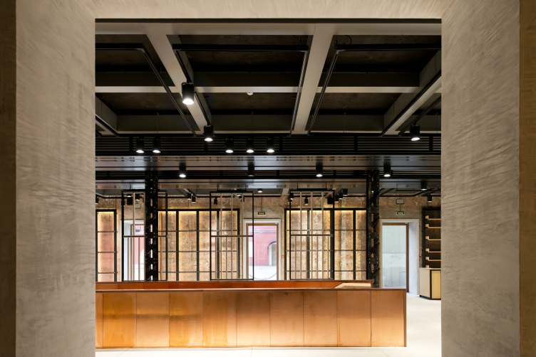
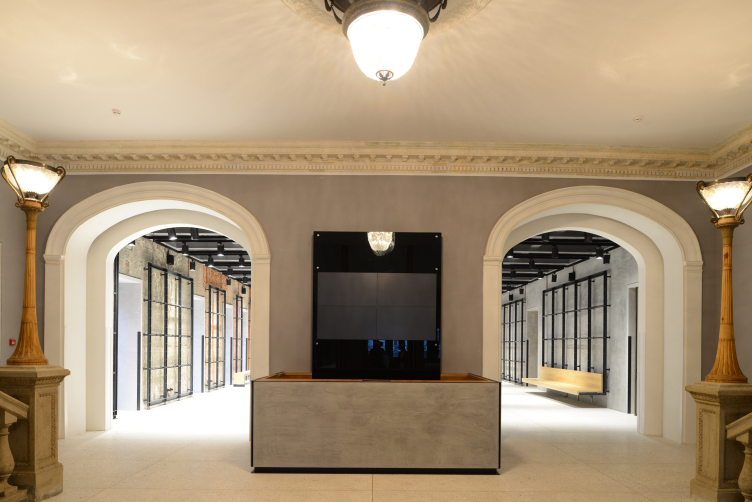
Meanwhile, from the purely architectural standpoint, interesting are not only the references to the Dionysian extravaganzas and their role in forming the images of heaven and hell but also the interaction between the Wowhaus architects with the space and the details of the historic building in the heart of the city. What catches the eye first of all here is the fact that all the surviving classicism decor - and these are the caissons with rosettes on the ceiling, and the banisters of the stairways - were stripped by the architects of the numerous layers of paint and not painted over again but covered with transparent lacquer. It is clearly seen that these decor elements are molded from rock chippings, rather large, the size of a lenticular seed - one can touch it with his or her fingers. Of course, initially this kind of texture would have required at least one layer of paint and, truth be told, was not meant to be in the public eye at all - the architects uncover it making a kind of "archeological theater" for the spectators - and achieve the right effect: the foyer, though not literally, started looking like a museum or maybe some antique ruin, even though the whole decor is not really historically valuable, from the Stalin times. Still, it is classicism - which is quite appropriate here.
Entrance to the main hall. "Electrotheater Stanislavsky". Photo © Ilia Ivanov, 2014
Stairway and a view of the main hall entrance. "Electrotheater Stanislavsky". Photo © Ilia Ivanov, 2014
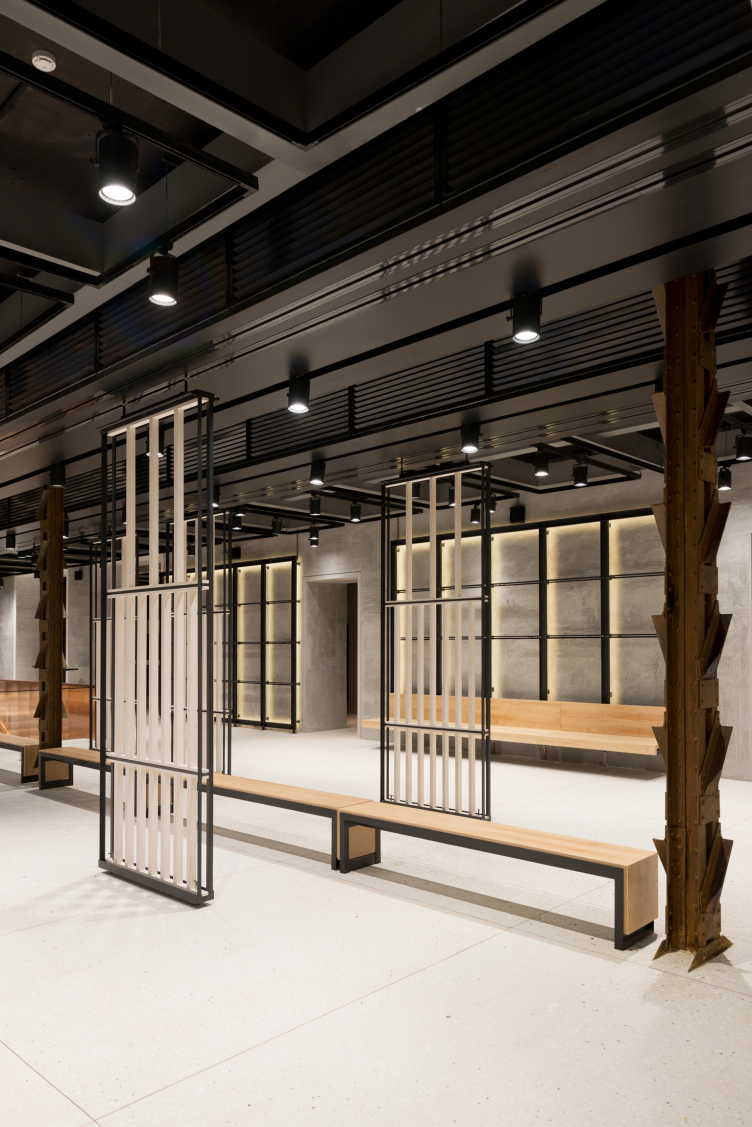
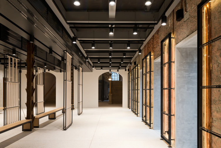
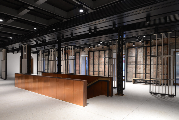
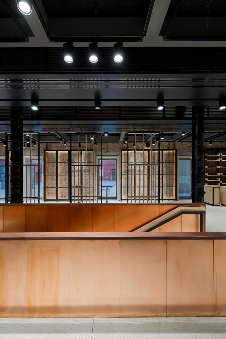
The second similar and maybe even more radical move of uncovering the old building to the audience is the pillars in the foyer on the first floor, in the already-mentioned annex that was added to the building from the side of the yard. Originally, the architects planned, treating the image of "electrotheater" literally, make the pillars glow in the dark all along their length. Ultimately, they did a different thing - they completely separated the metal rods of the pillars and left them as they were, painting them black together with the rivets and the welded-on pieces of metal that were in fact meant to support the decorative "skin" of the pillars. In a word, the perfect architectural ecorche! Thanks to which the space of the foyer, being saturated with metal, became looking like a production facility of some ancient factory, and there appeared, yet again, a little theatric, amplified by the sloppiness of the welding, effect of an industrial space turned into cultural.
Foyer. "Electrotheater Stanislavsky". Photo © Ilia Ivanov, 2014
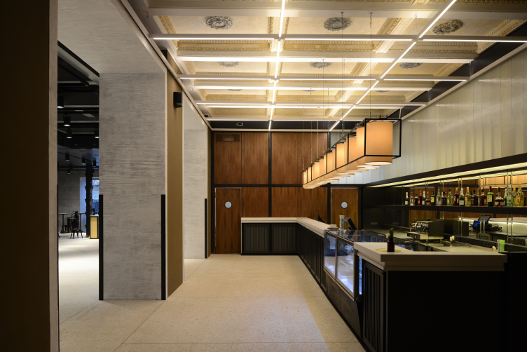
Foyer and bar "Noor". "Electrotheater Stanislavsky". Photo © Ilia Ivanov, 2014
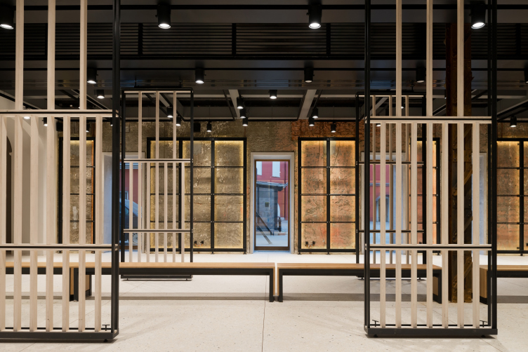
Foyer (the metallic rods and the movable partitions are viewable). "Electrotheater Stanislavsky". Photo © Ilia Ivanov, 2014
Foyer. "Electrotheater Stanislavsky". Photo © Ilia Ivanov, 2014
Foyer. "Electrotheater Stanislavsky". Photo © Ilia Ivanov, 2014
Parallel to the rows of the supports, the foyer sports the automatic partitions sliding along the guiding rails mounted on the ceiling, and thus the degree of lighting can vary within a really broad range. Everything is ready for making performances here, as well as mini-skits, for example, warming up the audience before the main show or even fully-fledged ones. Thus, the main foyer does not just precede the stage as a trivial lobby but boosts it to a higher level and in some ways replicates its possibilities; this foyer is also a stage of sorts. There is also an element of almost literal likeness: the caissons are duplicated by a grid of metal drafts with backlighting turned onto the ceiling and highlighting its geometrical logic - it looks like the black stripes with the backlighting reflected by the auditorium walls. Being the common technique here, the black grid united the areas accessible to the spectators into a single whole - it reminds us of the fact that we all are inside a three-dimensional space that is easier of all to understand being dissected into squares. It also opposes the exuberant caisson to the simple and technology-friendly metal draft with its clear avid simple task (just like the theater's!) - to provide the light.
The entrance lobby of the first floor will be open to the general public, not only to the people who bought the tickets. Even visiting the exhibition that it will house from time to time will be free of charge. The loss of the two restaurants that used to be there on the first floor of the theater will be made up for by the bar Noor; there has already opened a bookstore that is managed by Saint Petersburg's "Word Order" team. Another piece of practical information: the building that stretches along the Tverskaya Street towards the Mamontovsky Alley now houses six rehearsal halls; the theater got its own workshops for producing the decorations and costumes; the building got a new ventilation system and had all of its engineering communications replaced. The dressing-rooms are fitted in a really cozy way; their ceilings sports hints of an old celestial map, and in the corridor, there is one of Yukhananov's sketches of the performances.
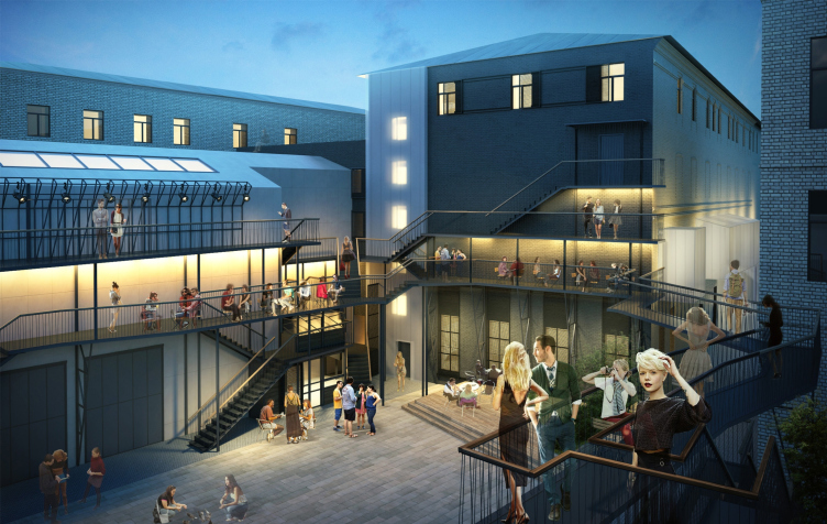
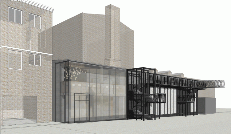
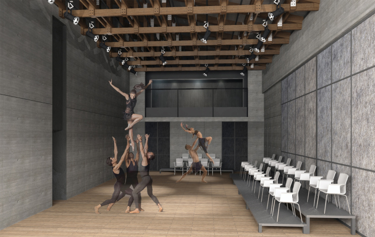
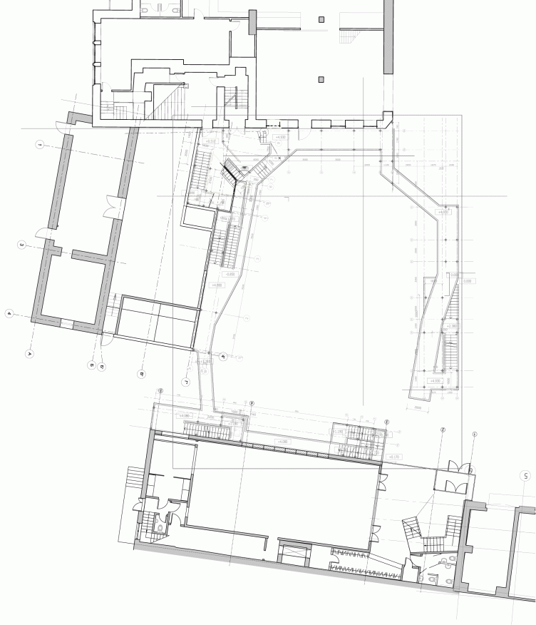
Back to the project, though! As was already said, all of the described above is only the first stage. The second stage, the implementation of which was delayed by the circumstances, in particular, because of the hearing main in the yard, provides for placing the minor stage of the theater in a small separately standing outbuilding, as well as for landscaping the yard. The ideas are pretty much the same: the space will be versatile, automatically transformed and multifunctional. Today, the small yard of the theater is in a neglected state (it looks particularly ugly because of the pipes of the heating main) but it presents a characteristic example of the yard territories of Moscow's center. One can enter the yard to the left of the main theater entrance.
Foyer. "Electrotheater Stanislavsky". Photo © Ilia Ivanov, 2014
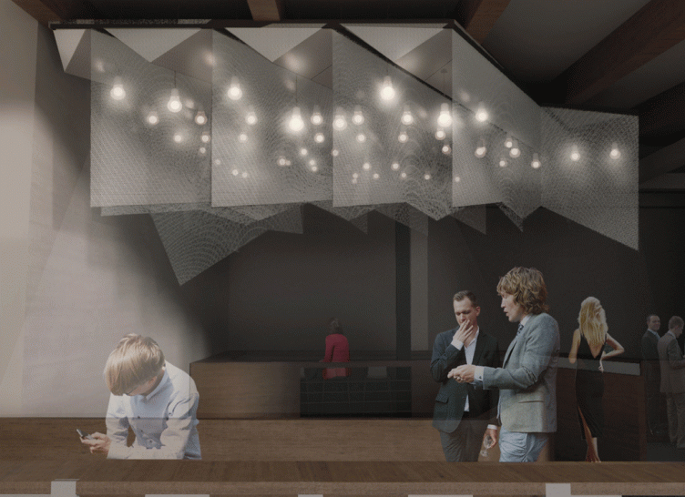
Foyer. Project. "Electrotheater Stanislavsky". 2014 © Wowhaus
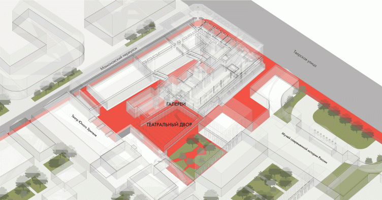
Theater yard. Project. "Electrotheater Stanislavsky". 2014 © Wowhaus
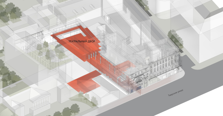
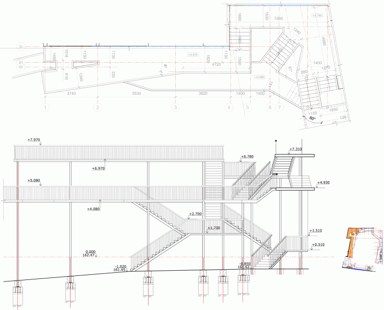
It is planned that the yard will be surrounded by a few tiers of metallic galleries - they look simultaneously like fire escape landings and the balconies in the southern towns, and pick up the idea of the metallic structural grille network that we liked so much on the inside. It looks as though the framework of the renovated theater grew not only into the building but also gave offshoots on the outside.
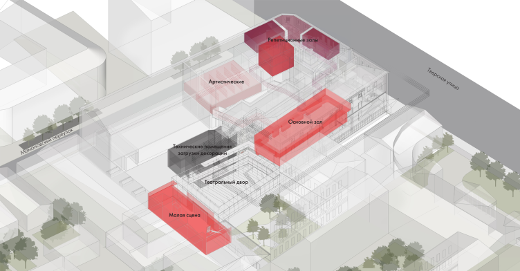
Theater territory. Interaction of theater spaces. "Electrotheater Stanislavsky". 2014 © Wowhaus
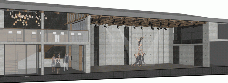
It is planned that the long facet of the box of the minor stage will be moved over to the wall of the reconstructed "barn" building in the yard that is adjacent to the yard territory. And, this wall will be made transformable, capable of opening up. Thus, in the wintertime, when Moscow is cold, the Minor Stage will be a small enclosed space for a small number of spectators, while in the summertime the audience can sit in the yard with the metal galleries (remember?) being the "the gods" and the stage performing its usual functions. The yard can be accessed both from the foyer of the first floor and from the street outside.
Theater territory. Interaction of public spaces. "Electrotheater Stanislavsky". 2014 © Wowhaus
Theater territory. Interaction of the city space and the space of the theater yard. "Electrotheater Stanislavsky". 2014 © Wowhaus
Minor stage with the opened south wall turned onto the yard. Project. "Electrotheater Stanislavsky". 2014 © Wowhaus
Minor stage. Project. "Electrotheater Stanislavsky". 2014 © Wowhaus
Minor stage. Project. "Electrotheater Stanislavsky". 2014 © Wowhaus
The project of such a theater is logical step in the development of Wowhaus that builds neither offices, nor residential houses, nor even shopping centers - but specializes in designing public territories of various degrees of complexity. The architects started their career from "Praktika" Theater on the Patriarshie Ponds; then there was the yard of "Strelka" Institute that became one of the best spaces for concerts and lectures in Moscow and that will, regretfully, soon be closed down; the "Green Theater", and a few other amphitheaters, in particular the one that was recently "inbuilt" into the space of Berlin Architectural Gallery. In a word, the theme of the theater as the ultimate public space (which was known perfectly well still in the Ancient Rome) is close and familiar to Wowhaus. Besides, in this particular case we are dealing with reconstruction of a historical building and here we would like to lay a little bit more stress on the architects uncovering the elements of the old architecture of the building and deliberately revealing the antiques. Having no antique ruin, for which so many theater lovers have such a soft spot, at their disposal, the architects took the path of the Russian empire style: they went ahead and dug out the antiques in the very heart of Moscow, maybe not much and not really antique, but they still were able to deliver the goods in terms of coming up with the classic image of theater decoration.
Oh, by the way, the interiors of the "back office" administrative and maintenance premises are designed in a much more reserved fashion: the smooth color of the walls, the coziness and comfort, the walls slightly livened up by the graphics provide the perfect working and recreation conditions. The spaces intended for the performance, on the other hand, show every sign of what the common mind usually associates with the notion of "backstage". Letting the audience go backstage (figuratively or even literally) has long since become one of the most popular theatric techniques - but what is interesting in this case is the fact that this technique is picked up and amplified by the very architecture of the building that actually "strips it down" taking off more stucco that the restoration purposes require and letting the audience take a peek not only at the inside of the theater but of the architecture too - which is also, to a certain extent, is turned "inside out".
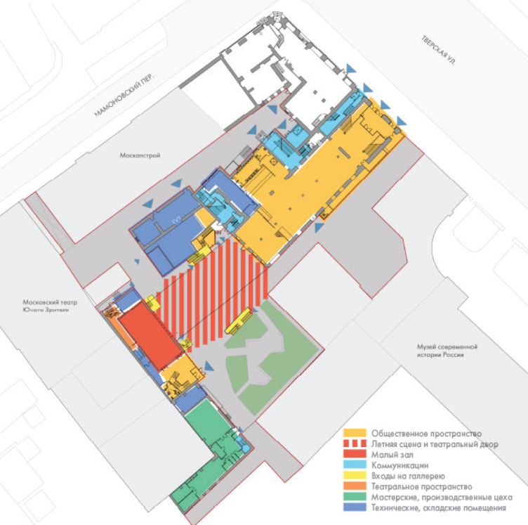
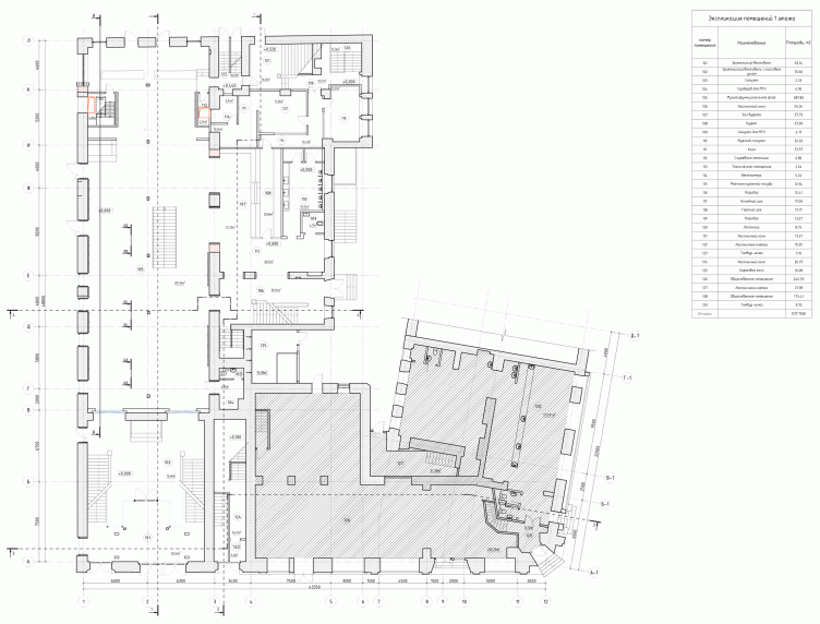
Plan of the 1st floor. "Electrotheater Stanislavsky". 2014 © Wowhaus
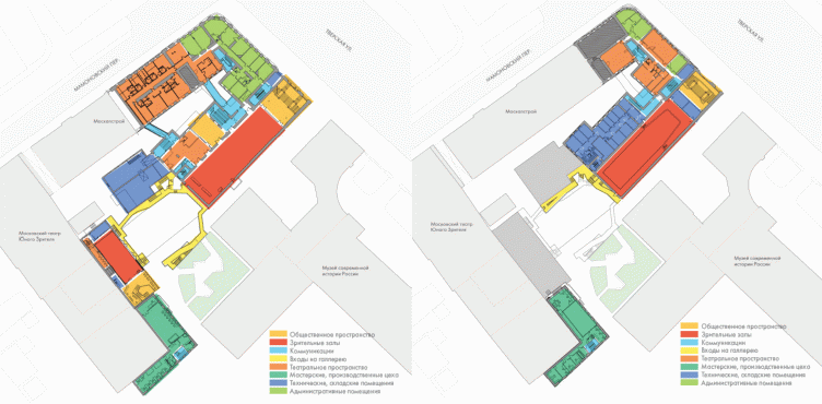
Plans of the 2nd and 3rd floors. "Electrotheater Stanislavsky". 2014 © Wowhaus
Foyer. "Electrotheater Stanislavsky". Photo © Ilia Ivanov, 2014
Foyer and the descent to the cloakroom. "Electrotheater Stanislavsky". Photo © Ilia Ivanov, 2014
Foyer. "Electrotheater Stanislavsky". Photo © Ilia Ivanov, 2014
Stairway leading from the cloakroom to the foyer. "Electrotheater Stanislavsky". Photo © Ilia Ivanov, 2014
Stairway before the entrance to the main hall. "Electrotheater Stanislavsky". Photo © Ilia Ivanov, 2014
Entrance to the foyer of the 1st floor from the street. "Electrotheater Stanislavsky". Photo © Ilia Ivanov, 2014
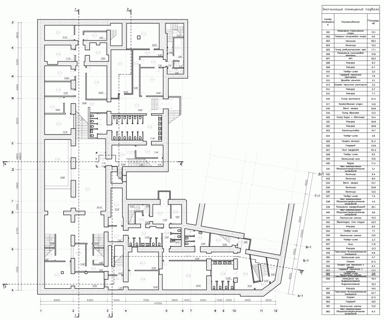
Building 1, plan of the basement floor. "Electrotheater Stanislavsky". 2014 © Wowhaus
Building 1, plan of the 1st floor. "Electrotheater Stanislavsky". 2014 © Wowhaus
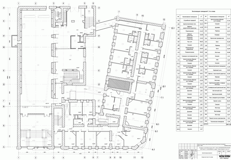
Building 1, plan of the 2nd floor. "Electrotheater Stanislavsky". 2014 © Wowhaus
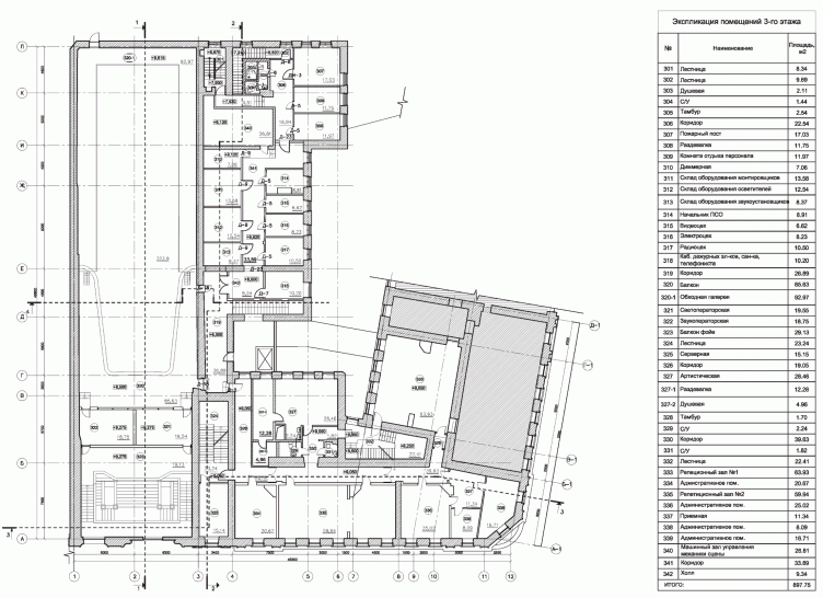
Building 1, plan of the 3rd floor. "Electrotheater Stanislavsky". 2014 © Wowhaus
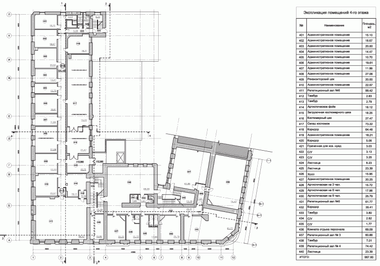
Building 1, plan of the 4th floor. "Electrotheater Stanislavsky". 2014 © Wowhaus
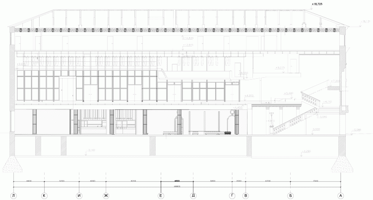
Building 1, section view. "Electrotheater Stanislavsky". 2014 © Wowhaus
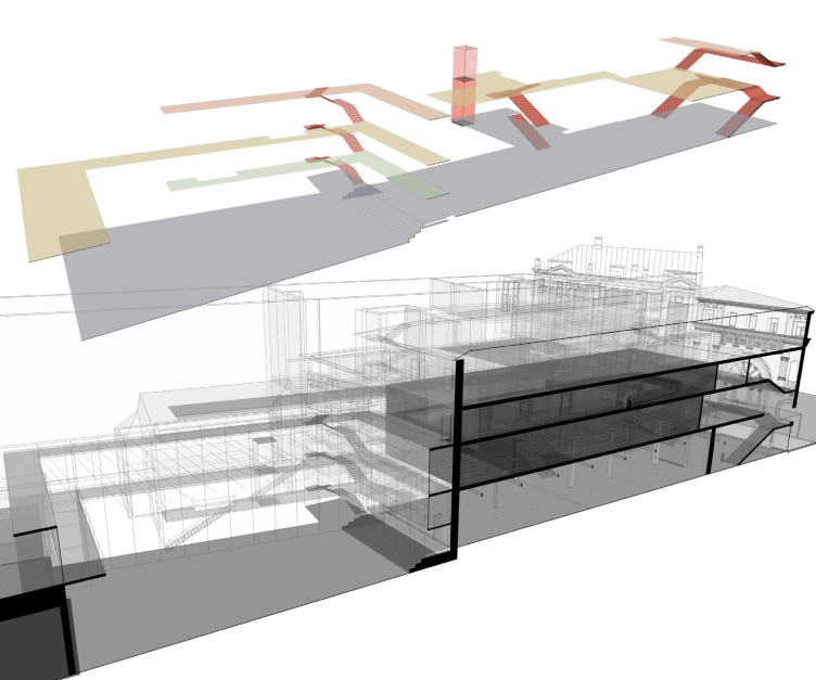
Diagram of the inside connections. "Electrotheater Stanislavsky". 2014 © Wowhaus
Main hall. Project. Perspective and section view. "Electrotheater Stanislavsky". 2014 © Wowhaus
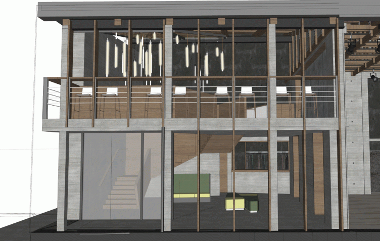
Hall of the minor stage. Project. "Electrotheater Stanislavsky". 2014 © Wowhaus
Foyer of the minor stage. Project. "Electrotheater Stanislavsky". 2014 © Wowhaus
Plans of Buildings 1,2 and the yard galleries. "Electrotheater Stanislavsky". 2014 © Wowhaus
Plan and section view of the west part of the yard galleries. "Electrotheater Stanislavsky". 2014 © Wowhaus
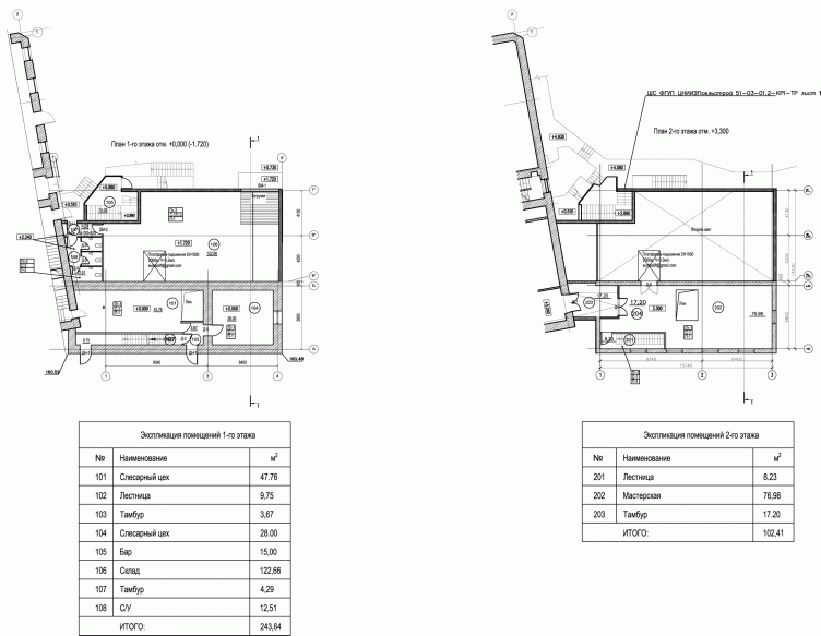
Building 2, plans of the 1st and 2nd floors. "Electrotheater Stanislavsky". 2014 © Wowhaus
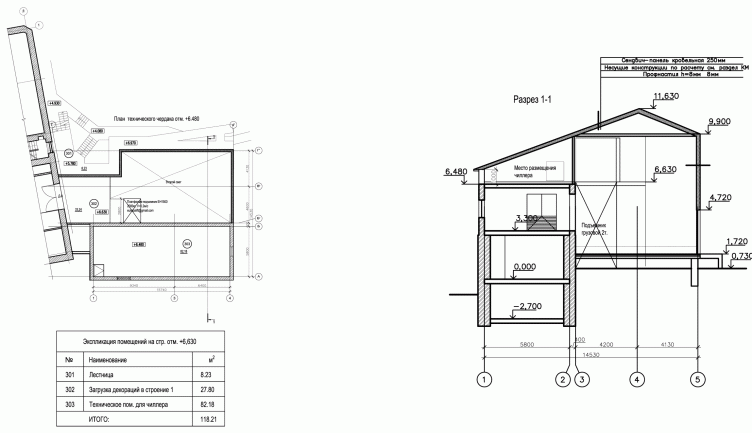
Building 2, plan at the notch of +6480 and a section view. "Electrotheater Stanislavsky". 2014 © Wowhaus
Building 3 (Minor stage), plans of the loft. "Electrotheater Stanislavsky". 2014 © Wowhaus
Building 3 (Minor stage), longitudinal section view. "Electrotheater Stanislavsky". 2014 © Wowhaus
Building 3 (Minor stage), cross-section view. "Electrotheater Stanislavsky". 2014 © Wowhaus

