По-русски

Viable Unit

A version of a mobile modular house with a protective "shell" of the easily transformable roof and a stunning variety of possible functions - from residential to office

16 February 2015
Object
mainImg

Last spring, within the framework of the key exposition of "Arch Moscow" named "Kvartaly" ("Quarters"), Totan Kuzembaev Bureau presented an interesting stand that seemed to us at that point to be conceptual and in some ways even ironic: a curious "anti-quarter" of sorts. Its idea was all about dissecting all the vistas of this boundless country into 5x5 kilometer squares placing inside each of such squares a capsule where "a lone hiker can take a test and spend the night". The grid of the live modules was just as attractive as unrealistic and utopian, clearly resembling the set-up of some sci-fi novel and not the real prospect of Russian life. 

"Dividing Russia into such fields is not at all utopian - comments Olzhas Kuzembaev on the regular mode of using his modular houses showcased at "Arch Moscow" - this idea was discussed as early as in the 1920's together with the so-called GOELRO plan, the first-ever Soviet plan for national economic recovery and development; it was at that time that the cadastral development scenario was developed. Over the last year, the Ministry of Economic Development and Trade promoted, in many subjects of the Russian Federation, the adoption of laws about providing the land to people for free, and our plan, though conditionally, reflects this process". Well, a great idea - any side observer will tell you. However, it turned out that the modular house is quite realistic and its first sample/prototype has already been built in Kuzembaev studio and will soon be offered - no, not for the tired hikers - will be offered for sale, and, for all intents and purposes, pretty soon, too. 

As for the historical background of the project, it runs as follows. Two years ago, Moscow Architects Union launched a scholarship program for the young architects who were offered to do a research in environmentally friendly and energy-efficient construction and ultimately come up with an innovation project - although the task was formulated in a general way, without any particular specifications. One of the participants of the program whose portfolio got short-listed was Olzhas Kuzembaev who ultimately proposed a version of the modular mini-house of his own. After that, the idea was developed and turned into a real project in Totan Kuzembaev Studio where Olzhas is now working alongside his father. 

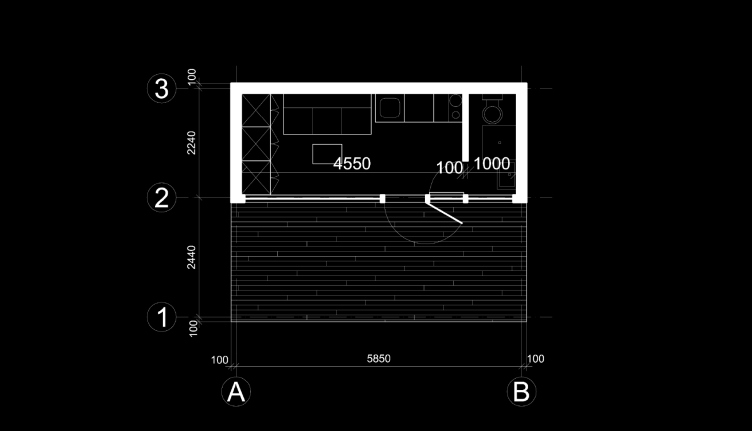
The resulting house, or, to be more exact, residential module named "InstaShell" is remarkably compact and easy to assemble. Six meters long, a little over two meters wide, and two and a half meters high on the inside - the dimensions are made to exactly fit the parameters of a standard transport container - which provides an opportunity to transport this module by truck, by train, or by sea, the extra sturdiness of its construction allowing for hundreds and hundreds of relocations. The module comes factory-made; it is expected that one single person armed with a small crane will be able to assemble it on a basement that is possible to place on the terrain of any complexity: "be that a virgin forest or a mountain slope", as the author comments. In any case, neither heavy machinery nor construction crew is needed. 

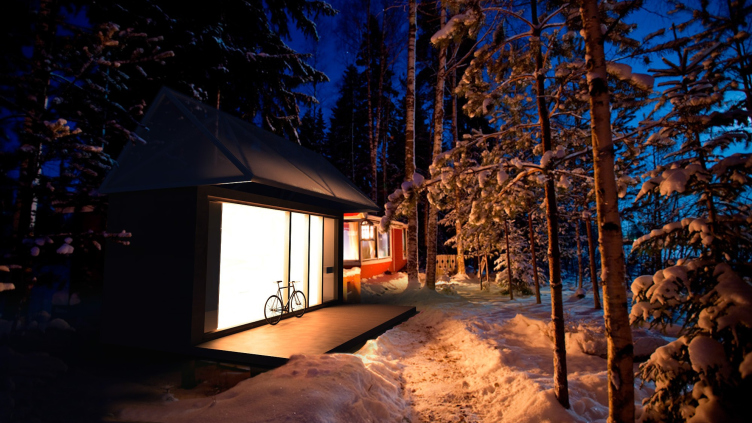
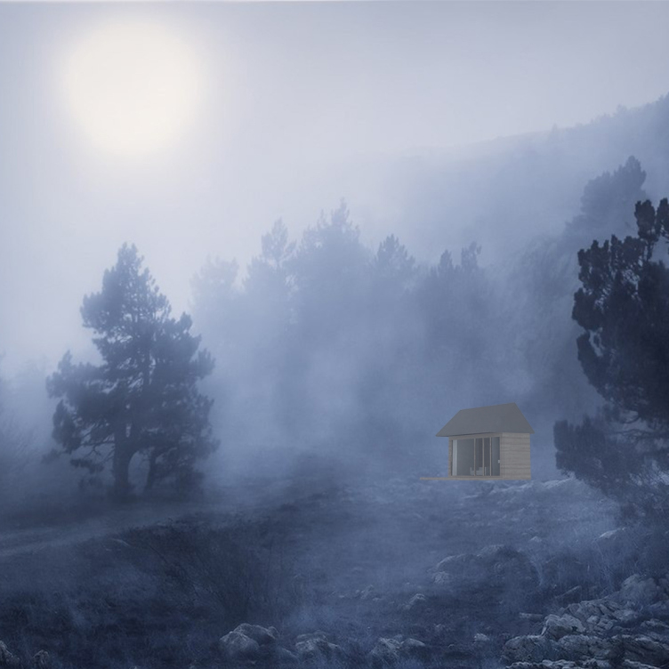
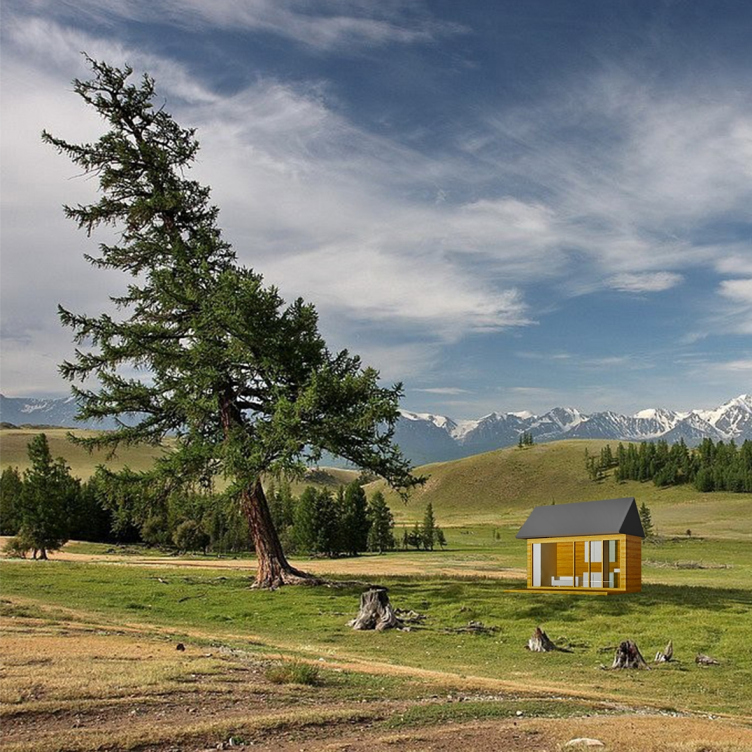
Eco house project. Forest bedroom © Totan Kuzembaev architectural studio
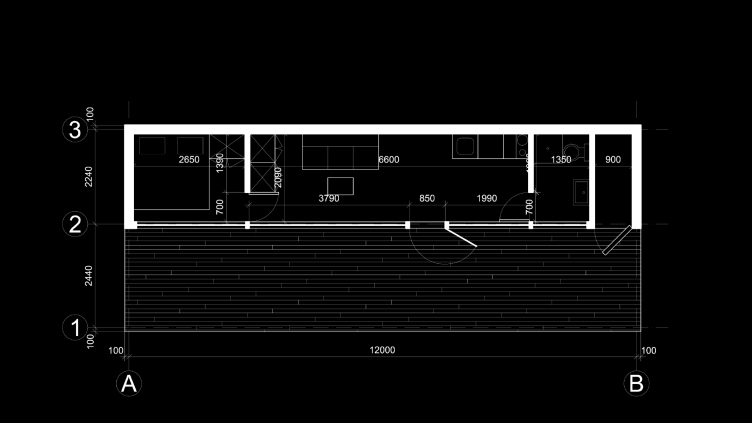
Eco house project. Plan of the mini-house © Totan Kuzembaev architectural studio


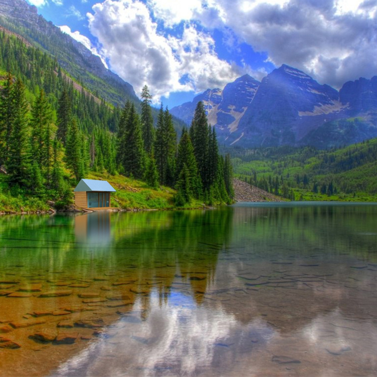
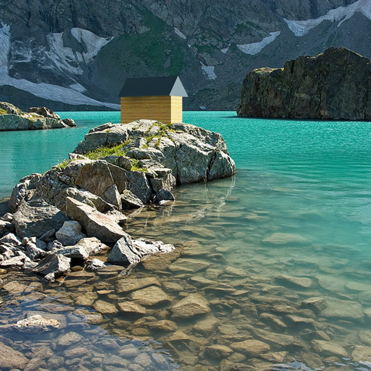
Eco house project. Bath house next to the lake © Totan Kuzembaev architectural studio


The architecture of the module is extremely simple: this is a parallelepiped, one of whose longitudinal walls is almost completely made of glass and serves as "the main facade" of sorts. Yet the most interesting element of the house is the "cap" of the transformer roof that can be raised or lowered by electricity or by hand-operated gear. When folded, it functions as a protective casing, something like rolling shutters, thanks to which it is possible to preserve the house long-term - the module, like a turtle, hides in its shell, providing for itself a secure protection from the sunlight, rain, and other elements, as well as vandals or aggressive wild animals. And in the fine weather, welcoming its guests, it opens its "shutter" just like a beetle opens its chitinous sheaths. The cap will be made from recycled corrugated metal sheets: on the one hand, they are hard to break or to bite through, and, on the other hand, the use of such material, according to the author, Olzhas Kuzembaev, "increases the ecological responsibility of the project". 

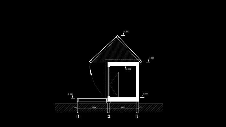
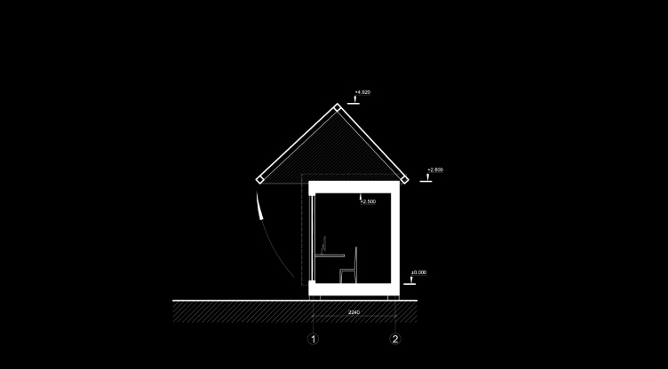
The cap is interesting not only because of the security of its protective properties but also because of its transformation possibilities: if you raise it but partly, for example, at 45 degrees, it forms, in front of the glass wall, a small-sized marquee, and the house's silhouette takes on a semblance of a gable roof that is as winning as it is convenient: the water and snow will not accumulate on the pitches of the roof. And, when it is completely open, the shell makes an open air roof terrace, at the same time protected from the wind and the rain. 

Eco house project. Section view of the house © Totan Kuzembaev architectural studio


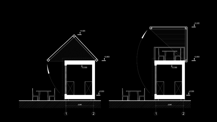
Eco house project. Section view of the dining room © Totan Kuzembaev architectural studio


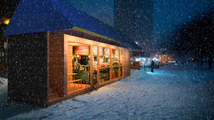
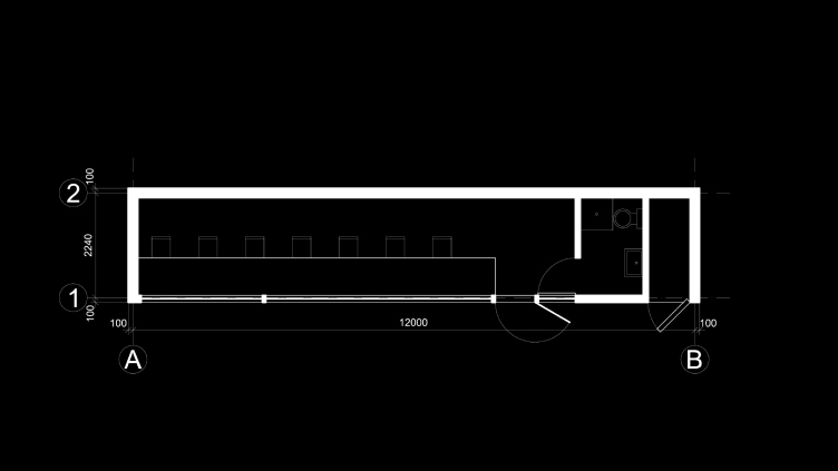
The standard residential module with a floor deck of small wooden terrace before the entrance includes but one room and a bathroom and is designed, rather, for temporary residence - during the fishing or hunting season, for example. As a permanent residence, the double version that is 12 meters long can be used. It has quite enough room for all the spaces and objects necessary for living. However, the authors position the module as quite a self-sufficient thing, proposing to use it not only as a temporary residence but also as a shop or a cafe - with little tables standing around it and on the roof as well, accessed by a steep roof. Inside of it, one can organize even a small office or a small gym or a rehearsal studio. A few separate capsules can be scattered around the forest: the bedroom can be placed in a thicket, the dining room - on a sunlit lawn, and the bathhouse - next to a river. The authors propose the idea that the people who will live in such houses will move between them by the most eco-friendly type of transport - the bicycle. 

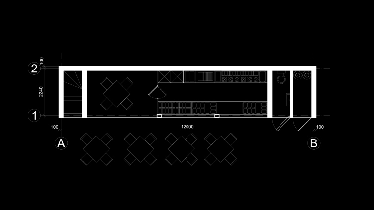
Eco house project. A cafeteria or a cafe © Totan Kuzembaev architectural studio


The video demonstrates logic of the mini-house's working process: 


The house is designed to be fully self-supported, it consumes very little power and can virtually take care of itself, the authors proposing, just like with the module function case, to combine various options of alternative energy sources, from wind-powered generators and solar batteries to the regular wood furnace. 

This Olzhas Kuzembaev project definitely belongs to the genre of compact transformable mini-modules that hitherto was presented in Russia by the board quick-mount dacha houses, kiosks, and the ubiquitous makeshift barracks that are really convenient to place back-to-back at the construction sites - all of the above bored the people to death, probably, still in the soviet era. So, it is only in the recent years that the Russian architects started designing various modern options of mini-houses. Some of them are unique and original, some claim the status of a fully-edged family residence; there are also houses that are into the possibility of transforming per se. What makes the Kuzembaev project different? Probably, the fact that it combines a few small-sized prototypes all rolled into one: a barrack, a kiosk, and a cabin in the woods with a slight "luxury" twist to it that is still quite discernible thanks to the glass wall - it turns out that all this can be squeezed into one module with a whole bunch of operation modes. As a matter of fact, it really thrills me imagining the Taiga or some large forest "tamed" with the help of such autonomous modules - but still, the most original idea of their area of employment is turning then into offices. 

Currently, the first sample of the mini-house is virtually complete. For the time being, it will be an exhibition specimen, but further on down the line everybody will be able to afford to buy the module fitting his it her needs in order to broaden the range of his or her notions of the houses that this life can be lived in.
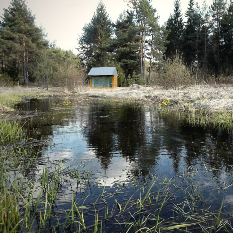
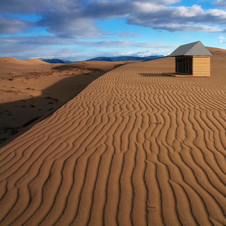
Eco house project. Options of placing the house in different kinds of environment © Totan Kuzembaev architectural studio
Eco house project. Plan of the dining room © Totan Kuzembaev architectural studio
Eco house project. Plan of the doible-room module © Totan Kuzembaev architectural studio
Eco house project. The option of office planning © Totan Kuzembaev architectural studio
Eco house project. Section view of the office © Totan Kuzembaev architectural studio

16 February 2015

Headlines now
The Golden Crown
The concept for a dental clinic in Yekaterinburg, developed by CNTR Studio, revolves around the idea of a “mouth full of gold”: pristine white porcelain stoneware walls are complemented by matte brass details. To avoid an overly literal interpretation, the architects focused on the building’s proportions, skillfully navigating between sunlight requirements and fire safety regulations.
Flexibility and Integration
Not long ago, we covered the project for the fourth phase of the ÁLIA residential complex, designed by APEX. Now, we’ve been shown different fence concepts they developed to enclose the complex’s private courtyards, incorporating a variety of public functions. We believe that the sheer fact that the complex’s architects were involved in such a detail as fencing speaks volumes.
A Step Forward
The HIDE residential complex represents a major milestone for ADM architects and their leaders Andrey Romanov and Ekaterina Kuznetsova in their quest for a fresh high-rise aesthetic – one that is flexible and layered, capable of bringing vibrancy to mass and silhouette while shaping form. Over recent years, this approach has become ADM’s “signature style”, with the golden HIDE tower playing a pivotal role in its evolution. Here, we delve into the project’s story, explore the details of the complex’s design, and uncover its core essence.
Gold in the Sands
A new office for a transcontinental company specializing in resource extraction and processing has opened in Dubai. Designed by T+T Architects, masters of creating spaces that are contemporary, diverse, flexible, and original, this project exemplifies their expertise. On the executive floor, a massive brass-clad partition dominates, while layered textures of compressed earth create a contextually resonant backdrop.
Layers and Levels of Flight
This project goes way back – Reserve Union won this architectural competition at the end of 2011, and the building was completed in 2018, so it’s practically “archival”. However, despite being relatively unknown, the building can hardly be considered “dated” and remains a prime example of architectural expression, particularly in the headquarters genre. And it’s especially fitting for an aviation company office. In some ways, it resembles the Aeroflot headquarters at Sheremetyevo but with its own unique identity, following the signature style of Vladimir Plotkin. In this article, we take an in-depth look at the United Aircraft Corporation (UAC) headquarters in the Moscow agglomeration town of Zhukovsky, supplemented by recent photographs from Alexey Naroditsky – a shoot that became only recently possible due to the fact that improvements were finally made in the surrounding area.
Light and Shadow
In this article, we delve into the architectural design of the “Chaika” house by DNK ag architects, which was recently completed in 2023 as part of the collection of signature designs at ZILArt. As is well-known, all the buildings in this complex follow a design code, yet each one is distinct. This particular building stands out not only for its whiteness and minimalism but also for the refined use of a limited number of techniques that, together, create what can confidently be called synergy.
Casus Novae
A master plan was developed for a large residential area with a name of “DNS City”, but now that its implementation began, the plan has been arbitrarily reformatted and replaced with something that, while similar on the surface, is actually quite different. This is not the first time such a thing happens, but it’s always frustrating. With permission from the author, we are sharing Maria Elkina’s post.
Treasure Hunting
The GAFA bureau, in collaboration with Tegola and Arkhitail, organized an expedition to the island of Kilpola in Karelia as part of Moskomarkhitektura’s “Open City” festival. There, amidst moss and rocks, the students sought answers to questions like: what is the sacred, where does it dwell, and what sustains it? Assisting the participants in this quest were landscape engineer Evgeny Levin, artist Nicholas Roerich, a moose, and the lack of cellular connection. Here’s how the story unfolded.
Depths of the Earth, Streams of Water
In the Malaya Okhta district, the Akzent building, designed by Stepan Liphart, was constructed. It follows a classic tripartite structure, yet it’s what you might call “hand-drawn”: each façade is unique in its form and details, some of which aren’t immediately noticeable. In this article, we explore the context and, together with the architect, delve into how the form was developed.
Fir Tree Dynamics
The “Airports of Region” holding is planning to build an airport in Karachay-Cherkessia, aiming to make the Arkhyz and Dombay resorts more accessible to travelers. The project that won in an invitation-only competition, submitted by Sergey Nikeshkin’s KPLN, blends natural imagery inspired by the shape of a conifer seed, open-air waiting spaces, majestic large trees, and a green roof elevated on needle-like columns. The result is both nature-inspired and WOW.
​A Brick Shell
In the process of designing a clubhouse situated among pine trees in a prestigious suburban area near Moscow, the architectural firm “A.Len” did the façade design part. The combination of different types of brick and masonry correlates with the volumetric and plastique solutions, further enhanced by the inclusion of wood-painted fragments and metal “glazing”.
Word Forms
ATRIUM architects love ambitious challenges, and for the firm’s thirtieth anniversary, they boldly play a game of words with an exhibition that dives deep into a self-created vocabulary. They immerse their projects – especially art installations – into this glossary, as if plunging into a current of their own. You feel as if you’re flowing through the veins of pure art, immersed in a universe of vertical cities, educational spaces – of which the architects are true masters – and the cultural codes of various locations. But what truly captivates is the bold statement that Vera Butko and Anton Nadtochy make, both through their work and this exhibition: architecture, above all, is art – the art of working with form and space.
Flexibility and Acuteness of Modernity
Luxurious, fluid, large “kokoshniks” and spiral barrel columns, as if made from colorful chewing gum: there seem to be no other mansion like this in Moscow, designed in the “Neo-Russian-Modern” style. And the “Teremok” on Malaya Kaluzhskaya, previously somewhat obscure, has “come alive with new colors” and gained visibility after its restoration for the office of the “architectural ecosystem” as the architects love to call themselves. It’s evident that Julius Borisov and the architects at UNK put their hearts into finding this new office and bringing it up to date. Let’s delve into the paradoxes of this mansion’s history and its plasticity. Spoiler: two versions of modernity meet here, both balancing on the razor’s edge of “what’s current”.
Yuri Vissarionov: “A modular house does not belong to the land”
It belongs to space, or to the air... It turns out that 3D printing is more effective when combined with a modular approach: the house is built in a workshop and then adapted to the site, including on uneven terrain. Yuri Vissarionov shares his latest experience in designing tourist complexes, both in central Russia and in the south. These include houseboats, homes printed from lightweight concrete using a 3D printer, and, of course, frame houses.
​Moscow’s First
“The quality of education largely depends on the quality of the educational environment”. This principle of the last decade has been realized by Sergey Skuratov in the project for the First Moscow Gymnasium on Rostovskaya Embankment in the Khamovniki district. The building seamlessly integrates into the complex urban landscape, responding both to the pedestrian flow of the city and the quiet alleyways. It skillfully takes advantage of the height differences and aligns with modern trends in educational space design. Let’s take a closer look.
Looking at the Water
The site of Villa Sonata stretches from the road to the water’s edge, offering its own shoreline, pier, and a picturesque river panorama. To reveal these sweeping views, Roman Leonidov “cut” the façade diagonally parallel to the river, thus getting two main axes for the house and, consequently, “two heads”. The internal core – two double-height spaces, a living room and a conservatory, with a “bridge” above them – makes the house both “transparent” and filled with light.
The White Wing
Well, it’s not exactly white. It’s more of a beige, white-stone structure that plays with the color of limestone – smoother surfaces are lighter, while rougher ones are darker. This wing unites various elements: it absorbs and interprets the surrounding themes. It responds to everything, yet maintains a cohesive expression – a challenging task! – while also incorporating recognizable features of its own, such as the dynamic cuts at the bottom, top, and middle.
Urban Dunes
The XSA Ramps team designed and built a three-part sports hub for a park in Rostov-on-Don, welcoming people of all ages and fitness levels. The skate plaza, pump track, and playground are all meticulously crafted with details that attract a diverse range of visitors. The technical execution of the shapes and slopes transforms this space into a kind of sculptural composition.
Proportional Growth
The project for the fourth phase of the ÁLIA residential area has been announced. The buildings are situated on an elongated plot – almost a “ray” that shoots out from the center of the area towards the river. Their layout reflects both a response to Moscow’s architectural preferences over the past 15 years, shifting “from blocks to towers”, and an interpretation of the neighboring business park designed by SOM. Additionally, the best apartments here are not located at the very top but closer to the middle, forming a glowing “waistline”.
The “Staircase” Building
In designing the “Details” residential complex in New Moscow, Rais Baishev spiced up the now-popular Moscow theme of a “courtyard” building with an idea drawn from the surrealist drawings by Maurits Escher. He envisioned the stepped silhouettes and descending slopes as a metaphysical mega-staircase, creating a key void within the courtyard that gave the project an internal “spine”. This concept is felt both in the building’s silhouette and on its façades.
Projection of the Quarter
No one doubted that the building that Vladimir Plotkin designed as part of the “Garden Quarters” would be the most modernist of all. And it turned out just that way: while adhering to the common design code, the building successfully combines brick and white stone, rhythmically responding to the neighboring building designed by Ostozhenka, yet tactfully and persistently making a few statements of its own. This includes the projection of the ideal urban development composition “14–9–6”, which can be found right next door, mathematical calculations, including those for various types of terraces (and perhaps the only reminder of the Soviet past of the Kauchuk rubber factory!), and the white “cross-stitch” pattern of the façade grid.
Domus Aurea
In this issue, we examine the “Tessinsky-1” house, designed by Sergey Skuratov and completed in 2023. Located in the middle of the Serebryanicheskaya Embankment district, at the intersection of its main streets, this house assumes a sort of “nodal” role: it not only responds to everything around it and preserves many memories of the former EMA factory within itself, but it weaves all this into a newly directed pattern, reconciling bright “gold” and dark-colored brick, largely with the help of the new, modern-yet-archaic Columba brick, which, come to think about it, is the most precious element here.
The Chimney of Nikola-Lenivets
In this issue, we are examining the “Obelisk House” designed by KATARSIS and built for the Arkhstoyanie 2023 festival. However, it was only finished later on, and this is why we are examining it now. It seems to us that after the “Obelisk House” appeared in Nikola-Lenivets, a dialogue and a few inner connections appeared between the temporary structures built here. These houses no longer look like “accidental neighbors”, more of which below.
​Periscope by the Bay
The jury awarded the second place in the competition for a public and cultural center in Petropavlovsk-Kamchatsky to the companies GORA (“Mountain”) and M4. In the consortium’s proposal, the building resembles a sperm whale with a calf swimming next to it or a periscope, whose lenses capture the most spectacular views from the surrounding landscape.
From Arcs to Dolmens
While working on the competition project for Petropavlovsk-Kamchatsky, ASADOV Architects prioritized the value of the natural and urban environment, aiming to preserve the balance of the location while minimizing the resemblance of the volume that they designed to a “traditional building”. The task was challenging, and the architects created three versions, one of which having been developed after the competition, where their main proposal took third place. However, the point of interest here is not the competition result but the continuity of creative thinking.
Hide and Seek
The ID Moskovskiy house, designed by Stepan Liphart in St. Petersburg, in the courtyards near Moskovskiy Avenue beyond the Obvodny Canal and recently completed, is notable for several reasons. Firstly, it has been realized with considerable accuracy, which is particularly significant as this is the first building where the architect was responsible not only for the facades but also for the layouts, allowing for better integration between the two. On the other hand, this building is interesting as an example of the “germination” of new architecture in the city: it draws on the best examples from the neighborhood and becomes an improved and developed sum of ideas found by the architect in the surrounding context.
The Big Twelve
Yesterday, the winners of the Moscow Mayor’s Architecture Award were announced and honored. Let’s take a look at what was awarded and, in some cases, even critique this esteemed award. After all, there is always room for improvement, right?
Above the Golden Horn
The residential complex “Philosophy” designed by T+T architects in Vladivostok, is one of the new projects in the “Golubinaya Pad” area, changing its development philosophy (pun intended) from single houses to a comprehensive approach. The buildings are organized along public streets, varying in height and format, with one house even executed in gallery typology, featuring a cantilever leaning on an art object.
Nuanced Alternative
How can you rhyme a square and space? Easily! But to do so, you need to rhyme everything you can possibly think of: weave everything together, like in a tensegrity structure, and find your own optics too. The new exhibition at GES-2 does just that, offering its visitor a new perspective on the history of art spanning 150 years, infused with the hope for endless multiplicity of worlds and art histories. Read on to see how this is achieved and how the exhibition design by Evgeny Ace contributes to it.
Blinds for Ice
An ice arena has been constructed in Domodedovo based on a project by Yuri Vissarionov Architects. To prevent the long façade, a technical requirement for winter sports facilities, from appearing monotonous, the architects proposed the use of suspended structures with multidirectional slats. This design protects the ice from direct sunlight while giving the wall texture and detail.