“Ostozhenka” Bureau made an architectural and town-planning investigation of Volkhonka areas in the early 2014. This examination had been ordered by “White City Project” Company as a part of a greater project created by the efforts of both Russian and international specialists and included into the book called “Culture Territory: Volkhonka Quarters”. The object of the project was to develop ideas for forming a so-called “museum quarter” – a city area uniting central Moscow museums, namely the Pushkin Museum of Fine Arts and Museum of Architecture.
In the context of the project a Danish studio of Jan Gehl estimated the condition of the common areas of the district, Italians from Mobility in Chain analyzed the traffic situation, professor Gabriele Filippini gave his advice on the landscape design and “Philips” company examined the lighting of the district. “Ostozhenka” was invited a bit later, so the architects had a chance to base their work on the results of their colleagues. However, their own considerable experience in working on the town-planning concept of the neighboring Ostozhenka district was also a great help to the architects.
“Once, many years ago, we studied the destiny of Ostozhenka district very closely, - says Alexander Skokan, - for a long while, practically during the whole 20th century, it had not been built up because there was supposed to be an avenue leading to the Palace of the Soviets. Volkhonka, as well as Ostozhenka, had got caught up in the “big construction” sphere: first of a chapel, then a castle, then a chapel again. So eminently, Ostozhenka became one wing of the center and Volkhonka – the other. For us, these territories form an interrelated group: one being the logical continuation of the other.”
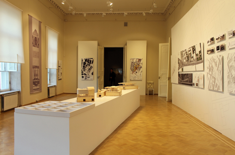
Exhibition in the Museum of Architecture, May 2014. Volkhonka Quarters - Culture Territory - Volkhonka Archive. Architectural and town-planning survey © "Ostozhenka" Bureau
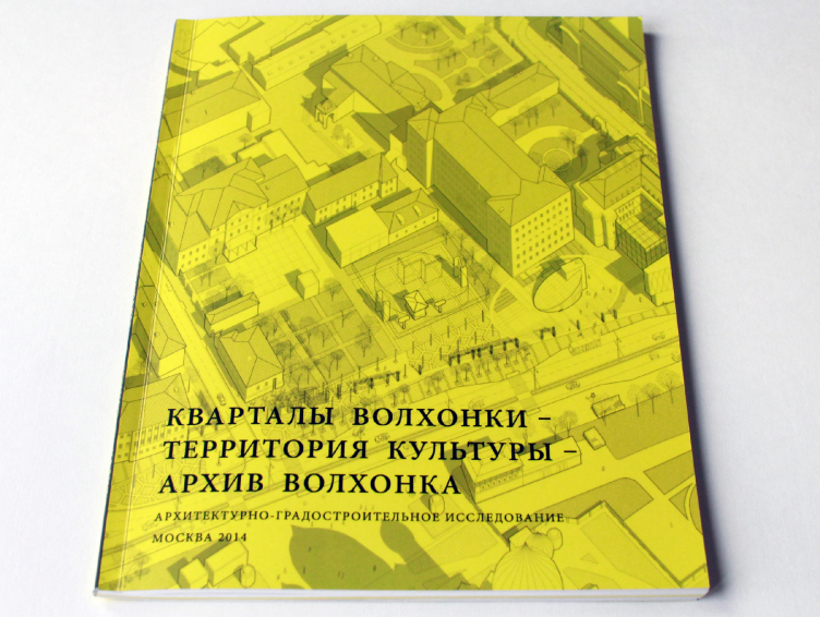
The cover of the brochure published by the bureau. Volkhonka Quarters - Culture Territory - Volkhonka Archive. Architectural and town-planning survey © "Ostozhenka" Bureau
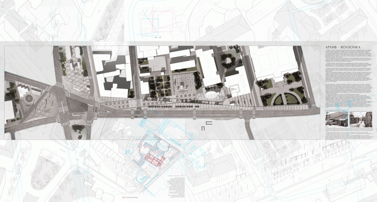
Expo boards at "Zodchestvo-2014". Volkhonka Quarters - Culture Territory - Volkhonka Archive. Architectural and town-planning survey © "Ostozhenka" Bureau
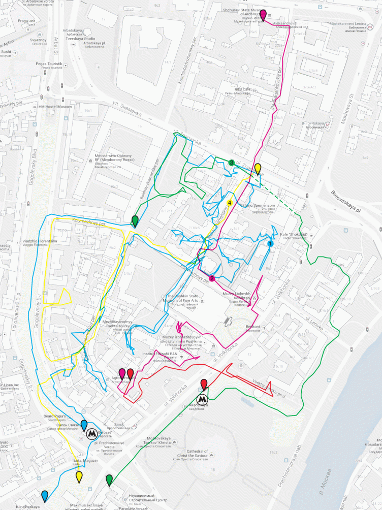
In the course of the survey that preceded the development of design offers as such, the main problems of the district became evident. First of all, this central area having a huge potential (with most important cultural and public sites in its assets) is underrated and not attractive enough either for Muscovites or for the tourists. For one, it turned out that the town-planning module of the whole district – a system of allotments (?) – is still there and one can clearly feel the charm of old Moscow inside the quarters. But the “field search” – a detailed walk-round check of the district with a GPS-tracker – showed bad permeability of this area: if a rare stroller wanders into a backstreet he would have to make his way out the same way, circuiting in tangled loops, well seen on the trackers. Most of the yards are inaccessible and the moving around is only possible on the main “arteries”. Secondly, the plans of the great “might-have-been” constructions disturb the integrity of the historical outline of the city – a part of the red lines are missing out, there are gaps – so wide that sometimes it is not even clear where is the entry and where is the exit of this part of the city. And finally, Volkhonka has become a widely used motor track. It cuts the district into parts, and on the whole the streets are given away to cars – there are few crosswalks and it is inconvenient for the pedestrians.
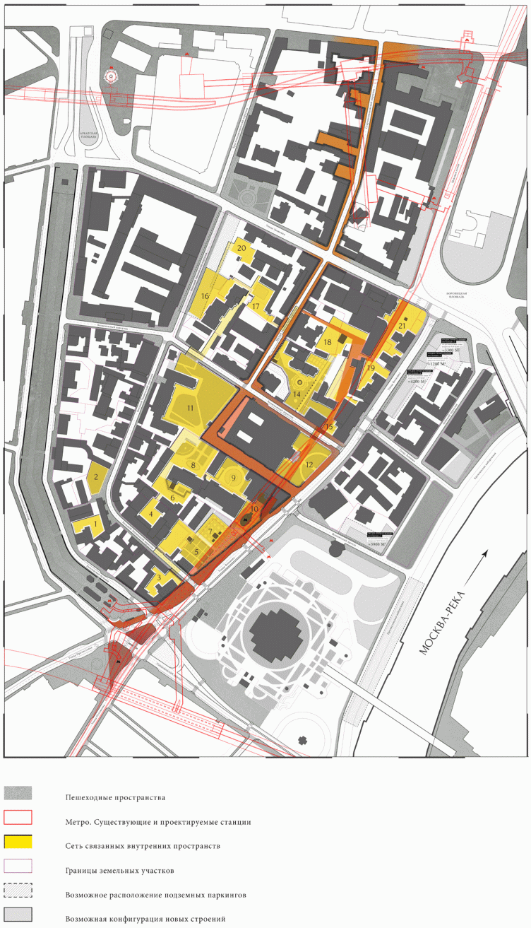
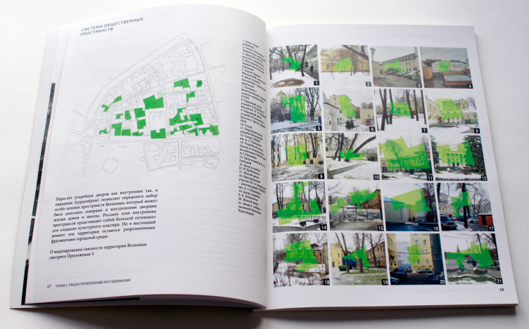
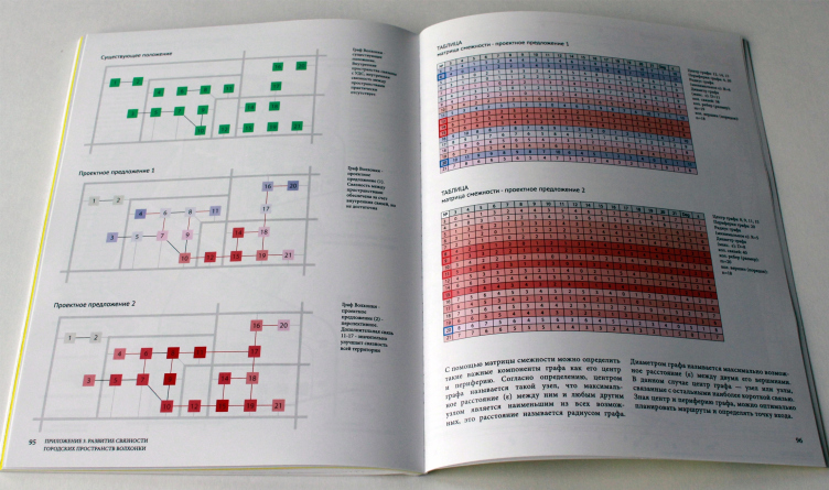
While working on the first of these problems – the bad permeability of the inner spaces of the district – the architects counted up all potentially walk-available allotments and gardens – there were 21 of them, so the authors suggested making new pedestrian connections between them. They came up with two options: with 14 added connections in one and 15 in the other. At that, according to the graph theory that the architects applied to the rout analysis, adding only one supplementary connection – between the yard of Golitsyn estate and the center, between Bolshoi and Maly Znamenskiy Pereulok – significantly raises all coefficients in one time and consequently makes walks much more diverse and the district itself – permeable and open, just as a museum quarter is supposed to be.
The integrated map of the routes of the field survey fixing the current permeability of the area. Volkhonka Quarters - Culture Territory - Volkhonka Archive. Architectural and town-planning survey © "Ostozhenka" Bureau
Master plan of the territory. Volkhonka Quarters - Culture Territory - Volkhonka Archive. Architectural and town-planning survey © "Ostozhenka" Bureau
System of the public territories. Volkhonka Quarters - Culture Territory - Volkhonka Archive. Architectural and town-planning survey © "Ostozhenka" Bureau
Graphs of the Volkhonka and the adjacency matrices. Volkhonka Quarters - Culture Territory - Volkhonka Archive. Architectural and town-planning survey © "Ostozhenka" Bureau
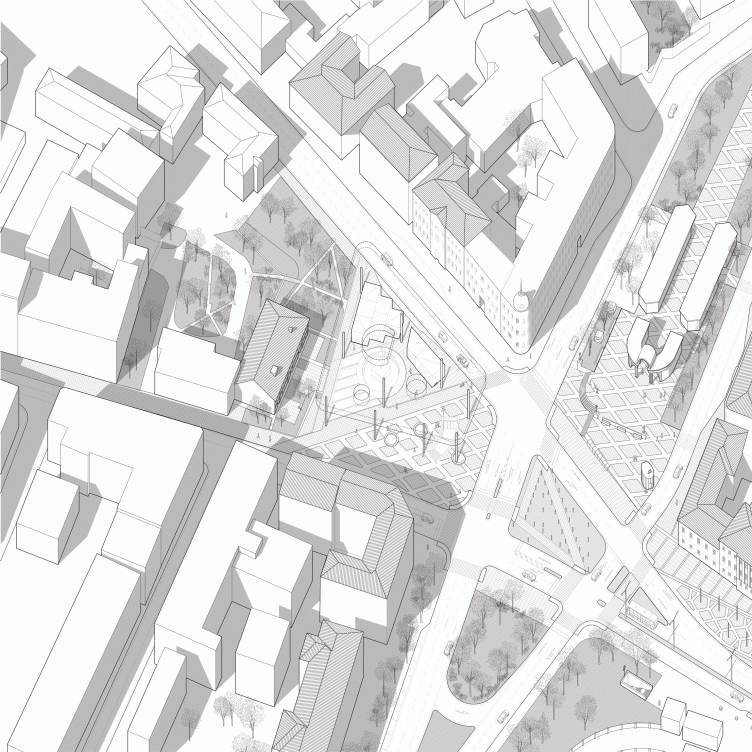
Perspective geometry of the Prechistenskiye Vorota Square. Volkhonka Quarters - Culture Territory - Volkhonka Archive. Architectural and town-planning survey © "Ostozhenka" Bureau
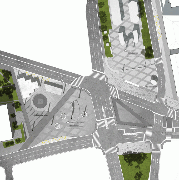
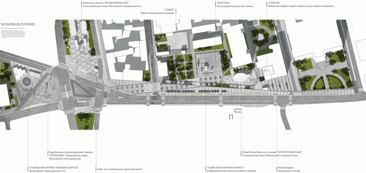
The net of yards and parks lies in-between the main walking route, along the streets, that has also become more entertaining stretching from the exit of “Kropotkinskaya” metro station along the left side of Volkhonka, past the Pushkin Museum of Fine Arts to Starovagankovskiy lane, reaching this way the Museum of Architecture. The architects consider Prechistenskiye Vorota square and the fragment of Volkhonka from the metro station to Pushkin Museum to be the core of the route, a sort of gate leading into the museum quarter.
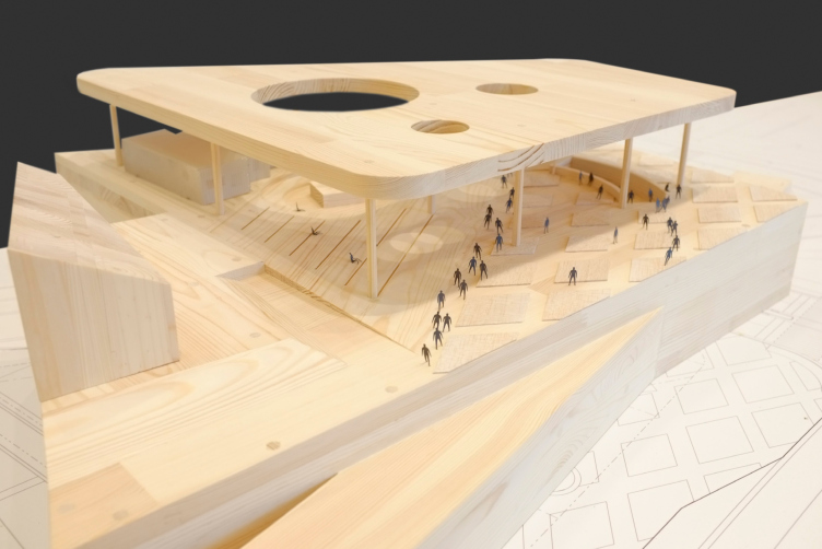
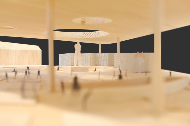
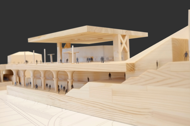
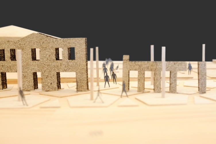
In order to visually complete the space of the square, and to bring back to it the scope that was lost after a two-storey house in front of the red houses on the spit between Prechistenskaya and Ostozhenka had been pulled down in 1972, the architects propose to fill the place of the demolished building with a light roof-pavilion on thin columns with a number of cafes, flower shops and a roofed path from the metro to Ostozhenka (in early 90s Ostozhenka was designing as part of refreshment a shopping mall of approximately the same size as the pavilion on this same place). The Engels monument that is now standing alone amid an empty park stays in the round cutaway of the bridgings, like a lone tree. The exit of “Volkhonka” metro station of Kalininskaya (yellow) line – being recently in construction – could be placed under the roof of the pavilion.
Fragment: Prechistenskiye Vorota Square. Volkhonka Quarters - Culture Territory - Volkhonka Archive. Architectural and town-planning survey © "Ostozhenka" Bureau
Pavillion between the ostozhenka and Prechistenka. Model 2014. Volkhonka Quarters - Culture Territory - Volkhonka Archive. Architectural and town-planning survey © "Ostozhenka" Bureau
Pavillion between the ostozhenka and Prechistenka. Model 2014. Volkhonka Quarters - Culture Territory - Volkhonka Archive. Architectural and town-planning survey © "Ostozhenka" Bureau
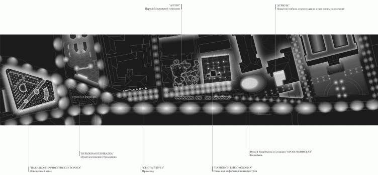
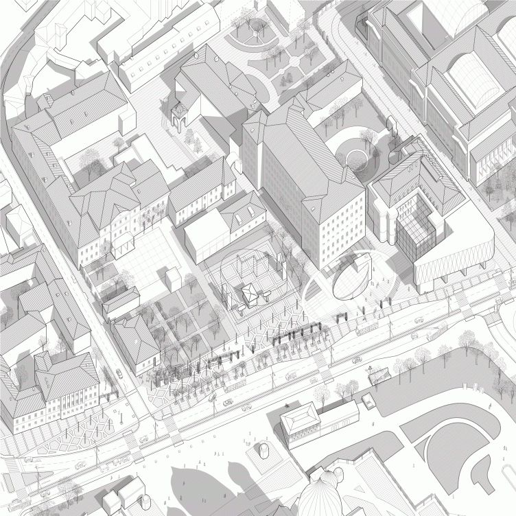
The climax of the walking route is the boulevard paved along the side-walk of the left part of Volkhonka towards Pushkin Museum. It follows the contours of “Kropotkinskaya” station vestibule – under the ground, about 16 feet below. The station had been known as “Palace of the Soviets” and had even been considered as its grand entrance: one of the station exits was to lead right into the chapel of the victorious proletariat. The pattern of the paving reflects the contours of the five-pointed stars carried by the columns of the station; and in the middle of every pentagon there is a light post that extends the columns under ground. This way the station springs up proving itself overground. At the eastern end it literally opens up with a new antrance in shape of an oval pedestal facing the Private Collection Museum. The drafts show that sunlight could reach the underground vestibule – so close it is to the surface.
The metro station, the festive arch-pavilion built by Samuel Quarz in 1935, the fragment of the substruction of the Palace if Soviets preserved under the ground as a part of showrooms of the new chapel and the park around the gas-station of the kremlin garage – the architects managed to unite all these memories of the great soviet plans into one piece calling the boulevard slightly ironically “The Shining Path” and so giving among others plenty of hints to the future guides. And some food for thought to the strollers.
Pedestrian and motor traffic layout and the landscaping of the Volkhonka together with the adjacent territories. Model 2014. Volkhonka Quarters - Culture Territory - Volkhonka Archive. Architectural and town-planning survey © "Ostozhenka" Bureau
Kropotkinskaya Metro Station above the gas station of the Special Operations Garage of Fedral Security Service. Volkhonka Quarters - Culture Territory - Volkhonka Archive. Architectural and town-planning survey © "Ostozhenka" Bureau
Street lighting concept. Volkhonka Quarters - Culture Territory - Volkhonka Archive. Architectural and town-planning survey © "Ostozhenka" Bureau
The new exit of the eastern end of “Kropotkinskaya” station faces the collection museum – and the authors build in its glass prism into the yard of the museum. A new building of Pushkin Museum will arise at the corner of Volkhonka and Maliy Znamenskiy: its architecture – fairly modern, but its volume repeats the scale of the demolished building and re-establishes the red line of Volkhonka. A line of garden pergolas stretches along the historical red line, from the new museum building towards the Boulevard Ring, diagonally splitting “The Shining Path”. It marks the scope of the old vanished buildings reminding about the overlap of different epochs, two at the very least: the soviet and old-estate ones (that is why “pergolas”) but in fact of course not two but many more. All together it forms a bit dramatized installation of the city transformation memory, reminding wing-flats: “The Palace of Soviets vestibule” meets the vanished line of an old street continued by a fragment of a cobbled street amid the traffic flows in the middle of the square and then – Engels whose figure is built into the contours of the house demolished forty years ago in order to erect the monument. This is the main plot of the project – the enumeration, the overlap, drawing the historical meanings, markers and reminders out of the place.
Perspective geomentry along the western part of the Volkhonka. Volkhonka Quarters - Culture Territory - Volkhonka Archive. Architectural and town-planning survey © "Ostozhenka" Bureau
Pergolas marking the histiorical red line along the "Path of Light". Volkhonka Quarters - Culture Territory - Volkhonka Archive. Architectural and town-planning survey © "Ostozhenka" Bureau
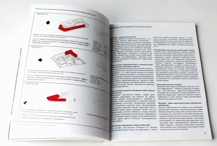
The architects proposed to restore the volume of the pre-soviet development in two other places: on Prechistenskaya quay behind Glazunov’s Gallery and in the park at the beginning of Volkhonka – also cleared before Nixon’s visit. The authors are calculating the town-planning potential for both cases and it turns out not very big: 2 acres in the first case and 1 in the other since it is only about regeneration – reconstruction of the gaps of the city canvas. All the calculations are merely hypothetical and do not go beyond recommendations for correcting the regulations that now prohibits any construction.
Table: town-planning potential of resoring the Volkhonka Quarters. Volkhonka Quarters - Culture Territory - Volkhonka Archive. Architectural and town-planning survey © "Ostozhenka" Bureau
In addition to the traffic situation study executed by the specialists of the Italian bureau MIC, who in terms of electronic calculations suggested to narrow the track way of Volkhonka fitting it with a traffic strip – all this without reducing its carrying capacity – the architects proposed some possible places for the additional parking lots for cars and sightseeing buses and have developed a more convenient crosswalk scheme on Prechistenskikh Vorot square – the center that together with the “cobble-museum” becomes a little pedestrian island.
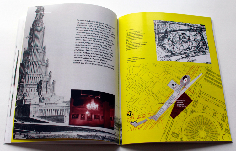
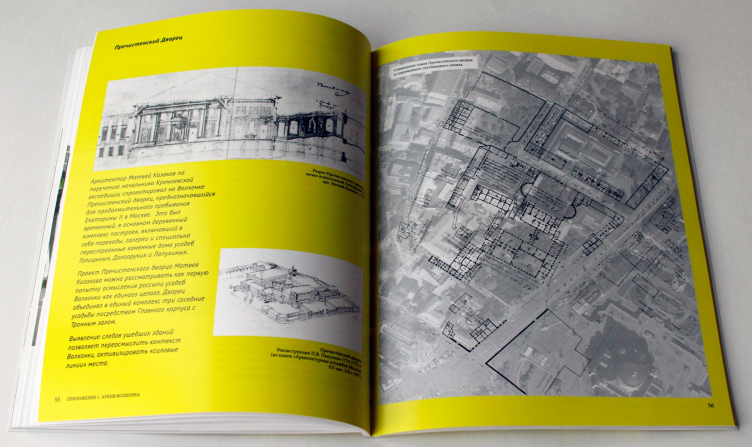
Besides the architectural inclusions and town-planning enquiries the book presenting Ostozhenka’s work is supplied with some additional sections. One of them is called “Archive Volkhonka” – it contains information about the history of the district that the architects based on during their work and also some additional facts that the authors found interesting. “What makes Volkhonka unique is that practically all the major stylistic and architectural conceptions have left their imprint here” – say the authors of the project, paying attention not only to the well-known things but to the forgotten details. There appears to be plenty of interesting facts here. For example, not everybody knows that Ivan Nikolayev’s commune-house was built on vaulted basements of the Rzhevskaya Virgin church that now hold a restaurant. The narrow, slip-like windows of the archives of Natural Science Library are practical because they follow the rhythm of the bookshelves arrangement inside. Cour d’honneur of the wooden palace of Catherine II built by architect Kazakov was like his later projects of Kremlin Palace and all together – it reminded a roman forum. And the competition for Lenin Museum, that a lot of celebrities took part in, such as Leonid Pavlov and Boris Mezentsev, allowed to sharpen the monumental ideas for the subsequent museums of the revolution leader, namely for the famous museum in Gorki. The museum was planned to be built on the right from Pushkin Museum behind Antipiy’s Church and completely demolishing the whole quarter up to Znamenka.
Palace of the Soviets. Volkhonka Quarters - Culture Territory - Volkhonka Archive. Architectural and town-planning survey © "Ostozhenka" Bureau
Prechistensky palace of Catherine the Great. Volkhonka Quarters - Culture Territory - Volkhonka Archive. Architectural and town-planning survey © "Ostozhenka" Bureau
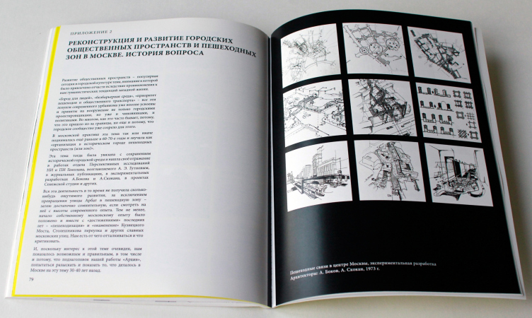
One more enclosure – a short history of Moscow urbanism with Alexey Gutnov as head of Advanced Research Department of Research and Project Institute of General Planning, Andrey Bokov and Alexander Skokan standing at its origins in the 60s. In the 70s Andrey Bokov and Alexander Skokan worked on the projects devoted to the city development and creating walking routes – all that the Moscow authorities and architects are so actively refining themselves today with. They differed from modern urbanism: at that time not so much attention was paid to the traffic problems as to preservation and regeneration, to the half-forgotten history of Moscow. They also paid attention to the permeability of the urban territories, pedestrian paths that in those socialist times were fairly abundant – you could pass all the yards through – it was a sort of an amusement to find the shortest way or more variants of the route. The urbanists of Gutnov’s school proposed comfortably equipping these lanes with benches, plant trees or sometimes cover them with glazed roofs of arcades. Maybe one of the main differences of Gutnov’s school from modern urbanism was less science in it and more devotion to history and culture, more effort to preserve old Moscow, remind of the lost, draw the old lines, restore the forgotten connections, grow the old city from the remains of its memories.
reconstruction and development of the public and pedestrian territories in moscow. Historic background. Volkhonka Quarters - Culture Territory - Volkhonka Archive. Architectural and town-planning survey © "Ostozhenka" Bureau
The town-planning analysis undertaken by Ostozhenka headed by Alexander Skokan – one of the authors of the projects in 70s – is on the one hand a set of ideas ordered for the book and the exhibition, a conceptual development. The project stands on its own, away from the Pushkin Museum reconstruction competition, even though it touches the same territory, only wider, concentrating on the territories located a bit further from the museum and someway or other suggesting its vision of the district. As known, Alexander Skokan entered the jury board for the reconstruction competition, it all happened almost at the same time: the exhibition and the book presentation took place in the end of May and the results of the competition were aired in the end of June.
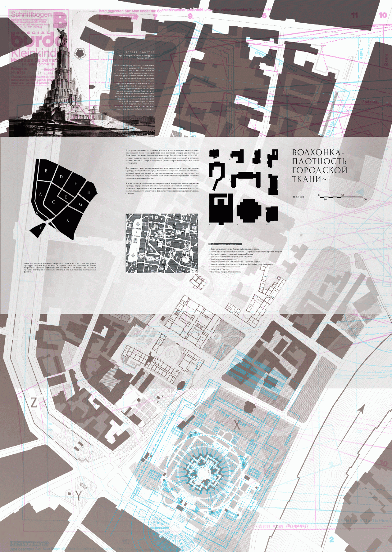
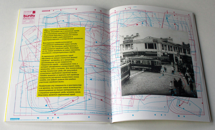
On the other hand, apart from the momentary tasks, this architectural research project has a way more ambitious goal: standing on the theoretical level the authors attempted to develop the universal principles of reconstructing the historical centers of Russian cities uniting the effective sides of high-tech European approach – proved in practice many times – with a more historic, attentive method of city culture investigation, a detailed “reading” of the place and writing to some extend its history by means of urban studies. The structure of old Russian cities is too contradictory and multilayered, there are too many “scars” on it and that is why it needs more attention – think the authors. It is no coincidence that on the last page of the booklet there is a sewing pattern from Burda magazine – a visible reflection of the multiple contours found and shown in the city – traces of memory making its space conscious as well as comfortable.
Last page of the brochure. Volkhonka Quarters - Culture Territory - Volkhonka Archive. Architectural and town-planning survey © "Ostozhenka" Bureau
Boards at "Zodchestvo-2014". Volkhonka Quarters - Culture Territory - Volkhonka Archive. Architectural and town-planning survey © "Ostozhenka" Bureau
***
The architects have prepared an edition of their project as a brochure and demonstrated it on a stand at “Zodchestvo” Festival in December.


