For the architects of DNK ag, the work on the project of "RASSVET LOFT*STUDIO" started from winning the closed blitz-tender that KR Properties organized last fall. Only three teams took part in the contest, including one bureau from Netherlands. The dimensions of the house were pre-set by the parameters of the already existing building; the architects were to come up with the concept of its outward appearance, as well as organize its adjacent territory and interiors - designing the latter in the "loft" style, at the same time making them look like other buildings of KR Properties.
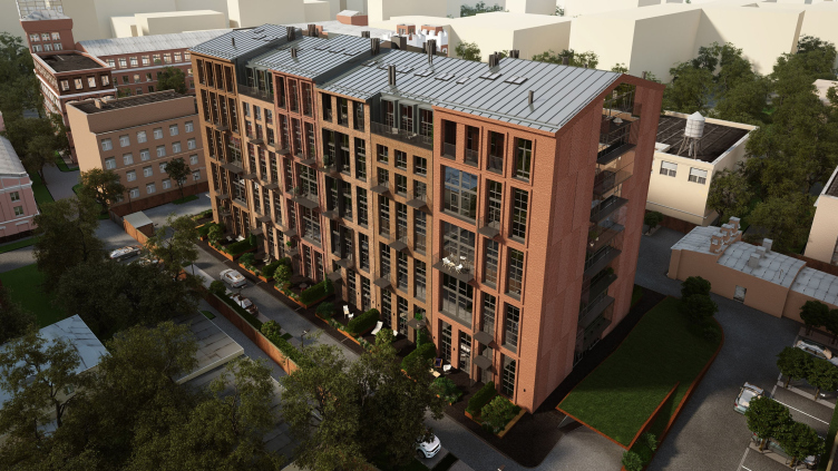
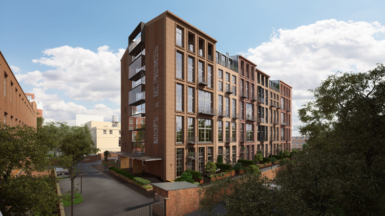
The building is situated in the neighborhood of Krasnaya Presnya in the center of the city: this is the east part of the mechanical engineering plant "Rassvet" whose oldest buildings, still belonging to the plant, were built as early as in 1900 by Roman Klein for the legendary furniture factory "Muir und Merilis". Since then, the land site kept getting industrial buildings of various times, including the end of the XX century. It was one of such "late-soviet" buildings that the architects of DNK ag got to deal with. The east border of the plot adjoins the park of the former Shchukin Antiquities Museum, a small complex in the neo-Russian style, now known to many Muscovites as the Timiryazev Biology Museum.
"Walking around its avenues of lime-trees with quaint museum cottages scattered about, you find yourself in the wonderful atmosphere of a cozy Moscow manor - shares Natalia Sidorova, one of the authors of the project - Not far away, one can see the residential high-rises and the sturdy industrial buildings of the pre-revolution and the soviet eras. We could not help but take into consideration this mottled neighborhood and try and find a solution that would fit in with this contrastive environment but at the same time would have an individual character of its own. Our ultimate goal was to form a comfortable yard territory without any "prompts" from the city context".
The aptitude of the conceptual solution that the architects found as early on as at the stage of the context sketch drawing allowed for them to follow their original idea in their ensuing work, only specifying the dimensions and parameters, as the architects share.
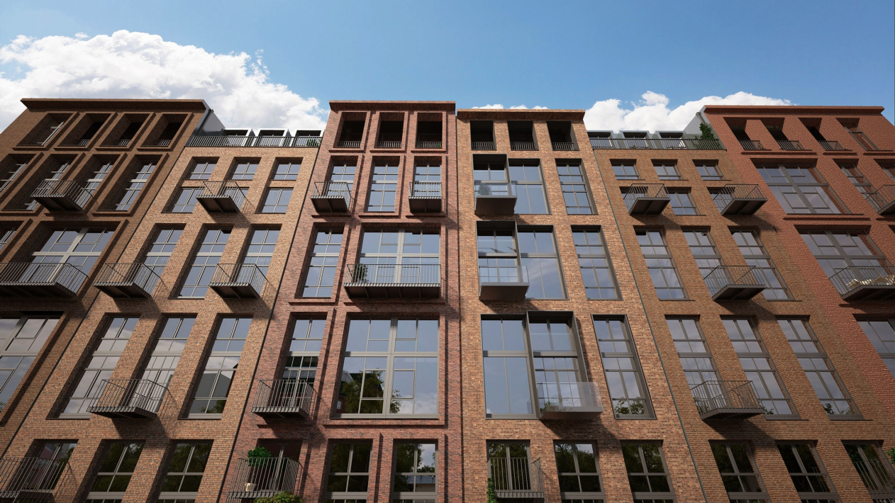
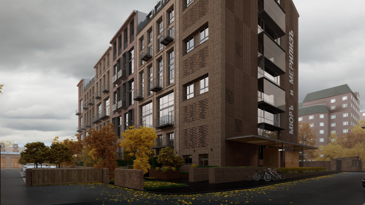
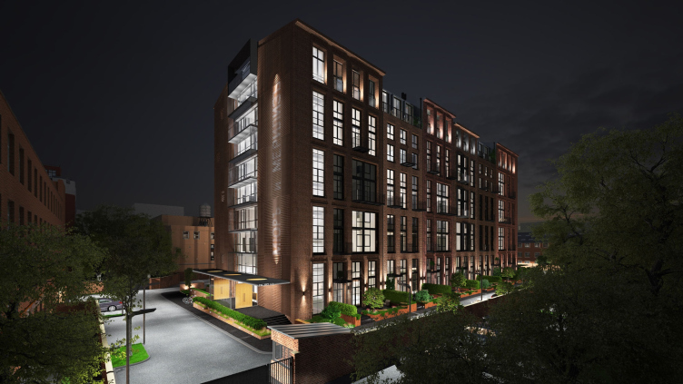
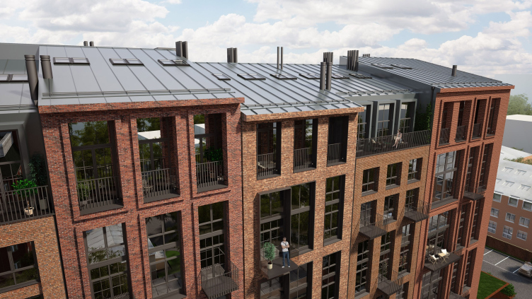
The idea was about visually breaking the horizontal line of the longitudinal facade of the building into six "independent houses" - together it produced the effect of a city street built in accordance with some common design code, only not quite identically.
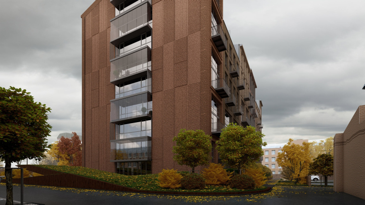
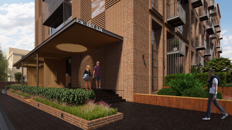
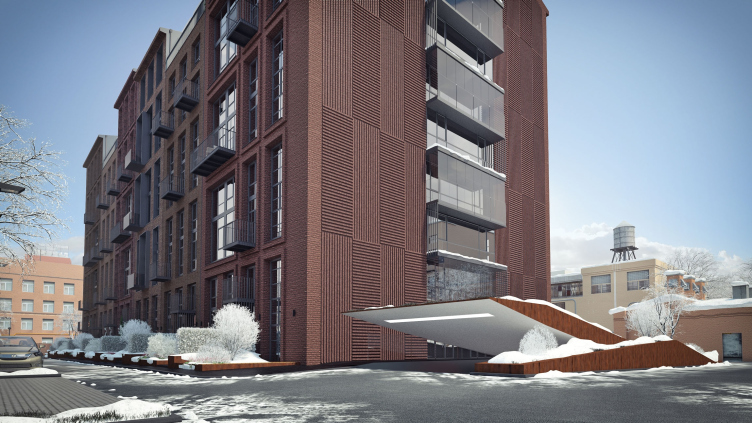
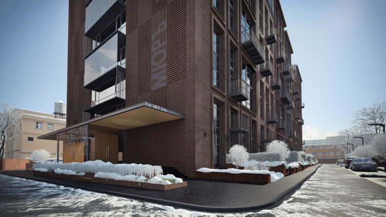
The architects use the bricks of various shades for each conditional "house" and "play" a little with the levels of the cornices. The idea of these small houses is enhanced not only by the gracefulness of the facades but also at the expense of the crest of the roof. The silhouette is also enriched by the open-air terraces of the upper floors, enhancing the resemblance to a city street. The conditional "house" - one cell of the facade - corresponds to one large loft commanding a view of the museum on the west side of the building and two smaller ones on the east side. This is why the east and the west facade have extra differences - in breadth, proportions, and the number of windows. The theme is picked up by the nuances and details: the texture of the brickwork, the window frames (brick frames, metallic, and laconic frameless windows) and the balconies (outstanding, and sunken-in) - forming the individual traits of each "house".
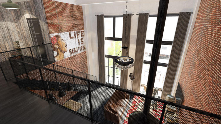
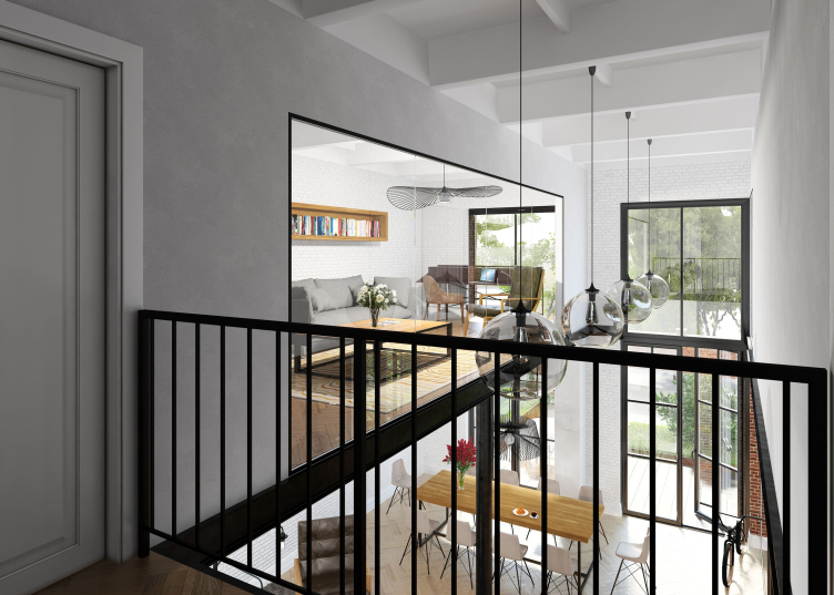
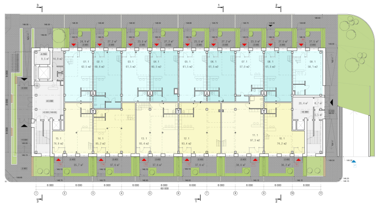
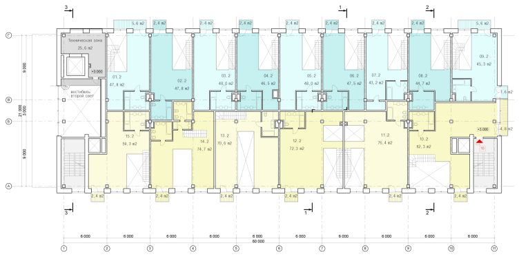
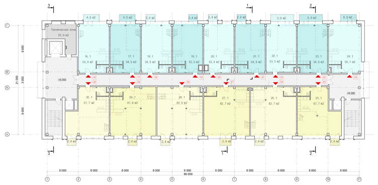
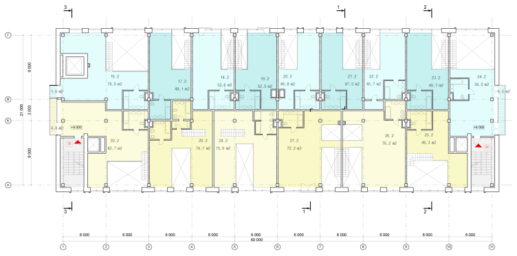
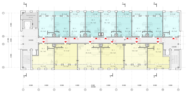
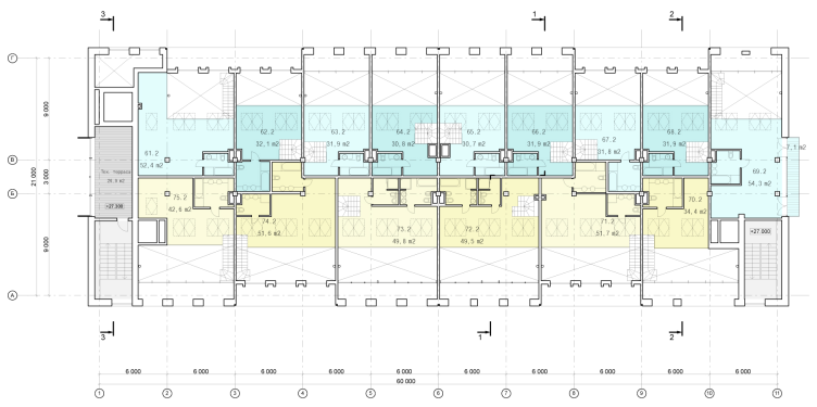
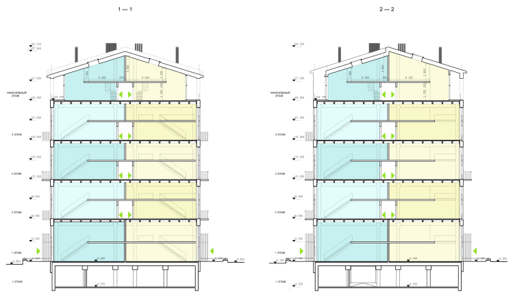
On the inside, there are four floors of double-level lofts with a parking garage organized in the already-existing basement and a double-height mansard on the upper tier. All the lofts are double-height and have in them a mezzanine floor, their total height reaching six meters. For the premises of the first floor, a direct street entrance is provided, the other lofts being accessible by the elevator halls and the longitudinal corridor. Due to the fact that the building structure is of the framework type, the customers will be able to easily join the lofts both along the facade and down the depth of the building by buying the neighboring units - which is exactly what the first customer immediately did, as the architects share.
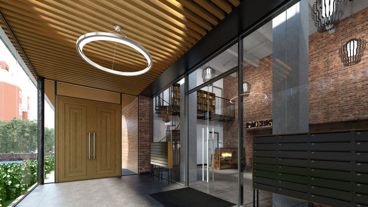
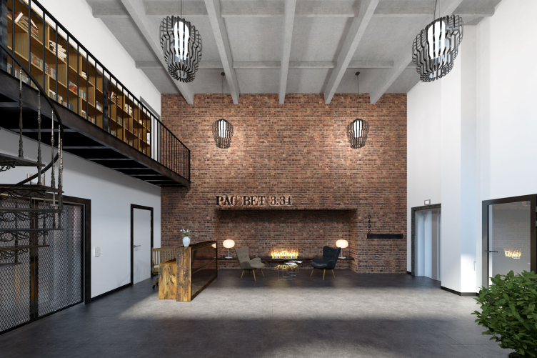
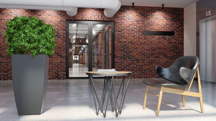
The concept of designing the public territories of the building proposed by the authors falls in with the general idea of the project. On the inside, the design of the corridor reflects fragments of the brickwork of each of the facades reminding the people just which of the conditional houses they are in right now: the brick decoration changes its color and texture, the boundaries between the conditional "houses" accentuated by frames.
According to the authors, the project required a solution that would allow for integrating the industrial development into the city environment at the same time preserving the historical spirit of the place. Hence the idea of inserting the smaller volumes, more characteristic of the residential development, into the large rectangular industrial framework. It would be hard to say which of the two themes is more important - the factory theme prompted by the environment and required by the customer, or the city theme introduced by the authors - probably, in this case it makes sense to speak about the combination of both or even these two bleeding into one another: the factory growing into the city and the city growing into the factory - a peculiar metaphor of reorganizing industrial parks as such.
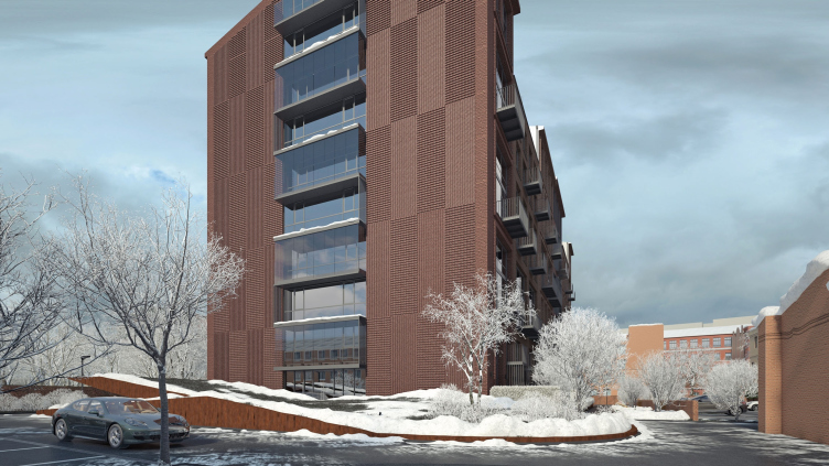
Still, though, just as important as the variety of the several buildings, is the unity of "code" that holds the composition together and keeps it from falling apart in the maze of the city's houses. All the six facades on both sides of the building are united by a common grid whose minimum module is accepted as a window of the two-level lofts. At some places, predominantly in the upper parts of the building, that, according to the principle of superposition must be lightened, the building gets a lintel that divides the module in two; at some places, on the other hand, the windows are joined together. Still, the logic is not violated: the module is even discernible on the blind firewalls on the side ends of the building - by the staggered pattern of the brickwork texture. The unity of the material is the brickwork and the common, in spite of the height of the cornices, gently sloping inclination of the gable roof.
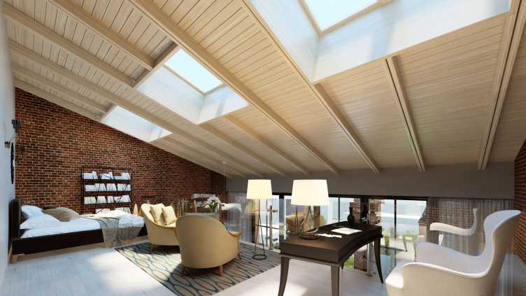
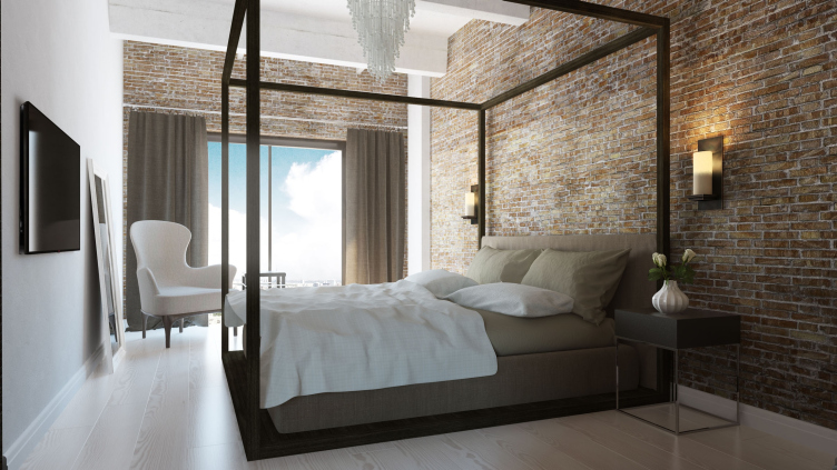
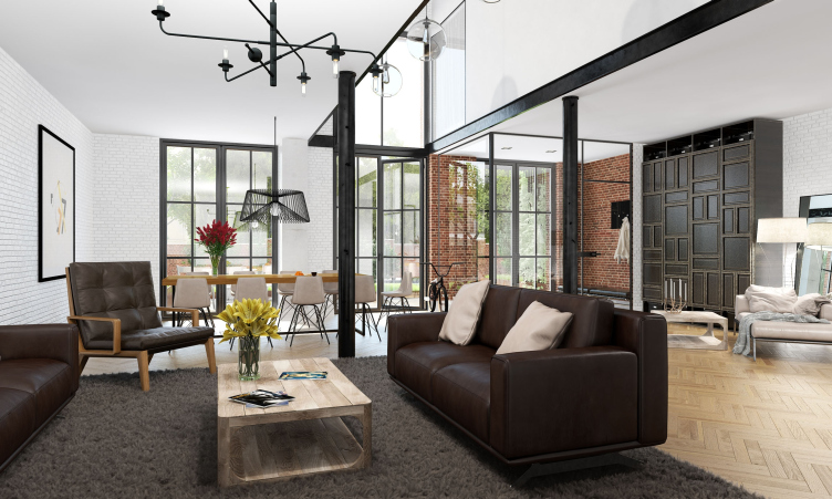
Inside, in the projects proposed by the architects, there are also many brickwork surfaces; they are supported by the structure of concrete, as well as by the black color of the doors and the metallic elements. A fair share of the "brutality" of this company is offset by the abundance of white surfaces of natural color: all the windows are of the "floor-to-ceiling" type which looks particularly chic in the double-height living rooms. The floor of the upper level of the mansard - in fact, the sloping surface of the bearing structure of the gable roof - is finished with wood and has in it the "zenith" windows of the upper light. The cozy "dacha" place is embellished by the spacious terraces and a fireplace, the latter provided for the top floors alone.
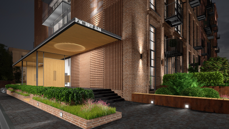
The wooden finish is also to be seen on the outside, in the ribbed marquee above the entrance. The marquee is slit through by a semblance of a lens that is capable of casting a striped spot of sunlight upon the wall: superimposed on the corrugated stripes of the brick wall, it will look truly enchanting. Besides, the circle of light at the entrance, moving after the sun, is conceived by the authors to be the allusion to the "RASSVET" logo. The evening backlight at the entrance repeats this same theme, and then gets doubled in the portal by a suspended spotlight that also casts a circle of light on the wooden surface.
The other side wall of the house sports a pointed nose of the marquee made from artificially oxidized steel above the garage entrance whose edge serves as the unmistakable sign of the difference or even opposition of the "human" and "automotive" entrances that are placed not by chance from the opposite sides.
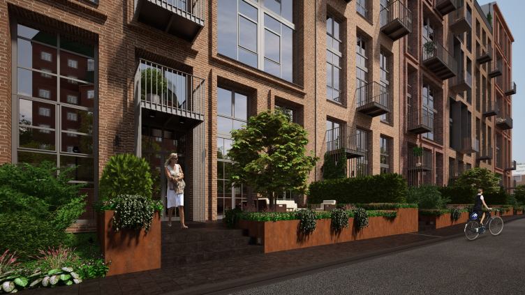
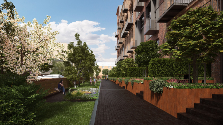
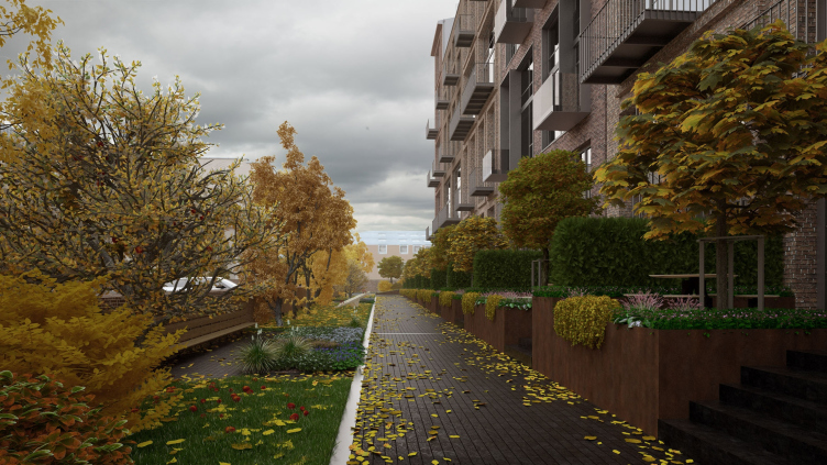
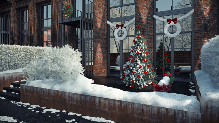
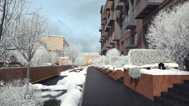
The lofts of the bottom floors got independent entrances of their own and open-air terraces raised above the sidewalks to the level of their floor. The foundations of the terraces, just like the garage entrance, are finished with sheets of oxidized steel and are decorated around their edges with various plants in the in-built beds. When put together, all these things form a permeable and artistic boundary between the public and the private and the house ultimately combines the properties of a suburb townhouse on its bottom floors with the properties of the city lofts above them. The private is raised above the human line of vision yet not completely - and, passing by, one will be able to catch a glimpse of the people living in this house having coffee on their terraces just as they would at some street cafe - such interaction of the residents with the city environment gives the house a new dimension, less confined and more humane than it is usually the case in Moscow.
***
Below we are publishing a brief interview that Julia Zinkevich took, with their gracious consent, from Natalia Sidorova, Konstantin Khodnev, and Daniel Lorentz.
- You say that you wanted to avoid using any "prompts from the city context". Still, you had to take the surroundings into consideration, didn't you?
Konstantin Khodnev:
- The building is situated amidst a densely overbuilt area; one can only see fragments of its facades or the whole of it only when he or she is up close to the building, while the long facades are perceived with a strong perspective contraction. The small-sized yard spaces are mostly formed by the building's own facades. This is why we paid a lot of attention to the curves and the proportions of the facade elements, texture of the material, detailed elaboration of the concept of the private terraces on the first floor and the plants we used for decorating them.
- When working on your projects, what is your source of inspiration?
Daniel Lorentz:
- Our numerous travels around the world we try to absorb different cultural and architectural impressions. Naturally, we use them in our further work. And it's not about copying any specific shapes that we've seen but about the urge to convey the right images and perceptions avoiding being secondary at all costs. Among the fresh "impressions" that came in handy while we were developing the concept of "RASSVET LOFT*STUDIO", I can name the historical "pack-houses" that stand along the haven's channels in Hamburg with picturesque brick walls going down underwater.
- Does DNK ag perform any author supervision over the implementation process?
Konstantin Khodnev:
- We always try to monitor our projects down to the point of full completion of all the work. Remodeling an existing factory building is a complex process - issues arise here and there that require the decisions made by the author supervision board, even in spite of the fact that we think out every little detail at the designing stage. I hope that in the case of this particular project we will also be with it at every stage of its implementation, all the more so because it has already begun.

