По-русски

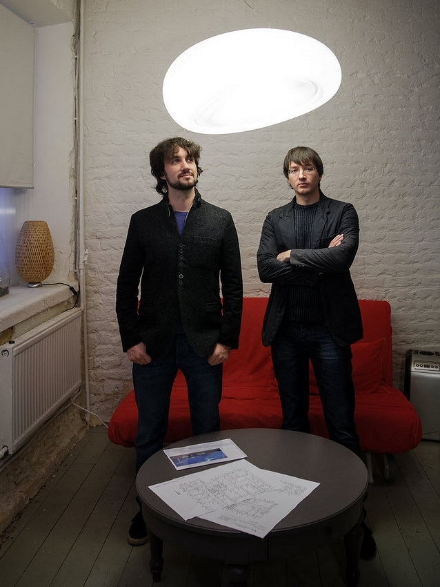
Aleksey Goryainov and Mikhail Krymov: "We are are moulding the clay that we've got in our hands trying to make a positive difference to the world around us".

The leaders of "Arch Group" share about the boundless possibilities of reconstruction, about the first day of creation, about participating in open and closed tenders, about renovating industrial parks, and about the invisible marquee.

03 December 2014
Interview
mainImg
Михаил Крымов и Алексей Горяинов © Архитектурная мастерская Arch group
Mikhail Krymov and Aleksey Goryainov © Arch group открыть большое изображение

Created in 2007 by Aleksey Goryainov and Mikhail Krymov, the architectural company "Arch Group" over the seven years of its existence has gained a reputation of a team with a huge creative potential. The recent Moscow contest inevitably had the company on their participant lists. And the company's works usually proved to be some of the best. We met the leaders of the company and spoke to them not only about their successful participation in the contests but also about their particular interest for reconstruction work. 

Archi.ru:
- Reconstruction is one of the leading branches of your company's activity. How did you choose this branch and why is it interesting to you?

Mikhail Krymov: 
- To me, architecture IS reconstruction. We create new things not in some sort of airless vacuum like our God did on his first day of creation: we mould things from the clay that's already there, and we change image of the world around us. All the tasks that we deal with are about reconstruction of this or that scale: from large-scale urbanist tasks of city reconstruction to the reconstruction of an apartment that some specific person lives in. When we create a new project we inevitably take into consideration the already existing buildings, and the environment, and the already-existing development scenarios, and earlier proposals, and a whole bunch of other factors. We choose what we need, at the same time singling out the potential possibilities using for this our set of architectural instruments. We are not so much demiurges as we are surgeons. 

Aleksey Goryainov: 
- Moscow looks like it solely consists of endless industrial parks. Like some sort of disease, they've crawled into every corner of the city. In the recent years, it has become evident that this problem is asking to be solved. The attempts of remodeling the industrial parks are already being made, and the appropriate tenders are held. However, thus huge work is only just beginning. About a third of Moscow's whole territory, let alone other cities, is in a desperate need of renovation. And this is really a full-scale task. 

Mikhail Krymov: 
- Besides the existing background factors, such as the presence of industrial parks that need to be remodeled, the subject of remodeling has been actualized by the very economic situation in this country. Our company actively clicked into the reconstruction mode when the financial crisis was in full swing, when it became obvious in 2008 that reconstructing an old building would be a lot more cost-efficient than taking it down and building a new one in its stead. 

- What was your first reconstruction project?

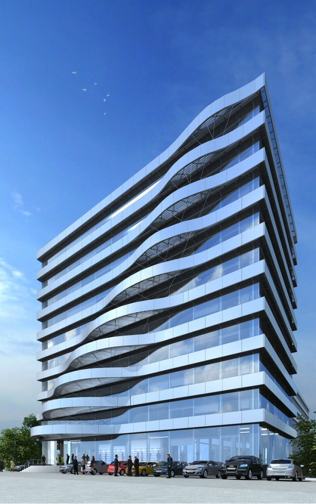
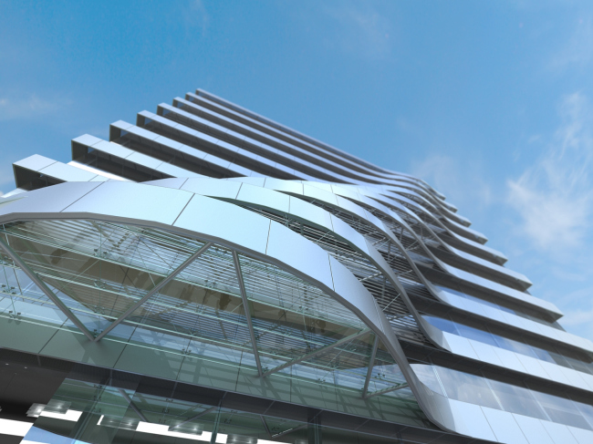
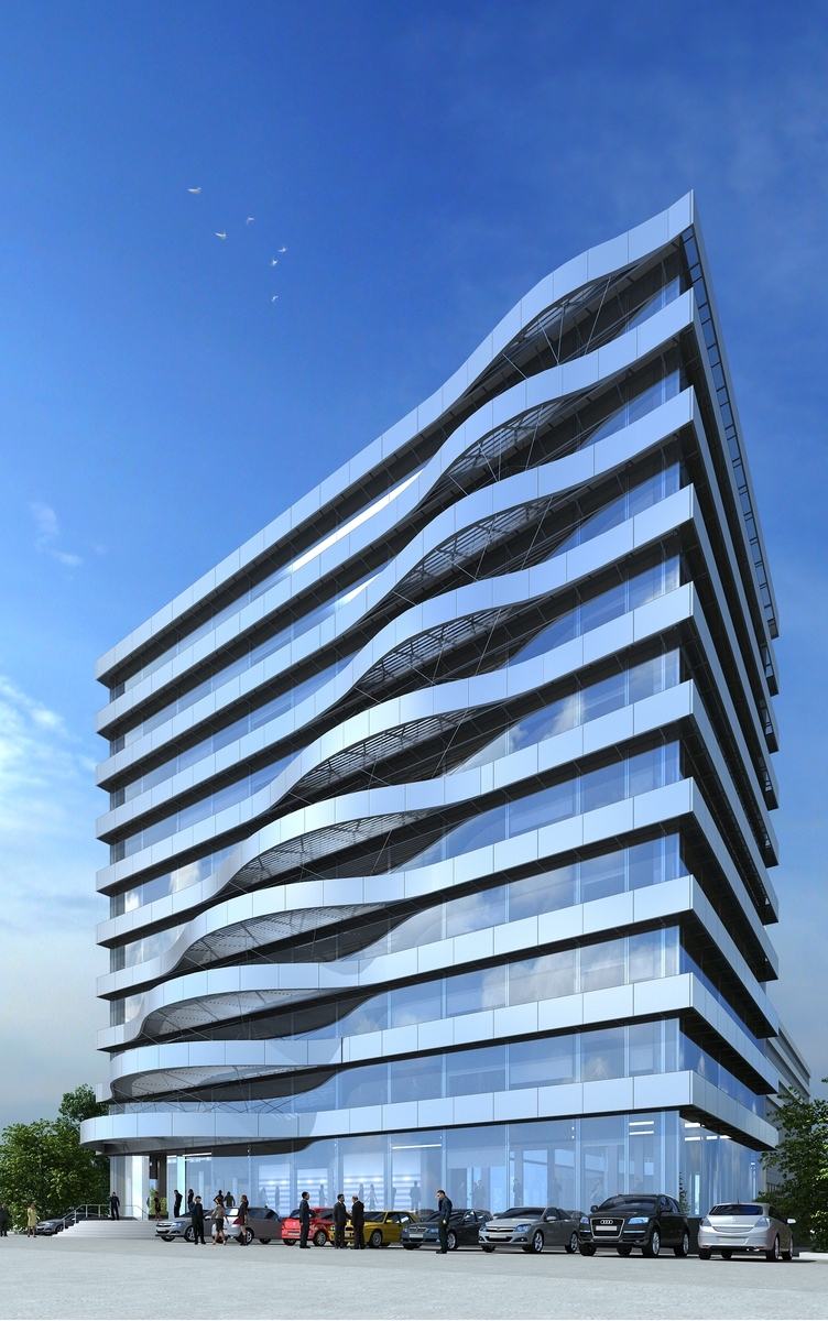
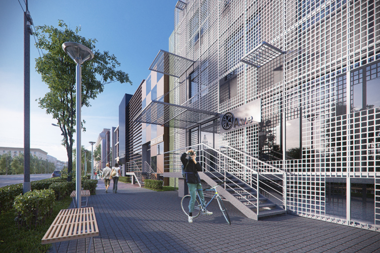
A.G.: Our history began with the project of reconstructing an office building at the Nizhnyaya Krasnoselskaya Street for MOESK Company. By that moment, our company had already came up with and implemented the interior design of several floors that was several times awarded various prizes at various competitions. The sharp contrast between the content of the building and its rather bleak appearance practically forced our customer to give a thought to its reconstruction. We came up with quite sweet facades with the uneven "wave" of balconies and railings that concealed the air conditioning units hanging out on the outside. We liked our result because we came to understand the fact that at times reconstruction can produce an effect that is just as powerful as building from scratch. 
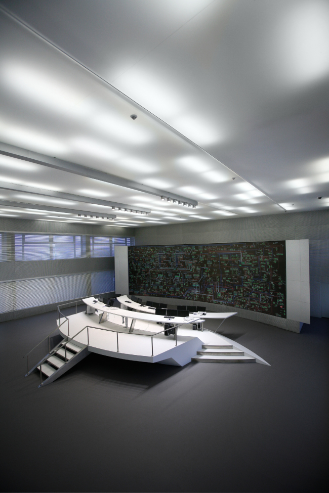
Интерьеры офисного здания на Нижней Красносельской улице © Архитектурная мастерская Arch group
Interior design of the office building at the Nizhnyaya Krasnoselskaya Street © Arch group открыть большое изображение

Реконструкция фасадов офисного здания на Нижней Красносельской улице © Архитектурная мастерская Arch group
Reconstruction of the facades of the office building at the Nizhnyaya Krasnoselskaya Street © Arch group открыть большое изображение

Реконструкция фасадов офисного здания на Нижней Красносельской улице © Архитектурная мастерская Arch group
Reconstruction of the facades of the office building at the Nizhnyaya Krasnoselskaya Street © Arch group открыть большое изображение

M.K.: And, besides, this approach was really cost-efficient. After that, a whole number of similar projects ensued: remodeling the facades of the "CenterTelecom" building, reconstruction of the facades of the office building at the Staroalekseevskaya Street, concept of the reconstruction of the industrial quarter at the Kalanchevskaya Street to become a business center...

After that, we came up with a rather daring concept of reconstructing a building at the Malaya Ordynka Street into a club complex of premium-class apartments. We took the existing house and clad it into panels, gave to it new console balconies and terraces on the outboard supports - thanks to which the building started looking like a fantastic super-car. If this project had been implemented, nobody would have ever guessed that it was a reconstruction. Basically, this is what our approach is all about. 
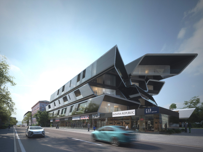
Реконструкция здания на Малой Ордынке под клубный комплекс апартаментов © Архитектурная мастерская Arch group
Reconstruction of the building on the malaya Ordynka Street into a club apartment complex © Arch group открыть большое изображение

Реконструкция здания на Малой Ордынке под клубный комплекс апартаментов © Архитектурная мастерская Arch group
Reconstruction of the building on the malaya Ordynka Street into a club apartment complex © Arch group открыть большое изображение

- You started your story from sharing about Moscow industrial parks that are in need of reconstruction. Have you already had a chance to work on such projects?

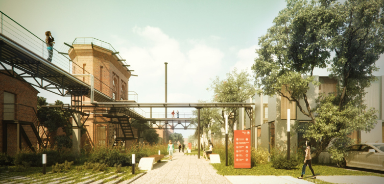
A.G.: Yes, and more than once, too! One of the largest was the project of renovating the territory of the former chemical plant on the Berezhkovskaya Embankment. This was a closed tender that was held twice. The first time around, when it was planned to take down all the existing buildings, it was won by "Project Meganom". We took part in it when the tender was organized for the second time and it was planned not to demolish but to reconstruct the existing houses. And it was our proposal that took the first place. 

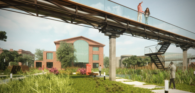
This project was interesting to us not only in terms of the magnitude of the task - a huge territory, one owner, and almost total freedom of creation - but also in terms of this land being very important for this city. More than seventy factory buildings have stretched along the riverbed of the Moskva River, across from Moscow City complex. According to our customer, this territory might become something that's similar to today's "Vinzavod", only on a larger scale, and with expanded set of features. 

Реновация территории завода на Бережковской набережной © Архитектурная мастерская Arch group
Renovation of the industriial territory at the Berezhkovskaya Embankment © Arch group открыть большое изображение

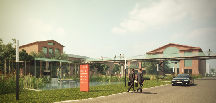
M.K.: We came up with a functional program, dividing all the buildings into seven independent groups. For example, the beautiful red-brick buildings were turned into loft apartments; the large production buildings became shopping malls; the historically valuable buildings got the protected status and were turned into cultural and exhibition objects. For such zoning, we had to do a quite serious analysis of the territory. 

Besides, it turned out that the very aesthetics of this place was very close to us, with all of its hanging bridges, and the backlit pedestrian trails that connect the buildings on the level of the second floor. The project also provides for the green part, its main axis being the broad car-free street. 
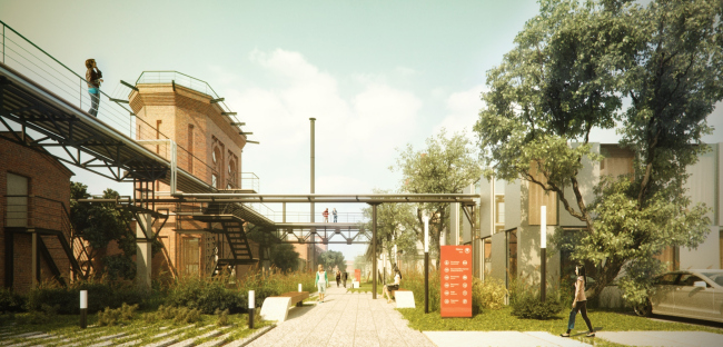
Реновация территории завода на Бережковской набережной © Архитектурная мастерская Arch group
Renovation of the industriial territory at the Berezhkovskaya Embankment © Arch group открыть большое изображение

Реновация территории завода на Бережковской набережной © Архитектурная мастерская Arch group
Renovation of the industriial territory at the Berezhkovskaya Embankment © Arch group открыть большое изображение

- As far as I understand, reconstruction is still the leading branch of your company's activity. What are you working on presently? 

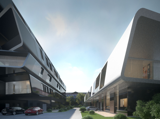
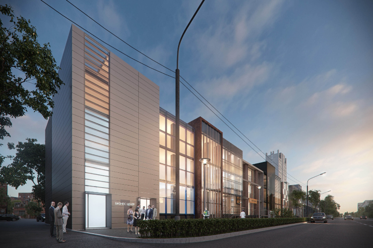
M.K.: One of our last project is "Novoostapovsky" business center. We won the right to design it in a closed tender that the customer organized. The task was to turn an elongated two-floor production building that stretches along the Sharikopodshipnikovaya Street into a modern office center. The task was complicated by the fact that the customer only owned half of the building, and the other half was to be left intact. The way I see it, we came up with an interesting proposal: refraining from continuing the horizontal theme we broke the building up into a series of vertical volumes. This "montage" of differently designed fragments symbolizes the diverse urban environment with closely standing facades that are decorated with different materials and look different from one another in terms of height and in terms of their recession from the building line. Thus, instead of but one extremely long building, there appeared a whole busy and lively street. Behind the different facades there are offices and little shop that this neighborhood had badly missed until then. And, more importantly, the place became human-proportionate. 

Деловой центр «Новоостаповский» на Шарикоподшипниковской улице © Архитектурная мастерская Arch group
"Novoostapovsky" Business center at the Sharikopodshipnikovaya Street in Moscow
© Arch group
открыть большое изображение

Деловой центр «Новоостаповский» на Шарикоподшипниковской улице © Архитектурная мастерская Arch group
"Novoostapovsky" Business center at the Sharikopodshipnikovaya Street in Moscow 
© Arch group
открыть большое изображение

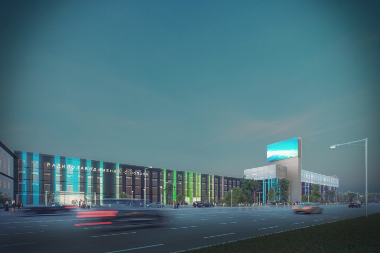
Yet another similar project that we also got through a closed tender was the redevelopment project of A.S. Popov radio factory in the city of Omsk. Its main difference from the previous one consisted in the fact that here we needed to reconstruct the still-functioning, and, in effect, the local economic mainstay: the three buildings of different height with no common facade. One of them was the checkpoint building, another - a round panel unit, and the third one - a traditional brick building. However, as opposed to the previous project, in this case we thought it right to do a single facade for all the three volumes. We decided to unite buildings adding a passage between them. And the common motif was the image of some mysterious radio device: the walls of the main facade of smoked glass bear the pattern that symbolically repeats the complex spectrogram of the radio waves. 

Проект реконструкции радиозавода имени А.С. Попова в Омске © Архитектурная мастерская Arch group
Project of reconstructing the radio palnt in Omsk, Russia ©  Arch group открыть большое изображение

Besides, we saved fragments of the Soviet architecture here. The most important and interesting-looking parts are encased in special casings of metal grille. Such a device lets us keep the memory of how the building looked like before the reconstruction. Backlit from inside, these parts turn into some sort of sculptures that remind us of the factory's past. 

- Your portfolio has in it a specially dedicated block of reconstructing airports. How are you getting along with that?

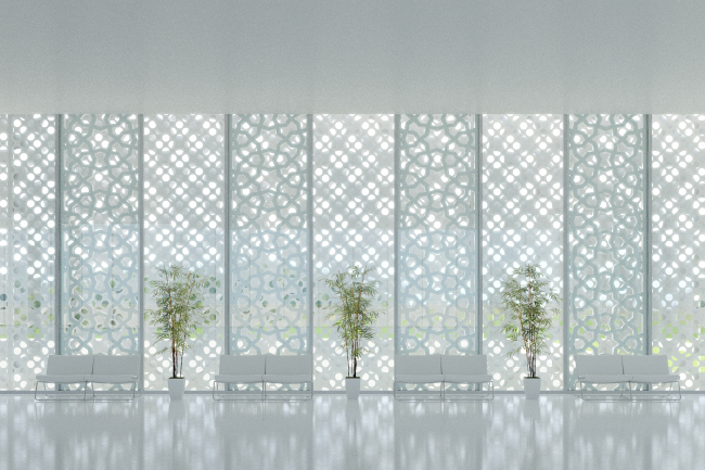
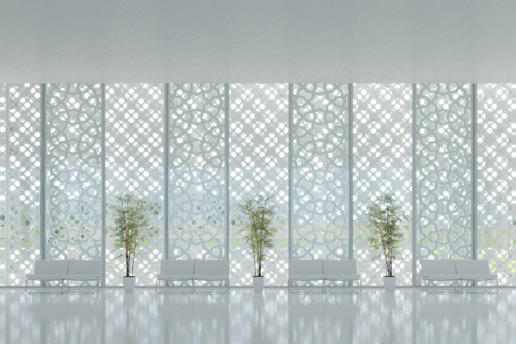
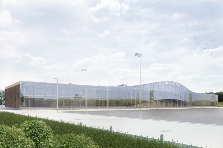
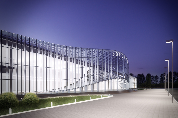
A.G.: We did a few projects of reconstructing the airports of a few major Russian cities. Generally, these are the rank-and-file soviet affairs with old panel facades. In all the cases it was supposed to leave but the framework of the building, upon the basis of which different facades could be created. At some places, the airport took on the modern features, and at some places, like in the city of Abakan, for example, the facade was designed with consideration of the regional ornamental tradition. 
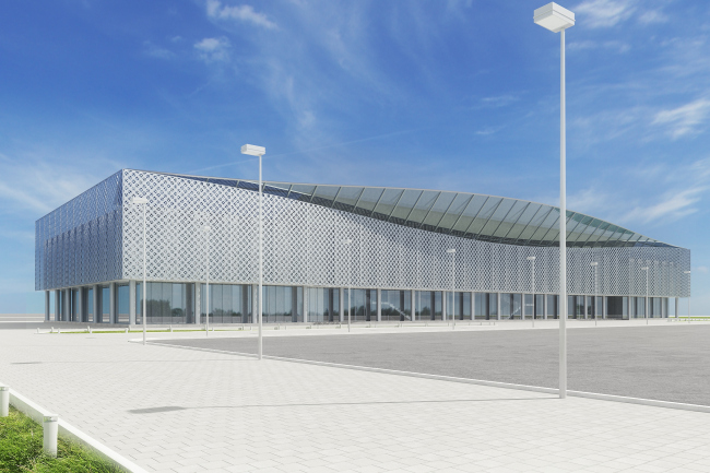
Концепция реконструкции аэропорта в Абакане © Архитектурная мастерская Arch group
Concept of reconstructing the airport in Abakan © Arch group открыть большое изображение

Концепция реконструкции аэропорта в Абакане © Архитектурная мастерская Arch group
Concept of reconstructing the airport in Abakan © Arch group открыть большое изображение

Концепция реконструкции аэропорта в Воронеже © Архитектурная мастерская Arch group
Concept of reconstructing the airport in Voronezh © Arch group открыть большое изображение

Концепция реконструкции аэропорта в Воронеже © Архитектурная мастерская Arch group
Concept of reconstructing the airport in Voronezh © Arch group открыть большое изображение

- And the reconstruction of the facades of the medical centers for children? 

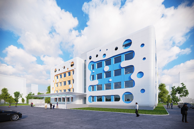
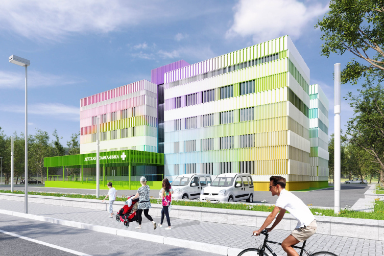
A.G.: As far as the medical centers are concerned, it was the city's initiative to renovate them. And I think it was really the right thing to do. When this idea gained momentum, we made a few proposals that could turn the bleak and sometimes even scary panel affairs into bright and vivacious-looking buildings. However, this idea was to remain on paper: the city's initiative was shut down as unexpectedly as it had appeared. 
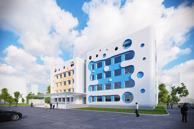
Реконструкция детской поликлиники в Новопеределкино © Архитектурная мастерская Arch group
Reconstruction of a children medical center in Novoperedelkino © Arch group открыть большое изображение

Реконструкция детской поликлиники в Солнцево © Архитектурная мастерская Arch group
Reconstruction of a children medical center in Solntsevo © Arch group открыть большое изображение

- You mentioned your participation in closed tenders. Do you like participating in closed or in open ones?

M.K.: As a matter of fact, yes, we like closed tenders more. And it's not about the number of participants that we have to compete with but about the very approach to evaluating the contest projects. In a closed tender the works are considered directly by the customer that first of all pays attention to their conforming to the specifications, cost efficiency, and plain common sense. In open contests, the judging panel's choice is often conditioned by their momentary impression from the effective manner of presentation or even a random emotion, and this method of evaluation simply cannot be objective. Winning in such a contest is really difficult, so we rather view such contest as a chance to stretch out gray cells. 

- Yet you still actively participate in open contests, including those that have to do with reconstruction. For example, recently the works of your studio were mentioned in the contests for the reconstruction of Luzhniki swimming complex and the Cheremushki bakery...

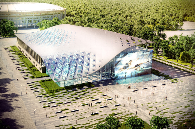
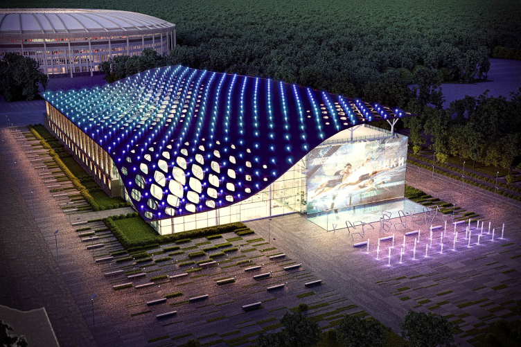
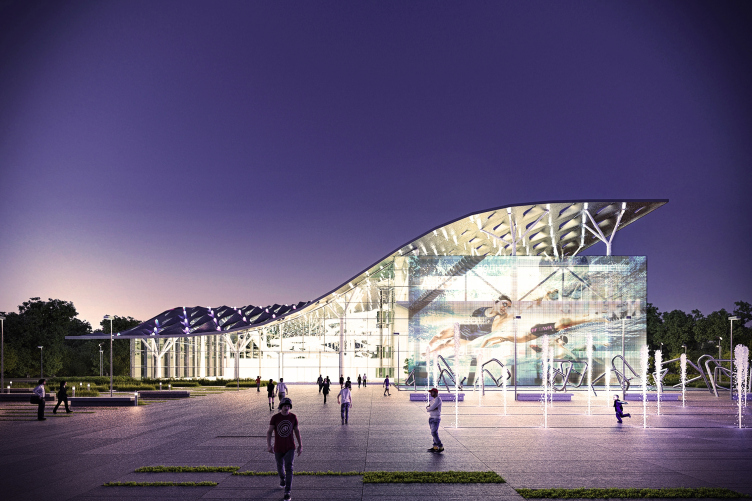
M.K.: The swimming complex of Luzhniki is not quite a reconstruction because, according to the specifications, the existing building is completely taken down, including its foundations. However, it is planned that three walls of the complex will be completely recreated, while the fourth one, the one that faces the "Metro-Bridge" and the road junction became the subject of design. 

Проект реконструкции бассейна Лужники © Архитектурная мастерская Arch group
Project of reconstructing the swimming complex of Luzhniki © Arch group открыть большое изображение

A.G.: Luzhniki is the complex that was built back in the soviet time a single architectural ensemble. The building of the complex is perfectly viewable from the bridge but it is almost absent in the panorama of the city. We completely hid its volume, lowering the roof in a beautiful curve so as to make the main arena of Luzhniki viewable from the city. And we thought out in detail the fifth facade of the swimming complex, the one that is turned to the "Metro-Bridge". 

Проект реконструкции бассейна Лужники © Архитектурная мастерская Arch group
Project of reconstructing the swimming complex of Luzhniki © Arch group открыть большое изображение

Проект реконструкции бассейна Лужники © Архитектурная мастерская Arch group
Project of reconstructing the swimming complex of Luzhniki © Arch group открыть большое изображение

M.K.: The project was thought out really well, down to the engineering communications and the water system. We must have overdid it here - because in an open tender it is the overall impression that matters, and details are secondary. We came up with a project that provided for every detail of the specifications and proposed simple and comprehensible solutions. And we took the third place but it was an exciting experience. 
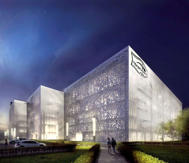
Реконструкция хлебобулочного завода «Простор» в Черемушках © Архитектурная мастерская Arch group
Reconstruction of "Prostor' Bakery in Cheremushki © Arch group открыть большое изображение

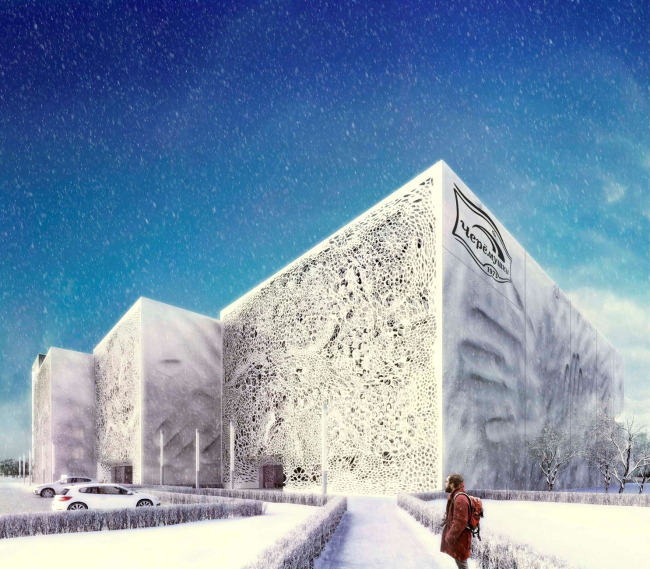
A.G.: In the contest of the reconstruction of the Cheremushki Bakery, we were required to take several independent factory buildings of a complex configuration and a huge facade area - and design them as a single ensemble. One elongated facade was to form a street with active pedestrian and traffic flows. The other was meant to be viewable from a distance - meaning it was supposed to sport a dramatic image that could be easily red from a distance. 
Реконструкция хлебобулочного завода «Простор» в Черемушках © Архитектурная мастерская Arch group
Reconstruction of "Prostor' Bakery in Cheremushki © Arch group открыть большое изображение

M.K.: We came up with a solution how to combine a dramatic image with a possibility of its simple and cost-effective implementation. For the decoration, we proposed to use the facade grid with prints of human hands on it - as if the walls were just molded from soft pastry. This would bring up direct association with the factory's activity. This is the inner facade. The street facade looks a bit more complex. Upon it, the dramatically backlit two-layer wall really looks like a slice of freshly baked bread. 

A.G.: Our work made it into the final but we did but we did not win the contest in the king run. As we learned from the interview of Julius Borisov who was one of the judges, the customer questioned the dependability of the decoration material that we chose. It sure is a pity... Incidentally, it was this specific net material that was used to build the Germany's exhibition pavilion for EXPO-2010 that gracefully survived the fair withstanding millions of guests. 

- There was yet another contest - the project of reconstructing the marquee of Ukraine Hotel. 

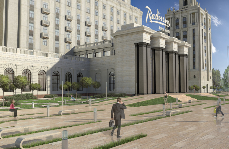
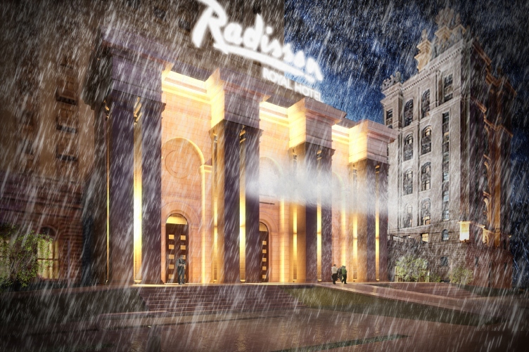
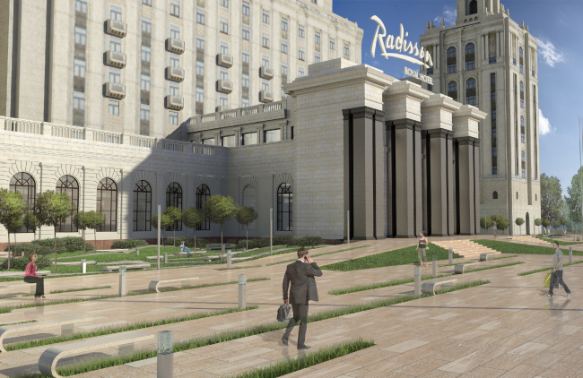
A.G.: This one was, probably, the must unusual of our reconstructions. We were not particularly keen on taking part in that contest but when we came up with a designing idea for the marquee that was really unexpected, we could not but go ahead. The thing is that this hotel needs this marquee solely to provide protection from the rain. On the other have, it is obvious that any marquee will simply block out part of the facade and ruin the image of this unique architectural monument. Therefore, the one and only right solution was to make a marquee that would not be there. This is how we came up with an invisible marquee that works by analogy with "air screens" that just cut off the cold air. The horizontal air screen blows the raindrops into the snow six meters away from the entrance, in there direction where there is no pedestrian flow. The marque is only on when it rains, and the air pressure depends on the intensity of the rain. 
Конкурсный проект козырька гостиницы «Украина» © Архитектурная мастерская Arch group
Contest project of the marquee of "Ukraine' Hotel © Arch group открыть большое изображение

M.K.: At the first stage of the contest, we presented our project as the overall idea and we were told that the customer had doubts about the implementability and the cost efficiency of this idea. As a result, by the time the second round started, we, together with the German company Arup calculated every tiny detail of it. Our calculations were so minute that they not only demonstrated the operating process but also provided for the trajectories of the motion of the blown raindrops, as well as their speed. We found the room to place all the necessary machinery, provided the annual report of precipitation in Moscow, calculated the costs of implementation and operation that was about ten times less than the construction of any, even the simplest, solid marquee... Nevertheless, our project did not win. No regrets, though: we were not interested in becoming the authors of just any marquee, and as for the interesting solution, we became the authors of one anyway. Strange, but there are no such marquees anywhere in the world! 

Конкурсный проект козырька гостиницы «Украина» © Архитектурная мастерская Arch group
Contest project of the marquee of "Ukraine' Hotel © Arch group открыть большое изображение

- And have their been any open tenders that you've won? 

A.G.: We won the international tender for the construction of the Russian Cultural Orthodox Church center in Paris. Our proposal consisted in preserving and reconstructing the existing buildings and then covering them with a single glass casing, like a single complex. The glass volume would even include the white-stone temple, which, with a certain share of irony, could be called "reconstruction of Orthodox Church architecture". However, even winning the tender does not guarantee you the implementation of your project. And this contest was no exception. Now this commission is handled by a different company in Paris. 

- What is the most exciting thing for you about reconstruction? Do you feel maybe cramped up within the confines of this branch? 

M.K.: Of course, our company does more than just reconstruction. At the initial stage, however, for such a young team as we were, reconstruction gave us a great opportunity to do architecture before we gained professional momentum. 

A.G.: As a rule, we only work with the framework of the building which does not really limit our architectural possibilities - simply because the architect has to meet the volume restriction even when he comes to an empty land plot. Reconstruction has a lot of pluses to it - for example, it allows to estimate the scale of the building at once, and, besides, the implementation of reconstruction projects takes place a lot sooner than the construction of new objects which can sometimes stretch for decades, as a result of which the architecture of the project can grow obsolete. 

M.K.: Architecture is the creative type of workmanship. The main rewards for the architect is seeing how the world changed with his efforts. Creating something new is great but changing the world around you with your own hands is quite a different story. This is a special architectural kind of magic.


03 December 2014

Headlines now
The Golden Crown
The concept for a dental clinic in Yekaterinburg, developed by CNTR Studio, revolves around the idea of a “mouth full of gold”: pristine white porcelain stoneware walls are complemented by matte brass details. To avoid an overly literal interpretation, the architects focused on the building’s proportions, skillfully navigating between sunlight requirements and fire safety regulations.
Flexibility and Integration
Not long ago, we covered the project for the fourth phase of the ÁLIA residential complex, designed by APEX. Now, we’ve been shown different fence concepts they developed to enclose the complex’s private courtyards, incorporating a variety of public functions. We believe that the sheer fact that the complex’s architects were involved in such a detail as fencing speaks volumes.
A Step Forward
The HIDE residential complex represents a major milestone for ADM architects and their leaders Andrey Romanov and Ekaterina Kuznetsova in their quest for a fresh high-rise aesthetic – one that is flexible and layered, capable of bringing vibrancy to mass and silhouette while shaping form. Over recent years, this approach has become ADM’s “signature style”, with the golden HIDE tower playing a pivotal role in its evolution. Here, we delve into the project’s story, explore the details of the complex’s design, and uncover its core essence.
Gold in the Sands
A new office for a transcontinental company specializing in resource extraction and processing has opened in Dubai. Designed by T+T Architects, masters of creating spaces that are contemporary, diverse, flexible, and original, this project exemplifies their expertise. On the executive floor, a massive brass-clad partition dominates, while layered textures of compressed earth create a contextually resonant backdrop.
Layers and Levels of Flight
This project goes way back – Reserve Union won this architectural competition at the end of 2011, and the building was completed in 2018, so it’s practically “archival”. However, despite being relatively unknown, the building can hardly be considered “dated” and remains a prime example of architectural expression, particularly in the headquarters genre. And it’s especially fitting for an aviation company office. In some ways, it resembles the Aeroflot headquarters at Sheremetyevo but with its own unique identity, following the signature style of Vladimir Plotkin. In this article, we take an in-depth look at the United Aircraft Corporation (UAC) headquarters in the Moscow agglomeration town of Zhukovsky, supplemented by recent photographs from Alexey Naroditsky – a shoot that became only recently possible due to the fact that improvements were finally made in the surrounding area.
Light and Shadow
In this article, we delve into the architectural design of the “Chaika” house by DNK ag architects, which was recently completed in 2023 as part of the collection of signature designs at ZILArt. As is well-known, all the buildings in this complex follow a design code, yet each one is distinct. This particular building stands out not only for its whiteness and minimalism but also for the refined use of a limited number of techniques that, together, create what can confidently be called synergy.
Casus Novae
A master plan was developed for a large residential area with a name of “DNS City”, but now that its implementation began, the plan has been arbitrarily reformatted and replaced with something that, while similar on the surface, is actually quite different. This is not the first time such a thing happens, but it’s always frustrating. With permission from the author, we are sharing Maria Elkina’s post.
Treasure Hunting
The GAFA bureau, in collaboration with Tegola and Arkhitail, organized an expedition to the island of Kilpola in Karelia as part of Moskomarkhitektura’s “Open City” festival. There, amidst moss and rocks, the students sought answers to questions like: what is the sacred, where does it dwell, and what sustains it? Assisting the participants in this quest were landscape engineer Evgeny Levin, artist Nicholas Roerich, a moose, and the lack of cellular connection. Here’s how the story unfolded.
Depths of the Earth, Streams of Water
In the Malaya Okhta district, the Akzent building, designed by Stepan Liphart, was constructed. It follows a classic tripartite structure, yet it’s what you might call “hand-drawn”: each façade is unique in its form and details, some of which aren’t immediately noticeable. In this article, we explore the context and, together with the architect, delve into how the form was developed.
Fir Tree Dynamics
The “Airports of Region” holding is planning to build an airport in Karachay-Cherkessia, aiming to make the Arkhyz and Dombay resorts more accessible to travelers. The project that won in an invitation-only competition, submitted by Sergey Nikeshkin’s KPLN, blends natural imagery inspired by the shape of a conifer seed, open-air waiting spaces, majestic large trees, and a green roof elevated on needle-like columns. The result is both nature-inspired and WOW.
​A Brick Shell
In the process of designing a clubhouse situated among pine trees in a prestigious suburban area near Moscow, the architectural firm “A.Len” did the façade design part. The combination of different types of brick and masonry correlates with the volumetric and plastique solutions, further enhanced by the inclusion of wood-painted fragments and metal “glazing”.
Word Forms
ATRIUM architects love ambitious challenges, and for the firm’s thirtieth anniversary, they boldly play a game of words with an exhibition that dives deep into a self-created vocabulary. They immerse their projects – especially art installations – into this glossary, as if plunging into a current of their own. You feel as if you’re flowing through the veins of pure art, immersed in a universe of vertical cities, educational spaces – of which the architects are true masters – and the cultural codes of various locations. But what truly captivates is the bold statement that Vera Butko and Anton Nadtochy make, both through their work and this exhibition: architecture, above all, is art – the art of working with form and space.
Flexibility and Acuteness of Modernity
Luxurious, fluid, large “kokoshniks” and spiral barrel columns, as if made from colorful chewing gum: there seem to be no other mansion like this in Moscow, designed in the “Neo-Russian-Modern” style. And the “Teremok” on Malaya Kaluzhskaya, previously somewhat obscure, has “come alive with new colors” and gained visibility after its restoration for the office of the “architectural ecosystem” as the architects love to call themselves. It’s evident that Julius Borisov and the architects at UNK put their hearts into finding this new office and bringing it up to date. Let’s delve into the paradoxes of this mansion’s history and its plasticity. Spoiler: two versions of modernity meet here, both balancing on the razor’s edge of “what’s current”.
Yuri Vissarionov: “A modular house does not belong to the land”
It belongs to space, or to the air... It turns out that 3D printing is more effective when combined with a modular approach: the house is built in a workshop and then adapted to the site, including on uneven terrain. Yuri Vissarionov shares his latest experience in designing tourist complexes, both in central Russia and in the south. These include houseboats, homes printed from lightweight concrete using a 3D printer, and, of course, frame houses.
​Moscow’s First
“The quality of education largely depends on the quality of the educational environment”. This principle of the last decade has been realized by Sergey Skuratov in the project for the First Moscow Gymnasium on Rostovskaya Embankment in the Khamovniki district. The building seamlessly integrates into the complex urban landscape, responding both to the pedestrian flow of the city and the quiet alleyways. It skillfully takes advantage of the height differences and aligns with modern trends in educational space design. Let’s take a closer look.
Looking at the Water
The site of Villa Sonata stretches from the road to the water’s edge, offering its own shoreline, pier, and a picturesque river panorama. To reveal these sweeping views, Roman Leonidov “cut” the façade diagonally parallel to the river, thus getting two main axes for the house and, consequently, “two heads”. The internal core – two double-height spaces, a living room and a conservatory, with a “bridge” above them – makes the house both “transparent” and filled with light.
The White Wing
Well, it’s not exactly white. It’s more of a beige, white-stone structure that plays with the color of limestone – smoother surfaces are lighter, while rougher ones are darker. This wing unites various elements: it absorbs and interprets the surrounding themes. It responds to everything, yet maintains a cohesive expression – a challenging task! – while also incorporating recognizable features of its own, such as the dynamic cuts at the bottom, top, and middle.
Urban Dunes
The XSA Ramps team designed and built a three-part sports hub for a park in Rostov-on-Don, welcoming people of all ages and fitness levels. The skate plaza, pump track, and playground are all meticulously crafted with details that attract a diverse range of visitors. The technical execution of the shapes and slopes transforms this space into a kind of sculptural composition.
Proportional Growth
The project for the fourth phase of the ÁLIA residential area has been announced. The buildings are situated on an elongated plot – almost a “ray” that shoots out from the center of the area towards the river. Their layout reflects both a response to Moscow’s architectural preferences over the past 15 years, shifting “from blocks to towers”, and an interpretation of the neighboring business park designed by SOM. Additionally, the best apartments here are not located at the very top but closer to the middle, forming a glowing “waistline”.
The “Staircase” Building
In designing the “Details” residential complex in New Moscow, Rais Baishev spiced up the now-popular Moscow theme of a “courtyard” building with an idea drawn from the surrealist drawings by Maurits Escher. He envisioned the stepped silhouettes and descending slopes as a metaphysical mega-staircase, creating a key void within the courtyard that gave the project an internal “spine”. This concept is felt both in the building’s silhouette and on its façades.
Projection of the Quarter
No one doubted that the building that Vladimir Plotkin designed as part of the “Garden Quarters” would be the most modernist of all. And it turned out just that way: while adhering to the common design code, the building successfully combines brick and white stone, rhythmically responding to the neighboring building designed by Ostozhenka, yet tactfully and persistently making a few statements of its own. This includes the projection of the ideal urban development composition “14–9–6”, which can be found right next door, mathematical calculations, including those for various types of terraces (and perhaps the only reminder of the Soviet past of the Kauchuk rubber factory!), and the white “cross-stitch” pattern of the façade grid.
Domus Aurea
In this issue, we examine the “Tessinsky-1” house, designed by Sergey Skuratov and completed in 2023. Located in the middle of the Serebryanicheskaya Embankment district, at the intersection of its main streets, this house assumes a sort of “nodal” role: it not only responds to everything around it and preserves many memories of the former EMA factory within itself, but it weaves all this into a newly directed pattern, reconciling bright “gold” and dark-colored brick, largely with the help of the new, modern-yet-archaic Columba brick, which, come to think about it, is the most precious element here.
The Chimney of Nikola-Lenivets
In this issue, we are examining the “Obelisk House” designed by KATARSIS and built for the Arkhstoyanie 2023 festival. However, it was only finished later on, and this is why we are examining it now. It seems to us that after the “Obelisk House” appeared in Nikola-Lenivets, a dialogue and a few inner connections appeared between the temporary structures built here. These houses no longer look like “accidental neighbors”, more of which below.
​Periscope by the Bay
The jury awarded the second place in the competition for a public and cultural center in Petropavlovsk-Kamchatsky to the companies GORA (“Mountain”) and M4. In the consortium’s proposal, the building resembles a sperm whale with a calf swimming next to it or a periscope, whose lenses capture the most spectacular views from the surrounding landscape.
From Arcs to Dolmens
While working on the competition project for Petropavlovsk-Kamchatsky, ASADOV Architects prioritized the value of the natural and urban environment, aiming to preserve the balance of the location while minimizing the resemblance of the volume that they designed to a “traditional building”. The task was challenging, and the architects created three versions, one of which having been developed after the competition, where their main proposal took third place. However, the point of interest here is not the competition result but the continuity of creative thinking.
Hide and Seek
The ID Moskovskiy house, designed by Stepan Liphart in St. Petersburg, in the courtyards near Moskovskiy Avenue beyond the Obvodny Canal and recently completed, is notable for several reasons. Firstly, it has been realized with considerable accuracy, which is particularly significant as this is the first building where the architect was responsible not only for the facades but also for the layouts, allowing for better integration between the two. On the other hand, this building is interesting as an example of the “germination” of new architecture in the city: it draws on the best examples from the neighborhood and becomes an improved and developed sum of ideas found by the architect in the surrounding context.
The Big Twelve
Yesterday, the winners of the Moscow Mayor’s Architecture Award were announced and honored. Let’s take a look at what was awarded and, in some cases, even critique this esteemed award. After all, there is always room for improvement, right?
Above the Golden Horn
The residential complex “Philosophy” designed by T+T architects in Vladivostok, is one of the new projects in the “Golubinaya Pad” area, changing its development philosophy (pun intended) from single houses to a comprehensive approach. The buildings are organized along public streets, varying in height and format, with one house even executed in gallery typology, featuring a cantilever leaning on an art object.
Nuanced Alternative
How can you rhyme a square and space? Easily! But to do so, you need to rhyme everything you can possibly think of: weave everything together, like in a tensegrity structure, and find your own optics too. The new exhibition at GES-2 does just that, offering its visitor a new perspective on the history of art spanning 150 years, infused with the hope for endless multiplicity of worlds and art histories. Read on to see how this is achieved and how the exhibition design by Evgeny Ace contributes to it.
Blinds for Ice
An ice arena has been constructed in Domodedovo based on a project by Yuri Vissarionov Architects. To prevent the long façade, a technical requirement for winter sports facilities, from appearing monotonous, the architects proposed the use of suspended structures with multidirectional slats. This design protects the ice from direct sunlight while giving the wall texture and detail.