По-русски

Image Transformation

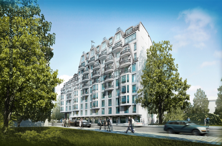
The house at the Chapaeva Street presents a dramatized intervention of the northern “Art Nouveau” into the mottled context of the former industrial park of Saint Petersburg's Petrograd Side.

23 December 2014
Object
mainImg
Architect:
Sergey Oreshkin
Firm:
A-Len
Object:
Residential building on the Chapaeva Street
Russia, St. Petersburg

2009 — 2014 / 2014 — 2015

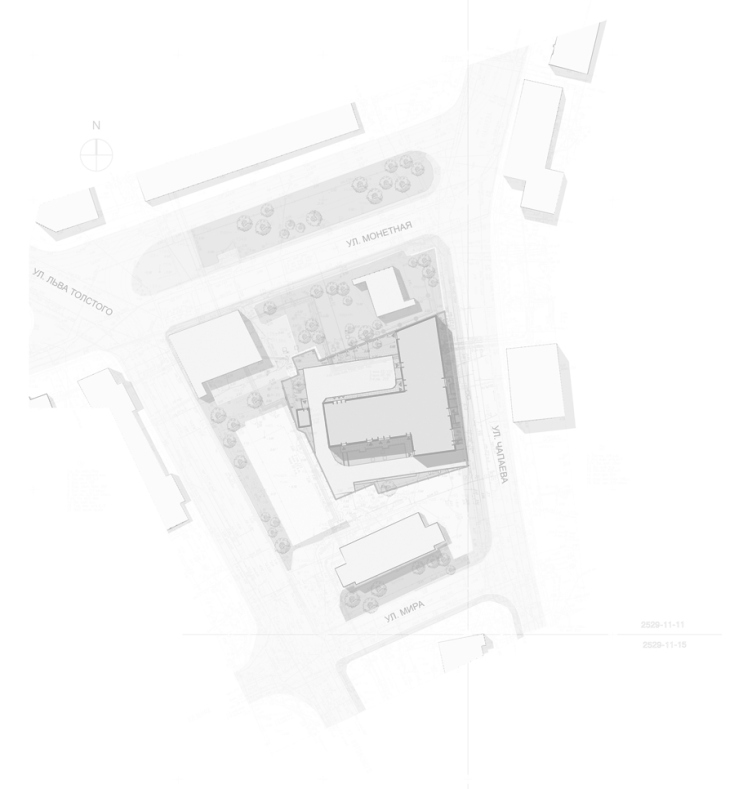
The ten-story residential house is now being built on the odd-numbered side of the Chapaeva street in the east side of the Petrograd Island (more frequently referred to as "Petrograd Side"). This place is a twenty minutes' walk away from the Petropavlovsk Fortress, and a ten minutes' walk away from the Kamennoostrovsky Avenue that was so upmarket in the early XX century. On its eastern end, however, closer to the Bolshaya Nevka River, the "upmarket" status as early as a hundred years ago gave way to the red-brick factory buildings, though still romantic-looking from today's standpoint - directly across from the house that is now being built upon the project by Sergey Oreshkin, there are buildings of the former cotton-spinning factory; besides, there used to be a "piano factory" nearby. The factories were grouped, probably, for technical reasons, close to the river, while the odd-numbered side of the Chapaeva Street remains - which is so unlike Saint-Petersburg - still "crumbly", as Sergey Oreshkin aptly described it: with a punctured line of houses intercepted by an odd tree or two. Nearby, there are: a lyceum, a bomb-shelter, an apartment house, and a sport ground. Still, though, the task was not to rob the neighboring houses of the appropriate insolation, as well as make the image of the new building match the historically formed environment. 

Which Sergey Oreshkin duly did, "pulling" the romantic image of a "castle" house executed in the "Art Nouveau" style from the Kamennoostrovsky Avenue to this street, to the once semi-industrial and now office and residential eastern part of the Petrograd Side. 

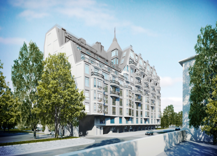
The two sections of the house are joined in a "T"-shaped fashion, the asymmetric horizontal stroke stretching along the street's red line, and the vertical stroke going into the yard, deeper into the trapeze-shaped land plot. The house is built according to the up-to-date standards: the reinforced-concrete framework, double skin facade ventilation, an underground parking garage, and the public functions on the first floor. The outward appearance of the house is also very much like a theater decoration where the stone, the light-hued stucco, the thin blacked-out window sashes, the cast-iron railings and even the grilles for mounting the air-conditioning units - everything plays into one single story, very romantic, according to the author's confession. Indeed, the resulting image of the house, on the one hand, brings up a steady association with the northern "Art Nouveau" style, and, on the other hand, the modernist style of Saint Petersburg's indigenous tenement houses is more austere and reserved, while the scale of the less-reserved villas of the Kamenny Island is significantly smaller - and one gets an impression that in this particular case the architect crossed the echoes of Saint Petersburg's Art Nouveau with the light fairy-tale ideas of the earlier times, namely, of the XIX century; at the back of one's mind now and then springs up some Neuschwanstein Castle once belonging to Ludwig of Bayern. 

The volumes and the decoration of the main facade grow richer as one's glance goes up. For example, the first floor of the main facade recedes deeper inside the building, freeing the pavement for the pedestrians bad forming an open-air street gallery resting on cantilevers without any columns. The volume of the second floor is almost completely devoid of any plastic, and it is only on the level of the third floor and higher up that the building gets bay windows that unite the next three floors (from the third to the sixth) and cast the curved shadows downwards. The wall sections between the bay windows are slit by three large windows, the middle one of which is accentuated by striped relief that looks slightly like the Parisian blinds but are softened by a characteristic wavy line.


From the fifth floor and higher up, there starts a dance of wide balconies with openwork railings - a balcony is a very important thing both in architecture and in the history of Saint-Petersburg, rainy weather no object - the Kseshinskaya Mansion, with its historical balcony, is also a fifteen minutes' walk away; both in the beginning of the Chapaeva and on the Malaya Posadskaya streets, one can see such balconies on the bay windows. This motif was quite common in the early XX century, although, back in those days it showed through in a more reserved manner; as for this particular case, the balconies grow not only from the bay windows alone: descending one floor down, they then climb up to the very top and adorn the four penthouses placed under the sharp Dutch tongs. 

The openwork grilles, echoed by the syncopated rhythm of the window frames successfully lighten the massive building, enticing the observer with a play supported by larger forms that also behave in a playful way: the tongs grow into the surface of the facade and now it is already hard to say where exactly their lines cross; although on top they alternate with the windows of a tall garret. The details of the sophisticated, and at places even decoratively fractured wave-shaped, composition look as if they came in motion still remembering their smooth shift, and the laws of balance and harmony. 

The balconies grow into stepping terraces of the southern part of the house - which would have been quite impossible in the northern "Art Nouveau" houses but which is quite common in modern architecture - caused by the insolation requirements, the steps of the terraces beautifully fall into groups growing into the tower at the crossing of the two sections of the house. Built in this way, the tower is found not on the corner - which one might expect from a stylization - but in the middle of the building; it is cut out from its mass like its very core, almost like a donjon or a city tower - possibly this is the reason why this building shows the uncharacteristic of the northern modernist style dramatic and associative qualities - it is quite a tall order to combine all the requirements of today with the historical image, and the plastic play, lightness, and transparency not only add to the "positive attitude" of this house but also make the rules of the rigid stylistic rules more bendable. It looks as though we found the tenement house of the modernist epoch at the moment of its hesitation as to whether it should turn into a city hall or a castle or an Italian villa - a moment of meditative growing-up, speculation on its own image, arrested search for identity (a true homage to deconstruction, really). 

The stepping composition that helps to conceal the considerable height and volume of the building has been used by Sergey Oreshkin many times already. In this particular case, it is interesting to note that the terrace facade is turned in the direction of the building that stands a bit at a distance, across the road, a building with a three-step facade, built more than a century ago, and enters into an active dialogue with it. In connection with the theme of the dialogue, we shall also note here that the side parts of the main facade resemble the firewalls of the neighboring buildings: they have no windows in them, and their only decoration is the completely unaccented cells of the austere rectangular niches that delicately structure the monotonous surfaces. 

The architecture of the house is just as complex as the task that the author had to handle. Suffice it to say that the thin layer of our society that is at all interested in architecture split in two: those who deny stylization as such and those who think it to be the only possible design solution for the historical cities, especially for Saint Petersburg - the two standpoints that cancel each other out. One way or another, it is known that Sergey Oreshkin dares to work both with the must up-to-date shapes and with the historical stylizations - for example, as recently as in 2013 he designed for Petrograd Side a large residential complex on the embankment of the Karpovka River - also in the spirit of the early XX century architecture but a little more pristine and austere: closer to neo-classics or even art-deco. In both of the examples, we see a rather professional command of the style and proportions of the source matter - always with a fine-tuning adjustment to the realities of today letting us know that the house was built only recently. Still, though, the Art Nouveau projects are comparatively predictable, and for the buildings that have to do with any historical styles, the implementation is especially important, and the quality of every detail matters. But then again, we only have a short while to go - the building will probably soon be completed. 

Recently, the house was awarded a prize at Urban Awards 2014 as "Best in-construction business class residential complex in Saint Petersburg".


Architect:
Sergey Oreshkin
Firm:
A-Len
Object:
Residential building on the Chapaeva Street
Russia, St. Petersburg

2009 — 2014 / 2014 — 2015

23 December 2014

Headlines now
The Golden Crown
The concept for a dental clinic in Yekaterinburg, developed by CNTR Studio, revolves around the idea of a “mouth full of gold”: pristine white porcelain stoneware walls are complemented by matte brass details. To avoid an overly literal interpretation, the architects focused on the building’s proportions, skillfully navigating between sunlight requirements and fire safety regulations.
Flexibility and Integration
Not long ago, we covered the project for the fourth phase of the ÁLIA residential complex, designed by APEX. Now, we’ve been shown different fence concepts they developed to enclose the complex’s private courtyards, incorporating a variety of public functions. We believe that the sheer fact that the complex’s architects were involved in such a detail as fencing speaks volumes.
A Step Forward
The HIDE residential complex represents a major milestone for ADM architects and their leaders Andrey Romanov and Ekaterina Kuznetsova in their quest for a fresh high-rise aesthetic – one that is flexible and layered, capable of bringing vibrancy to mass and silhouette while shaping form. Over recent years, this approach has become ADM’s “signature style”, with the golden HIDE tower playing a pivotal role in its evolution. Here, we delve into the project’s story, explore the details of the complex’s design, and uncover its core essence.
Gold in the Sands
A new office for a transcontinental company specializing in resource extraction and processing has opened in Dubai. Designed by T+T Architects, masters of creating spaces that are contemporary, diverse, flexible, and original, this project exemplifies their expertise. On the executive floor, a massive brass-clad partition dominates, while layered textures of compressed earth create a contextually resonant backdrop.
Layers and Levels of Flight
This project goes way back – Reserve Union won this architectural competition at the end of 2011, and the building was completed in 2018, so it’s practically “archival”. However, despite being relatively unknown, the building can hardly be considered “dated” and remains a prime example of architectural expression, particularly in the headquarters genre. And it’s especially fitting for an aviation company office. In some ways, it resembles the Aeroflot headquarters at Sheremetyevo but with its own unique identity, following the signature style of Vladimir Plotkin. In this article, we take an in-depth look at the United Aircraft Corporation (UAC) headquarters in the Moscow agglomeration town of Zhukovsky, supplemented by recent photographs from Alexey Naroditsky – a shoot that became only recently possible due to the fact that improvements were finally made in the surrounding area.
Light and Shadow
In this article, we delve into the architectural design of the “Chaika” house by DNK ag architects, which was recently completed in 2023 as part of the collection of signature designs at ZILArt. As is well-known, all the buildings in this complex follow a design code, yet each one is distinct. This particular building stands out not only for its whiteness and minimalism but also for the refined use of a limited number of techniques that, together, create what can confidently be called synergy.
Casus Novae
A master plan was developed for a large residential area with a name of “DNS City”, but now that its implementation began, the plan has been arbitrarily reformatted and replaced with something that, while similar on the surface, is actually quite different. This is not the first time such a thing happens, but it’s always frustrating. With permission from the author, we are sharing Maria Elkina’s post.
Treasure Hunting
The GAFA bureau, in collaboration with Tegola and Arkhitail, organized an expedition to the island of Kilpola in Karelia as part of Moskomarkhitektura’s “Open City” festival. There, amidst moss and rocks, the students sought answers to questions like: what is the sacred, where does it dwell, and what sustains it? Assisting the participants in this quest were landscape engineer Evgeny Levin, artist Nicholas Roerich, a moose, and the lack of cellular connection. Here’s how the story unfolded.
Depths of the Earth, Streams of Water
In the Malaya Okhta district, the Akzent building, designed by Stepan Liphart, was constructed. It follows a classic tripartite structure, yet it’s what you might call “hand-drawn”: each façade is unique in its form and details, some of which aren’t immediately noticeable. In this article, we explore the context and, together with the architect, delve into how the form was developed.
Fir Tree Dynamics
The “Airports of Region” holding is planning to build an airport in Karachay-Cherkessia, aiming to make the Arkhyz and Dombay resorts more accessible to travelers. The project that won in an invitation-only competition, submitted by Sergey Nikeshkin’s KPLN, blends natural imagery inspired by the shape of a conifer seed, open-air waiting spaces, majestic large trees, and a green roof elevated on needle-like columns. The result is both nature-inspired and WOW.
​A Brick Shell
In the process of designing a clubhouse situated among pine trees in a prestigious suburban area near Moscow, the architectural firm “A.Len” did the façade design part. The combination of different types of brick and masonry correlates with the volumetric and plastique solutions, further enhanced by the inclusion of wood-painted fragments and metal “glazing”.
Word Forms
ATRIUM architects love ambitious challenges, and for the firm’s thirtieth anniversary, they boldly play a game of words with an exhibition that dives deep into a self-created vocabulary. They immerse their projects – especially art installations – into this glossary, as if plunging into a current of their own. You feel as if you’re flowing through the veins of pure art, immersed in a universe of vertical cities, educational spaces – of which the architects are true masters – and the cultural codes of various locations. But what truly captivates is the bold statement that Vera Butko and Anton Nadtochy make, both through their work and this exhibition: architecture, above all, is art – the art of working with form and space.
Flexibility and Acuteness of Modernity
Luxurious, fluid, large “kokoshniks” and spiral barrel columns, as if made from colorful chewing gum: there seem to be no other mansion like this in Moscow, designed in the “Neo-Russian-Modern” style. And the “Teremok” on Malaya Kaluzhskaya, previously somewhat obscure, has “come alive with new colors” and gained visibility after its restoration for the office of the “architectural ecosystem” as the architects love to call themselves. It’s evident that Julius Borisov and the architects at UNK put their hearts into finding this new office and bringing it up to date. Let’s delve into the paradoxes of this mansion’s history and its plasticity. Spoiler: two versions of modernity meet here, both balancing on the razor’s edge of “what’s current”.
Yuri Vissarionov: “A modular house does not belong to the land”
It belongs to space, or to the air... It turns out that 3D printing is more effective when combined with a modular approach: the house is built in a workshop and then adapted to the site, including on uneven terrain. Yuri Vissarionov shares his latest experience in designing tourist complexes, both in central Russia and in the south. These include houseboats, homes printed from lightweight concrete using a 3D printer, and, of course, frame houses.
​Moscow’s First
“The quality of education largely depends on the quality of the educational environment”. This principle of the last decade has been realized by Sergey Skuratov in the project for the First Moscow Gymnasium on Rostovskaya Embankment in the Khamovniki district. The building seamlessly integrates into the complex urban landscape, responding both to the pedestrian flow of the city and the quiet alleyways. It skillfully takes advantage of the height differences and aligns with modern trends in educational space design. Let’s take a closer look.
Looking at the Water
The site of Villa Sonata stretches from the road to the water’s edge, offering its own shoreline, pier, and a picturesque river panorama. To reveal these sweeping views, Roman Leonidov “cut” the façade diagonally parallel to the river, thus getting two main axes for the house and, consequently, “two heads”. The internal core – two double-height spaces, a living room and a conservatory, with a “bridge” above them – makes the house both “transparent” and filled with light.
The White Wing
Well, it’s not exactly white. It’s more of a beige, white-stone structure that plays with the color of limestone – smoother surfaces are lighter, while rougher ones are darker. This wing unites various elements: it absorbs and interprets the surrounding themes. It responds to everything, yet maintains a cohesive expression – a challenging task! – while also incorporating recognizable features of its own, such as the dynamic cuts at the bottom, top, and middle.
Urban Dunes
The XSA Ramps team designed and built a three-part sports hub for a park in Rostov-on-Don, welcoming people of all ages and fitness levels. The skate plaza, pump track, and playground are all meticulously crafted with details that attract a diverse range of visitors. The technical execution of the shapes and slopes transforms this space into a kind of sculptural composition.
Proportional Growth
The project for the fourth phase of the ÁLIA residential area has been announced. The buildings are situated on an elongated plot – almost a “ray” that shoots out from the center of the area towards the river. Their layout reflects both a response to Moscow’s architectural preferences over the past 15 years, shifting “from blocks to towers”, and an interpretation of the neighboring business park designed by SOM. Additionally, the best apartments here are not located at the very top but closer to the middle, forming a glowing “waistline”.
The “Staircase” Building
In designing the “Details” residential complex in New Moscow, Rais Baishev spiced up the now-popular Moscow theme of a “courtyard” building with an idea drawn from the surrealist drawings by Maurits Escher. He envisioned the stepped silhouettes and descending slopes as a metaphysical mega-staircase, creating a key void within the courtyard that gave the project an internal “spine”. This concept is felt both in the building’s silhouette and on its façades.
Projection of the Quarter
No one doubted that the building that Vladimir Plotkin designed as part of the “Garden Quarters” would be the most modernist of all. And it turned out just that way: while adhering to the common design code, the building successfully combines brick and white stone, rhythmically responding to the neighboring building designed by Ostozhenka, yet tactfully and persistently making a few statements of its own. This includes the projection of the ideal urban development composition “14–9–6”, which can be found right next door, mathematical calculations, including those for various types of terraces (and perhaps the only reminder of the Soviet past of the Kauchuk rubber factory!), and the white “cross-stitch” pattern of the façade grid.
Domus Aurea
In this issue, we examine the “Tessinsky-1” house, designed by Sergey Skuratov and completed in 2023. Located in the middle of the Serebryanicheskaya Embankment district, at the intersection of its main streets, this house assumes a sort of “nodal” role: it not only responds to everything around it and preserves many memories of the former EMA factory within itself, but it weaves all this into a newly directed pattern, reconciling bright “gold” and dark-colored brick, largely with the help of the new, modern-yet-archaic Columba brick, which, come to think about it, is the most precious element here.
The Chimney of Nikola-Lenivets
In this issue, we are examining the “Obelisk House” designed by KATARSIS and built for the Arkhstoyanie 2023 festival. However, it was only finished later on, and this is why we are examining it now. It seems to us that after the “Obelisk House” appeared in Nikola-Lenivets, a dialogue and a few inner connections appeared between the temporary structures built here. These houses no longer look like “accidental neighbors”, more of which below.
​Periscope by the Bay
The jury awarded the second place in the competition for a public and cultural center in Petropavlovsk-Kamchatsky to the companies GORA (“Mountain”) and M4. In the consortium’s proposal, the building resembles a sperm whale with a calf swimming next to it or a periscope, whose lenses capture the most spectacular views from the surrounding landscape.
From Arcs to Dolmens
While working on the competition project for Petropavlovsk-Kamchatsky, ASADOV Architects prioritized the value of the natural and urban environment, aiming to preserve the balance of the location while minimizing the resemblance of the volume that they designed to a “traditional building”. The task was challenging, and the architects created three versions, one of which having been developed after the competition, where their main proposal took third place. However, the point of interest here is not the competition result but the continuity of creative thinking.
Hide and Seek
The ID Moskovskiy house, designed by Stepan Liphart in St. Petersburg, in the courtyards near Moskovskiy Avenue beyond the Obvodny Canal and recently completed, is notable for several reasons. Firstly, it has been realized with considerable accuracy, which is particularly significant as this is the first building where the architect was responsible not only for the facades but also for the layouts, allowing for better integration between the two. On the other hand, this building is interesting as an example of the “germination” of new architecture in the city: it draws on the best examples from the neighborhood and becomes an improved and developed sum of ideas found by the architect in the surrounding context.
The Big Twelve
Yesterday, the winners of the Moscow Mayor’s Architecture Award were announced and honored. Let’s take a look at what was awarded and, in some cases, even critique this esteemed award. After all, there is always room for improvement, right?
Above the Golden Horn
The residential complex “Philosophy” designed by T+T architects in Vladivostok, is one of the new projects in the “Golubinaya Pad” area, changing its development philosophy (pun intended) from single houses to a comprehensive approach. The buildings are organized along public streets, varying in height and format, with one house even executed in gallery typology, featuring a cantilever leaning on an art object.
Nuanced Alternative
How can you rhyme a square and space? Easily! But to do so, you need to rhyme everything you can possibly think of: weave everything together, like in a tensegrity structure, and find your own optics too. The new exhibition at GES-2 does just that, offering its visitor a new perspective on the history of art spanning 150 years, infused with the hope for endless multiplicity of worlds and art histories. Read on to see how this is achieved and how the exhibition design by Evgeny Ace contributes to it.
Blinds for Ice
An ice arena has been constructed in Domodedovo based on a project by Yuri Vissarionov Architects. To prevent the long façade, a technical requirement for winter sports facilities, from appearing monotonous, the architects proposed the use of suspended structures with multidirectional slats. This design protects the ice from direct sunlight while giving the wall texture and detail.