По-русски

Sunstroke: Avant-garde of the XXI Century

A daring plastic play with the volume of a giant multi-apartment complex just outside of Moscow: a sophisticated silhouette, impressive views and a beautiful-looking reminder of the fact that avant-garde is our all.

04 February 2015
Object
mainImg

The story of the residential complex in Moscow's suburb of Odintsovo started simultaneously with the story of the complex "Water Colors" in Balashikha - during the crisis of 2008. It was at that time that "Tekta" company thought nothing of launching two large-scale projects at once, turning to "Ostozhenka" Bureau. Today, both complexes have been successfully put into operation, and, furthermore, got several honorable mentions as the model residential projects that meet all the requirements of forming a quality urban environment. Just one example: at Arch Moscow 2014, they both were short-listed as the most relevant projects for the quarter construction and development in Russia. 

In both cases, the architects were required to build, on a limited land plot, a residential complex of impressive dimensions. "The main thing to remember while doing such projects is not to indulge in any kind of excesses - says Alexander Skokan - Our work was all about making the giant building look appropriate in its place using various techniques: arches, color spots, work with scale and silhouette... These are compositional and plastic techniques, the building does not grow any smaller just because of them but you still can get interesting visual effects that help liven up the boredom of the contemporary construction. I think that the yard space of the Odintsovo complex turned out to be interesting and even exciting specifically thanks to its giant arches". 

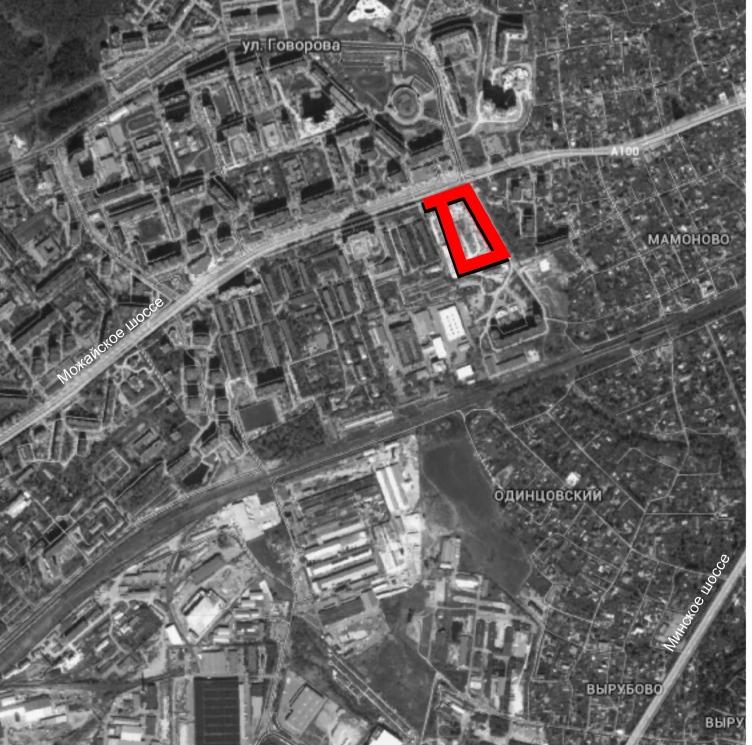
The land plot on which the house has been built is in fact the territory of a former motor pool located at the driveway from Moscow to Odintsovo, to the left of the Mozhaisk Highway where the scattered private cottages give way to residential high-rises. The place was suggestive of creating here a prominent building, an “entrance” landmark of sorts, outstanding and memorable, signifying the change from the village to the city scale. 


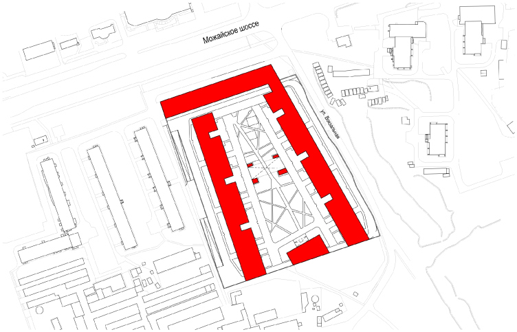
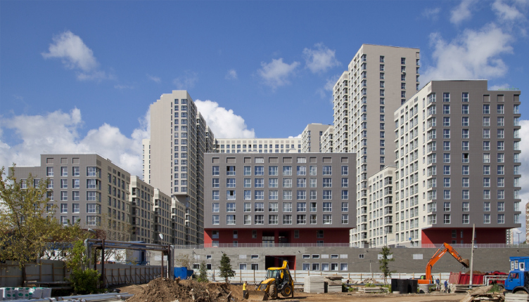
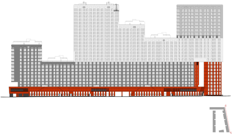
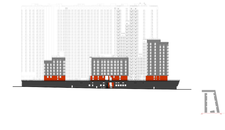
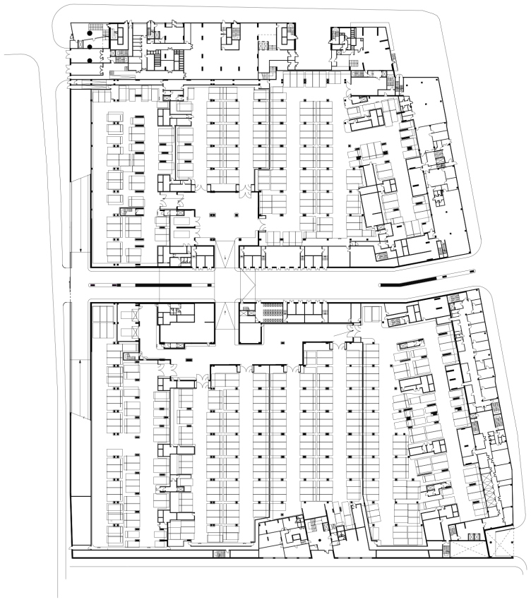
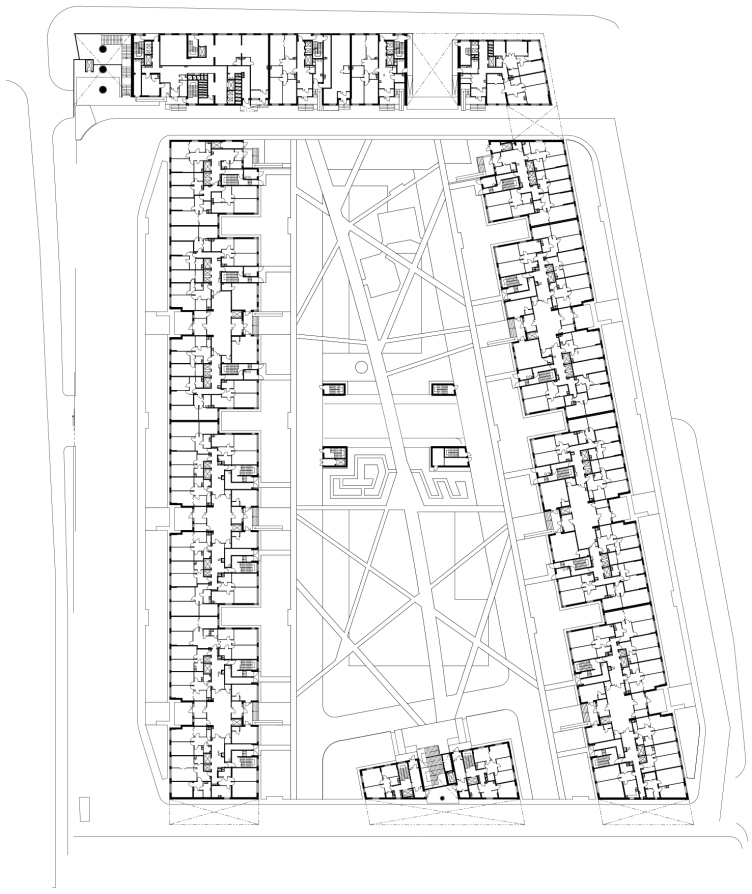
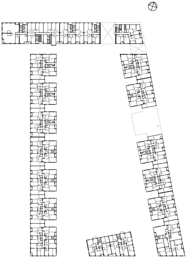
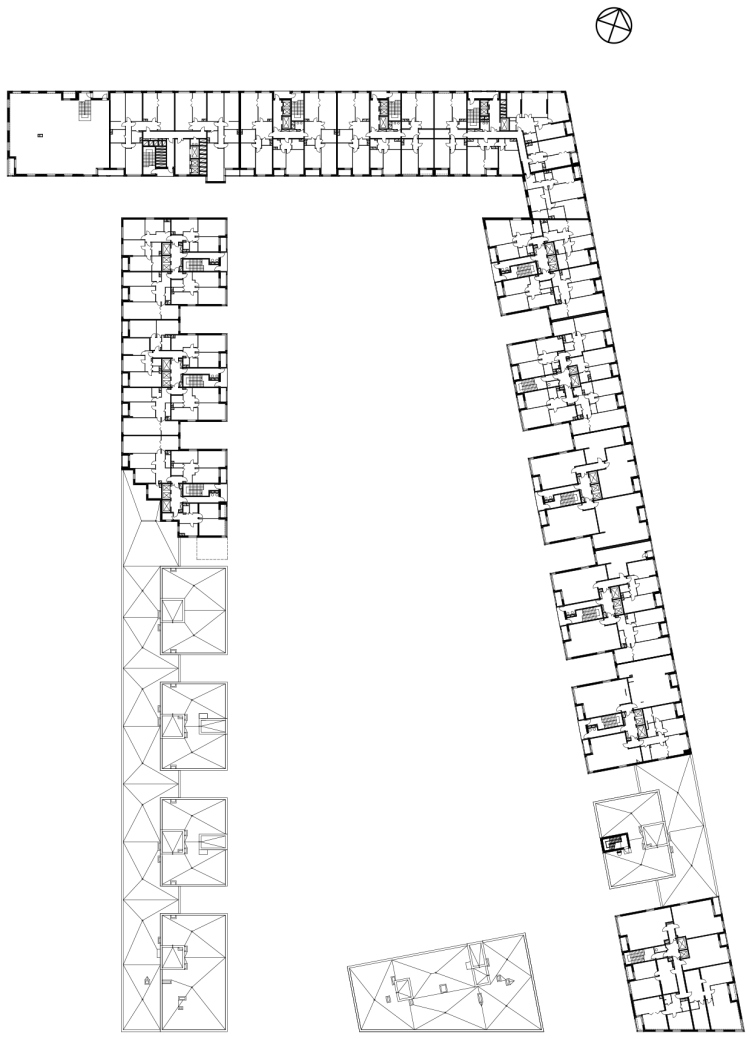
From the standpoint of planning techniques, the project follows the principles of quarterly development - so it is not surprising that it represented the so-recently-popular genre at Arch Moscow. Raised on a single stylobate one level above the ground, the three units "embrace" the trapeze-shaped land plot along its perimeter. One of them, the longest, marks the borders from the northeast and from the northwest, forming almost a right angle along the Vokzalnaya Street and the Mozhaisk Highway. The second - stands like an impregnable bastion on the western border of the plot. The third building, the most compact one, occupies the south position leaving wide passages that lead to the landscaped yard organized upon the stylobate.


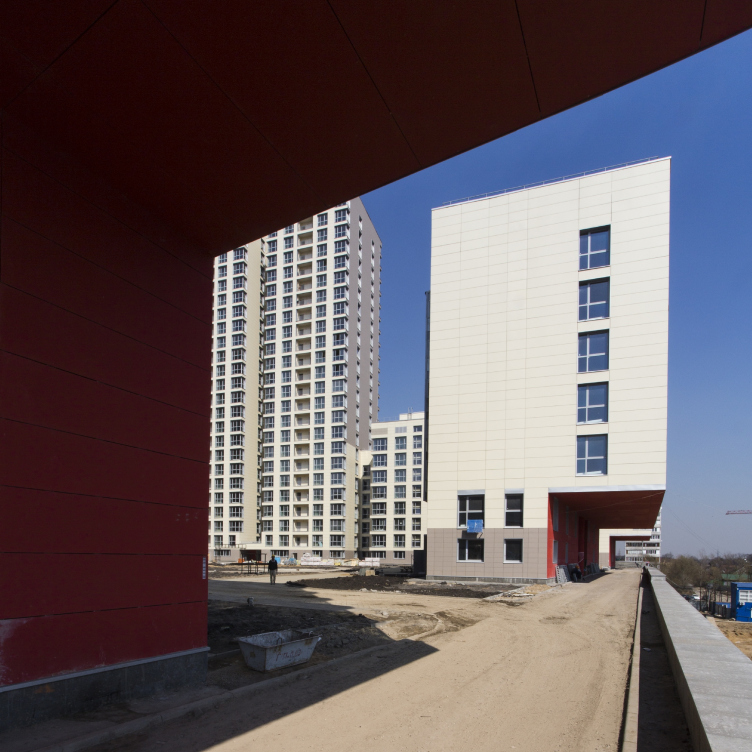
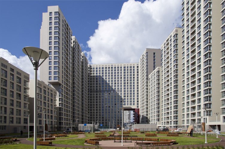
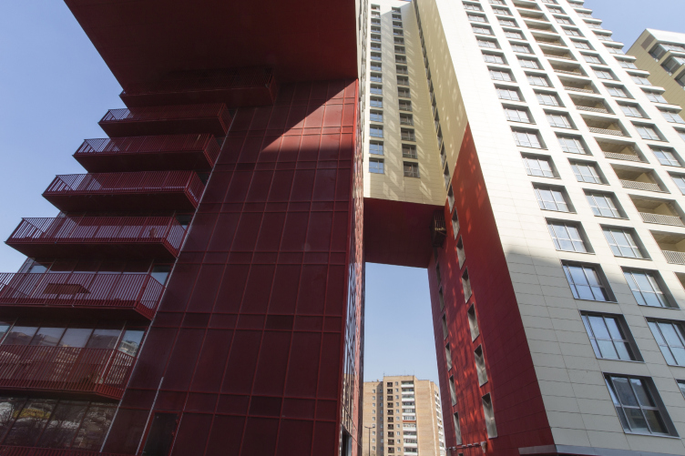
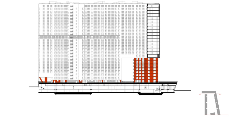
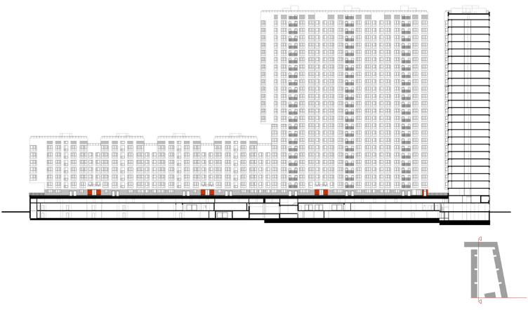
What is interesting is the fact that the yard here is of a two-level kind - not a yard, really, but a curious vertical structure: the upper one, green and quiet, spreads on the roof of the stylobate, while the busy upper one, with a whole system of driveways and streets, one piercing the whole complex from bed to end, hides inside. This solution helped to significantly save up the territory that was initially, as usual, barely enough for the construction of such a large residential complex. Besides, by raising the yard one floor up in the air, the architects were able to make it almost completely vehicle-free, providing only the fire lanes stretching along the outer side of the complex - under the beautiful cantilevers. 


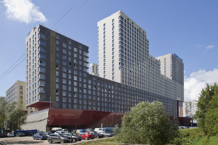
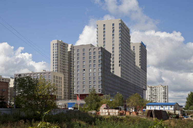
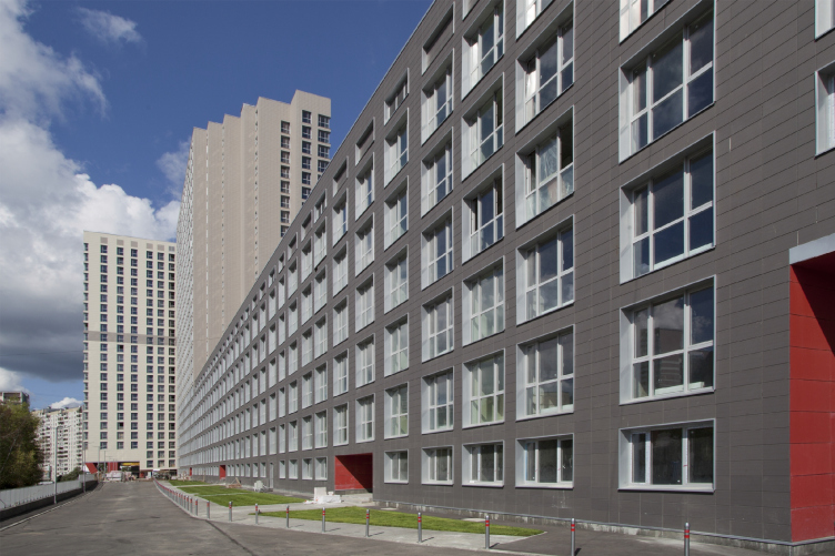
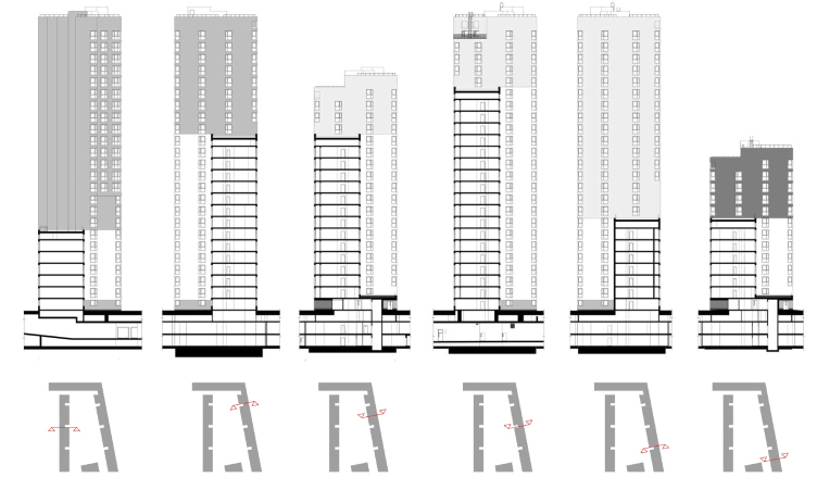
With the rather simple and laconic planning, the first thing that catches one's eye when looking at the complex is its incredibly sophisticated silhouette with a height drop from five to seven floors. The authors say that these height drops are their response to the requirement to observe the insolation norms and provide the necessary amount of light for the people living in the new complex and for the people from the neighboring houses. It seems to me that this is false modesty, though: coming up and drawing in detail a sophisticated silhouette is always more difficult and time-consuming than finding a simple and efficient solution with the help of an insolation ruler superimposed upon the master plan. In this case, however, the insolation ruler was not the ultimate means but one of the designing instruments. As a result, in the part where the land plot borders closely on the residential five-story buildings, the height of the new complex drops down to seven floors. From the direction of the Vokzalnaya Street, where, at some distance from the construction site, three twelve-story buildings are situated, the border of the complex is formed by a jagged stepping block whose skyline follows the sun rays so as not to be on the neighbors' light. 

The authors also found a way to provide the necessary amount of light for the apartments inside of the yard. Obviously, the decrease in the number of floors considerably influenced the end output of square meters. The loss was to be made up for: this is how the idea to play around with the typology of the apartments. We already wrote about the "Ostozhenka" architects dealing with a similar challenge when building "Water Colors" residential complex. In this case, a slightly different solution was found: in order to squeeze the required amount of square footage into the given dimensions, the architects took the buildings that marked the boundaries of the complex, and stretched them up to twenty-two meters as opposed to the regular sixteen. This was possible thanks to the deep vertical niches that at large intervals pierce the volumes of the buildings all along the length of the complex. Around the niches, the architects placed the kitchens whose windows overlook the yard, while the living rooms and the bedrooms get the maximum amount of ambient light. 

Apart from the interesting typological solution and the necessary "square footage output", the architects were able to come up with a very attractive image of the inside-the-yard facades. Thanks to the deep cutaway niches, the yard-oriented facades turned into a semblance of slender towers of different height that form fractured and variously-scaled development that is really human-proportionate. The rhythm of the pattern formed by the walls, together with the different heights of the volumes, makes the complex look like a giant church organ or maybe some rocky mountain. 

Especially beautiful and robust the complex looks in the rays in the setting sun when its slanting rays - one of the main instruments of shape-building, they really do a great "carving" sculptural job here - cast long shadows on the walls of the complex, and the whole things stats looking pretty sci-fi. In a word, a "sunstroke", as the authors who highly appreciate the meaning of the sunlight in making their architecture complete aptly called it. 


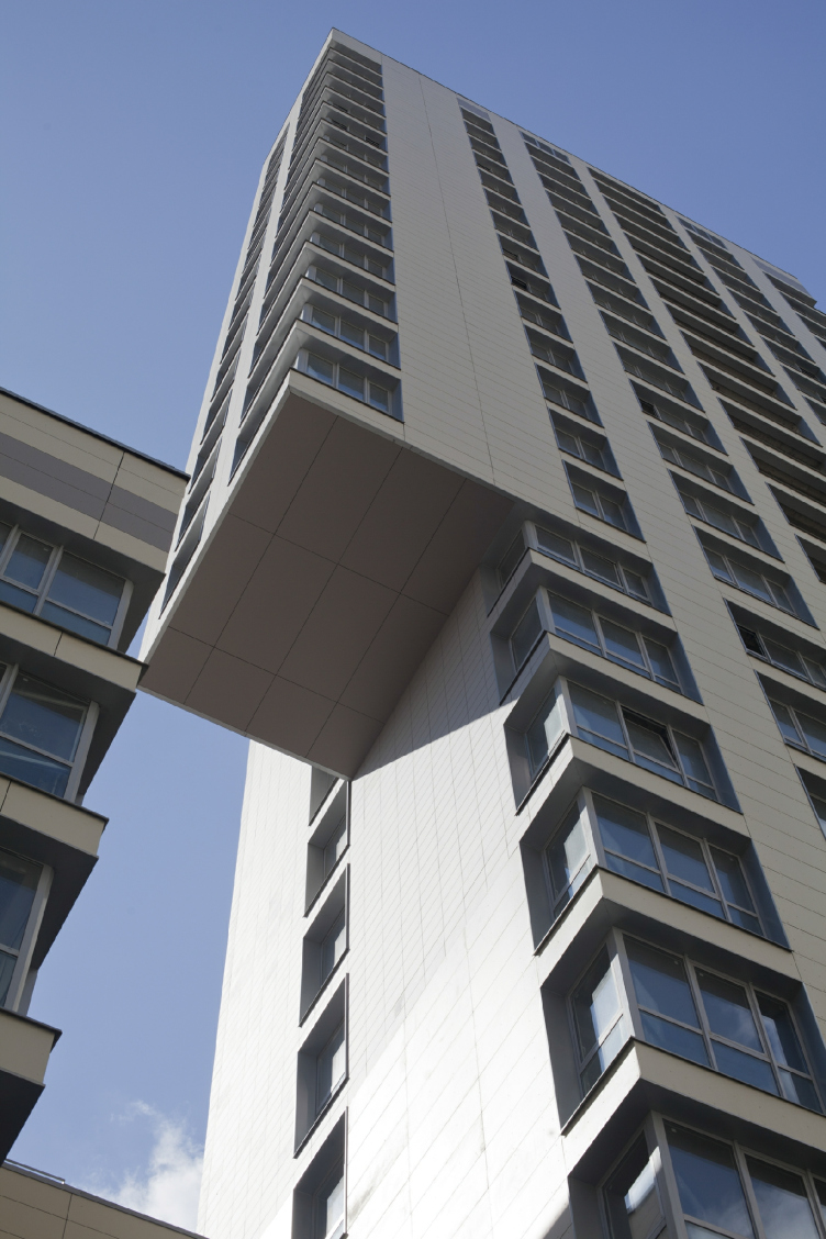
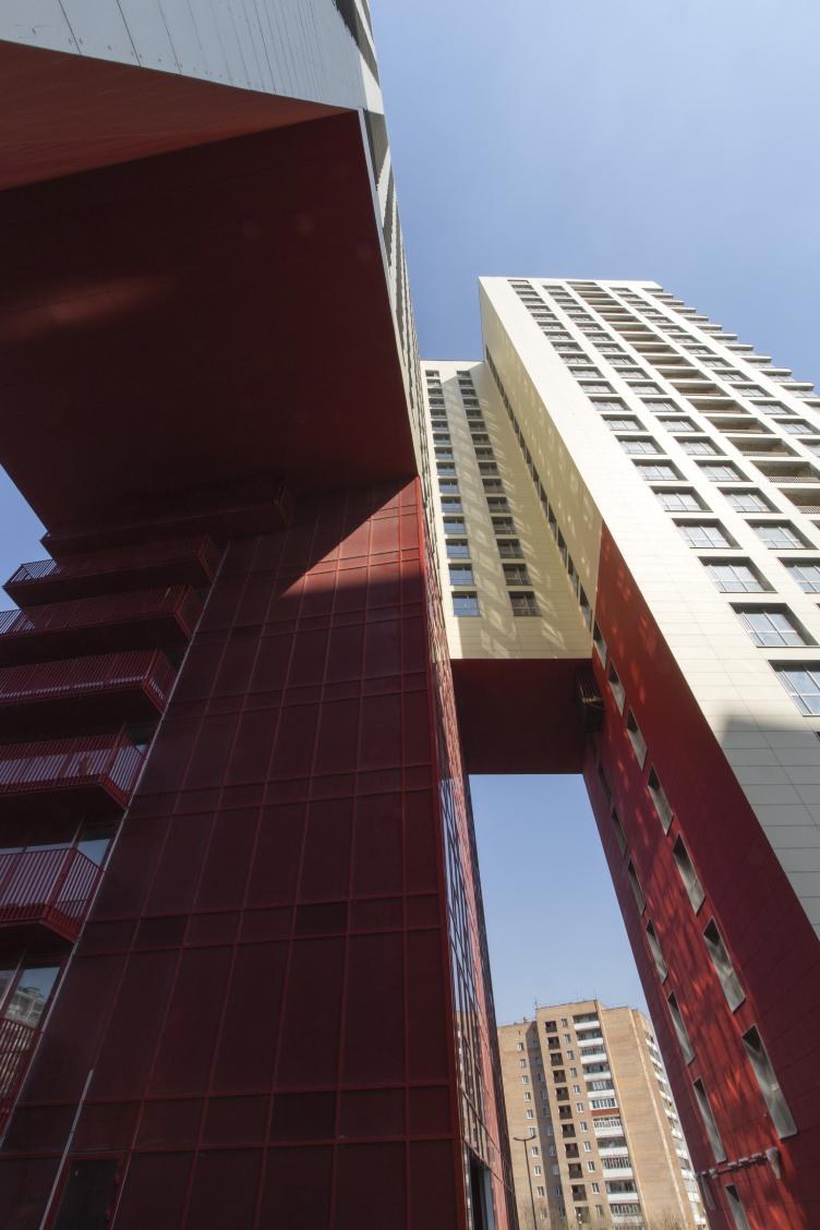
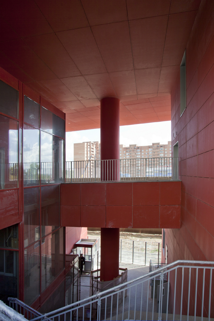
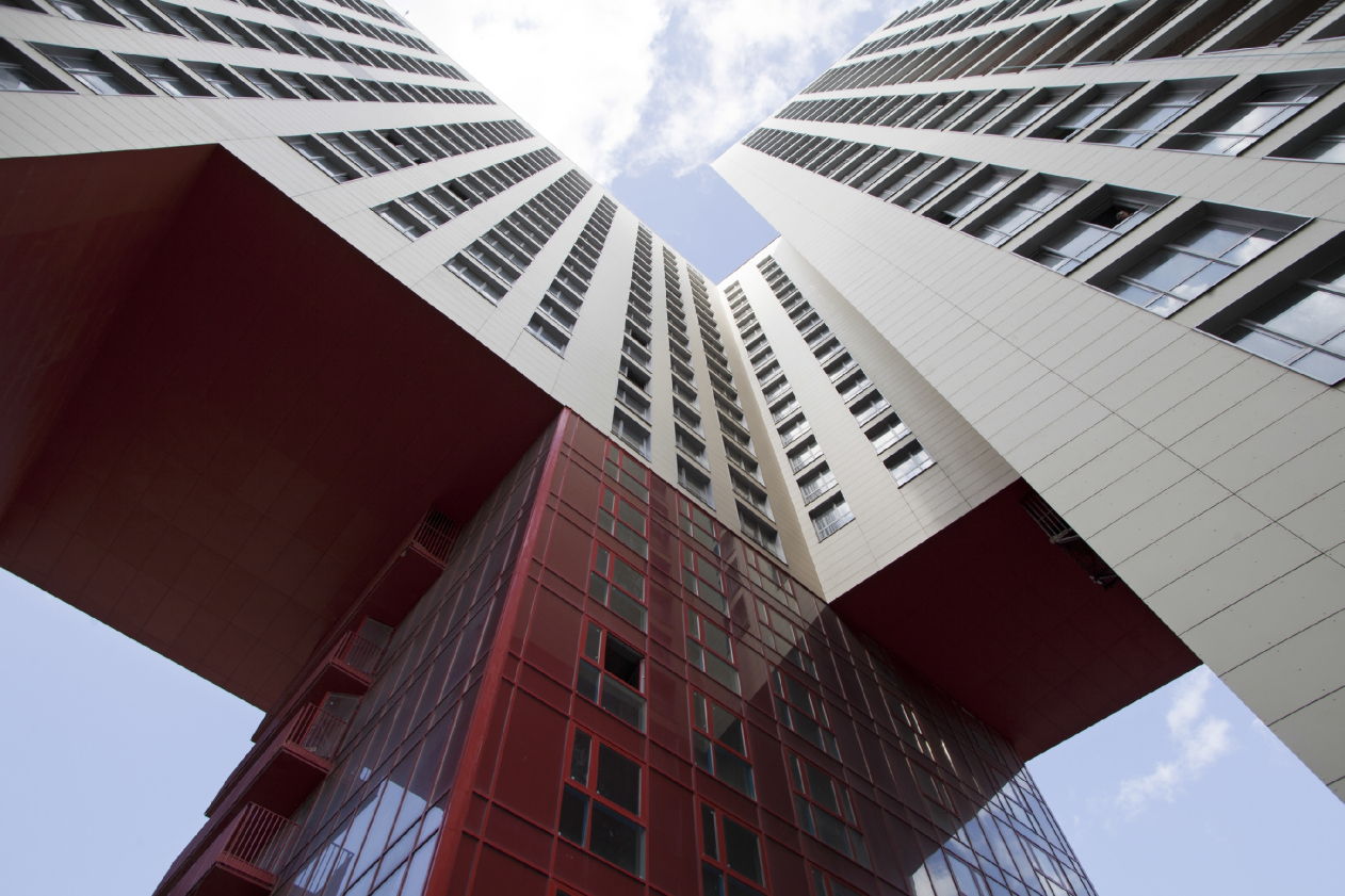
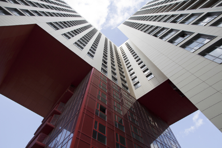
However, it was not the sun that the architects were inspired by, or, rather, not the sun alone. The whole image of the complex vividly shows its creators' love for the Russian avant-garde tradition. This can be seen both from the usual "constructivist" colors - gray, white, red, and crimson - and by the thought-out work with the form where particular attention is paid not only to the substance but to the void as well. Giant "chunks" of the body of the building get simply taken out of it, like, for example, the cantilevers overhanging above the fire lanes or the already-mentioned vertical niches. Also, the substance-and-void vocabulary of constructivism gives birth to the opening that appears between the northwest and northeast buildings, through which, like through a ravine, the rays of the setting sun penetrate into the yard. Another sunstroke, to be sure. 

The most outstanding element in this array of voids, however, is the huge arch that pierces one of the buildings from end to end and opens up a magnificent view of the Mozhaisk Highway, the town's main transport artery. A corner of the twenty-five story building ominously overhangs in the air. As for its support, it is provided, in the classic tradition of Russian avant-garde, by the bright-red volume placed inside this giant arch (also painted red). A red parallelepiped inside a red cube! This "red leg" in fact functions as the landmark of the entrance of the city - bright and memorable. 

"...Based on the architectural experience of the 1920's, and using their lexicon, we tried to revise this territory in our own unique way - shares Rais Baishev - For the language of architecture, painting, and sculpture, air is oftentimes more important than substance is. Hence the huge cantilevers and the giant arch that leaves the complex devoid of at least fifteen fully-fledged apartments, and the "slit" between two buildings, the one that gives you the feeling of space". 

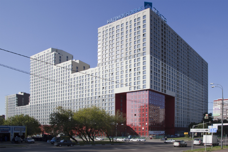
The street facades that correspond not to the human, but already to the city scale, are designed in a different way. Here, the smooth and uninterrupted surfaces of the walls are devoid of any plastics whatsoever. The "fractured" feel of one's perception of it is only provided by the stepping silhouette and the color solution that let the architects prevent the volume from looking too big or too bulky. The opaque but still saturated gray color of the crowning part of the complex blends with the tones of the overcast leaden sky. As for the main body of the building that is "tied up" to the skyline of the surrounding houses, it was designed unobtrusive white. Thus, the facade looks as if a strict horizon line was drawn upon it: everything that is below it belongs to the city, everything that is above - to the sky. 

The desire to soften the volume and make it proportionate not only to humans but also to the environment shoes in details. For example, to conceal the massiveness of the main volumes, the architects came up with corner windows - and the pieces of glass look as if they were "embracing" the corners of the building. And this is yet another curtsy to the ideas of Bauhaus and Russian constructivism. Very large, floor-to-ceiling and equal in their size square glass apertures set the general rhythm for the entire complex, and, besides, create extra possibilities for developing one's interior design ideas. 

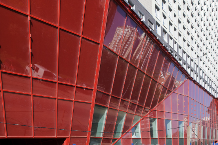
The entire necessary social infrastructure is situated in the stylobate whose plastic and color solution is perceived not from distant vantage points but when one comes close to it. On the level of the first floor, as an offset to the flat vertical forms of the residential units, the facade of the non-residential part is designed in as plastic a manner as possible. Executed from colored glass, it reminds a stylized surrealistic river bank, washed out by the whitewater flow or maybe a fragment of rock with bright-red clay loam inserts showing through... And this is now the waterline through which the sun shines "undulating on the water of the broad lakes".

04 February 2015

Headlines now
The Golden Crown
The concept for a dental clinic in Yekaterinburg, developed by CNTR Studio, revolves around the idea of a “mouth full of gold”: pristine white porcelain stoneware walls are complemented by matte brass details. To avoid an overly literal interpretation, the architects focused on the building’s proportions, skillfully navigating between sunlight requirements and fire safety regulations.
Flexibility and Integration
Not long ago, we covered the project for the fourth phase of the ÁLIA residential complex, designed by APEX. Now, we’ve been shown different fence concepts they developed to enclose the complex’s private courtyards, incorporating a variety of public functions. We believe that the sheer fact that the complex’s architects were involved in such a detail as fencing speaks volumes.
A Step Forward
The HIDE residential complex represents a major milestone for ADM architects and their leaders Andrey Romanov and Ekaterina Kuznetsova in their quest for a fresh high-rise aesthetic – one that is flexible and layered, capable of bringing vibrancy to mass and silhouette while shaping form. Over recent years, this approach has become ADM’s “signature style”, with the golden HIDE tower playing a pivotal role in its evolution. Here, we delve into the project’s story, explore the details of the complex’s design, and uncover its core essence.
Gold in the Sands
A new office for a transcontinental company specializing in resource extraction and processing has opened in Dubai. Designed by T+T Architects, masters of creating spaces that are contemporary, diverse, flexible, and original, this project exemplifies their expertise. On the executive floor, a massive brass-clad partition dominates, while layered textures of compressed earth create a contextually resonant backdrop.
Layers and Levels of Flight
This project goes way back – Reserve Union won this architectural competition at the end of 2011, and the building was completed in 2018, so it’s practically “archival”. However, despite being relatively unknown, the building can hardly be considered “dated” and remains a prime example of architectural expression, particularly in the headquarters genre. And it’s especially fitting for an aviation company office. In some ways, it resembles the Aeroflot headquarters at Sheremetyevo but with its own unique identity, following the signature style of Vladimir Plotkin. In this article, we take an in-depth look at the United Aircraft Corporation (UAC) headquarters in the Moscow agglomeration town of Zhukovsky, supplemented by recent photographs from Alexey Naroditsky – a shoot that became only recently possible due to the fact that improvements were finally made in the surrounding area.
Light and Shadow
In this article, we delve into the architectural design of the “Chaika” house by DNK ag architects, which was recently completed in 2023 as part of the collection of signature designs at ZILArt. As is well-known, all the buildings in this complex follow a design code, yet each one is distinct. This particular building stands out not only for its whiteness and minimalism but also for the refined use of a limited number of techniques that, together, create what can confidently be called synergy.
Casus Novae
A master plan was developed for a large residential area with a name of “DNS City”, but now that its implementation began, the plan has been arbitrarily reformatted and replaced with something that, while similar on the surface, is actually quite different. This is not the first time such a thing happens, but it’s always frustrating. With permission from the author, we are sharing Maria Elkina’s post.
Treasure Hunting
The GAFA bureau, in collaboration with Tegola and Arkhitail, organized an expedition to the island of Kilpola in Karelia as part of Moskomarkhitektura’s “Open City” festival. There, amidst moss and rocks, the students sought answers to questions like: what is the sacred, where does it dwell, and what sustains it? Assisting the participants in this quest were landscape engineer Evgeny Levin, artist Nicholas Roerich, a moose, and the lack of cellular connection. Here’s how the story unfolded.
Depths of the Earth, Streams of Water
In the Malaya Okhta district, the Akzent building, designed by Stepan Liphart, was constructed. It follows a classic tripartite structure, yet it’s what you might call “hand-drawn”: each façade is unique in its form and details, some of which aren’t immediately noticeable. In this article, we explore the context and, together with the architect, delve into how the form was developed.
Fir Tree Dynamics
The “Airports of Region” holding is planning to build an airport in Karachay-Cherkessia, aiming to make the Arkhyz and Dombay resorts more accessible to travelers. The project that won in an invitation-only competition, submitted by Sergey Nikeshkin’s KPLN, blends natural imagery inspired by the shape of a conifer seed, open-air waiting spaces, majestic large trees, and a green roof elevated on needle-like columns. The result is both nature-inspired and WOW.
​A Brick Shell
In the process of designing a clubhouse situated among pine trees in a prestigious suburban area near Moscow, the architectural firm “A.Len” did the façade design part. The combination of different types of brick and masonry correlates with the volumetric and plastique solutions, further enhanced by the inclusion of wood-painted fragments and metal “glazing”.
Word Forms
ATRIUM architects love ambitious challenges, and for the firm’s thirtieth anniversary, they boldly play a game of words with an exhibition that dives deep into a self-created vocabulary. They immerse their projects – especially art installations – into this glossary, as if plunging into a current of their own. You feel as if you’re flowing through the veins of pure art, immersed in a universe of vertical cities, educational spaces – of which the architects are true masters – and the cultural codes of various locations. But what truly captivates is the bold statement that Vera Butko and Anton Nadtochy make, both through their work and this exhibition: architecture, above all, is art – the art of working with form and space.
Flexibility and Acuteness of Modernity
Luxurious, fluid, large “kokoshniks” and spiral barrel columns, as if made from colorful chewing gum: there seem to be no other mansion like this in Moscow, designed in the “Neo-Russian-Modern” style. And the “Teremok” on Malaya Kaluzhskaya, previously somewhat obscure, has “come alive with new colors” and gained visibility after its restoration for the office of the “architectural ecosystem” as the architects love to call themselves. It’s evident that Julius Borisov and the architects at UNK put their hearts into finding this new office and bringing it up to date. Let’s delve into the paradoxes of this mansion’s history and its plasticity. Spoiler: two versions of modernity meet here, both balancing on the razor’s edge of “what’s current”.
Yuri Vissarionov: “A modular house does not belong to the land”
It belongs to space, or to the air... It turns out that 3D printing is more effective when combined with a modular approach: the house is built in a workshop and then adapted to the site, including on uneven terrain. Yuri Vissarionov shares his latest experience in designing tourist complexes, both in central Russia and in the south. These include houseboats, homes printed from lightweight concrete using a 3D printer, and, of course, frame houses.
​Moscow’s First
“The quality of education largely depends on the quality of the educational environment”. This principle of the last decade has been realized by Sergey Skuratov in the project for the First Moscow Gymnasium on Rostovskaya Embankment in the Khamovniki district. The building seamlessly integrates into the complex urban landscape, responding both to the pedestrian flow of the city and the quiet alleyways. It skillfully takes advantage of the height differences and aligns with modern trends in educational space design. Let’s take a closer look.
Looking at the Water
The site of Villa Sonata stretches from the road to the water’s edge, offering its own shoreline, pier, and a picturesque river panorama. To reveal these sweeping views, Roman Leonidov “cut” the façade diagonally parallel to the river, thus getting two main axes for the house and, consequently, “two heads”. The internal core – two double-height spaces, a living room and a conservatory, with a “bridge” above them – makes the house both “transparent” and filled with light.
The White Wing
Well, it’s not exactly white. It’s more of a beige, white-stone structure that plays with the color of limestone – smoother surfaces are lighter, while rougher ones are darker. This wing unites various elements: it absorbs and interprets the surrounding themes. It responds to everything, yet maintains a cohesive expression – a challenging task! – while also incorporating recognizable features of its own, such as the dynamic cuts at the bottom, top, and middle.
Urban Dunes
The XSA Ramps team designed and built a three-part sports hub for a park in Rostov-on-Don, welcoming people of all ages and fitness levels. The skate plaza, pump track, and playground are all meticulously crafted with details that attract a diverse range of visitors. The technical execution of the shapes and slopes transforms this space into a kind of sculptural composition.
Proportional Growth
The project for the fourth phase of the ÁLIA residential area has been announced. The buildings are situated on an elongated plot – almost a “ray” that shoots out from the center of the area towards the river. Their layout reflects both a response to Moscow’s architectural preferences over the past 15 years, shifting “from blocks to towers”, and an interpretation of the neighboring business park designed by SOM. Additionally, the best apartments here are not located at the very top but closer to the middle, forming a glowing “waistline”.
The “Staircase” Building
In designing the “Details” residential complex in New Moscow, Rais Baishev spiced up the now-popular Moscow theme of a “courtyard” building with an idea drawn from the surrealist drawings by Maurits Escher. He envisioned the stepped silhouettes and descending slopes as a metaphysical mega-staircase, creating a key void within the courtyard that gave the project an internal “spine”. This concept is felt both in the building’s silhouette and on its façades.
Projection of the Quarter
No one doubted that the building that Vladimir Plotkin designed as part of the “Garden Quarters” would be the most modernist of all. And it turned out just that way: while adhering to the common design code, the building successfully combines brick and white stone, rhythmically responding to the neighboring building designed by Ostozhenka, yet tactfully and persistently making a few statements of its own. This includes the projection of the ideal urban development composition “14–9–6”, which can be found right next door, mathematical calculations, including those for various types of terraces (and perhaps the only reminder of the Soviet past of the Kauchuk rubber factory!), and the white “cross-stitch” pattern of the façade grid.
Domus Aurea
In this issue, we examine the “Tessinsky-1” house, designed by Sergey Skuratov and completed in 2023. Located in the middle of the Serebryanicheskaya Embankment district, at the intersection of its main streets, this house assumes a sort of “nodal” role: it not only responds to everything around it and preserves many memories of the former EMA factory within itself, but it weaves all this into a newly directed pattern, reconciling bright “gold” and dark-colored brick, largely with the help of the new, modern-yet-archaic Columba brick, which, come to think about it, is the most precious element here.
The Chimney of Nikola-Lenivets
In this issue, we are examining the “Obelisk House” designed by KATARSIS and built for the Arkhstoyanie 2023 festival. However, it was only finished later on, and this is why we are examining it now. It seems to us that after the “Obelisk House” appeared in Nikola-Lenivets, a dialogue and a few inner connections appeared between the temporary structures built here. These houses no longer look like “accidental neighbors”, more of which below.
​Periscope by the Bay
The jury awarded the second place in the competition for a public and cultural center in Petropavlovsk-Kamchatsky to the companies GORA (“Mountain”) and M4. In the consortium’s proposal, the building resembles a sperm whale with a calf swimming next to it or a periscope, whose lenses capture the most spectacular views from the surrounding landscape.
From Arcs to Dolmens
While working on the competition project for Petropavlovsk-Kamchatsky, ASADOV Architects prioritized the value of the natural and urban environment, aiming to preserve the balance of the location while minimizing the resemblance of the volume that they designed to a “traditional building”. The task was challenging, and the architects created three versions, one of which having been developed after the competition, where their main proposal took third place. However, the point of interest here is not the competition result but the continuity of creative thinking.
Hide and Seek
The ID Moskovskiy house, designed by Stepan Liphart in St. Petersburg, in the courtyards near Moskovskiy Avenue beyond the Obvodny Canal and recently completed, is notable for several reasons. Firstly, it has been realized with considerable accuracy, which is particularly significant as this is the first building where the architect was responsible not only for the facades but also for the layouts, allowing for better integration between the two. On the other hand, this building is interesting as an example of the “germination” of new architecture in the city: it draws on the best examples from the neighborhood and becomes an improved and developed sum of ideas found by the architect in the surrounding context.
The Big Twelve
Yesterday, the winners of the Moscow Mayor’s Architecture Award were announced and honored. Let’s take a look at what was awarded and, in some cases, even critique this esteemed award. After all, there is always room for improvement, right?
Above the Golden Horn
The residential complex “Philosophy” designed by T+T architects in Vladivostok, is one of the new projects in the “Golubinaya Pad” area, changing its development philosophy (pun intended) from single houses to a comprehensive approach. The buildings are organized along public streets, varying in height and format, with one house even executed in gallery typology, featuring a cantilever leaning on an art object.
Nuanced Alternative
How can you rhyme a square and space? Easily! But to do so, you need to rhyme everything you can possibly think of: weave everything together, like in a tensegrity structure, and find your own optics too. The new exhibition at GES-2 does just that, offering its visitor a new perspective on the history of art spanning 150 years, infused with the hope for endless multiplicity of worlds and art histories. Read on to see how this is achieved and how the exhibition design by Evgeny Ace contributes to it.
Blinds for Ice
An ice arena has been constructed in Domodedovo based on a project by Yuri Vissarionov Architects. To prevent the long façade, a technical requirement for winter sports facilities, from appearing monotonous, the architects proposed the use of suspended structures with multidirectional slats. This design protects the ice from direct sunlight while giving the wall texture and detail.