По-русски

From Kaliningrad to Koenigsberg and back

The projects by the finalists of the contest for the development of Kaliningrad's historical center

17 October 2014
Contest Results
mainImg
In this issue, we are covering the projects done by the finalists of the international architectural and town-planning contest for the best concept of developing Kaliningrad's city center. The first place was won by the project of "Studio 44" and its leader Nikita Yavein prepared in cooperation with Saint Petersburg's Institute of Territorial Development; this project is covered in this specially dedicated issue. 


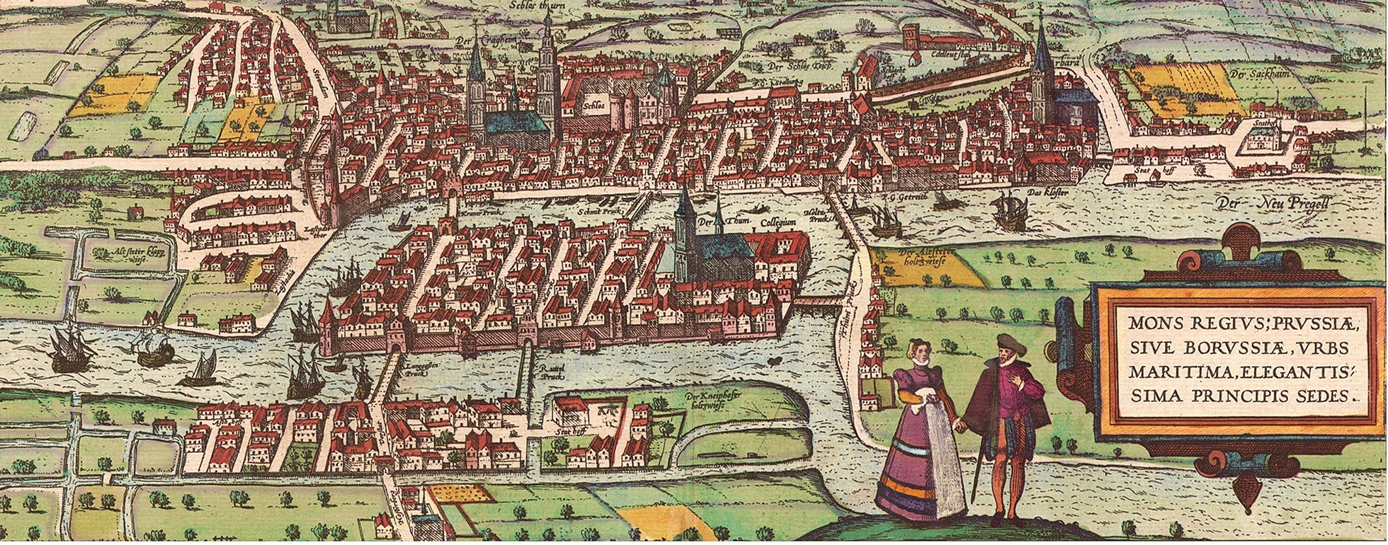
Plan of Koenigsberg by Braun, 1581 Source: Town-planning bureau “Heart of the City”, www.tuwangste.ru

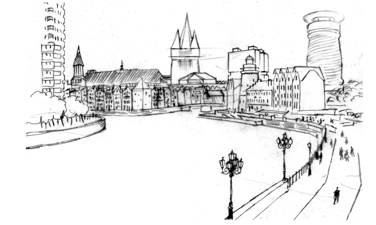
The subject of the contest was the King's Mountain (actually, this is how the name of Koenigsberg translates from German) with the remnants of the king's castle founded back in 1255 and its immediate surroundings where during the Middle Ages there were the towns of Alpstadt, Lebenicht, Kneipfhof, and Vorstadt, as well as the Lomse Island lying at the junction of the Old and New Pregola rivers. This oldest district of Koenigsberg was almost completely destroyed by the bombings during the WWII. All that survived was the gothic cathedral on the island (1333–1380) with the grave of Immanuel Kant in it, the building of the Stock Exchange of 1875; the Jewish orphanage of 1904 and a few other buildings. Also, two bridges survived, the Medovy ("Honey") and the Derevyanny ("Wooden") that made the list of the famous seven bridges one had to cross without stepping on a single one of them twice - a problem that was scientifically proved unsolvable in 1736 by Leonhard Euler who concurrently to that developed the theory of graphs and founded the science of topology. 

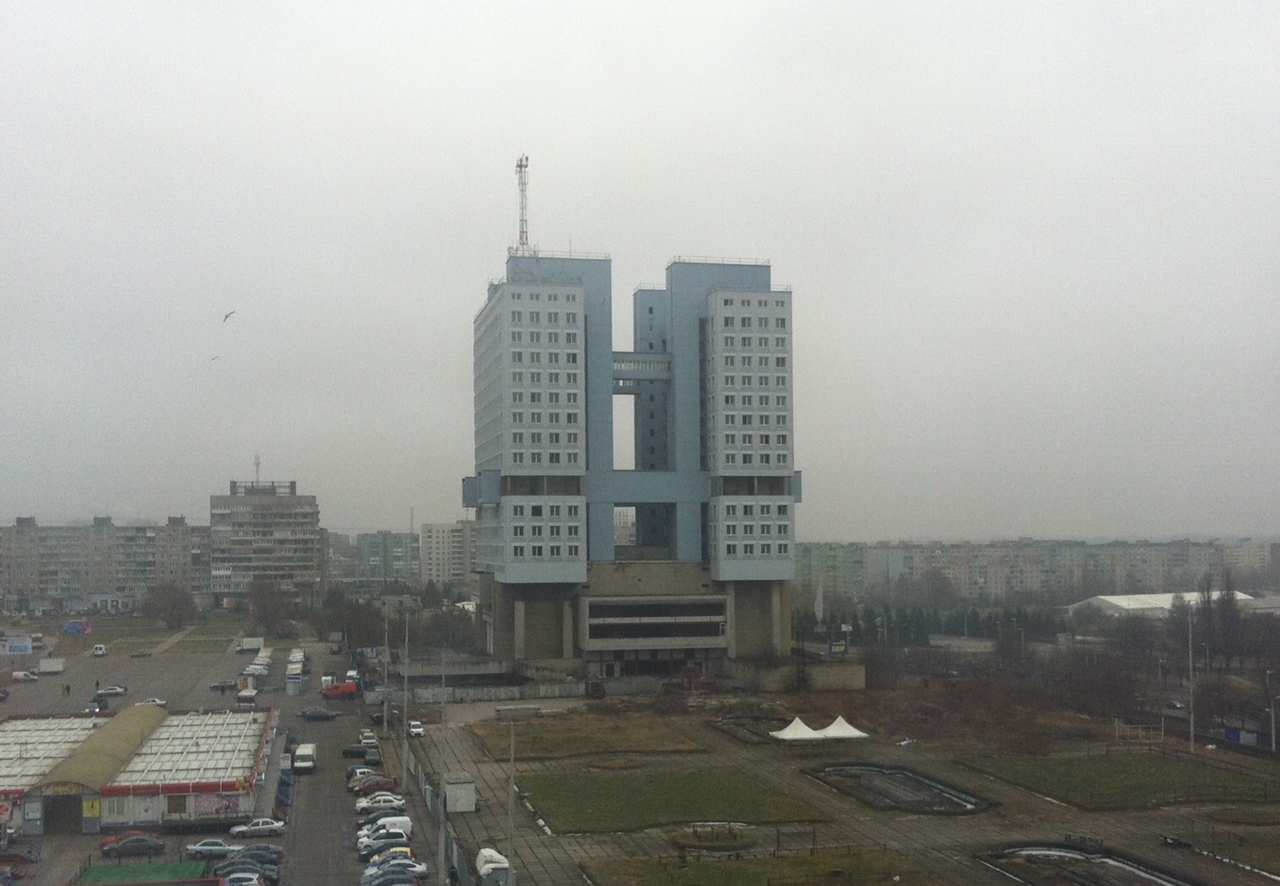
Today, there is nothing left of Koenigsberg's traditional orthogonal planning grid and its dense array of houses (8,6х9х20 meters, the last figure being the "depth" of the house growing into the land plot); the center of the once-famous city turned into a place bleak and hostile with a giant House of the Soviets standing next to the ruined castle and the high-rises. The contestants had a task of turning this war-mangled territory into something of value, breathe a new live into this land, at the same time connecting it with the past by making its history come alive. 
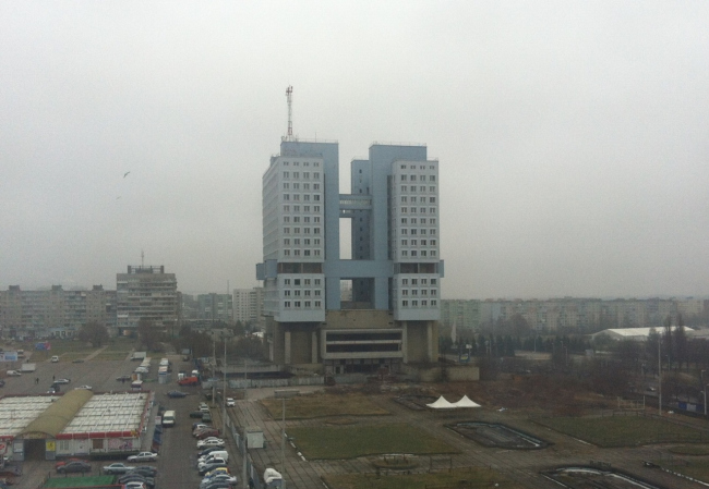

House of the Soviets. Source: Town-planning bureau “Heart of the City”, www.tuwangste.ru

The second prize was won by the trio of "Devillers et Associes (France) + Off-the-grid + Wall (Russia), and the two other prizes were awarded to Trevor Skempton from Great Britain and HOSPER Sweden from Sweden. In this issue, we are covering all the four projects. 
 
***

2nd prize
Koenigsberg-Kaliningrad 
Devillers et Associes (France) + Off-the-grid + Wall (Russia)
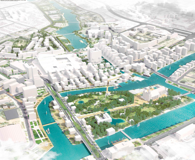


Contest project for the best concept of developing Kaliningrad's city center. 2nd place © Devillers et Associes (France) + Off-the-grid + Wall (Russia)

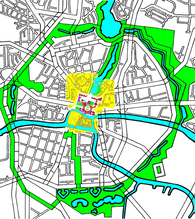
This team decided to pick up and develop the idea of duality of Koenigsberg-Kaliningrad that was proposed by the art critic Ivan Chechot: "Two centers, two cathedrals, two names, two K's (Kant and Kalinin, Kant and Koch, Kleist the writer and Kleist the general), two railway terminals, two lakes...", and give equal rights to the two already-existing city centers (one of them being the trade and business quarter, located in a different part of the city, the other, historical, located at the very heart of it). 

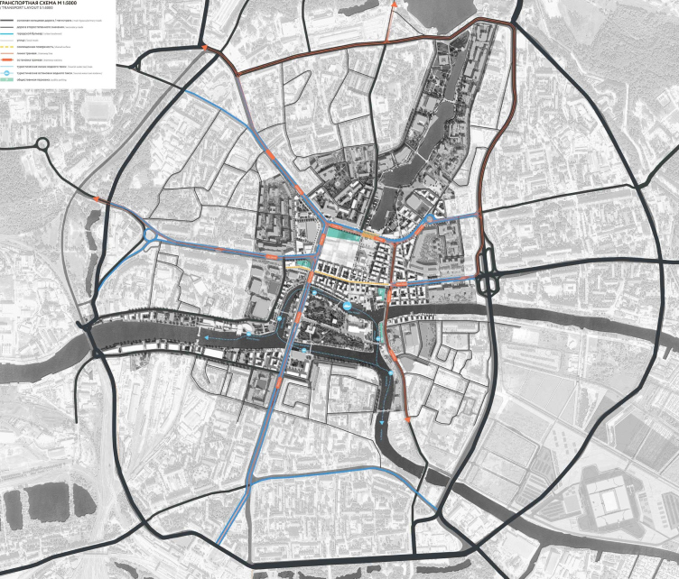
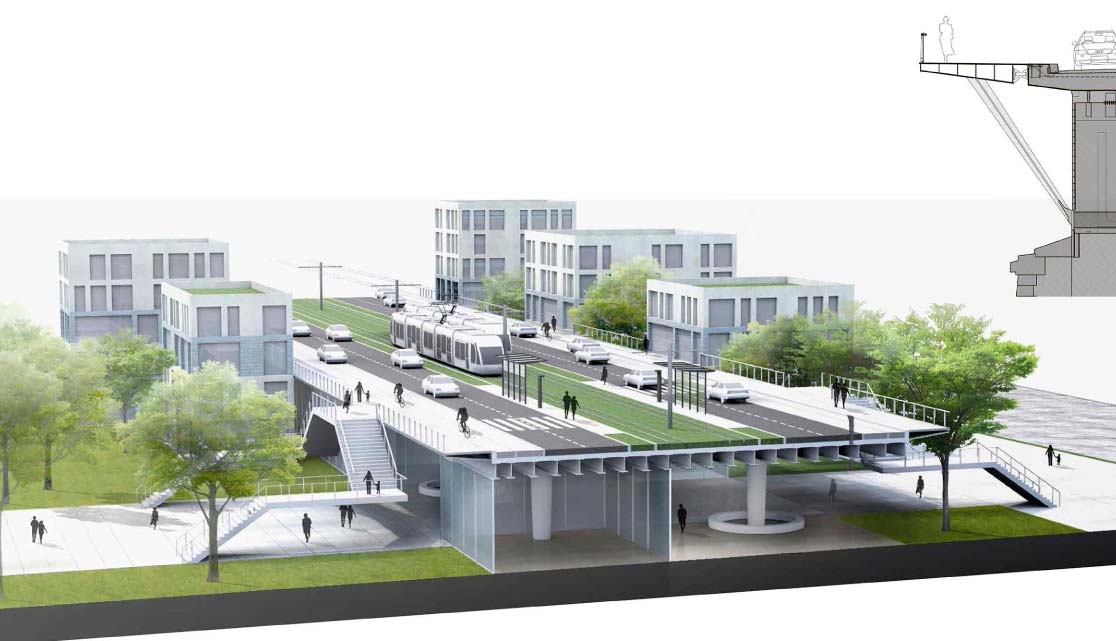
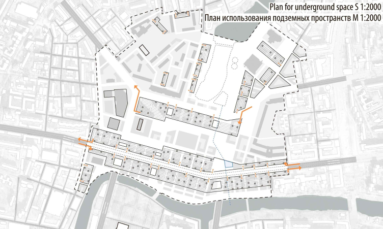
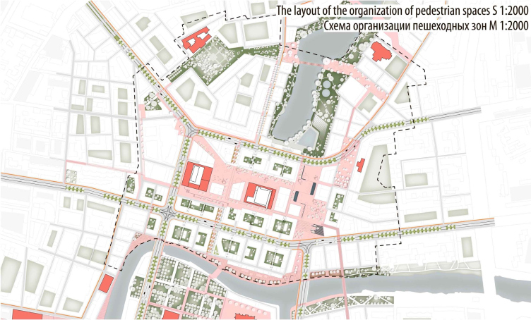
The authors paid a lot of attention to the transportation layout, giving it a "pedestrian-friendly" quality. The three main transport thoroughfares - the Shevchenko Street, and the Moscow and Lenin avenues (just like in the project by HOSPER Sweden) will be turned into boulevards after the construction of the inside ring road. The architects insist on refraining from taking down trestle bridge but propose to improve it by adding broad sidewalks to it and then use it as a sightseeing platform commanding a fine view of the island. 


Contest project for the best concept of developing Kaliningrad's city center. 2nd place © Devillers et Associes (France) + Off-the-grid + Wall (Russia)
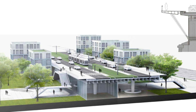

Contest project for the best concept of developing Kaliningrad's city center. 2nd place © Devillers et Associes (France) + Off-the-grid + Wall (Russia)

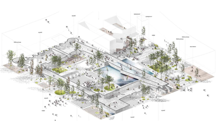
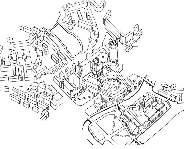
The authors of the project divide the whole territory into seven historical sectors. The main promenade near the Lower Lake will become the place for secluded leisure, quiet rest, and family picnics. The new forum on the central square next to the House of the Soviets becomes the place for the city's public events, and the House of the Soviets itself turns into a sightseeing platform with a panoramic cafe and a large screen for the sports broadcastings and movie showreels. The museum quarter next to the castle ruins becomes a multifunctional cultural center. 


Museum center on the castle ruins. Contest project for the best concept of developing Kaliningrad's city center. 2nd place © Devillers et Associes (France) + Off-the-grid + Wall (Russia)​


Contest project for the best concept of developing Kaliningrad's city center. 2nd place © Devillers et Associes (France) + Off-the-grid + Wall (Russia)
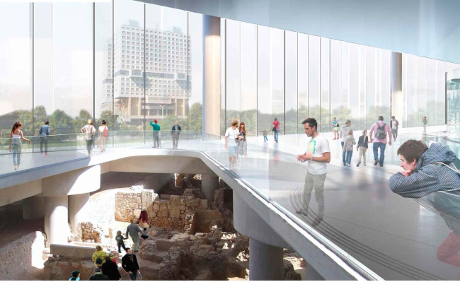
The contemporary architecture of the historical district of Alpstadt is based on revisiting the old European cities with their shops and cafés; the marina next to the embankment, a hostel on the moored boat, and a fish market. Named after Kant, the philosophical park on the Kneiphof Island is meant to become the "place for deep meditation two steps away from the city fuss" with libraries, discussion clubs, musical evenings, and exhibitions organized in the cathedral. The two other territories are the open university on the Kant Square and the "tourist paradise" on the Steindamm Street, the main pedestrian and shopping thoroughfare of the city. 
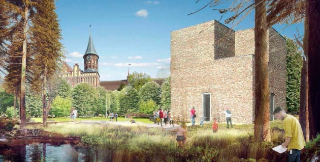

Contest project for the best concept of developing Kaliningrad's city center. 2nd place © Devillers et Associes (France) + Off-the-grid + Wall (Russia)


Contest project for the best concept of developing Kaliningrad's city center. 2nd place © Devillers et Associes (France) + Off-the-grid + Wall (Russia)
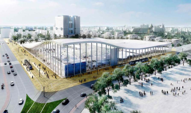

Contest project for the best concept of developing Kaliningrad's city center. 2nd place © Devillers et Associes (France) + Off-the-grid + Wall (Russia)


Contest project for the best concept of developing Kaliningrad's city center. 2nd place © Devillers et Associes (France) + Off-the-grid + Wall (Russia)

***

3rd prize
Three towers and one oculus
Trevor Skempton (Great Britain)


Contest project for the best concept of developing Kaliningrad's city center. 3rd place © Trevor Skempton (Great Britain)

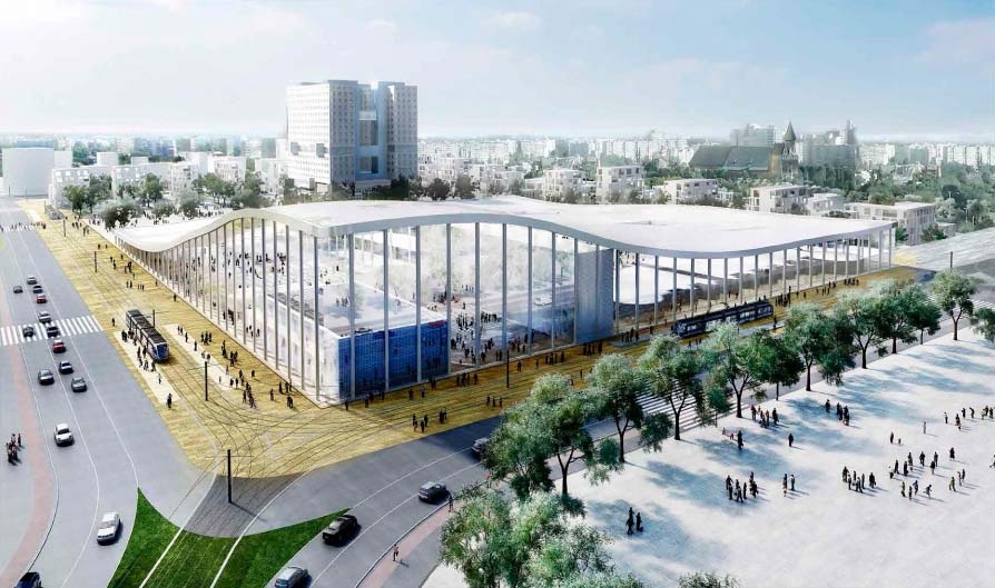
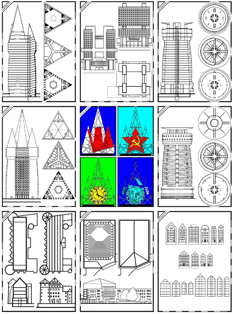
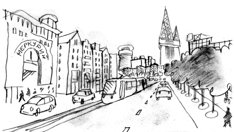
What Skempton proposes is to complete the construction of the yet-unfinished House of the Soviets, renting it out to the commercial and governmental offices and augmenting it with two centerpieces, these being two multifunctional towers: "Gothic" 144 meters high and "Classic" 110 meters high, with the height of the House of the Soviets being about 70 meters. Connecting the towers with a multipurpose concert hall on the level of the basement floor, the author gets a "circular square" with a structure of underpasses around it, that he gives the name of "Oculus" and considers a worthy alternative to the long-term investments into the reconstruction of the Moscow and Lenin avenues. His project also provides for separating the pedestrian and the traffic flows, while the two new "centerpiece" towers are connected by the narrow pedestrian streets with the spire of the cathedral on the Kant Island. 


Contest project for the best concept of developing Kaliningrad's city center. 3rd place © Trevor Skempton (Great Britain)

It is planned that some of the houses standing between "Oculus" and the river will be restored, breaking away from the exactitude of the copying wherever necessary in order to fit the main architectural idea or to adjust to the current realities of the river bank. Skempton proposes to make the new houses seven-stories high, organizing on the first floors and in the mezzanines bars and restaurants, on the next two floors - offices, and apartments further up. 

This modernist project is all about the homage to the soviet legacy; there is even something "post-soviet" about it because the construction of the high-rises is combined with the recreation of the lost buildings. 
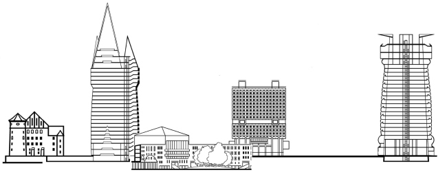

Contest project for the best concept of developing Kaliningrad's city center. 3rd place © Trevor Skempton (Great Britain)
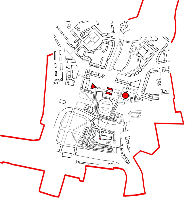

Contest project for the best concept of developing Kaliningrad's city center. 3rd place © Trevor Skempton (Great Britain)


Contest project for the best concept of developing Kaliningrad's city center. 3rd place © Trevor Skempton (Great Britain)


Contest project for the best concept of developing Kaliningrad's city center. 3rd place © Trevor Skempton (Great Britain)


Contest project for the best concept of developing Kaliningrad's city center. 3rd place © Trevor Skempton (Great Britain)
 
***

3rd prize
HOSPER Sweden AB (Sweden)
Co-authors of Mandaworks AB and Andreas Jonasson Arkitektkontor ABC
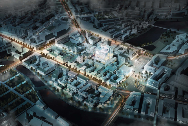


Contest project for the best concept of developing Kaliningrad's city center. 3rd place © HOSPER Sweden AB (Sweden), co-authors: Mandaworks AB and Andreas Jonasson Arkitektkontor AB

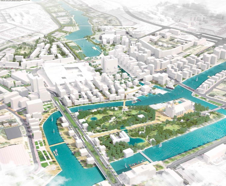
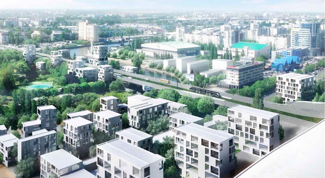
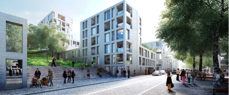
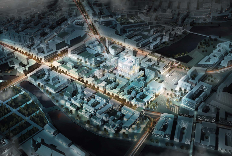
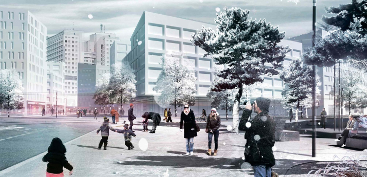
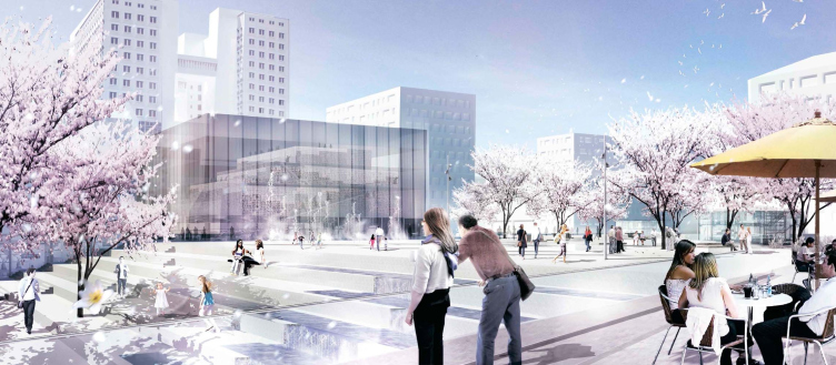
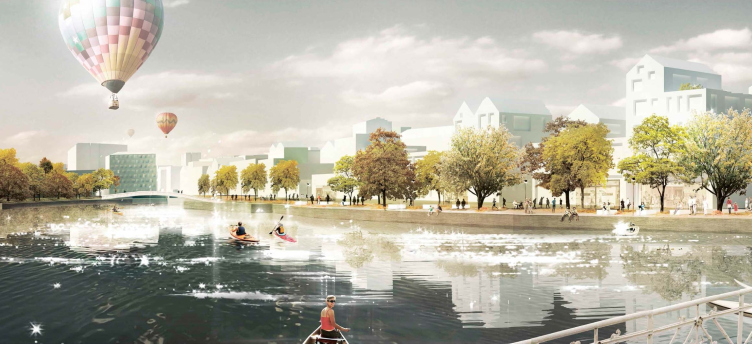
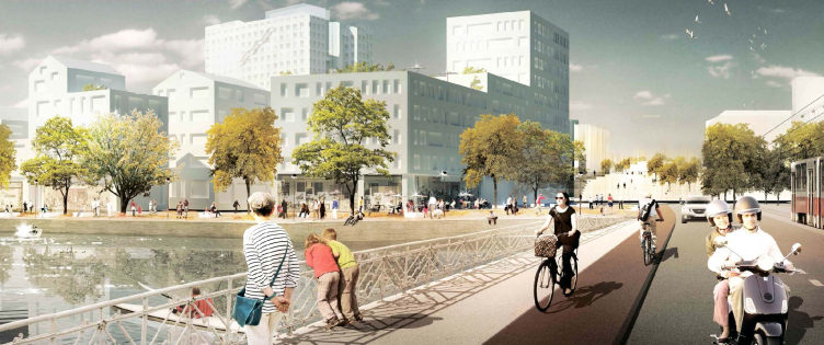
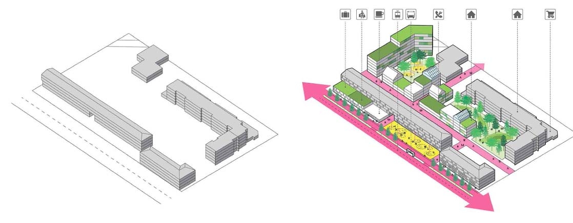
The authors propose a block plan with elements of "green" architecture and thought-out insolation. The blocks consist predominantly of five and six story houses and include elements of green architecture. The project also provides for green plants, good insolation, and actively uses the proximity to the reservoirs. 

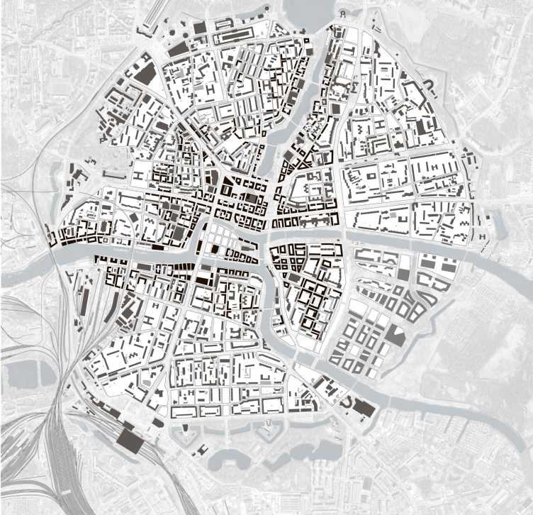
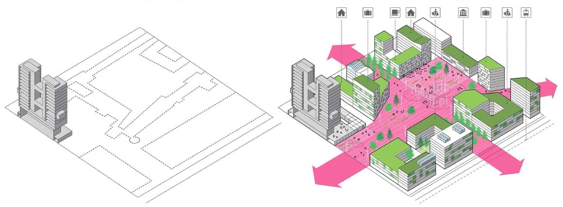
The main elements of the public territories are formed by the historical street grid the shape of which is slightly altered in the places where it overlaps with the legacy elements of both Koenigsberg's and the soviet periods. In order to avoid turning the city's downtown area into an isolated structure, the authors propose to continue the block planning in all the directions. 


Contest project for the best concept of developing Kaliningrad's city center. 3rd place © HOSPER Sweden AB (Sweden), co-authors: Mandaworks AB and Andreas Jonasson Arkitektkontor AB

From the city's main thoroughfares, the traffic flows are routed both to the exits and entrances of the distribution road and to the streets of the residential part. Thank to such system, a lot of streets in the central part of the city can become predominantly pedestrian. The traffic-overloaded Lenin and Moscow avenues, as well as the Shevchenko Street, in the future will be turned into green, generally pedestrian, streets with limited automotive traffic. 
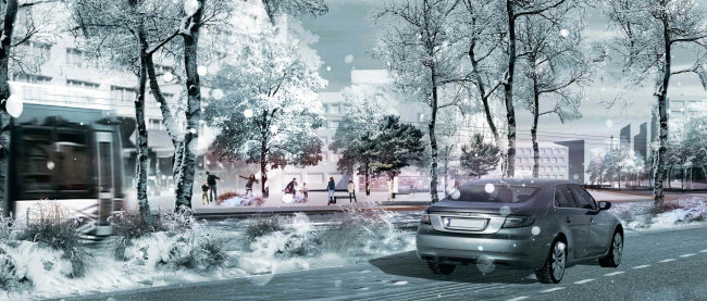

Contest project for the best concept of developing Kaliningrad's city center. 3rd place © HOSPER Sweden AB (Sweden), co-authors: Mandaworks AB and Andreas Jonasson Arkitektkontor AB


Contest project for the best concept of developing Kaliningrad's city center. 3rd place © HOSPER Sweden AB (Sweden), co-authors: Mandaworks AB and Andreas Jonasson Arkitektkontor AB


Contest project for the best concept of developing Kaliningrad's city center. 3rd place © HOSPER Sweden AB (Sweden), co-authors: Mandaworks AB and Andreas Jonasson Arkitektkontor AB


Contest project for the best concept of developing Kaliningrad's city center. 3rd place © HOSPER Sweden AB (Sweden), co-authors: Mandaworks AB and Andreas Jonasson Arkitektkontor AB


Contest project for the best concept of developing Kaliningrad's city center. 3rd place © HOSPER Sweden AB (Sweden), co-authors: Mandaworks AB and Andreas Jonasson Arkitektkontor AB

***

The contest for the concept of developing this territory was organized by the non-profit partnership organization "Town-planning Bureau "Heart of the City" at the commission of the government of the Kaliningrad region and with the support of the municipal board "Kaliningrad Urban District".


Contest project for the best concept of developing Kaliningrad's city center. 3rd place © HOSPER Sweden AB (Sweden), co-authors: Mandaworks AB and Andreas Jonasson Arkitektkontor AB
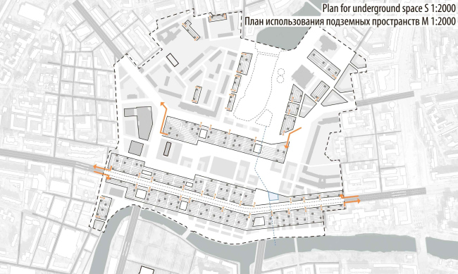

Contest project for the best concept of developing Kaliningrad's city center. 3rd place © HOSPER Sweden AB (Sweden), co-authors: Mandaworks AB and Andreas Jonasson Arkitektkontor AB


Contest project for the best concept of developing Kaliningrad's city center. 3rd place © HOSPER Sweden AB (Sweden), co-authors: Mandaworks AB and Andreas Jonasson Arkitektkontor AB


Contest project for the best concept of developing Kaliningrad's city center. 3rd place © HOSPER Sweden AB (Sweden), co-authors: Mandaworks AB and Andreas Jonasson Arkitektkontor AB
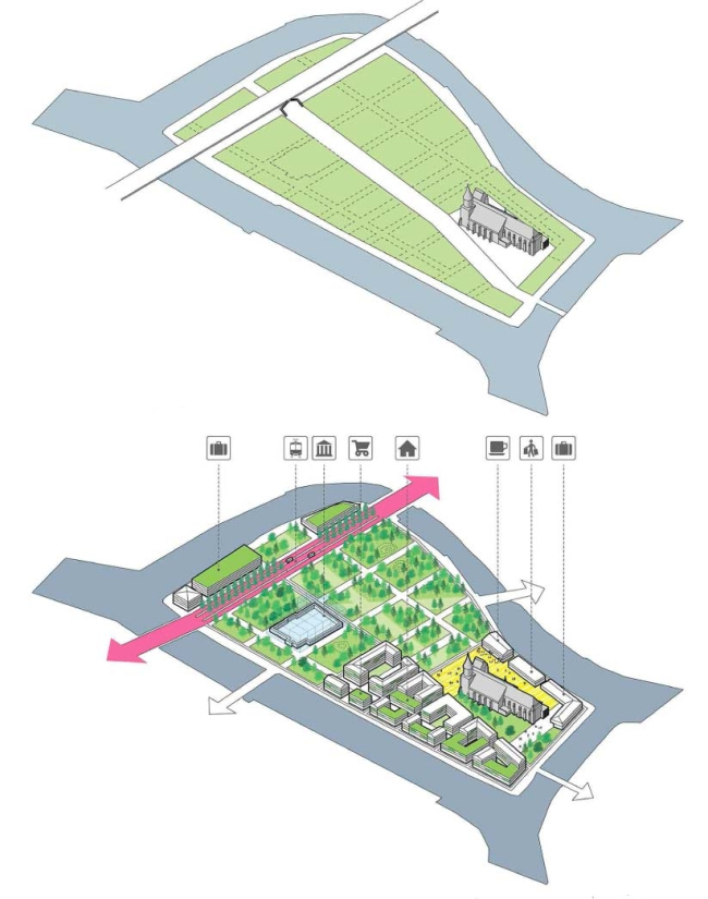

Contest project for the best concept of developing Kaliningrad's city center. 3rd place © HOSPER Sweden AB (Sweden), co-authors: Mandaworks AB and Andreas Jonasson Arkitektkontor AB


Contest project for the best concept of developing Kaliningrad's city center. 3rd place © HOSPER Sweden AB (Sweden), co-authors: Mandaworks AB and Andreas Jonasson Arkitektkontor AB
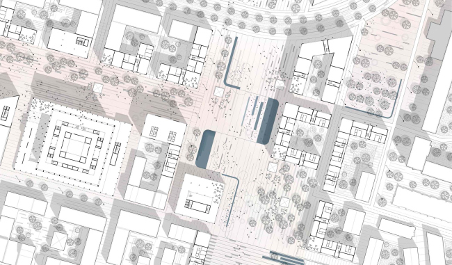

Contest project for the best concept of developing Kaliningrad's city center. 3rd place © HOSPER Sweden AB (Sweden), co-authors: Mandaworks AB and Andreas Jonasson Arkitektkontor AB
 
zooming
zooming
zooming
zooming
zooming
zooming
zooming
zooming


17 October 2014

Headlines now
The Golden Crown
The concept for a dental clinic in Yekaterinburg, developed by CNTR Studio, revolves around the idea of a “mouth full of gold”: pristine white porcelain stoneware walls are complemented by matte brass details. To avoid an overly literal interpretation, the architects focused on the building’s proportions, skillfully navigating between sunlight requirements and fire safety regulations.
Flexibility and Integration
Not long ago, we covered the project for the fourth phase of the ÁLIA residential complex, designed by APEX. Now, we’ve been shown different fence concepts they developed to enclose the complex’s private courtyards, incorporating a variety of public functions. We believe that the sheer fact that the complex’s architects were involved in such a detail as fencing speaks volumes.
A Step Forward
The HIDE residential complex represents a major milestone for ADM architects and their leaders Andrey Romanov and Ekaterina Kuznetsova in their quest for a fresh high-rise aesthetic – one that is flexible and layered, capable of bringing vibrancy to mass and silhouette while shaping form. Over recent years, this approach has become ADM’s “signature style”, with the golden HIDE tower playing a pivotal role in its evolution. Here, we delve into the project’s story, explore the details of the complex’s design, and uncover its core essence.
Gold in the Sands
A new office for a transcontinental company specializing in resource extraction and processing has opened in Dubai. Designed by T+T Architects, masters of creating spaces that are contemporary, diverse, flexible, and original, this project exemplifies their expertise. On the executive floor, a massive brass-clad partition dominates, while layered textures of compressed earth create a contextually resonant backdrop.
Layers and Levels of Flight
This project goes way back – Reserve Union won this architectural competition at the end of 2011, and the building was completed in 2018, so it’s practically “archival”. However, despite being relatively unknown, the building can hardly be considered “dated” and remains a prime example of architectural expression, particularly in the headquarters genre. And it’s especially fitting for an aviation company office. In some ways, it resembles the Aeroflot headquarters at Sheremetyevo but with its own unique identity, following the signature style of Vladimir Plotkin. In this article, we take an in-depth look at the United Aircraft Corporation (UAC) headquarters in the Moscow agglomeration town of Zhukovsky, supplemented by recent photographs from Alexey Naroditsky – a shoot that became only recently possible due to the fact that improvements were finally made in the surrounding area.
Light and Shadow
In this article, we delve into the architectural design of the “Chaika” house by DNK ag architects, which was recently completed in 2023 as part of the collection of signature designs at ZILArt. As is well-known, all the buildings in this complex follow a design code, yet each one is distinct. This particular building stands out not only for its whiteness and minimalism but also for the refined use of a limited number of techniques that, together, create what can confidently be called synergy.
Casus Novae
A master plan was developed for a large residential area with a name of “DNS City”, but now that its implementation began, the plan has been arbitrarily reformatted and replaced with something that, while similar on the surface, is actually quite different. This is not the first time such a thing happens, but it’s always frustrating. With permission from the author, we are sharing Maria Elkina’s post.
Treasure Hunting
The GAFA bureau, in collaboration with Tegola and Arkhitail, organized an expedition to the island of Kilpola in Karelia as part of Moskomarkhitektura’s “Open City” festival. There, amidst moss and rocks, the students sought answers to questions like: what is the sacred, where does it dwell, and what sustains it? Assisting the participants in this quest were landscape engineer Evgeny Levin, artist Nicholas Roerich, a moose, and the lack of cellular connection. Here’s how the story unfolded.
Depths of the Earth, Streams of Water
In the Malaya Okhta district, the Akzent building, designed by Stepan Liphart, was constructed. It follows a classic tripartite structure, yet it’s what you might call “hand-drawn”: each façade is unique in its form and details, some of which aren’t immediately noticeable. In this article, we explore the context and, together with the architect, delve into how the form was developed.
Fir Tree Dynamics
The “Airports of Region” holding is planning to build an airport in Karachay-Cherkessia, aiming to make the Arkhyz and Dombay resorts more accessible to travelers. The project that won in an invitation-only competition, submitted by Sergey Nikeshkin’s KPLN, blends natural imagery inspired by the shape of a conifer seed, open-air waiting spaces, majestic large trees, and a green roof elevated on needle-like columns. The result is both nature-inspired and WOW.
​A Brick Shell
In the process of designing a clubhouse situated among pine trees in a prestigious suburban area near Moscow, the architectural firm “A.Len” did the façade design part. The combination of different types of brick and masonry correlates with the volumetric and plastique solutions, further enhanced by the inclusion of wood-painted fragments and metal “glazing”.
Word Forms
ATRIUM architects love ambitious challenges, and for the firm’s thirtieth anniversary, they boldly play a game of words with an exhibition that dives deep into a self-created vocabulary. They immerse their projects – especially art installations – into this glossary, as if plunging into a current of their own. You feel as if you’re flowing through the veins of pure art, immersed in a universe of vertical cities, educational spaces – of which the architects are true masters – and the cultural codes of various locations. But what truly captivates is the bold statement that Vera Butko and Anton Nadtochy make, both through their work and this exhibition: architecture, above all, is art – the art of working with form and space.
Flexibility and Acuteness of Modernity
Luxurious, fluid, large “kokoshniks” and spiral barrel columns, as if made from colorful chewing gum: there seem to be no other mansion like this in Moscow, designed in the “Neo-Russian-Modern” style. And the “Teremok” on Malaya Kaluzhskaya, previously somewhat obscure, has “come alive with new colors” and gained visibility after its restoration for the office of the “architectural ecosystem” as the architects love to call themselves. It’s evident that Julius Borisov and the architects at UNK put their hearts into finding this new office and bringing it up to date. Let’s delve into the paradoxes of this mansion’s history and its plasticity. Spoiler: two versions of modernity meet here, both balancing on the razor’s edge of “what’s current”.
Yuri Vissarionov: “A modular house does not belong to the land”
It belongs to space, or to the air... It turns out that 3D printing is more effective when combined with a modular approach: the house is built in a workshop and then adapted to the site, including on uneven terrain. Yuri Vissarionov shares his latest experience in designing tourist complexes, both in central Russia and in the south. These include houseboats, homes printed from lightweight concrete using a 3D printer, and, of course, frame houses.
​Moscow’s First
“The quality of education largely depends on the quality of the educational environment”. This principle of the last decade has been realized by Sergey Skuratov in the project for the First Moscow Gymnasium on Rostovskaya Embankment in the Khamovniki district. The building seamlessly integrates into the complex urban landscape, responding both to the pedestrian flow of the city and the quiet alleyways. It skillfully takes advantage of the height differences and aligns with modern trends in educational space design. Let’s take a closer look.
Looking at the Water
The site of Villa Sonata stretches from the road to the water’s edge, offering its own shoreline, pier, and a picturesque river panorama. To reveal these sweeping views, Roman Leonidov “cut” the façade diagonally parallel to the river, thus getting two main axes for the house and, consequently, “two heads”. The internal core – two double-height spaces, a living room and a conservatory, with a “bridge” above them – makes the house both “transparent” and filled with light.
The White Wing
Well, it’s not exactly white. It’s more of a beige, white-stone structure that plays with the color of limestone – smoother surfaces are lighter, while rougher ones are darker. This wing unites various elements: it absorbs and interprets the surrounding themes. It responds to everything, yet maintains a cohesive expression – a challenging task! – while also incorporating recognizable features of its own, such as the dynamic cuts at the bottom, top, and middle.
Urban Dunes
The XSA Ramps team designed and built a three-part sports hub for a park in Rostov-on-Don, welcoming people of all ages and fitness levels. The skate plaza, pump track, and playground are all meticulously crafted with details that attract a diverse range of visitors. The technical execution of the shapes and slopes transforms this space into a kind of sculptural composition.
Proportional Growth
The project for the fourth phase of the ÁLIA residential area has been announced. The buildings are situated on an elongated plot – almost a “ray” that shoots out from the center of the area towards the river. Their layout reflects both a response to Moscow’s architectural preferences over the past 15 years, shifting “from blocks to towers”, and an interpretation of the neighboring business park designed by SOM. Additionally, the best apartments here are not located at the very top but closer to the middle, forming a glowing “waistline”.
The “Staircase” Building
In designing the “Details” residential complex in New Moscow, Rais Baishev spiced up the now-popular Moscow theme of a “courtyard” building with an idea drawn from the surrealist drawings by Maurits Escher. He envisioned the stepped silhouettes and descending slopes as a metaphysical mega-staircase, creating a key void within the courtyard that gave the project an internal “spine”. This concept is felt both in the building’s silhouette and on its façades.
Projection of the Quarter
No one doubted that the building that Vladimir Plotkin designed as part of the “Garden Quarters” would be the most modernist of all. And it turned out just that way: while adhering to the common design code, the building successfully combines brick and white stone, rhythmically responding to the neighboring building designed by Ostozhenka, yet tactfully and persistently making a few statements of its own. This includes the projection of the ideal urban development composition “14–9–6”, which can be found right next door, mathematical calculations, including those for various types of terraces (and perhaps the only reminder of the Soviet past of the Kauchuk rubber factory!), and the white “cross-stitch” pattern of the façade grid.
Domus Aurea
In this issue, we examine the “Tessinsky-1” house, designed by Sergey Skuratov and completed in 2023. Located in the middle of the Serebryanicheskaya Embankment district, at the intersection of its main streets, this house assumes a sort of “nodal” role: it not only responds to everything around it and preserves many memories of the former EMA factory within itself, but it weaves all this into a newly directed pattern, reconciling bright “gold” and dark-colored brick, largely with the help of the new, modern-yet-archaic Columba brick, which, come to think about it, is the most precious element here.
The Chimney of Nikola-Lenivets
In this issue, we are examining the “Obelisk House” designed by KATARSIS and built for the Arkhstoyanie 2023 festival. However, it was only finished later on, and this is why we are examining it now. It seems to us that after the “Obelisk House” appeared in Nikola-Lenivets, a dialogue and a few inner connections appeared between the temporary structures built here. These houses no longer look like “accidental neighbors”, more of which below.
​Periscope by the Bay
The jury awarded the second place in the competition for a public and cultural center in Petropavlovsk-Kamchatsky to the companies GORA (“Mountain”) and M4. In the consortium’s proposal, the building resembles a sperm whale with a calf swimming next to it or a periscope, whose lenses capture the most spectacular views from the surrounding landscape.
From Arcs to Dolmens
While working on the competition project for Petropavlovsk-Kamchatsky, ASADOV Architects prioritized the value of the natural and urban environment, aiming to preserve the balance of the location while minimizing the resemblance of the volume that they designed to a “traditional building”. The task was challenging, and the architects created three versions, one of which having been developed after the competition, where their main proposal took third place. However, the point of interest here is not the competition result but the continuity of creative thinking.
Hide and Seek
The ID Moskovskiy house, designed by Stepan Liphart in St. Petersburg, in the courtyards near Moskovskiy Avenue beyond the Obvodny Canal and recently completed, is notable for several reasons. Firstly, it has been realized with considerable accuracy, which is particularly significant as this is the first building where the architect was responsible not only for the facades but also for the layouts, allowing for better integration between the two. On the other hand, this building is interesting as an example of the “germination” of new architecture in the city: it draws on the best examples from the neighborhood and becomes an improved and developed sum of ideas found by the architect in the surrounding context.
The Big Twelve
Yesterday, the winners of the Moscow Mayor’s Architecture Award were announced and honored. Let’s take a look at what was awarded and, in some cases, even critique this esteemed award. After all, there is always room for improvement, right?
Above the Golden Horn
The residential complex “Philosophy” designed by T+T architects in Vladivostok, is one of the new projects in the “Golubinaya Pad” area, changing its development philosophy (pun intended) from single houses to a comprehensive approach. The buildings are organized along public streets, varying in height and format, with one house even executed in gallery typology, featuring a cantilever leaning on an art object.
Nuanced Alternative
How can you rhyme a square and space? Easily! But to do so, you need to rhyme everything you can possibly think of: weave everything together, like in a tensegrity structure, and find your own optics too. The new exhibition at GES-2 does just that, offering its visitor a new perspective on the history of art spanning 150 years, infused with the hope for endless multiplicity of worlds and art histories. Read on to see how this is achieved and how the exhibition design by Evgeny Ace contributes to it.
Blinds for Ice
An ice arena has been constructed in Domodedovo based on a project by Yuri Vissarionov Architects. To prevent the long façade, a technical requirement for winter sports facilities, from appearing monotonous, the architects proposed the use of suspended structures with multidirectional slats. This design protects the ice from direct sunlight while giving the wall texture and detail.