По-русски

A Country House with a Southern Flavor

A country residence with a sophisticated structure of terraces, balconies, and patios was built in a Moscow suburb upon the project done by "Fourth Dimension" Studio.

17 September 2014
Object
mainImg

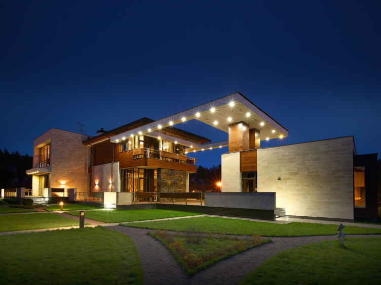
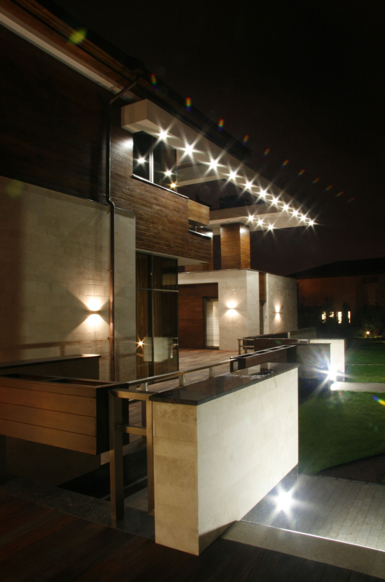
Country house in Moscow area. Night view © Fourth dimension

This country house has been built in one of the most picturesque sites in the north of Moscow area. The absolutely flat relief without so much as a hint at a height drop made the architects' task significantly easier - although, according to Mikhail Kanunnikov, one of the authors of the project, they were not after taking the line of least resistance; and looking at the entwining lines, surfaces, and volumes of the house, one certainly believes that. 

The architects started working on this project back in 2008, when the future customer, upon seeing a house built by them on a neighboring site, found the authors and asked them to design a still more "outstanding" building. For such an exacting customer, "Fourth Dimension" came up with an unusual solution that still, according to the authors, turned out to be a very practical one. 


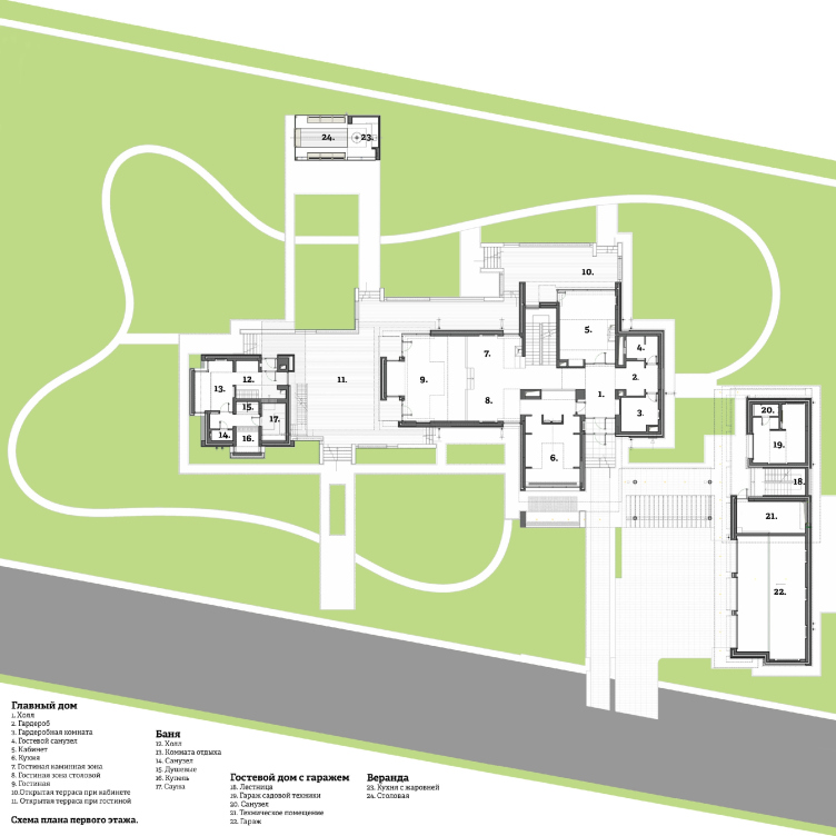
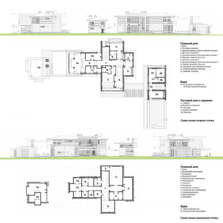
Country house in Moscow area. Plan of the first floor © Fourth dimension

The cross-shaped plan of the house falls in with the principles of Frank Lloyd Wright who insisted that at the core of any house there must be a cross - the windows are oriented to all sides, and the danger of a "dark nucleus" in the center is completely ruled out. The cross is rather conditional and asymmetric, though, in full accordance with Wright's teachings that the practical and "honest" planning should be done "from inside to outside". Thus, all the sleeves of the cross have a different length even at the second floor, while on the first floor the volume next to the billiard room is completely "cut away", and the void is turned into an open-air terrace beneath the children's room - which turns the cross-shaped figure into a intricate Tetris piece. The long "leg" of the cross on the second floor is occupied by the master's bedroom - a spacious one with a broad stanza balcony and a magnificent view over the rooftop of a small single-story bathhouse that continues the line of the leg of the conditional cross. 


Country house in Moscow area. Plans of the second and the basement floors © Fourth dimension

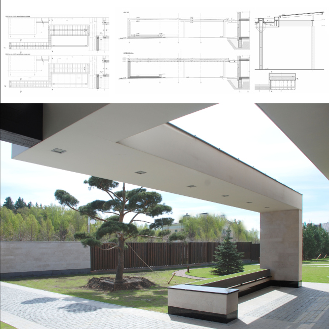
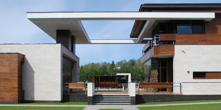
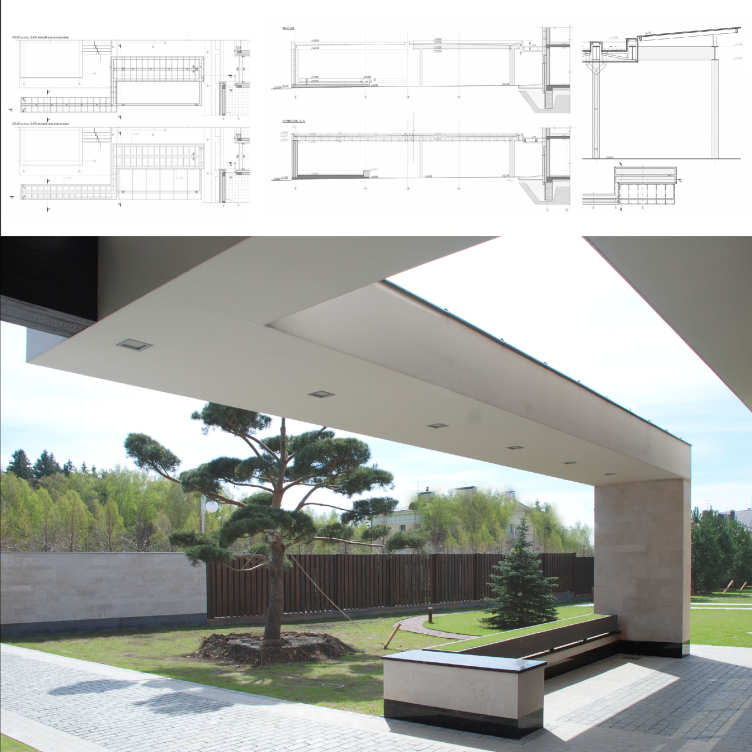
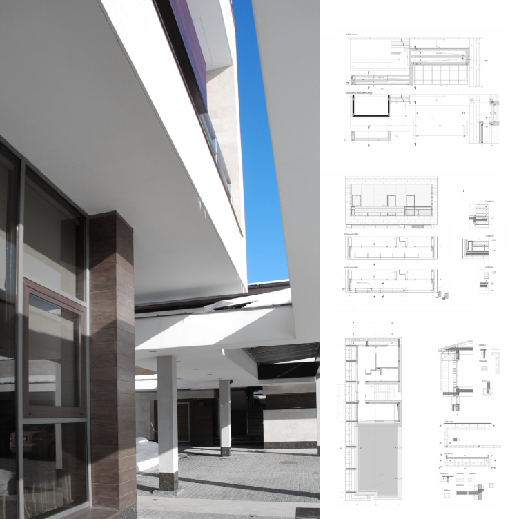
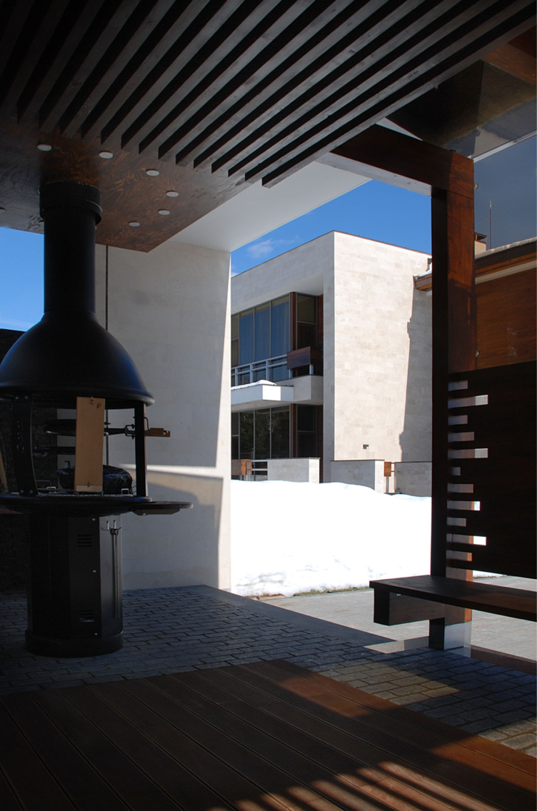
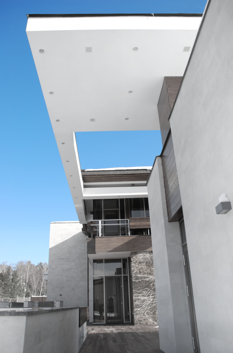
From the opposite side, shifted a little off the main axis and even elongated sidewise perpendicular to it, there is a single-story guest house with a garage, connected to the main house by a spacious terrace and a "deconstructionist" white frame above it with a large rectangular opening. In the evenings, this rig lightens up with a multitude of spotlights and lights the territory beneath it - however, what is really interesting is the fact that higher up the flat roof of the second floor can be pulled apart, and during the rain the terrace finds itself under the roof and one can cross from the main house to the guest house without getting wet, while in the sunny weather the roof can be opened just like a car hatch. Deeper inside the plot, the architects tucked away the tiny cozy barbecue veranda. 


Country house in Moscow area. The complex metallic rig above the terrace between the main and the guest houses © Fourth dimension


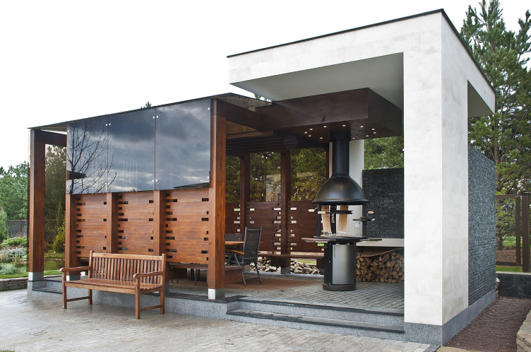
Country house in Moscow area. Barbecue spot © Fourth dimension

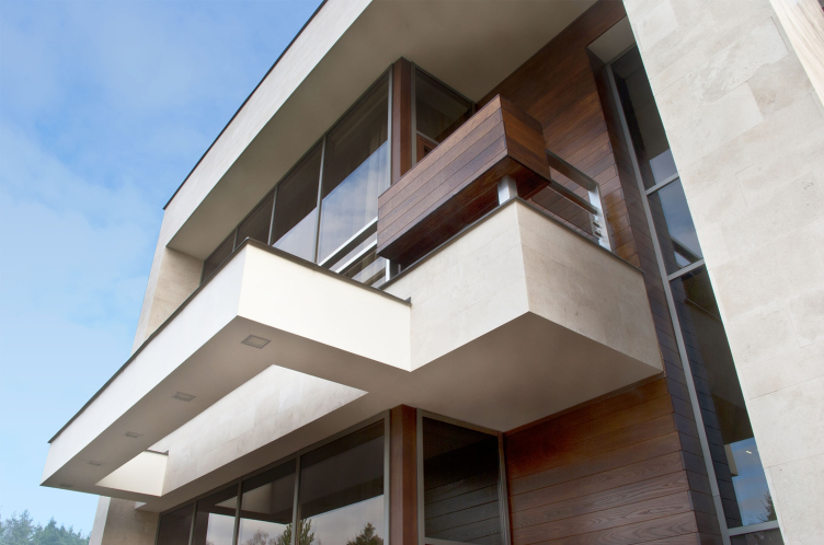
Described above, the pull-out roof terrace is the most vivid example of the open-air recreation area of this house - but one will be able to see a lot more similar spots of a smaller size here - under the stone and wooden awnings that seem to grow out of the very house. The slits, protrusions, and stanzas are in abundance here: the house bites into the space, and casts its large jagged protuberances into it - as if it engages in a symbiosis with it, at the same time offering to it its cubic geometrical language as a means of “inter-material” communication. 

In other words, the pull-out roof is the apotheosis - but the house itself looks as if had started assembling itself, before our eyes, from several different materials - stone, white concrete, wood, and glass - and then suddenly stopped in midair, forgetting either to cuddle up or to unfold to the fullest, projecting a multitude of parallelepipeds of all shapes and sizes. All these weird shapes are functionally justified - as the authors explain, each block of the main house - i.e. each of the "sleeves" of its cross is designed for a particular family member (two children, the parents, and the guests) . The windows of the residential blocks do not face their neighbors, they only command beautiful views, avoiding even the fences and nearby construction sites - so there is not much need for curtains that will only get in the way of the guests enjoying the scenery. Oh, by the way, each room here has its own exit to this or that terrace. 


Country house in Moscow area. Open air terraces and recreation zones © Fourth dimension


Country house in Moscow area. Numerous cantilevers, awnings, and balconies © Fourth dimension


Country house in Moscow area © Fourth dimension


Country house in Moscow area. Fragment of dark natural stone © Fourth dimension


Country house in Moscow area. Open air terraces and recreation zones © Fourth dimension


Country house in Moscow area © Fourth dimension

For decorating the house, it was decided to use predominantly local materials: wood and natural stone. To get the sandstone, the architect set out to one of the old quarries that, as the legend has it, was there as early as in the times when the Church of the Intercession on the Nerl was built. The sandstone and wood decorate the building's blind walls that contrast with the transparent ones glazed from wall to ceiling. The central accent of the decoration is the "island wall" of dark natural stone that is turned onto the main (yes, the main one under the pull-out roof) terrace between the houses. The stone, contrastingly backlit from all sides, symbolizes the family hearth. 


Country house in Moscow area © Fourth dimension

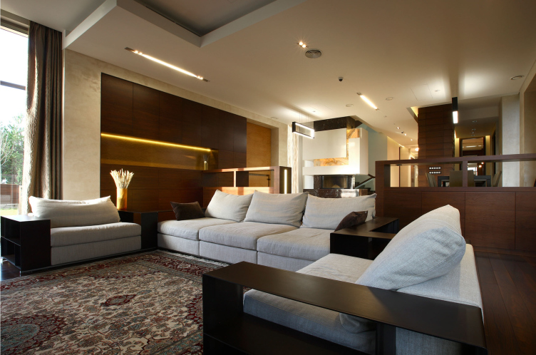
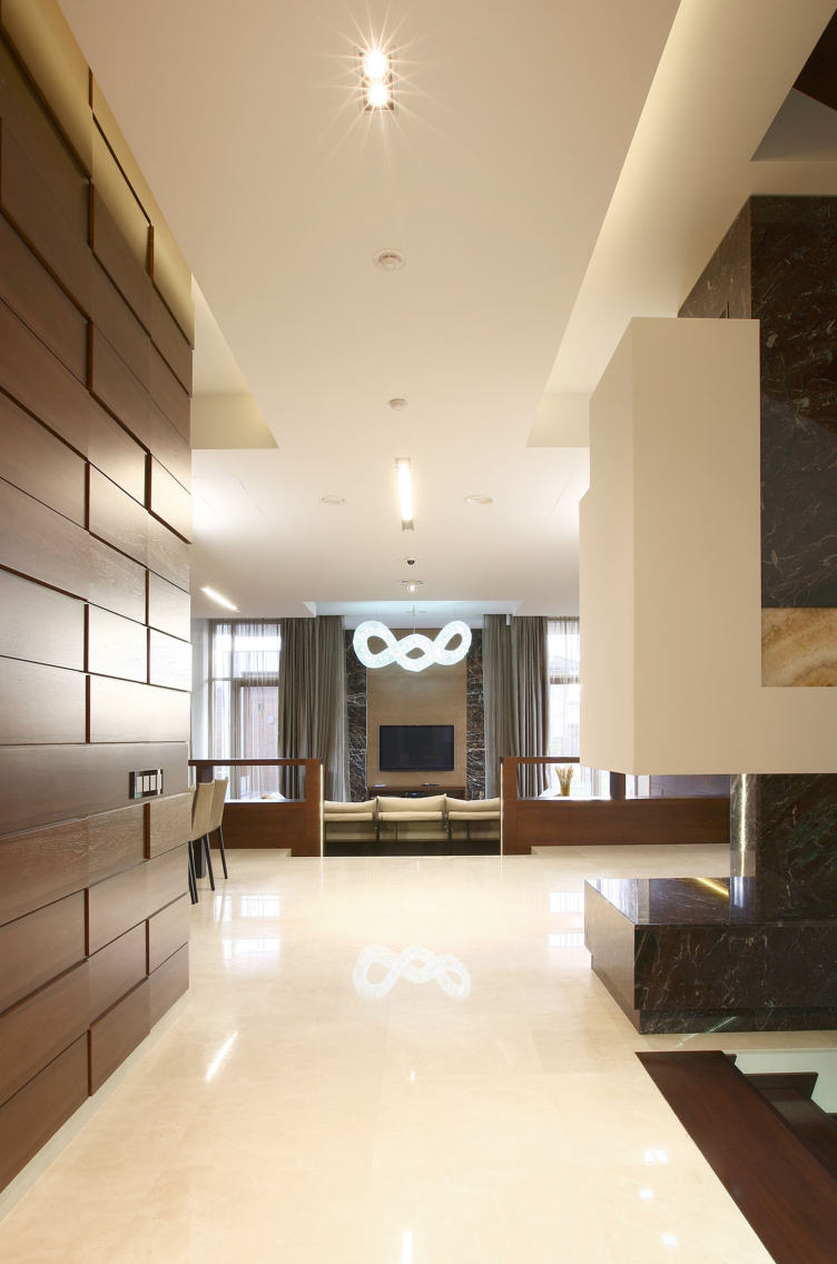
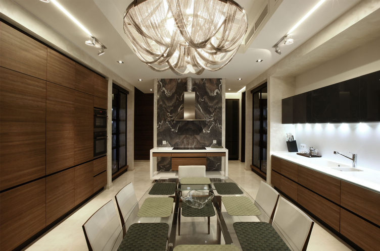
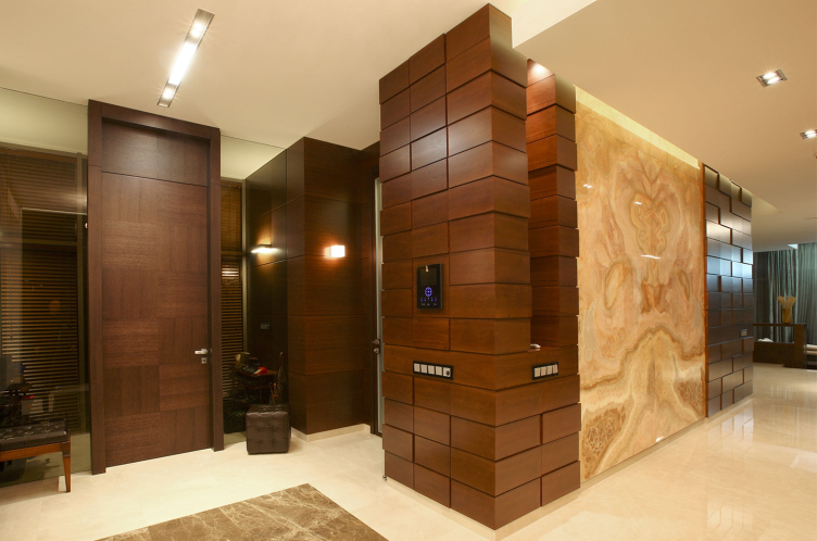
The multilayer character of the facades is repeated in the interiors of the house. The custom-designed in-built furniture becomes the building's second skin and replicates the pattern of the outside walls on the inside. There are no redundant partitions; the premises smoothly flow into one another - Wright again! - the hall bleeds into the dining-room, the dining-room - into the fireplace room, the fireplace room - into the drawing room, from which one can exit onto the terrace and then find his way into the garage. If one is going to encounter any "borders", then these are to be found on the first floor, made of glass, transparent, and quite unobtrusive. One can easily "run through" the house from end to end, through the length and breadth of it, coming up with ever new locomotion routes. It is because of this that the owner's children called this house a "labyrinth". 


Country house in Moscow area. Drawing room © Fourth dimension


Country house in Moscow area. Interior design © Fourth dimension


Country house in Moscow area. Bathroom design © Fourth dimension


Country house in Moscow area. Dining room © Fourth dimension


Country house in Moscow area. Bathroom design © Fourth dimension

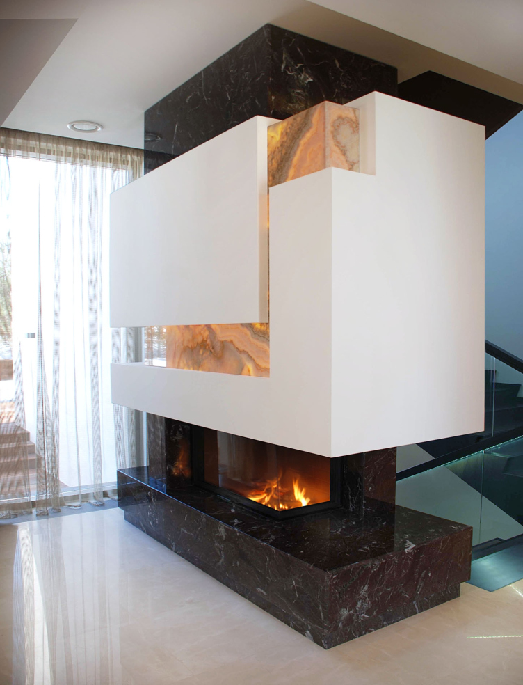
By the way, the theme of "family hearth" comes up here once again - this time in connection with the real fireplace, around which the attention is inevitably concentrated when the hearth is surrounded by the zigzag layers of stone, including the semitransparent onyx, glowing against the fire. Or at the places where the dark glass above the fireplace is turned into a multimedia screen. 


Country house in Moscow area. Fireplace room © Fourth dimension


Country house in Moscow area. The dark glass above the fireplace is used as a multimedia screen © Fourth dimension

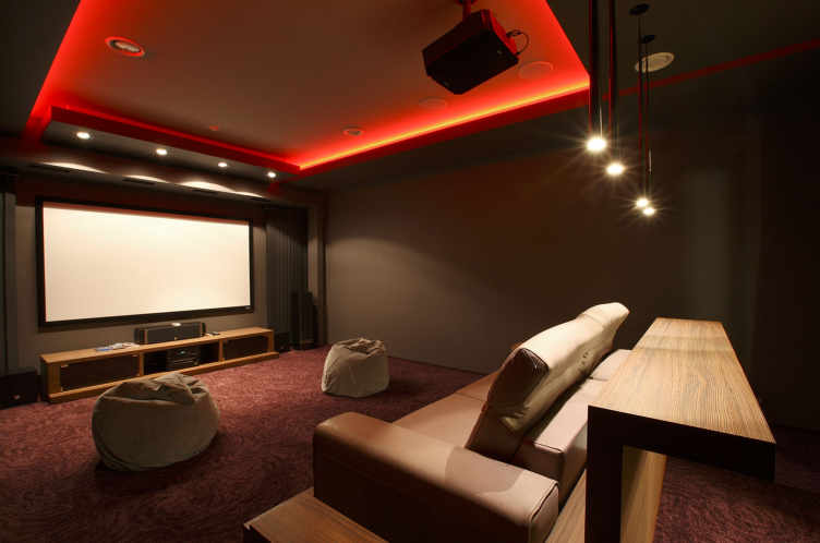
Apart from the spacious and sunlit first floor, the house provides a more private layout on the second level that cozily houses a few bedrooms, a game room, and a children's room. In the basement, there is a full-scale movie theater, and presently, the construction of a swimming pool is being completed. 

Sharing about his project, Mikhail Kanunnikov repeatedly stressed that minimalism is what this house is all about, as well as pragmatism and the keen attention to detail: "more function, less decoration". And even - "house with a man's character". Meaning - a house that is sturdy, a house with integrity, and a bit gnarled at times; one that appreciates the technical novelties but at the same time not alien to the roughness of the "wild" stone. And still, apart from the certain austerity in details, there is one more peculiarity to it - with all of its terraces, the house sports a very "southern" look, one of a house open to the life in the wild, and because of this, in spite of all of its masculine qualities (or maybe even thanks to them), a look of a house that is very warm - like a villa on a seaside. 


Country house in Moscow area. Movie theater © Fourth dimension
Подмосковный загородный дом. Ночной вид ©Четвертое Измерение
Country house in Moscow area. Plan of the first floor © Fourth dimension
Country house in Moscow area. Plans of the second and the basement floors © Fourth dimension
Country house in Moscow area. The complex metallic rig above the terrace between the main and the guest houses © Fourth dimension
Country house in Moscow area. Open air terraces and recreation zones © Fourth dimension
Country house in Moscow area. Barbecue spot © Fourth dimension
Country house in Moscow area. Numerous cantilevers, awnings, and balconies © Fourth dimension
Country house in Moscow area © Fourth dimension
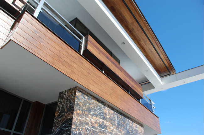
Country house in Moscow area. Fragment of dark natural stone © Fourth dimension
Country house in Moscow area. Open air terraces and recreation zones © Fourth dimension
Country house in Moscow area © Fourth dimension
Country house in Moscow area. Drawing room © Fourth dimension
Country house in Moscow area. Interior design © Fourth dimension
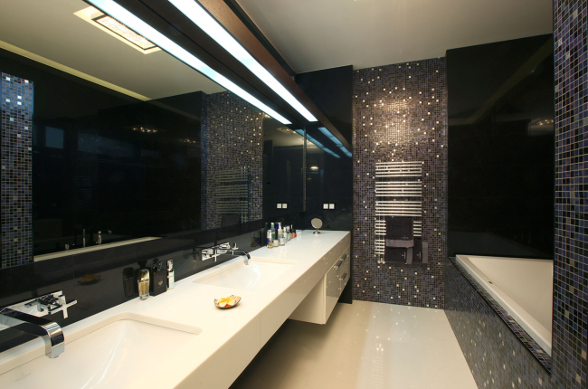
Country house in Moscow area. Bathroom design © Fourth dimension
Country house in Moscow area. Dining room © Fourth dimension
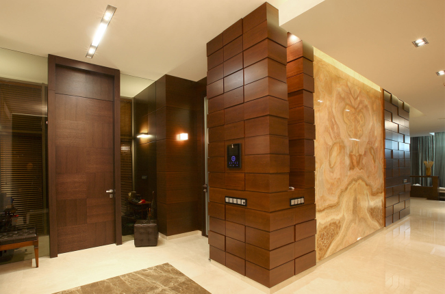
Country house in Moscow area. Bathroom design © Fourth dimension
Country house in Moscow area. Fireplace room © Fourth dimension
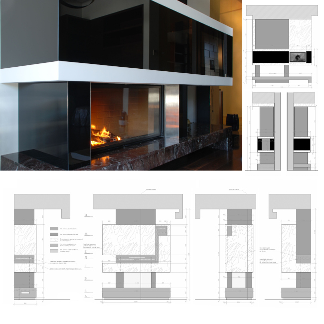
Country house in Moscow area. The dark glass above the fireplace is used as a multimedia screen © Fourth dimension
Country house in Moscow area. Movie theater © Fourth dimension


17 September 2014

Headlines now
The Golden Crown
The concept for a dental clinic in Yekaterinburg, developed by CNTR Studio, revolves around the idea of a “mouth full of gold”: pristine white porcelain stoneware walls are complemented by matte brass details. To avoid an overly literal interpretation, the architects focused on the building’s proportions, skillfully navigating between sunlight requirements and fire safety regulations.
Flexibility and Integration
Not long ago, we covered the project for the fourth phase of the ÁLIA residential complex, designed by APEX. Now, we’ve been shown different fence concepts they developed to enclose the complex’s private courtyards, incorporating a variety of public functions. We believe that the sheer fact that the complex’s architects were involved in such a detail as fencing speaks volumes.
A Step Forward
The HIDE residential complex represents a major milestone for ADM architects and their leaders Andrey Romanov and Ekaterina Kuznetsova in their quest for a fresh high-rise aesthetic – one that is flexible and layered, capable of bringing vibrancy to mass and silhouette while shaping form. Over recent years, this approach has become ADM’s “signature style”, with the golden HIDE tower playing a pivotal role in its evolution. Here, we delve into the project’s story, explore the details of the complex’s design, and uncover its core essence.
Gold in the Sands
A new office for a transcontinental company specializing in resource extraction and processing has opened in Dubai. Designed by T+T Architects, masters of creating spaces that are contemporary, diverse, flexible, and original, this project exemplifies their expertise. On the executive floor, a massive brass-clad partition dominates, while layered textures of compressed earth create a contextually resonant backdrop.
Layers and Levels of Flight
This project goes way back – Reserve Union won this architectural competition at the end of 2011, and the building was completed in 2018, so it’s practically “archival”. However, despite being relatively unknown, the building can hardly be considered “dated” and remains a prime example of architectural expression, particularly in the headquarters genre. And it’s especially fitting for an aviation company office. In some ways, it resembles the Aeroflot headquarters at Sheremetyevo but with its own unique identity, following the signature style of Vladimir Plotkin. In this article, we take an in-depth look at the United Aircraft Corporation (UAC) headquarters in the Moscow agglomeration town of Zhukovsky, supplemented by recent photographs from Alexey Naroditsky – a shoot that became only recently possible due to the fact that improvements were finally made in the surrounding area.
Light and Shadow
In this article, we delve into the architectural design of the “Chaika” house by DNK ag architects, which was recently completed in 2023 as part of the collection of signature designs at ZILArt. As is well-known, all the buildings in this complex follow a design code, yet each one is distinct. This particular building stands out not only for its whiteness and minimalism but also for the refined use of a limited number of techniques that, together, create what can confidently be called synergy.
Casus Novae
A master plan was developed for a large residential area with a name of “DNS City”, but now that its implementation began, the plan has been arbitrarily reformatted and replaced with something that, while similar on the surface, is actually quite different. This is not the first time such a thing happens, but it’s always frustrating. With permission from the author, we are sharing Maria Elkina’s post.
Treasure Hunting
The GAFA bureau, in collaboration with Tegola and Arkhitail, organized an expedition to the island of Kilpola in Karelia as part of Moskomarkhitektura’s “Open City” festival. There, amidst moss and rocks, the students sought answers to questions like: what is the sacred, where does it dwell, and what sustains it? Assisting the participants in this quest were landscape engineer Evgeny Levin, artist Nicholas Roerich, a moose, and the lack of cellular connection. Here’s how the story unfolded.
Depths of the Earth, Streams of Water
In the Malaya Okhta district, the Akzent building, designed by Stepan Liphart, was constructed. It follows a classic tripartite structure, yet it’s what you might call “hand-drawn”: each façade is unique in its form and details, some of which aren’t immediately noticeable. In this article, we explore the context and, together with the architect, delve into how the form was developed.
Fir Tree Dynamics
The “Airports of Region” holding is planning to build an airport in Karachay-Cherkessia, aiming to make the Arkhyz and Dombay resorts more accessible to travelers. The project that won in an invitation-only competition, submitted by Sergey Nikeshkin’s KPLN, blends natural imagery inspired by the shape of a conifer seed, open-air waiting spaces, majestic large trees, and a green roof elevated on needle-like columns. The result is both nature-inspired and WOW.
​A Brick Shell
In the process of designing a clubhouse situated among pine trees in a prestigious suburban area near Moscow, the architectural firm “A.Len” did the façade design part. The combination of different types of brick and masonry correlates with the volumetric and plastique solutions, further enhanced by the inclusion of wood-painted fragments and metal “glazing”.
Word Forms
ATRIUM architects love ambitious challenges, and for the firm’s thirtieth anniversary, they boldly play a game of words with an exhibition that dives deep into a self-created vocabulary. They immerse their projects – especially art installations – into this glossary, as if plunging into a current of their own. You feel as if you’re flowing through the veins of pure art, immersed in a universe of vertical cities, educational spaces – of which the architects are true masters – and the cultural codes of various locations. But what truly captivates is the bold statement that Vera Butko and Anton Nadtochy make, both through their work and this exhibition: architecture, above all, is art – the art of working with form and space.
Flexibility and Acuteness of Modernity
Luxurious, fluid, large “kokoshniks” and spiral barrel columns, as if made from colorful chewing gum: there seem to be no other mansion like this in Moscow, designed in the “Neo-Russian-Modern” style. And the “Teremok” on Malaya Kaluzhskaya, previously somewhat obscure, has “come alive with new colors” and gained visibility after its restoration for the office of the “architectural ecosystem” as the architects love to call themselves. It’s evident that Julius Borisov and the architects at UNK put their hearts into finding this new office and bringing it up to date. Let’s delve into the paradoxes of this mansion’s history and its plasticity. Spoiler: two versions of modernity meet here, both balancing on the razor’s edge of “what’s current”.
Yuri Vissarionov: “A modular house does not belong to the land”
It belongs to space, or to the air... It turns out that 3D printing is more effective when combined with a modular approach: the house is built in a workshop and then adapted to the site, including on uneven terrain. Yuri Vissarionov shares his latest experience in designing tourist complexes, both in central Russia and in the south. These include houseboats, homes printed from lightweight concrete using a 3D printer, and, of course, frame houses.
​Moscow’s First
“The quality of education largely depends on the quality of the educational environment”. This principle of the last decade has been realized by Sergey Skuratov in the project for the First Moscow Gymnasium on Rostovskaya Embankment in the Khamovniki district. The building seamlessly integrates into the complex urban landscape, responding both to the pedestrian flow of the city and the quiet alleyways. It skillfully takes advantage of the height differences and aligns with modern trends in educational space design. Let’s take a closer look.
Looking at the Water
The site of Villa Sonata stretches from the road to the water’s edge, offering its own shoreline, pier, and a picturesque river panorama. To reveal these sweeping views, Roman Leonidov “cut” the façade diagonally parallel to the river, thus getting two main axes for the house and, consequently, “two heads”. The internal core – two double-height spaces, a living room and a conservatory, with a “bridge” above them – makes the house both “transparent” and filled with light.
The White Wing
Well, it’s not exactly white. It’s more of a beige, white-stone structure that plays with the color of limestone – smoother surfaces are lighter, while rougher ones are darker. This wing unites various elements: it absorbs and interprets the surrounding themes. It responds to everything, yet maintains a cohesive expression – a challenging task! – while also incorporating recognizable features of its own, such as the dynamic cuts at the bottom, top, and middle.
Urban Dunes
The XSA Ramps team designed and built a three-part sports hub for a park in Rostov-on-Don, welcoming people of all ages and fitness levels. The skate plaza, pump track, and playground are all meticulously crafted with details that attract a diverse range of visitors. The technical execution of the shapes and slopes transforms this space into a kind of sculptural composition.
Proportional Growth
The project for the fourth phase of the ÁLIA residential area has been announced. The buildings are situated on an elongated plot – almost a “ray” that shoots out from the center of the area towards the river. Their layout reflects both a response to Moscow’s architectural preferences over the past 15 years, shifting “from blocks to towers”, and an interpretation of the neighboring business park designed by SOM. Additionally, the best apartments here are not located at the very top but closer to the middle, forming a glowing “waistline”.
The “Staircase” Building
In designing the “Details” residential complex in New Moscow, Rais Baishev spiced up the now-popular Moscow theme of a “courtyard” building with an idea drawn from the surrealist drawings by Maurits Escher. He envisioned the stepped silhouettes and descending slopes as a metaphysical mega-staircase, creating a key void within the courtyard that gave the project an internal “spine”. This concept is felt both in the building’s silhouette and on its façades.
Projection of the Quarter
No one doubted that the building that Vladimir Plotkin designed as part of the “Garden Quarters” would be the most modernist of all. And it turned out just that way: while adhering to the common design code, the building successfully combines brick and white stone, rhythmically responding to the neighboring building designed by Ostozhenka, yet tactfully and persistently making a few statements of its own. This includes the projection of the ideal urban development composition “14–9–6”, which can be found right next door, mathematical calculations, including those for various types of terraces (and perhaps the only reminder of the Soviet past of the Kauchuk rubber factory!), and the white “cross-stitch” pattern of the façade grid.
Domus Aurea
In this issue, we examine the “Tessinsky-1” house, designed by Sergey Skuratov and completed in 2023. Located in the middle of the Serebryanicheskaya Embankment district, at the intersection of its main streets, this house assumes a sort of “nodal” role: it not only responds to everything around it and preserves many memories of the former EMA factory within itself, but it weaves all this into a newly directed pattern, reconciling bright “gold” and dark-colored brick, largely with the help of the new, modern-yet-archaic Columba brick, which, come to think about it, is the most precious element here.
The Chimney of Nikola-Lenivets
In this issue, we are examining the “Obelisk House” designed by KATARSIS and built for the Arkhstoyanie 2023 festival. However, it was only finished later on, and this is why we are examining it now. It seems to us that after the “Obelisk House” appeared in Nikola-Lenivets, a dialogue and a few inner connections appeared between the temporary structures built here. These houses no longer look like “accidental neighbors”, more of which below.
​Periscope by the Bay
The jury awarded the second place in the competition for a public and cultural center in Petropavlovsk-Kamchatsky to the companies GORA (“Mountain”) and M4. In the consortium’s proposal, the building resembles a sperm whale with a calf swimming next to it or a periscope, whose lenses capture the most spectacular views from the surrounding landscape.
From Arcs to Dolmens
While working on the competition project for Petropavlovsk-Kamchatsky, ASADOV Architects prioritized the value of the natural and urban environment, aiming to preserve the balance of the location while minimizing the resemblance of the volume that they designed to a “traditional building”. The task was challenging, and the architects created three versions, one of which having been developed after the competition, where their main proposal took third place. However, the point of interest here is not the competition result but the continuity of creative thinking.
Hide and Seek
The ID Moskovskiy house, designed by Stepan Liphart in St. Petersburg, in the courtyards near Moskovskiy Avenue beyond the Obvodny Canal and recently completed, is notable for several reasons. Firstly, it has been realized with considerable accuracy, which is particularly significant as this is the first building where the architect was responsible not only for the facades but also for the layouts, allowing for better integration between the two. On the other hand, this building is interesting as an example of the “germination” of new architecture in the city: it draws on the best examples from the neighborhood and becomes an improved and developed sum of ideas found by the architect in the surrounding context.
The Big Twelve
Yesterday, the winners of the Moscow Mayor’s Architecture Award were announced and honored. Let’s take a look at what was awarded and, in some cases, even critique this esteemed award. After all, there is always room for improvement, right?
Above the Golden Horn
The residential complex “Philosophy” designed by T+T architects in Vladivostok, is one of the new projects in the “Golubinaya Pad” area, changing its development philosophy (pun intended) from single houses to a comprehensive approach. The buildings are organized along public streets, varying in height and format, with one house even executed in gallery typology, featuring a cantilever leaning on an art object.
Nuanced Alternative
How can you rhyme a square and space? Easily! But to do so, you need to rhyme everything you can possibly think of: weave everything together, like in a tensegrity structure, and find your own optics too. The new exhibition at GES-2 does just that, offering its visitor a new perspective on the history of art spanning 150 years, infused with the hope for endless multiplicity of worlds and art histories. Read on to see how this is achieved and how the exhibition design by Evgeny Ace contributes to it.
Blinds for Ice
An ice arena has been constructed in Domodedovo based on a project by Yuri Vissarionov Architects. To prevent the long façade, a technical requirement for winter sports facilities, from appearing monotonous, the architects proposed the use of suspended structures with multidirectional slats. This design protects the ice from direct sunlight while giving the wall texture and detail.