Anna Bronovitskaya about the exhibition "Look into the Eyes of War" that was designed by Eugene and Kirill Aces and Nadezhda Korbut.
Written by: Translated by: Anton Mizonov
03 September 2014
Review
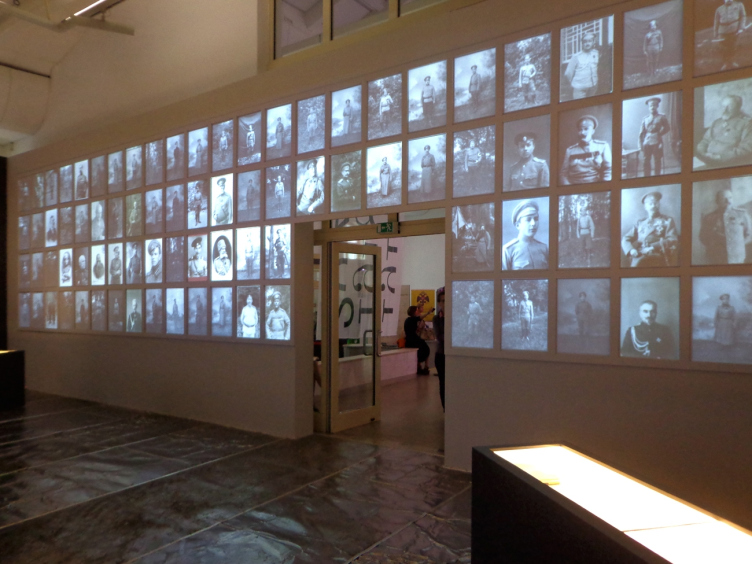
On August 28, Moscow's "New Manezh" opened the exhibition "Look into the Eyes of War” - Russia in World War I in documentaries, photos, and records. The authors of its design, or, rather the authors of the space arrangement solution that articulates its exposition, are Eugene Ace, Kirill Ace, and Nadezhda Korbut. Otherwise, the curator lineup is complex and sophisticated: besides the leader of the project (Zelphira Tregulova), the scientific supervisor (Sergey Mironenko), scientific curators (Olga Barkovets, Aleksey Litvin), designers (Alexander Vasin and Julia Kondratyeva), there are also an executive director (Pavel Lungin) and just a director (Elena Yakovich). The high-quality lighting was provided by Alexander Starovoitov's "Special Montage Service". Without the insider information, making sense of each participant's input would have been next to impossible, but one sure could appreciate the result: the exhibition of historic materials is presented as a striking show in which architecture plays one of the key parts. Actually, it is architecture that creates the visuality - because, in spite of the presence of a few large pictures, most of the exhibits are but old black-and-white photographs, written records, and documentary footage that also needed to be turned into the material component of the exposition.
Exhibition "Look into the Eyes of War" . Photo courtesy by Eugene Ace
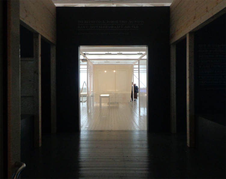
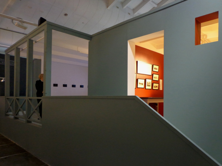
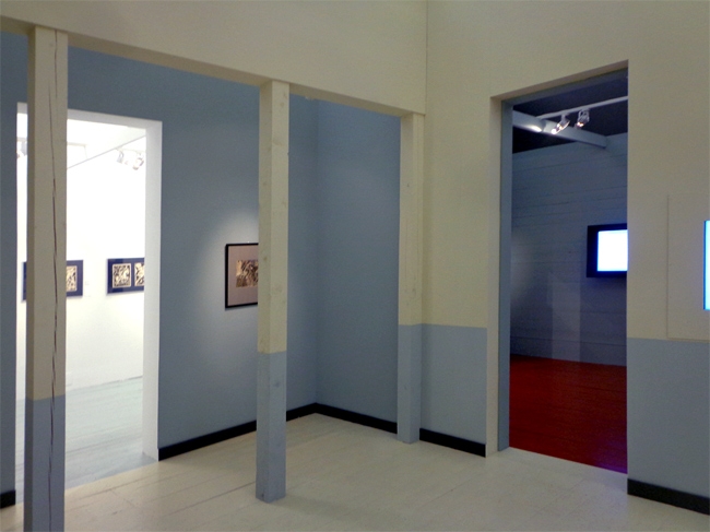
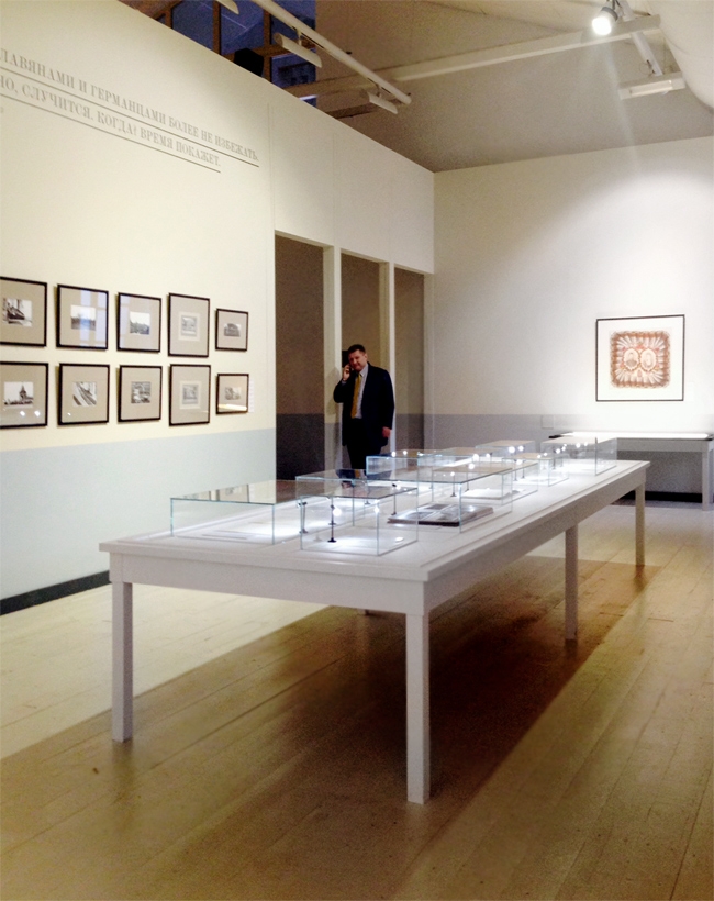
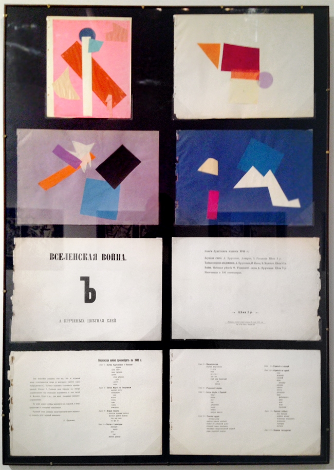
The territory of the "New Manezh", the two long halls running out from the lobby, is completely transformed and looks nothing like the typical white box. The first part that is dedicated to the pre-war years and its very beginning, is designed in the spirit of Adolf Loos. In fact, the space of the hall "houses" a home interior with wooden floors and walls painted white, blue, and terra cotta colors. This house is cozy and barely perceptibly "Viennese-style", putting one simultaneously in the mind of Haus Steiner, Secession House, and the Museum of Applied Arts. The Austrian association is quite appropriate here: at the entrance, we are at once reminded that World War I broke out from the incident that happened in the Gabbsburg Empire, preceded by a local war in the South-Eastern Europe. And as for the "home" atmosphere, it conveys the relaxed state in which the future enemies had all been up to the beginning of the all-European catastrophe. The large hall looks like a dining-room thanks to the fact that its middle is occupied by a table of quite a regular kind, though covered, instead of dish-ware, with impeccably lighted showcases with documents and photos. Encased into neat frames, old prints hang on the walls in a quite "homely" manner. One of them is dedicated to the family gatherings of the cousins Nicolas, Wilhelm, and George; one also sees here the inevitable in such cases portrait of Queen Victoria, their grandmother. The peaceful tranquility by inertia carries on even after the war is declared. It permeates even the photos of the three sons of the Great Prince Konstantin clad in uniform, and the simple soldiers who had their photo taken before they were sent to the frontline. Only the artists with the sensitivity inherent to them describe the events in the terms of Apocalypse: these are the "Mystical Images of War" by Natalia Goncharova, and the collages by Olga Rosanova that illustrate Aleksey Kruchenykh book "Universal War".
Exhibition "Look into the Eyes of War" . Photo courtesy by Eugene Ace
Exhibition "Look into the Eyes of War" . Photo courtesy by Anna Bronovitskaya
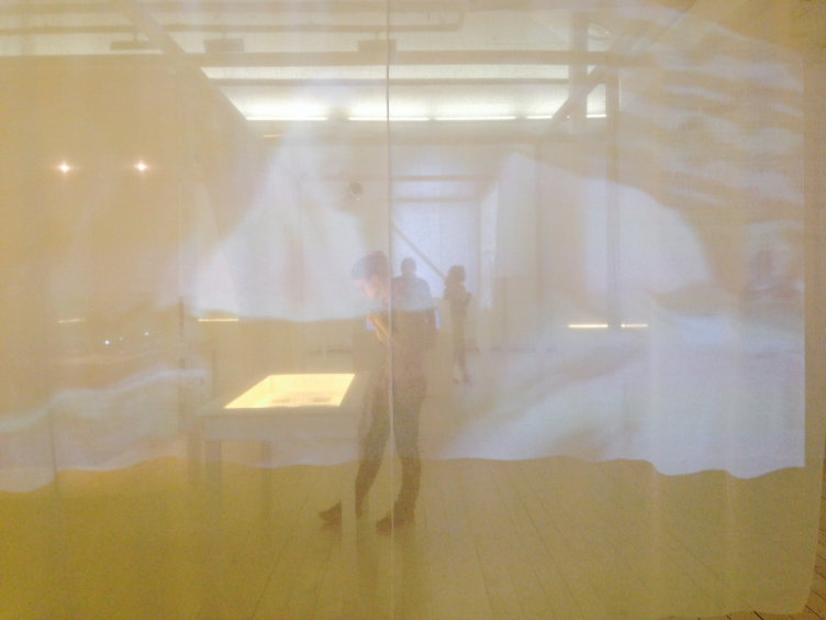
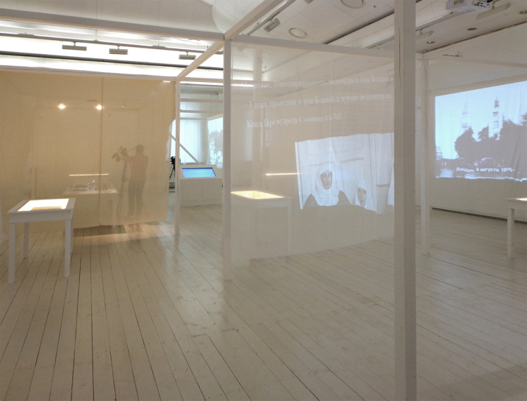
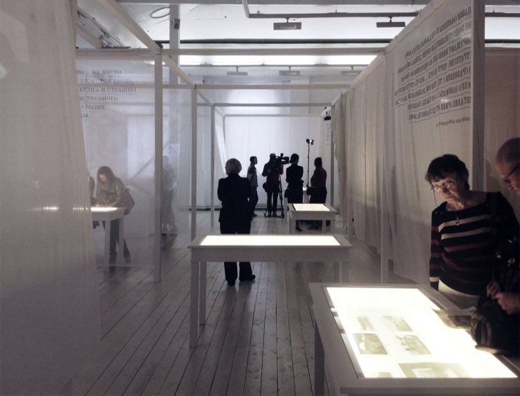
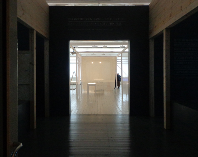
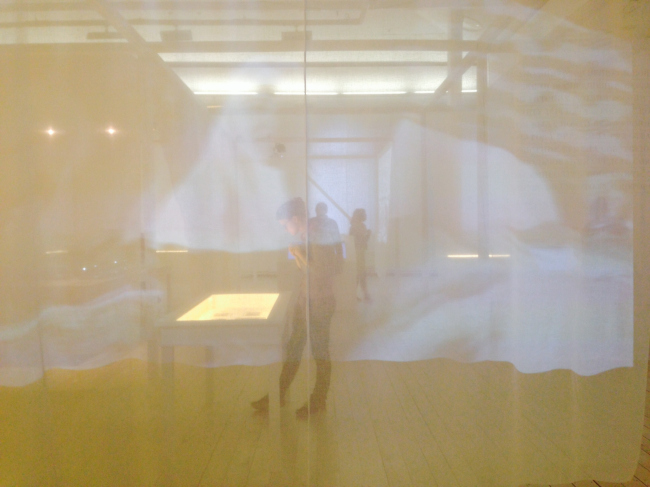
The next section that explores the topic of war nurses and the role that women played in that war is by contrast abstract and detached. Here, instead of the clear wooden walls with openings, white curtains are waving, sometimes dividing the sections with "table" showcases and sometimes serving as screens on which the documentary footage is projected. The solution is very simple and at the same time very effective: we are either in a medical tent or in a hospital ward, meaning - in the world ruled by women, or maybe even on our way to heaven up above. The transcendental note is reminiscent of the white curtains of the installation "Cistern", made in 2011 by Alexander Brodsky. Probably, not by chance - Nadezhda Korbut and Kirill Ace have been working in Brodsky's studio for years.
Exhibition "Look into the Eyes of War" . Photo courtesy by Anna Bronovitskaya
Exhibition "Look into the Eyes of War" . Photo courtesy by Eugene Ace
Exhibition "Look into the Eyes of War" . Photo courtesy by Anna Bronovitskaya
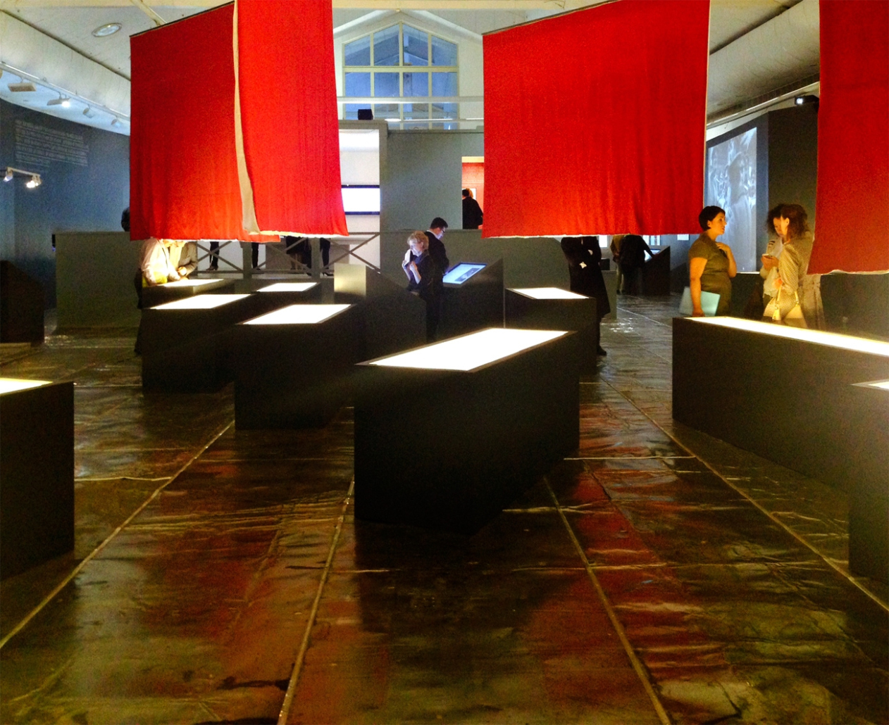
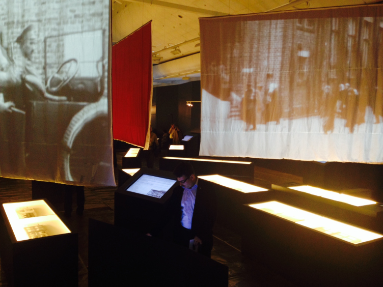
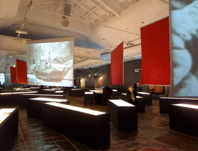
As for the third part of the exposition that occupies the entire second hall, it is not only far from being minimalist - it is baroque-expressive, and for a good reason, too: it shows the battles, the heroism, the killings in action, the patriotic calls, and the inglorious withdrawal from the war by the country that was never to be the same again. By the contrast with the first light half, it is dark here. From the darkness, spots of light stand out: light boxes with the pictures of military men, battle maps, backlit showcases, screens with documentaries, and the rectangles of paintings. The dramatic contrast of light and shade is enhanced by the opposition of order and chaos. The rectangular grid of the walls gets broken up by slanted strokes - the showcases and the screens look as if they are moving. The vertigo is still enhanced by the fact that the floor is covered with crumpled metal sheets. They glitter like the surface of a sea in which the ships are slowly sinking, and ominously rattle under the visitors' feet. The chaos brings death and destruction: dissected into fields, the wall with the portraits of Saint George's Cross Chevaliers looks like the wall of a cinerarium; the black podiums of the showcases - like coffins. The largest architectural element here is the "headquarters building", upon ascending to which one can cast his eye over space of the hall that is prolonged by a mirror sidewall and... feel all the helplessness of the commanders. Surprising though it is, the exposition in the "headquarters" is dedicated not to the High Command but to General Brusilov who was the first to claim that he "puts his loyalty to Russia on top of his loyalty to the Emperor". The logic of the exposition leads the visitor from the beginning of the hall where the main topic is the battle glory and patriotic calls to the last exhibit - the electronic copy of Treaty of Brest-Litovsk. Looking back, the visitor sees that the textile screens that used to look like holy banners have now turned into the soviet red flags.
Exhibition "Look into the Eyes of War" . Photo courtesy by Anna Bronovitskaya
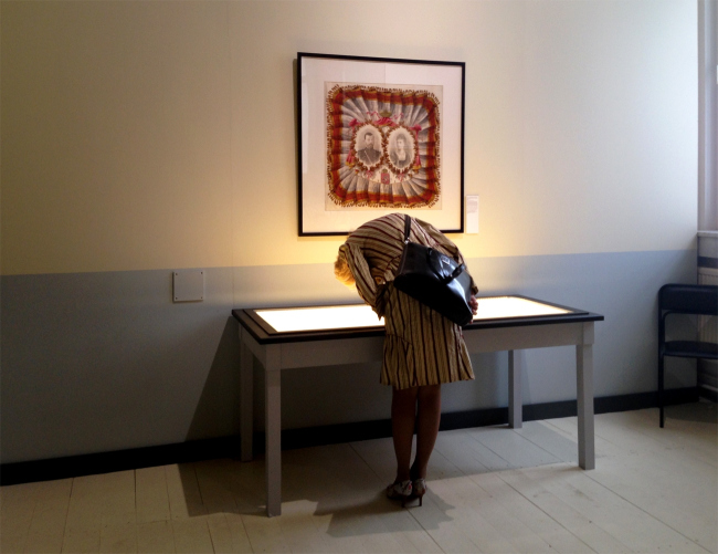
Basically, one does not even have to turn around - all he needs to do is look up to see the perspective of the hall reflected in the mirror, together with himself. This is an unexpected and even a shocking sensation: the light is adjusted in such a way that until the last moment one does not realize that it is a mirror in front of him or her - and then finds himself or herself amidst coffins floating over the sea. This is the most powerful but not the only stylistic device used by the authors of the exposition to warp the historical time and to actualize the message of the exhibition that consists of three dates: 1914/1918/2014. The first "homely" part has two such tricks in it. One of them is a peculiar automatic "monarchical altar". On the wall, there is quite a kitsch kerchief with the portraits of Nicolas the Emperor and Alexandra the Empress, while beneath them there is a rather low showcase with a page from Russia's first population census with their names ("Nikolai Aleksandrovich Romanov, the master of the land of Russia Alexandra Fedorovna Romaniva, the mistress of the land of Russia"). To get a better look of the records, the visitor bends over - and involuntary makes a deep bow to the monarchical couple. The second trick is purely visual. The sheets of "Universal War" by Kruchenykh and Rosanova are grouped in eights in a black passé partout, looking like a window sash: this way, the architects hint that the events that are reflected here have not quite remained in the past, separated from today by a safe century-long distance. And, as far as the "hospital" part is concerned, it creates a fully realistic impression of merging with the afterworld. The curtains are semi-transparent, and the figures of the visitors that show through them look just as immaterial as the moving shadows of people that lived and died a hundred years ago.
Exhibition "Look into the Eyes of War" . Photo courtesy by Anna Bronovitskaya
The exhibition projects with a large budget and an international participation take a long time to prepare, and in the very beginning nobody could even think that "Look into the Eyes of War" would open against the background of headlines about a full-scale war and fruitless attempts of the top public officials to grope for a diplomatic solution; that the exhibition would be much more vital than anybody expected it to be. The choice of the hall, the huge amount of the members of the royal family, and the very fact that at the inauguration an address was made by Dmitry Medvedev - make one suppose that the exhibition was meant to be a state-and-patriotic one. The resulting artistic statement, however, bears a totally different meaning. Go and watch.
Living in the Architecture of One’s Own Making
Do architects design houses for themselves? You bet! In this article, we are examining a new book by TATLIN publishing house. This book – unprecedented for Russia – features 52 private homes designed and built by contemporary architects for themselves. It includes houses that are famous, even iconic, as well as lesser-known ones; large and small, stylish and eccentric. To some extent, the book reflects the history of Russian architecture over the past 30 years.
A City Block Isoline
Another competition project for a residential complex on the banks of the Volga in Nizhny Novgorod has been prepared by Studio 44. A team of architects led by Ivan Kozhin concluded that using a regular block layout in such a location would be inappropriate and developed a “custom design” approach: a chain of parceled multi-section buildings stretching along the entire embankment. Let’s explore the features and advantages of this unconventional method.
Competition: The Price of Creativity?
Any day now, we’re expecting the results of a competition held by the “Samolet” development group for a plot in Kommunarka. In the meantime, we share the impressions of Editor-in-Chief Julia Tarabarina, who managed to conduct a public talk. Though technically focused on the interaction between developers and architects, the public talk turned into a discussion about the pros and cons of architectural competitions.
Terraced Design
The “River Park” residential complex has confidently and securely shaped the Nagatinsky Backwater shoreline. Featuring a public embankment, elevated courtyards connected by pedestrian bridges, and brick façades, the development invites exploration of its nuanced response to the surrounding context, as well as hints of the architects’ megalithic design thinking.
A Kremlin’s Core and Meteorite Fragments
We continue our coverage of the competition projects for the residential district that the development company GloraX plans to build along the embankment of the Rowing Channel in Nizhny Novgorod. ASADOV Architects approached the concept through a deep dive into local identity, using storytelling to pinpoint a central idea for the design: the master plan and composition are imagined as if a meteorite had struck a “proto-Kremlin”. Sounds weird? Find more details below!
The Volga Regatta
GloraX plans to develop a residential complex spanning 14 hectares along the Volga River in Nizhny Novgorod. The winning design in a closed-door competition, created by GORA Architects, features housing typologies ranging from townhouses to terraced high-rise slabs, a balance of functions, diverse ways of engaging with the water, and even a dedicated island (no less!) for the city residents.
A New Track
We took a thorough look at D_Station, a railcar repair depot dating back to 1906, recently reconstructed while preserving its century-old industrial structure, upon the project by Sergey Trukhanov and T+T Architects. Though work on the interiors – set to house restaurants and public spaces – is still underway, the building’s exterior already offers plenty to see. Visitors can explore the blend of old and new brickwork, appreciate the architect’s unique interpretation of ruin aesthetics, and enjoy the newly built pedestrian route that connects the Citydel Business Center’s arches to Kazakova Street.
Four Different Surveys
The “Explore the City” competition, organized this year by the Genplan Institute of Moscow, stands out as a pretty unconventional one for the architectural field but aligns perfectly well with the character of urban planning work. The winning project analyzed contemporary residential complexes, combining urban planning insights with a realtor’s perspective to propose a hybrid approach. Other entries explored public centers, motivations for car ownership, and housing vacancy rates. A fifth participant withdrew. Here’s a closer look at the four completed works.
Scheduled Evolution
ASADOV Architects unveiled the EvyCenter pavilion, a microcultural hub for fostering personal growth, organizing workshops, and doing gymnastics. Additionally, this pavilion serves as a prototype for a scalable country house, drawing inspiration from the “Loskutok” project, and constructed from CLT panels in a factory. This marks the beginning of a developer project initiated by the architectural firm (sic!), which is seeking partners to expand both small Evy settlements and even larger Evy cities, which are, according to Andrey Asadov, aimed at fostering the “evolutionary” development of the people who will inhabit them.
The Golden Crown
The concept for a dental clinic in Yekaterinburg, developed by CNTR Studio, revolves around the idea of a “mouth full of gold”: pristine white porcelain stoneware walls are complemented by matte brass details. To avoid an overly literal interpretation, the architects focused on the building’s proportions, skillfully navigating between sunlight requirements and fire safety regulations.
Flexibility and Integration
Not long ago, we covered the project for the fourth phase of the ÁLIA residential complex, designed by APEX. Now, we’ve been shown different fence concepts they developed to enclose the complex’s private courtyards, incorporating a variety of public functions. We believe that the sheer fact that the complex’s architects were involved in such a detail as fencing speaks volumes.
A Step Forward
The HIDE residential complex represents a major milestone for ADM architects and their leaders Andrey Romanov and Ekaterina Kuznetsova in their quest for a fresh high-rise aesthetic – one that is flexible and layered, capable of bringing vibrancy to mass and silhouette while shaping form. Over recent years, this approach has become ADM’s “signature style”, with the golden HIDE tower playing a pivotal role in its evolution. Here, we delve into the project’s story, explore the details of the complex’s design, and uncover its core essence.
Gold in the Sands
A new office for a transcontinental company specializing in resource extraction and processing has opened in Dubai. Designed by T+T Architects, masters of creating spaces that are contemporary, diverse, flexible, and original, this project exemplifies their expertise. On the executive floor, a massive brass-clad partition dominates, while layered textures of compressed earth create a contextually resonant backdrop.
Layers and Levels of Flight
This project goes way back – Reserve Union won this architectural competition at the end of 2011, and the building was completed in 2018, so it’s practically “archival”. However, despite being relatively unknown, the building can hardly be considered “dated” and remains a prime example of architectural expression, particularly in the headquarters genre. And it’s especially fitting for an aviation company office. In some ways, it resembles the Aeroflot headquarters at Sheremetyevo but with its own unique identity, following the signature style of Vladimir Plotkin. In this article, we take an in-depth look at the United Aircraft Corporation (UAC) headquarters in the Moscow agglomeration town of Zhukovsky, supplemented by recent photographs from Alexey Naroditsky – a shoot that became only recently possible due to the fact that improvements were finally made in the surrounding area.
Light and Shadow
In this article, we delve into the architectural design of the “Chaika” house by DNK ag architects, which was recently completed in 2023 as part of the collection of signature designs at ZILArt. As is well-known, all the buildings in this complex follow a design code, yet each one is distinct. This particular building stands out not only for its whiteness and minimalism but also for the refined use of a limited number of techniques that, together, create what can confidently be called synergy.
Casus Novae
A master plan was developed for a large residential area with a name of “DNS City”, but now that its implementation began, the plan has been arbitrarily reformatted and replaced with something that, while similar on the surface, is actually quite different. This is not the first time such a thing happens, but it’s always frustrating. With permission from the author, we are sharing Maria Elkina’s post.
Treasure Hunting
The GAFA bureau, in collaboration with Tegola and Arkhitail, organized an expedition to the island of Kilpola in Karelia as part of Moskomarkhitektura’s “Open City” festival. There, amidst moss and rocks, the students sought answers to questions like: what is the sacred, where does it dwell, and what sustains it? Assisting the participants in this quest were landscape engineer Evgeny Levin, artist Nicholas Roerich, a moose, and the lack of cellular connection. Here’s how the story unfolded.
Depths of the Earth, Streams of Water
In the Malaya Okhta district, the Akzent building, designed by Stepan Liphart, was constructed. It follows a classic tripartite structure, yet it’s what you might call “hand-drawn”: each façade is unique in its form and details, some of which aren’t immediately noticeable. In this article, we explore the context and, together with the architect, delve into how the form was developed.
Fir Tree Dynamics
The “Airports of Region” holding is planning to build an airport in Karachay-Cherkessia, aiming to make the Arkhyz and Dombay resorts more accessible to travelers. The project that won in an invitation-only competition, submitted by Sergey Nikeshkin’s KPLN, blends natural imagery inspired by the shape of a conifer seed, open-air waiting spaces, majestic large trees, and a green roof elevated on needle-like columns. The result is both nature-inspired and WOW.
A Brick Shell
In the process of designing a clubhouse situated among pine trees in a prestigious suburban area near Moscow, the architectural firm “A.Len” did the façade design part. The combination of different types of brick and masonry correlates with the volumetric and plastique solutions, further enhanced by the inclusion of wood-painted fragments and metal “glazing”.
Word Forms
ATRIUM architects love ambitious challenges, and for the firm’s thirtieth anniversary, they boldly play a game of words with an exhibition that dives deep into a self-created vocabulary. They immerse their projects – especially art installations – into this glossary, as if plunging into a current of their own. You feel as if you’re flowing through the veins of pure art, immersed in a universe of vertical cities, educational spaces – of which the architects are true masters – and the cultural codes of various locations. But what truly captivates is the bold statement that Vera Butko and Anton Nadtochy make, both through their work and this exhibition: architecture, above all, is art – the art of working with form and space.
Flexibility and Acuteness of Modernity
Luxurious, fluid, large “kokoshniks” and spiral barrel columns, as if made from colorful chewing gum: there seem to be no other mansion like this in Moscow, designed in the “Neo-Russian-Modern” style. And the “Teremok” on Malaya Kaluzhskaya, previously somewhat obscure, has “come alive with new colors” and gained visibility after its restoration for the office of the “architectural ecosystem” as the architects love to call themselves. It’s evident that Julius Borisov and the architects at UNK put their hearts into finding this new office and bringing it up to date. Let’s delve into the paradoxes of this mansion’s history and its plasticity. Spoiler: two versions of modernity meet here, both balancing on the razor’s edge of “what’s current”.
Yuri Vissarionov: “A modular house does not belong to the land”
It belongs to space, or to the air... It turns out that 3D printing is more effective when combined with a modular approach: the house is built in a workshop and then adapted to the site, including on uneven terrain. Yuri Vissarionov shares his latest experience in designing tourist complexes, both in central Russia and in the south. These include houseboats, homes printed from lightweight concrete using a 3D printer, and, of course, frame houses.
Moscow’s First
“The quality of education largely depends on the quality of the educational environment”. This principle of the last decade has been realized by Sergey Skuratov in the project for the First Moscow Gymnasium on Rostovskaya Embankment in the Khamovniki district. The building seamlessly integrates into the complex urban landscape, responding both to the pedestrian flow of the city and the quiet alleyways. It skillfully takes advantage of the height differences and aligns with modern trends in educational space design. Let’s take a closer look.
Looking at the Water
The site of Villa Sonata stretches from the road to the water’s edge, offering its own shoreline, pier, and a picturesque river panorama. To reveal these sweeping views, Roman Leonidov “cut” the façade diagonally parallel to the river, thus getting two main axes for the house and, consequently, “two heads”. The internal core – two double-height spaces, a living room and a conservatory, with a “bridge” above them – makes the house both “transparent” and filled with light.
The White Wing
Well, it’s not exactly white. It’s more of a beige, white-stone structure that plays with the color of limestone – smoother surfaces are lighter, while rougher ones are darker. This wing unites various elements: it absorbs and interprets the surrounding themes. It responds to everything, yet maintains a cohesive expression – a challenging task! – while also incorporating recognizable features of its own, such as the dynamic cuts at the bottom, top, and middle.
Urban Dunes
The XSA Ramps team designed and built a three-part sports hub for a park in Rostov-on-Don, welcoming people of all ages and fitness levels. The skate plaza, pump track, and playground are all meticulously crafted with details that attract a diverse range of visitors. The technical execution of the shapes and slopes transforms this space into a kind of sculptural composition.
Proportional Growth
The project for the fourth phase of the ÁLIA residential area has been announced. The buildings are situated on an elongated plot – almost a “ray” that shoots out from the center of the area towards the river. Their layout reflects both a response to Moscow’s architectural preferences over the past 15 years, shifting “from blocks to towers”, and an interpretation of the neighboring business park designed by SOM. Additionally, the best apartments here are not located at the very top but closer to the middle, forming a glowing “waistline”.
The “Staircase” Building
In designing the “Details” residential complex in New Moscow, Rais Baishev spiced up the now-popular Moscow theme of a “courtyard” building with an idea drawn from the surrealist drawings by Maurits Escher. He envisioned the stepped silhouettes and descending slopes as a metaphysical mega-staircase, creating a key void within the courtyard that gave the project an internal “spine”. This concept is felt both in the building’s silhouette and on its façades.
Projection of the Quarter
No one doubted that the building that Vladimir Plotkin designed as part of the “Garden Quarters” would be the most modernist of all. And it turned out just that way: while adhering to the common design code, the building successfully combines brick and white stone, rhythmically responding to the neighboring building designed by Ostozhenka, yet tactfully and persistently making a few statements of its own. This includes the projection of the ideal urban development composition “14–9–6”, which can be found right next door, mathematical calculations, including those for various types of terraces (and perhaps the only reminder of the Soviet past of the Kauchuk rubber factory!), and the white “cross-stitch” pattern of the façade grid.