По-русски

Merchant Zaryvny's Windmill Loft

In the city of Orenburg, T+T Architects completed the reconstruction of an office building that became the first case of an "loft office" in this city considerably remote from either of the two nation's capitals.

02 September 2014
Object
mainImg

Reconstruction of the milling factory of Merchant Zaryvny into an office center © Т+Т Architects, Mealhouse Concept Design

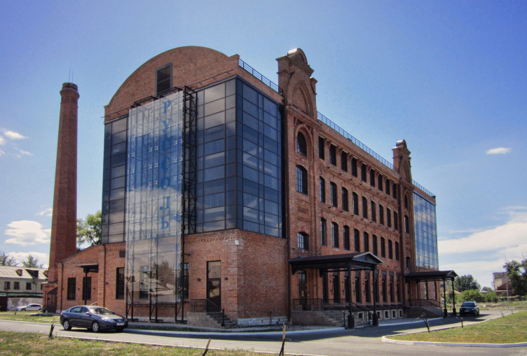
Transforming a derelict building into an up-to-date office center is a task that is quite difficult but at the same time quite common nowadays. The only thing that is uncommon in this particular case is the very subject of reconstruction - it is the mill house of Merchant Zaryvny, built back in 1894, Orenburg's fine specimen of Russian provincial red-brick style. And it was not just "transformed". This is the city's first experiment of reconstructing a building in the "loft" style so popular nowadays. And the experiment turned out to be a success: the work of Т+Т Architects in cooperation with Mealhouse Concept Design immediately became a nominee of International (Europe & Africa) Commercial Property Awards 2010 (London), winning in the category "best architectural project (office building). 

Back in the day, during the 1940's, the process of turning derelict industrial objects into residential buildings was launched in the United States. It was also the American architects of those days that developed the "inner-process" fashion and style. Originating from Manhattan, this fashion of remodeling the empty lofts of industrial premises into "studio" apartments grew into a fashion for full-scale reconstruction of industrial buildings into residential houses. However, the architectural and constructional specifics dictated their own conditions, and the idea of remodeling the factory buildings into housing projects with time transformed into the idea of reconstructing them into office premises. The next logic step was reconstructing the outdated factory buildings into business centers. 

The fashion changed but the style based on the inevitable idea of implementing the authentic parts of the building into the context of the new architectural solution - remained effectively the same. The factory chimneys, stairways, and even some production units were turned into indispensable elements of the new and reformed building. 

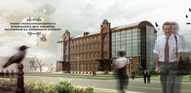
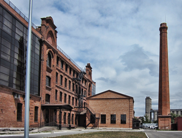
Exactly in this way, in full accordance with the rules of the genre, acted the authors of the transformation of mill house, or, to be more exact, of the red-brick building of the flour mill, once belonging to Merchant Zaryvny, built in 1894, to be rebuilt into an office center of "B" Class for "Russol" company, creating in the provincial Orenburg the canonic example of the style (the work started in 2010 and ended in 2014). On the one side - a monument of architecture, an example of reconstruction that is conservatively careful, one that inspires admiration for the keen attention to detail, almost restoration and preservation of everything that could be possibly saved: from the size and the rhythm of the basement floor windows to the brickwork of the arches on the gables of the main facade. On the other side - organizing the open space behind the gigantic glass over the annex of the former boiler house, expo area on the attic story, the inevitable meeting points for informal communication at each level and the reception desk, drawn with the "big city flash", curiously looking very much like a salt evaporation vessel. Oh, we forgot to mention that the customer is Russia's largest manufacturer of salt. The authors also came up with an unusual project of the the interior design of the offices: calm light shades, bright accents, and a color code for the floors. 
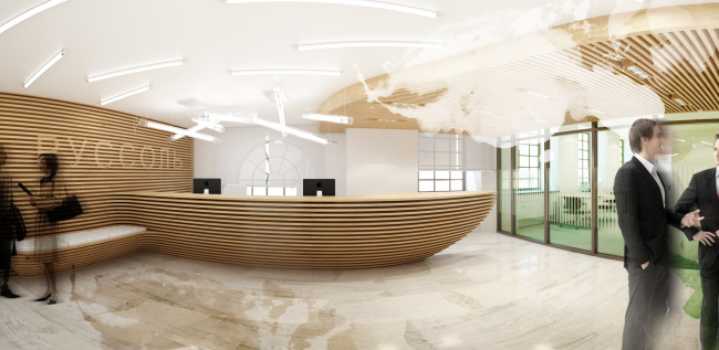

Reconstruction of the milling factory of Merchant Zaryvny into an office center © Т+Т Architects, Mealhouse Concept Design
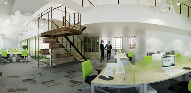

Reconstruction of the milling factory of Merchant Zaryvny into an office center © Т+Т Architects, Mealhouse Concept Design
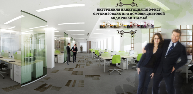

Reconstruction of the milling factory of Merchant Zaryvny into an office center © Т+Т Architects, Mealhouse Concept Design

The edifice is open for the guests visiting the showroom not on the first but on the top floor, or, rather, even above it, just as the idea to place the cafe in the basement floor is quite the traditional "loft-style" solution: the visitors simply must see all the possibilities of the remodeled space - from the opened-up basements to the ceiling supporting trusses. 

A special mention should be given to the metallic parts of the facade. The presence of metallic parts - the already-mentioned staircases, hoist blocks, and other structural parts, is one of the "ground rules" of any loft. However, the traditional red-brick architecture is more often than not devoid of any metallic columns or horizontal beams or housing equipment or any other metallic arsenal that could be used to the style's benefit. And, without trying to imitate anything in the interiors with the only exception being the metallic staircase leading to the attic floor level, the architects came up with an interesting inversion, running the vertical metallic supports into the transparent side facade of the annex. They support the four-story glass wall, the only function of which is to be the "billboard" that displays the company's logo. This principle is usually employed in building the theater setups. 
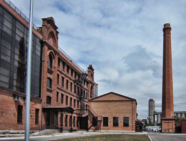

Reconstruction of the milling factory of Merchant Zaryvny into an office center © Т+Т Architects, Mealhouse Concept Design


Reconstruction of the milling factory of Merchant Zaryvny into an office center © Т+Т Architects, Mealhouse Concept Design

Reconstruction of the milling factory of Merchant Zaryvny into an office center © Т+Т Architects, Mealhouse Concept Design

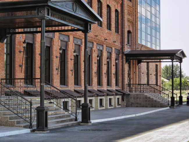
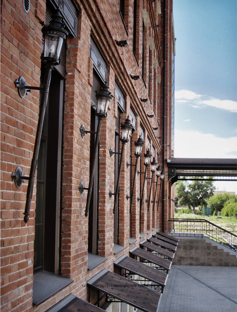
However, while the girders of the side facade are quite obviously but a decorative element, the metal of the main facade presents serious restoration work based on almost exact replicating of the historical analogues. In this case, the metallic theme is continued by an array of wall-mounted lights and the above-window elements, behind which hide the Venetian blinds of the windows of the first floor, the staircase railings, and the marquees. The last point of this "metallic" environment is the fire staircase of the back wall - the exact copy of its New York ancestors that once formed this red-brick style. 

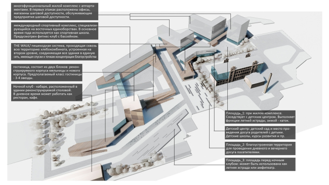
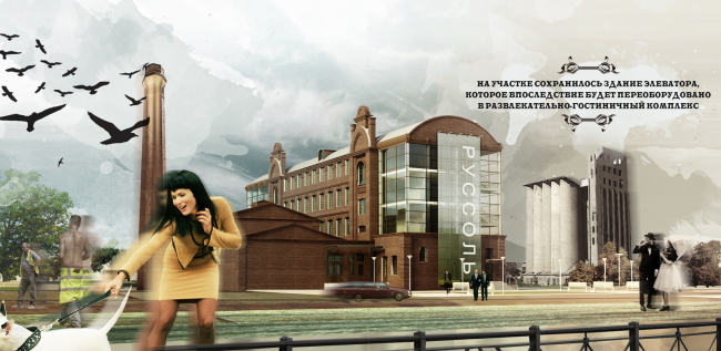
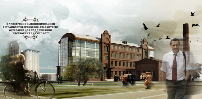
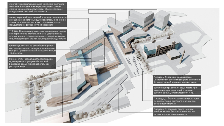
One's attention is also attracted by the fact that, in spite of the total self-sufficiency of the building, its authors never treated it as a separate building surrounded by the dilapidated environment of the bread-making factory. Judging by the master plan, drawn in the vein of Liebenskind, the reformed mill house must become the starting point for creating here a multi-function residential complex with its own fitness center, children's education center and a system of territories united by the pedestrian structure ruining through the entire complex. This, however, is still on paper. Today, this rare-to-be-seen-in-these parts picture of "loft works" is only completed by the restored chimney of the boiler house that is meant, according to the authors, to "support the spirit of loft", and by the surviving building of the grain storage that will be with time turned into a hotel and entertainment complex, creating yet another example to be followed by his kin.

Reconstruction of the milling factory of Merchant Zaryvny into an office center © Т+Т Architects, Mealhouse Concept Design


Plan of the 1st floor. Reconstruction of the milling factory of Merchant Zaryvny into an office center © Т+Т Architects, Mealhouse Concept Design
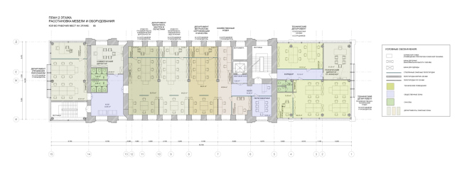

Plan of the 2nd floor. Reconstruction of the milling factory of Merchant Zaryvny into an office center © Т+Т Architects, Mealhouse Concept Design
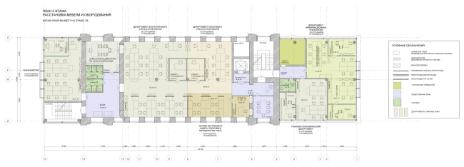


Plan of the 3rd floor. Reconstruction of the milling factory of Merchant Zaryvny into an office center © Т+Т Architects, Mealhouse Concept Design

Plan of the 4th floor. Reconstruction of the milling factory of Merchant Zaryvny into an office center © Т+Т Architects, Mealhouse Concept Design


Reconstruction of the milling factory of Merchant Zaryvny into an office center © Т+Т Architects, Mealhouse Concept Design

Reconstruction of the milling factory of Merchant Zaryvny into an office center © Т+Т Architects, Mealhouse Concept Design

Reconstruction of the milling factory of Merchant Zaryvny into an office center © Т+Т Architects, Mealhouse Concept Design

Reconstruction of the milling factory of Merchant Zaryvny into an office center © Т+Т Architects, Mealhouse Concept Design
Plan of the 1st floor. Reconstruction of the milling factory of Merchant Zaryvny into an office center © Т+Т Architects, Mealhouse Concept Design
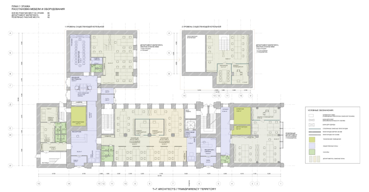
zooming
Plan of the 2nd floor. Reconstruction of the milling factory of Merchant Zaryvny into an office center © Т+Т Architects, Mealhouse Concept Design
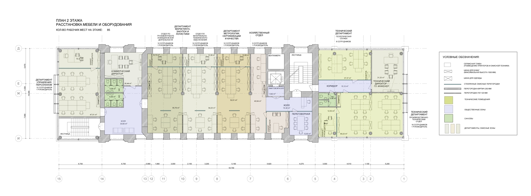
zooming
Plan of the 3rd floor. Reconstruction of the milling factory of Merchant Zaryvny into an office center © Т+Т Architects, Mealhouse Concept Design
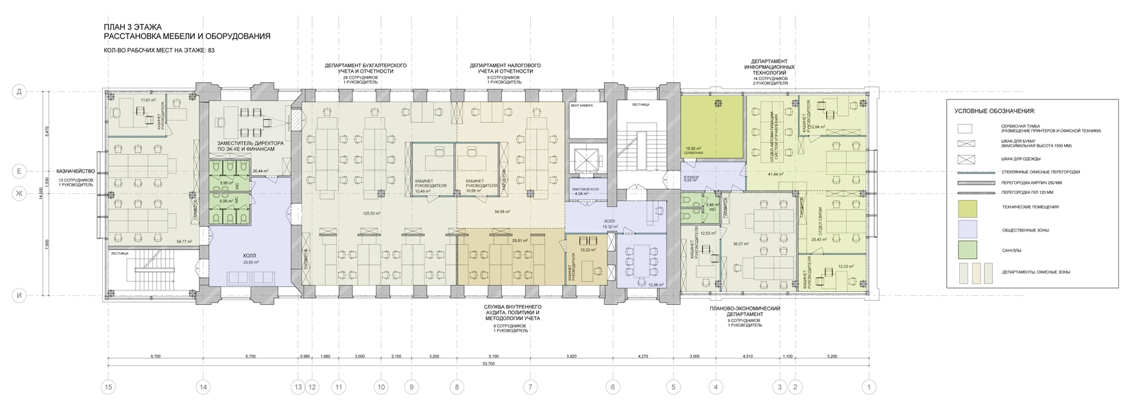
zooming
Plan of the 4th floor. Reconstruction of the milling factory of Merchant Zaryvny into an office center © Т+Т Architects, Mealhouse Concept Design
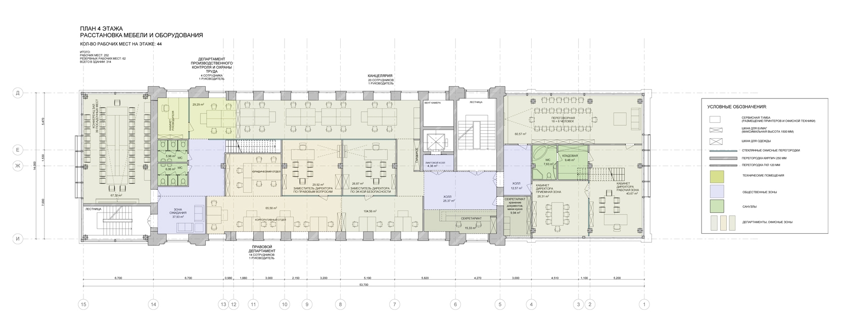
Reconstruction of the milling factory of Merchant Zaryvny into an office center © Т+Т Architects, Mealhouse Concept Design
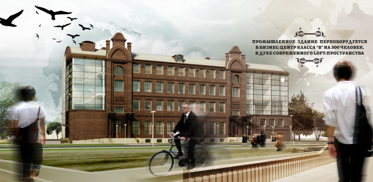


02 September 2014

Headlines now
The Golden Crown
The concept for a dental clinic in Yekaterinburg, developed by CNTR Studio, revolves around the idea of a “mouth full of gold”: pristine white porcelain stoneware walls are complemented by matte brass details. To avoid an overly literal interpretation, the architects focused on the building’s proportions, skillfully navigating between sunlight requirements and fire safety regulations.
Flexibility and Integration
Not long ago, we covered the project for the fourth phase of the ÁLIA residential complex, designed by APEX. Now, we’ve been shown different fence concepts they developed to enclose the complex’s private courtyards, incorporating a variety of public functions. We believe that the sheer fact that the complex’s architects were involved in such a detail as fencing speaks volumes.
A Step Forward
The HIDE residential complex represents a major milestone for ADM architects and their leaders Andrey Romanov and Ekaterina Kuznetsova in their quest for a fresh high-rise aesthetic – one that is flexible and layered, capable of bringing vibrancy to mass and silhouette while shaping form. Over recent years, this approach has become ADM’s “signature style”, with the golden HIDE tower playing a pivotal role in its evolution. Here, we delve into the project’s story, explore the details of the complex’s design, and uncover its core essence.
Gold in the Sands
A new office for a transcontinental company specializing in resource extraction and processing has opened in Dubai. Designed by T+T Architects, masters of creating spaces that are contemporary, diverse, flexible, and original, this project exemplifies their expertise. On the executive floor, a massive brass-clad partition dominates, while layered textures of compressed earth create a contextually resonant backdrop.
Layers and Levels of Flight
This project goes way back – Reserve Union won this architectural competition at the end of 2011, and the building was completed in 2018, so it’s practically “archival”. However, despite being relatively unknown, the building can hardly be considered “dated” and remains a prime example of architectural expression, particularly in the headquarters genre. And it’s especially fitting for an aviation company office. In some ways, it resembles the Aeroflot headquarters at Sheremetyevo but with its own unique identity, following the signature style of Vladimir Plotkin. In this article, we take an in-depth look at the United Aircraft Corporation (UAC) headquarters in the Moscow agglomeration town of Zhukovsky, supplemented by recent photographs from Alexey Naroditsky – a shoot that became only recently possible due to the fact that improvements were finally made in the surrounding area.
Light and Shadow
In this article, we delve into the architectural design of the “Chaika” house by DNK ag architects, which was recently completed in 2023 as part of the collection of signature designs at ZILArt. As is well-known, all the buildings in this complex follow a design code, yet each one is distinct. This particular building stands out not only for its whiteness and minimalism but also for the refined use of a limited number of techniques that, together, create what can confidently be called synergy.
Casus Novae
A master plan was developed for a large residential area with a name of “DNS City”, but now that its implementation began, the plan has been arbitrarily reformatted and replaced with something that, while similar on the surface, is actually quite different. This is not the first time such a thing happens, but it’s always frustrating. With permission from the author, we are sharing Maria Elkina’s post.
Treasure Hunting
The GAFA bureau, in collaboration with Tegola and Arkhitail, organized an expedition to the island of Kilpola in Karelia as part of Moskomarkhitektura’s “Open City” festival. There, amidst moss and rocks, the students sought answers to questions like: what is the sacred, where does it dwell, and what sustains it? Assisting the participants in this quest were landscape engineer Evgeny Levin, artist Nicholas Roerich, a moose, and the lack of cellular connection. Here’s how the story unfolded.
Depths of the Earth, Streams of Water
In the Malaya Okhta district, the Akzent building, designed by Stepan Liphart, was constructed. It follows a classic tripartite structure, yet it’s what you might call “hand-drawn”: each façade is unique in its form and details, some of which aren’t immediately noticeable. In this article, we explore the context and, together with the architect, delve into how the form was developed.
Fir Tree Dynamics
The “Airports of Region” holding is planning to build an airport in Karachay-Cherkessia, aiming to make the Arkhyz and Dombay resorts more accessible to travelers. The project that won in an invitation-only competition, submitted by Sergey Nikeshkin’s KPLN, blends natural imagery inspired by the shape of a conifer seed, open-air waiting spaces, majestic large trees, and a green roof elevated on needle-like columns. The result is both nature-inspired and WOW.
​A Brick Shell
In the process of designing a clubhouse situated among pine trees in a prestigious suburban area near Moscow, the architectural firm “A.Len” did the façade design part. The combination of different types of brick and masonry correlates with the volumetric and plastique solutions, further enhanced by the inclusion of wood-painted fragments and metal “glazing”.
Word Forms
ATRIUM architects love ambitious challenges, and for the firm’s thirtieth anniversary, they boldly play a game of words with an exhibition that dives deep into a self-created vocabulary. They immerse their projects – especially art installations – into this glossary, as if plunging into a current of their own. You feel as if you’re flowing through the veins of pure art, immersed in a universe of vertical cities, educational spaces – of which the architects are true masters – and the cultural codes of various locations. But what truly captivates is the bold statement that Vera Butko and Anton Nadtochy make, both through their work and this exhibition: architecture, above all, is art – the art of working with form and space.
Flexibility and Acuteness of Modernity
Luxurious, fluid, large “kokoshniks” and spiral barrel columns, as if made from colorful chewing gum: there seem to be no other mansion like this in Moscow, designed in the “Neo-Russian-Modern” style. And the “Teremok” on Malaya Kaluzhskaya, previously somewhat obscure, has “come alive with new colors” and gained visibility after its restoration for the office of the “architectural ecosystem” as the architects love to call themselves. It’s evident that Julius Borisov and the architects at UNK put their hearts into finding this new office and bringing it up to date. Let’s delve into the paradoxes of this mansion’s history and its plasticity. Spoiler: two versions of modernity meet here, both balancing on the razor’s edge of “what’s current”.
Yuri Vissarionov: “A modular house does not belong to the land”
It belongs to space, or to the air... It turns out that 3D printing is more effective when combined with a modular approach: the house is built in a workshop and then adapted to the site, including on uneven terrain. Yuri Vissarionov shares his latest experience in designing tourist complexes, both in central Russia and in the south. These include houseboats, homes printed from lightweight concrete using a 3D printer, and, of course, frame houses.
​Moscow’s First
“The quality of education largely depends on the quality of the educational environment”. This principle of the last decade has been realized by Sergey Skuratov in the project for the First Moscow Gymnasium on Rostovskaya Embankment in the Khamovniki district. The building seamlessly integrates into the complex urban landscape, responding both to the pedestrian flow of the city and the quiet alleyways. It skillfully takes advantage of the height differences and aligns with modern trends in educational space design. Let’s take a closer look.
Looking at the Water
The site of Villa Sonata stretches from the road to the water’s edge, offering its own shoreline, pier, and a picturesque river panorama. To reveal these sweeping views, Roman Leonidov “cut” the façade diagonally parallel to the river, thus getting two main axes for the house and, consequently, “two heads”. The internal core – two double-height spaces, a living room and a conservatory, with a “bridge” above them – makes the house both “transparent” and filled with light.
The White Wing
Well, it’s not exactly white. It’s more of a beige, white-stone structure that plays with the color of limestone – smoother surfaces are lighter, while rougher ones are darker. This wing unites various elements: it absorbs and interprets the surrounding themes. It responds to everything, yet maintains a cohesive expression – a challenging task! – while also incorporating recognizable features of its own, such as the dynamic cuts at the bottom, top, and middle.
Urban Dunes
The XSA Ramps team designed and built a three-part sports hub for a park in Rostov-on-Don, welcoming people of all ages and fitness levels. The skate plaza, pump track, and playground are all meticulously crafted with details that attract a diverse range of visitors. The technical execution of the shapes and slopes transforms this space into a kind of sculptural composition.
Proportional Growth
The project for the fourth phase of the ÁLIA residential area has been announced. The buildings are situated on an elongated plot – almost a “ray” that shoots out from the center of the area towards the river. Their layout reflects both a response to Moscow’s architectural preferences over the past 15 years, shifting “from blocks to towers”, and an interpretation of the neighboring business park designed by SOM. Additionally, the best apartments here are not located at the very top but closer to the middle, forming a glowing “waistline”.
The “Staircase” Building
In designing the “Details” residential complex in New Moscow, Rais Baishev spiced up the now-popular Moscow theme of a “courtyard” building with an idea drawn from the surrealist drawings by Maurits Escher. He envisioned the stepped silhouettes and descending slopes as a metaphysical mega-staircase, creating a key void within the courtyard that gave the project an internal “spine”. This concept is felt both in the building’s silhouette and on its façades.
Projection of the Quarter
No one doubted that the building that Vladimir Plotkin designed as part of the “Garden Quarters” would be the most modernist of all. And it turned out just that way: while adhering to the common design code, the building successfully combines brick and white stone, rhythmically responding to the neighboring building designed by Ostozhenka, yet tactfully and persistently making a few statements of its own. This includes the projection of the ideal urban development composition “14–9–6”, which can be found right next door, mathematical calculations, including those for various types of terraces (and perhaps the only reminder of the Soviet past of the Kauchuk rubber factory!), and the white “cross-stitch” pattern of the façade grid.
Domus Aurea
In this issue, we examine the “Tessinsky-1” house, designed by Sergey Skuratov and completed in 2023. Located in the middle of the Serebryanicheskaya Embankment district, at the intersection of its main streets, this house assumes a sort of “nodal” role: it not only responds to everything around it and preserves many memories of the former EMA factory within itself, but it weaves all this into a newly directed pattern, reconciling bright “gold” and dark-colored brick, largely with the help of the new, modern-yet-archaic Columba brick, which, come to think about it, is the most precious element here.
The Chimney of Nikola-Lenivets
In this issue, we are examining the “Obelisk House” designed by KATARSIS and built for the Arkhstoyanie 2023 festival. However, it was only finished later on, and this is why we are examining it now. It seems to us that after the “Obelisk House” appeared in Nikola-Lenivets, a dialogue and a few inner connections appeared between the temporary structures built here. These houses no longer look like “accidental neighbors”, more of which below.
​Periscope by the Bay
The jury awarded the second place in the competition for a public and cultural center in Petropavlovsk-Kamchatsky to the companies GORA (“Mountain”) and M4. In the consortium’s proposal, the building resembles a sperm whale with a calf swimming next to it or a periscope, whose lenses capture the most spectacular views from the surrounding landscape.
From Arcs to Dolmens
While working on the competition project for Petropavlovsk-Kamchatsky, ASADOV Architects prioritized the value of the natural and urban environment, aiming to preserve the balance of the location while minimizing the resemblance of the volume that they designed to a “traditional building”. The task was challenging, and the architects created three versions, one of which having been developed after the competition, where their main proposal took third place. However, the point of interest here is not the competition result but the continuity of creative thinking.
Hide and Seek
The ID Moskovskiy house, designed by Stepan Liphart in St. Petersburg, in the courtyards near Moskovskiy Avenue beyond the Obvodny Canal and recently completed, is notable for several reasons. Firstly, it has been realized with considerable accuracy, which is particularly significant as this is the first building where the architect was responsible not only for the facades but also for the layouts, allowing for better integration between the two. On the other hand, this building is interesting as an example of the “germination” of new architecture in the city: it draws on the best examples from the neighborhood and becomes an improved and developed sum of ideas found by the architect in the surrounding context.
The Big Twelve
Yesterday, the winners of the Moscow Mayor’s Architecture Award were announced and honored. Let’s take a look at what was awarded and, in some cases, even critique this esteemed award. After all, there is always room for improvement, right?
Above the Golden Horn
The residential complex “Philosophy” designed by T+T architects in Vladivostok, is one of the new projects in the “Golubinaya Pad” area, changing its development philosophy (pun intended) from single houses to a comprehensive approach. The buildings are organized along public streets, varying in height and format, with one house even executed in gallery typology, featuring a cantilever leaning on an art object.
Nuanced Alternative
How can you rhyme a square and space? Easily! But to do so, you need to rhyme everything you can possibly think of: weave everything together, like in a tensegrity structure, and find your own optics too. The new exhibition at GES-2 does just that, offering its visitor a new perspective on the history of art spanning 150 years, infused with the hope for endless multiplicity of worlds and art histories. Read on to see how this is achieved and how the exhibition design by Evgeny Ace contributes to it.
Blinds for Ice
An ice arena has been constructed in Domodedovo based on a project by Yuri Vissarionov Architects. To prevent the long façade, a technical requirement for winter sports facilities, from appearing monotonous, the architects proposed the use of suspended structures with multidirectional slats. This design protects the ice from direct sunlight while giving the wall texture and detail.