По-русски

Twice more ambitions. The contest in Perm has got the two winners

Results of the open architectural contest on the project of new museum centre in Perm, organized by the Centre of Modern architecture, have been summarized. The main award was shared between the Swiss architect Valerio Olgiati and Boris Bernaskoni The third award was given to Zaha Hadid. Peter Noever is happy for he “has survived”, Peter Zumthor suggested to construct a special museum for Perm wooden sculpture, and preferences in style are changing, but not in favor of digitality

26 March 2008
Report
mainImg

The organizers of the PermMuseumXXI contest call it a most ambitious in the new Russia, and they have true reasons for that. This is the first open architectural contest organized for Russia, in which took part Russian, as well as foreign architects, including the “stars”. The first stage was held in summer – the experts examined more than 300 portfolios of architects from 50 countries, and picked 25 studios that took part in the second stage – projected the museum. These architects were taken to Perm, were shown the collection for which they would make project.

The museum is expected to become a symbolic object that will transform that sad part of the town and attract tourists. In short, to become a “Permsky Bilbao”. Peter Zumthor, the president of jury, made the task even more difficult: he is sure that such kind of contests must create not only a symbolic object, but discover new names – help to promote young and gifted. So, theoretically, a project of “not a star”, or rather the future star, was expected to win.

On the 24th of March the envelope with voting results was opened and it appeared that the two objects gained the equal number of points. So the first $100 000 and the second $ 70 000 awards were added up and each winner got $ 85 000. The two winners are Boris Bernaskoni and Valerio Olgiati. It is not known yet who will continue the project and construct. Irina Korobina, the director of the Centre of modern architecture, said that Ministry of Cultural Affairs of Permsky krai, the developer, took time-out and is considering the further steps.

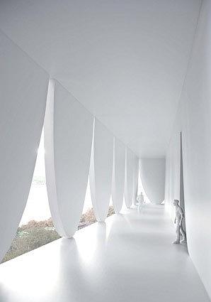
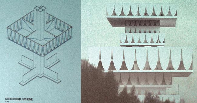
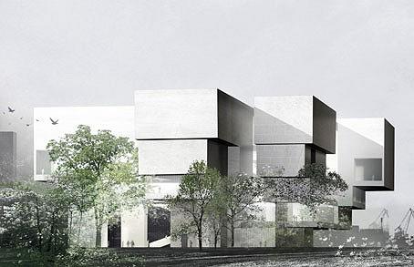
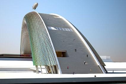
The project by Valerio Olgiati, the Swiss architect, is a tower, interesting outline of which consists of 7 or 8 rectangular layers of different width thread onto the single core. All the facades have equal half-ovals and they resemble a giant flattened fringe. This shape reminds of the palace Alvorada by Oscar Niemeyer or even more of something from Soviet period. Like, a collective image of Breznev museum was taken, than multiplied in different sizes and than these clones were disorderly staged onto each other – there shaped a kind of disorderly pyramid. But the building is quite tall (many projects are made closer to the ground), views to Perm surrounding, to the town and the Kama open from large windows.

Speaking about this project Peter Zumthor noticed that all the Russian members of the jury hated him from the first sight. Than, answering Sergey Khachaturov’s question – what were the criteria for the choice of this pagoda? – Zumthor said that the building is “growing like a tree” and opens the views around it. Probably, noticed the president of jury, the Russians saw something from their Soviet past in it. The Russian members of jury called it kitsch but Peter Zumthor sees it as a challenge.

“I thought, the Russians would like it…” – said the president of jury, and added: this might be due to the difference in mentalities of Europeans and the Russians. And we add that here might be an influence of the image of Russia as something soviet , serious but ornamental. Ornamentally-serious and so growing like a tree, without particular rules, its very orientally. Viollet-le-Duc, the French restorer of the XIX century, constructed Russian domes and “hills of kokoshnik” in Indian architecture. And here – if “pagoda” – we have something Russian-Chinese. Someone of the audience said – a hint on the nearest future… Such image of the Siberia does not seem to be a result of a thorough consideration of the context. It is rather based on the believe that “there is much snow”.

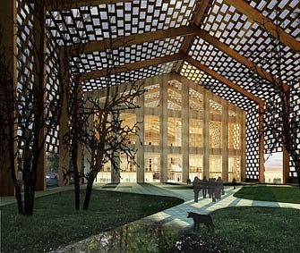
Well, during the discussions over the contest Peter Zumthor suggested an interesting idea – to build a special and minimalist building for the Perm collection of wooden sculpture, which is the main treasure of the museum. The idea seems to be fine but it has not been suggested in the frame of the contest. If take the main treasure of the Perm collection to a separate building then what will remain there? The Central House of Artist?

The equal winner – Boris Bernaskoni – in Moscow is mostly popular due to due to his conceptual extravagant works. Last ArchMoscow he presented the museum of Tsereteli as a monument to Peter the Great, taken to a glass parallelepiped; a year before that – a house-matreshka. The architect is popular but has no significant constructions. For Bernaskoni, in this meaning, the win (or half-win) on the Perm contest is an important event and it responses to the plan of Zumthor to promote the new names. Boris Bernaskoni is the youngest of all the Russian participants (he is 37).

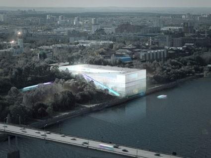
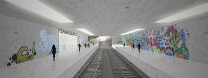
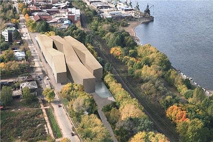
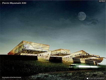
The Perm museum in the variant of Boris Bernaskoni is a parallelepiped glowing in the night. One of its sizes is turned to the river – the project includes the complete development of the bank zone, its transformation into a real quay (and this was one of the main value). Along the “long” sides there are wide and stretched symmetrical rampants that lead visitors to the roof. The peculiarity of the project is that it supposes railways in the interior of the museum, arranging a station inside, visitors will probably get directly to the museum from there. This idea that reminds of an airport, made the journalist Grigory Revzin doubt whether such experiment would not be prohibited by the Russian standards of design and engineering. Answering the question Irina Korobina quoted Peter Zumthor “rules are for people and they can be corrected if it is necessary”.

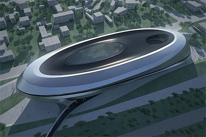
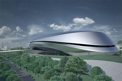
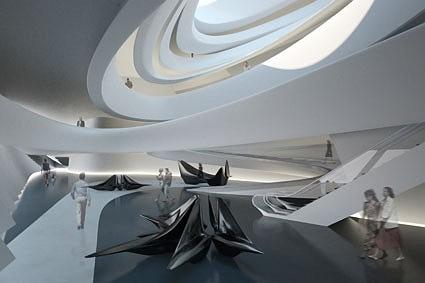
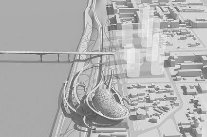
The third award ($ 50 000) was given to Zaha Hadid, and thus was shown the preference of the young against the recognized “stars”. Her project is impressionable as always, but more relaxed and calm as usual: the well-known figurable shape is folded into an oval ring. Such “plainness” seems to be a response to the Peter Zumthor’s line, he repeated it on the press-conference that he was against impersonal “star” architecture, but after the local uniqueness and the context. And this was one of the criteria voiced by the jury.

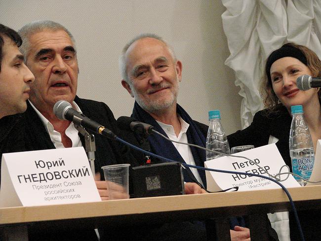
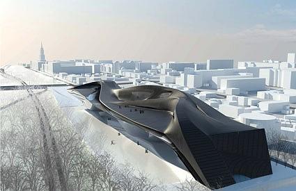
The example is of Hadid is telling. The results of the second stage show an interesting tendency – the jury seemed to be unwelcome to curvilinearity. Beautifully and plastically drawn project of Asymptote was given just an encouragement prize, the brilliant Zaha curled up and got the third prize, and the first award was shared between the dramatically rectangular projects. It’s like they declare they are rectangular. Is that a shift of style priorities? Or is that how foreigners see the Russian context, or how the Russians see themselves? Or is that longing for avant-garde that was mentioned by Yuri Gnedovsky? It is hard to say why but popular digitality is suddenly kept down. It might be that very international style against which warned Peter Zumthor.

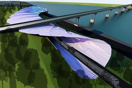
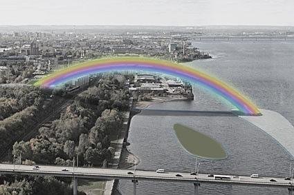
There was the other criteria mentioned by Aleksandr Kudryavcev – the preference was given to the projects that could be implemented. Probably, this is why the project by Totan Kuzembaev in the shape of bridge-rainbow, thrown over from the bank to the island in the Kama, got only the encouragement prize. Though, to my mind, it would be symbolic: clear image is full of emotions and meanings – rainbow is the symbol of hope, and here it could be understood as a hope for renewal of the town. Still, the symbol is too well-known and might be another reason the project did not win.

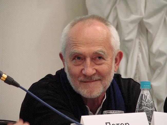
The other foreign member of jury is the director of museum MAK Peter Noever said about the work: “fortunately I have survived” and hinted at the extremely intensive discussions, and it was very hard not to fail to meet the quorum because a few members of jury refused. Arata Isodzaki was not in jury because of illness; Mikhail Piotrovsky, the director of Hermitage, voted by e-mail, but the jury did not accept it because it was via Internet and focused on live debates on projects. Oleg Oschepkov, Minister of Cultural Affairs of Permsky krai also did not take part, he was removed from the post that time. Nadezhda Belyaeva, the director of Perm are gallery was voting instead of Piotrovsky, and senator Sergey Gordeev, the founder of the fund “Russky avangard” [Russian avant-garde], could vote instead Oleg Oschepkov. Ben van Berkel, an architect from the Netherlands refused three weeks before the start of the contest and his right to vote was not given to anyone else. Irina Korobina, the director of the Centre of modern architecture, said all the replacements were done according to law and we managed to make the quorum.

Also Peter Noever added: “it is sad that we failed to give clear recommendation” and this is sad indeed. We can be joyful for the both finalists of the second stage, but there inevitably goes the third one. The projects cannot be joined, both Noever and Zumthor admitted that. Such alternative as joint construction is not considered. The rising stars might remain on the paper only. What decision will make the developer, region ministry and administration, which structure had been renewed the time when the jury was doing their job.

zooming
zooming
zooming
zooming
zooming
zooming
zooming
zooming
zooming
zooming
zooming
zooming
zooming
zooming
zooming
zooming


26 March 2008

Headlines now
The Golden Crown
The concept for a dental clinic in Yekaterinburg, developed by CNTR Studio, revolves around the idea of a “mouth full of gold”: pristine white porcelain stoneware walls are complemented by matte brass details. To avoid an overly literal interpretation, the architects focused on the building’s proportions, skillfully navigating between sunlight requirements and fire safety regulations.
Flexibility and Integration
Not long ago, we covered the project for the fourth phase of the ÁLIA residential complex, designed by APEX. Now, we’ve been shown different fence concepts they developed to enclose the complex’s private courtyards, incorporating a variety of public functions. We believe that the sheer fact that the complex’s architects were involved in such a detail as fencing speaks volumes.
A Step Forward
The HIDE residential complex represents a major milestone for ADM architects and their leaders Andrey Romanov and Ekaterina Kuznetsova in their quest for a fresh high-rise aesthetic – one that is flexible and layered, capable of bringing vibrancy to mass and silhouette while shaping form. Over recent years, this approach has become ADM’s “signature style”, with the golden HIDE tower playing a pivotal role in its evolution. Here, we delve into the project’s story, explore the details of the complex’s design, and uncover its core essence.
Gold in the Sands
A new office for a transcontinental company specializing in resource extraction and processing has opened in Dubai. Designed by T+T Architects, masters of creating spaces that are contemporary, diverse, flexible, and original, this project exemplifies their expertise. On the executive floor, a massive brass-clad partition dominates, while layered textures of compressed earth create a contextually resonant backdrop.
Layers and Levels of Flight
This project goes way back – Reserve Union won this architectural competition at the end of 2011, and the building was completed in 2018, so it’s practically “archival”. However, despite being relatively unknown, the building can hardly be considered “dated” and remains a prime example of architectural expression, particularly in the headquarters genre. And it’s especially fitting for an aviation company office. In some ways, it resembles the Aeroflot headquarters at Sheremetyevo but with its own unique identity, following the signature style of Vladimir Plotkin. In this article, we take an in-depth look at the United Aircraft Corporation (UAC) headquarters in the Moscow agglomeration town of Zhukovsky, supplemented by recent photographs from Alexey Naroditsky – a shoot that became only recently possible due to the fact that improvements were finally made in the surrounding area.
Light and Shadow
In this article, we delve into the architectural design of the “Chaika” house by DNK ag architects, which was recently completed in 2023 as part of the collection of signature designs at ZILArt. As is well-known, all the buildings in this complex follow a design code, yet each one is distinct. This particular building stands out not only for its whiteness and minimalism but also for the refined use of a limited number of techniques that, together, create what can confidently be called synergy.
Casus Novae
A master plan was developed for a large residential area with a name of “DNS City”, but now that its implementation began, the plan has been arbitrarily reformatted and replaced with something that, while similar on the surface, is actually quite different. This is not the first time such a thing happens, but it’s always frustrating. With permission from the author, we are sharing Maria Elkina’s post.
Treasure Hunting
The GAFA bureau, in collaboration with Tegola and Arkhitail, organized an expedition to the island of Kilpola in Karelia as part of Moskomarkhitektura’s “Open City” festival. There, amidst moss and rocks, the students sought answers to questions like: what is the sacred, where does it dwell, and what sustains it? Assisting the participants in this quest were landscape engineer Evgeny Levin, artist Nicholas Roerich, a moose, and the lack of cellular connection. Here’s how the story unfolded.
Depths of the Earth, Streams of Water
In the Malaya Okhta district, the Akzent building, designed by Stepan Liphart, was constructed. It follows a classic tripartite structure, yet it’s what you might call “hand-drawn”: each façade is unique in its form and details, some of which aren’t immediately noticeable. In this article, we explore the context and, together with the architect, delve into how the form was developed.
Fir Tree Dynamics
The “Airports of Region” holding is planning to build an airport in Karachay-Cherkessia, aiming to make the Arkhyz and Dombay resorts more accessible to travelers. The project that won in an invitation-only competition, submitted by Sergey Nikeshkin’s KPLN, blends natural imagery inspired by the shape of a conifer seed, open-air waiting spaces, majestic large trees, and a green roof elevated on needle-like columns. The result is both nature-inspired and WOW.
​A Brick Shell
In the process of designing a clubhouse situated among pine trees in a prestigious suburban area near Moscow, the architectural firm “A.Len” did the façade design part. The combination of different types of brick and masonry correlates with the volumetric and plastique solutions, further enhanced by the inclusion of wood-painted fragments and metal “glazing”.
Word Forms
ATRIUM architects love ambitious challenges, and for the firm’s thirtieth anniversary, they boldly play a game of words with an exhibition that dives deep into a self-created vocabulary. They immerse their projects – especially art installations – into this glossary, as if plunging into a current of their own. You feel as if you’re flowing through the veins of pure art, immersed in a universe of vertical cities, educational spaces – of which the architects are true masters – and the cultural codes of various locations. But what truly captivates is the bold statement that Vera Butko and Anton Nadtochy make, both through their work and this exhibition: architecture, above all, is art – the art of working with form and space.
Flexibility and Acuteness of Modernity
Luxurious, fluid, large “kokoshniks” and spiral barrel columns, as if made from colorful chewing gum: there seem to be no other mansion like this in Moscow, designed in the “Neo-Russian-Modern” style. And the “Teremok” on Malaya Kaluzhskaya, previously somewhat obscure, has “come alive with new colors” and gained visibility after its restoration for the office of the “architectural ecosystem” as the architects love to call themselves. It’s evident that Julius Borisov and the architects at UNK put their hearts into finding this new office and bringing it up to date. Let’s delve into the paradoxes of this mansion’s history and its plasticity. Spoiler: two versions of modernity meet here, both balancing on the razor’s edge of “what’s current”.
Yuri Vissarionov: “A modular house does not belong to the land”
It belongs to space, or to the air... It turns out that 3D printing is more effective when combined with a modular approach: the house is built in a workshop and then adapted to the site, including on uneven terrain. Yuri Vissarionov shares his latest experience in designing tourist complexes, both in central Russia and in the south. These include houseboats, homes printed from lightweight concrete using a 3D printer, and, of course, frame houses.
​Moscow’s First
“The quality of education largely depends on the quality of the educational environment”. This principle of the last decade has been realized by Sergey Skuratov in the project for the First Moscow Gymnasium on Rostovskaya Embankment in the Khamovniki district. The building seamlessly integrates into the complex urban landscape, responding both to the pedestrian flow of the city and the quiet alleyways. It skillfully takes advantage of the height differences and aligns with modern trends in educational space design. Let’s take a closer look.
Looking at the Water
The site of Villa Sonata stretches from the road to the water’s edge, offering its own shoreline, pier, and a picturesque river panorama. To reveal these sweeping views, Roman Leonidov “cut” the façade diagonally parallel to the river, thus getting two main axes for the house and, consequently, “two heads”. The internal core – two double-height spaces, a living room and a conservatory, with a “bridge” above them – makes the house both “transparent” and filled with light.
The White Wing
Well, it’s not exactly white. It’s more of a beige, white-stone structure that plays with the color of limestone – smoother surfaces are lighter, while rougher ones are darker. This wing unites various elements: it absorbs and interprets the surrounding themes. It responds to everything, yet maintains a cohesive expression – a challenging task! – while also incorporating recognizable features of its own, such as the dynamic cuts at the bottom, top, and middle.
Urban Dunes
The XSA Ramps team designed and built a three-part sports hub for a park in Rostov-on-Don, welcoming people of all ages and fitness levels. The skate plaza, pump track, and playground are all meticulously crafted with details that attract a diverse range of visitors. The technical execution of the shapes and slopes transforms this space into a kind of sculptural composition.
Proportional Growth
The project for the fourth phase of the ÁLIA residential area has been announced. The buildings are situated on an elongated plot – almost a “ray” that shoots out from the center of the area towards the river. Their layout reflects both a response to Moscow’s architectural preferences over the past 15 years, shifting “from blocks to towers”, and an interpretation of the neighboring business park designed by SOM. Additionally, the best apartments here are not located at the very top but closer to the middle, forming a glowing “waistline”.
The “Staircase” Building
In designing the “Details” residential complex in New Moscow, Rais Baishev spiced up the now-popular Moscow theme of a “courtyard” building with an idea drawn from the surrealist drawings by Maurits Escher. He envisioned the stepped silhouettes and descending slopes as a metaphysical mega-staircase, creating a key void within the courtyard that gave the project an internal “spine”. This concept is felt both in the building’s silhouette and on its façades.
Projection of the Quarter
No one doubted that the building that Vladimir Plotkin designed as part of the “Garden Quarters” would be the most modernist of all. And it turned out just that way: while adhering to the common design code, the building successfully combines brick and white stone, rhythmically responding to the neighboring building designed by Ostozhenka, yet tactfully and persistently making a few statements of its own. This includes the projection of the ideal urban development composition “14–9–6”, which can be found right next door, mathematical calculations, including those for various types of terraces (and perhaps the only reminder of the Soviet past of the Kauchuk rubber factory!), and the white “cross-stitch” pattern of the façade grid.
Domus Aurea
In this issue, we examine the “Tessinsky-1” house, designed by Sergey Skuratov and completed in 2023. Located in the middle of the Serebryanicheskaya Embankment district, at the intersection of its main streets, this house assumes a sort of “nodal” role: it not only responds to everything around it and preserves many memories of the former EMA factory within itself, but it weaves all this into a newly directed pattern, reconciling bright “gold” and dark-colored brick, largely with the help of the new, modern-yet-archaic Columba brick, which, come to think about it, is the most precious element here.
The Chimney of Nikola-Lenivets
In this issue, we are examining the “Obelisk House” designed by KATARSIS and built for the Arkhstoyanie 2023 festival. However, it was only finished later on, and this is why we are examining it now. It seems to us that after the “Obelisk House” appeared in Nikola-Lenivets, a dialogue and a few inner connections appeared between the temporary structures built here. These houses no longer look like “accidental neighbors”, more of which below.
​Periscope by the Bay
The jury awarded the second place in the competition for a public and cultural center in Petropavlovsk-Kamchatsky to the companies GORA (“Mountain”) and M4. In the consortium’s proposal, the building resembles a sperm whale with a calf swimming next to it or a periscope, whose lenses capture the most spectacular views from the surrounding landscape.
From Arcs to Dolmens
While working on the competition project for Petropavlovsk-Kamchatsky, ASADOV Architects prioritized the value of the natural and urban environment, aiming to preserve the balance of the location while minimizing the resemblance of the volume that they designed to a “traditional building”. The task was challenging, and the architects created three versions, one of which having been developed after the competition, where their main proposal took third place. However, the point of interest here is not the competition result but the continuity of creative thinking.
Hide and Seek
The ID Moskovskiy house, designed by Stepan Liphart in St. Petersburg, in the courtyards near Moskovskiy Avenue beyond the Obvodny Canal and recently completed, is notable for several reasons. Firstly, it has been realized with considerable accuracy, which is particularly significant as this is the first building where the architect was responsible not only for the facades but also for the layouts, allowing for better integration between the two. On the other hand, this building is interesting as an example of the “germination” of new architecture in the city: it draws on the best examples from the neighborhood and becomes an improved and developed sum of ideas found by the architect in the surrounding context.
The Big Twelve
Yesterday, the winners of the Moscow Mayor’s Architecture Award were announced and honored. Let’s take a look at what was awarded and, in some cases, even critique this esteemed award. After all, there is always room for improvement, right?
Above the Golden Horn
The residential complex “Philosophy” designed by T+T architects in Vladivostok, is one of the new projects in the “Golubinaya Pad” area, changing its development philosophy (pun intended) from single houses to a comprehensive approach. The buildings are organized along public streets, varying in height and format, with one house even executed in gallery typology, featuring a cantilever leaning on an art object.
Nuanced Alternative
How can you rhyme a square and space? Easily! But to do so, you need to rhyme everything you can possibly think of: weave everything together, like in a tensegrity structure, and find your own optics too. The new exhibition at GES-2 does just that, offering its visitor a new perspective on the history of art spanning 150 years, infused with the hope for endless multiplicity of worlds and art histories. Read on to see how this is achieved and how the exhibition design by Evgeny Ace contributes to it.
Blinds for Ice
An ice arena has been constructed in Domodedovo based on a project by Yuri Vissarionov Architects. To prevent the long façade, a technical requirement for winter sports facilities, from appearing monotonous, the architects proposed the use of suspended structures with multidirectional slats. This design protects the ice from direct sunlight while giving the wall texture and detail.