По-русски

Vertical City Experiment

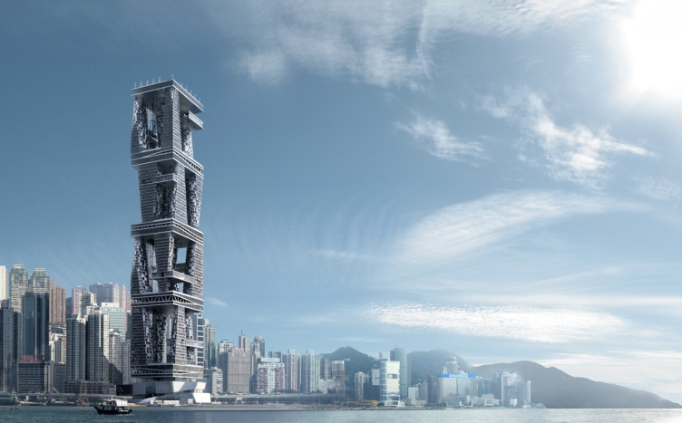
Designed for Hong-Kong by Levon Airapetov and Valeria Preobrazhenskaya, the contest project of a skyscraper continues the search for a fresh view of the architectural matter characteristic of these authors, and at the sane time proposes a new look at the grammar of the high-rise architecture.

10 July 2014
Object
mainImg
Originally, the project was developed for the international contest of ideas but, missing the deadlines, the architects finished it in the "paper" capacity, as the concept of the new and unconventional shape of the skyscraper, and showed it at the stand of "Archcatalogue" at "Arch
Moscow" fair.


Project of the skyscraper upon the Arcology concept for Hong-Kong. 2014 © TOTEMENT / PAPER

According to the terms and conditions of the contest that took place this spring, the participants were to propose a design of a high-rise building that will be built in one of the most high-profile places of Hong-Kong, on the shore next to the Expo Center. The skyscraper was not to be just excellent but "arcological" - meaning, answering the Arcology concept - which was proposed by the architect Paolo Soleri back in 1969, he started to implement it at that time but never finished it - this concept is still to be found more in sci-fi books and movies than in the architecture, which is admitted in their brief, repeating the Wikipedia, by the authors of the contest concept. According to this semi-sci-fi concept (the word is actually a combination of "architecture" and "ecology"), the building must be completely self-sufficient and fully capable of serving itself, being "passive", causing no harm to nature, and including everything necessary for normal life. The main thing (that actually makes the concept particularly "sci-fi") about this building is that besides the traditional for any contemporary mixed-use complex residential premises, offices, and public spaces, the building must also has in it agricultural farms providing the entire place with food. According to the Soleri concept, the "arcological" building does not necessarily have to be a skyscraper, but Hong-Kong is a high-rise city, and required particularly a super-skyscraper, i.e. a building no less than 300 meters tall. 

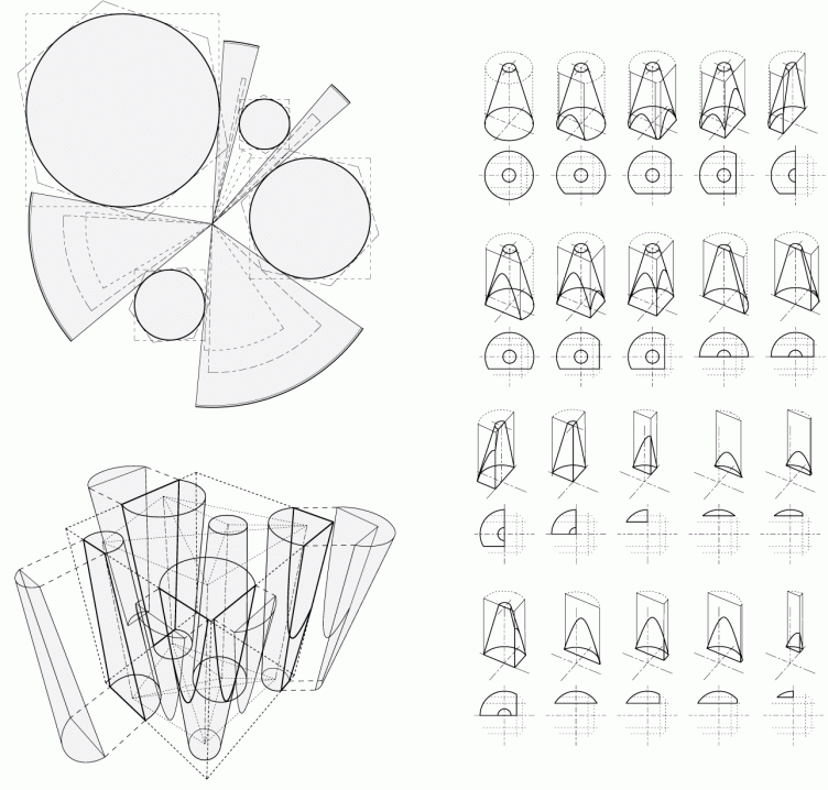
As an answer to this challenge, the architects of TOTEMENT/PAPER (with considerable input from the bureau's young architect Egor Legkov - stress the bureau's leaders Levon Airapetov and Valeria Preobrazhenskaya) proposed a skyscraper totally unlike the "usual" high-rises of the modern world. They remembered and developed an idea of their own, one that they had already tried with the project of an expo and business center in Sakhalin - it consists in the fact that the architectural matter is formed in accordance with a specific plastic "code". In this case, just like at Sakhalin, the space and the plastics are formed by the multiply repeated cones of different sizes, some of which are turned upside down, i.e. they are narrowing downwards. Thus, the plan of the building consists of numerous circles, the vertical outlines are slanted, and the dissection of any constituent part by a vertical surface turns out parabolic. By using this technique, the architects get a rather broad range of unconventional shapes, setting, as the basis of their plastic code, but a single and clearly readable unit of a cone. 


"Stereotonomy" layout © TOTEMENT / PAPER

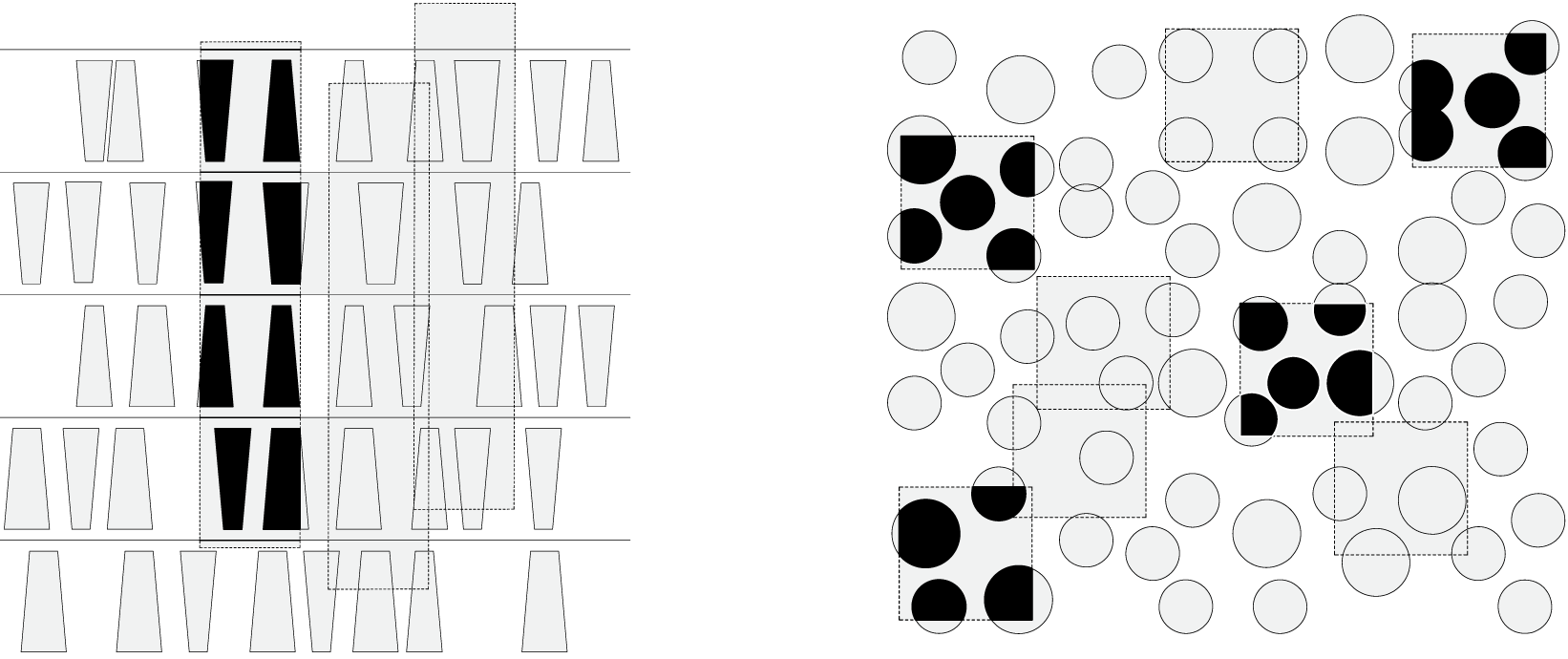
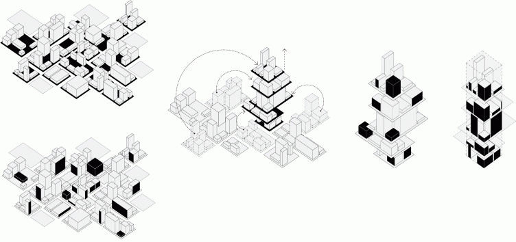
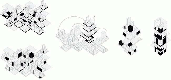
However, a more important technique in this project (just as in the Sakhalin one) is not the cone as such but its section. The authors gave their main technique a name of "stereotonomy" that they literally decipher as "dissection of a volume": the city matter that consists of conical buildings and spaces between them is dissected by planes at the borders of the land site - like Swiss cheese or a piece if water-melon cut out from the whole. Such an approach - and the architects specifically stress this - allows for an indefinite development broadways: let us imagine a city the blocks of which consist of cone-shaped buildings, rather closely placed on green lawns - a forest of sorts of "tree-trunk" houses, dissected by the streets, and where the red line of the site runs over the mass of the cone, they grow into one another, forming a surface with parabolic outlines. This approach is opposed to the classical "square block" one where the houses are built along the perimeter of the land site, and, at the same time, the freedom of section allows to inscribe such "urban matter" into any street grid. 
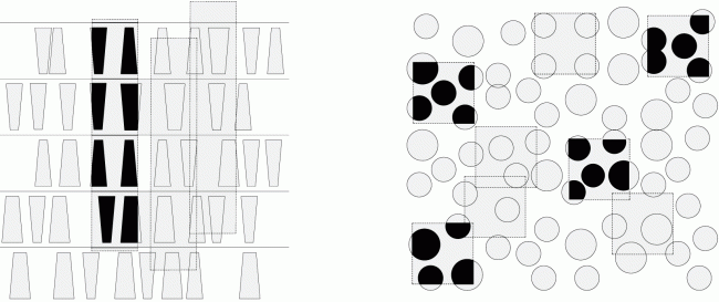

"Stereotonomy" layout © TOTEMENT / PAPER
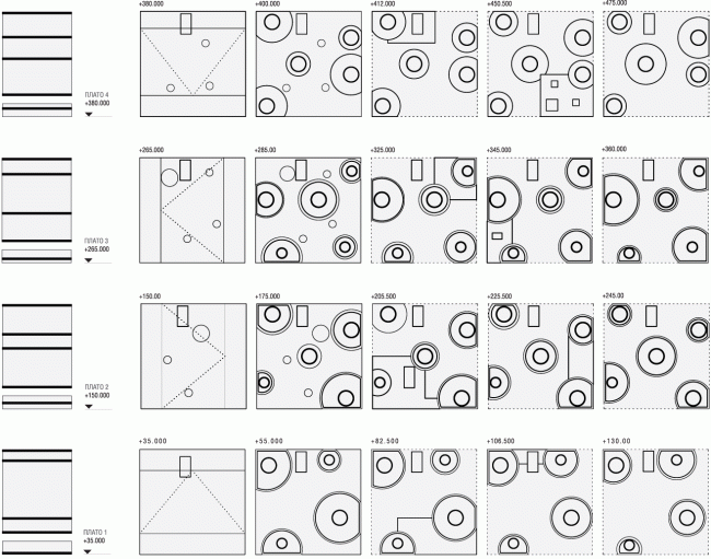

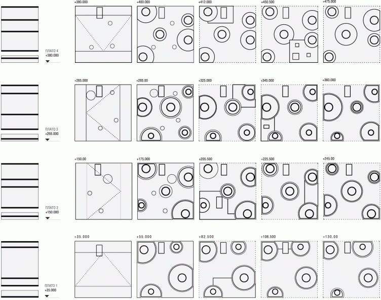
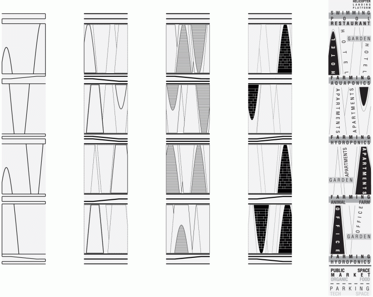
Section views of the floors © TOTEMENT / PAPER

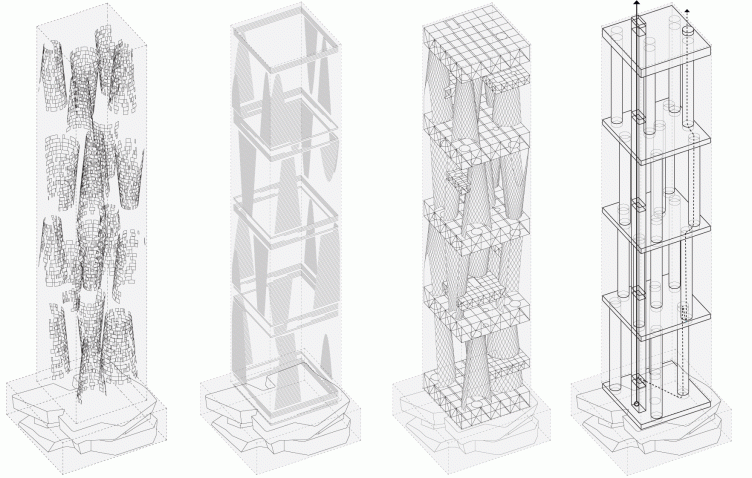
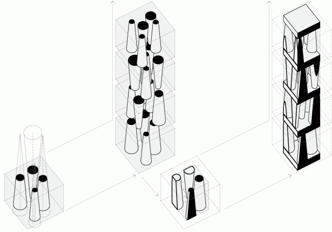
The sucession of forming the "vertical block" in the project © TOTEMENT / PAPER

"Stereotonomy" layout © TOTEMENT / PAPER

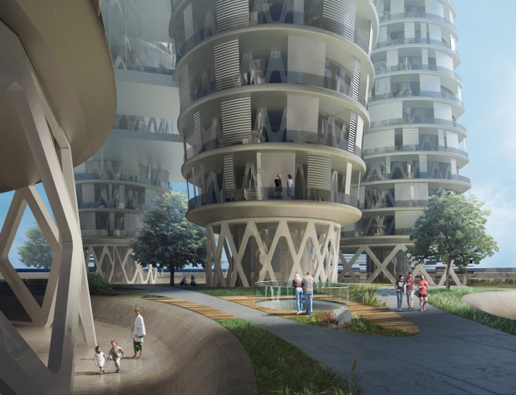
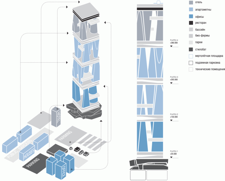
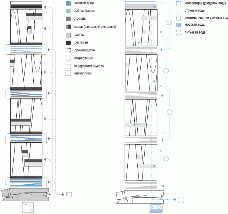
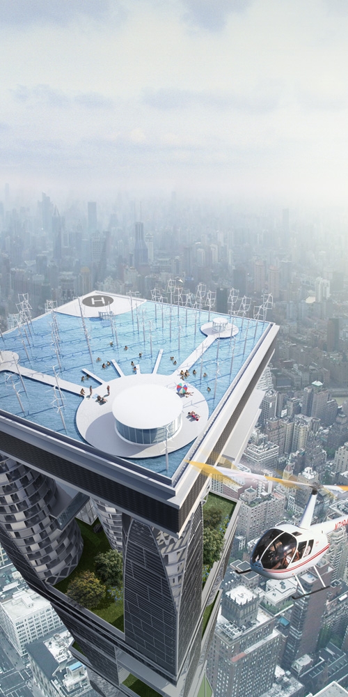
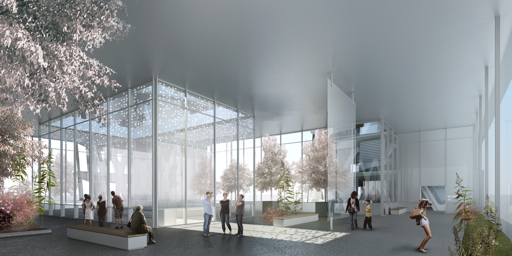
Still more important here is the vertical development of this idea. At this point, the "tectonics" comes into play: the 17-story cone houses plus the tall upper and lower tiers (their facades are designed in the form of diagonal girders, the idea being both feasible and expressive). Each group of the houses rests on a single-piece stylobate that has three agricultural tiers in it (there are fish farms, kitchen gardens, and even dairy farms), each tire supporting another one of the same kind. This pattern is repeated four times: the "column" houses placed in a dense hypostyle five ones per tier carry the next stylobate with similar cone-shaped buildings. The buildings of the lower block are occupied by offices, the two middle ones - by apartments, and the top one, two hundred meter high, includes the hotels. Such "city" designed by TOTEMENT architects, is capable of duplicating itself not only broadways but upward as well. The authors call their concept a "vertical quarter"; it looks as if somebody cut out from the city pieces of the "soil", including the agricultural basis below and all the houses that grew out of it - all these things are put in a stack, entwined into a 3D grid, strengthened by common vertical communications (that also serve as the stiffeners). 
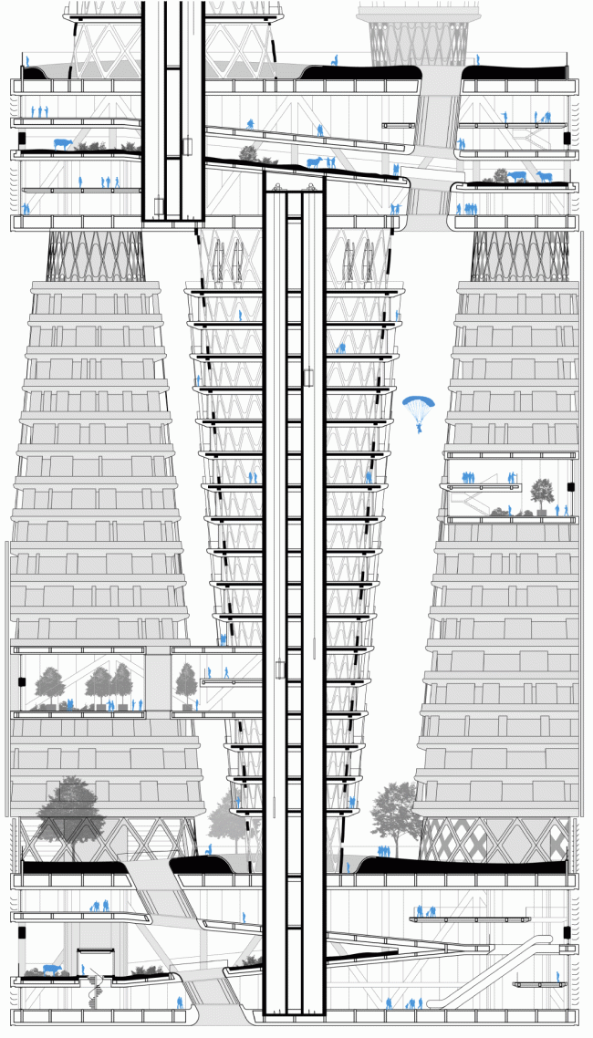

Section view © TOTEMENT / PAPER


Axonometric perspective © TOTEMENT / PAPER
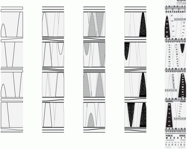

Silhouette of the building © TOTEMENT / PAPER
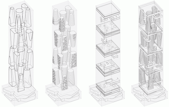

Structure: levels, platos, glazing © TOTEMENT / PAPER
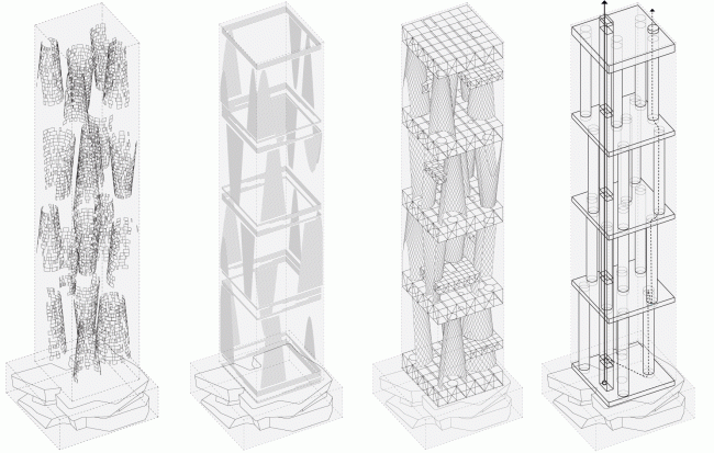

Structure: screens, lamellae, building structural system, vertical communication © TOTEMENT / PAPER
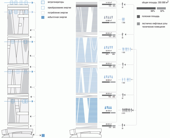

Wind energy. Balance of the areas.© TOTEMENT / PAPER


Program © TOTEMENT / PAPER
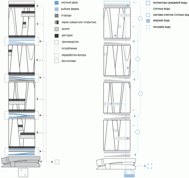

Food and biofuel. Sewage disposal © TOTEMENT / PAPER
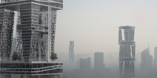

Project of the skyscraper upon the Arcology concept for Hong-Kong. 2014 © TOTEMENT / PAPER

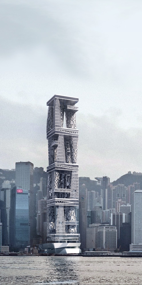
"As a rule, the structure of today's skyscrapers is concealed behind the beautiful casing and that is usually sleek and at the same time pretty faceless - explains Levon Airapetov - what's inside is totally unclear, and those who look at such a tower from outside and admire its plastics, are not even supposed to know that. Our solution of the skyscraper is crucially different: this is a vertical city, it is open and not hidden with its structure plainly visible". 
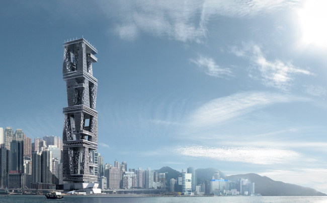

Project of the skyscraper upon the Arcology concept for Hong-Kong. 2014 © TOTEMENT / PAPER

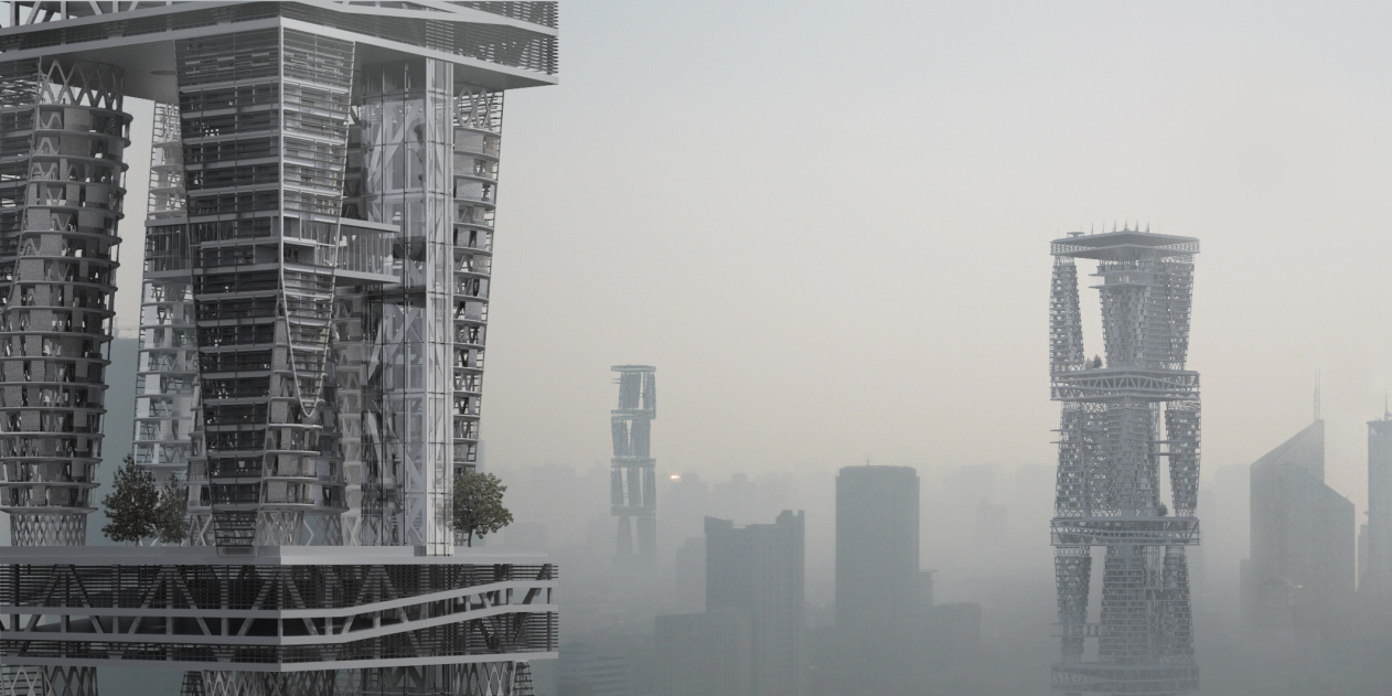
The building's structure is indeed transparent, even windswept; the super-skyscraper gets a new "intermediate" scale: on the one side, it is still a giant, but, on the other side, this "inevitable" gigantism gets fractured, divided into fragments that are accessible to human perception (at any rate, twenty stories are less than a hundred). 

Of course, one cannot claim that the idea of a vertical city is 100% groundbreaking: it was proposed rather a long time ago, just like Soleri's "arcology". The idea of connecting the towers with bridges (well, one will have to move around, say, between the 70th floors), cutting the large volume with openings, or likening a high-rise to a stack of houses climbing upward on one another's shoulders is not new (see De Rotterdam by Rem Koolhaas or M-City by Vladimir Plotkin). 

At the same time, the TOTEMENT project takes the very principle of a vertical city to a point of ultimate clarity. It looks like a fragment of the ultimate, ready for duplication, city of the future and presents a sketch of a system, in its essence akin to the "quarter" system of some historical city. This, however, is not a version of such a quarter but rather an alternative to it springing out of new conditions. The classic quarter, strictly speaking, also performs the function of the city's "gene code", only not developed by humans but historically formed, the quarter grid being part of the grammar of the language that the city speaks. The TOTEMENT skyscraper offers a different set of rules, to a certain extent hybrid: from the city block the architects borrow the scale of the inner geometry, from the "garden city" - the houses placed on the green park lawn, from the quarter - the subjugation to the plot's boundaries that play the role of "dissecting planes", and, finally, from the skyscraper - the overall tallness, while the city lends the modesty of the tallness of each tier. From the classic architecture - a rather remote likeness of the round buildings with columns. 
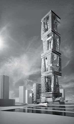

Project of the skyscraper upon the Arcology concept for Hong-Kong. 2014 © TOTEMENT / PAPER
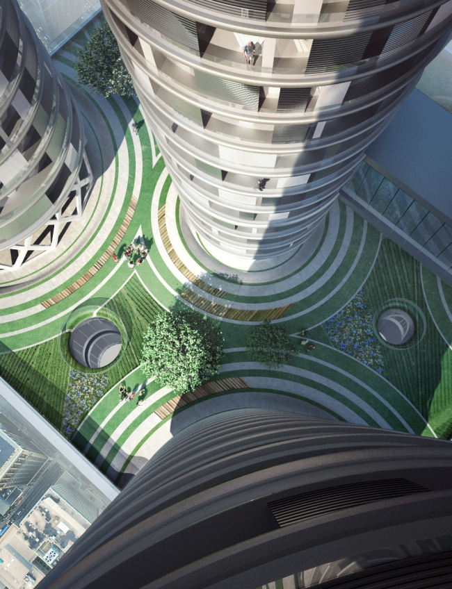

Project of the skyscraper upon the Arcology concept for Hong-Kong. 2014 © TOTEMENT / PAPER

The project has a lot of idealism about it, and this is why one would rather treat it as a study, an abstract statement on the subject of the language of architecture - more than a real-life project for any specific place (even though it would really fit in for Hong-Kong and it was really designed for a real-life contest, a contest of ideas, though). There's also something creepy about this gigantism also, especially if one is to think about the prospects of its possible implementation. "The younger members of the bureau were vocal critics of this project, they would even say that it's amoral even to set down to designing such scary giants - confess Levon Airapetov and Valeria Preobrazhenskaya – but to us it was an exciting opportunity to work with the shape". 

Meanwhile, if we are to treat this project as a plastic statement, beyond the context of the future overpopulation of the Earth and the present of the Asian cities (and also the crammed-in areas just outside the Moscow Ring Road) - then the vertical city looks like a brave new attempt at reconciling the magnitude of a super-city and its towers with the humans, setting off the ambitious energy of its verticals with the down-to-earth horizontals of the farming "slabs". The tower in this case is devoid of aspirations to become "a monument to itself", rather, the architects disclose its "anthill" nature. Well, this is quite a sci-fi but nevertheless quite the "arcological" approach; its plastics accurately catch the shift of the accents in the high-rise construction. Because there are basically two meanings about the high-rises: aspirations (the happiness of reaching the highest point that no one else could reach) and the sheer necessity (overpopulation, anthill, and a forest of giant towers obscuring the sunlight). In this case, we see a dialogue of the former and the latter - which is an interesting thing in its own right. 


Project of the skyscraper upon the Arcology concept for Hong-Kong. 2014 © TOTEMENT / PAPER
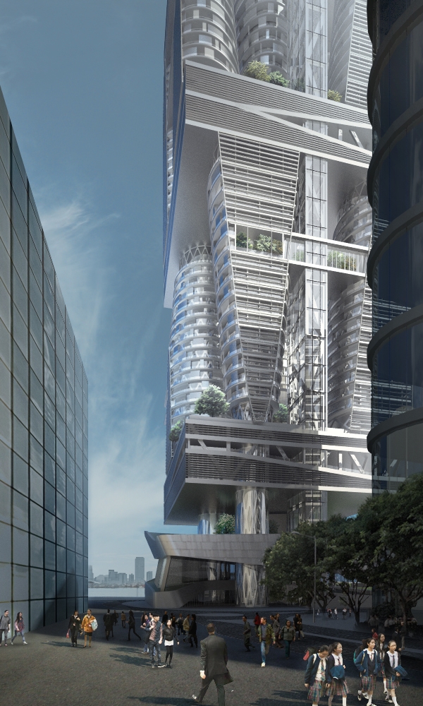


Project of the skyscraper upon the Arcology concept for Hong-Kong. 2014 © TOTEMENT / PAPER


Project of the skyscraper upon the Arcology concept for Hong-Kong. 2014 © TOTEMENT / PAPER
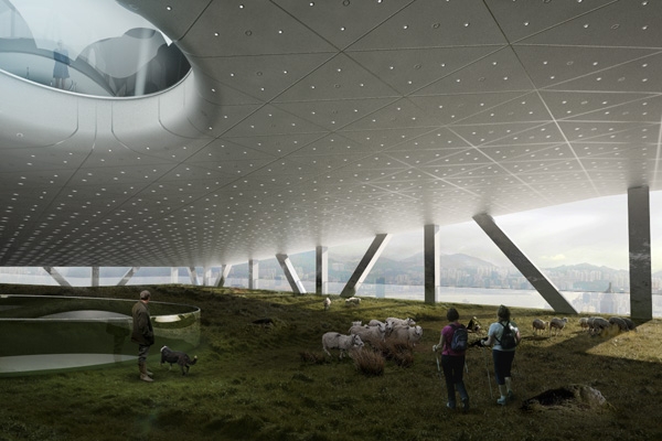

Project of the skyscraper upon the Arcology concept for Hong-Kong. 2014 © TOTEMENT / PAPER


Project of the skyscraper upon the Arcology concept for Hong-Kong. 2014 © TOTEMENT / PAPER
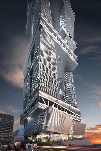

Project of the skyscraper upon the Arcology concept for Hong-Kong. 2014 © TOTEMENT / PAPER
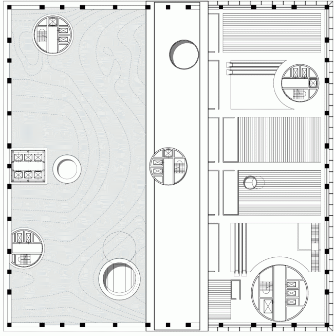

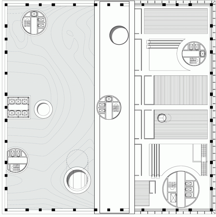
Plan: the level of bio farms © TOTEMENT / PAPER


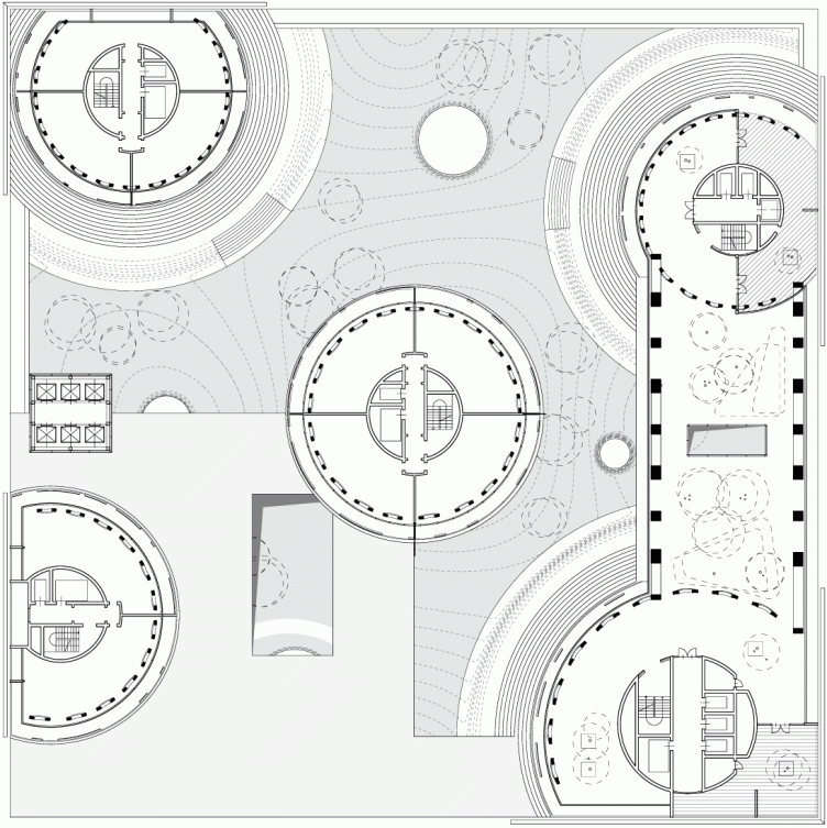
Plan: apartments and park © TOTEMENT / PAPER
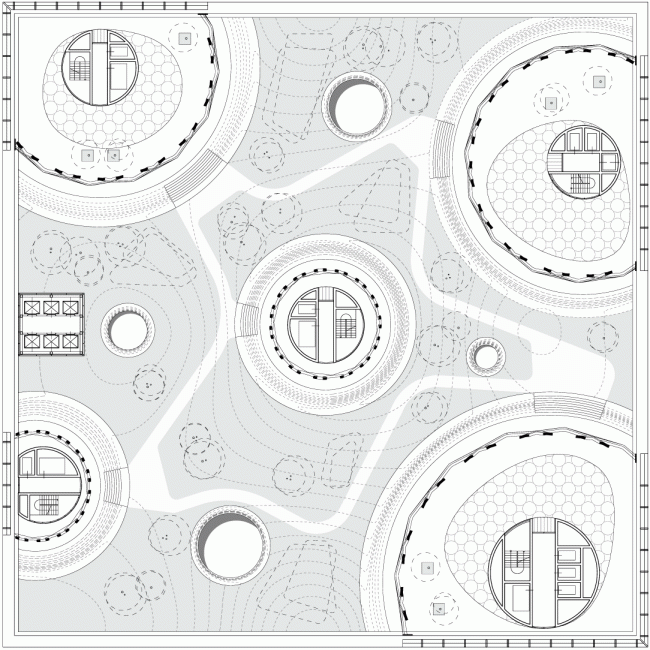
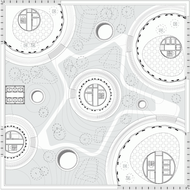
Plan: courtyard © TOTEMENT / PAPER
Project of the skyscraper upon the Arcology concept for Hong-Kong. 2014 © TOTEMENT / PAPER
"Stereotonomy" layout © TOTEMENT / PAPER
zooming
"Stereotonomy" layout © TOTEMENT / PAPER
Section views of the floors © TOTEMENT / PAPER
The sucession of forming the "vertical block" in the project © TOTEMENT / PAPER
"Stereotonomy" layout © TOTEMENT / PAPER
Section view © TOTEMENT / PAPER
Axonometric perspective © TOTEMENT / PAPER
Silhouette of the building © TOTEMENT / PAPER
Structure: levels, platos, glazing © TOTEMENT / PAPER
Structure: screens, lamellae, building structural system, vertical communication © TOTEMENT / PAPER
Wind energy. Balance of the areas.© TOTEMENT / PAPER
Program © TOTEMENT / PAPER
Food and biofuel. Sewage disposal © TOTEMENT / PAPER
Project of the skyscraper upon the Arcology concept for Hong-Kong. 2014 © TOTEMENT / PAPER
zooming
Project of the skyscraper upon the Arcology concept for Hong-Kong. 2014 © TOTEMENT / PAPER
zooming
Project of the skyscraper upon the Arcology concept for Hong-Kong. 2014 © TOTEMENT / PAPER
zooming
Project of the skyscraper upon the Arcology concept for Hong-Kong. 2014 © TOTEMENT / PAPER
zooming
Project of the skyscraper upon the Arcology concept for Hong-Kong. 2014 © TOTEMENT / PAPER
zooming
Project of the skyscraper upon the Arcology concept for Hong-Kong. 2014 © TOTEMENT / PAPER
zooming
Project of the skyscraper upon the Arcology concept for Hong-Kong. 2014 © TOTEMENT / PAPER
zooming
Project of the skyscraper upon the Arcology concept for Hong-Kong. 2014 © TOTEMENT / PAPER
Plan: the level of bio farms © TOTEMENT / PAPER
Plan: apartments and park © TOTEMENT / PAPER
Plan: courtyard © TOTEMENT / PAPER

10 July 2014

Headlines now
The Golden Crown
The concept for a dental clinic in Yekaterinburg, developed by CNTR Studio, revolves around the idea of a “mouth full of gold”: pristine white porcelain stoneware walls are complemented by matte brass details. To avoid an overly literal interpretation, the architects focused on the building’s proportions, skillfully navigating between sunlight requirements and fire safety regulations.
Flexibility and Integration
Not long ago, we covered the project for the fourth phase of the ÁLIA residential complex, designed by APEX. Now, we’ve been shown different fence concepts they developed to enclose the complex’s private courtyards, incorporating a variety of public functions. We believe that the sheer fact that the complex’s architects were involved in such a detail as fencing speaks volumes.
A Step Forward
The HIDE residential complex represents a major milestone for ADM architects and their leaders Andrey Romanov and Ekaterina Kuznetsova in their quest for a fresh high-rise aesthetic – one that is flexible and layered, capable of bringing vibrancy to mass and silhouette while shaping form. Over recent years, this approach has become ADM’s “signature style”, with the golden HIDE tower playing a pivotal role in its evolution. Here, we delve into the project’s story, explore the details of the complex’s design, and uncover its core essence.
Gold in the Sands
A new office for a transcontinental company specializing in resource extraction and processing has opened in Dubai. Designed by T+T Architects, masters of creating spaces that are contemporary, diverse, flexible, and original, this project exemplifies their expertise. On the executive floor, a massive brass-clad partition dominates, while layered textures of compressed earth create a contextually resonant backdrop.
Layers and Levels of Flight
This project goes way back – Reserve Union won this architectural competition at the end of 2011, and the building was completed in 2018, so it’s practically “archival”. However, despite being relatively unknown, the building can hardly be considered “dated” and remains a prime example of architectural expression, particularly in the headquarters genre. And it’s especially fitting for an aviation company office. In some ways, it resembles the Aeroflot headquarters at Sheremetyevo but with its own unique identity, following the signature style of Vladimir Plotkin. In this article, we take an in-depth look at the United Aircraft Corporation (UAC) headquarters in the Moscow agglomeration town of Zhukovsky, supplemented by recent photographs from Alexey Naroditsky – a shoot that became only recently possible due to the fact that improvements were finally made in the surrounding area.
Light and Shadow
In this article, we delve into the architectural design of the “Chaika” house by DNK ag architects, which was recently completed in 2023 as part of the collection of signature designs at ZILArt. As is well-known, all the buildings in this complex follow a design code, yet each one is distinct. This particular building stands out not only for its whiteness and minimalism but also for the refined use of a limited number of techniques that, together, create what can confidently be called synergy.
Casus Novae
A master plan was developed for a large residential area with a name of “DNS City”, but now that its implementation began, the plan has been arbitrarily reformatted and replaced with something that, while similar on the surface, is actually quite different. This is not the first time such a thing happens, but it’s always frustrating. With permission from the author, we are sharing Maria Elkina’s post.
Treasure Hunting
The GAFA bureau, in collaboration with Tegola and Arkhitail, organized an expedition to the island of Kilpola in Karelia as part of Moskomarkhitektura’s “Open City” festival. There, amidst moss and rocks, the students sought answers to questions like: what is the sacred, where does it dwell, and what sustains it? Assisting the participants in this quest were landscape engineer Evgeny Levin, artist Nicholas Roerich, a moose, and the lack of cellular connection. Here’s how the story unfolded.
Depths of the Earth, Streams of Water
In the Malaya Okhta district, the Akzent building, designed by Stepan Liphart, was constructed. It follows a classic tripartite structure, yet it’s what you might call “hand-drawn”: each façade is unique in its form and details, some of which aren’t immediately noticeable. In this article, we explore the context and, together with the architect, delve into how the form was developed.
Fir Tree Dynamics
The “Airports of Region” holding is planning to build an airport in Karachay-Cherkessia, aiming to make the Arkhyz and Dombay resorts more accessible to travelers. The project that won in an invitation-only competition, submitted by Sergey Nikeshkin’s KPLN, blends natural imagery inspired by the shape of a conifer seed, open-air waiting spaces, majestic large trees, and a green roof elevated on needle-like columns. The result is both nature-inspired and WOW.
​A Brick Shell
In the process of designing a clubhouse situated among pine trees in a prestigious suburban area near Moscow, the architectural firm “A.Len” did the façade design part. The combination of different types of brick and masonry correlates with the volumetric and plastique solutions, further enhanced by the inclusion of wood-painted fragments and metal “glazing”.
Word Forms
ATRIUM architects love ambitious challenges, and for the firm’s thirtieth anniversary, they boldly play a game of words with an exhibition that dives deep into a self-created vocabulary. They immerse their projects – especially art installations – into this glossary, as if plunging into a current of their own. You feel as if you’re flowing through the veins of pure art, immersed in a universe of vertical cities, educational spaces – of which the architects are true masters – and the cultural codes of various locations. But what truly captivates is the bold statement that Vera Butko and Anton Nadtochy make, both through their work and this exhibition: architecture, above all, is art – the art of working with form and space.
Flexibility and Acuteness of Modernity
Luxurious, fluid, large “kokoshniks” and spiral barrel columns, as if made from colorful chewing gum: there seem to be no other mansion like this in Moscow, designed in the “Neo-Russian-Modern” style. And the “Teremok” on Malaya Kaluzhskaya, previously somewhat obscure, has “come alive with new colors” and gained visibility after its restoration for the office of the “architectural ecosystem” as the architects love to call themselves. It’s evident that Julius Borisov and the architects at UNK put their hearts into finding this new office and bringing it up to date. Let’s delve into the paradoxes of this mansion’s history and its plasticity. Spoiler: two versions of modernity meet here, both balancing on the razor’s edge of “what’s current”.
Yuri Vissarionov: “A modular house does not belong to the land”
It belongs to space, or to the air... It turns out that 3D printing is more effective when combined with a modular approach: the house is built in a workshop and then adapted to the site, including on uneven terrain. Yuri Vissarionov shares his latest experience in designing tourist complexes, both in central Russia and in the south. These include houseboats, homes printed from lightweight concrete using a 3D printer, and, of course, frame houses.
​Moscow’s First
“The quality of education largely depends on the quality of the educational environment”. This principle of the last decade has been realized by Sergey Skuratov in the project for the First Moscow Gymnasium on Rostovskaya Embankment in the Khamovniki district. The building seamlessly integrates into the complex urban landscape, responding both to the pedestrian flow of the city and the quiet alleyways. It skillfully takes advantage of the height differences and aligns with modern trends in educational space design. Let’s take a closer look.
Looking at the Water
The site of Villa Sonata stretches from the road to the water’s edge, offering its own shoreline, pier, and a picturesque river panorama. To reveal these sweeping views, Roman Leonidov “cut” the façade diagonally parallel to the river, thus getting two main axes for the house and, consequently, “two heads”. The internal core – two double-height spaces, a living room and a conservatory, with a “bridge” above them – makes the house both “transparent” and filled with light.
The White Wing
Well, it’s not exactly white. It’s more of a beige, white-stone structure that plays with the color of limestone – smoother surfaces are lighter, while rougher ones are darker. This wing unites various elements: it absorbs and interprets the surrounding themes. It responds to everything, yet maintains a cohesive expression – a challenging task! – while also incorporating recognizable features of its own, such as the dynamic cuts at the bottom, top, and middle.
Urban Dunes
The XSA Ramps team designed and built a three-part sports hub for a park in Rostov-on-Don, welcoming people of all ages and fitness levels. The skate plaza, pump track, and playground are all meticulously crafted with details that attract a diverse range of visitors. The technical execution of the shapes and slopes transforms this space into a kind of sculptural composition.
Proportional Growth
The project for the fourth phase of the ÁLIA residential area has been announced. The buildings are situated on an elongated plot – almost a “ray” that shoots out from the center of the area towards the river. Their layout reflects both a response to Moscow’s architectural preferences over the past 15 years, shifting “from blocks to towers”, and an interpretation of the neighboring business park designed by SOM. Additionally, the best apartments here are not located at the very top but closer to the middle, forming a glowing “waistline”.
The “Staircase” Building
In designing the “Details” residential complex in New Moscow, Rais Baishev spiced up the now-popular Moscow theme of a “courtyard” building with an idea drawn from the surrealist drawings by Maurits Escher. He envisioned the stepped silhouettes and descending slopes as a metaphysical mega-staircase, creating a key void within the courtyard that gave the project an internal “spine”. This concept is felt both in the building’s silhouette and on its façades.
Projection of the Quarter
No one doubted that the building that Vladimir Plotkin designed as part of the “Garden Quarters” would be the most modernist of all. And it turned out just that way: while adhering to the common design code, the building successfully combines brick and white stone, rhythmically responding to the neighboring building designed by Ostozhenka, yet tactfully and persistently making a few statements of its own. This includes the projection of the ideal urban development composition “14–9–6”, which can be found right next door, mathematical calculations, including those for various types of terraces (and perhaps the only reminder of the Soviet past of the Kauchuk rubber factory!), and the white “cross-stitch” pattern of the façade grid.
Domus Aurea
In this issue, we examine the “Tessinsky-1” house, designed by Sergey Skuratov and completed in 2023. Located in the middle of the Serebryanicheskaya Embankment district, at the intersection of its main streets, this house assumes a sort of “nodal” role: it not only responds to everything around it and preserves many memories of the former EMA factory within itself, but it weaves all this into a newly directed pattern, reconciling bright “gold” and dark-colored brick, largely with the help of the new, modern-yet-archaic Columba brick, which, come to think about it, is the most precious element here.
The Chimney of Nikola-Lenivets
In this issue, we are examining the “Obelisk House” designed by KATARSIS and built for the Arkhstoyanie 2023 festival. However, it was only finished later on, and this is why we are examining it now. It seems to us that after the “Obelisk House” appeared in Nikola-Lenivets, a dialogue and a few inner connections appeared between the temporary structures built here. These houses no longer look like “accidental neighbors”, more of which below.
​Periscope by the Bay
The jury awarded the second place in the competition for a public and cultural center in Petropavlovsk-Kamchatsky to the companies GORA (“Mountain”) and M4. In the consortium’s proposal, the building resembles a sperm whale with a calf swimming next to it or a periscope, whose lenses capture the most spectacular views from the surrounding landscape.
From Arcs to Dolmens
While working on the competition project for Petropavlovsk-Kamchatsky, ASADOV Architects prioritized the value of the natural and urban environment, aiming to preserve the balance of the location while minimizing the resemblance of the volume that they designed to a “traditional building”. The task was challenging, and the architects created three versions, one of which having been developed after the competition, where their main proposal took third place. However, the point of interest here is not the competition result but the continuity of creative thinking.
Hide and Seek
The ID Moskovskiy house, designed by Stepan Liphart in St. Petersburg, in the courtyards near Moskovskiy Avenue beyond the Obvodny Canal and recently completed, is notable for several reasons. Firstly, it has been realized with considerable accuracy, which is particularly significant as this is the first building where the architect was responsible not only for the facades but also for the layouts, allowing for better integration between the two. On the other hand, this building is interesting as an example of the “germination” of new architecture in the city: it draws on the best examples from the neighborhood and becomes an improved and developed sum of ideas found by the architect in the surrounding context.
The Big Twelve
Yesterday, the winners of the Moscow Mayor’s Architecture Award were announced and honored. Let’s take a look at what was awarded and, in some cases, even critique this esteemed award. After all, there is always room for improvement, right?
Above the Golden Horn
The residential complex “Philosophy” designed by T+T architects in Vladivostok, is one of the new projects in the “Golubinaya Pad” area, changing its development philosophy (pun intended) from single houses to a comprehensive approach. The buildings are organized along public streets, varying in height and format, with one house even executed in gallery typology, featuring a cantilever leaning on an art object.
Nuanced Alternative
How can you rhyme a square and space? Easily! But to do so, you need to rhyme everything you can possibly think of: weave everything together, like in a tensegrity structure, and find your own optics too. The new exhibition at GES-2 does just that, offering its visitor a new perspective on the history of art spanning 150 years, infused with the hope for endless multiplicity of worlds and art histories. Read on to see how this is achieved and how the exhibition design by Evgeny Ace contributes to it.
Blinds for Ice
An ice arena has been constructed in Domodedovo based on a project by Yuri Vissarionov Architects. To prevent the long façade, a technical requirement for winter sports facilities, from appearing monotonous, the architects proposed the use of suspended structures with multidirectional slats. This design protects the ice from direct sunlight while giving the wall texture and detail.