По-русски

Vladimir Bindeman: "The architecture that we have here is quite up to the western standards - what we are still missing is the respect for the architects"

On Thursday, Museum of Architecture opens the exhibition called "Gorod Architecturium" dedicated to the tenth anniversary of the architectural studio of the same name. What has the studio been able to achieve over these years - about this we are talking to its founder Vladimir Bindeman.

23 June 2014
Interview
mainImg

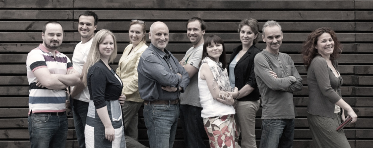
Senior managemant of "Architecturium" Studio. Vladimir Bindeman is in the center © "Architecturium"

Archi.ru: Vladimir, let us start from the start: who founded "Architecturium"? How did you come up with this name and which was the first project that your studio did?

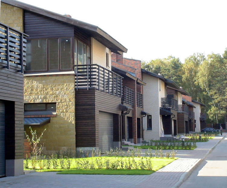
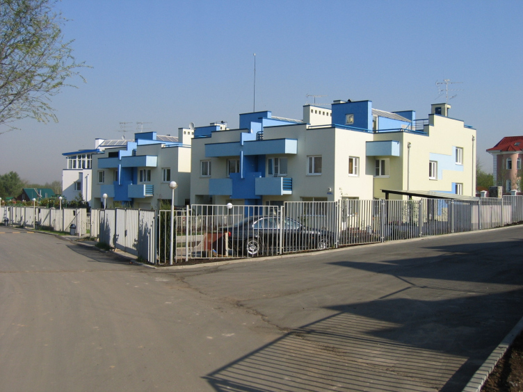
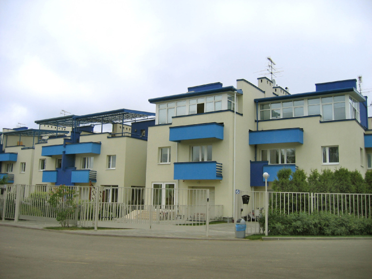
Vladimir Bindeman: "Architecturium" was founded in May of 2004. By that day, it had almost been ten years since I quit working with official and municipal structures and was mainly doing private commissions with a group of like-minded colleagues of mine. In the spring of 2004, our team won the contest organized by "Modern House" magazine for the townhouse settlement of "Novo-Arkhangelskoe", and it was this victory that stirred us to found a fully-fledged studio of our own. As for the name, this was a "set piece" that I had up my sleeve - it rings of "impressive" Latin terms that end in "ium". Besides, back in those days I was a great fan of the Russian rock-band called "Aquarium"... So, now we have a way of telling out customers and colleagues that "Architecturium" is the place where architects and architecture live at peace with one another. 


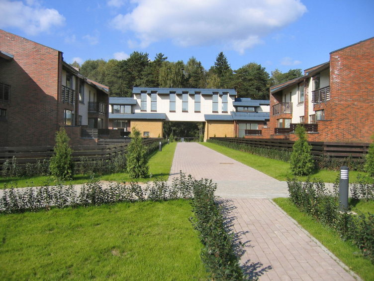
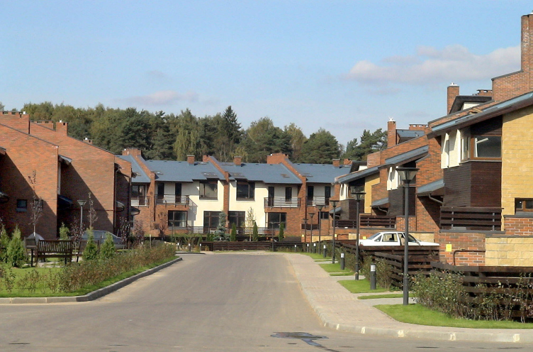
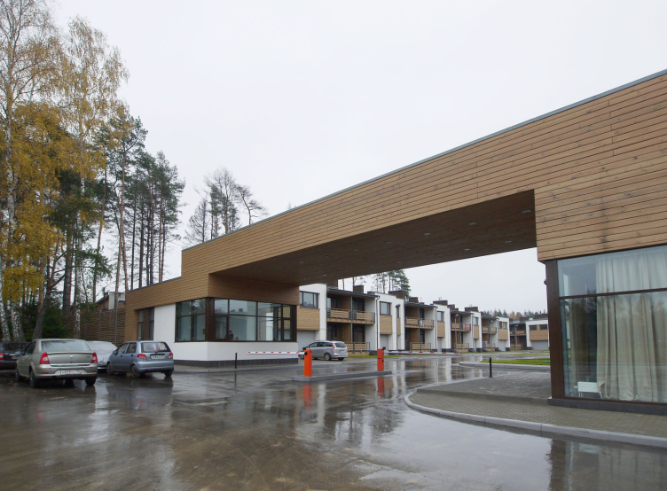
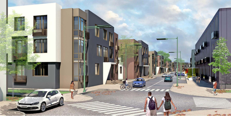
Novo-Arkhangelskoe Settlement © "Architecturium"


Novo-Arkhangelskoe Settlement © "Architecturium"
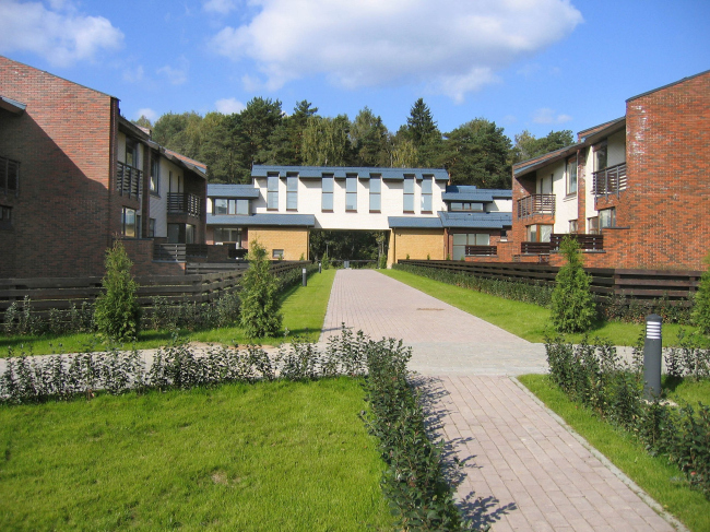

Novo-Arkhangelskoe Settlement © "Architecturium"

- In other words, "Novo-Arkhangelskoe" became for your studio the "kick-off" project that predestined your specialization in townhouse settlements? 

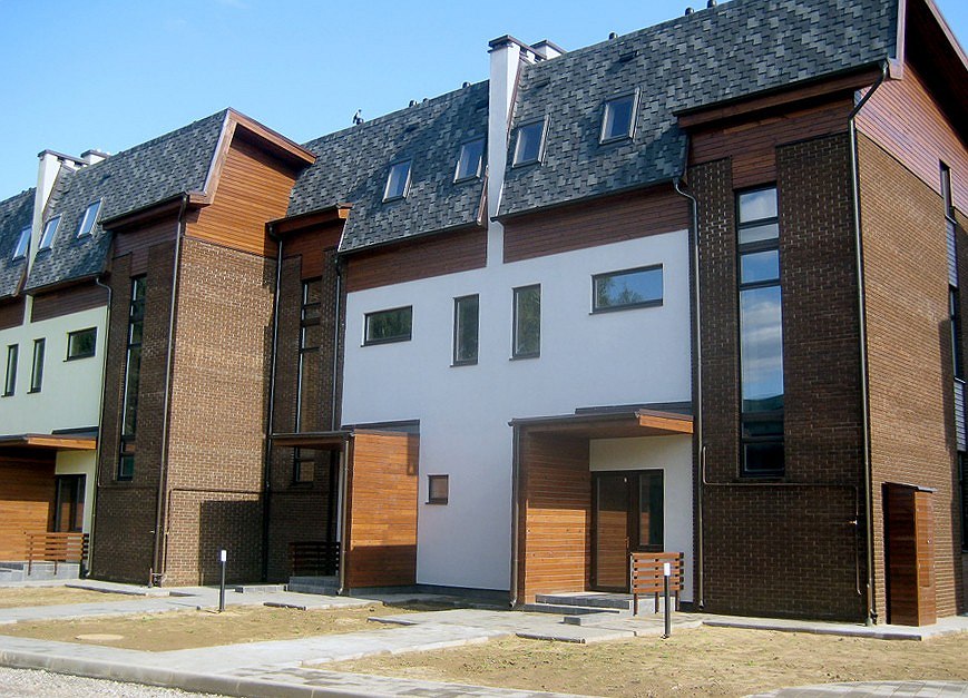
- This project did not bring us any revenue but it did bring us recognition, thanks to which we later on got a lot of customers with orders for designing townhouse settlements. And even our today's "multisession" project - the Olympian Village Novogorsk - came to us thanks to "Novo-Arkhangelskoe". As for the subject of townhouses, I was into it ever since I embarked on my freelance career in the early 90's, and one can safely say that I am still exploring this idea - "from a cottage to a townhouse block". Back in the 1998-99 I was literally "burning" with this theme, offering it to every investor and trying to convince them that a townhouse is a lot more dependable than a villa and is a lot better suited for the Moscow suburbs. This resulted in the first three houses for "MIEL" company in Romashkovo, designed and built in 1999-2000.


Townhouses in Romashkovo © "Architecturium"
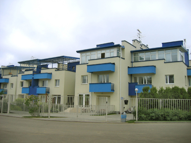

Townhouses in Romashkovo © "Architecturium"

After that, there was a contest with the same investor, only this time for "Barvikha-Club" and the already-mentioned "Novo-Arkhangelskoe". In the latter we did some serious work with the block planning options and came up with give different combinations. Then we did the settlements - "quarters" - for "METRA-Development" - "Ilinsky" and "Rizhsky" where we perfected our expertise and architectural style. And, as for the projects of "Olympic Village", they incorporated all the experience that we accumulated. 


"Ilinsky Quarter" © "Architecturium"


"Rizhsky Quarter" © "Architecturium"
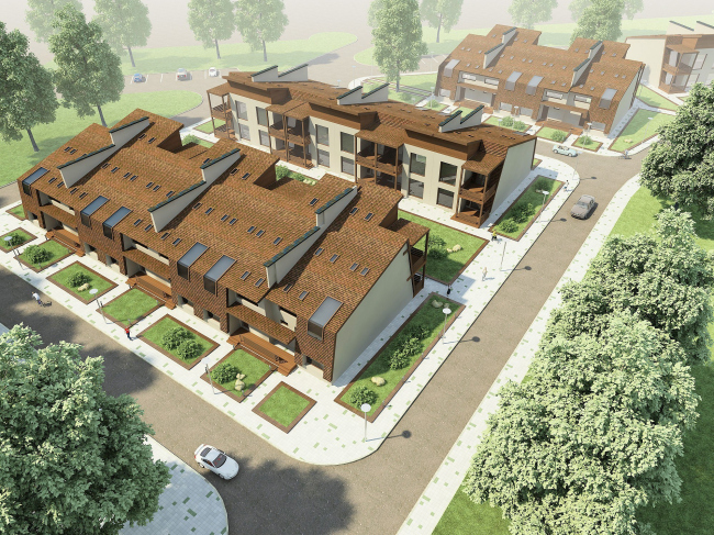

Kuzminskoe Settlement © "Architecturium"

- What was it about the idea of townhouse that attracted you so much? 

- First of all, its planning possibilities. The variability of its planning solutions that provided an opportunity to create a cozy little city. This type of opportunity is not provided by the cottage settlement. Townhouse planning is something that you can describe with the term "community" - which you cannot say about the heavily fenced villas. You can arrange townhouses to make streets, courtyards, and even squares. It was a truly exciting thing for me to do. 

- You seem to be speaking about it in the past tense. However, "Architecturium" still does townhouses, it would be enough to mention the third stage of the "Olympic Village Novogorsk" or the settlement of "Andersen" that, along with the multi-story buildings, includes townhouses as well. 

- I hope that these two projects will be out last statement on the subject of this particular typology. Now I am really sceptic about this subject because I think that the townhouse is just not meant for Russia. At least, at the present stage of development. Objectively, the townhouse is mean for tolerant communities, open-minded and friendly. Also, meaning-well and law-abiding people, simply because living in a block house presupposes respect of the neighbors to one another, as well as to the house itself. Living "wall-to-wall" at a plot that is on an average nine meters wide makes you learn how to say hello to your neighbor and learn how to be cool about his children playing noisy games. Respect means that you will not build a gazebo the size of the whole plot and getting in the way of everybody's light, that you will not uglify the house with "outlaw" annexes and all.
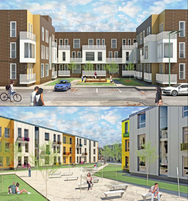

"Andersen" © "Architecturium"


"Andersen" © "Architecturium"

The thing is that the buyers of townhouses are a very specific segment of the country real estate market. For many people, a townhouse is "more than a flat, yet less that a villa" - but, because they still want to live in a villa, they treat this house that they've purchased as their own one. The percentage of the rebuilt and reprinted townhouses beats any power of imagination: neither us, nor our colleagues that build townhouses can be sure that they will see them in the original state half a year after the purchase. And it is not because the planning solutions leave much to be desired - it is about the buyers and the real estate agents. I once asked one of such customers a question: "If you want to remodel so much and build extra stuff worth half of the plot, why did you not go and buy an individual villa?" The answer could have knocked me down with a feather: "Actually, I did build a villa! And now I want a townhouse!" No comments. 

So, generally, as the pioneer of the "townhouse" movement, I can safely say that over these years I've come to a complete denial of it. Simply because of the fact that your work on the project of blocked houses boils down to trying to figure out what the future owners might want to rebuild - and eliminate such a possibility. I cannot even afford a flat roof: take Romashkovo, for example - all the flat roofs were overbuilt...

- Perhaps, the expansion of Moscow could somehow improve the situation? As far as I understand, after the expansion of Moscow the proverbial "Andersen" turned into a Moscow project and it is common knowledge that Moscow is a lot more attentive to the process of implementation of the approved projects than its region is. 

- I cannot help but admit: things became a bit more organized after the southeast area was annexed by Moscow. And the same client of "Andersen", for example, really hopes that his buildings will be kept in the original shape and form, while we, in turn, hope that we have a right to expect that the territory planning that we designed will be implemented in full measure - which will give our project the desired integrity and the comfort of the environment that is great to live in. 

- If you are through with the townhouse then what typology is the most interesting to you today?

- This is still the idea of integrated development of the territories, only now it's low-rise and medium-rise housing. In particular, I would really like to overcome today's poverty of planning solutions offered by the developers. It's pathetic that now it is only studio and double-room apartments that are designed - just because they are easier of all to sell. The developer's reasoning is really on a grassroots level: "If somebody needs more, they are going to buy two apartmnents". But we do realize that the house is not elastic! A great three-room apartment is not equal to a studio and a double welded together: in the bearing walls the owners will be at best allowed to make a standard doorway. This is why, by the way, I always ask my designers to foresee these things in advance and design more columns and fewer pylons. In Novogorsk, for example, we had to move the reinforced-concrete pylons. 


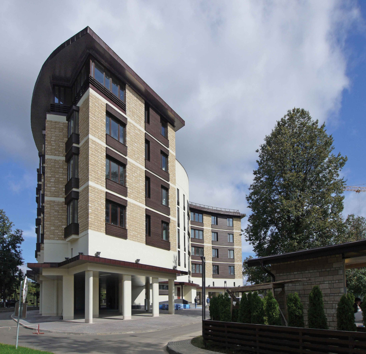
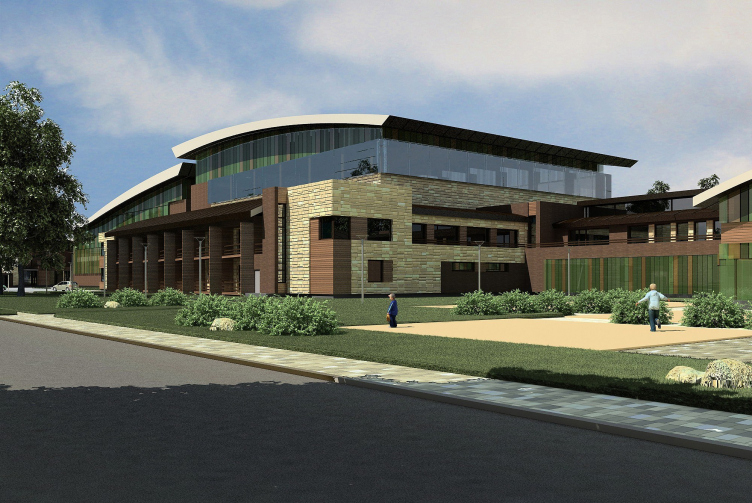
Apartment house in the settlement of "Olympic Village Novogorsk" © "Architecturium"


Residential and sports complex "Olympic Village Novogorsk" © "Architecturium"

- In one of your interviews you said that now architecture could be bought and sold - the way I see it, this is a very accurate description of what you seem to be describing...

- It is enough to hear the modern developers speak about architecture. The things that we put out souls into - they just call them "product", no more, no less. And this "product" is only considered successful if it sells quickly. Generally, I have to mention at this point that the average project is influenced by the sales departments and their leaders all but totally, and the final decisions is made not by this or that person but by a "board if directors". Besides the obvious fact that it is very inconvenient and the fact that it takes them forever, it speaks about the level of trust to the professionals: today it's simply non-existent. And, while the main purpose of the designer is quality architecture, the purpose of the developer is selling the product as quickly as possible. Probably, it is always the case with the forming capitalism. I am reading right now "Delirious New York" by Rem Koolhaas - in the 1930's, in the USA, it was the same, even the Rockefeller Center was many times rebuilt to satisfy the leaseholders. I think that fighting it is only possible by personal connections and convictions. 

- So this means that there are customers out there that can be persuaded into doing the right thing?

- Very few and far between. There are too many heartless manages out there that will listen politely to everything you have to say but then will fall in with the decision of their board. Today, regretfully, there are no bright personalities in the developer business. The "authoritative" leaders have their weak and strong points - but one thing us certain: creative people form a trend, and passive people follow suit in its wake without caring too much about things. 
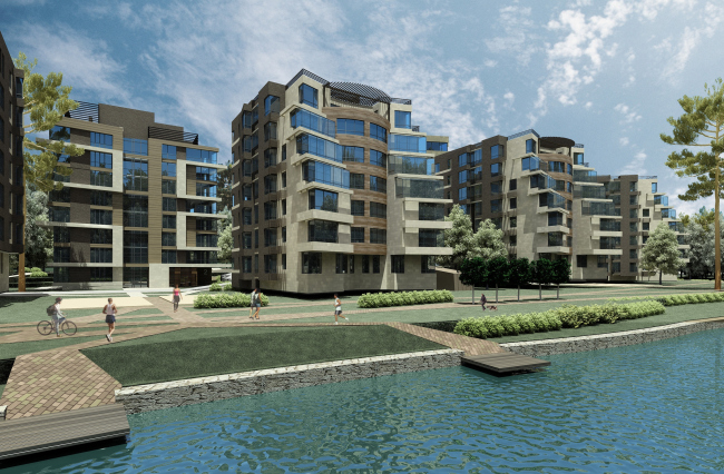

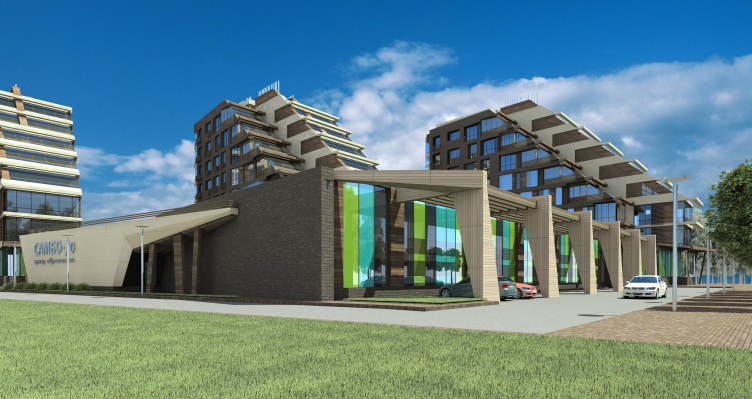
Residential complex "Olympic Village Novogorsk. Apartments" © "Architecturium"

- How is the working process organized in "Architecturium"? Is this all about the team work or is it a team that only works under your supervision? 

- Initially, of course, it was only one team. Speaking, again, of "Novo-Arkhangelskoe", we did it as a team of five people. Right now we have a few teams - but they do not a fixed lineup because they are formed for each specific project. Right now, there are 30 people on our studio, 4 of them being designers, 4 office managers, and the others are architects, including five chief architects of the project. 

- How actively are you personally involved in the development of the projects by your studio?

- I, as always, am responsible for the general architectural and planning solution, going through the options and choosing the best one. And, since I am the "playing coach", I do the sketches myself. This applies to the town-planning, as well as the architectural projects. At the same time the chiefs, as well as all the architects of our studio that want to propose an idea of their own, are entirely welcome to do so, furthermore, I always encourage them to do that - the way I see it, this is about the only way to come up with a worthy solution. Generally, the more I live, the more I am convinced that the modern architecture simply cannot be based on the architect's taste alone. Especially when it comes to town-planning! I will give you a simple example here. There was a time when I thought that all the roofs of low-rise housing must be blue. "Novo-Arkhangelskoe" is done in this way, as well as the Sochi health center, and I always insisted on that point, making the customers comply with my taste and overpay for the building materials. Now, looking back, I think that that it was voluntarism in its pure form! So, generally, it is a better thing to do trying to find rational, and not emotional, justification for your architectural solutions. 


Residential complex "Olympic Village Novogorsk. Apartments" © "Architecturium"

- Are there orders that "Architecturium" chooses to turn down? 

- Actually, we all but never get to do stand-alone projects. So it turned out that we mainly work with territories doing integrated housing projects. Now I would probably feel strange getting down to work on some separate project. Well, I might do so in Moscow, maybe. Even in this case, however, we would have started our work from the inevitable survey of the town-planning context and would have ended with the landscaping. Oh, yes, by the way, if the customer is not ready to commission us with the landscaping job - this is when we turn the project down. We firmly believe that landscaping is the fifth facade of architecture, even more important than the roof, and it needs to be the direct continuation of the ideas and visions that are there in the very soul of the building. 

- What qualities must an architect possess to be admitted to work in your company?

- Our main requirement is that this person should love and understand modern architecture. And we do not like the "I've-seen-it-all" type. 

- And, speaking of the modern western architecture, which examples of it would you like to bring over to the Russian soil? 

- I think that the architecture that we have here is quite up to the western standards. The quote-unquote classicism has long since stopped being a mass trend and this seems to me almost the most important achievement of the last two years. Remembering back to the time when we exhibited with "Romashkovo" at "Under the Roof" show back in 2002, our stands were all surrounded by castles and chalets - and now they are very few and far between. So, if we are to borrow something from the West, this must be the respect to the architect's work - both from the customers and the society.
zooming


23 June 2014

Headlines now
The Golden Crown
The concept for a dental clinic in Yekaterinburg, developed by CNTR Studio, revolves around the idea of a “mouth full of gold”: pristine white porcelain stoneware walls are complemented by matte brass details. To avoid an overly literal interpretation, the architects focused on the building’s proportions, skillfully navigating between sunlight requirements and fire safety regulations.
Flexibility and Integration
Not long ago, we covered the project for the fourth phase of the ÁLIA residential complex, designed by APEX. Now, we’ve been shown different fence concepts they developed to enclose the complex’s private courtyards, incorporating a variety of public functions. We believe that the sheer fact that the complex’s architects were involved in such a detail as fencing speaks volumes.
A Step Forward
The HIDE residential complex represents a major milestone for ADM architects and their leaders Andrey Romanov and Ekaterina Kuznetsova in their quest for a fresh high-rise aesthetic – one that is flexible and layered, capable of bringing vibrancy to mass and silhouette while shaping form. Over recent years, this approach has become ADM’s “signature style”, with the golden HIDE tower playing a pivotal role in its evolution. Here, we delve into the project’s story, explore the details of the complex’s design, and uncover its core essence.
Gold in the Sands
A new office for a transcontinental company specializing in resource extraction and processing has opened in Dubai. Designed by T+T Architects, masters of creating spaces that are contemporary, diverse, flexible, and original, this project exemplifies their expertise. On the executive floor, a massive brass-clad partition dominates, while layered textures of compressed earth create a contextually resonant backdrop.
Layers and Levels of Flight
This project goes way back – Reserve Union won this architectural competition at the end of 2011, and the building was completed in 2018, so it’s practically “archival”. However, despite being relatively unknown, the building can hardly be considered “dated” and remains a prime example of architectural expression, particularly in the headquarters genre. And it’s especially fitting for an aviation company office. In some ways, it resembles the Aeroflot headquarters at Sheremetyevo but with its own unique identity, following the signature style of Vladimir Plotkin. In this article, we take an in-depth look at the United Aircraft Corporation (UAC) headquarters in the Moscow agglomeration town of Zhukovsky, supplemented by recent photographs from Alexey Naroditsky – a shoot that became only recently possible due to the fact that improvements were finally made in the surrounding area.
Light and Shadow
In this article, we delve into the architectural design of the “Chaika” house by DNK ag architects, which was recently completed in 2023 as part of the collection of signature designs at ZILArt. As is well-known, all the buildings in this complex follow a design code, yet each one is distinct. This particular building stands out not only for its whiteness and minimalism but also for the refined use of a limited number of techniques that, together, create what can confidently be called synergy.
Casus Novae
A master plan was developed for a large residential area with a name of “DNS City”, but now that its implementation began, the plan has been arbitrarily reformatted and replaced with something that, while similar on the surface, is actually quite different. This is not the first time such a thing happens, but it’s always frustrating. With permission from the author, we are sharing Maria Elkina’s post.
Treasure Hunting
The GAFA bureau, in collaboration with Tegola and Arkhitail, organized an expedition to the island of Kilpola in Karelia as part of Moskomarkhitektura’s “Open City” festival. There, amidst moss and rocks, the students sought answers to questions like: what is the sacred, where does it dwell, and what sustains it? Assisting the participants in this quest were landscape engineer Evgeny Levin, artist Nicholas Roerich, a moose, and the lack of cellular connection. Here’s how the story unfolded.
Depths of the Earth, Streams of Water
In the Malaya Okhta district, the Akzent building, designed by Stepan Liphart, was constructed. It follows a classic tripartite structure, yet it’s what you might call “hand-drawn”: each façade is unique in its form and details, some of which aren’t immediately noticeable. In this article, we explore the context and, together with the architect, delve into how the form was developed.
Fir Tree Dynamics
The “Airports of Region” holding is planning to build an airport in Karachay-Cherkessia, aiming to make the Arkhyz and Dombay resorts more accessible to travelers. The project that won in an invitation-only competition, submitted by Sergey Nikeshkin’s KPLN, blends natural imagery inspired by the shape of a conifer seed, open-air waiting spaces, majestic large trees, and a green roof elevated on needle-like columns. The result is both nature-inspired and WOW.
​A Brick Shell
In the process of designing a clubhouse situated among pine trees in a prestigious suburban area near Moscow, the architectural firm “A.Len” did the façade design part. The combination of different types of brick and masonry correlates with the volumetric and plastique solutions, further enhanced by the inclusion of wood-painted fragments and metal “glazing”.
Word Forms
ATRIUM architects love ambitious challenges, and for the firm’s thirtieth anniversary, they boldly play a game of words with an exhibition that dives deep into a self-created vocabulary. They immerse their projects – especially art installations – into this glossary, as if plunging into a current of their own. You feel as if you’re flowing through the veins of pure art, immersed in a universe of vertical cities, educational spaces – of which the architects are true masters – and the cultural codes of various locations. But what truly captivates is the bold statement that Vera Butko and Anton Nadtochy make, both through their work and this exhibition: architecture, above all, is art – the art of working with form and space.
Flexibility and Acuteness of Modernity
Luxurious, fluid, large “kokoshniks” and spiral barrel columns, as if made from colorful chewing gum: there seem to be no other mansion like this in Moscow, designed in the “Neo-Russian-Modern” style. And the “Teremok” on Malaya Kaluzhskaya, previously somewhat obscure, has “come alive with new colors” and gained visibility after its restoration for the office of the “architectural ecosystem” as the architects love to call themselves. It’s evident that Julius Borisov and the architects at UNK put their hearts into finding this new office and bringing it up to date. Let’s delve into the paradoxes of this mansion’s history and its plasticity. Spoiler: two versions of modernity meet here, both balancing on the razor’s edge of “what’s current”.
Yuri Vissarionov: “A modular house does not belong to the land”
It belongs to space, or to the air... It turns out that 3D printing is more effective when combined with a modular approach: the house is built in a workshop and then adapted to the site, including on uneven terrain. Yuri Vissarionov shares his latest experience in designing tourist complexes, both in central Russia and in the south. These include houseboats, homes printed from lightweight concrete using a 3D printer, and, of course, frame houses.
​Moscow’s First
“The quality of education largely depends on the quality of the educational environment”. This principle of the last decade has been realized by Sergey Skuratov in the project for the First Moscow Gymnasium on Rostovskaya Embankment in the Khamovniki district. The building seamlessly integrates into the complex urban landscape, responding both to the pedestrian flow of the city and the quiet alleyways. It skillfully takes advantage of the height differences and aligns with modern trends in educational space design. Let’s take a closer look.
Looking at the Water
The site of Villa Sonata stretches from the road to the water’s edge, offering its own shoreline, pier, and a picturesque river panorama. To reveal these sweeping views, Roman Leonidov “cut” the façade diagonally parallel to the river, thus getting two main axes for the house and, consequently, “two heads”. The internal core – two double-height spaces, a living room and a conservatory, with a “bridge” above them – makes the house both “transparent” and filled with light.
The White Wing
Well, it’s not exactly white. It’s more of a beige, white-stone structure that plays with the color of limestone – smoother surfaces are lighter, while rougher ones are darker. This wing unites various elements: it absorbs and interprets the surrounding themes. It responds to everything, yet maintains a cohesive expression – a challenging task! – while also incorporating recognizable features of its own, such as the dynamic cuts at the bottom, top, and middle.
Urban Dunes
The XSA Ramps team designed and built a three-part sports hub for a park in Rostov-on-Don, welcoming people of all ages and fitness levels. The skate plaza, pump track, and playground are all meticulously crafted with details that attract a diverse range of visitors. The technical execution of the shapes and slopes transforms this space into a kind of sculptural composition.
Proportional Growth
The project for the fourth phase of the ÁLIA residential area has been announced. The buildings are situated on an elongated plot – almost a “ray” that shoots out from the center of the area towards the river. Their layout reflects both a response to Moscow’s architectural preferences over the past 15 years, shifting “from blocks to towers”, and an interpretation of the neighboring business park designed by SOM. Additionally, the best apartments here are not located at the very top but closer to the middle, forming a glowing “waistline”.
The “Staircase” Building
In designing the “Details” residential complex in New Moscow, Rais Baishev spiced up the now-popular Moscow theme of a “courtyard” building with an idea drawn from the surrealist drawings by Maurits Escher. He envisioned the stepped silhouettes and descending slopes as a metaphysical mega-staircase, creating a key void within the courtyard that gave the project an internal “spine”. This concept is felt both in the building’s silhouette and on its façades.
Projection of the Quarter
No one doubted that the building that Vladimir Plotkin designed as part of the “Garden Quarters” would be the most modernist of all. And it turned out just that way: while adhering to the common design code, the building successfully combines brick and white stone, rhythmically responding to the neighboring building designed by Ostozhenka, yet tactfully and persistently making a few statements of its own. This includes the projection of the ideal urban development composition “14–9–6”, which can be found right next door, mathematical calculations, including those for various types of terraces (and perhaps the only reminder of the Soviet past of the Kauchuk rubber factory!), and the white “cross-stitch” pattern of the façade grid.
Domus Aurea
In this issue, we examine the “Tessinsky-1” house, designed by Sergey Skuratov and completed in 2023. Located in the middle of the Serebryanicheskaya Embankment district, at the intersection of its main streets, this house assumes a sort of “nodal” role: it not only responds to everything around it and preserves many memories of the former EMA factory within itself, but it weaves all this into a newly directed pattern, reconciling bright “gold” and dark-colored brick, largely with the help of the new, modern-yet-archaic Columba brick, which, come to think about it, is the most precious element here.
The Chimney of Nikola-Lenivets
In this issue, we are examining the “Obelisk House” designed by KATARSIS and built for the Arkhstoyanie 2023 festival. However, it was only finished later on, and this is why we are examining it now. It seems to us that after the “Obelisk House” appeared in Nikola-Lenivets, a dialogue and a few inner connections appeared between the temporary structures built here. These houses no longer look like “accidental neighbors”, more of which below.
​Periscope by the Bay
The jury awarded the second place in the competition for a public and cultural center in Petropavlovsk-Kamchatsky to the companies GORA (“Mountain”) and M4. In the consortium’s proposal, the building resembles a sperm whale with a calf swimming next to it or a periscope, whose lenses capture the most spectacular views from the surrounding landscape.
From Arcs to Dolmens
While working on the competition project for Petropavlovsk-Kamchatsky, ASADOV Architects prioritized the value of the natural and urban environment, aiming to preserve the balance of the location while minimizing the resemblance of the volume that they designed to a “traditional building”. The task was challenging, and the architects created three versions, one of which having been developed after the competition, where their main proposal took third place. However, the point of interest here is not the competition result but the continuity of creative thinking.
Hide and Seek
The ID Moskovskiy house, designed by Stepan Liphart in St. Petersburg, in the courtyards near Moskovskiy Avenue beyond the Obvodny Canal and recently completed, is notable for several reasons. Firstly, it has been realized with considerable accuracy, which is particularly significant as this is the first building where the architect was responsible not only for the facades but also for the layouts, allowing for better integration between the two. On the other hand, this building is interesting as an example of the “germination” of new architecture in the city: it draws on the best examples from the neighborhood and becomes an improved and developed sum of ideas found by the architect in the surrounding context.
The Big Twelve
Yesterday, the winners of the Moscow Mayor’s Architecture Award were announced and honored. Let’s take a look at what was awarded and, in some cases, even critique this esteemed award. After all, there is always room for improvement, right?
Above the Golden Horn
The residential complex “Philosophy” designed by T+T architects in Vladivostok, is one of the new projects in the “Golubinaya Pad” area, changing its development philosophy (pun intended) from single houses to a comprehensive approach. The buildings are organized along public streets, varying in height and format, with one house even executed in gallery typology, featuring a cantilever leaning on an art object.
Nuanced Alternative
How can you rhyme a square and space? Easily! But to do so, you need to rhyme everything you can possibly think of: weave everything together, like in a tensegrity structure, and find your own optics too. The new exhibition at GES-2 does just that, offering its visitor a new perspective on the history of art spanning 150 years, infused with the hope for endless multiplicity of worlds and art histories. Read on to see how this is achieved and how the exhibition design by Evgeny Ace contributes to it.
Blinds for Ice
An ice arena has been constructed in Domodedovo based on a project by Yuri Vissarionov Architects. To prevent the long façade, a technical requirement for winter sports facilities, from appearing monotonous, the architects proposed the use of suspended structures with multidirectional slats. This design protects the ice from direct sunlight while giving the wall texture and detail.