По-русски

Parks of Deluxe Class

Architect Aleksey Ivanov speaks about the all-but-obsolete format of deluxe villa communities, one of the essential attributes of which was a large-scale landscaped territory.

16 April 2014
View
mainImg
Architect:
Aleksey Ivanov
Firm:
Arkhstroydesign ASD
Object:
Rubin Estate village
Russia, Moscow

2010
"Count Ponds" Settlement © Arkhstroydesign ASD

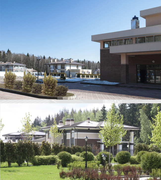
"Arkhstroydesign" Studio built in the Moscow Region a fairly large number of villa communities and suburban settlements but we take special pride in the projects that we were able to fully implement - not only building a dozen or two houses but creating for the people a comfortable environment to live in, one that is capable of making a statement with its bright and memorable image. Back in the 2000's, such projects were mainly implemented in the deluxe segment. And I think that in many respects the today's fashion of the public spaces is rooted precisely in these expensive settlements - because their investors were the first to realize that comfortable and visually attractive territory around the house was a factor that for the future tenants was almost more important, than the house itself. The well-organized parks, reservoirs with the landscaped embankments, the decorated promenades, and the open-air recreation spaces - all of this initially appeared outside the city, and it is still interesting for me to watch these territories live and develop, deservedly becoming the compositional, and, if you want, ideological centers of these settlements.

"Belgian Village" Settlement © Arkhstroydesign ASD

“Belgian Village”, 12 km along the Kaluga highway, 2005 - 2007, 29 hectares

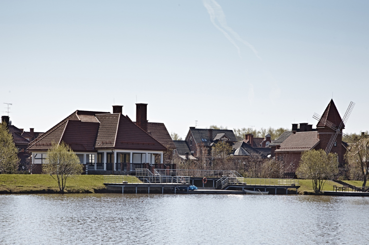
We did not have to build "Belgian Village" from scratch. By the time our company got this particular commission, the master plan of the settlement was already developed and approved. Actually, one of our main tasks was giving a "human touch" to the "wire-like" dissection of the master plan. Our customer asked us to pay special attention to the "bald spots" near the reservoir located in the middle of the future settlement - there were, indeed, some strange spots of wasteland, and not one or two, but a whole bunch of them. And, since the stylistic theme of the settlement had been set before we came (the very name of "Belgian Village" speaks for itself), we decided that it would make perfect sense to pick it up and develop it to the fullest in landscaping this territory. The vastness of the territory allowed for making a whole park there; the presence of a few wasteland spots necessitated for making this park a multi-part one - so, we decided that this must be a system of interconnected territories, each of which would have a "national" twist of its own. The way I see it, it was a rather unconventional move: usually, it is the villas that are built in the various national styles - while we went ahead and transferred this generally commercial technique to the housing-free territories. And it seems to me that we ultimately did the right thing.
"Belgian Village" Settlement © Arkhstroydesign ASD

"Belgian Village" Settlement © Arkhstroydesign ASD

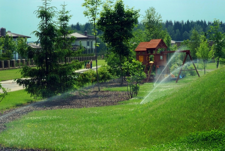
In fact, what we do is we make, in the middle of the settlement, a huge park that we later divide into the theme segments, each of which can be treated as a piece of the jigsaw puzzle, collectively called "Europe". One will find here the English landscape garden, and the "regular" French one, the children's playground, built with Germen accuracy and based on the stories of the Grimm brothers, the picturesque tulip meadow (hail from Netherlands), and a small cozy pub - which is the "visiting card" of Belgium as such. Plus - we properly organized the beach and built a boat-renting station. As for the small infrastructure objects, we stylized them in the "European" spirit - the windmill, the hunter's cabin, and so on. 

"Belgian Village" Settlement © Arkhstroydesign ASD

"Belgian Village" Settlement © Arkhstroydesign ASD
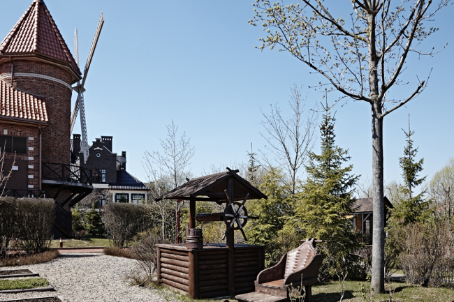
"Belgian Village" Settlement © Arkhstroydesign ASD

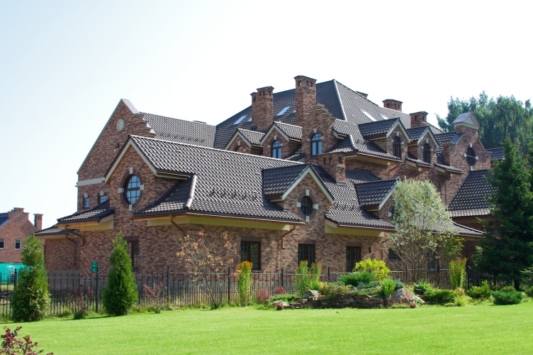
And, of course, the entrance group - it got a more dramatic solution, a-la Disneyland. We thought this would be appropriate because this is the "outside" facade of the settlement. As for the houses as such - although they do continue the "European" style, they do so in a more reserved manner, simply because there are so many of them, and we did not want to endlessly multiply the all-too-recognizable decoration. So, what we did was limit ourselves to the play of the gables that speaks for itself, and to using the Belgian brick of hand molding. By the way, the settlement “Belgian Village” was twice acknowledged as the best settlement of the Moscow area in the deluxe category, and in 2013 it received the reward of International Property Awards in London.
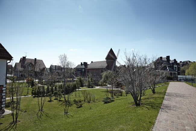
"Belgian Village" Settlement © Arkhstroydesign ASD

"Belgian Village" Settlement © Arkhstroydesign ASD
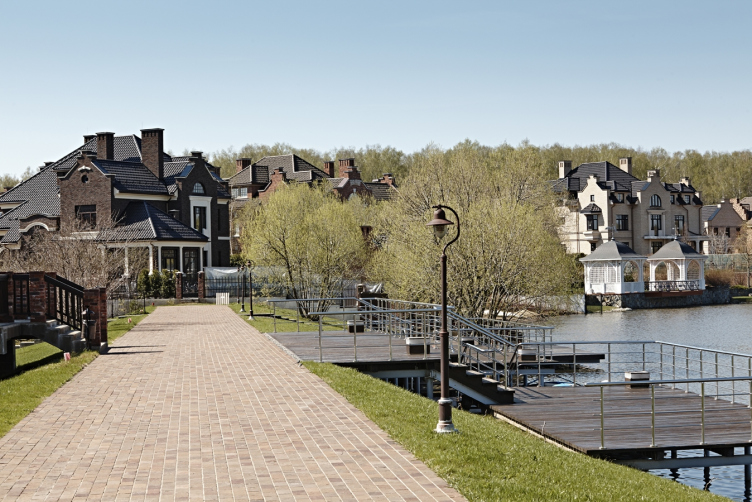
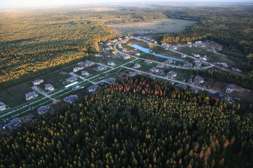
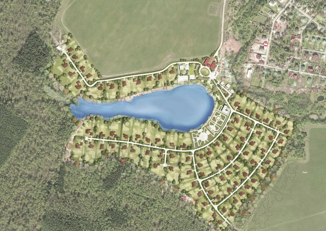
"Count Ponds" Settlement © Arkhstroydesign ASD

“Count Ponds”, 21 km along the Kiev highway, 2006-2008, 52 Hectares

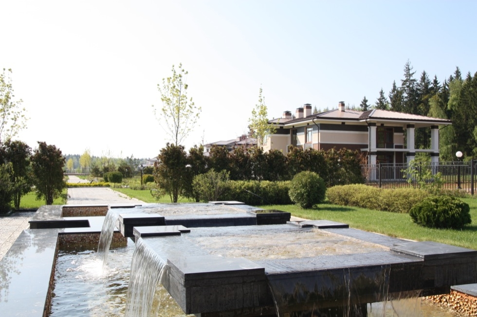
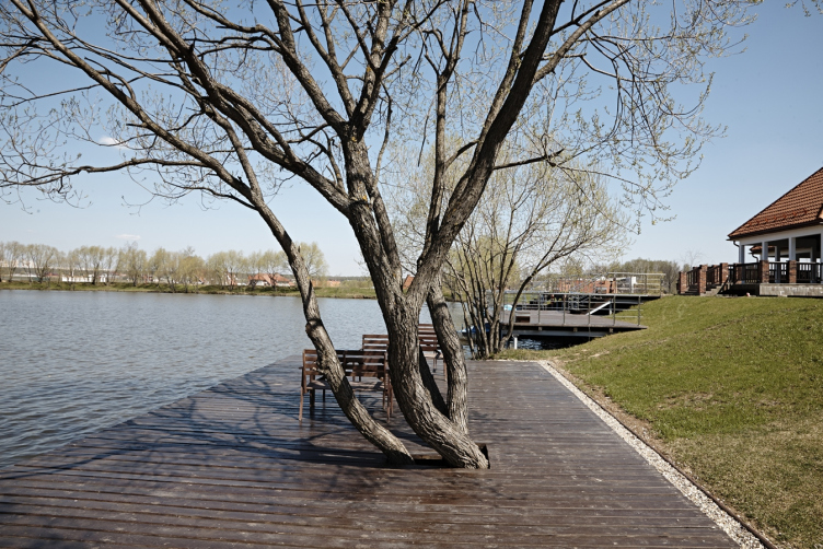
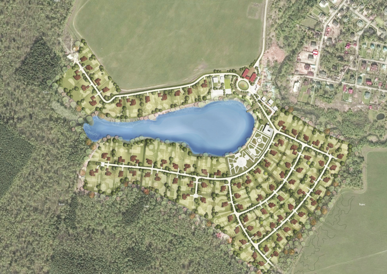
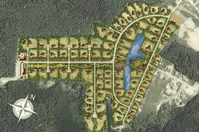
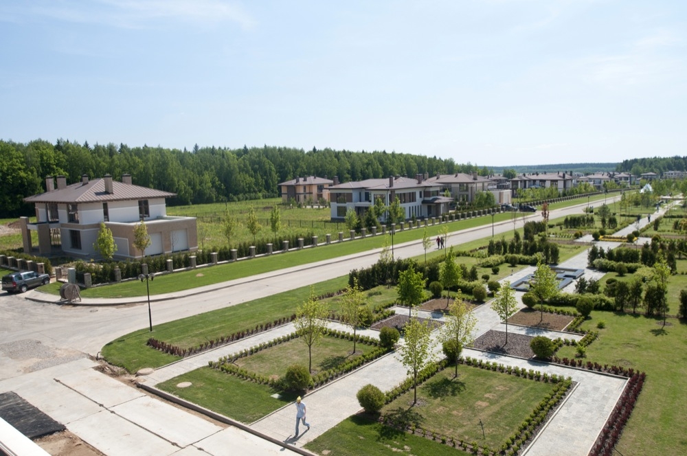
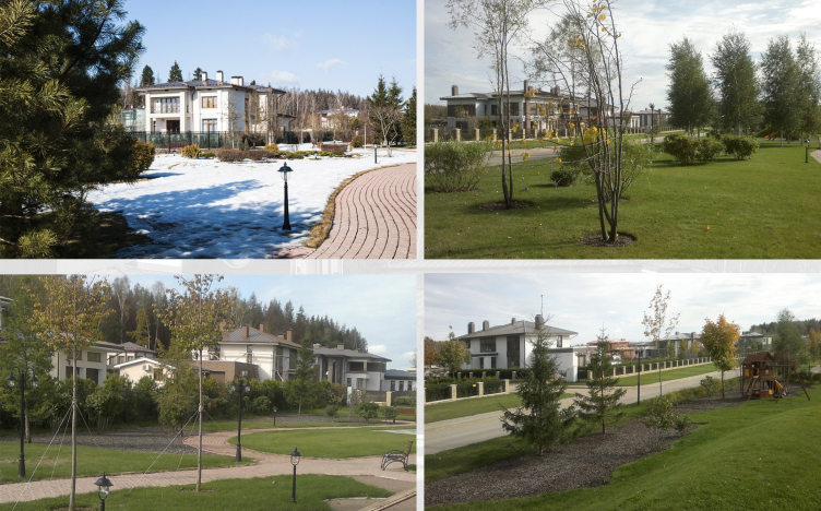
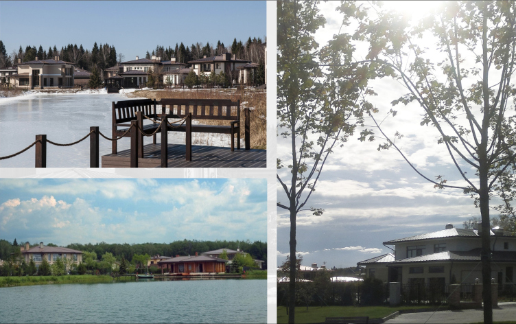
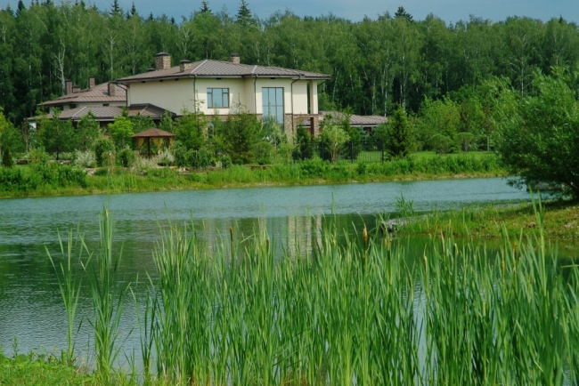
We did the project of this settlement from the very start after we won the tender for its architectural concept and master plan. The concept that we proposed was based on the idea of creating an interesting landscape and a public space that would be capable of becoming the centerpiece of the whole settlement. As for the name "Count Ponds", it actually goes back to a small creek that was there in the middle of the land site from the very start - it was this creek that suggested to us the idea of creating here a fully-fledged reservoir with landscaped embankments. The lake with an area of 1.6 hectares got a slightly bent but still strictly geometrically justified shape - together with the esplanade of the park, it forms a peculiar cross, very much like the frame of reference of the entire settlement. And upon this green and blue cross we strung our land sites. Those that are larger are situated along the outer perimeter and they got a direct access to the woodland, while those that are smaller adjoin the park's esplanade - which sort of makes up for the absence of access to the said woodland.

"Count Ponds" Settlement © Arkhstroydesign ASD
"Count Ponds" Settlement © Arkhstroydesign ASD
"Count Ponds" Settlement © Arkhstroydesign ASD

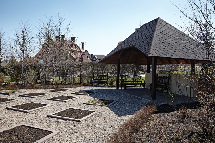
And although the planning of the public area is based on a rigid structure, from the inside, we tried to fill it in with a sophisticated and diverse pattern. What we did was create some sort of a jigsaw puzzle from the the parks of various "styles". One will find here the Russian garden with apple and prune trees, a French park, and a rock-garden as well. The resulting boulevard is in fact a green stripe 50 meters wide and a whopping kilometer long. Would be such "improper" use of space conceivable today? I don't think so. The "Count Ponds" were lucky, however, and the life of this settlement is concentrated around this multilevel green area, to which we "plugged in" all the social functions.

"Count Ponds" Settlement © Arkhstroydesign ASD

"Count Ponds" Settlement © Arkhstroydesign ASD

"Count Ponds" Settlement © Arkhstroydesign ASD

"Count Ponds" Settlement © Arkhstroydesign ASD

Reconstruction of "Rubin Estate" Settlement © Arkhstroydesign ASD

Reconstruction of "Rubin Estate" Settlement © Arkhstroydesign ASD

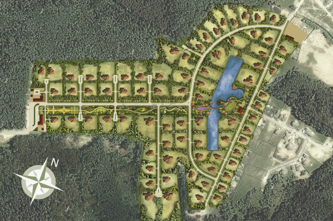
Rubin Estate, 15 km down the Rublevo-Uspenskoe highway, 2011, 6.5 Hectares

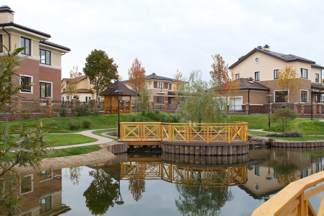
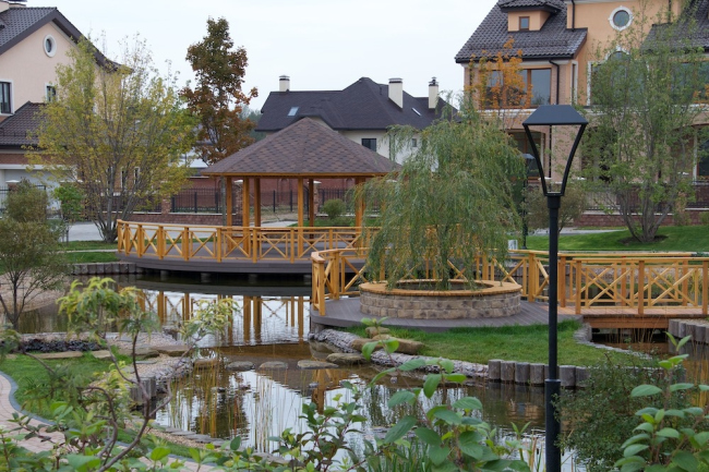
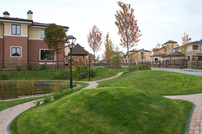
This settlement, located 15 kilometers away from Moscow Ring Road down the Rublevo-Uspenskoe Highway, got into the hands of "Arkhstroydesign" almost completed. It had complete roads in it, and the houses were already built up to their roofs. The reconstruction work was already covered by Archi.ru, and now I want to share in greater detail about the organization of the public territories of this settlement. The thing is that originally it was not supposed to have any public territories whatsoever: in fact, the whole settlement was "dissected" into private estates, so even the most basic landscaping was initially out of the question. But, despite the fact that the crisis was already in full swing, we were able to convince the customer that a certain general sense from the point of view of urban planning space settlement is vital: I must admit that in recent years, not all developers are listening to this argument, but in the case of Rubin Estate we persevered and proved the necessity of the park. 
Reconstruction of "Rubin Estate" Settlement © Arkhstroydesign ASD
Reconstruction of "Rubin Estate" Settlement © Arkhstroydesign ASD
Reconstruction of "Rubin Estate" Settlement © Arkhstroydesign ASD

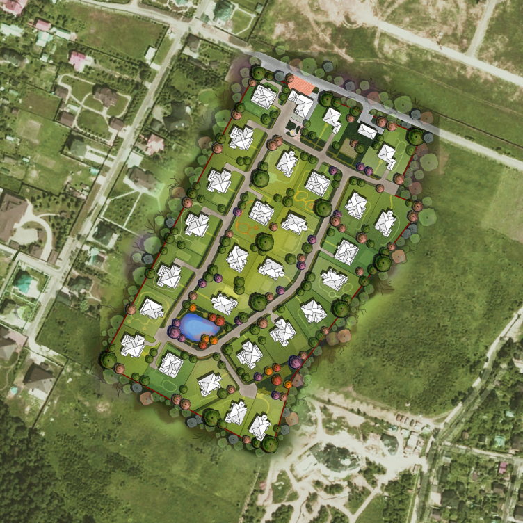
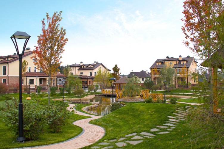
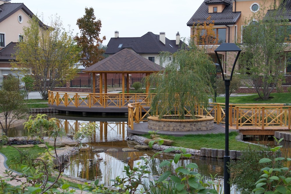
On the plan, the territory of the settlement presents an elongated rectangle, whose central part is framed by the smooth curve of the road on either side of which the estates are situated. We, first of all, corrected the plans of the estates, after giving to them a deliberately different form, which, in the first place, introduced into the panoramas of the settlement some additional variety, and, in the second place, made it possible to free, in the base of the loop, some room sufficient for creating the artificial lake. This small reservoir was put into a casket of walking paths and picturesque bridges. And, even though the lake is located not exactly in the center of the settlement but closer to its further border, i.e. on the broad side of the "triangle", it definitely became the "visiting card" of the settlement, and, more importantly, gave its people an opportunity to go for walks in the fresh air without leaving its confines. 

This charming mini- park (which we, by the way, made together with of the workshop of topographical design “Arteza”) became in our practice the last experience of the creation of integral public spaces within the confines of out-of-town settlements. At least, for now. Will there ever be a return to such a luxury? For me this question remains open. I think, if expensive settlements still will be built, they will be built in a totally different way. And their public spaces will be different too. And the "villa communities" are still to remain in the past.

zooming
zooming
zooming
zooming
zooming
zooming
zooming
zooming


Architect:
Aleksey Ivanov
Firm:
Arkhstroydesign ASD
Object:
Rubin Estate village
Russia, Moscow

2010

16 April 2014

Headlines now
The Golden Crown
The concept for a dental clinic in Yekaterinburg, developed by CNTR Studio, revolves around the idea of a “mouth full of gold”: pristine white porcelain stoneware walls are complemented by matte brass details. To avoid an overly literal interpretation, the architects focused on the building’s proportions, skillfully navigating between sunlight requirements and fire safety regulations.
Flexibility and Integration
Not long ago, we covered the project for the fourth phase of the ÁLIA residential complex, designed by APEX. Now, we’ve been shown different fence concepts they developed to enclose the complex’s private courtyards, incorporating a variety of public functions. We believe that the sheer fact that the complex’s architects were involved in such a detail as fencing speaks volumes.
A Step Forward
The HIDE residential complex represents a major milestone for ADM architects and their leaders Andrey Romanov and Ekaterina Kuznetsova in their quest for a fresh high-rise aesthetic – one that is flexible and layered, capable of bringing vibrancy to mass and silhouette while shaping form. Over recent years, this approach has become ADM’s “signature style”, with the golden HIDE tower playing a pivotal role in its evolution. Here, we delve into the project’s story, explore the details of the complex’s design, and uncover its core essence.
Gold in the Sands
A new office for a transcontinental company specializing in resource extraction and processing has opened in Dubai. Designed by T+T Architects, masters of creating spaces that are contemporary, diverse, flexible, and original, this project exemplifies their expertise. On the executive floor, a massive brass-clad partition dominates, while layered textures of compressed earth create a contextually resonant backdrop.
Layers and Levels of Flight
This project goes way back – Reserve Union won this architectural competition at the end of 2011, and the building was completed in 2018, so it’s practically “archival”. However, despite being relatively unknown, the building can hardly be considered “dated” and remains a prime example of architectural expression, particularly in the headquarters genre. And it’s especially fitting for an aviation company office. In some ways, it resembles the Aeroflot headquarters at Sheremetyevo but with its own unique identity, following the signature style of Vladimir Plotkin. In this article, we take an in-depth look at the United Aircraft Corporation (UAC) headquarters in the Moscow agglomeration town of Zhukovsky, supplemented by recent photographs from Alexey Naroditsky – a shoot that became only recently possible due to the fact that improvements were finally made in the surrounding area.
Light and Shadow
In this article, we delve into the architectural design of the “Chaika” house by DNK ag architects, which was recently completed in 2023 as part of the collection of signature designs at ZILArt. As is well-known, all the buildings in this complex follow a design code, yet each one is distinct. This particular building stands out not only for its whiteness and minimalism but also for the refined use of a limited number of techniques that, together, create what can confidently be called synergy.
Casus Novae
A master plan was developed for a large residential area with a name of “DNS City”, but now that its implementation began, the plan has been arbitrarily reformatted and replaced with something that, while similar on the surface, is actually quite different. This is not the first time such a thing happens, but it’s always frustrating. With permission from the author, we are sharing Maria Elkina’s post.
Treasure Hunting
The GAFA bureau, in collaboration with Tegola and Arkhitail, organized an expedition to the island of Kilpola in Karelia as part of Moskomarkhitektura’s “Open City” festival. There, amidst moss and rocks, the students sought answers to questions like: what is the sacred, where does it dwell, and what sustains it? Assisting the participants in this quest were landscape engineer Evgeny Levin, artist Nicholas Roerich, a moose, and the lack of cellular connection. Here’s how the story unfolded.
Depths of the Earth, Streams of Water
In the Malaya Okhta district, the Akzent building, designed by Stepan Liphart, was constructed. It follows a classic tripartite structure, yet it’s what you might call “hand-drawn”: each façade is unique in its form and details, some of which aren’t immediately noticeable. In this article, we explore the context and, together with the architect, delve into how the form was developed.
Fir Tree Dynamics
The “Airports of Region” holding is planning to build an airport in Karachay-Cherkessia, aiming to make the Arkhyz and Dombay resorts more accessible to travelers. The project that won in an invitation-only competition, submitted by Sergey Nikeshkin’s KPLN, blends natural imagery inspired by the shape of a conifer seed, open-air waiting spaces, majestic large trees, and a green roof elevated on needle-like columns. The result is both nature-inspired and WOW.
​A Brick Shell
In the process of designing a clubhouse situated among pine trees in a prestigious suburban area near Moscow, the architectural firm “A.Len” did the façade design part. The combination of different types of brick and masonry correlates with the volumetric and plastique solutions, further enhanced by the inclusion of wood-painted fragments and metal “glazing”.
Word Forms
ATRIUM architects love ambitious challenges, and for the firm’s thirtieth anniversary, they boldly play a game of words with an exhibition that dives deep into a self-created vocabulary. They immerse their projects – especially art installations – into this glossary, as if plunging into a current of their own. You feel as if you’re flowing through the veins of pure art, immersed in a universe of vertical cities, educational spaces – of which the architects are true masters – and the cultural codes of various locations. But what truly captivates is the bold statement that Vera Butko and Anton Nadtochy make, both through their work and this exhibition: architecture, above all, is art – the art of working with form and space.
Flexibility and Acuteness of Modernity
Luxurious, fluid, large “kokoshniks” and spiral barrel columns, as if made from colorful chewing gum: there seem to be no other mansion like this in Moscow, designed in the “Neo-Russian-Modern” style. And the “Teremok” on Malaya Kaluzhskaya, previously somewhat obscure, has “come alive with new colors” and gained visibility after its restoration for the office of the “architectural ecosystem” as the architects love to call themselves. It’s evident that Julius Borisov and the architects at UNK put their hearts into finding this new office and bringing it up to date. Let’s delve into the paradoxes of this mansion’s history and its plasticity. Spoiler: two versions of modernity meet here, both balancing on the razor’s edge of “what’s current”.
Yuri Vissarionov: “A modular house does not belong to the land”
It belongs to space, or to the air... It turns out that 3D printing is more effective when combined with a modular approach: the house is built in a workshop and then adapted to the site, including on uneven terrain. Yuri Vissarionov shares his latest experience in designing tourist complexes, both in central Russia and in the south. These include houseboats, homes printed from lightweight concrete using a 3D printer, and, of course, frame houses.
​Moscow’s First
“The quality of education largely depends on the quality of the educational environment”. This principle of the last decade has been realized by Sergey Skuratov in the project for the First Moscow Gymnasium on Rostovskaya Embankment in the Khamovniki district. The building seamlessly integrates into the complex urban landscape, responding both to the pedestrian flow of the city and the quiet alleyways. It skillfully takes advantage of the height differences and aligns with modern trends in educational space design. Let’s take a closer look.
Looking at the Water
The site of Villa Sonata stretches from the road to the water’s edge, offering its own shoreline, pier, and a picturesque river panorama. To reveal these sweeping views, Roman Leonidov “cut” the façade diagonally parallel to the river, thus getting two main axes for the house and, consequently, “two heads”. The internal core – two double-height spaces, a living room and a conservatory, with a “bridge” above them – makes the house both “transparent” and filled with light.
The White Wing
Well, it’s not exactly white. It’s more of a beige, white-stone structure that plays with the color of limestone – smoother surfaces are lighter, while rougher ones are darker. This wing unites various elements: it absorbs and interprets the surrounding themes. It responds to everything, yet maintains a cohesive expression – a challenging task! – while also incorporating recognizable features of its own, such as the dynamic cuts at the bottom, top, and middle.
Urban Dunes
The XSA Ramps team designed and built a three-part sports hub for a park in Rostov-on-Don, welcoming people of all ages and fitness levels. The skate plaza, pump track, and playground are all meticulously crafted with details that attract a diverse range of visitors. The technical execution of the shapes and slopes transforms this space into a kind of sculptural composition.
Proportional Growth
The project for the fourth phase of the ÁLIA residential area has been announced. The buildings are situated on an elongated plot – almost a “ray” that shoots out from the center of the area towards the river. Their layout reflects both a response to Moscow’s architectural preferences over the past 15 years, shifting “from blocks to towers”, and an interpretation of the neighboring business park designed by SOM. Additionally, the best apartments here are not located at the very top but closer to the middle, forming a glowing “waistline”.
The “Staircase” Building
In designing the “Details” residential complex in New Moscow, Rais Baishev spiced up the now-popular Moscow theme of a “courtyard” building with an idea drawn from the surrealist drawings by Maurits Escher. He envisioned the stepped silhouettes and descending slopes as a metaphysical mega-staircase, creating a key void within the courtyard that gave the project an internal “spine”. This concept is felt both in the building’s silhouette and on its façades.
Projection of the Quarter
No one doubted that the building that Vladimir Plotkin designed as part of the “Garden Quarters” would be the most modernist of all. And it turned out just that way: while adhering to the common design code, the building successfully combines brick and white stone, rhythmically responding to the neighboring building designed by Ostozhenka, yet tactfully and persistently making a few statements of its own. This includes the projection of the ideal urban development composition “14–9–6”, which can be found right next door, mathematical calculations, including those for various types of terraces (and perhaps the only reminder of the Soviet past of the Kauchuk rubber factory!), and the white “cross-stitch” pattern of the façade grid.
Domus Aurea
In this issue, we examine the “Tessinsky-1” house, designed by Sergey Skuratov and completed in 2023. Located in the middle of the Serebryanicheskaya Embankment district, at the intersection of its main streets, this house assumes a sort of “nodal” role: it not only responds to everything around it and preserves many memories of the former EMA factory within itself, but it weaves all this into a newly directed pattern, reconciling bright “gold” and dark-colored brick, largely with the help of the new, modern-yet-archaic Columba brick, which, come to think about it, is the most precious element here.
The Chimney of Nikola-Lenivets
In this issue, we are examining the “Obelisk House” designed by KATARSIS and built for the Arkhstoyanie 2023 festival. However, it was only finished later on, and this is why we are examining it now. It seems to us that after the “Obelisk House” appeared in Nikola-Lenivets, a dialogue and a few inner connections appeared between the temporary structures built here. These houses no longer look like “accidental neighbors”, more of which below.
​Periscope by the Bay
The jury awarded the second place in the competition for a public and cultural center in Petropavlovsk-Kamchatsky to the companies GORA (“Mountain”) and M4. In the consortium’s proposal, the building resembles a sperm whale with a calf swimming next to it or a periscope, whose lenses capture the most spectacular views from the surrounding landscape.
From Arcs to Dolmens
While working on the competition project for Petropavlovsk-Kamchatsky, ASADOV Architects prioritized the value of the natural and urban environment, aiming to preserve the balance of the location while minimizing the resemblance of the volume that they designed to a “traditional building”. The task was challenging, and the architects created three versions, one of which having been developed after the competition, where their main proposal took third place. However, the point of interest here is not the competition result but the continuity of creative thinking.
Hide and Seek
The ID Moskovskiy house, designed by Stepan Liphart in St. Petersburg, in the courtyards near Moskovskiy Avenue beyond the Obvodny Canal and recently completed, is notable for several reasons. Firstly, it has been realized with considerable accuracy, which is particularly significant as this is the first building where the architect was responsible not only for the facades but also for the layouts, allowing for better integration between the two. On the other hand, this building is interesting as an example of the “germination” of new architecture in the city: it draws on the best examples from the neighborhood and becomes an improved and developed sum of ideas found by the architect in the surrounding context.
The Big Twelve
Yesterday, the winners of the Moscow Mayor’s Architecture Award were announced and honored. Let’s take a look at what was awarded and, in some cases, even critique this esteemed award. After all, there is always room for improvement, right?
Above the Golden Horn
The residential complex “Philosophy” designed by T+T architects in Vladivostok, is one of the new projects in the “Golubinaya Pad” area, changing its development philosophy (pun intended) from single houses to a comprehensive approach. The buildings are organized along public streets, varying in height and format, with one house even executed in gallery typology, featuring a cantilever leaning on an art object.
Nuanced Alternative
How can you rhyme a square and space? Easily! But to do so, you need to rhyme everything you can possibly think of: weave everything together, like in a tensegrity structure, and find your own optics too. The new exhibition at GES-2 does just that, offering its visitor a new perspective on the history of art spanning 150 years, infused with the hope for endless multiplicity of worlds and art histories. Read on to see how this is achieved and how the exhibition design by Evgeny Ace contributes to it.
Blinds for Ice
An ice arena has been constructed in Domodedovo based on a project by Yuri Vissarionov Architects. To prevent the long façade, a technical requirement for winter sports facilities, from appearing monotonous, the architects proposed the use of suspended structures with multidirectional slats. This design protects the ice from direct sunlight while giving the wall texture and detail.