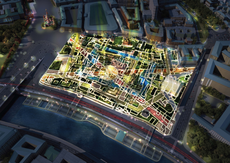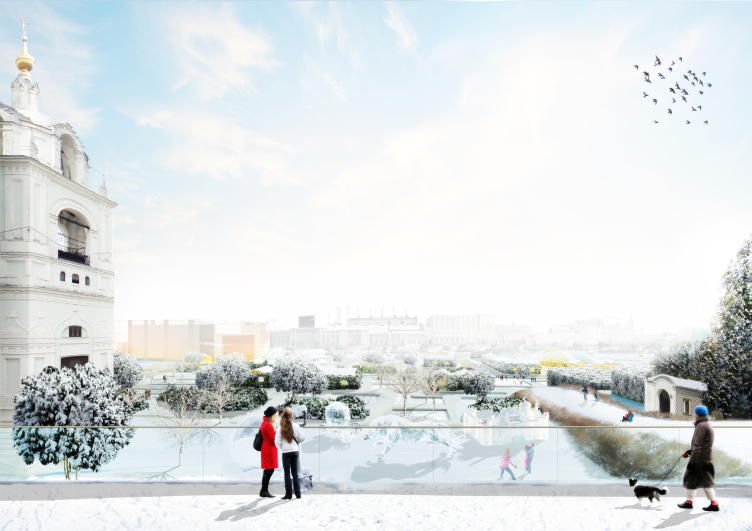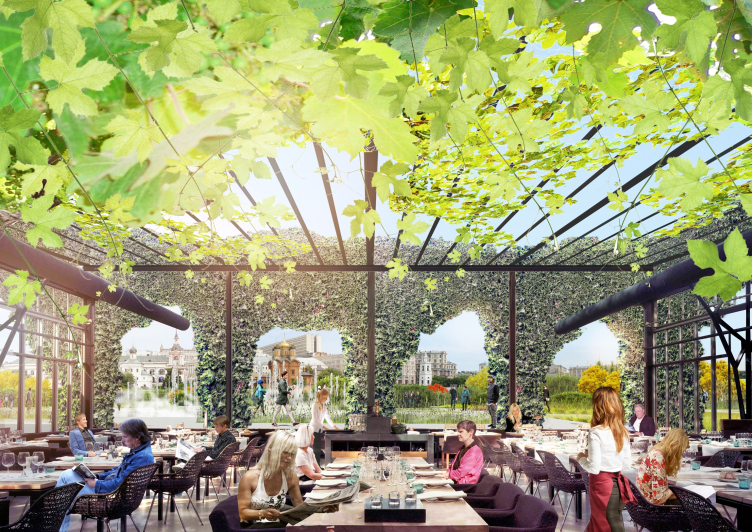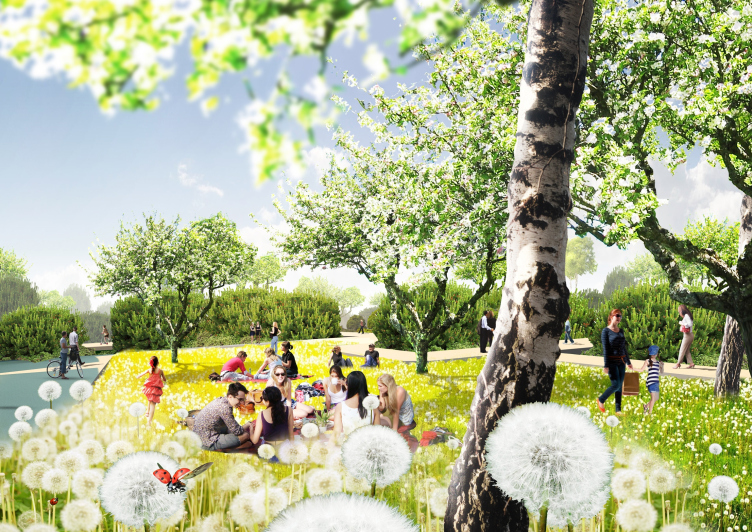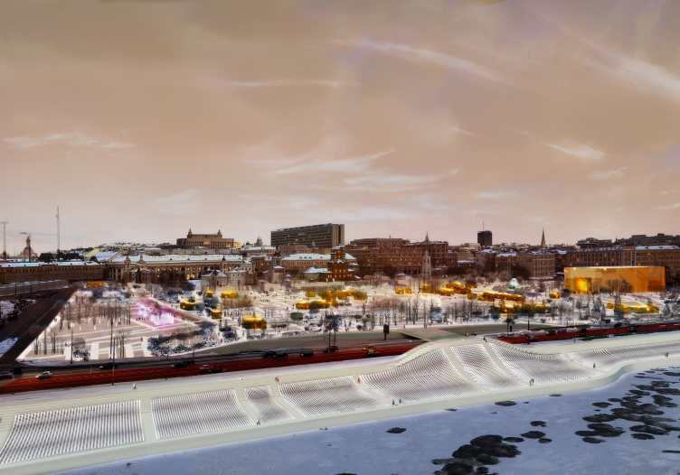
Top view by night. "Zaryadye" Park. Project. © MVRDV Consortium. Image courtesy by "Atrium" Bureau
It has been more that a month since the three finalists of the Zaryadye contest were announced, and we continue publishing the details of the winning projects. The project by MVDRV Consortium that won the honorable third prize is built around the historical legacy of this territory. In this consortium, Russia was represented by "Atrium" Bureau headed by Vera Butko and Anton Nadtochy. We asked the architects to share in more detail about their project and their experience of working together with the famous Dutch studio.
Archi.ru:
- So, you went ahead and proposed an "archeological" park?
Anton Nadtochy:
- Well, "archeological" would be a rather oversimplified definition. What we did was design quite a contemporary park that is based on the history of this unique place.
Vera Butko:
- At the same time, we wanted to break away as far as possible from the idea of literal recreation. We did not want to limit ourselves to reconstructing or doing the purely archeological thing - what we wanted to do was present the up-to-date representation of this history. I myself graduated from the restoration department and have a soft spot for history and monuments but nevertheless the task implied creating an up-to-date park, and the architects were invited based on this criterion.
- So how did the idea of the contemporary interpretation of history come up?
Anton Nadtochy:
- Once the second round shortlist was announced, we started getting calls from the industry reporters, and we had to - literally within a span of five minutes - figure out just what to tell them. Vera and I did a shotgun meeting to figure out just what was the most important thing in this project for us and what most Muscovites associated Zaryadye with - and pretty soon we came to the conclusion that its historical and cultural identity is what matters most. At our first meeting with Winy Maas, during the kick-off workshop, this theme also became a priority. Accordingly, we also discussed with him the history of Zaryadye, and the archeology. We recalled the case of Pompeii, meditated of the phenomenon of superposition (overlaying of structures) and the phenomenon of palimpsest (overlaying of meanings), about the world's existing analogues, about Moscow and Muscovites... As early as on our first day we arrived at the decision just in which direction we would go - all that was left to do was figure out just how to reflect the history and at the same time make quite a contemporary park.
Due to the fact that it was obvious for us from the very start that we were in for some serious work with the historical context, we invited into our team the most experienced specialists in this field - Anna and Nathalie Bronovitsky. We also turned for help to the Russian consultants on cultural planning, dendrology, and logistics issues.
Vera Butko:
- We were certain that the other contestants would also offer various interpretations of this place. We thought that what we came up with was the only right solution for this area. And then, much to our surprise, nobody proposed anything of the sort.

"Zaryadye" Park. Project. © MVRDV Consortium. Image courtesy by "Atrium" Bureau

"Zaryadye" Park. Project. © MVRDV Consortium. Image courtesy by "Atrium" Bureau
- How did your project develop?
Vera Butko:
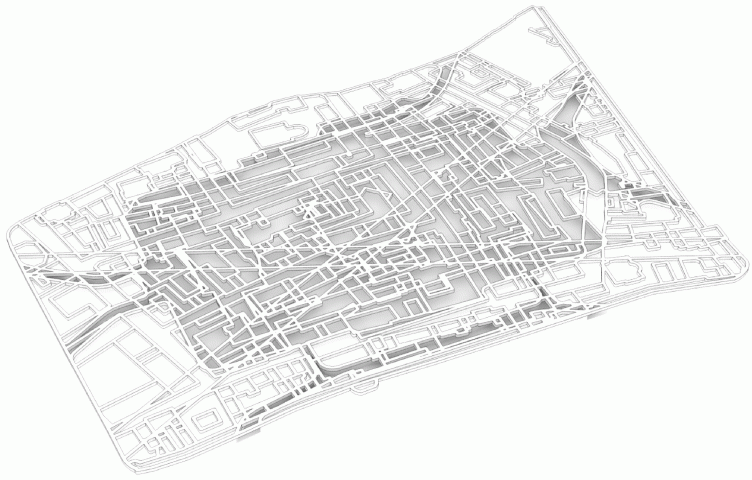
- It all started with something that might be described as "ruined vaults". Initially, Maas suggested experimenting with the circuit matrix of the Zaryadye historical maps, separating the layers in space to form several levels. For example, we thought of "embossing" only the houses, then only the streets, thought of groping for some formal or meaningful algorithms. At some places we would make these elements from the cropped bushes, at some places - from concrete, so as to walk between them and even over them. The lower layer of the park was in fact a labyrinth that housed the main functional program, while the top layer was the panorama park. It looked strikingly radical - only we realized that nobody would ever accept that. We knew that it was impossible to build a labyrinth in the heart of Moscow. Ultimately we still were able to keep the original idea and make the park comfortable and functional.
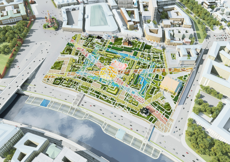
The project is based on the principle of "superposition". The architects filtered down a few housing maps of different periods, choosing the most interesting ones. Also, they took into consideration the plans of two projects that were left unimplemented: the building of Narkomtyazhptom, and the Chechulin high-rise. The authors also introduced two diagonal viewing axis: from the double arch of the China Town wall to the Beklemishevskaya Tower, and from the high-rise on the Kotelnicheskaya Embankment up to St. Basil's Cathedral. All of this put together in one layer formed the ornamental grid of the trails, not devoid of a "generalization" feel but still not decorative and conditioned by the earlier housing layouts.
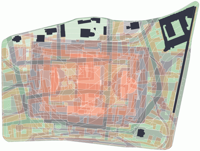
Superposition of all the layers. "Zaryadye" Park. Project. © MVRDV Consortium. Image courtesy by "Atrium" Bureau
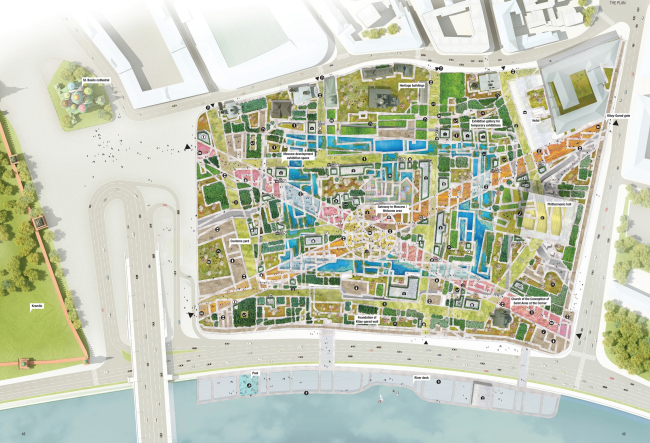
"Zaryadye" Park. Project. © MVRDV Consortium. Image courtesy by "Atrium" Bureau

"Zaryadye" Park. Project. © MVRDV Consortium. Image courtesy by "Atrium" Bureau
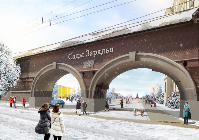
Entrance from the side of the Chinatown Driveway (through the existing arch). "Zaryadye" Park. Project. © MVRDV Consortium. Image courtesy by "Atrium" Bureau
Due to the fact that the historical relief of Zaryadye was destroyed still in the times when "Russia" Hotel was built, the architects bent the grid to make it match the main relief drop and the requirements imposed by the functions designed. "What the Dutch did was cut this ornament out from paper and then they bent and folded it for a long time - Vera Butko reminisces - Thus, there was a moment when the symbolic trace from the the Vesnin Brothers tower that was designed in the 1920's but was left unbuilt, turned into a "hump" of a tourist center".
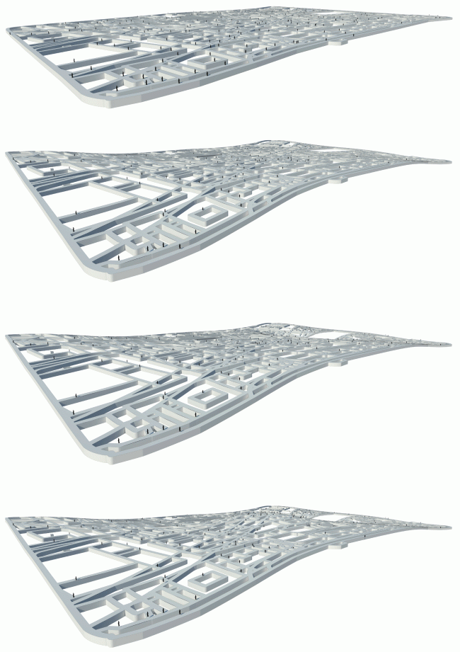
Concept: axonometric perspective."Zaryadye" Park. Project. © MVRDV Consortium. Image courtesy by "Atrium" Bureau
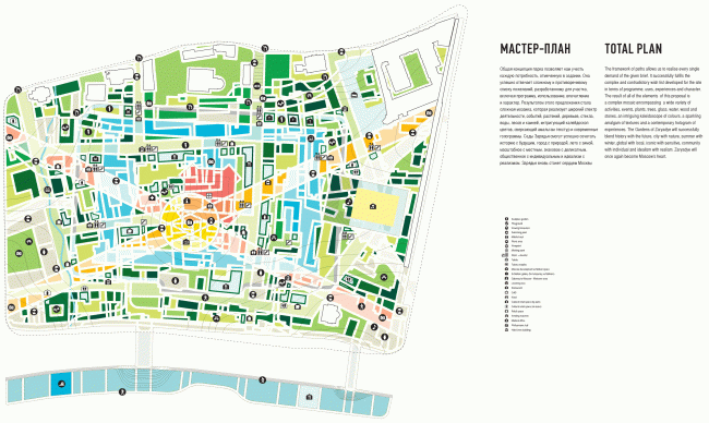
Explication with distribution of functions. "Zaryadye" Park. Project. © MVRDV Consortium. Image courtesy by "Atrium" Bureau
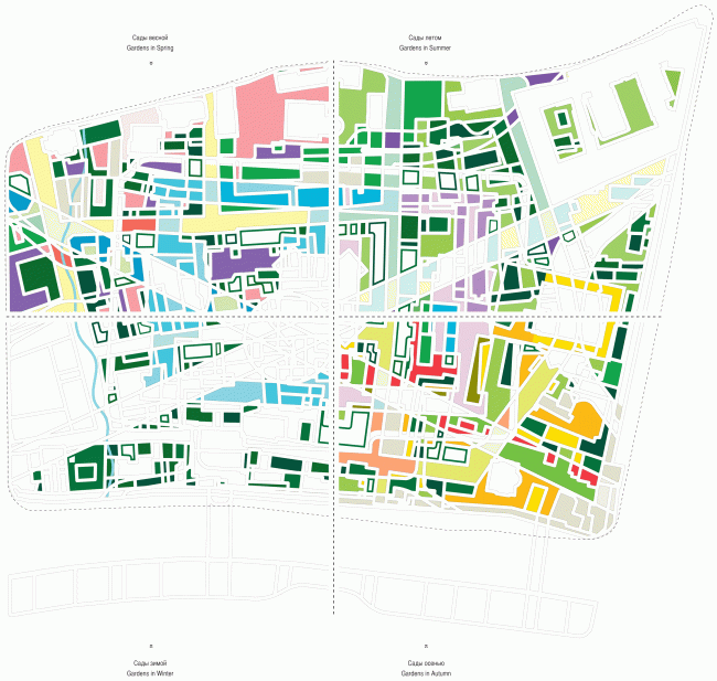
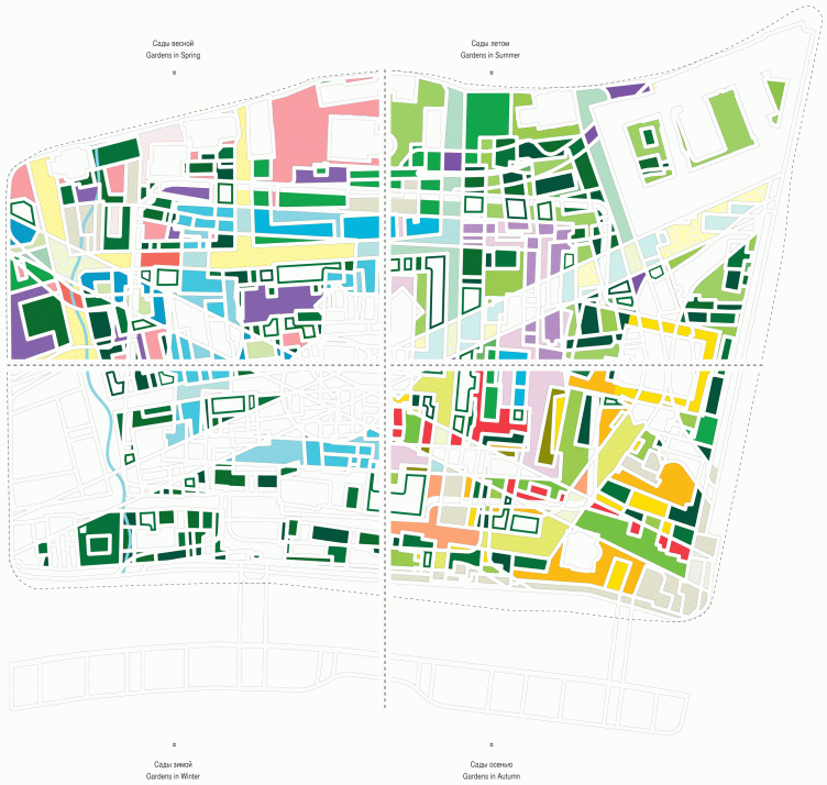
Park in different seasons. "Zaryadye" Park. Project. © MVRDV Consortium. Image courtesy by "Atrium" Bureau
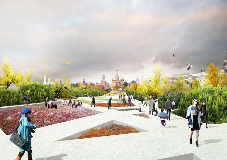
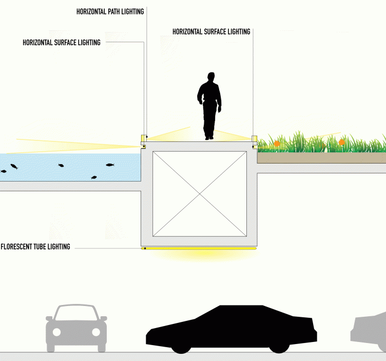
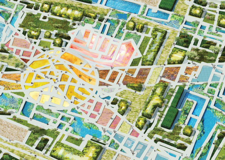
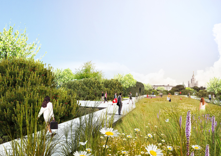
The large number of the trails allows for a wealth of walking routes that turn the park into an emotional and intellectual attraction. The walks that are made from 2-meter wide hollow concrete blocks rise 40 cm above the ground. They are multifunctional - they also serve as benches and even lamps. According to the architects, one can sit down at any moment, using the trail as a bench. The blocks also have in them backlighting niches aimed both into the park and under one's feet - this is why their contours glow in the dark. In the nighttime, the backlighting grid hovering above the grass and between the trees and shrubs would look particularly enticing. The design of the walks, that mostly follow the formerly existing roads, allows for opening any sector for the archeological research and subsequent exposition. At the same time, the density of the grid, conditioned by the superposition of several different maps, allows a large number of people to walk through the park: in the specifications, the park was defined as a "walk-through" one, the average time of a person staying there was not to exceed an hour or two. In this sense, the newly-introduced diagonal viewing axis also go along way to provide the opportunity for quickly crossing this territory. Generally, the park came out flexible and open to transformation: at any time, if needed, a fragment of its landscape could be changed, as well as a function of some of its parts - without any damage for the overall concept and perception.
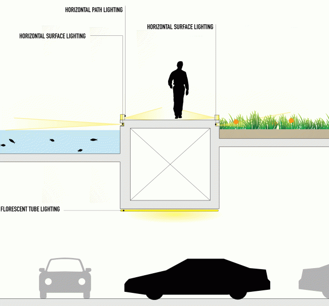
Section view of the module of the park walk. "Zaryadye" Park. Project. © MVRDV Consortium. Image courtesy by "Atrium" Bureau

"Zaryadye" Park. Project. © MVRDV Consortium. Image courtesy by "Atrium" Bureau
"Zaryadye" Park. Project. © MVRDV Consortium. Image courtesy by "Atrium" Bureau

"Zaryadye" Park. Project. © MVRDV Consortium. Image courtesy by "Atrium" Bureau
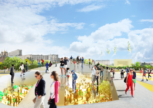
"Zaryadye" Park. Project. © MVRDV Consortium. Image courtesy by "Atrium" Bureau
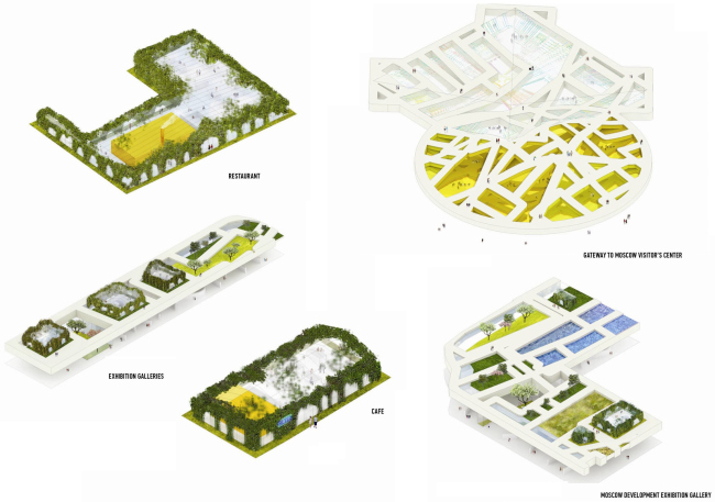
Info center, galleries, and cafes. "Zaryadye" Park. Project. © MVRDV Consortium. Image courtesy by "Atrium" Bureau
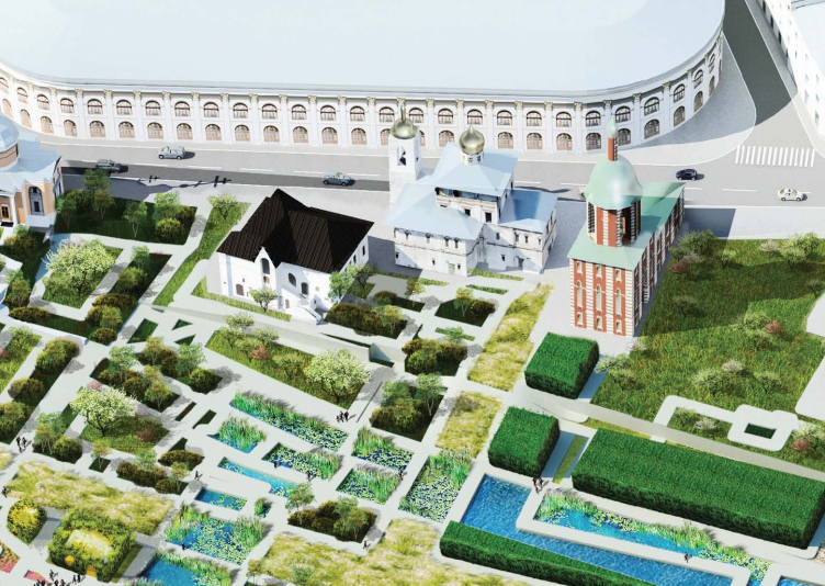
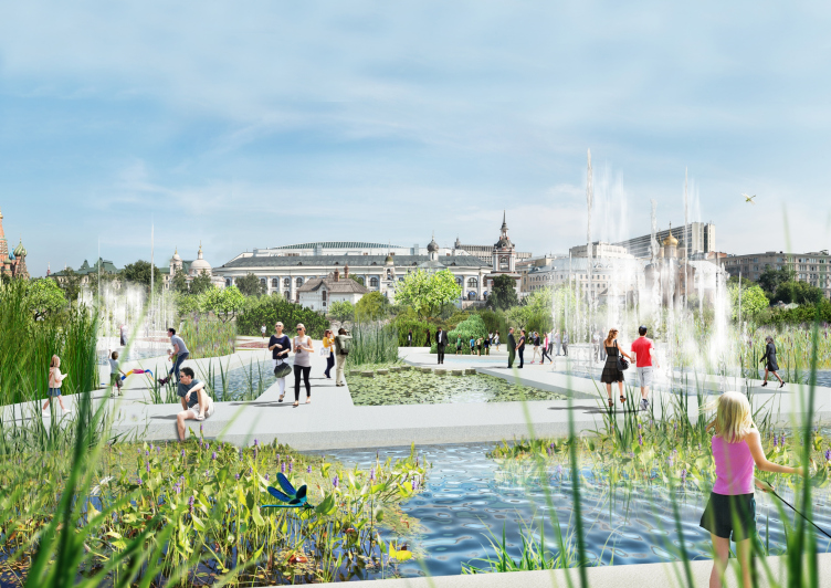
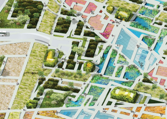
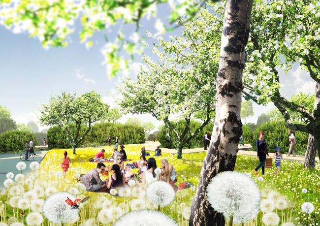
The multitude of mini parks, inserted between the walks, became the "visiting" card of the project. The explanatory note promises "750 gardens". This is a whole natural kaleidoscope based on the wealth of the Russian nature. Unlike their competition, the authors operate not so much in climate belts as in the landscape diversity, highlighting the river meadows, summer home gardens, manor parks, and other similar elements of various height, natural texture, and the degree of "naturalness" of their origin. So, the initial concept of "Pompeii labyrinth" only manifests itself in some places by the figure-cut shrubbery. Put in the place of the lost buildings, they look very much like an exaggerated historical decoration and at the same time like a piece of romanticized Versalles. This "mismatching" jigsaw puzzle with trees and shrubbery as diverse as its functions became the answer to the specifications' requirement to avoid large open spaces.

"Zaryadye" Park. Project. © MVRDV Consortium. Image courtesy by "Atrium" Bureau
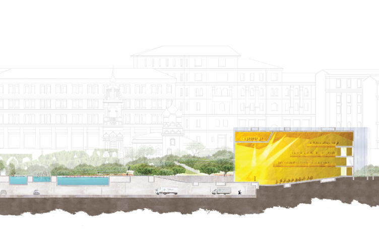
One of the things that makes this project prominently different from the others is the parking lot whose solution reflects the original labyrinth idea. Singling out the root "park" in the word "parking", the architects turned it into yet another underground landscape where one can find shelter from bad weather and from where one gets direct access to the Philarmonic Hall or the Museum of Moscow. The parking lot gets the entire rectangle of the basement slab of the former "Russia" hotel: the resulting number of car stalls is well over the required five hundred - which gave the architects an opportunity to make the parking layout rather free, as well as to suggest that the bus stops on the Vasilievsky Slope be mover over here as well. Some places in the lower area get the "light wells" - the trees grow up from the lower tier to the upper one, forming a smooth transition from the parking to the park. "We turned the parking lot into the continuation, or, rather, the threshold of the park. The park would begin already at this point, and the people who would come by bus or by car, would at once find themselves in a comfortable environment" - Vera Butko explains.

Section view of the underground space. "Zaryadye" Park. Project. © MVRDV Consortium. Image courtesy by "Atrium" Bureau

Section view by the Philarmonic Hall. "Zaryadye" Park. Project. © MVRDV Consortium. Image courtesy by "Atrium" Bureau
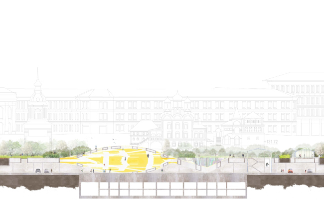
Section view by the infocenterl. "Zaryadye" Park. Project. © MVRDV Consortium. Image courtesy by "Atrium" Bureau
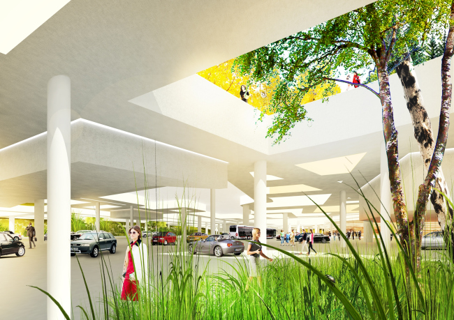
"Zaryadye" Park. Project. © MVRDV Consortium. Image courtesy by "Atrium" Bureau

"Zaryadye" Park. Project. © MVRDV Consortium. Image courtesy by "Atrium" Bureau
On the level of the park, the perimeter of the hotel is highlighted by a band of decorative basins. The rounded hill almost in the center is the paraphrase of the hub of the universe; its dome houses the tourist information center "Moscow Gates" - the poetic name echoes the idea of a hearty welcome for the guests if the city: this is the place where the tourists getting off the busses and out of the cars would find themselves in. The walks climb up this hill with the spaces between them separated with glass, over which one can also walk. The upper point of the dome of the info center is to become the sightseeing platform.
- How did you find yourselves in the consortium MVDRV?
Anton Nadtochy:
- We got acquainted at the Venice Biennale 2012 (Sergey Kuznetsov had just been announced the chief architect of Moscow, this "contest" affair had not begun yet) and at once decided to work on some project together, provided we have an opportunity. During the year, there were a few attempts, both from our and from their side, but it was not until this Zaryadye project that we finally got down to joint designing. In this case the initiative came from the Dutch side.
Incidentally, in this contest the requirement of the Russian architects in the consortium was not at all mandatory. From our point of view, however, designing in such a place was totally impossible without the deep knowledge of the specifics.
- What are your impressions from your joint work?
Anton Nadtochy:
- We have a large experience of working with foreign companies. We worked with German, British, and French companies, and our evaluation of their activity in Russia is really ambivalent.
Zaryadye, however, became a most interesting and exciting project for us. MVRDV is one of the most conceptual architectural companies in the world, they have a huge experience of both implementing projects and taking part in contests. After they come up with the basic approach, they implement their idea to perfection. This is why all their project come out very accurate, sometimes even radical but alway conceptual and interesting from the shape and form standpoint. We drew inspiration from their work when we were still very young architects. What stands out in my memory especially vividly is my visiting the Dutch pavilion at EXPO-2000 in Hannover and their conceptual exposition at the Biennale in Venice. That was magnificent!
Vera Butko:
- They have their technological process fine-tuned to perfection, which does not interfere with the creative principle. The entire team is literally aflame with the work, and all the participants are perfectly clear about their tasks. Winy is generally a very "winning" person, capable of infecting you with his enthusiasm; the architects in his bureau hear him perfectly - they catch on the idea and start working on it at once - they scatter to their workplaces and each one of them starts doing his own bit. The team is reigned by the atmosphere of boundless trust and openness, as well as personal responsibility of each of its members.
Anton Nadtochy:
- Yes, the Dutch work in an entirely different way. They have a highly developed culture of interaction between the members of the team. In Russia, it is hard to find "partner" companies that would do the engineering or designing work, so it is easier to have your own designers and engineers on the team, rather than turn to an outside company - we have not yet developed the culture of information exchange between the related companies.
In Europe, as I understand it, it's quite the other way around - there are a lot of highly specialized companies, and none of them does the entire volume of work on the project; they interact with one another to produce the final result. There are, of course, project "giants" that do the entire bulk of work from beginning to end - but they miss out on the creative part, their product is usually on the "average" standard level.
It is quite the other way around in the specialized companies - they have super-specialists that are real pros in but one thing. This is why they have an established process of interaction and information exchange between the bureaus that specialize in different areas. Besides, MVRDV is an international company - they design and build all over the globe, and this, in a way, is also a specific experience.
- And how was the work organized in your particular case?
Anton Nadtochy:
- The first thing that we did was draw up the timetable: two weeks for the analysis and survey work, a month for developing the concept, then still some time for fine-tuning and adjusting it. Once the general outlines were defined, MVRDV, as the leaders of the consortium, started the communication between all the participants of the process. The discussion included us and the Swiss landscape designer Anouk Vogel. At later stages, the engineering company Arcadis came into play. From time to time, the Dutch would throw in an odd conceptual question to all the participants of the process. For example: we have a task of designing a contemporary park. So, what is your definition of "contemporary", and, specifically, "contemporary" for Russia?
In late July, in Rotterdam, there was a joint workshop, where out of a multitude of options the key solutions were picked out.
During our work we constantly analyzed and translated the reference information, took part in the joint discussions and offered solutions of our own, developed the functional layout, and all the cultural program. We would adapt and adjust our colleagues' offers to the territory specifics, local mentality, local rules and regulations, and the like.
Vera Butko:
- Here we have to do justice to the extreme efficiency and commitment of the Dutch specialists, their culture of graphical statement and exchange of information.
This was a great working experience, and we are happy both with the process and with the end result. We think that our joint team was able not only to create a comfortable green territory but also to keep the historical and cultural identity of this unique place.

Sightseeing platform. "Zaryadye" Park. Project. © MVRDV Consortium. Image courtesy by "Atrium" Bureau

Cafe. "Zaryadye" Park. Project. © MVRDV Consortium. Image courtesy by "Atrium" Bureau
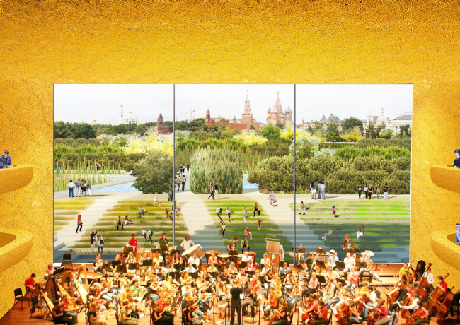
Concert hall. "Zaryadye" Park. Project. © MVRDV Consortium. Image courtesy by "Atrium" Bureau
"Zaryadye" Park. Project. © MVRDV Consortium. Image courtesy by "Atrium" Bureau

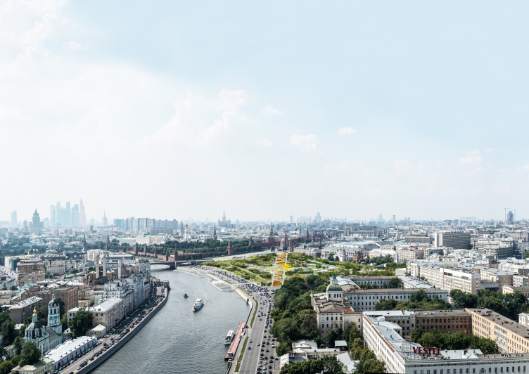
View from the side of the Moskva River and its embankment. "Zaryadye" Park. Project. © MVRDV Consortium. Image courtesy by "Atrium" Bureau
Top view by night. "Zaryadye" Park. Project © Consortium MVRDV. Photo courtesy by "Atrium"


