По-русски

Green Heart of Moscow

Project of the park "Zaryadye" developed by the consortium of "Reserve" Group + Maxwan + Latz und Partner

27 November 2013
Object
mainImg
"Zaryadye" Park. Project by the consortium "Reserve + Maxwan + Latz und Partner" 

From the very start, this consortium was formed "on a parity basis". “We and Maxwan Bureau go back a long way and we know that we both are capable of effective and efficient cooperation. However, to develop the concept for "Zaryadye" park our two teams would not have been enough, so our main challenge was to find a top-of-the-list landscape designer" - Vladimir Plotkin shares. - It was Maxwan that suggested working with Latz und Partner because we had already been quite familiar with one another after working on several joint projects, and it was not until we got their consent to cooperate that we finally decided to take part in the competition. Together, all the participants of the consortium had met three times - in Russia, in Germany, and in the Netherlands. The first workshop took place in Moscow shortly after the shortlist of the contest was announced”.

"Zaryadye" Park. Project by the consortium "Reserve + Maxwan + Latz und Partner"

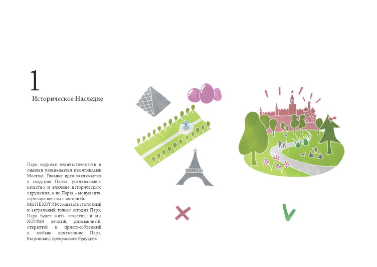
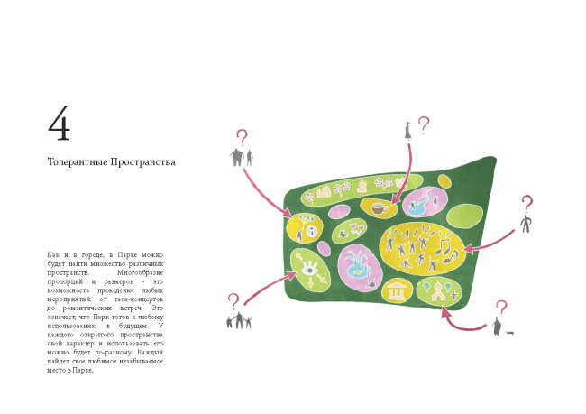
The architect recalls that the most difficult challenge of the two first workshops in Moscow and Munich was, without even getting down to actual drawing, settle the main question: what kind of park can be there in the heart of Moscow. “We examined three possible solutions. The first solution was to treat the park as a symbol worthy of Moscow's best place, like a breakthrough into the future, a park that produces a "wow-effect" (I have to admit that initially this idea was a favorite with me). The second one was a park with the interestingly devised and elegant three-dimensional topographical intrigue, which is based either on its historical background or on some kind of intellectual game. And, finally, the third solution was to create a park in the form of a… park, the greatest park of all times, which enhances and emphasizes the merits of its historical environment and the natural landscape. And it was this last idea that won us over with its simplicity and its being so convincingly appropriate on this land spot that is really tired as it is from all of the endless experiments of recent years. So our choice was made. True, the "wow-effects" in the form of unprecedented abundance of trees and shrubbery that create most unexpected color palettes during the year, and the intrigue of the diverse "semi-functional" spaces formed by the trees flanking the endless spiral-like trail, are also playing an important part in the project". 

Following a joint decision on the main idea and basic conceptual solutions, the areas of responsibility of each of the groups were defined: "Reserve Group" in this project was responsible for the architecture, Latz und Partner - for the landscape design and dendrology, and Maxwan - for the town-planning issues, the layouts, and, together with Reserve, it coordinated the management of the project. 

"Zaryadye" Park. Project by the consortium "Reserve + Maxwan + Latz und Partner"

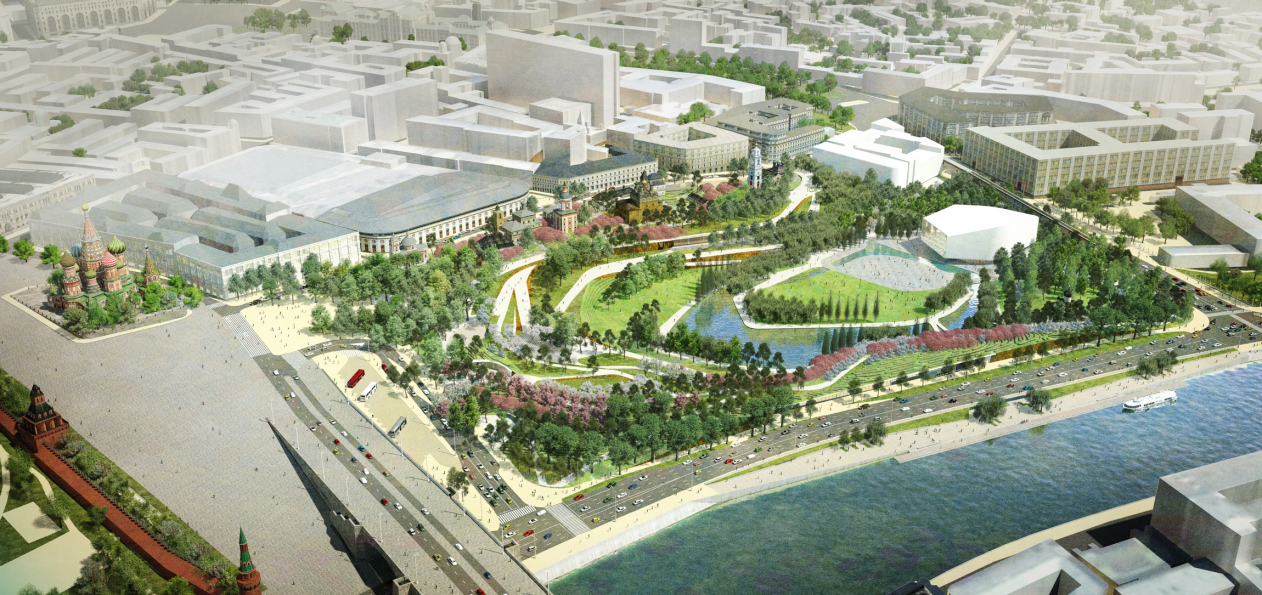
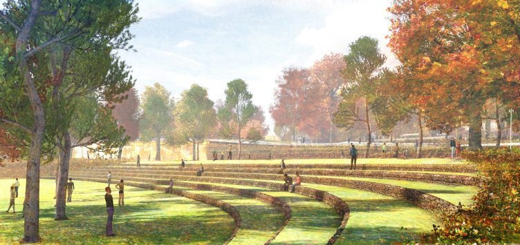
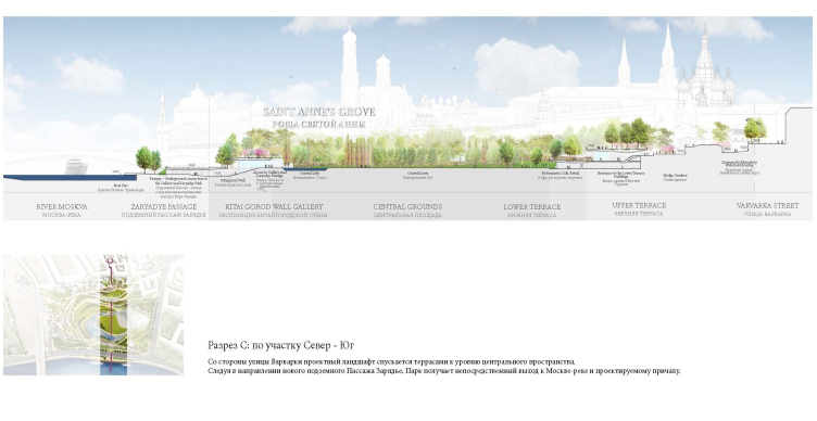
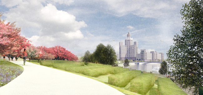
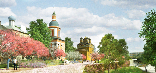
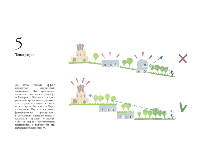
In fact, what the architects do is they recreate the topography of this place in the form that preceded the historical planning of Zaryadye. Instead of the walks-through and strict dividing into sectors and plots, the place is ruled by smooth outlines that follow the logic of gradually lowering relief. One can say that it was the existing relief drop (some 16 meters from the Varvarka Street to the Moskva River Embankment) that became the main theme of the project - the park is treated as a system of terraces cascading down to the water. By using them, the architects achieve the necessary effect - the landscaped territory cast a cooling shadow on Moscow's most famous places, thus enhancing their significance - while all the functions that make the park a self-sufficient recreation area, are hidden inside the giant green steps.
"Zaryadye" Park. Project by the consortium "Reserve + Maxwan + Latz und Partner"

"Zaryadye" Park. Project by the consortium "Reserve + Maxwan + Latz und Partner"

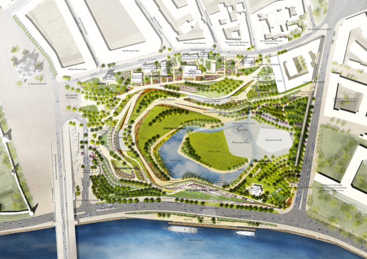
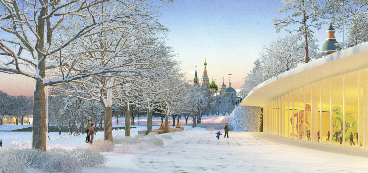
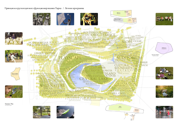
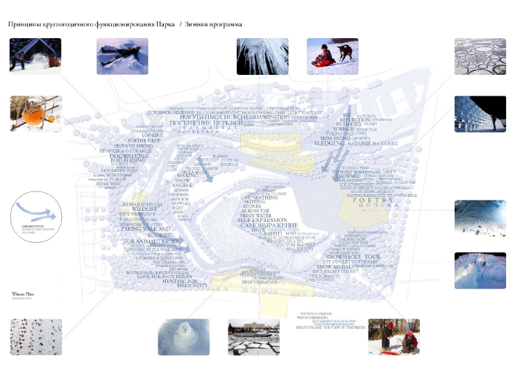
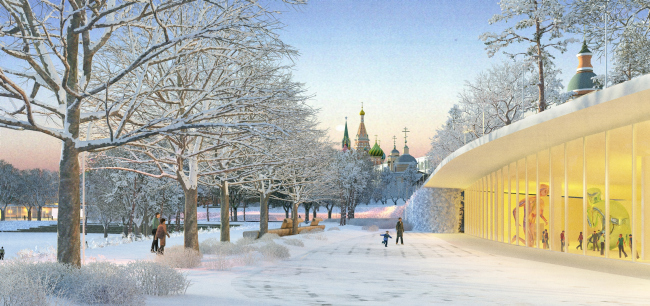
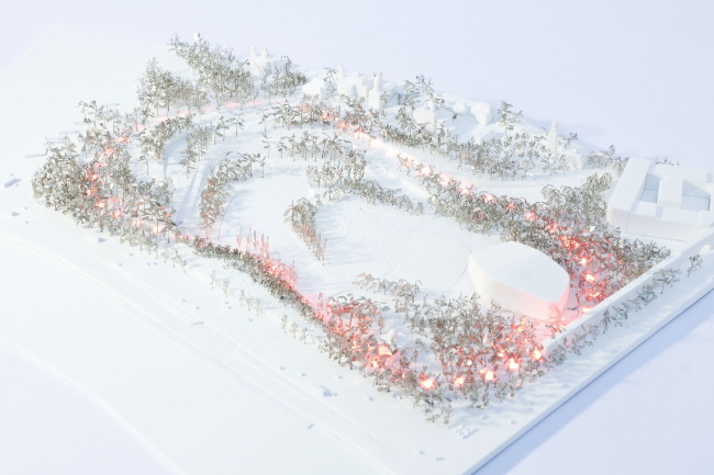
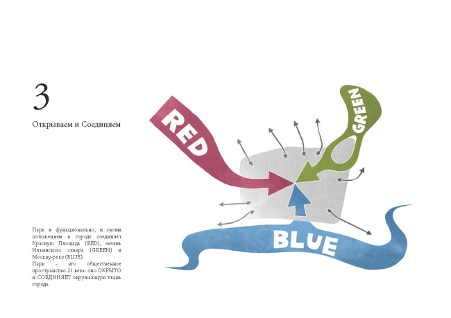
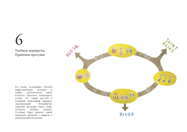
This kind of layout allows the architects to address yet another vital challenge - that is to create a diverse, and, most importantly, a sufficiently long walking route. Here is the thing - "Zaryadye" is vastly different from Gorky Park or Hyde Park; its area, by the park standards, is at least modest, and if one treats it as a mere territory connecting the Red Square, Ilinka Square, and the Moskva River, there is a risk that the pedestrians will not notice it at all. And it is the circular route that will make the pedestrians involuntarily slow down and, once in the park, switch to a strolling pace. Throughout the route, the architects place cafes, showrooms, training centers, and shops - such a "necklace" of buildings and pavilions is especially relevant in Russia in the wintertime when the walks get shorter, and the need to go somewhere warm becomes more pressing. The authors of the project, incidentally, are positive that in winter this park will be just in as much demand as it will be in summer: the transparency of the scenery views and the snowy vistas would emphasize the beauty of Russian winter and form here a place quiet and peaceful - the kind that is so hard to find in today's Moscow. Still, nobody is speaking about canceling the traditional winter fun activities: the project provides for snow fortresses, ice sculptures, and of course, sleigh rides from the Pskov slide.
"Zaryadye" Park. Project by the consortium "Reserve + Maxwan + Latz und Partner"

"Zaryadye" Park. Project by the consortium "Reserve + Maxwan + Latz und Partner"
"Zaryadye" Park. Project by the consortium "Reserve + Maxwan + Latz und Partner"

"Zaryadye" Park. Project by the consortium "Reserve + Maxwan + Latz und Partner"

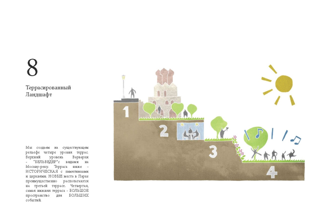
Totally, the park has in it four levels of terraces. The upper level of the Varvarka Street is the "belvedere" that commands the views of the Moskva River; the terrace beneath it is the historic one, with churches and monuments. The new functions are concentrated predominantly at the third level (it is these function that are united by the single pedestrian ring), while the fourth bottom terrace is in fact a sort of an open-air stage, the park' main public space mean for organizing large-scale events. At this same level, as far away from the Kremlin as possible, there is the Philharmonic Hall (as expected, it will be built through a dedicated tender, this is why, for the time being, it is designated by a symbolic volume), the underground car park also exits here. The latter is the special pride of the authors: designing the space for storing vehicles, they still were able to avoid turning it into a "stone bag" hidden underground. The relief drop here is also used to its best advantage: in fact, the car park is a large hood, turned to the trees and shrubs and "collecting" the excessive sunlight.
"Zaryadye" Park. Project by the consortium "Reserve + Maxwan + Latz und Partner"

"Zaryadye" Park. Project by the consortium "Reserve + Maxwan + Latz und Partner"

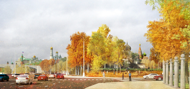
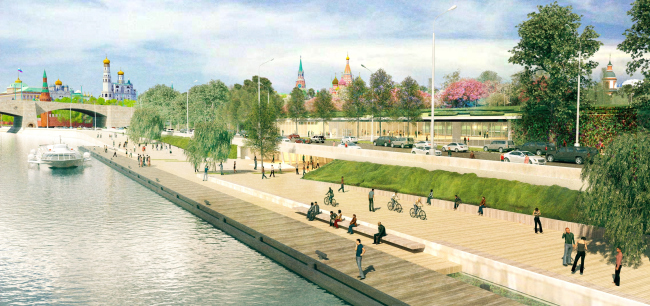
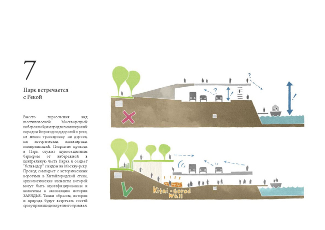
Just as unconventional is the solution that was found to link the park with the Moskva River embankment, one that the "Zaryadye" project is meant to breathe new life into. According to the contest specifications, the contestants were to link the park with the Moskva River with some sort of a bridge and an overpass, and it was only the team "Reserve + Maxwan + Latz und Partner" that took the liberty to rethink this requirement. In order to avoid the necessity of grappling with the six-lane road at the top, the architects make a wide passage underneath it. The underground underpass is the last thing in the world that it looks like - rather a gallery or yet another, the "super-bottom" terrace that leads into a small but beautiful tunnel. The latter, by the way, coincides with the historical gates leading into the "China-Town Wall", whose "museum" archeological elements will become its main adornment. An additional lower level also appears at the embankment itself - the Moskva River makes in this place a slight bend, which the architects straighten out with the aid of two smooth ramps, leading the basic pavement away from them. And, although the pedestrians will still be able to walk along the traffic way, the cozy territory next to the water with the bikeways and the marina for the waterbuses are not visually connected with the stream of cars in any way. Thanks to the underground passage, "Zaryadye" park gets not only the required connection with the river but also an imposing extra entrance - the judging board of the contest gave high critical acclaim to this proposal by "Reserve" and its partners; later the Chief Architect of Moscow Sergey Kuznetsov even announced that it would possibly be used in the winning project.
"Zaryadye" Park. Project by the consortium "Reserve + Maxwan + Latz und Partner"
"Zaryadye" Park. Project by the consortium "Reserve + Maxwan + Latz und Partner"

"Zaryadye" Park. Project by the consortium "Reserve + Maxwan + Latz und Partner"

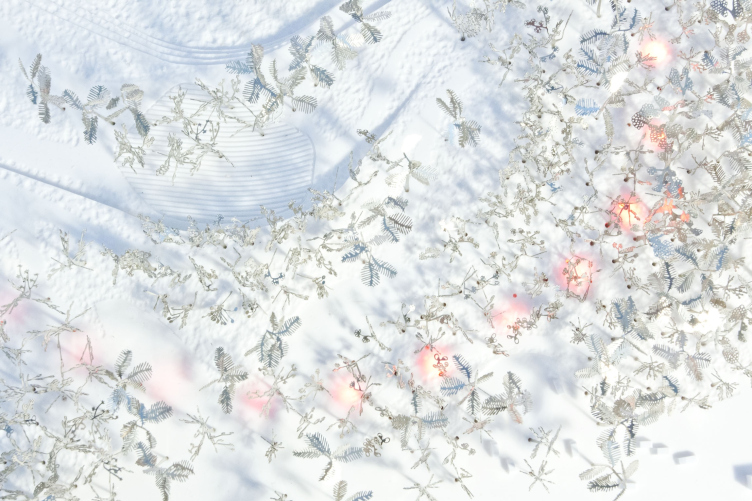
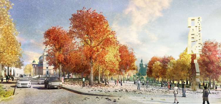
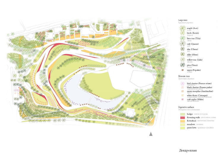
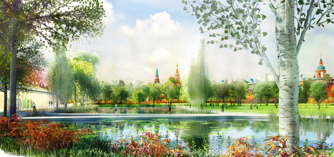
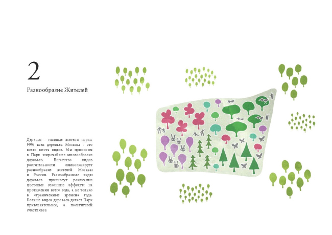
As was already mentioned before, the main "building material" that forms the park territories is in fact trees and shrubs. These are the flower walls, hedges, lawns, flower beds, and, of course, the trees, which in the park are represented in the variety that is unique for Moscow. “Wealth of the forms of vegetation, according to our concept, symbolizes the variety of the inhabitants of Moscow and Russia, and furthermore it guarantees that the park will boast a saturated color palette almost all year round”, explain Anton Egerev, leader of the 5th architectural workshop of “Reserve”. The park also has a body of water of its own - the symbolic connection to the river is underlined with the help of an artificial creek that, in the shape of a giant horseshoe, straddles the Philharmonic Hall building, as well as by the brook running down the slope and turning into a water surface covering the main square. This "thin film of water", just like the lake, will be reflecting the wealth of the surrounding architectural monuments, while in the night time it will serve, together with the rest of the park, as the background of the various lighting scenarios.
"Zaryadye" Park. Project by the consortium "Reserve + Maxwan + Latz und Partner"

"Zaryadye" Park. Project by the consortium "Reserve + Maxwan + Latz und Partner"

Designing the park as, predominantly, a work of landscape design, the consortium Reserve + Maxwan + Latz und Partner creates in Zaryadye a space that is as much as possible comfortable, natural, and thus "timeless" - the XXI century makes its presence known not with the modern technological twists but the so-rare for Russia idea of proportion and respect for the immediate surroundings.

"Zaryadye" Park. Project by the consortium "Reserve + Maxwan + Latz und Partner"


"Zaryadye" Park. Project by the consortium "Reserve + Maxwan + Latz und Partner"

"Zaryadye" Park. Project by the consortium "Reserve + Maxwan + Latz und Partner"

"Zaryadye" Park. Project by the consortium "Reserve + Maxwan + Latz und Partner"
"Zaryadye" Park. Project by the consortium "Reserve + Maxwan + Latz und Partner"
"Zaryadye" Park. Project by the consortium "Reserve + Maxwan + Latz und Partner"
"Zaryadye" Park. Project by the consortium "Reserve + Maxwan + Latz und Partner"
"Zaryadye" Park. Project by the consortium "Reserve + Maxwan + Latz und Partner"

"Zaryadye" Park. Project by the consortium "Reserve + Maxwan + Latz und Partner"
zooming


27 November 2013

Headlines now
The Golden Crown
The concept for a dental clinic in Yekaterinburg, developed by CNTR Studio, revolves around the idea of a “mouth full of gold”: pristine white porcelain stoneware walls are complemented by matte brass details. To avoid an overly literal interpretation, the architects focused on the building’s proportions, skillfully navigating between sunlight requirements and fire safety regulations.
Flexibility and Integration
Not long ago, we covered the project for the fourth phase of the ÁLIA residential complex, designed by APEX. Now, we’ve been shown different fence concepts they developed to enclose the complex’s private courtyards, incorporating a variety of public functions. We believe that the sheer fact that the complex’s architects were involved in such a detail as fencing speaks volumes.
A Step Forward
The HIDE residential complex represents a major milestone for ADM architects and their leaders Andrey Romanov and Ekaterina Kuznetsova in their quest for a fresh high-rise aesthetic – one that is flexible and layered, capable of bringing vibrancy to mass and silhouette while shaping form. Over recent years, this approach has become ADM’s “signature style”, with the golden HIDE tower playing a pivotal role in its evolution. Here, we delve into the project’s story, explore the details of the complex’s design, and uncover its core essence.
Gold in the Sands
A new office for a transcontinental company specializing in resource extraction and processing has opened in Dubai. Designed by T+T Architects, masters of creating spaces that are contemporary, diverse, flexible, and original, this project exemplifies their expertise. On the executive floor, a massive brass-clad partition dominates, while layered textures of compressed earth create a contextually resonant backdrop.
Layers and Levels of Flight
This project goes way back – Reserve Union won this architectural competition at the end of 2011, and the building was completed in 2018, so it’s practically “archival”. However, despite being relatively unknown, the building can hardly be considered “dated” and remains a prime example of architectural expression, particularly in the headquarters genre. And it’s especially fitting for an aviation company office. In some ways, it resembles the Aeroflot headquarters at Sheremetyevo but with its own unique identity, following the signature style of Vladimir Plotkin. In this article, we take an in-depth look at the United Aircraft Corporation (UAC) headquarters in the Moscow agglomeration town of Zhukovsky, supplemented by recent photographs from Alexey Naroditsky – a shoot that became only recently possible due to the fact that improvements were finally made in the surrounding area.
Light and Shadow
In this article, we delve into the architectural design of the “Chaika” house by DNK ag architects, which was recently completed in 2023 as part of the collection of signature designs at ZILArt. As is well-known, all the buildings in this complex follow a design code, yet each one is distinct. This particular building stands out not only for its whiteness and minimalism but also for the refined use of a limited number of techniques that, together, create what can confidently be called synergy.
Casus Novae
A master plan was developed for a large residential area with a name of “DNS City”, but now that its implementation began, the plan has been arbitrarily reformatted and replaced with something that, while similar on the surface, is actually quite different. This is not the first time such a thing happens, but it’s always frustrating. With permission from the author, we are sharing Maria Elkina’s post.
Treasure Hunting
The GAFA bureau, in collaboration with Tegola and Arkhitail, organized an expedition to the island of Kilpola in Karelia as part of Moskomarkhitektura’s “Open City” festival. There, amidst moss and rocks, the students sought answers to questions like: what is the sacred, where does it dwell, and what sustains it? Assisting the participants in this quest were landscape engineer Evgeny Levin, artist Nicholas Roerich, a moose, and the lack of cellular connection. Here’s how the story unfolded.
Depths of the Earth, Streams of Water
In the Malaya Okhta district, the Akzent building, designed by Stepan Liphart, was constructed. It follows a classic tripartite structure, yet it’s what you might call “hand-drawn”: each façade is unique in its form and details, some of which aren’t immediately noticeable. In this article, we explore the context and, together with the architect, delve into how the form was developed.
Fir Tree Dynamics
The “Airports of Region” holding is planning to build an airport in Karachay-Cherkessia, aiming to make the Arkhyz and Dombay resorts more accessible to travelers. The project that won in an invitation-only competition, submitted by Sergey Nikeshkin’s KPLN, blends natural imagery inspired by the shape of a conifer seed, open-air waiting spaces, majestic large trees, and a green roof elevated on needle-like columns. The result is both nature-inspired and WOW.
​A Brick Shell
In the process of designing a clubhouse situated among pine trees in a prestigious suburban area near Moscow, the architectural firm “A.Len” did the façade design part. The combination of different types of brick and masonry correlates with the volumetric and plastique solutions, further enhanced by the inclusion of wood-painted fragments and metal “glazing”.
Word Forms
ATRIUM architects love ambitious challenges, and for the firm’s thirtieth anniversary, they boldly play a game of words with an exhibition that dives deep into a self-created vocabulary. They immerse their projects – especially art installations – into this glossary, as if plunging into a current of their own. You feel as if you’re flowing through the veins of pure art, immersed in a universe of vertical cities, educational spaces – of which the architects are true masters – and the cultural codes of various locations. But what truly captivates is the bold statement that Vera Butko and Anton Nadtochy make, both through their work and this exhibition: architecture, above all, is art – the art of working with form and space.
Flexibility and Acuteness of Modernity
Luxurious, fluid, large “kokoshniks” and spiral barrel columns, as if made from colorful chewing gum: there seem to be no other mansion like this in Moscow, designed in the “Neo-Russian-Modern” style. And the “Teremok” on Malaya Kaluzhskaya, previously somewhat obscure, has “come alive with new colors” and gained visibility after its restoration for the office of the “architectural ecosystem” as the architects love to call themselves. It’s evident that Julius Borisov and the architects at UNK put their hearts into finding this new office and bringing it up to date. Let’s delve into the paradoxes of this mansion’s history and its plasticity. Spoiler: two versions of modernity meet here, both balancing on the razor’s edge of “what’s current”.
Yuri Vissarionov: “A modular house does not belong to the land”
It belongs to space, or to the air... It turns out that 3D printing is more effective when combined with a modular approach: the house is built in a workshop and then adapted to the site, including on uneven terrain. Yuri Vissarionov shares his latest experience in designing tourist complexes, both in central Russia and in the south. These include houseboats, homes printed from lightweight concrete using a 3D printer, and, of course, frame houses.
​Moscow’s First
“The quality of education largely depends on the quality of the educational environment”. This principle of the last decade has been realized by Sergey Skuratov in the project for the First Moscow Gymnasium on Rostovskaya Embankment in the Khamovniki district. The building seamlessly integrates into the complex urban landscape, responding both to the pedestrian flow of the city and the quiet alleyways. It skillfully takes advantage of the height differences and aligns with modern trends in educational space design. Let’s take a closer look.
Looking at the Water
The site of Villa Sonata stretches from the road to the water’s edge, offering its own shoreline, pier, and a picturesque river panorama. To reveal these sweeping views, Roman Leonidov “cut” the façade diagonally parallel to the river, thus getting two main axes for the house and, consequently, “two heads”. The internal core – two double-height spaces, a living room and a conservatory, with a “bridge” above them – makes the house both “transparent” and filled with light.
The White Wing
Well, it’s not exactly white. It’s more of a beige, white-stone structure that plays with the color of limestone – smoother surfaces are lighter, while rougher ones are darker. This wing unites various elements: it absorbs and interprets the surrounding themes. It responds to everything, yet maintains a cohesive expression – a challenging task! – while also incorporating recognizable features of its own, such as the dynamic cuts at the bottom, top, and middle.
Urban Dunes
The XSA Ramps team designed and built a three-part sports hub for a park in Rostov-on-Don, welcoming people of all ages and fitness levels. The skate plaza, pump track, and playground are all meticulously crafted with details that attract a diverse range of visitors. The technical execution of the shapes and slopes transforms this space into a kind of sculptural composition.
Proportional Growth
The project for the fourth phase of the ÁLIA residential area has been announced. The buildings are situated on an elongated plot – almost a “ray” that shoots out from the center of the area towards the river. Their layout reflects both a response to Moscow’s architectural preferences over the past 15 years, shifting “from blocks to towers”, and an interpretation of the neighboring business park designed by SOM. Additionally, the best apartments here are not located at the very top but closer to the middle, forming a glowing “waistline”.
The “Staircase” Building
In designing the “Details” residential complex in New Moscow, Rais Baishev spiced up the now-popular Moscow theme of a “courtyard” building with an idea drawn from the surrealist drawings by Maurits Escher. He envisioned the stepped silhouettes and descending slopes as a metaphysical mega-staircase, creating a key void within the courtyard that gave the project an internal “spine”. This concept is felt both in the building’s silhouette and on its façades.
Projection of the Quarter
No one doubted that the building that Vladimir Plotkin designed as part of the “Garden Quarters” would be the most modernist of all. And it turned out just that way: while adhering to the common design code, the building successfully combines brick and white stone, rhythmically responding to the neighboring building designed by Ostozhenka, yet tactfully and persistently making a few statements of its own. This includes the projection of the ideal urban development composition “14–9–6”, which can be found right next door, mathematical calculations, including those for various types of terraces (and perhaps the only reminder of the Soviet past of the Kauchuk rubber factory!), and the white “cross-stitch” pattern of the façade grid.
Domus Aurea
In this issue, we examine the “Tessinsky-1” house, designed by Sergey Skuratov and completed in 2023. Located in the middle of the Serebryanicheskaya Embankment district, at the intersection of its main streets, this house assumes a sort of “nodal” role: it not only responds to everything around it and preserves many memories of the former EMA factory within itself, but it weaves all this into a newly directed pattern, reconciling bright “gold” and dark-colored brick, largely with the help of the new, modern-yet-archaic Columba brick, which, come to think about it, is the most precious element here.
The Chimney of Nikola-Lenivets
In this issue, we are examining the “Obelisk House” designed by KATARSIS and built for the Arkhstoyanie 2023 festival. However, it was only finished later on, and this is why we are examining it now. It seems to us that after the “Obelisk House” appeared in Nikola-Lenivets, a dialogue and a few inner connections appeared between the temporary structures built here. These houses no longer look like “accidental neighbors”, more of which below.
​Periscope by the Bay
The jury awarded the second place in the competition for a public and cultural center in Petropavlovsk-Kamchatsky to the companies GORA (“Mountain”) and M4. In the consortium’s proposal, the building resembles a sperm whale with a calf swimming next to it or a periscope, whose lenses capture the most spectacular views from the surrounding landscape.
From Arcs to Dolmens
While working on the competition project for Petropavlovsk-Kamchatsky, ASADOV Architects prioritized the value of the natural and urban environment, aiming to preserve the balance of the location while minimizing the resemblance of the volume that they designed to a “traditional building”. The task was challenging, and the architects created three versions, one of which having been developed after the competition, where their main proposal took third place. However, the point of interest here is not the competition result but the continuity of creative thinking.
Hide and Seek
The ID Moskovskiy house, designed by Stepan Liphart in St. Petersburg, in the courtyards near Moskovskiy Avenue beyond the Obvodny Canal and recently completed, is notable for several reasons. Firstly, it has been realized with considerable accuracy, which is particularly significant as this is the first building where the architect was responsible not only for the facades but also for the layouts, allowing for better integration between the two. On the other hand, this building is interesting as an example of the “germination” of new architecture in the city: it draws on the best examples from the neighborhood and becomes an improved and developed sum of ideas found by the architect in the surrounding context.
The Big Twelve
Yesterday, the winners of the Moscow Mayor’s Architecture Award were announced and honored. Let’s take a look at what was awarded and, in some cases, even critique this esteemed award. After all, there is always room for improvement, right?
Above the Golden Horn
The residential complex “Philosophy” designed by T+T architects in Vladivostok, is one of the new projects in the “Golubinaya Pad” area, changing its development philosophy (pun intended) from single houses to a comprehensive approach. The buildings are organized along public streets, varying in height and format, with one house even executed in gallery typology, featuring a cantilever leaning on an art object.
Nuanced Alternative
How can you rhyme a square and space? Easily! But to do so, you need to rhyme everything you can possibly think of: weave everything together, like in a tensegrity structure, and find your own optics too. The new exhibition at GES-2 does just that, offering its visitor a new perspective on the history of art spanning 150 years, infused with the hope for endless multiplicity of worlds and art histories. Read on to see how this is achieved and how the exhibition design by Evgeny Ace contributes to it.
Blinds for Ice
An ice arena has been constructed in Domodedovo based on a project by Yuri Vissarionov Architects. To prevent the long façade, a technical requirement for winter sports facilities, from appearing monotonous, the architects proposed the use of suspended structures with multidirectional slats. This design protects the ice from direct sunlight while giving the wall texture and detail.