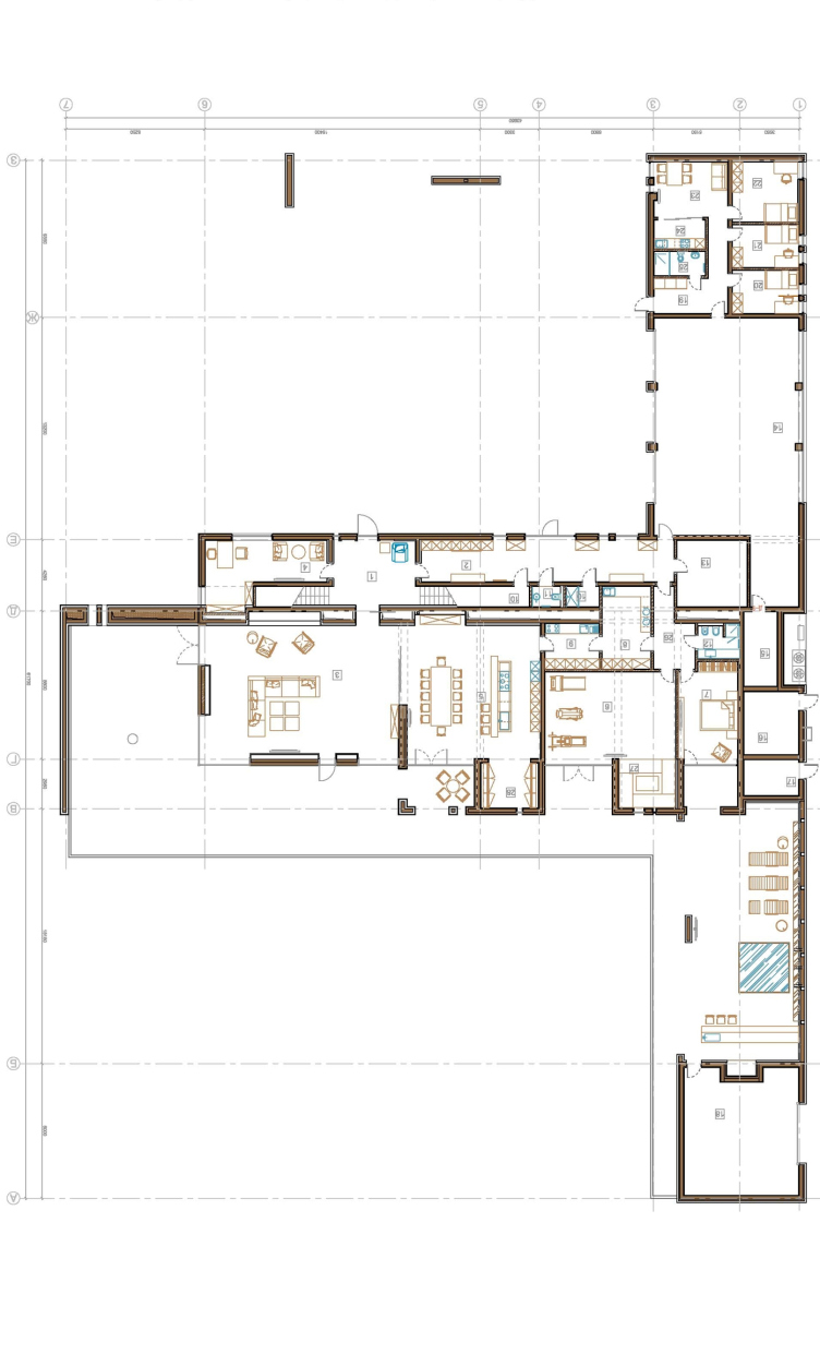
This house has a
large area - some
In terms of
composition, things are pretty simple here. The land site had neither
significant height difference nor any particular vegetation and was absolutely
easy to see through. And, because the option of building a tall fence around
the house was never even considered, it was the house itself that was to play
the part of such fence. This explains its extremely elongated shape - the
architects positioned the house across the land site, exactly in the middle of
it, clearly separating the public and private areas. Quite predictably, the
entrance is faced by the premises that are not "afraid" of the
onlookers' eyes, while the backyard is commanded by the windows of the living
room, the dining room, and the bedroom. On this same side the main open-air
veranda is also situated. And, to give the backyard an even more
"private" feel, the architects fence it off with the garage that they
position perpendicular to the main volume. Presently, on the
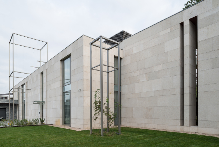
"entrance" side of the yard, there are only metallic parallelepipeds
- the basis for the future sculptural compositions of lianas.

The customer wanted
a modern house, and the architects felt free to indulge themselves into
building one that is modernist from top to bottom. The blocks - both
residential one and the garage - keep the original parallelepiped shape, and it
is this laconism together with the austere geometry that become the main theme
of this project. In actuality, however, the parallelepipeds are only shells
inside of which a complex "space" intrigue is played out.
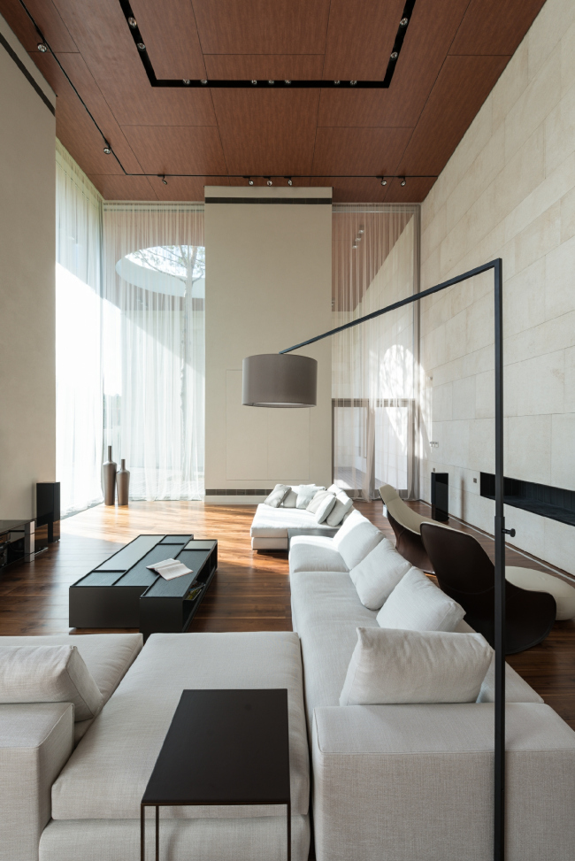
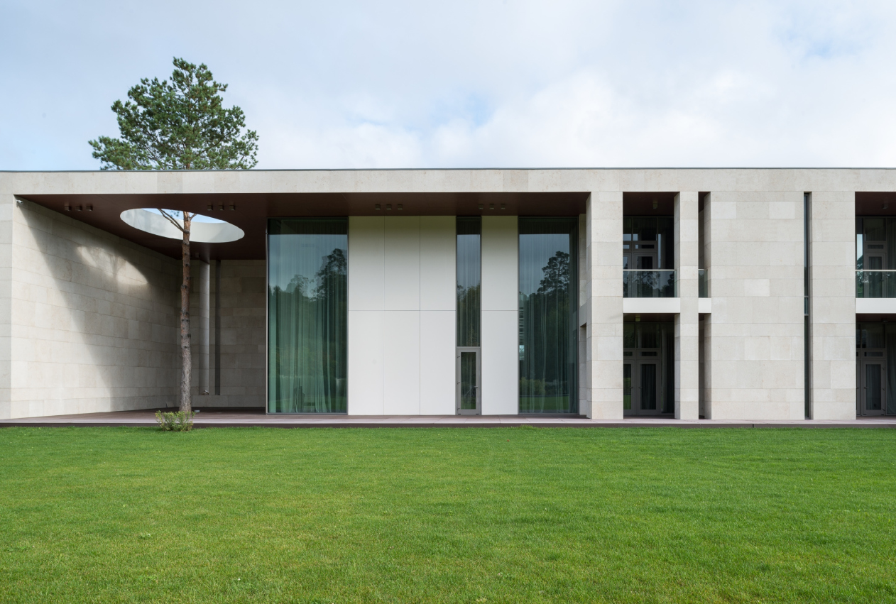
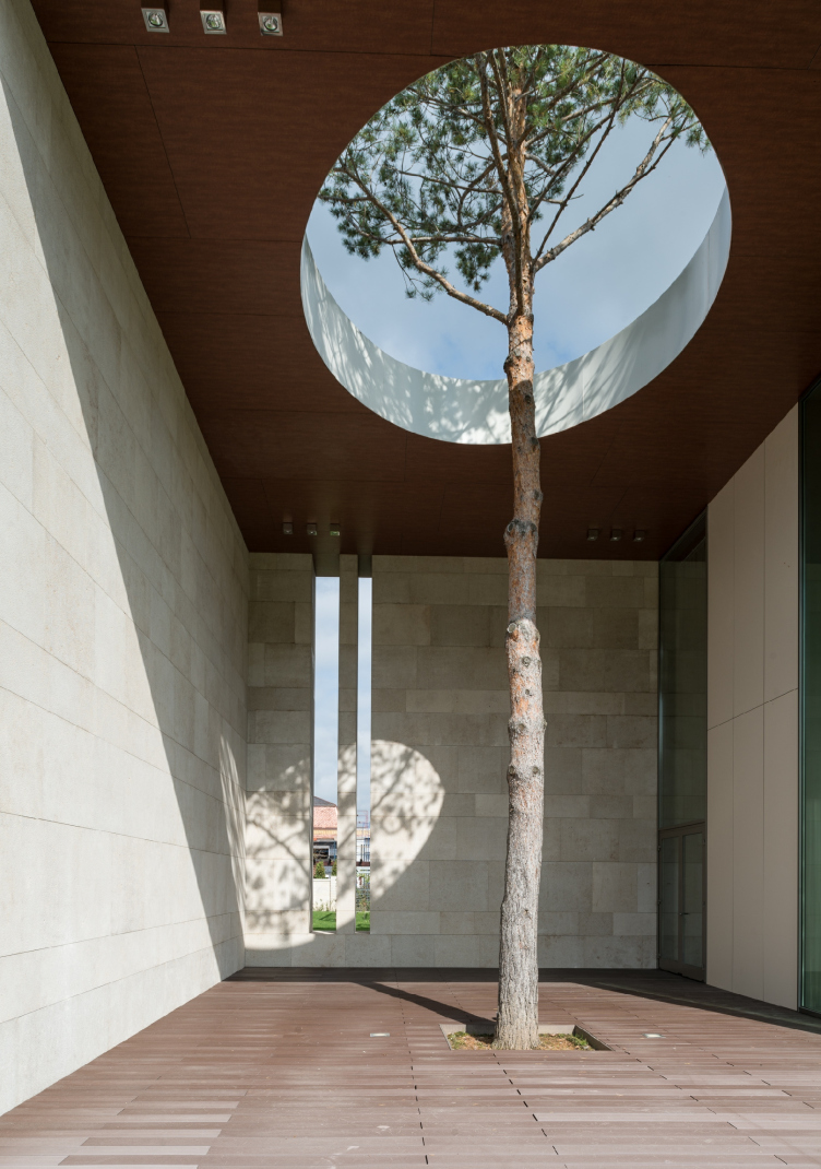
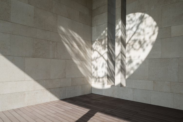
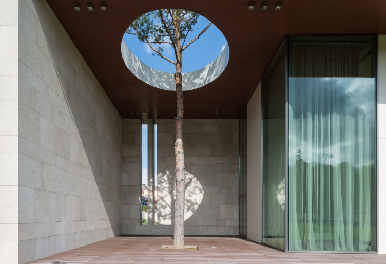
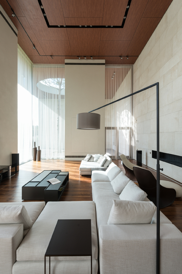
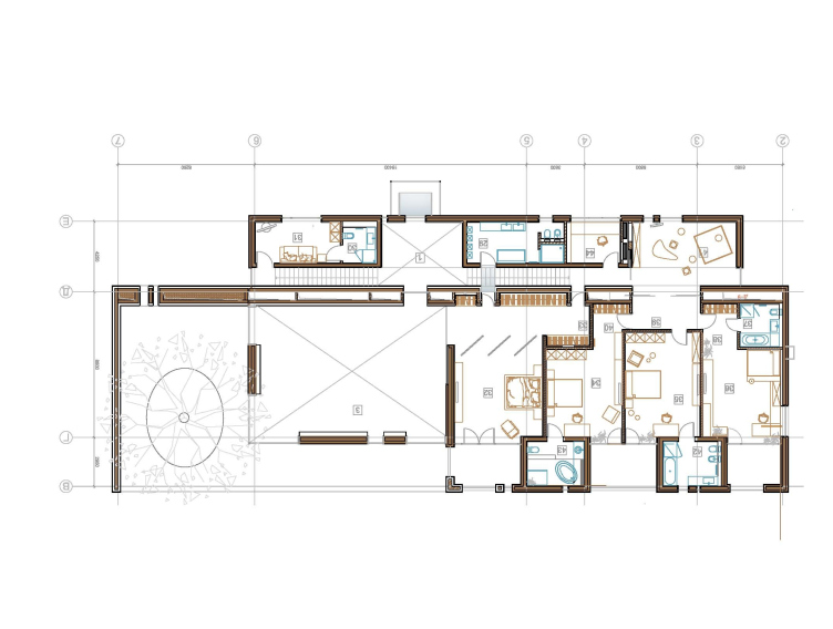
Just as they do with the land site, the architects divide the elongated volume of the house into two parts: public and private. And, while the bedroom block takes up the entire wing of the house, rectangular on the plan, the double-height living room and the dining room take up only half of it. The remaining quarter is the open-air veranda that is treated as an integral part of the house: it looks as if the architects "emboss" part of the yard-side facade and fully glaze the "bent" section, thus rendering the boundary between these two areas pretty ethereal. Thanks to such a transformation, the building gets a peculiar "hood" of a kind in which the architects cut a large round opening. And it is this grand opening that has a tree growing right through it and that let's the sun rays move around the entire veranda during the day, that got so much press coverage - over the seven years that the house was under construction there was hardly a single industry magazine that did not publish the "coordinate system" developed by UNK. The architects were able to achieve the effect that it looks as if this house had actually sprung from and then developed around this tree - even though things were exactly the other way around: the pin, or, rather, the "pivot", with which the house is pinned to the land site, appeared after the construction was completed - as the vertical centerpiece that the composition was in desperate need of, and just as a "story-telling" element. The crown of the pine tree casts the picturesque ever-changing shadows on the walls and the floor of the veranda, while the straight line of the tree trunk is supported by the narrow vertical windows, with which the architects visually fracture this elongated volume. There is also a narrow slit directly behind the tree: when sitting on the veranda one can see through it if somebody has arrived from the side of the road without being seen himself.
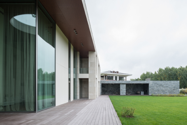
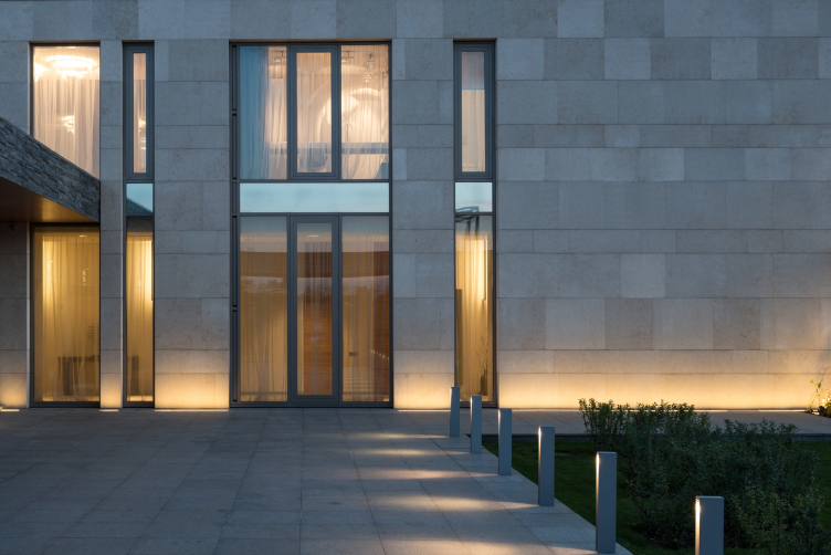
The facade finish consists of but two materials - glass and natural stone. The house itself is faced with light-beige travertine, while the garage is coated with narrow slate tiles, which clearly indicates the hierarchy of these two objects. The architects think, though, that such a perfect concordance of the materials would have been impossible to achieve, had it not been for the background of natural verdure. The vegetation is present here in all possible shapes and forms - it is the grand-scale lawn, the draping of one of the gazebo's walls with grapevine, and, ultimately, the architectural centerpiece of a pine tree.


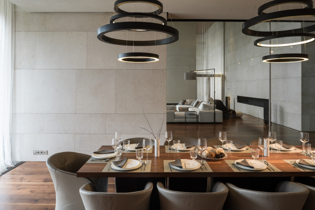
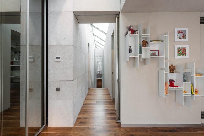
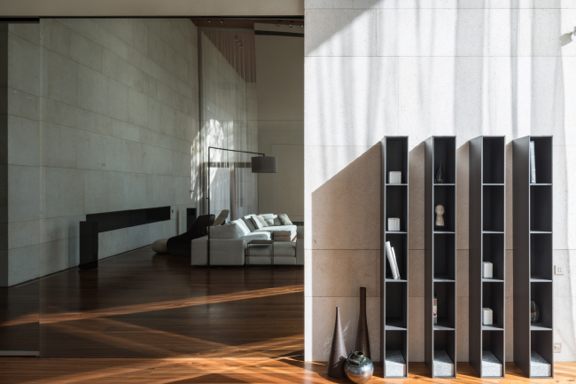
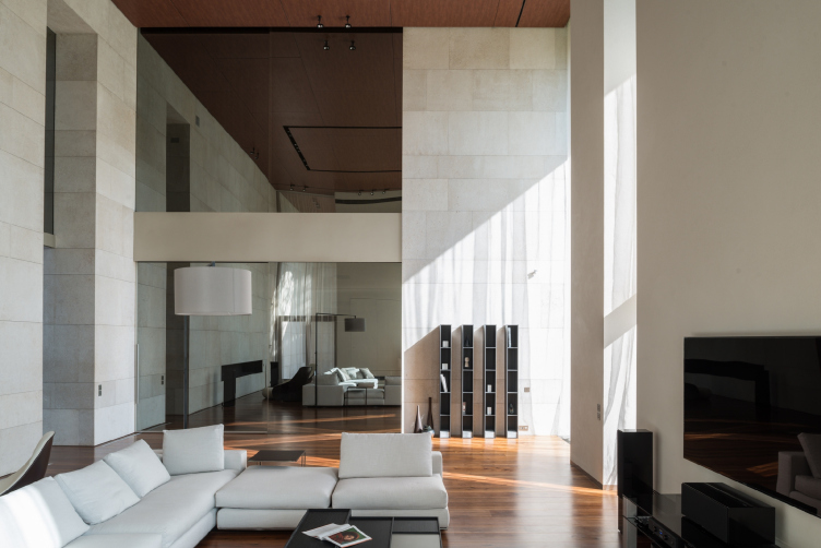
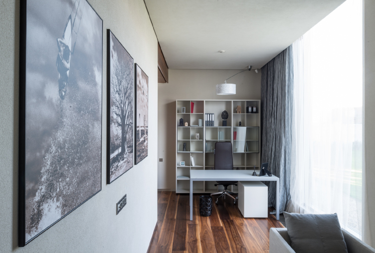
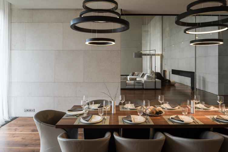
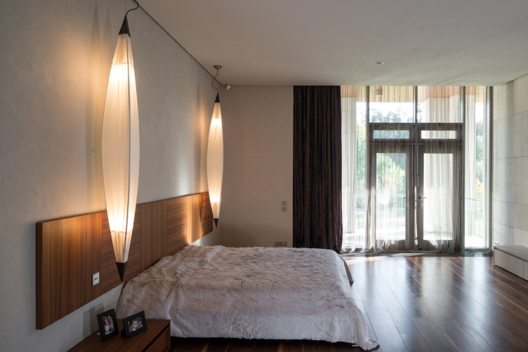
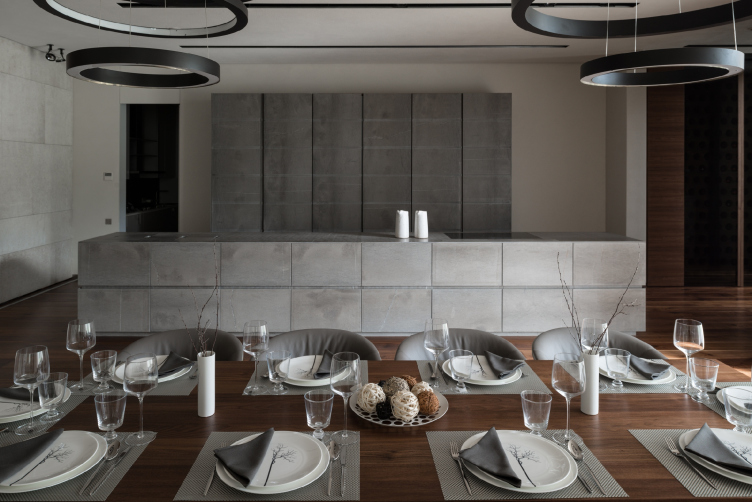
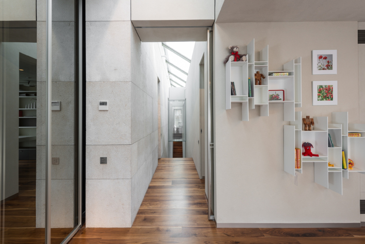
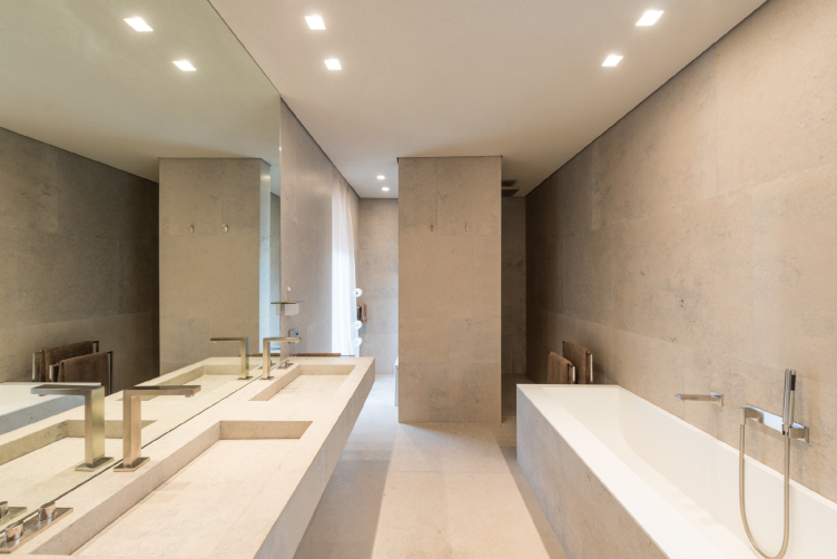
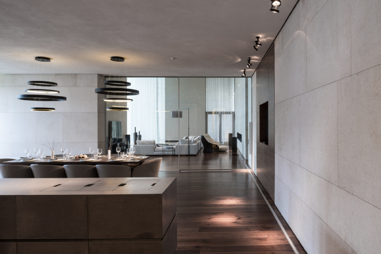
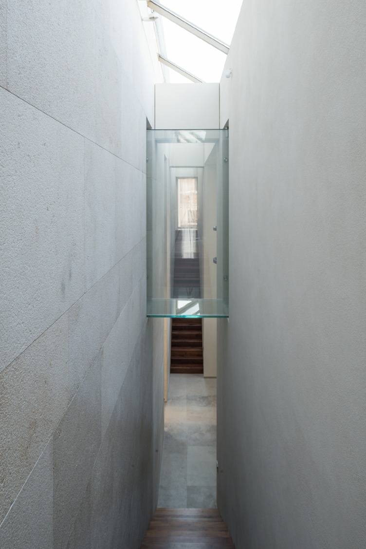
In the interiors of the house, glass and stone are also actively present - but here they share the scene with wood that softens them and brings into the rooms the necessary comfort and warmth. The architects designed or selected the furniture to match the exterior - all the premises are designed in an as laconic way as possible. As Julius Borisov reminisces, instead of the "frills", traditionally expected in a country house, the customer was after unconventional and creative ideas and solutions. Misleadingly simple, this reserved interior design is in fact full of sophisticated solutions. Suffice it to mention the glass little bridge that connects the bedrooms and the bathrooms: in order to make it possible for a person to cross it without embarrassing himself or herself, the glass partitions are equipped with motion sensors, and, once they are active, the walls turn from transparent to opaque.
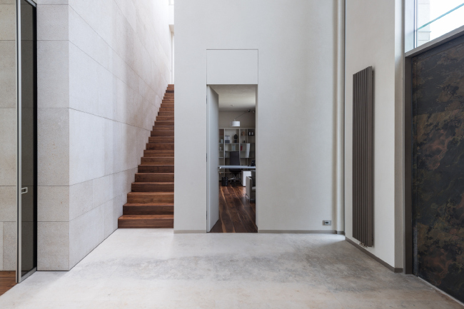
Building this "contemporary" and "aesthetic" house in every possible sense of this word, the architects were able to make it really cozy indeed. The austere geometry and perfect laconism do not scare one away with their cold perfection but quite the other way around, create all the necessary conditions for a person to feel at one with the universe.


