По-русски

Office with a View

The new office of Mail.ru Group - created by UNK Project

11 November 2013
Object
mainImg
Architect:
Nikolai Milovidov
Firm:
UNK
Object:
Mail.ru Group HQ
Russia, Moscow, Leningrad Avenue, 39

2011 — 2012 / 2013

Engineering solutions: MEP engineering. General contractor: KMT. Project management: Sunbury Heights

Mail.ru Group moved into the new 27-story building on the Leningrad Avenue in late August but the office of one of the largest Internet companies of the Russian segment of the web was given the finishing touch only recently.

The total area of the new office amounts to some 28 thousand square meters. One of the towers of SkyLight business center on the Leningrad Avenue was chosen not only for the abundance of the useful space it provides, though - almost the top consideration in its favor was its location: the previous office of Mail.ru Group was situated practically in the neighboring building and the last thing the company wanted to do was lose some of its employees while moving into the new office solely because they would be daunted by the prospect of commuting into a different part of Moscow.

The project of the new HQ was chosen through a tender that Mail.ru Group organized a couple of years back. As many as 19 companies took part, the winners of the best design concept being UNK Project. As Nikolai Milovidov, the chief architect of the project, reminisces, the accent was made on the upwardly mobile, free and functional space - and now that the construction is complete, one can safely say that most of the design and conceptual solutions proposed by UNK Project at the contest have been implemented to a letter. "Our customer put his basic requirement to the future office in this nutshell: the new HQ was to become an effective HR tool - Nikolai Milovidov explains - In other words, it had to be so attractive-looking and great to work in as to become, as much as the financial terms, an extra compelling factor to seek a job with Mail.ru Group. And, the way we see it, we succeeded in making it really attractive in all senses of the word!"
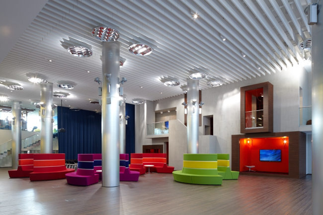
 

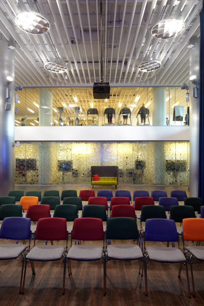
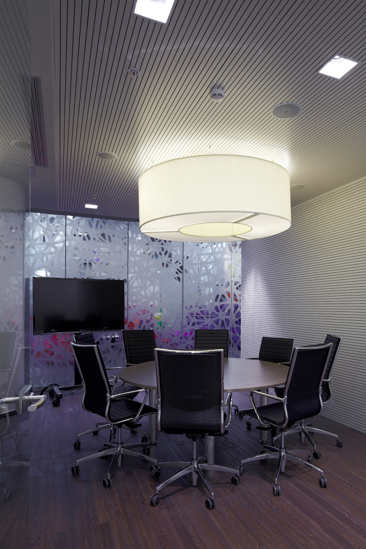
Among the main "socially attractive" functions of the new office is the all-purpose gym (Russia's only indoor gym the size of a football field) that, if necessary, easily transforms into a 585-seat congress hall, a fitness center with an area of 600 square meters with premises for group sessions, and a movie theater. The all-purpose hall, incidentally, was initially designed as a suspension one: the existing volume was used for sports, while, for organizing conferences, the sloping amphitheater was to get lowered down to the center of the hall directly from the ceiling, simultaneously forming a hall and a foyer. "This idea was thoroughly thought out from the technical standpoint (we based ourselves on our experience of designing theaters), and we had to give it up solely because of the absence of the very notion of suspension public premises in the current construction regulations" - explains Nikolai Milovidov. Versatility is generally one of the strong points of this office. The gym and the movie theater easily transform into conference halls, the meeting rooms - into offices and the other way around, and any white vertical surface, be that a wall, a column, or a locker door, can serve as a marker board that is just a few steps away from any workplace or an armchair in the meeting room.
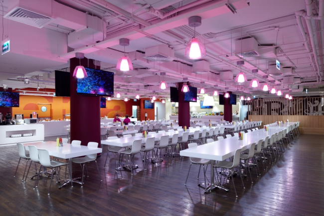
 

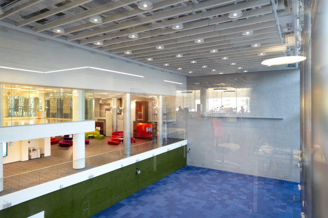
In this same place, next to the minor and the major atriums, there are the meeting rooms and the recreation areas, as well as a restaurant and a fresh bar. Nikolai Milovidov stresses that the project provided for the creation of space that would be as much as possible "graded" in terms of providing opportunities for individual and collective work. Suffice it to mention the round sofas in the lounge area: on the inside, they all are about active communication between people, while on the outside one can sit perfectly undisturbed with a cup of coffee. In the building, the are lots of absolutely secluded places where no one will find you and where you can work for a long time one on one with your laptop.


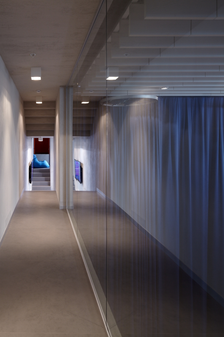
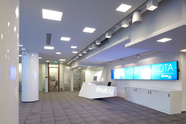
What is important is the fact that all the public areas are made as open as possible. Their walls are executed from glass, so each potential employee, while going to his job interview, at his very first visit sees what Mail.ru Group has to offer it employees apart from work per se: pumping iron, doing yoga, have a glass of fresh juice or have a comfortable coffee break with their colleagues. This same atrium is overlooked by one of the office floors, so the future employee can also see his or her workplace.

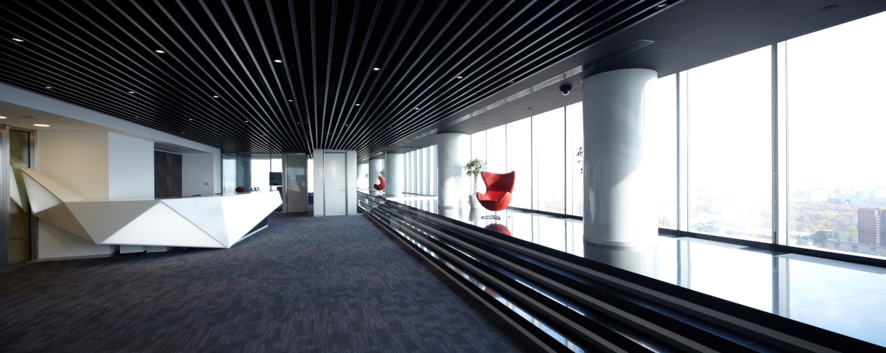
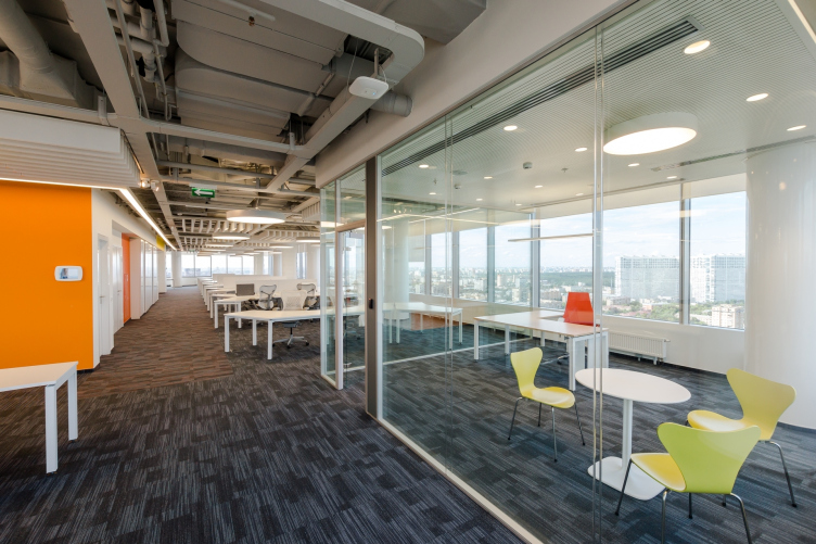
The principle of maximum transparency and openness is also something that the layouts of the "working" floors are based upon. On the one hand, this is done to facilitate as much as possible the communication between the employees, on the other hand - for the sake of breathtaking views of Moscow that the Leningrad Avenue tower commands. "The theme of openness and transparency became a design code of sorts for this office, and all the other design solutions were made with reference to the principle that "the view must always be there" - Nikolai Milovidov comments. Providing each employee with a "personal" window view of his or her own is made possible by the layout of the open-space type - any employee can see the breathtaking panorama of Moscow. And it was only on the very to VIP floor that the architects had to make blind partitions at some spots - but even those partitions were covered by mirrors so as to keep the "cityscape" visual effect here as well. Peculiar is the fact that even the company president's window commands a view that is less stunning than the one that the reception on this floor commands - he deliberately sacrificed the beautiful view in favor of the first impression that his guests are going to get.
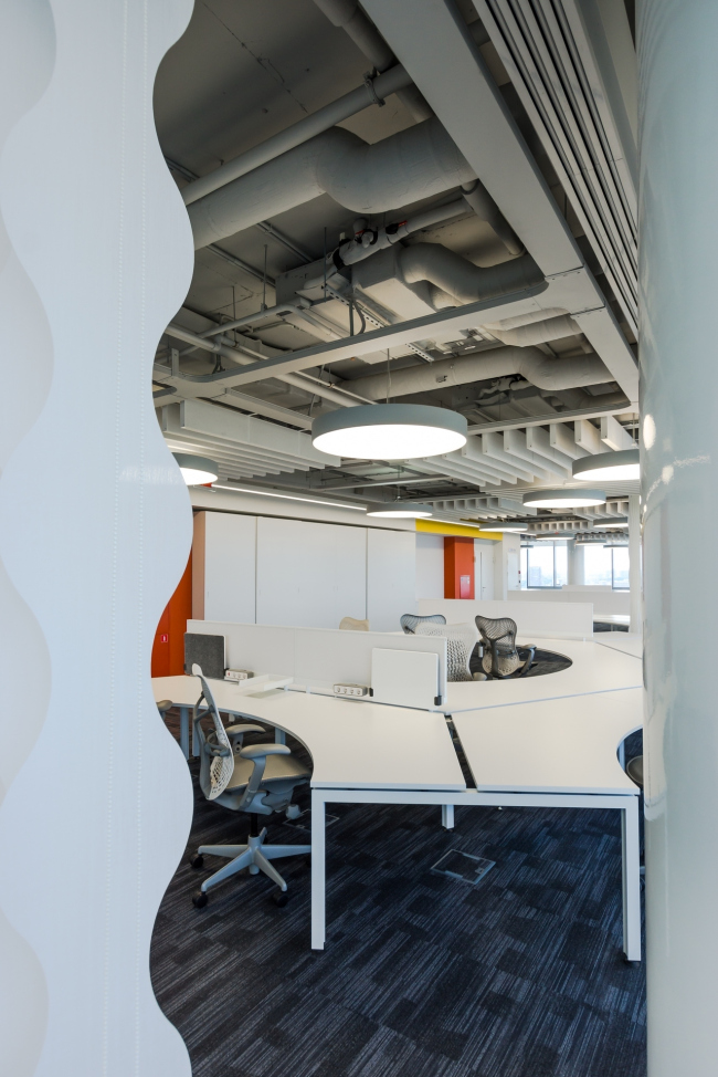
 

Back to the typical office floor, though! The working spaces are scattered freely around the elevator chute - but, in order to give them a touch of individuality and help the employees to easier find their way around, the architects split each of the floors into two parts and mark them with either blue or orange color - the corporate colors of Mail.ru. As for the furniture, it was chosen of a neutral white color, at places "diluted" by multicolored padded stools. The employees' desks are arranged in "chamomile" or "star" patterns as the architects themselves call them. And, even though such an unusual configuration of desks seems obviously more space-consuming than the traditional squares or lines of desks, UNK Project were still able to provide for the required number of workplaces at each of the floors. The main benefit of the "chamomile" pattern, as Nikolai Milovidov explains, consists in the fact that all the employees are seated at a round in respect to one another, and to talk to a colleague or the whole workgroup, it is enough to rotate your chair at 90 degrees.


The boundaries between the clusters are of a pretty conditional nature - they are made in the form of geometrical "curtains" - and these are suspended not everywhere but in the spots where the employees really need them. Apart from that, each floor provides for individual demountable cubicles that can serve as meeting rooms or studies for those who need to be left alone. The cubicle's area is 12 square meters, and the dimensions of its elements strictly correspond to the capacity of the building's cargo elevator, so, when taken apart, this "room" can travel between the floors. For a typical 800-square-meter floor, UNK Project provided 4 standard draw-off points which provide the opportunity to assemble the required extra meeting room practically at any conceivable spot.


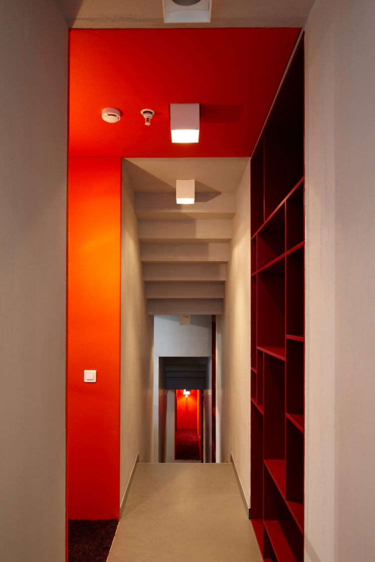
The architects proudly claim that Mail.ru Group HQ is, first of all, Moscow's most athletic office (the overall area of its sports facilities exceeds 1000 square meters), and second of all, the most thought-through office in terms of space arrangement for various communication levels. Also, virtually its every premise has a few using options - for work and for things outside of work, while the numerous "twists", when put together, form the unique image of the company in the future employees' eyes.


Architect:
Nikolai Milovidov
Firm:
UNK
Object:
Mail.ru Group HQ
Russia, Moscow, Leningrad Avenue, 39

2011 — 2012 / 2013

Engineering solutions: MEP engineering. General contractor: KMT. Project management: Sunbury Heights

11 November 2013

Headlines now
Four Different Surveys
The “Explore the City” competition, organized this year by the Genplan Institute of Moscow, stands out as a pretty unconventional one for the architectural field but aligns perfectly well with the character of urban planning work. The winning project analyzed contemporary residential complexes, combining urban planning insights with a realtor’s perspective to propose a hybrid approach. Other entries explored public centers, motivations for car ownership, and housing vacancy rates. A fifth participant withdrew. Here’s a closer look at the four completed works.
Scheduled Evolution
ASADOV Architects unveiled the EvyCenter pavilion, a microcultural hub for fostering personal growth, organizing workshops, and doing gymnastics. Additionally, this pavilion serves as a prototype for a scalable country house, drawing inspiration from the “Loskutok” project, and constructed from CLT panels in a factory. This marks the beginning of a developer project initiated by the architectural firm (sic!), which is seeking partners to expand both small Evy settlements and even larger Evy cities, which are, according to Andrey Asadov, aimed at fostering the “evolutionary” development of the people who will inhabit them.
The Golden Crown
The concept for a dental clinic in Yekaterinburg, developed by CNTR Studio, revolves around the idea of a “mouth full of gold”: pristine white porcelain stoneware walls are complemented by matte brass details. To avoid an overly literal interpretation, the architects focused on the building’s proportions, skillfully navigating between sunlight requirements and fire safety regulations.
Flexibility and Integration
Not long ago, we covered the project for the fourth phase of the ÁLIA residential complex, designed by APEX. Now, we’ve been shown different fence concepts they developed to enclose the complex’s private courtyards, incorporating a variety of public functions. We believe that the sheer fact that the complex’s architects were involved in such a detail as fencing speaks volumes.
A Step Forward
The HIDE residential complex represents a major milestone for ADM architects and their leaders Andrey Romanov and Ekaterina Kuznetsova in their quest for a fresh high-rise aesthetic – one that is flexible and layered, capable of bringing vibrancy to mass and silhouette while shaping form. Over recent years, this approach has become ADM’s “signature style”, with the golden HIDE tower playing a pivotal role in its evolution. Here, we delve into the project’s story, explore the details of the complex’s design, and uncover its core essence.
Gold in the Sands
A new office for a transcontinental company specializing in resource extraction and processing has opened in Dubai. Designed by T+T Architects, masters of creating spaces that are contemporary, diverse, flexible, and original, this project exemplifies their expertise. On the executive floor, a massive brass-clad partition dominates, while layered textures of compressed earth create a contextually resonant backdrop.
Layers and Levels of Flight
This project goes way back – Reserve Union won this architectural competition at the end of 2011, and the building was completed in 2018, so it’s practically “archival”. However, despite being relatively unknown, the building can hardly be considered “dated” and remains a prime example of architectural expression, particularly in the headquarters genre. And it’s especially fitting for an aviation company office. In some ways, it resembles the Aeroflot headquarters at Sheremetyevo but with its own unique identity, following the signature style of Vladimir Plotkin. In this article, we take an in-depth look at the United Aircraft Corporation (UAC) headquarters in the Moscow agglomeration town of Zhukovsky, supplemented by recent photographs from Alexey Naroditsky – a shoot that became only recently possible due to the fact that improvements were finally made in the surrounding area.
Light and Shadow
In this article, we delve into the architectural design of the “Chaika” house by DNK ag architects, which was recently completed in 2023 as part of the collection of signature designs at ZILArt. As is well-known, all the buildings in this complex follow a design code, yet each one is distinct. This particular building stands out not only for its whiteness and minimalism but also for the refined use of a limited number of techniques that, together, create what can confidently be called synergy.
Casus Novae
A master plan was developed for a large residential area with a name of “DNS City”, but now that its implementation began, the plan has been arbitrarily reformatted and replaced with something that, while similar on the surface, is actually quite different. This is not the first time such a thing happens, but it’s always frustrating. With permission from the author, we are sharing Maria Elkina’s post.
Treasure Hunting
The GAFA bureau, in collaboration with Tegola and Arkhitail, organized an expedition to the island of Kilpola in Karelia as part of Moskomarkhitektura’s “Open City” festival. There, amidst moss and rocks, the students sought answers to questions like: what is the sacred, where does it dwell, and what sustains it? Assisting the participants in this quest were landscape engineer Evgeny Levin, artist Nicholas Roerich, a moose, and the lack of cellular connection. Here’s how the story unfolded.
Depths of the Earth, Streams of Water
In the Malaya Okhta district, the Akzent building, designed by Stepan Liphart, was constructed. It follows a classic tripartite structure, yet it’s what you might call “hand-drawn”: each façade is unique in its form and details, some of which aren’t immediately noticeable. In this article, we explore the context and, together with the architect, delve into how the form was developed.
Fir Tree Dynamics
The “Airports of Region” holding is planning to build an airport in Karachay-Cherkessia, aiming to make the Arkhyz and Dombay resorts more accessible to travelers. The project that won in an invitation-only competition, submitted by Sergey Nikeshkin’s KPLN, blends natural imagery inspired by the shape of a conifer seed, open-air waiting spaces, majestic large trees, and a green roof elevated on needle-like columns. The result is both nature-inspired and WOW.
​A Brick Shell
In the process of designing a clubhouse situated among pine trees in a prestigious suburban area near Moscow, the architectural firm “A.Len” did the façade design part. The combination of different types of brick and masonry correlates with the volumetric and plastique solutions, further enhanced by the inclusion of wood-painted fragments and metal “glazing”.
Word Forms
ATRIUM architects love ambitious challenges, and for the firm’s thirtieth anniversary, they boldly play a game of words with an exhibition that dives deep into a self-created vocabulary. They immerse their projects – especially art installations – into this glossary, as if plunging into a current of their own. You feel as if you’re flowing through the veins of pure art, immersed in a universe of vertical cities, educational spaces – of which the architects are true masters – and the cultural codes of various locations. But what truly captivates is the bold statement that Vera Butko and Anton Nadtochy make, both through their work and this exhibition: architecture, above all, is art – the art of working with form and space.
Flexibility and Acuteness of Modernity
Luxurious, fluid, large “kokoshniks” and spiral barrel columns, as if made from colorful chewing gum: there seem to be no other mansion like this in Moscow, designed in the “Neo-Russian-Modern” style. And the “Teremok” on Malaya Kaluzhskaya, previously somewhat obscure, has “come alive with new colors” and gained visibility after its restoration for the office of the “architectural ecosystem” as the architects love to call themselves. It’s evident that Julius Borisov and the architects at UNK put their hearts into finding this new office and bringing it up to date. Let’s delve into the paradoxes of this mansion’s history and its plasticity. Spoiler: two versions of modernity meet here, both balancing on the razor’s edge of “what’s current”.
Yuri Vissarionov: “A modular house does not belong to the land”
It belongs to space, or to the air... It turns out that 3D printing is more effective when combined with a modular approach: the house is built in a workshop and then adapted to the site, including on uneven terrain. Yuri Vissarionov shares his latest experience in designing tourist complexes, both in central Russia and in the south. These include houseboats, homes printed from lightweight concrete using a 3D printer, and, of course, frame houses.
​Moscow’s First
“The quality of education largely depends on the quality of the educational environment”. This principle of the last decade has been realized by Sergey Skuratov in the project for the First Moscow Gymnasium on Rostovskaya Embankment in the Khamovniki district. The building seamlessly integrates into the complex urban landscape, responding both to the pedestrian flow of the city and the quiet alleyways. It skillfully takes advantage of the height differences and aligns with modern trends in educational space design. Let’s take a closer look.
Looking at the Water
The site of Villa Sonata stretches from the road to the water’s edge, offering its own shoreline, pier, and a picturesque river panorama. To reveal these sweeping views, Roman Leonidov “cut” the façade diagonally parallel to the river, thus getting two main axes for the house and, consequently, “two heads”. The internal core – two double-height spaces, a living room and a conservatory, with a “bridge” above them – makes the house both “transparent” and filled with light.
The White Wing
Well, it’s not exactly white. It’s more of a beige, white-stone structure that plays with the color of limestone – smoother surfaces are lighter, while rougher ones are darker. This wing unites various elements: it absorbs and interprets the surrounding themes. It responds to everything, yet maintains a cohesive expression – a challenging task! – while also incorporating recognizable features of its own, such as the dynamic cuts at the bottom, top, and middle.
Urban Dunes
The XSA Ramps team designed and built a three-part sports hub for a park in Rostov-on-Don, welcoming people of all ages and fitness levels. The skate plaza, pump track, and playground are all meticulously crafted with details that attract a diverse range of visitors. The technical execution of the shapes and slopes transforms this space into a kind of sculptural composition.
Proportional Growth
The project for the fourth phase of the ÁLIA residential area has been announced. The buildings are situated on an elongated plot – almost a “ray” that shoots out from the center of the area towards the river. Their layout reflects both a response to Moscow’s architectural preferences over the past 15 years, shifting “from blocks to towers”, and an interpretation of the neighboring business park designed by SOM. Additionally, the best apartments here are not located at the very top but closer to the middle, forming a glowing “waistline”.
The “Staircase” Building
In designing the “Details” residential complex in New Moscow, Rais Baishev spiced up the now-popular Moscow theme of a “courtyard” building with an idea drawn from the surrealist drawings by Maurits Escher. He envisioned the stepped silhouettes and descending slopes as a metaphysical mega-staircase, creating a key void within the courtyard that gave the project an internal “spine”. This concept is felt both in the building’s silhouette and on its façades.
Projection of the Quarter
No one doubted that the building that Vladimir Plotkin designed as part of the “Garden Quarters” would be the most modernist of all. And it turned out just that way: while adhering to the common design code, the building successfully combines brick and white stone, rhythmically responding to the neighboring building designed by Ostozhenka, yet tactfully and persistently making a few statements of its own. This includes the projection of the ideal urban development composition “14–9–6”, which can be found right next door, mathematical calculations, including those for various types of terraces (and perhaps the only reminder of the Soviet past of the Kauchuk rubber factory!), and the white “cross-stitch” pattern of the façade grid.
Domus Aurea
In this issue, we examine the “Tessinsky-1” house, designed by Sergey Skuratov and completed in 2023. Located in the middle of the Serebryanicheskaya Embankment district, at the intersection of its main streets, this house assumes a sort of “nodal” role: it not only responds to everything around it and preserves many memories of the former EMA factory within itself, but it weaves all this into a newly directed pattern, reconciling bright “gold” and dark-colored brick, largely with the help of the new, modern-yet-archaic Columba brick, which, come to think about it, is the most precious element here.
The Chimney of Nikola-Lenivets
In this issue, we are examining the “Obelisk House” designed by KATARSIS and built for the Arkhstoyanie 2023 festival. However, it was only finished later on, and this is why we are examining it now. It seems to us that after the “Obelisk House” appeared in Nikola-Lenivets, a dialogue and a few inner connections appeared between the temporary structures built here. These houses no longer look like “accidental neighbors”, more of which below.
​Periscope by the Bay
The jury awarded the second place in the competition for a public and cultural center in Petropavlovsk-Kamchatsky to the companies GORA (“Mountain”) and M4. In the consortium’s proposal, the building resembles a sperm whale with a calf swimming next to it or a periscope, whose lenses capture the most spectacular views from the surrounding landscape.
From Arcs to Dolmens
While working on the competition project for Petropavlovsk-Kamchatsky, ASADOV Architects prioritized the value of the natural and urban environment, aiming to preserve the balance of the location while minimizing the resemblance of the volume that they designed to a “traditional building”. The task was challenging, and the architects created three versions, one of which having been developed after the competition, where their main proposal took third place. However, the point of interest here is not the competition result but the continuity of creative thinking.
Hide and Seek
The ID Moskovskiy house, designed by Stepan Liphart in St. Petersburg, in the courtyards near Moskovskiy Avenue beyond the Obvodny Canal and recently completed, is notable for several reasons. Firstly, it has been realized with considerable accuracy, which is particularly significant as this is the first building where the architect was responsible not only for the facades but also for the layouts, allowing for better integration between the two. On the other hand, this building is interesting as an example of the “germination” of new architecture in the city: it draws on the best examples from the neighborhood and becomes an improved and developed sum of ideas found by the architect in the surrounding context.
The Big Twelve
Yesterday, the winners of the Moscow Mayor’s Architecture Award were announced and honored. Let’s take a look at what was awarded and, in some cases, even critique this esteemed award. After all, there is always room for improvement, right?
Above the Golden Horn
The residential complex “Philosophy” designed by T+T architects in Vladivostok, is one of the new projects in the “Golubinaya Pad” area, changing its development philosophy (pun intended) from single houses to a comprehensive approach. The buildings are organized along public streets, varying in height and format, with one house even executed in gallery typology, featuring a cantilever leaning on an art object.