“Dubrovka"
is a rather large settlement located down the
The
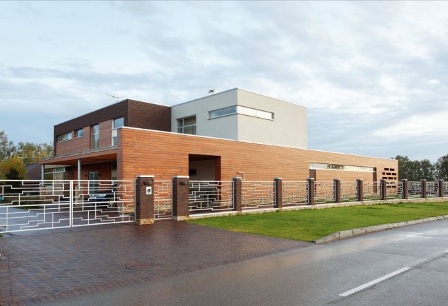
cottage is located at the end of a rectangular land site in such a way that,
first of all, it keeps a fairly large portion of surrounding grounds intact,
and, second of all, it simply turns away from the super-dense mass of block
housing. Like a true introvert, the house looks directly before itself - the
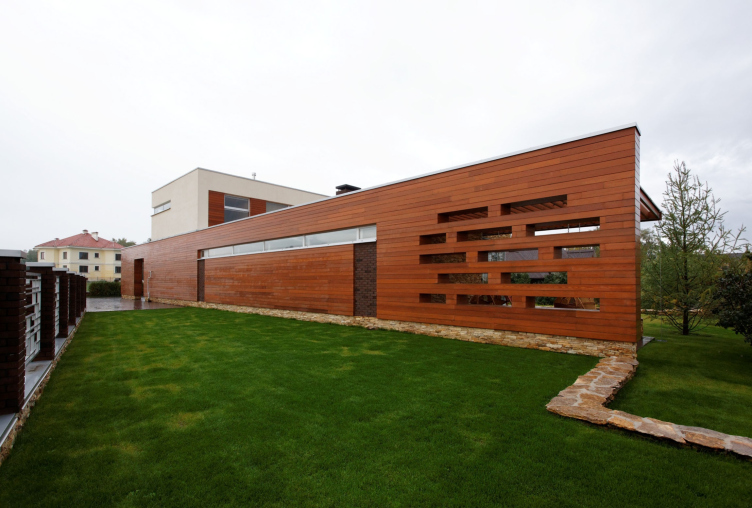
street that runs along the longer side of the plot gets shut off not with a fence
(which, according to the master plan, must be all but conditional here) but by
some sort of a partition screen. And although its length is more than
For
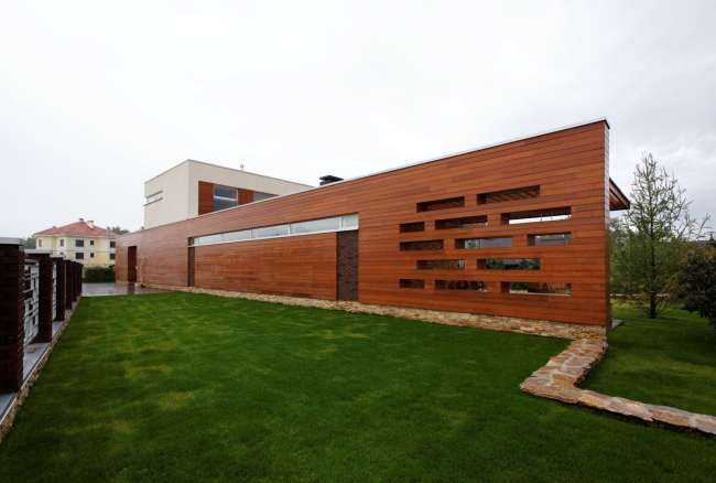
the revetment of this wall, Roman Leonidov selects the natural wood of the
saturated terracotta color that looks bright and vivid even in the cloudiest
weather. “On the one hand, I wanted to somehow soften the rigor of our
'introvert', and wood was the perfect material for this task - the architect
explains – and on the other, the choice of material was prompted by the very
name of the village” ("Dubrovka" may be literally translated as
"Oakland" - translator's note). I wanted to spin the name of
"Dubrovka" somehow, all the more so because, regretfully, most of its
houses are not connected with wood in any way”. The name that Roman Leonidov
eventually gave to the cottage is more than appropriate:
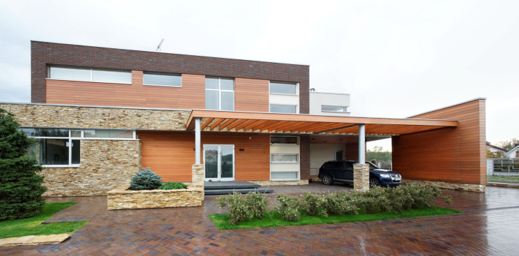
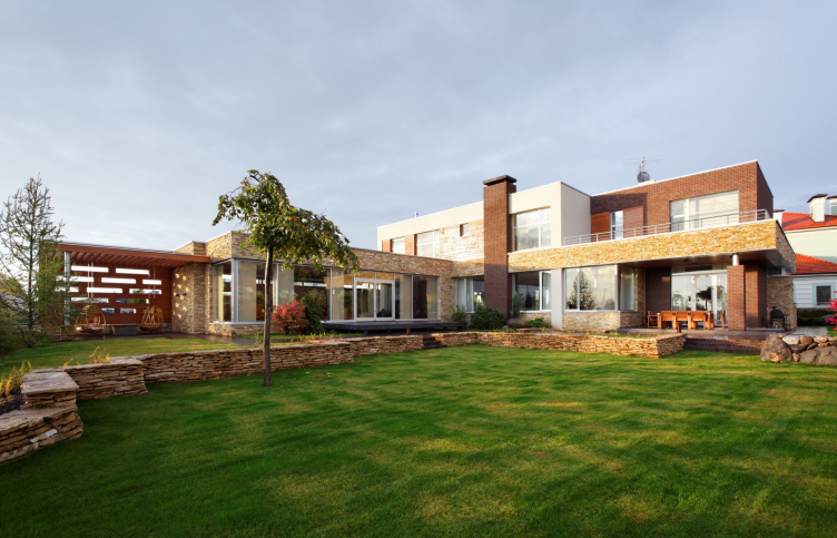
The main residential volume is placed perpendicular to the wall, while the swimming pool, as was already said, is placed directly beneath it. A similar L-shaped composition made it possible to orient all the living premises inside the land site and to make in front of the house a quiet lawn, isolated from the outside world. Peculiar is the fact that this space in fact remains the "air" that this house breathes - to provide for utter privacy, Roman Leonidov goes as far as to refrain from bringing the terraces to the public eye: one of the terraces is designed as the continuation of the swimming pool, and the other is placed under the balcony of the master's bedroom.

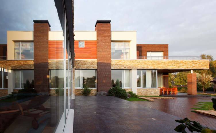
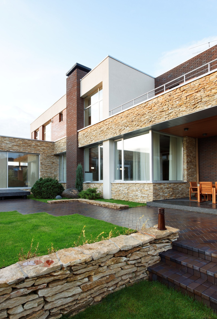
Opting in favor of the laconic, horizontally-oriented composition, Roman Leonidov enriches it with the finish. And, if from the street the house is separated by the wooden screen, through which one can only see the plastered parallelepiped of the second floor, it faces the land plot with a dress that is far more refined and sophisticated. What we see here is large-scale glazing that reflects the landscape, the wide textured natural stone friezes, wooden inserts, and expensive brick that is used to coat the "private" part of the house, the supporting pillars and the balcony, and the imposing pylon. The architect deliberately carried out the latter to the stucco facade and it now looks like a decorative sculptural element but this impression is deceptive: in fact, it performs the function of a bearing wall with a fireplace inside of it.

The
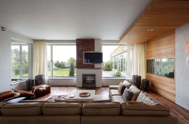
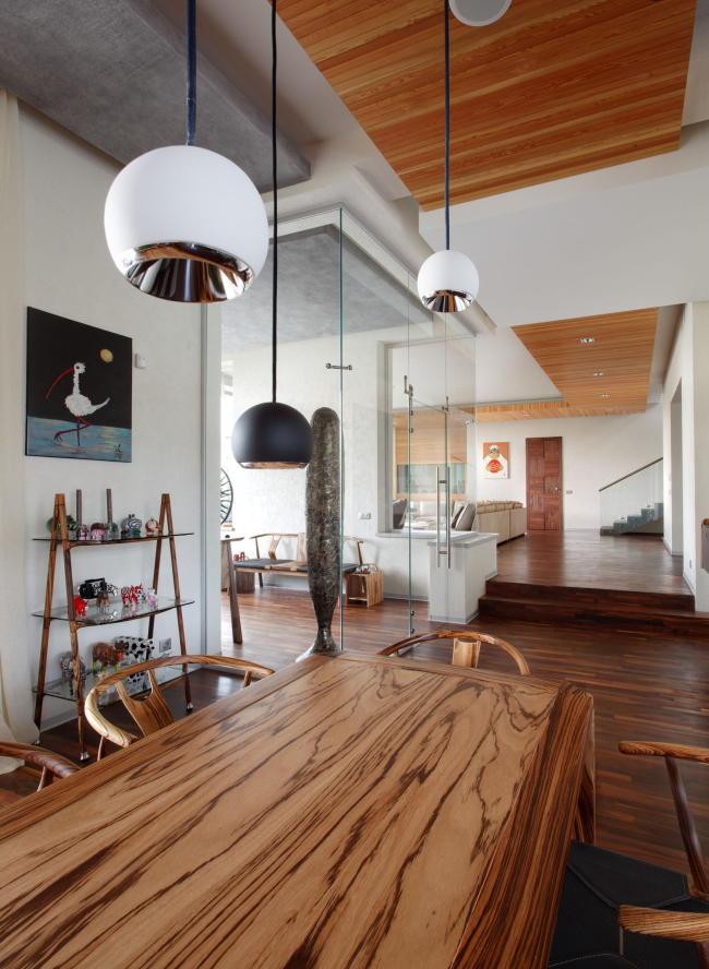
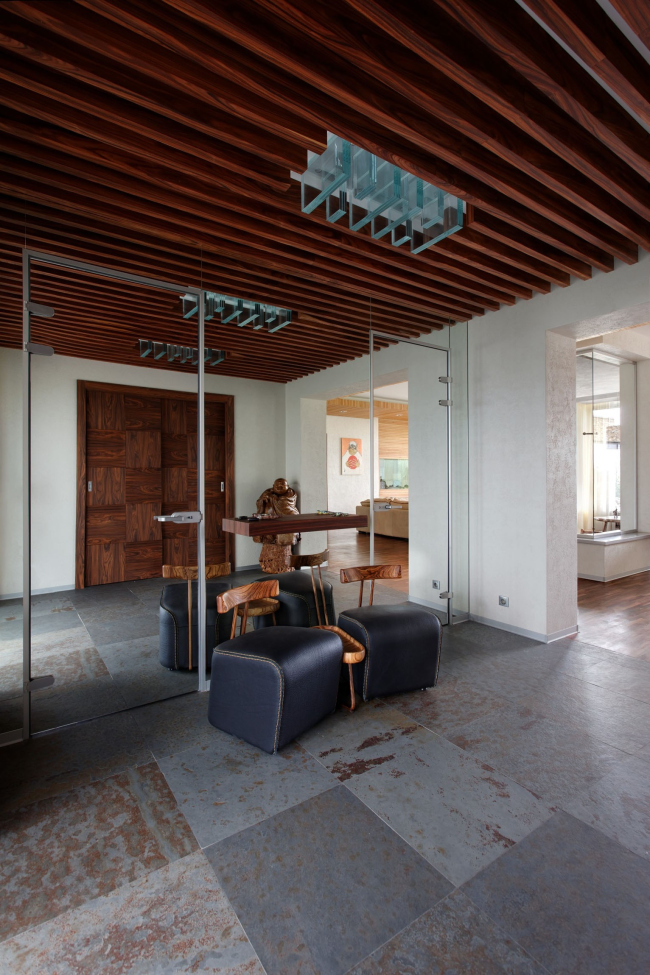
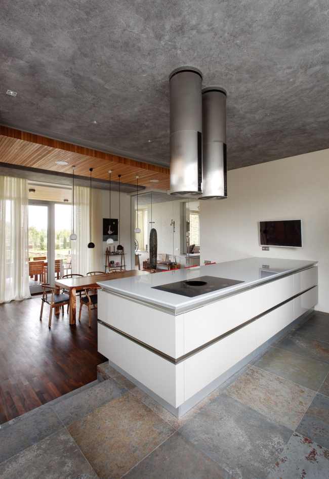
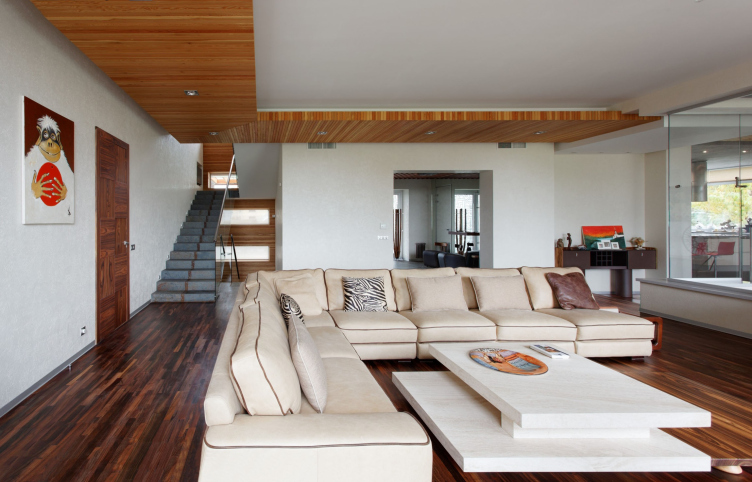
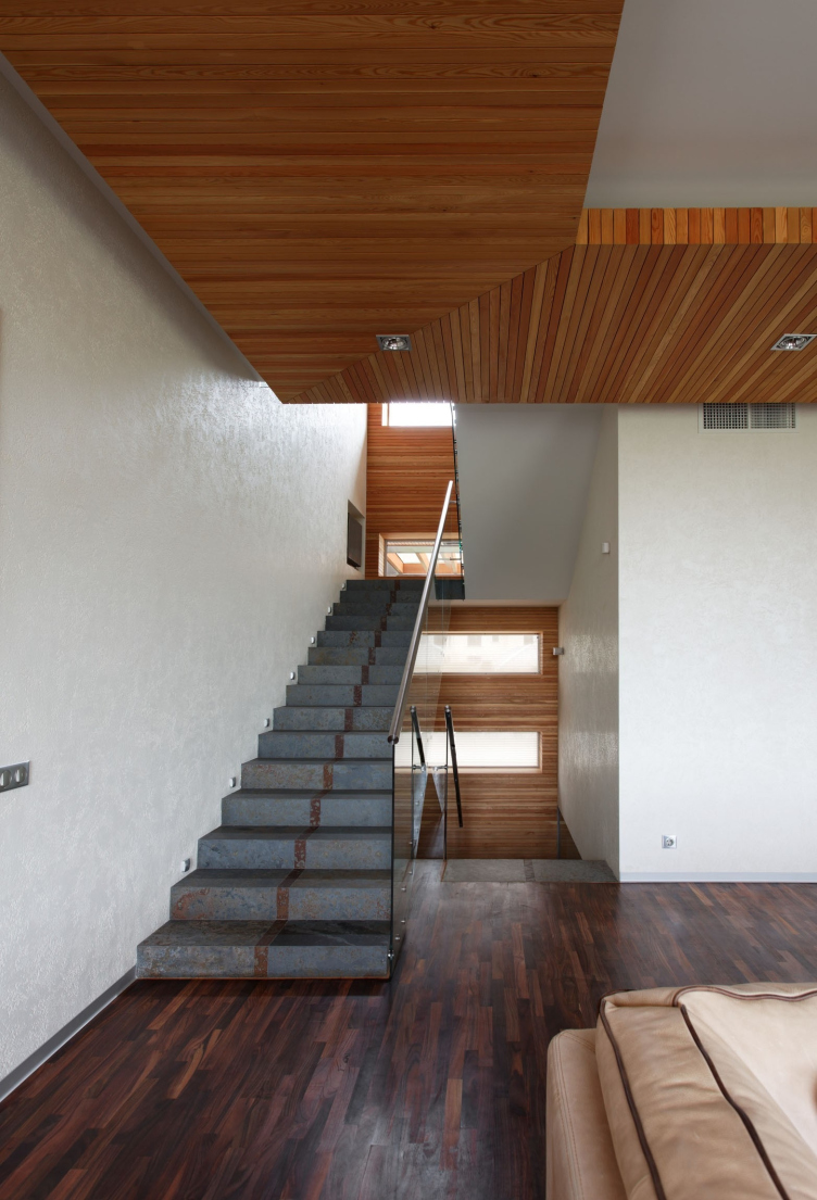
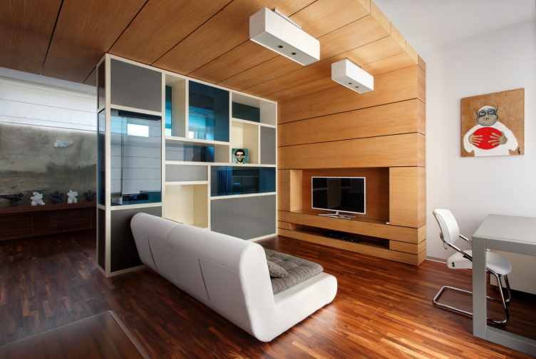
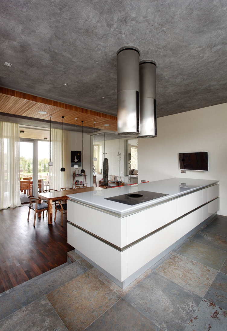
materials declared on the facade set the tone in the indoor design. Here the
customers had one extra request though: the indoor design was to look
completely up-to-date but at the same time allow for quite perceptible ethnic
allusions. The fact is that the owners of this house are the collectors of
African and Asian art, and they are planning to exhibit some parts of their
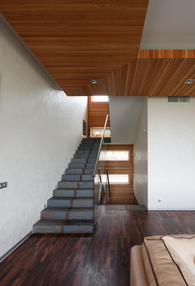
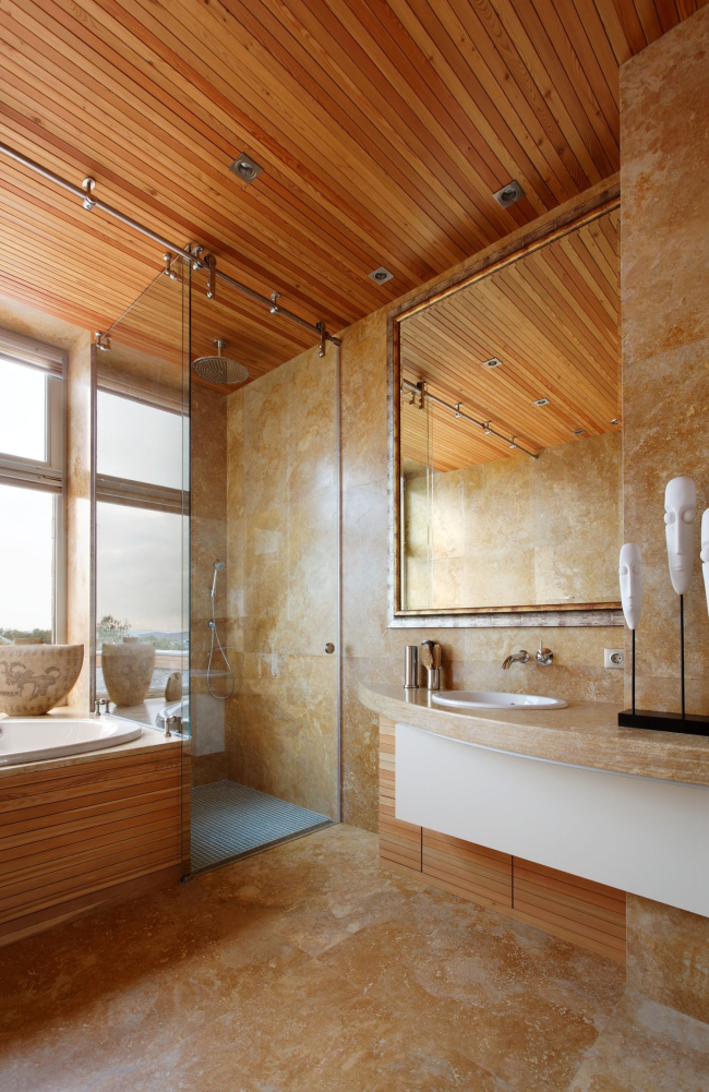
collection. With this task in mind, designer Anastasia Leonidova who developed
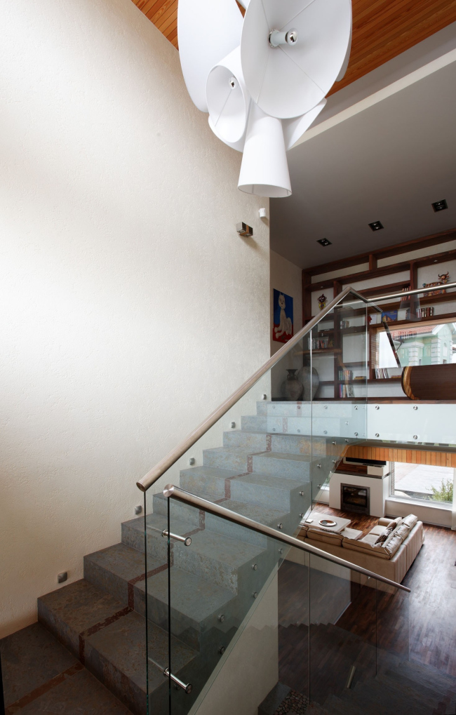
the indoor design placed the main stress on the combination of natural wood and
stone, using rosewood, slate, and travertine.

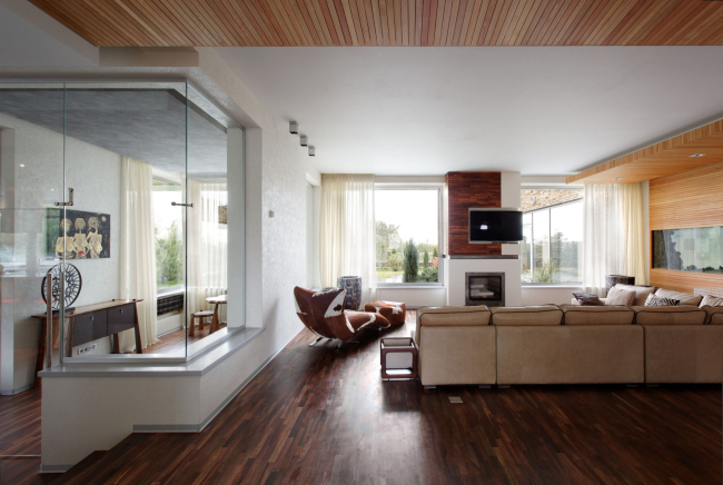
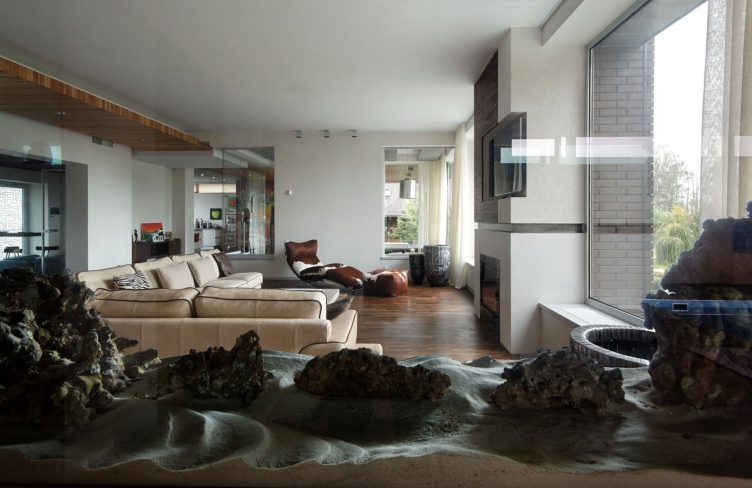
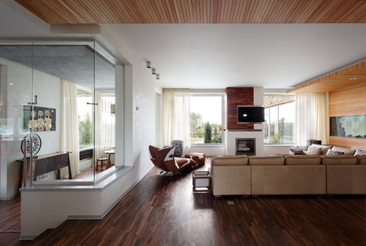
The
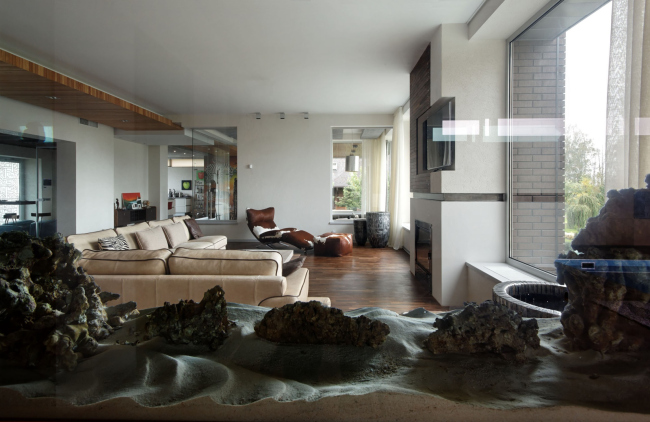
architects were able to compensate for the relatively small square footage of
the living room by making a fully-glass wall between the living room and the
study, as well as installing a large aquarium into the opposite wall. The
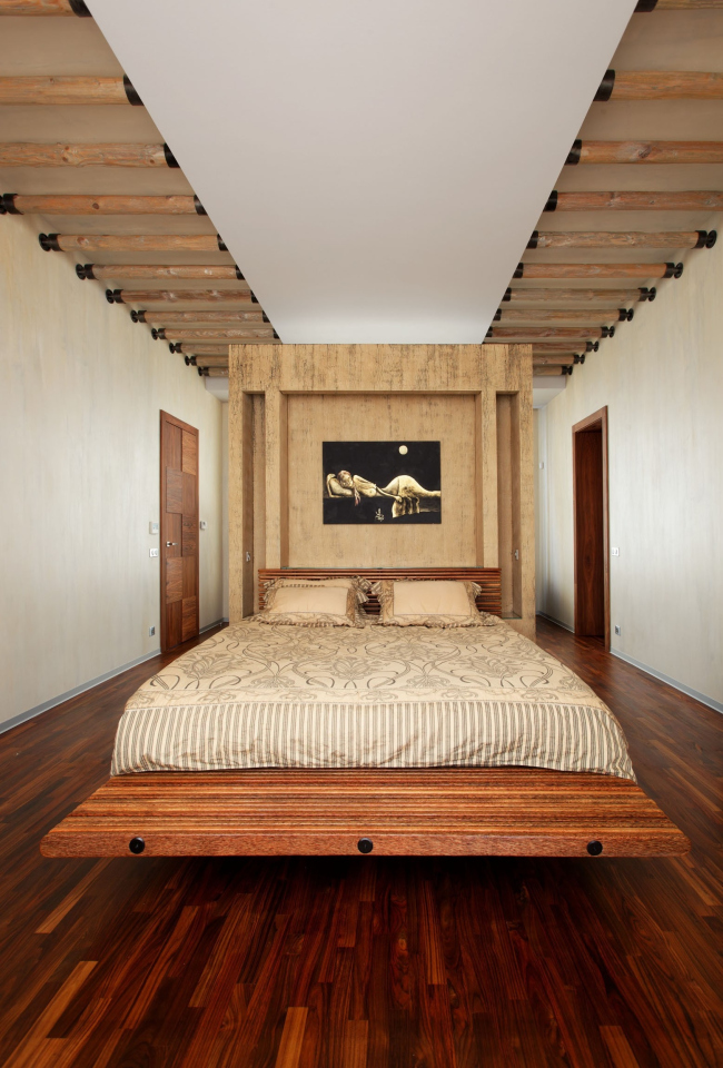
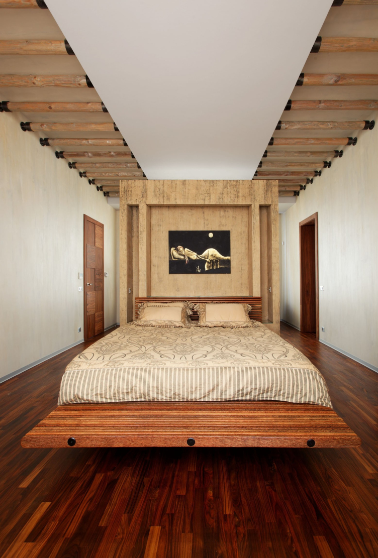
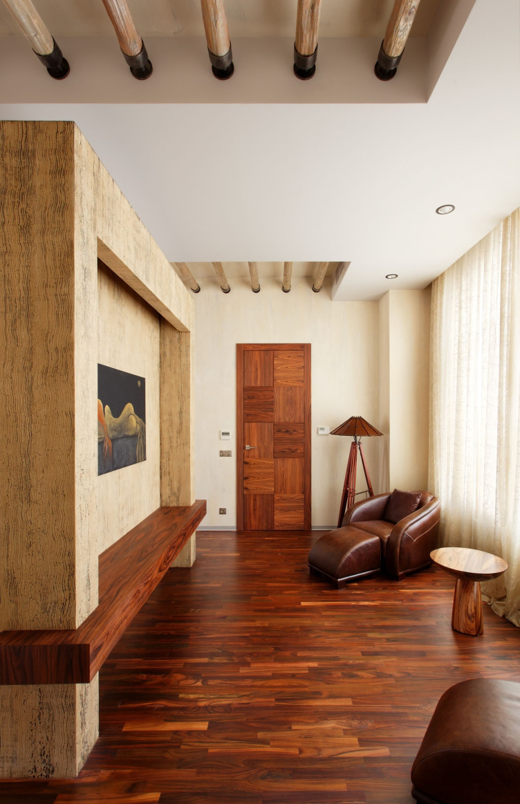
designer introduced the colonial motifs into the decoration of the bedroom as
well - besides the accurately selected furniture, this room sports a very
unusual ceiling: in the narrow shallow niches, which cut through the ceiling
throughout the entire length of the room, Anastasia Leonidova put the wooden
bars that resemble the necklace of some savage tribe leader or maybe the
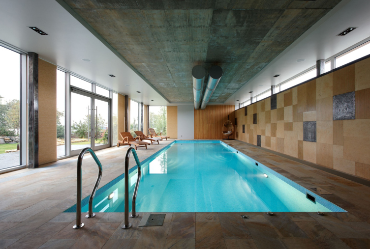
skeleton of some prehistoric animal. The swimming pool is also designed in a
very interesting way - the same orchestra of materials is enriched by unfinished
concrete of the ceiling and the "honest" metal of the vents that the
architects decided not to hide but turn into a decoration of this light-colored
space.
