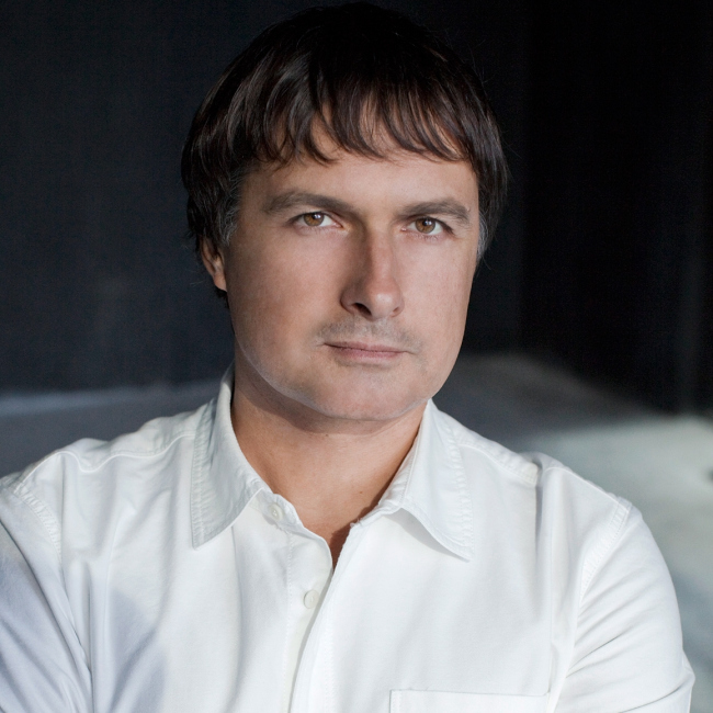
Anton Nadtochy. Photo © Atrium
The projects of "Atrium" Bureau are complex, plastic, diverse, and, evidently, reflective of the personalities of its founders, Vera Butko and Anton Nadtochy, who have every reason to call their bureau an "author" one. We talked to one of its partners and co-founders Anton Nadtochy about their creative method and working fundamentals - about everything that the "Atrium" architects consider important.
Archi.ru:
- In one of your interviews, you described yourselves as "neo-modernists". Do you still hold on to that definition?
Anton Nadtochy:
In our case, probably any definition will be inadequate. You just cannot describe the framework of your creative search in but one word; besides the terminology itself is not always unambiguous and well-established. What we do know for sure, though, is that we express ourselves with the language of abstract geometric shape that was invented and developed by modernist architecture. At the same time, we always search for our own experimenting field, try to come up with our own interpretations of things, and always approach architecture as an art. However, because we are always asked this question about our style, we decided that the term "neo-modernism" is the most suitable conditional response.
- Are we speaking of linear architecture here?
- Being non-linear never was for us a goal in itself, some fashionable trend that we needed to be in. It visualizes one of the universals of the modern world that we interact with. Still, however, all these shapes of ours are not done just for the sake of the beautiful picture. They are born as a result of a careful and thorough analysis that takes into consideration various criteria and parameters: functional, technological, contextual, visual, and many others.
- Sounds a lot like the description of parametric architecture.
- Not quite true either. Yes, parametric architecture includes lots of things but it is ultimately based on obtaining your shape by a mechanical method, out of a formula, into which one just inserts the appropriate mechanical parameters. We, on the othe hand, create our shapes manually, by deliberately reacting to the key criteria that we infer from analyzing the starting situation. At the same time, we look for the optimum shape that matches these parameters, trying to uncover the diversity and the contrasts by visualizing them.
- What do you start from?
- At the core of each task, there is a function, and this is why we always start from the thorough analysis of the task, after which we come up with a block diagram that answers the original program. As a rule, it gives a whole hierarchy of spaces - public and private, large and small, grand-scale and cozy, etc. And the architect's task is to organize these spaces in the right way.
Out of this program, the "absolute forms" are born: for example, from the lighting standpoint this shape will be perfect, the terrain dictates a "perfect" version of its own, while the sightseeing properties demand a third option. Thus, a few different models come up, each of which successfully answers some certain requirements. After that, we analyze all the resulting models, compare them, and ultimately come up with the shape that in this particular case seems optimum to us for this specific site and for this specific task. Our buildings are maximally contextual, they literally merge with their environment. You cannot just take them and carry them over to a different place.
- Do your taste preferences play a part in the process of mixing down several absolute shapes into the single resulting one?
- Of course, the taste preferences are there. Tastes are but superficial, though. Rather, it makes sense to speak about the correspondence of the shape and form to our inside principles. There are qualities that we want to visualize - such as heterogeneity, mutual integrity of the parts, their interaction and interrelation, the layers, and the blending of forms into one another. Why is it that we often have our intermediate floors bleed into the wall, and the wall bleed into the ceiling? Because we cannot accept the separate entities even at our perception level. Because inside of us we have some certain fundamentals, some paradigm of how this world should function.
- What fundamentals are that?
- I will try to answer in a nutshell, deliberately simplifying the magnitude of this discussion. The way we see it, our century is different from all the others because all the notions and definitions are pretty vague now. Today's world exists simultaneously within the framework of several paradigms. One of them is the Newton one that was actually discovered a long time ago but it entered out day-to-day life but a century back - because hitherto the world was dominated by other, predominantly religious, paradigms. This "scientific" notion of the world as consisting of a multitude of separate particles interacting according to the mechanical laws and it is the world in which you can predict the behavior of the matter with absolute precision, guided by these laws.
At the same time, all the great scientific discoveries of the XX century - the relativity theory, the quantum physics, the complexity sciences, information sciences, and others, brought us to the conclusion that the mechanical laws only apply within closed systems, and are actively intruded by such notions as mind, will, and other subjective factors. And, generally, the world is not as simple as we think it is. The world is a single whole, while the particles are but fragments of this whole that take on different shapes.
- Still, how do you explain the fact that all your corners are either acute or rounded, and your planes are all askew?
- I will explain it. In earlier days, the criterion of being technology- and industry-friendly was the primary consideration. From this standpoint, it was easier to work only in straight lines that went well together with the duplicable projects and serial furniture. All the XX century was based on the industrial idea. Actually, it was modernism that "invented" the curvilinear approach but it mainly aestheticized the orthogonal form, and only at a more mature stage it came to a more sophisticated form. Corbusier, Niemeyer, and all the masterminds of the XX century architecture were after creating a shape that would be more artistic and closer to the nature.
- Is this the victory of the individual over the industrial?
- Nowadays, you can build virtually anything - the technology is no longer about minimizing the number of elements and the unit sizes. Today, in a sense, we create the ideal shape meant to serve the ideal function - the way it used to be when religious buildings and structures were built.
There appears a more complex but at the same time a more customized shape, and, as a consequence, the straight lines have to go - which does not diminish the role of the function as the main criterion.
- How much more expensive is that?
- If the economy criterion is the primary criterion for this or that particular project, then the space can be orthogonal with one and only sculptural element that forms its plastics. About 5% of the overall project will be 2-3 times more expensive than the rest but it's not too much against the overall costs. However, if such a solution will give the building some new extra quality, then its value will be measured not only in the amount of the time, money, and the building materials that were spent.
Let's take the Olympian stadium in Beijing, the famous "bird nest". It is evident that the economy criterion was not the primary consideration there. The amount of metal that was used in the construction of its roof is simply unparalleled. However, that's because those who built this stadium were after creating the symbol of the Olympics and their nation in general. This project yielded quite a different return on investment.
- How often do you meet an understanding customer that is ready to go for extra expenses for the sake of plastics and shape?
- We do not have a goal of milking our customers and making them pay the extra "beauty" money. However, oftentimes the land site that we work at poses certain challenges that you simply cannot address in the traditional manner. For example, in Moscow's district of Schukino, we did a project of two new kindergartens and a school building. On this territory - that was not even large enough for the existing buildings - we had to do the projects of a triple capacity. This problem simply cannot be solved in the Carthusian system of coordinates. There are typologies of school buildings that are absolutely perfect for a windswept field - but they just could not be implemented at such a complex site as ours. We had to employ 100% of our potential. As a result, we came up with an unconventional and seemingly complicated solution when a significant part of the building was sunk underground, useable roofs appeared, as well as broken lines (the result of insolation analysis), connecting overpasses, and many other interesting things.
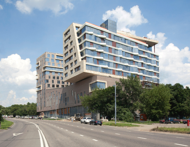
Barkli Park on the Sovetskoy Armii Street. Photo 2013 © Atrium / Anton Nadtochy
The shape, with all its importance, is not an end in itself. In our case, it is the result of functional necessity, while the plastics is in fact the inner essence of the building.
Actually, this is why we detest decorations so much, that are today is the symbol of postmodernism.
- And you do not like postmodernism?
- Well, you cannot put that simple! It was postmodernism that created the sophisticated space instead of the simple orthogonal system of the classic modernism. Later on, the quintessence of postmodernism was presented in deconstructionism that raised the space to the power of super-complexity.
However, while in Peter Greenaway films, the stage props, the playing with historical associations, the histrionics, the irony and the grotesque - all these stylistic devices that were so liberally used by postmodernism - are perceived quite harmoniously, in architecture this is nothing but substitution of notions.
The main tool of architecture as an art is, first of all, the space and the form. Symbolism, historicism, and other buildups and developments are of evil - they can only be there as part of a larger space and volume solution. Yes, the boundaries between the arts and genres today are much less rigorous but you just cannot do away with them altogether. In some sense, we are the advocates of purifying the architectural language.
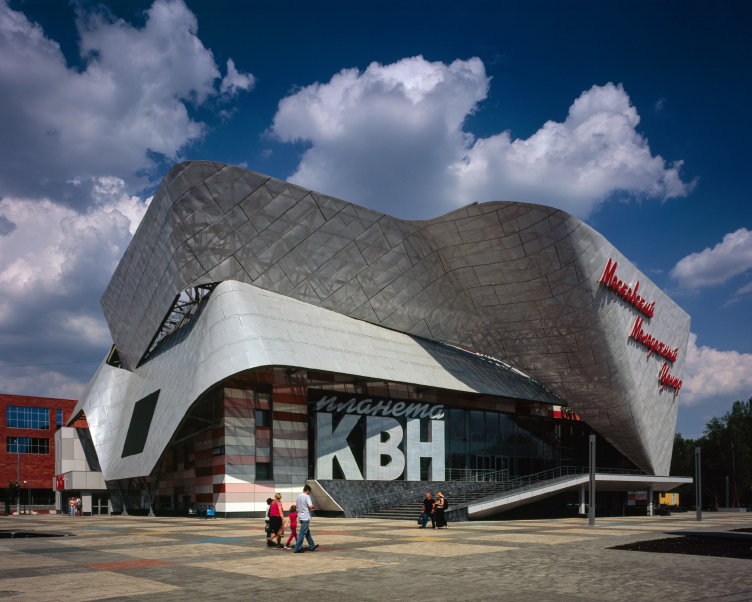
Of course, we do not achieve the 100% result all the time. For example, our project of "KVN Planet" ("Club of the Funny and Inventive" TV Show - translator's note) came out on a rather populist side, even decorative, the way we see it - because the plastics of the facade is completely mismatched with the inside layout. I would rather have it the way we did in Bilbao where there is a single composition and a single structure.

Reconstruction of "Gavana" Movie Theater building for "KVN Planet" © Atrium / Ilia Egorkin
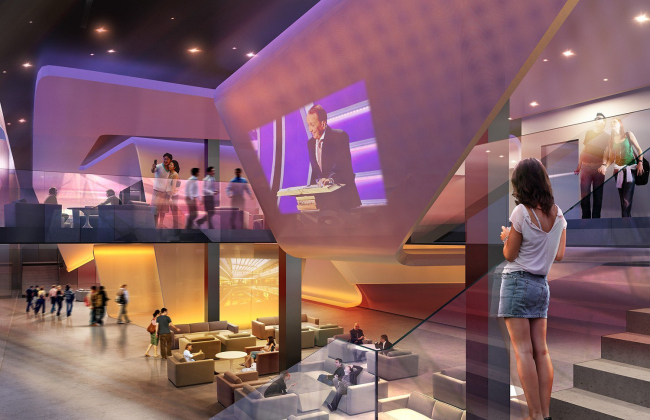
Interior design of "KVN Planet" © Atrium
But then again, this shape is justified "from the outside", i.e. from the town-planning perspective - our facade organizes the square and the crossroads in a new way. Besides, we did not have any opportunity to work with the inside structure of the building because this "box" of walls was all that we got from the old movie theater, and the interior design was not done by us either. We did propose a project that would have allowed for creating to make a duo between the outside and inside structure but it never was implemented. Right now what they've got there is the hideously tasteless pseudo-classic interiors with raised panels, little arches and landscape paintings on the walls. Such an approach is, to put it mildly, not our cup of tea.
- Is the connection between the facade and the interior that important to you?
- We do not do either facades or interiors separately.
We never do the facades, this approach contradicts our very understanding of architecture. Our facades always come out naturally.
What we do is create some three-dimensional composition that is a single whole inside and out. And as for the facade - well, this is just a view of the house in the orthogonal perspective. The facade is not there even in real life because we as humans see things in motion and in perspective, but not from the proverbial "front view".
I liked the motto of one company: "We start at the point where the others stop!" While usually a plan is drawn up, then it gets push-pulled up and thus the architects get the form, we do our architecture in a different way - starting from the point where a casual observer might think that the work has been done already. The search for the optimum functional and formal solution runs concurrently, in the volume, and goes through many iterations. This is a lot like a dance - one motion flows into another.
- If this is really the case then you are the true unalloyed modernists: the absence of the facade, the inside-out principle, the abstract shape, the interflowing spaces...
- The modernists also had life-affirming ideas. To some extent, we also have them: we also seek to create an environment that is comfortable to live in - but at the same time we stir the people to think out of the box and see in architecture more than just pretty houses. However, our emotions lack the positivism and the life-affirming impulse that is characteristic of the early XX century.
We employ the same formal language and techniques but we try to come up with our own, more sophisticated, interpretation, reflect other things that do not necessarily meet the eye.
What still matters for us is the quality of being structural and articulate - but at the same time we rarely work with the form alone. Our building is a result of several complex elements interacting, and at the same time the forms and the spaces created by them are more sophisticated, ambiguous, and dipfferently-sized, while the entire project is less homogenious. Its structure breaks away from the Carthusian grid of columns. What we try to do is break the traditional stereotypes - floor, wall, ceiling, window, roof, stairs, etc, turning our building into a single sculptural object where the boundaries of the standard elements will be blurred as much as possible or interpreted in a totally different way. This is what counts as the artistic part in it. If the whole is more than just the sum of its parts - then it is an act of creation, if not - it is just a mediocre project.
The modernist architecture reflected its own time, while we try to reflect ours.
Our architecture is a statement of modern age, in its most current interpretation.
- But, speaking of the modern age, it looks as though you are through with non-linear things, and now you are into other trends - balanced green architecture, urban style...
- These are quite different notions.
The balanced green architecture is closely connected with the holistic concepts of these unity of the world that we are to protect. Everybody understands that in the next hundred years, maybe earlier, many nations will run out if their oil and coal resources - which makes us think about the sustainability issues. This is to a large extent one of the economic needs and one of the global issue of survival of the human race. All the things mentioned above was conductive of a large-scale technological breakthrough - but it was all about technical novelties, and they created neither new form or concept in the world of architecture, and did not affect the development of architecture and art in general in any way. As an exception, it is only Barcelona's Cloud 9 project that comes to mind - while, on the other hand, there are plenty of examples of "supergreen" houses that are just hideous from the architectural standpoint or at best nothing out of the ordinary. We also do "green" architecture. For example, our residential house in "Berkley Park" was designed and built in full accordance with the "golden" standard of Leed system - but its formal solution was developed by totally different criteria.
It is clear that with the advance of the technology and with raising the bar of the quality demands the buildings are getting more and more perfect technically. Today, excellence is something that is expected. These standards of steady growth are in fact quite numerous - Russia has developed its own "Green Architecture Council" with its voluntary certification, and all these are things that make a positive difference.
As far as urban planning is concerned, it has been around for centuries. The urban planning concepts were developed in the XX century, and in the epoch of Renaissance, and in the Middle Ages (recently I saw in the Caucasus the "cave" cities that are dated IV century B.C.). Of course, as a separate branch, the urban planning is developing, its methods become more and more sophisticated, economically justified, statistically and mathematically verified, socially forecast, etc. At least, I would like to believe that.
Now Moscow has finally announced and started to implement the new urban planning approaches that logically spring out from the change of the economic relationship. The new town planning unit is now the city block. Plus - the city has now started returning to its inhabitants the streets and public territories, and started struggling for their quality, in the broad sense if this world. In the creation of the environment, a lot of attention is paid to its landscaping, and this is also very important.
Nevertheless, switching to "block" planning will not solve all of the issues automatically. Urban planning should also be artistic, too. In my opinion, if the Hafen City project had not gotten the input from Enric Miralles, Gunther Behnisch and the good old Herzog & de Meuron Architecten, then, in spite of the urban-planning concept and generally sturdy buildings, it would have looked dull and uninteresting. Because the city needs contrasts, variety, activeness, and efficiency. Especially this holds true for Moscow.
Today's growing popularity of urban planning and the green technology has obviously a lot to do with the cascade of the he world crises and the necessity of revisiting the social and economic aspects of architecture. But these ups are searching for the answer to the "what", while the "how" is still in the realm of author solutions, regardless of the traditional typologies, norms, and regulations.
We, as a studio, do more and more town planning projects, and we try to implement in them the same principles that we developed over the almost twenty years of working with interior design and 3D modeling - because these principles are more or less universal - and try to search for a "how" of our own. In this sense, our most high-profile work was the concept of the 300-hectare district in the city of Krasnodar that we did as early on as five years ago.
- What is architecture for you then?
- I do not know just how "criminal" this idea will sound - but for us architecture is all about the creation of form, and the art of working with the form is the main criterion of evaluation of its artistic quality. Or, rather, creation of form/space. And it doesn't matter where this is done on the scale of a single room, a single building or a whole city.
The form can be there both in urban planning and in the eco-architecture. In our town planning projects we also work with form, it just gets transferred to a different scale. I'm seeing this dependency: once the form starts to prevail over the space, this is where design starts, once the space gets the upper hand - this is the interior or the city. Designing an office high-rise has indeed a lot to do with design as such - because the person there usually operates within the scope of one floor, and the building is not readable from the inside - accordingly, the most important thing, i.e. the perception of the form, is lost.
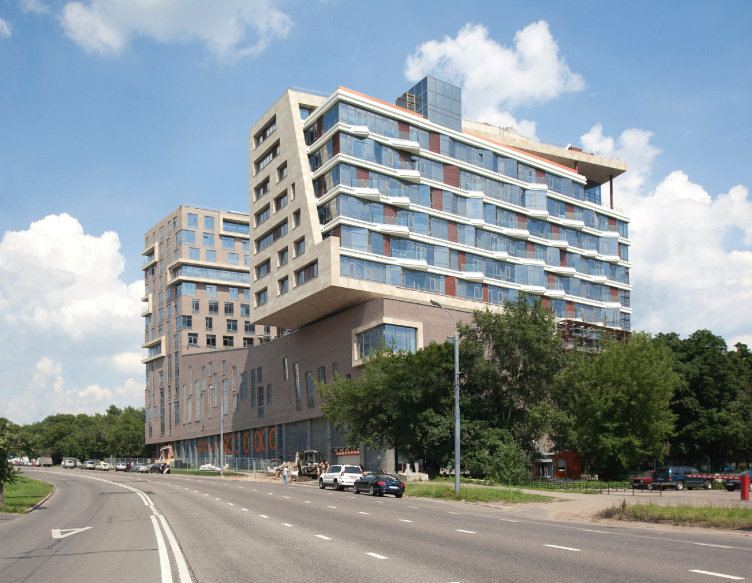
We tried to solve this problem in our project of a shopping and office complex next to Vodny Stadion metro station. We had to make cantilevers, use a few types of glass and finishes for the sake of creating the plastics of the volumes that really interact with each other.
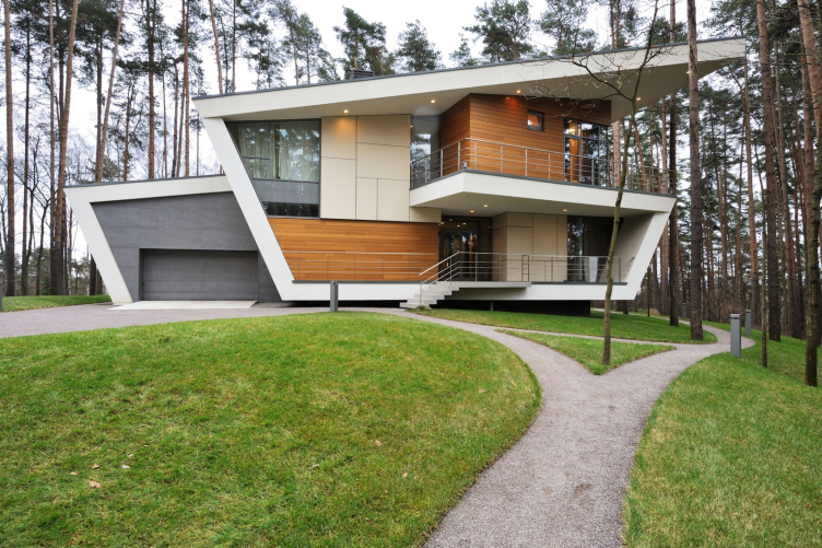
The most "correct" magnitude for me is a private house or a public building because in them the space/form and the mass/emptiness ratio is approximately equal.
- So it turns out that you are formalists?
- Let it be that way, even though I already made it clear that we object to labeling of any type.
- And your architecture does not tell a story?
- The story of our architecture is not of the literary type; our story is the scenario of reading and deciphering the building. The building should not be completely readable at a first glance. What is the difference between the fashionable and the true architecture for me? The fashionable architecture but imitates the image. When you look at the "KVN planet" building, it is readable, as a sign, at the very first sight. You do not have to walk around this building for long to understand it - and this is precisely why I consider it to be a piece of "fashionable" architecture.
We, as a rule, look to design "charade" buildings. They are different if looked at from different angles. During the deciphering, as the person starts grasping the structure of the building, they change their perception of it: this is a journey that promises new discoveries and encounters.
- Zaha Hadid says that she proceeds from the Russian Avant-garde. What do you proceed from? Bauhaus, Malevich, Russian constructivism?
- I graduated from the department of theory and history if contemporary foreign architecture of Moscow Institute of Architecture. The subject of my research work was "Transformative Grammar of Architecture in the Works of Peter Eisenman". As for the term "transformative grammar", I came up with it when I was doing the research of the language of modern architecture and its roots. Eisenman has a project of a private house where the starting point is a simple cube that is tumbling down the mountain, and the overlapping projections form new spaces. It is like in the picture of Marcel Duchamp - "Nude Descending a Staircase". In that picture, the canvas depicts different stages of motion...
Lately I am increasingly inspired by Soviet modernism of the 70's and 80's, which created a lot of underrated world masterpieces. I believe that the health resort "Friendship" in Yalta is as important architectural work as La Turret and the building of "Avtodor" in Tbilisi stands up to the most daring concepts by the metabolists.
So if we are to speak about the root, yes, I have plenty of them, and many of them coincide with Zaha's. It's just that we don't like that the western world usurped the Russian avant-garde, and if you start doing something with this same language - the language of abstract shape - then you are already guilty in borrowing from them.
Of course, in the West, the traditions of contemporary architecture did not suffer such a serious break as our did. Therefore it is understandable that they had time to do much more than we did here in Russia. Plus - add to it the high educational standards, the high level of technology and the very system of relationship when the professionalism and the quality of architceture are all that matters.
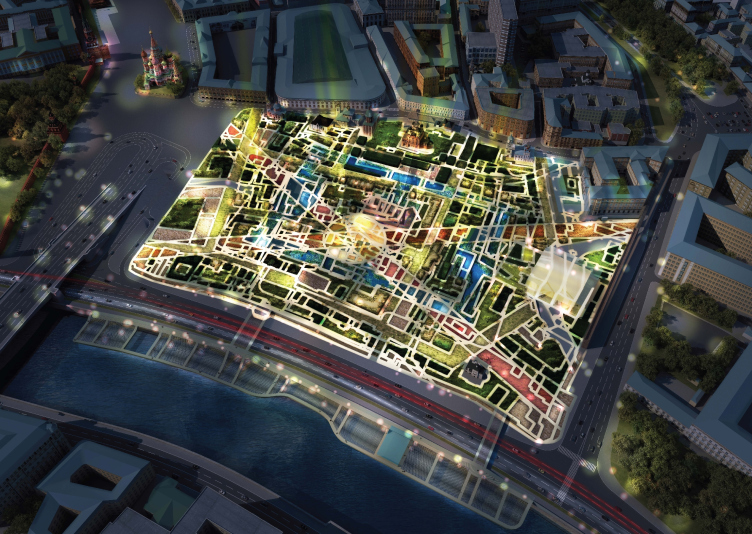
We worked a lot with foreign architects and specialists here in Russia, and our evaluation of this experience is rather ambiguous. Our most successful and useful experience was that of working with MVRDV on the Zaryadye contest project. It's a pity, of course, that we only took the third place - but still I like our project most of all. What we wanted to do was create a park that would be really place-specific for this paricular historical part of Moscow. It cannot be transferred into another place. This is the perfect example of cultural and historical charade I talked about, and it is also the landscape and achitectural abject, and it is a comfortable place for the city people to be in, with a range of diverse spaces and landscapes. Winy Maas is certainly a brilliant architect. There are lessons that can be learned from the Dutch both from the conceptual and the technological standpoint.

"Zaryadye"Park. Night top view. Project. © Consortium MVRDV. Photo coutesy by Atrium
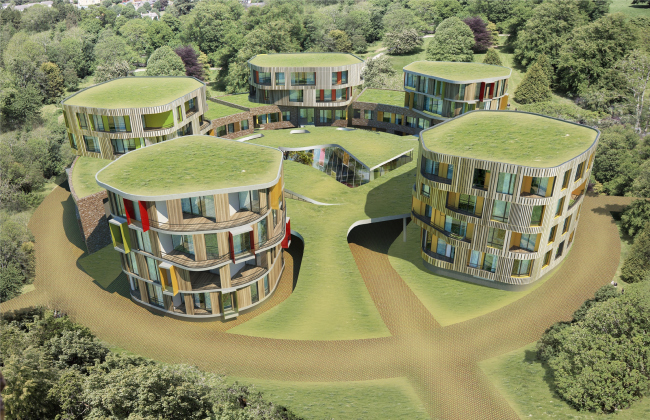
Townhouse complex in Block D2 of Skolkovo science town. Contest project © Atrium
- Who, out of the fathers of abstract art, is closer to you: Malevich or Kandinsky?
- From the point of view of suprematism versus constructionism, I think you should have asked - Malevich or Tatlin?
Malevich. Because we do not beautify our construction, hi-tech is not our cup of tea. Malevich's Black Square (and especially White Square) is the quintessence of mystical abstract forms, the maximum abstraction. But if we are to choose between Malevichem and Kandinsky, then, probably the latter. Malevich is all about the pure declaration and manifesto, while Kandinsky is about music, about life itself. Over Kandinsky I put Filonov, though.
We also have a deep respect for Mies - because he discovered the free space and turned it inside out. While, before he came about, the space was sort of "air-tight", i.e. architecture was all about providing protection from the adverse external influences, in the XX century the tables turned, and there appeared the "free space" of Ludwig Mies van der Rohe.
Another hero of ours is Bernhard Hans Henry Scharoun, because of his "relation to the interaction of parts". He was the first one to break away from the orthogonality and to start doing really sculptural things. He reacted to his situations in very unconventional ways, and he discovered new forms. Out of Russian architects, I am feeling closest to Konstantin Melnikov - innovation is very characteristic of virtually his every work.
- But Melnikov form is far from abstract, even the other way around - it is very "body-like" and plastic. Melnikov and Malevich are rather on the opposite poles. And it seems to me that, if anything, you are closer to Melnikov. Malevich is all about mysticism. But where do you have mysticism?
- Yes, Malevich attracts us by the purity of his abstraction, and our architecture is plastic. Here is the thing - the language of architecture is as abstract as the language of music, it creates its plastic from terminally abstract prime elements.
- I.e., for you abstraction is the method of breaking away from the classical decorative architecture?
- Yes! The language is abstract but what is said in this language, is concrete; each project is the author's phrase, his statement.
Top view by night. "Zaryadye" Park. Project © Consortium MVRDV. Photo courtesy by "Atrium"


