По-русски

A Different Ostozhenka

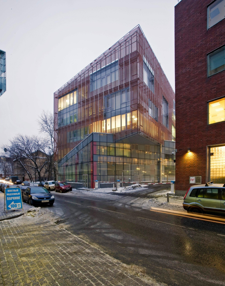
Having responded to all the themes that were set by its architectural context, the new bank building in the Butikovsky Side-street still does not look lost amidst its neighbors. Quite the contrary: one can regard this new building as the old Ostozhenka's breakthrough into the company of the glamorous "golden mile".

14 March 2013
Object
mainImg
Object:
Office building in Butikovsky Side-street, 9
Russia, Moscow, Butikovsky Side-street, 17-19

Project Team:
Director and leader of the author team: Alexander Skokan, Chief architect of the project: Valery Kanyashin Chief architect: Maria Dekhtyar Architects and contributors to the project: Maria Elizarova, Boris Elagin, Alexandra Skachkova Chief engineer of the project: Aleksey Konarev Designing engineer: Alexander Kventsel

2003 — 2008 / 2007 — 2010

Commisioner: UniCredit Bank Engineers: OOO “Stroystyle XXI Vek” (“XXI Century Construction Style”) General contractor: ZAO “Setstroy” Technical customer: ZAO “Setstroy” Contractor on the facades: NPO “Steklostroy” Façade works: NPO “Steklostroy” Aluminum facade system: REYNAERS aluminium CW50SC Terra-cotta baguettes: Terreal Terracotta Interior trimming: OOO “Gint-M”

The new building of UniCredit Bank has been built at the crossing of Korobeinikov and Butikovsky side-street. For those who has even the slightest interest for the contemporary Moscow architecture, the specification of the place alone means quite a lot: by the end of the 2000's, all the industry publications were heatedly discussing this particular part of Ostozhenka area, and, truth be told, it is this particular place that comes to mind when the proverbial "golden mile" definition comes up in the conversation. On the left, on the right, and diagonally across the street, one sees the buildings by "Project Meganom" Bureau, and two houses by Sergey Skuratov situated a bit further away. Nearby, a bit deeper into the site, stands the first building of UniCredit Bank (back in those days it was called "International Bank of Moscow"), built by "Ostozhenka" Bureau in 1995 and also celebrated by the journalists and industry awards. Actually, the new building became the continuation of the 1995 building: it houses the HQ offices of the bank. The new and the old buildings are connected by an overpass at the level of the second floor, and they have one common parking lot with one entrance - so the two buildings function as a single organism.

Office building in the Butikovsky Side-street, 9. Master plan.
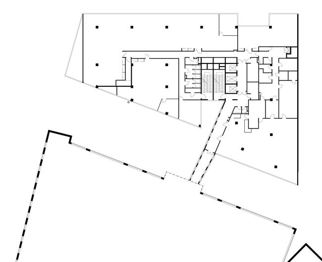
 Office building in the Butikovsky Side-street, 9. Plan of the second floor.

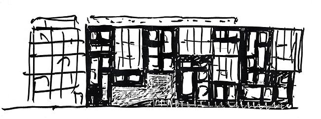
 Office building in the Butikovsky Side-street, 9. Sketch

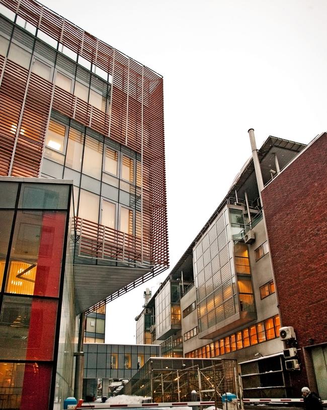
Office building in the Butikovsky Side-street, 9. Left: new building, right: building of 1995.


Office building in the Butikovsky Side-street, 9.

"UniCredit Bank, the former International Bank of Moscow, is Russia's first private bank - it has license number one. Its management team is international, and it operates on western principles rather than Russian ones. Besides, Russian and foreign leaders of the bank control and balance off each other's decisions, - the chief architect of the project Valery Kanyashin shares - They were easy and pleasant to work with because the taste of one particular leader never really prevailed. The style of the building was from the start defined as contemporary, and the further details (within reason, of course), the commissioners left to our own discretion. This is why we were able to make facades that were not typical for the standard office. If the commissioner had not been of the international kind, the building would have come out different".

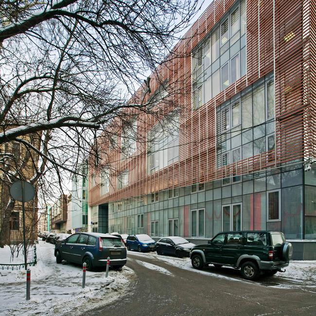
The building, indeed, looks unusual. At first glance, one cannot even get it how the architects were able to dissolve such a huge thing in the space and in the air. Its surface is covered with ripples and the whole building looks like a ghost or maybe a 3D image of its own self. Not completely, but to a very large extent it seems to be devoid of its bulk. Besides, if we go past it and down to the river along the Korobeinikov Side-street, one cannot get rid of a feeling that the house is gently moving away from us, as if letting us by to the riverside.
Office building in the Butikovsky Side-street, 9.

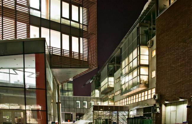
"Almost devoid of a bulk" does not mean with no bulk at all: the matter this bank building is made of, is, though thin, quite palpable - it is this matter that creates the effect of slight flexibility and at the same time the deluxe look of an expensive building. The effect is akin to a Chinese screen: one cannot see a thing behind it but at the same time it does not look like a blind wall at all, it is quite graceful and it is quite unobtrusive. Oh, one more detail: in the nighttime the whole building lightens up like a lantern.
Office building in the Butikovsky Side-street, 9.

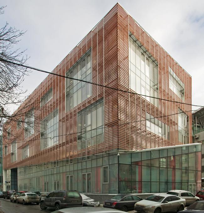
This "transparent non-transparency" is the result of the fact that the glass facades covered with the fine dots of silk-screen printing from the side of the street are covered with the grilles of the horizontal ceramic lamella: thin stripes of terra-cotta color. The striped canvas is pierced in some places by the large rectangles of pseudo "windows" that are larger than the usual windows, ones that you might expect in such a building, by two or three times. The decorative openings are asymmetrically scattered over the facades; they liven up their rhythm and make it more sophisticated, at the same time adding to the likeness to a "usual building", one falling in with the archetypes of the city, according to which the buildings are to have windows in them.

Office building in the Butikovsky Side-street, 9. 3D model. 

The brick-red color of the lamellae fits the tone of the "old" (1995) building on the embankment and provides the integrity of the ensemble of the two buildings, as well as for their "contextual respectability": after all, we are downtown, and the terra-cotta color is one of the most "historical" ones. The stripes also fit the context: nearby, on the Butikovsky Side-street, there stands a house built by "Project Meganom", covered with vertical lamellae from top to bottom (even more transparent-looking; the horizontal strokes of the "Ostozhenka" building is more palpable in comparison to it, which makes sense because these strokes, among other things, need to "hold the corner" of the street, and this is quite an important task to do).
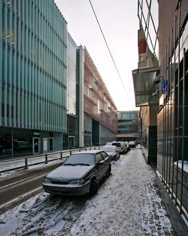
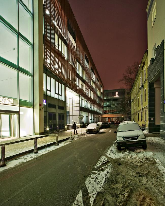
Office building in the Butikovsky Side-street, 9. View from the Butikovsky Side-street. On the left: "Meganom Bureau" building in the Butikovsky Side-street. Ahead in the distance: the residential house and its glass "villa".


Office building in the Butikovsky Side-street, 9.


The said corner - the crossing of Korobeinikov and Butikovsky side-streets - is definitely the most important one in the entire building. It virtually plays the part of its main facade, it "business card": it is the first thing that catches the eye of a passer-by who walks off the Ostozhenka and down the Korobeinikov side-street. All the right-hand side of the side-street is filled with a house that was built (just like the above-mentioned lamellae hose) by Yuri Grigoryan - the long bulk of the building wrapped in a thick layer of mortar "holds" the line of the side street. Аnd, directly above the crossroads, at a third-floor level, the surface of the wall shouts off with a glass volume of a "city villa" inserted into the house. Its glass "iceberg" appeared back in the days when the crossing of the Butikovsky and the Korobeinikov side streets was still empty. And now in order to keep this part of the side street from looking gloomy and constrained, the "Ostozhenka" architects had to retreat before the energetic mass of glass.
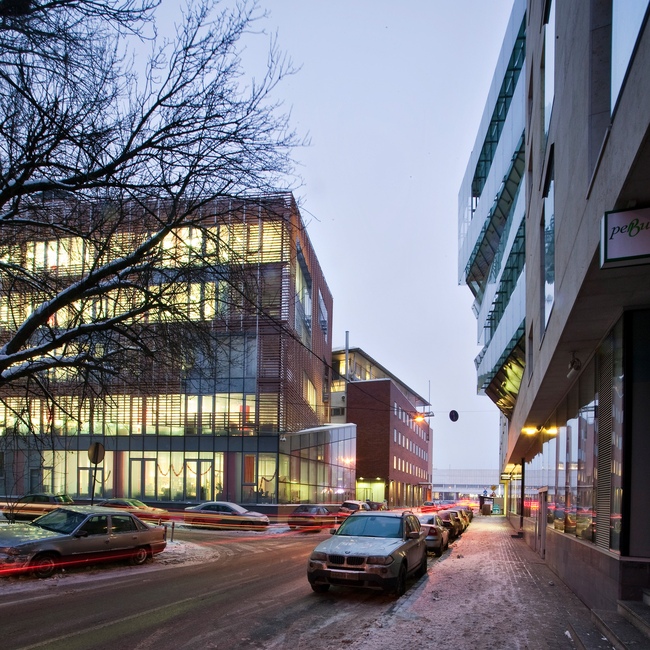
 

Office building in the Butikovsky Side-street 17-19. View from the Korobeinikov Side-street from the Ostozhenka side.

By doing so, they were able to "fool" the perspective with the play of lines and shapes. To cut a long story short, the lines of the top and bottom edges of the terra-cotta screens before the facades are not parallel to the ground. They rise diagonally up to the crossroads, fully capturing a whole floor, and it turns out that the corner of the building that faces the crossroads is lower, while the other corners "fly up" very much like the wings of a paper butterfly or maybe a melancholic smile stylized into a triangular check mark.
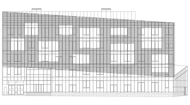
 

Office building in the Butikovsky Side-street, 9.
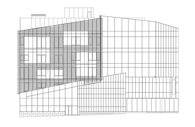
Office building in the Butikovsky Side-street, 9.

Peculiar is the fact that while along the Butikovsky Side-street this technique is implemented in a linear and decorative fashion with the lower outline of the striped screen being cut diagonally and continuing the linear play that is there in the glass volume of the "villa", on the side of the Korobeinikov Side-street, the terra-cotta wall breaks away from the red line turning about twenty degrees to the left. The basement of the building at the same time stays firmly in its place; the two volumes veer off from one another like the steps of a spiral staircase would or the shelves of a whatnot that rotates on a pivot. Besides, as we go further down the side-street, the basement floor grows into being actually a double-height one, turning up its pointed "nose".
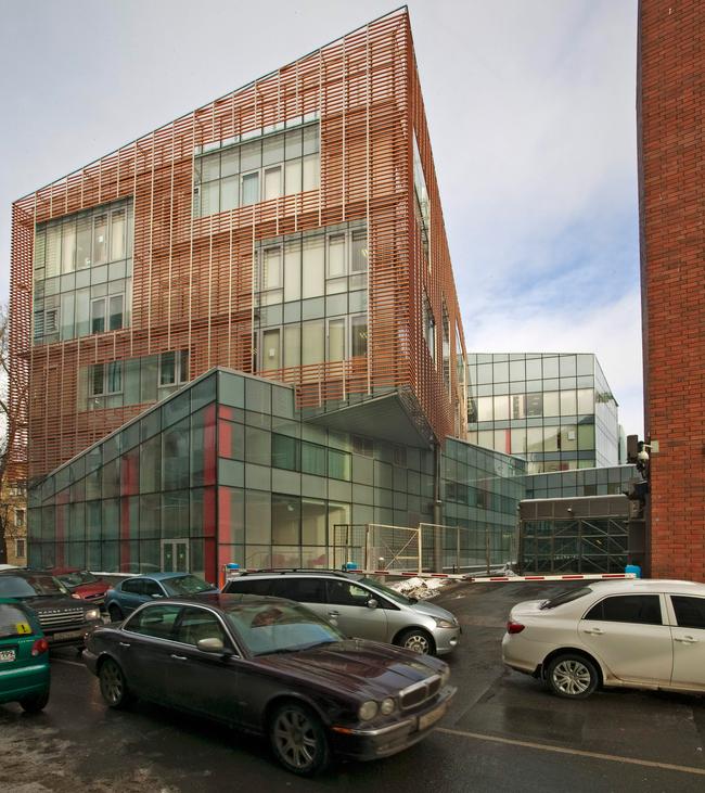
 

Office building in the Butikovsky Side-street, 9.
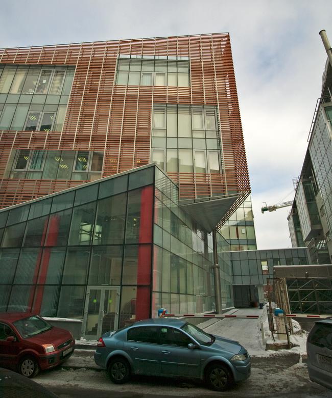
Office building in the Butikovsky Side-street, 9.

If we are to look at this building from the riverside, from that standpoint it will look like it is made up of two volumes put on top of one another with a diagonal shift - the terra-cotta corner overhangs above the basement, and the play of lines turns into a whole 3D composition. But what is interesting is the fact that the surface of the terra-cotta grille from this standpoint looks like the immediate continuation of the brick wall of the old bank building, it is at this particular point that the similarity of the two buildings is particularly obvious. This similarity is not to be overestimated though: the "strokes" of the new building are a lot more sophisticated and transparent, and the line of its cornice continues the perspective play, this time strengthening the contraction and making the street a little bit shorter (of course, it only looks that way).
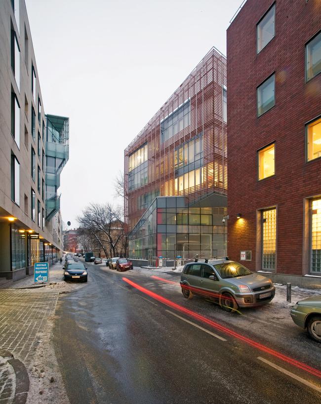
 

Office building in the Butikovsky Side-street, 9.

As a result, the space of the Korobeinikov Side-Street stratifies: its lower part is still dominated by the red line, while the upper part veers off to the left. The volume of the glass "villa" and the volume of the bank are engaged in a silent dialogue: one offends and the other retreats but it does so not only with dignity but it looks like it really knows what it is doing - it sets a new direction of space, yet new for this street: a little bit more on the left side and a little bit higher - a virtual "Stairway to Heaven"! In any case, if you walk down the street without taking your eyes off this building - and this effect has been proven - that the steep descent of the pavement will feel really unexpected to you and even inappropriate. You will feel like jumping up!

The bank building has yet another peculiarity: not only does it carefully reflect its environment but it also looks different from the surrounding houses, significantly different. First of all, it has become a common cliché to blame the Butikovsky of having become a "dead" street - few residential houses are left there at all, and this street is roamed mostly by the security guards. To tell the truth, the architects are not to blame for this at all, but still what ended up happening was a rather strange environment. The new bank building, on the other hand, is a living and breathing thing, it works, and it has value - like a workhorse opposed to some unnecessary luxury.

Second of all - and this is a plastic difference already - the building opposes itself to the neighboring houses with their respectable stones and their traditional bricks, with their serious and pompous "sturdiness". The new building, unlike its neighbors, sports a look of being a tiny bit incomplete: instead of self-contentedly presenting itself, it turns away, withdraws, and covers itself with a stroke sketch. The asymmetric openings of the variously-sized "pseudo-windows" in the thin fabric of the lamellae look, on the one hand, like a torn-up cloak, and on the other hand, it looks like the old Moscow fence lath. And it is namely because of this that the new bank building can quite unexpectedly seem like an echo of that old, wooden, "incomplete" and unpretentious Ostozhenka that is no longer there and that so many people so badly miss.


Object:
Office building in Butikovsky Side-street, 9
Russia, Moscow, Butikovsky Side-street, 17-19

Project Team:
Director and leader of the author team: Alexander Skokan, Chief architect of the project: Valery Kanyashin Chief architect: Maria Dekhtyar Architects and contributors to the project: Maria Elizarova, Boris Elagin, Alexandra Skachkova Chief engineer of the project: Aleksey Konarev Designing engineer: Alexander Kventsel

2003 — 2008 / 2007 — 2010

Commisioner: UniCredit Bank Engineers: OOO “Stroystyle XXI Vek” (“XXI Century Construction Style”) General contractor: ZAO “Setstroy” Technical customer: ZAO “Setstroy” Contractor on the facades: NPO “Steklostroy” Façade works: NPO “Steklostroy” Aluminum facade system: REYNAERS aluminium CW50SC Terra-cotta baguettes: Terreal Terracotta Interior trimming: OOO “Gint-M”

14 March 2013

Headlines now
A Paper Clip above the River
In this article, we talk with Vitaly Lutz from the Genplan Institute of Moscow about the design and unique features of the pedestrian bridge that now links the two banks of the Yauza River in the new cluster of Bauman Moscow State Technical University (MSTU). The bridge’s form and functionality – particularly the inclusion of an amphitheater suspended over the river – were conceived during the planning phase of the territory’s development. Typically, this approach is not standard practice, but the architects advocate for it, referring to this intermediate project phase as the “pre-AGR” stage (AGR stands for Architectural and Urban Planning Approval). Such a practice, they argue, helps define key parameters of future projects and bridge the gap between urban planning and architectural design.
Living in the Architecture of One’s Own Making
Do architects design houses for themselves? You bet! In this article, we are examining a new book by TATLIN publishing house. This book – unprecedented for Russia – features 52 private homes designed and built by contemporary architects for themselves. It includes houses that are famous, even iconic, as well as lesser-known ones; large and small, stylish and eccentric. To some extent, the book reflects the history of Russian architecture over the past 30 years.
A City Block Isoline
Another competition project for a residential complex on the banks of the Volga in Nizhny Novgorod has been prepared by Studio 44. A team of architects led by Ivan Kozhin concluded that using a regular block layout in such a location would be inappropriate and developed a “custom design” approach: a chain of parceled multi-section buildings stretching along the entire embankment. Let’s explore the features and advantages of this unconventional method.
Competition: The Price of Creativity?
Any day now, we’re expecting the results of a competition held by the “Samolet” development group for a plot in Kommunarka. In the meantime, we share the impressions of Editor-in-Chief Julia Tarabarina, who managed to conduct a public talk. Though technically focused on the interaction between developers and architects, the public talk turned into a discussion about the pros and cons of architectural competitions.
Terraced Design
The “River Park” residential complex has confidently and securely shaped the Nagatinsky Backwater shoreline. Featuring a public embankment, elevated courtyards connected by pedestrian bridges, and brick façades, the development invites exploration of its nuanced response to the surrounding context, as well as hints of the architects’ megalithic design thinking.
A Kremlin’s Core and Meteorite Fragments
We continue our coverage of the competition projects for the residential district that the development company GloraX plans to build along the embankment of the Rowing Channel in Nizhny Novgorod. ASADOV Architects approached the concept through a deep dive into local identity, using storytelling to pinpoint a central idea for the design: the master plan and composition are imagined as if a meteorite had struck a “proto-Kremlin”. Sounds weird? Find more details below!
The Volga Regatta
GloraX plans to develop a residential complex spanning 14 hectares along the Volga River in Nizhny Novgorod. The winning design in a closed-door competition, created by GORA Architects, features housing typologies ranging from townhouses to terraced high-rise slabs, a balance of functions, diverse ways of engaging with the water, and even a dedicated island (no less!) for the city residents.
Life Plans
The master plan for the residential district “Prityazheniye” (“Gravity”) in Naberezhnye Chelny was developed by the architectural company A.Len, taking into account the specific urban planning context and partially implemented solutions of the first phase. However, the master plan prioritized its own values: a green framework, a system of focal points, a hierarchy of spaces, and pedestrian priority. After this, the question of what residents will do in their neighborhood simply doesn’t arise.
A New Track
We took a thorough look at D_Station, a railcar repair depot dating back to 1906, recently reconstructed while preserving its century-old industrial structure, upon the project by Sergey Trukhanov and T+T Architects. Though work on the interiors – set to house restaurants and public spaces – is still underway, the building’s exterior already offers plenty to see. Visitors can explore the blend of old and new brickwork, appreciate the architect’s unique interpretation of ruin aesthetics, and enjoy the newly built pedestrian route that connects the Citydel Business Center’s arches to Kazakova Street.
Four Different Surveys
The “Explore the City” competition, organized this year by the Genplan Institute of Moscow, stands out as a pretty unconventional one for the architectural field but aligns perfectly well with the character of urban planning work. The winning project analyzed contemporary residential complexes, combining urban planning insights with a realtor’s perspective to propose a hybrid approach. Other entries explored public centers, motivations for car ownership, and housing vacancy rates. A fifth participant withdrew. Here’s a closer look at the four completed works.
Scheduled Evolution
ASADOV Architects unveiled the EvyCenter pavilion, a microcultural hub for fostering personal growth, organizing workshops, and doing gymnastics. Additionally, this pavilion serves as a prototype for a scalable country house, drawing inspiration from the “Loskutok” project, and constructed from CLT panels in a factory. This marks the beginning of a developer project initiated by the architectural firm (sic!), which is seeking partners to expand both small Evy settlements and even larger Evy cities, which are, according to Andrey Asadov, aimed at fostering the “evolutionary” development of the people who will inhabit them.
The Golden Crown
The concept for a dental clinic in Yekaterinburg, developed by CNTR Studio, revolves around the idea of a “mouth full of gold”: pristine white porcelain stoneware walls are complemented by matte brass details. To avoid an overly literal interpretation, the architects focused on the building’s proportions, skillfully navigating between sunlight requirements and fire safety regulations.
Flexibility and Integration
Not long ago, we covered the project for the fourth phase of the ÁLIA residential complex, designed by APEX. Now, we’ve been shown different fence concepts they developed to enclose the complex’s private courtyards, incorporating a variety of public functions. We believe that the sheer fact that the complex’s architects were involved in such a detail as fencing speaks volumes.
A Step Forward
The HIDE residential complex represents a major milestone for ADM architects and their leaders Andrey Romanov and Ekaterina Kuznetsova in their quest for a fresh high-rise aesthetic – one that is flexible and layered, capable of bringing vibrancy to mass and silhouette while shaping form. Over recent years, this approach has become ADM’s “signature style”, with the golden HIDE tower playing a pivotal role in its evolution. Here, we delve into the project’s story, explore the details of the complex’s design, and uncover its core essence.
Gold in the Sands
A new office for a transcontinental company specializing in resource extraction and processing has opened in Dubai. Designed by T+T Architects, masters of creating spaces that are contemporary, diverse, flexible, and original, this project exemplifies their expertise. On the executive floor, a massive brass-clad partition dominates, while layered textures of compressed earth create a contextually resonant backdrop.
Layers and Levels of Flight
This project goes way back – Reserve Union won this architectural competition at the end of 2011, and the building was completed in 2018, so it’s practically “archival”. However, despite being relatively unknown, the building can hardly be considered “dated” and remains a prime example of architectural expression, particularly in the headquarters genre. And it’s especially fitting for an aviation company office. In some ways, it resembles the Aeroflot headquarters at Sheremetyevo but with its own unique identity, following the signature style of Vladimir Plotkin. In this article, we take an in-depth look at the United Aircraft Corporation (UAC) headquarters in the Moscow agglomeration town of Zhukovsky, supplemented by recent photographs from Alexey Naroditsky – a shoot that became only recently possible due to the fact that improvements were finally made in the surrounding area.
Light and Shadow
In this article, we delve into the architectural design of the “Chaika” house by DNK ag architects, which was recently completed in 2023 as part of the collection of signature designs at ZILArt. As is well-known, all the buildings in this complex follow a design code, yet each one is distinct. This particular building stands out not only for its whiteness and minimalism but also for the refined use of a limited number of techniques that, together, create what can confidently be called synergy.
Casus Novae
A master plan was developed for a large residential area with a name of “DNS City”, but now that its implementation began, the plan has been arbitrarily reformatted and replaced with something that, while similar on the surface, is actually quite different. This is not the first time such a thing happens, but it’s always frustrating. With permission from the author, we are sharing Maria Elkina’s post.
Treasure Hunting
The GAFA bureau, in collaboration with Tegola and Arkhitail, organized an expedition to the island of Kilpola in Karelia as part of Moskomarkhitektura’s “Open City” festival. There, amidst moss and rocks, the students sought answers to questions like: what is the sacred, where does it dwell, and what sustains it? Assisting the participants in this quest were landscape engineer Evgeny Levin, artist Nicholas Roerich, a moose, and the lack of cellular connection. Here’s how the story unfolded.
Depths of the Earth, Streams of Water
In the Malaya Okhta district, the Akzent building, designed by Stepan Liphart, was constructed. It follows a classic tripartite structure, yet it’s what you might call “hand-drawn”: each façade is unique in its form and details, some of which aren’t immediately noticeable. In this article, we explore the context and, together with the architect, delve into how the form was developed.
Fir Tree Dynamics
The “Airports of Region” holding is planning to build an airport in Karachay-Cherkessia, aiming to make the Arkhyz and Dombay resorts more accessible to travelers. The project that won in an invitation-only competition, submitted by Sergey Nikeshkin’s KPLN, blends natural imagery inspired by the shape of a conifer seed, open-air waiting spaces, majestic large trees, and a green roof elevated on needle-like columns. The result is both nature-inspired and WOW.
​A Brick Shell
In the process of designing a clubhouse situated among pine trees in a prestigious suburban area near Moscow, the architectural firm “A.Len” did the façade design part. The combination of different types of brick and masonry correlates with the volumetric and plastique solutions, further enhanced by the inclusion of wood-painted fragments and metal “glazing”.
Word Forms
ATRIUM architects love ambitious challenges, and for the firm’s thirtieth anniversary, they boldly play a game of words with an exhibition that dives deep into a self-created vocabulary. They immerse their projects – especially art installations – into this glossary, as if plunging into a current of their own. You feel as if you’re flowing through the veins of pure art, immersed in a universe of vertical cities, educational spaces – of which the architects are true masters – and the cultural codes of various locations. But what truly captivates is the bold statement that Vera Butko and Anton Nadtochy make, both through their work and this exhibition: architecture, above all, is art – the art of working with form and space.
Flexibility and Acuteness of Modernity
Luxurious, fluid, large “kokoshniks” and spiral barrel columns, as if made from colorful chewing gum: there seem to be no other mansion like this in Moscow, designed in the “Neo-Russian-Modern” style. And the “Teremok” on Malaya Kaluzhskaya, previously somewhat obscure, has “come alive with new colors” and gained visibility after its restoration for the office of the “architectural ecosystem” as the architects love to call themselves. It’s evident that Julius Borisov and the architects at UNK put their hearts into finding this new office and bringing it up to date. Let’s delve into the paradoxes of this mansion’s history and its plasticity. Spoiler: two versions of modernity meet here, both balancing on the razor’s edge of “what’s current”.
Yuri Vissarionov: “A modular house does not belong to the land”
It belongs to space, or to the air... It turns out that 3D printing is more effective when combined with a modular approach: the house is built in a workshop and then adapted to the site, including on uneven terrain. Yuri Vissarionov shares his latest experience in designing tourist complexes, both in central Russia and in the south. These include houseboats, homes printed from lightweight concrete using a 3D printer, and, of course, frame houses.
​Moscow’s First
“The quality of education largely depends on the quality of the educational environment”. This principle of the last decade has been realized by Sergey Skuratov in the project for the First Moscow Gymnasium on Rostovskaya Embankment in the Khamovniki district. The building seamlessly integrates into the complex urban landscape, responding both to the pedestrian flow of the city and the quiet alleyways. It skillfully takes advantage of the height differences and aligns with modern trends in educational space design. Let’s take a closer look.
Looking at the Water
The site of Villa Sonata stretches from the road to the water’s edge, offering its own shoreline, pier, and a picturesque river panorama. To reveal these sweeping views, Roman Leonidov “cut” the façade diagonally parallel to the river, thus getting two main axes for the house and, consequently, “two heads”. The internal core – two double-height spaces, a living room and a conservatory, with a “bridge” above them – makes the house both “transparent” and filled with light.
The White Wing
Well, it’s not exactly white. It’s more of a beige, white-stone structure that plays with the color of limestone – smoother surfaces are lighter, while rougher ones are darker. This wing unites various elements: it absorbs and interprets the surrounding themes. It responds to everything, yet maintains a cohesive expression – a challenging task! – while also incorporating recognizable features of its own, such as the dynamic cuts at the bottom, top, and middle.
Urban Dunes
The XSA Ramps team designed and built a three-part sports hub for a park in Rostov-on-Don, welcoming people of all ages and fitness levels. The skate plaza, pump track, and playground are all meticulously crafted with details that attract a diverse range of visitors. The technical execution of the shapes and slopes transforms this space into a kind of sculptural composition.
Proportional Growth
The project for the fourth phase of the ÁLIA residential area has been announced. The buildings are situated on an elongated plot – almost a “ray” that shoots out from the center of the area towards the river. Their layout reflects both a response to Moscow’s architectural preferences over the past 15 years, shifting “from blocks to towers”, and an interpretation of the neighboring business park designed by SOM. Additionally, the best apartments here are not located at the very top but closer to the middle, forming a glowing “waistline”.