По-русски

Multicolored Barcode

Late last year, yet another medical institution in the southeast of Moscow got positively-looking multicolored facades that inspire confidence in the art of healing and the triumph of life. The project of reconstruction of Research Center for Obstetrics, Gynecology and Perinatology named after Kulakov, situated on Akademika Oparina Street, was developed by the author team led by Alexander Asadov.

06 February 2013
Object
mainImg

The architects got this order thanks to the successful implementation of their project of Federal Scientific and Research Center of Pediatric Hematology, Oncology and Immunology whose dazzling facades beautified the crossing of Leninsky Avenue and Miklukho-Maklaya Street. The reconstruction and remodeling of its interior premises had been carried out in the center a few years back - now it is not only Moscow's but the whole Russia's most advanced clinic in its class - but from the outside it still looks like a rather ordinary gray volume. Its image is in fact a nutshell of the basic principles of Soviet modernism - simplicity and harshness of composition, laconism of decoration, minimal plastics - and it is probably the length of its main building alone that makes it stand out against its surrounding background. After the Center of Pediatric Hematology, Oncology and Immunology was built nearby, the management of the center got a vivid example of how bright and unconventional the architecture of a medical institution could be. The decision to commission the development of the project of facade reconstruction to the same team of architects made perfect sense, even though the immediate vicinity of the already implemented "prototype" created a few extra challenges.


The thing is that Akademika Oparina Street runs parallel to Leninsky Avenue and stops dead crossing that same Miklukho-Maklaya Street. In fact, it is the same block that the Center of Pediatric Hematology, Oncology and Immunology has already been built in. The crucial difference in the location of the two medical centers consists in the fact that the Daedalus Prize winning children clinic building stands with its main facade turned to the multilane carriage way, while the Obstetrics Center is flesh and blood of the tensely populated residential area. It is specifically because of the density of the housing that the two medical buildings do not interact with one another - but once you exit the maternity home and walk just a few meters away, you start seeing time and again, in the clearances between the houses, the bright colors of the pediatric center. This is why the architects got the task of coming up with a fundamentally different "color code" - the renewed facades of the Maternity Center were to be different from those of Pediatric Center but be as optimistic-looking.


Working on the new image of the facades, the architects looked not only to refresh them but also to develop the building's intrinsic principles of modernist architecture and highlight the strong points of the latter. This is 
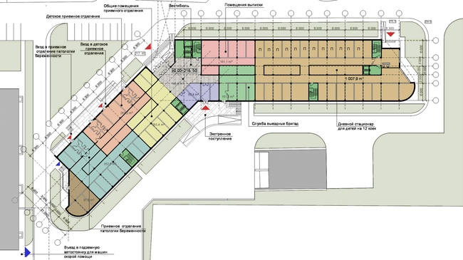
why as the starting point of the reconstruction project was chosen the layout 
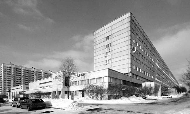
of the complex built back in 1979. On the plan it looks like a hair comb and consists of the main longitudinal building and five transverse ones, the length of them varying and the height being twice as little (three floors versus six in the main building. The longest "tooth" that is turned to the crossing of Akademika Oparina and Ostrovityanova Streets, plays the part of the main facade of the entire complex - it is here that the main entrance is 
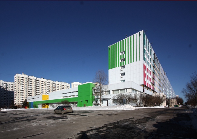
situated, manifested by brutal triangular pillars and rectangular bay windows. So it was this fracturing into separate bulky segments that became the main theme of the new "color code".


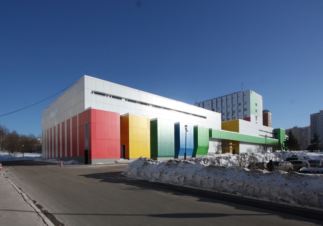
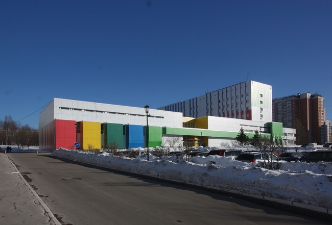
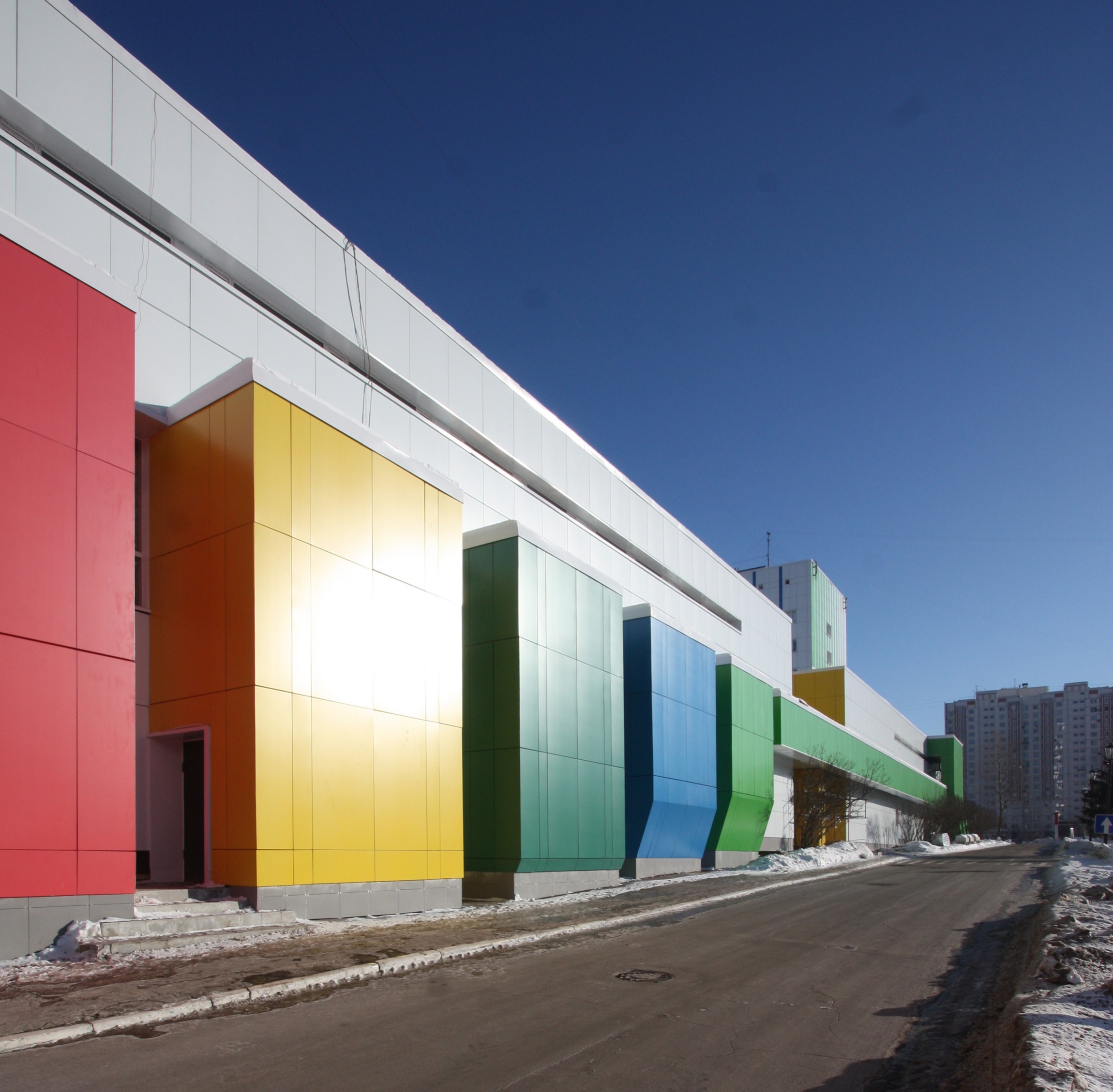
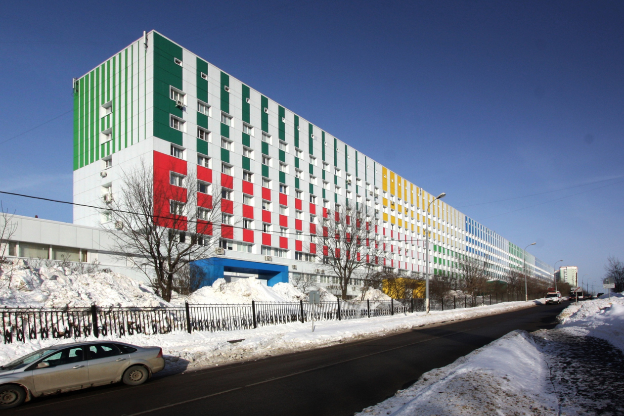
Totally, there are five bay windows, each of which the architect painted into a distinct color of its own - red, yellow, blue, dark green, and bright green. The latter becomes the leitmotif of the decoration of the entrance group - it bleeds onto the long horizontal beam above the main entrance porch and the pillars flanking it from the opposite side. The niche itself, in turn, is painted yellow. Highlighting the main plastic elements with color and coating them with Kraspan panels fundamentally changes the image of the facade: what used to look like a mono-texture light-gray mass, now has become a canvas with bright strokes that not only make the building look more dramatic but also help the visitors find their bearings a lot easier.

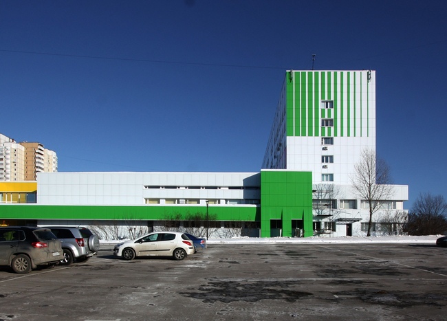
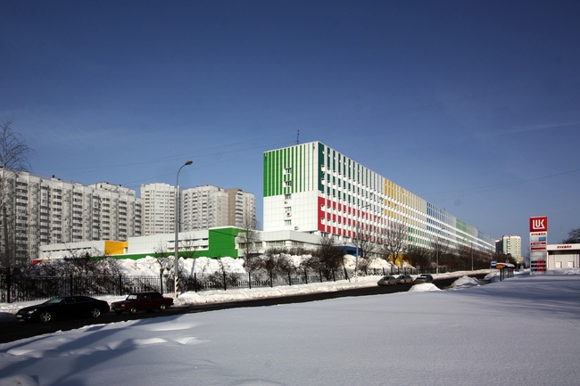
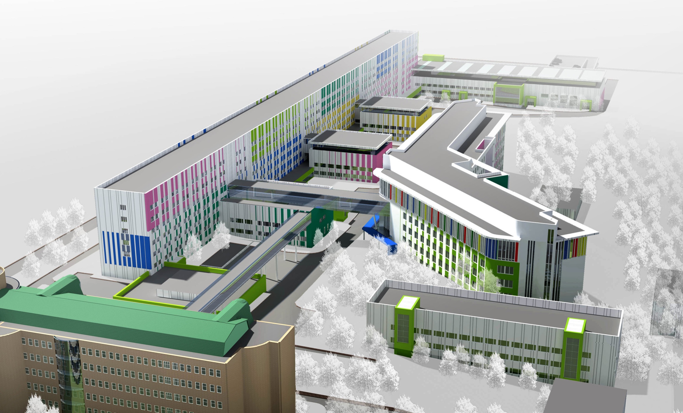
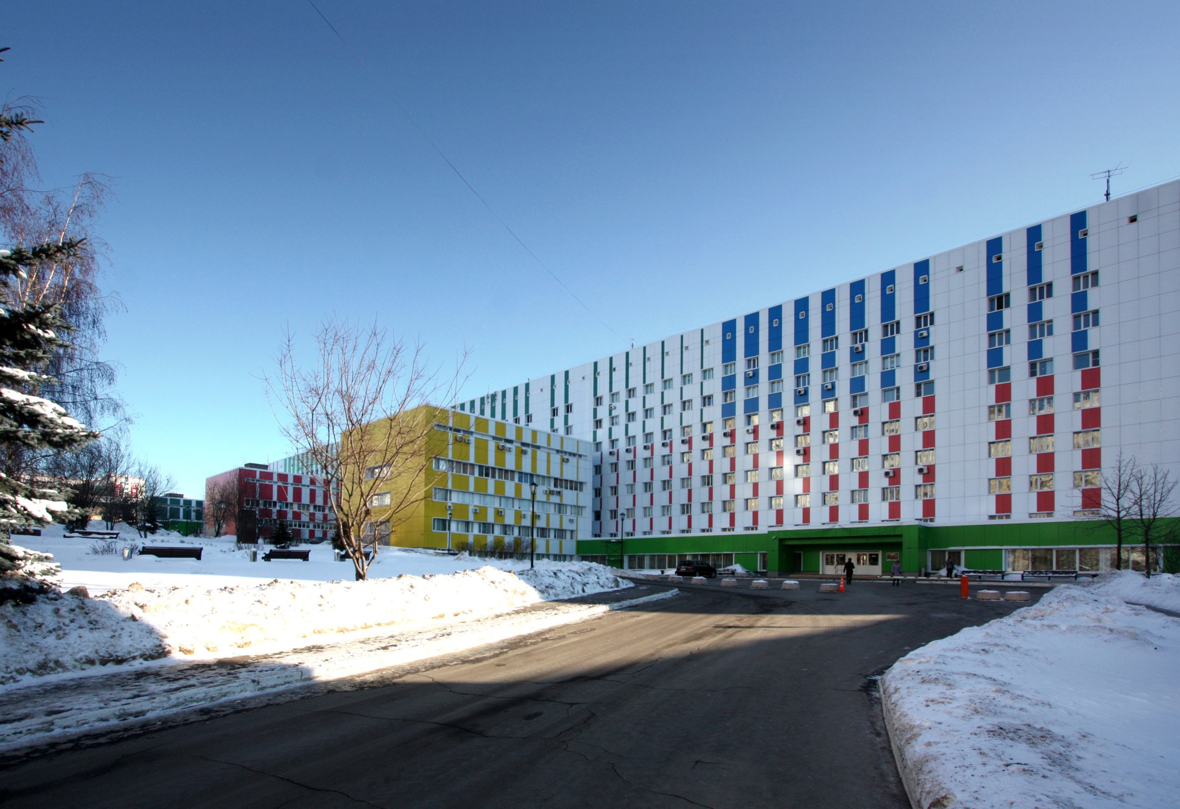
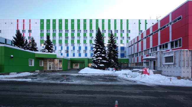
The five basic colors that are brought to the surface of the entrance facade form the color palette off the complex. One could compare them to a set of magic markers or maybe to a barcode that bears the encrypted information about this building, or, rather, about the changes that the obstetrics center 
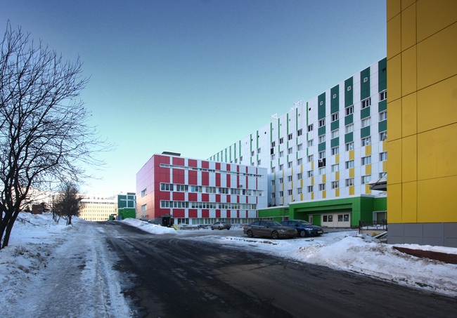
underwent in the course of the reconstruction. And while the facades of the pediatrics center are surfaces painted with bright optimistic colors, this building, on the other hand, is dominated by white color - possibly, the most appropriate metaphor for the birth of a new life and the aseptic conditions in 
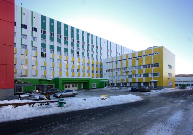
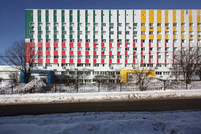
which it must take place. Apart from the already-mentioned bay windows, only the side walls of the transverse buildings are executed in full color - all the other facades present snow-white surfaces, over which the colorful strokes (or "splashes", as the architects themselves call them) are thrown. What is interesting is the fact that their length varies from floor to floor which helps avoid the trivial "striped pattern" and make each part of the facade look individual. This technique looks particularly striking on the facades of the longitudinal building - the multicolored barcode visually fractures the elongated volume, at the same time keeping its linear character.

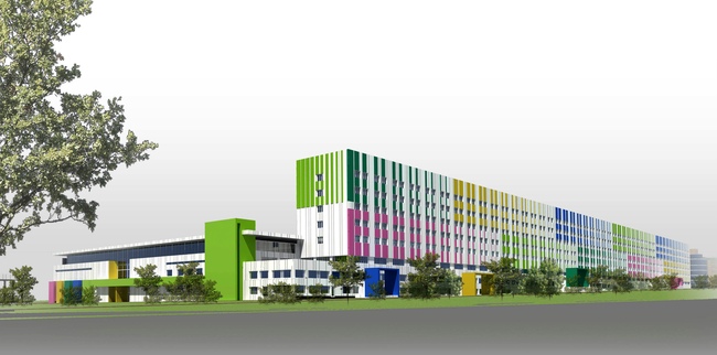
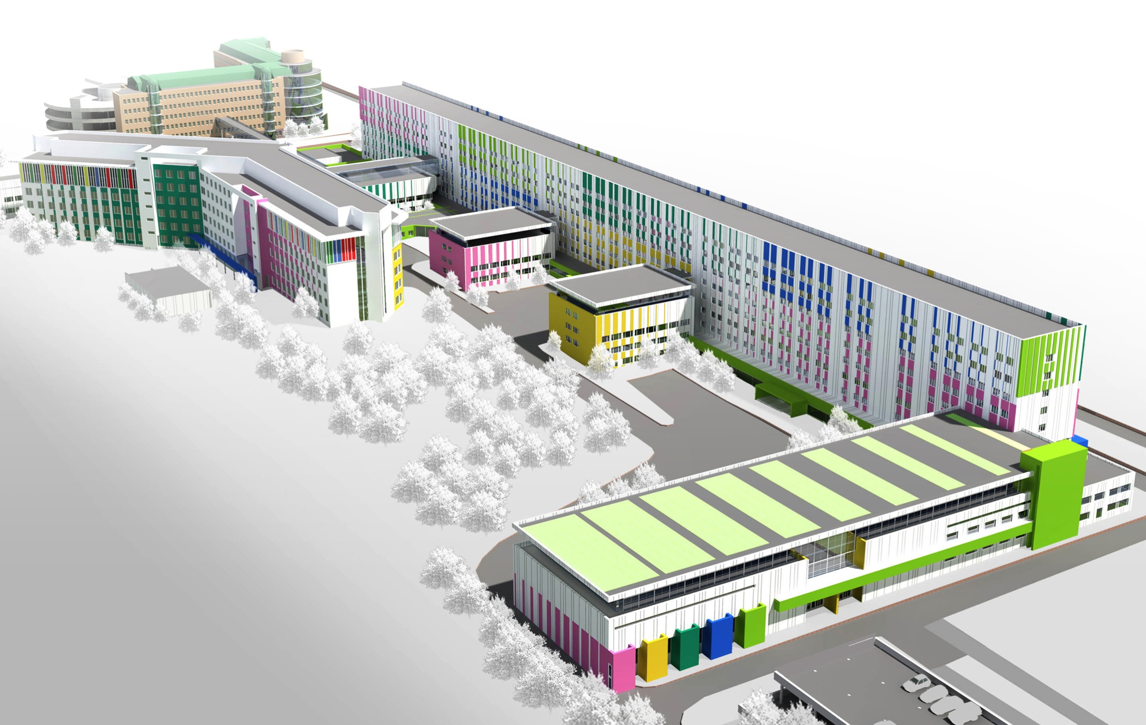
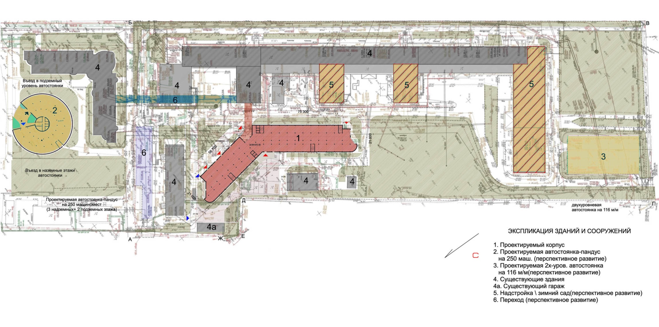
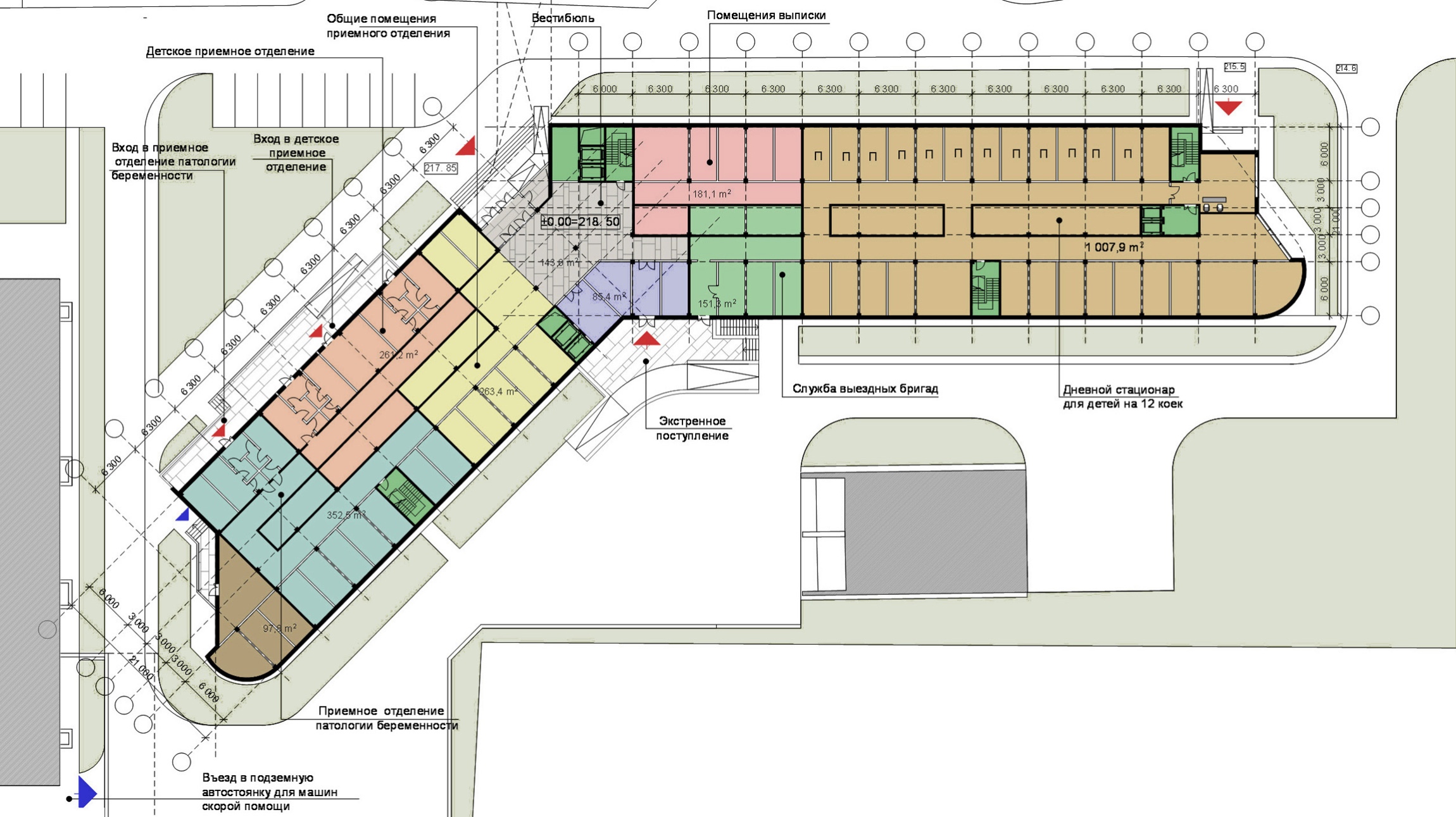
Apart from "sanitation" of the existing facades, the reconstruction project developed by Asadov team and "Transumed" company provides for the construction of a whole new building on the territory of the complex - the contemporary perinatal center. The architects plan to position it in the yard in such a way that three transverse buildings out of five became the overpasses from the old building into the new one - the connecting galleries are going to be built on the roofs of the three-storey volumes. And, since it makes little sense to start a reconstruction just because of but one overpass, the authors propose to use its space for the conservatories, meeting rooms and recreation areas for the patients. On the plan, the new volume has the shape of a tick mark - one wing of the building is located parallel to the main building of the center, and the other one is turned at a 45-degree angle to it. "Such positioning lends us the opportunity to make the most of the land site allotted to us and maximally expand the area before the main entrance to the future perinatal center", - the designers explain. The architectural solution of the new building develops the theme given by the following volume: the terminal laconism of the parallelepipeds is softened by the multi-corner side walls, and the color barcode is added by a frieze with stained-glass pieces with colorful inserts between them.

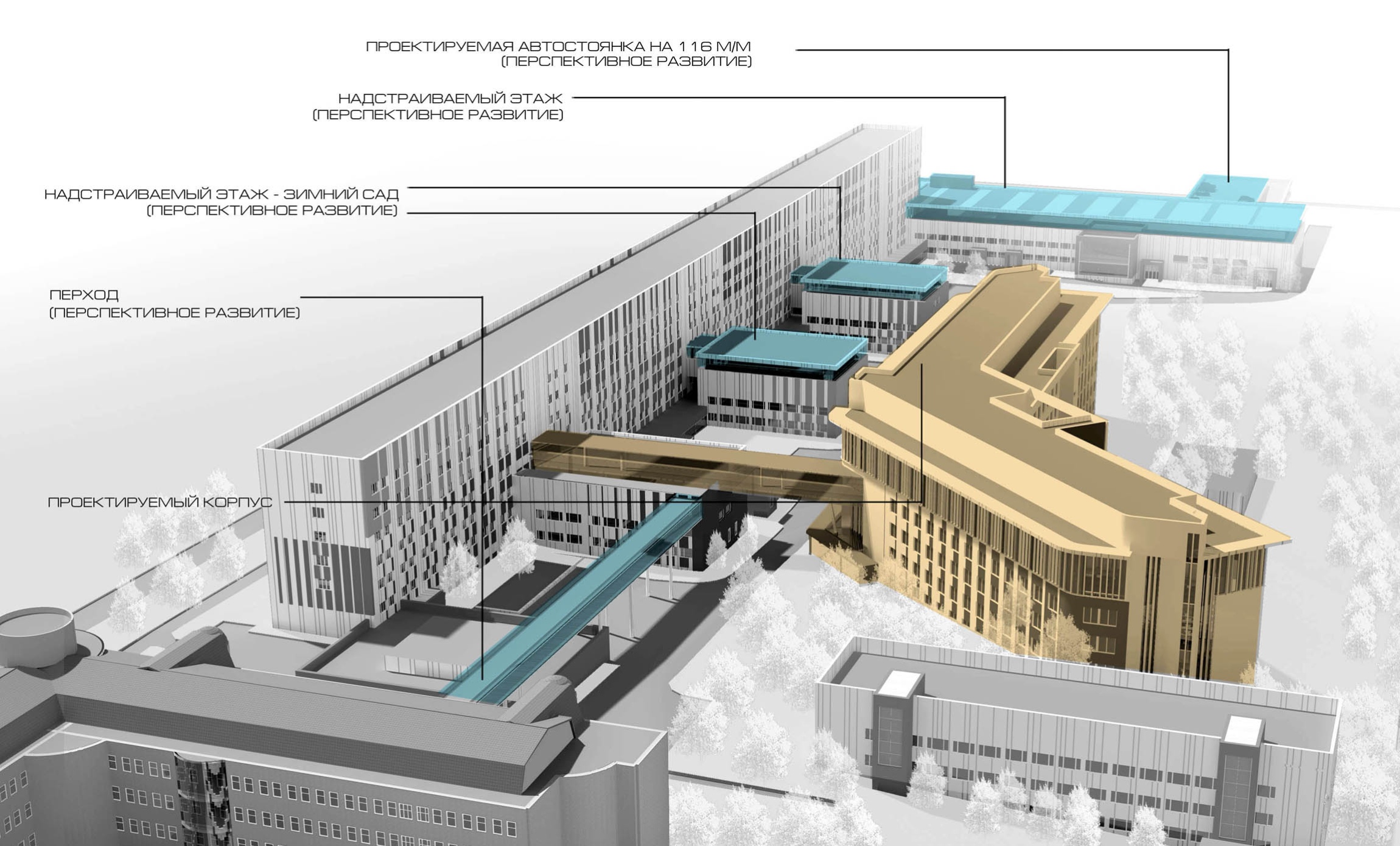
And, while the the construction project of the perinatal center has entered the concluding stage of obtaining the final permissions, the reconstruction of the facades of the center is already complete - the snow-white 290 meter long building, dissected with multicolored vertical stripes, has really made a difference in the outlook of Akademika Oparina Street, bringing into the rather faceless and aggressive visual environment a bright and dramatic centerpiece that symbolizes the purity and joy of a new life being born.


06 February 2013

Headlines now
Home Base
Working on the new building for Letovo Junior School – opened to students in autumn 2025 in the MSU Valley – the architects of UNK, following the client’s vision, subordinated both façades and interiors to the theme of “home”. Multiple variations of pitched roofs, a city skyline traced across glass balustrades, wooden textures, and a whole series of micro-spaces for retreat within public areas are all at the disposal of primary and middle school students. We take a closer look at the new school building – and at how it interprets current trends in educational environments.
Doubles Match
The architecture of the Tennis Palace built in Luzhniki Olympic Complex, designed by Arena Design Institute, was shaped by three factors: the proximity of the brutalist Druzhba Arena, the closeness of the Moskva River and the metro bridge overpass, as well as the specifics of the function – tennis courts require large spans, abundant light, yet at the same time protection from direct sunlight. The architects divided the building into several blocks, playing on contrast, which is further emphasized by the façades developed in collaboration with TPO Reserve and Vladimir Plotkin.
Microdynamics of Macroprocesses
Given the proximity of the multifunctional complex SOLOS to Sokolniki Park and to a major transport hub, Kleinewelt Architekten embedded in the design of the two high-rise towers a sense of dynamism more characteristic of natural phenomena than of man-made objects. Without the authors’ diagrams, this logic is not easy to decipher, although the eye immediately detects a pattern and tries to grasp it. It seems to us that one tower contains the impulse of a bud about to open, while the other evokes the movement of a lithospheric plate. Let us try to unravel it together.
The Space of Post-Cubism
Sergei Tchoban and Alexandra Sheiner, of Studio CHART, created for the exhibition of “post-cubist” sculpture by Beatrice Sandomirskaya – a talented and even “mainstream” artist, yet almost unknown even to art historians – a space akin to her sculptural language: solidly built, confidently stereometric, and subtly expressive. It curves, emphasizing the mass of the sculpture, envelops the viewer, and guides them from one perspective to another, from a generic “shrine” to a “Madonna”.
The Value of Open Space
For the site near the Barrikadnaya Metro Station, Sergey Skuratov developed five projects between 2020 and 2025. Two of them were ones that won the client’s invitation-only competitions. The fifth was recently selected by the Mayor of Moscow for implementation. The project is vivid and sculptural, expressive, eye-catching, and engaging – very much in line with the spirit of our time. And yet, this project is mid-rise rather than tall. In its northwestern part, near the metro and Druzhinnikovskaya Street, it shapes a comfortable urban environment. On the opposite side, it opens up, allowing sunlight into the courtyard and creating a spatial pause within the dense city fabric. How it is organized, what geometric principles underlie it, and why it takes this form – all this is explored in our article.
Coming From the Cold
The ArchBukhta Festival remains one of the few events in Russia where participants go through the entire process of creating an architectural object – from concept to construction. And they do so on the shores of Lake Baikal, in dedication to it. This year, GAFA took part and shared its experience: a local legend, a team-specific design code, friendship, as well as ice skating and endurance in freezing temperatures all contributed to gaining something more than just an award.
Symphony of Water and Brick
The Alter residential complex, designed by Stepan Liphart and built on a bend of the Okhta River, is an example of a “drawn house”: the number of original architectural details is virtually immeasurable. As a result, ribs, projections, and recesses create a picturesque silhouette even without a significant variation in height. Both composition and material respond to the proximity of the river and to the red-brick factory building dating back to the early 20th century. The project was also significantly shaped by recommendations from the city’s chief architect. More details in our article.
Wave and Vertical
The premium residential complex designed by GAFA for a site in the Khoroshevsky District responds to multiple constraints – the arc of a planned roadway, the water protection zone of the Khodynka River, and insolation requirements – through inventive massing. The composition is built on the interplay of two spatial layers: an elongated perimeter block and three towers concealed behind it generate the silhouette and key viewpoints, while also adding semantic depth reinforced by the façade solutions. Another defining feature is a large private courtyard, complemented by a citywide linear park.
Office on Trubnaya
We continue publishing projects by Valery Kanyashin. A building once described, a quarter century ago, as an example of “quiet modernism” has remained just that in some people’s memory. According to Anatoly Belov, its main quality is its unobtrusiveness. The architects from Ostozhenka say the leading role here is played by context and landscape – the change in elevation. Yet is it really so inconspicuous?
The First International
With this publication, we begin a series of texts dedicated to works by the late Valery Kanyashin, one of the founders of Ostozhenka Architects. As it happens, the projects he was involved in largely illustrate our understanding of the firm and its history. The first project in this series is the International Moscow Bank on Prechistenskaya Embankment.
In Memory of Valery Kanyashin
On Friday, February 27, architect Valery Kanyashin passed away – co-founder of Ostozhenka Architects and the author of many significant buildings in Moscow. We publish a text by Anatoly Belov in memory of Valery Kanyashin.
Hypertext in Space
As part of the exhibition “What We Have We (Do Not) Keep”, Sergey Tchoban, the Museum of Architecture, and the CHART studio experiment with an eco-conscious approach to exhibition design, with thematic cross-references and even with publicistic reflections on the necessity of preserving modernism, the roots of contemporary architecture, and the birth of ideas. All of this makes the exhibition, with its light and transparent design, look quite innovative. The elements – both “material” and conceptual – are familiar, yet their combination is far from conventional.
The Outline of “Foundation”
In their competition proposal for the Fili transport hub, the consortium led by Alexey Ilyin proposed an “inhabited arch” – a form that is simple yet complex. The architects emphasize that even at the competition stage, the project’s feasibility was fully calculated, taking into account the minimal nighttime closures of Bagration Avenue. How was this achieved? With what functions? Let us take a closer look. In our view, the building would have suited the heroes of Isaac Asimov’s Foundation novels perfectly.
The Flying Horizontal
“A house in the spirit of Wright”, as architect Roman Leonidov describes it, pointing to his source of inspiration, was built on a challenging wedge-shaped site. To achieve a sense of intimacy and secure good views from the windows, the entire volume had to be shifted toward the far boundary, turning the house “back” to the neighboring mansions. The main façade demonstrates time-tested techniques often employed by the company: articulated horizontals, a weightless roofline, and a triad of materials – light plaster, dark slate, and warm wood.
Needles of Horizon Contemplation
The “House of Horizons”, designed by Kleinewelt Architekten in Krylatskoye, is carefully thought out at the stereometric level – from the logic of how the volumes interlock (and, conversely, how gaps are articulated between them) to the triangular balconies that give the building its striking, slightly bristling silhouette.
The Red Thread
A linear park project prepared by Alexey Ilyin studio for the improvement of a riverbank in one of the residential districts seeks to reconnect people with nature. Two levels of the embankment invite visitors to contemplate the landscape while at the same time protecting the riverbank from excessive human impact. The “aerial street” links functional zones and the opposite banks, creating new points of attraction along the way: balconies, bridges, and even a “grotto”.
Spindle and Thread
The concept of the Waver residential complex in Yekaterinburg draws inspiration from the past of the Parkovy district. In order to preserve the memory of the late-19th-century flax spinning mill once located here, the architectural company KPLN turns to the theme of textiles and weaving. The project’s main expressive device is a system of ribbons made of perforated weathering steel – a material that, in such volumes, has arguably not yet been used in Russian residential projects.
From Ski Resorts to Year-Round Recreation Clusters
In mid-December, several architectural firms gathered to discuss a “seasonal” topic: the prospects for the development of domestic ski tourism. Where is modern infrastructure already in place, where do only remnants of the Soviet legacy remain, and where is there still nothing – but projects are underway and soon to be completed? This article explores these questions.
Woven Into Sokolniki
Over the past few years, high-rise residential construction in former industrial zones has become the main theme of Moscow architecture. Towers are springing up here and there – but the question is what kind of towers they are. The residential complex CODE Sokolniki, designed by Ostozhenka Architects, is a project where every detail has been taken care of. The authors are attentive to the history of the site, the continuity of the urban fabric, the skyline, and visual corridors. They also proposed a motif with the lyrical name “scarf”. We take a closer look at the volumetric composition and the large-scale décor “woven”, in this case, out of terraces and balconies.
Stepan Liphart and Yuri Gerth: “Our Program Is Aesthetic”
The studio of Stepan Liphart, an architect known for his distinctive signature style and one-off projects, now has a partner. Yuri Khitrov, a specialist with a broad range of competencies, will take on the part of the work that distracts one from creativity but drives the business forward. One of the aims of this partnership is to improve the urban environment through dialogue with clients and officials. We spoke with both sides about their ambitions, the firm’s development strategy, shared values, and the need for pragmatism. And why the studio is called “Liphart & Gerth” only became clear at the very end of the interview.
The Copper Mirror
The varied-toned sheen of “unsealed” copper, painterly streaks and fingerprints, exposed concrete, and the unusual proportions – when you study the ZILART Museum building by Sergei Tchoban and SPEECH architects, there is plenty to talk about. However, it seems to us that the most interesting thing is how the museum’s composition responds to the realities of the district itself. The residential district has been realized as an open-air exhibition of façade statements by contemporary architects – but without public access to the inner courtyards of the blocks. This building – that is, the museum – is exactly the opposite: on the outside, it is deliberately restrained, while inside it shines spectacularly, creating its own sunbeams in any weather.
“Strangers” in the City
We asked Alexander Skokan for a comment on the results of 2025 – and he sent us a whole article, moreover one devoted to the discussion we recently began on the “appropriateness of high-rises” – or, more broadly speaking, “contrasting insertions into the urban fabric”. The result is a text that is essentially a question: why here? Why like this?
Dmitry Ostroumov: “To use the language of alchemy, we are involved in the process of “transmutation...
What we ended up having was an extremely unusual conversation with Dmitry Ostroumov. Why? At the very least, because he is not just an architect specializing in the construction of Orthodox churches. And not just – which is an extreme rarity – a proponent of developing contemporary stylistics within this still highly conservative field. Dmitry Ostroumov is a Master of Theology. So in addition to the history and specifics of the company, we speak about the very concept of the temple, about canon and tradition, about the living and the eternal, and even about the Russian Logos.
A Glazed Figurine
In searching for an image for a residential building near the Novodevichy Convent, GAFA architects turned to their own perception of the place: it evoked associations with antiquity, plein-air painting, and vintage artifacts. The two towers will be entirely clad in volumetric glazed ceramic – at present, there are no other buildings like this in Russia. The complex will also stand out thanks to its metabolic bay-window cells, streamlined surfaces, a ceremonial “hotel-style” driveway, and a lobby overlooking a lush garden.
A Knight’s Move via the Cour d’Honneur
Intercolumnium Architects presented to the City Planning Council a residential complex project that is set to replace the Aquatoria business center on Vyborgskaya Embankment. Experts praised the overall quality of the work, but expressed reservations about the three cour d’honneurs and suggested softening the contrast between the facades facing the embankment and the Kantemirovsky Bridge.
Mountains, Groves, and Ancestral Towers
The year-round mountain resort Armkhi situated in Russia’s Republic of Ingushetia is positioned as a destination for calm family recreation and has well-established traditions shaped by its hundred-year history and the culture of the region. The development program prepared by the Genplan Institute of Moscow preserves the resort’s identity while expanding its offerings and introducing new types of tourist leisure. In the near future, the resort will feature a balneological center, a thermal complex, an interactive museum, an extreme park, and, of course, new ski slopes.
A Small Country
Mezonproekt is developing a long-term master plan for the MEPhI campus in Obninsk. Over the next ten years, an enclave territory of about 100 hectares, located in a forest on the northern edge of the city, is set to transform into a modern center for the development of the nuclear energy sector. The plan envisions attracting international students and specialists, as well as comprehensive territorial development: both through the contemporary realization of “frozen” plans from the 1980s and through the introduction of new trends – public spaces, an aquapark, a food court, a school, and even a nuclear medicine center. Public and sports facilities are intended to be accessible to city residents as well, and the campus is to be physically and functionally connected to Obninsk.
Pearl Divers
GAFA has designed an apartment complex for Derbent intended to switch people from a work mode to a resort mindset – and to give the surrounding area a much-needed jolt. The building offers two distinct faces: restrained and laconic on the city side, and a lushly ornate façade facing the sea. At the heart of the complex, a hidden pearl lies – an open-air pool with an arch, offering views of a starry sky, and providing direct access to the beach.
A Satellite Island
The Genplan Institute of Moscow has prepared a master plan for the development of the Sarpinsky and Golodny island system, located within the administrative boundaries of Volgograd and considered among the largest river islands in Russia. By 2045, the plan envisions the implementation of 15 large-scale investment projects, including sports and educational clusters, a congress center with a “Volgonarium”, a film production cluster, and twenty-one theme parks. We explain which engineering, environmental, and transportation challenges must be addressed to turn this vision into reality. The master plan solutions have already been approved and incorporated into the city’s general development plan.