The original project
provided for a gently sloping green roof that was meant to simulate the slope
of a golf course. In the center of this roof, the architect even planned to
make a hole as real as it could be - so as the ball sent here by a faulty golf
player would not get lost somewhere on the property but would roll down the
special chute into the hands of the owners of the building. This beautiful idea
was never to leave the paper though, but the name of "House Next to Hole
10" did stick.
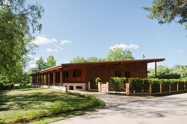
While the “hole” as such
was ultimately not included in the project, the close vicinity of the golf
course played the key part in its development. In particular, it determined the
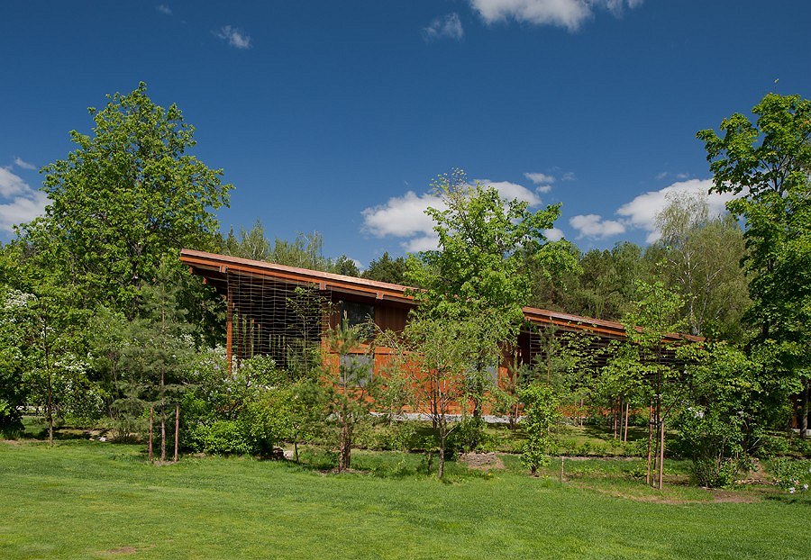
orientation of the house on the plot - in order to protect it from accidental
ball hits, the architect stretched an openwork steel net along its south
border, and turned the main facade westwards, farther away from the courses,
and at the same time making it overlook the building of the golf club itself
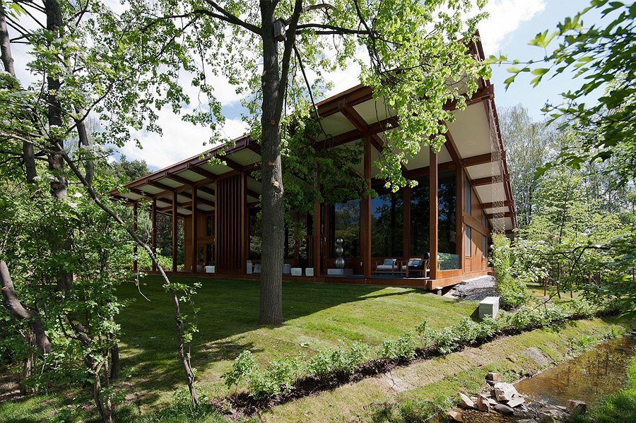
bathing in the trees of the woodland. Such configuration of the volume
gave the architects an opportunity to also make a cozy yard next to the house,
at the same time keeping all of the existing trees intact.
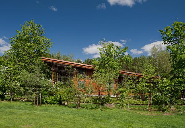
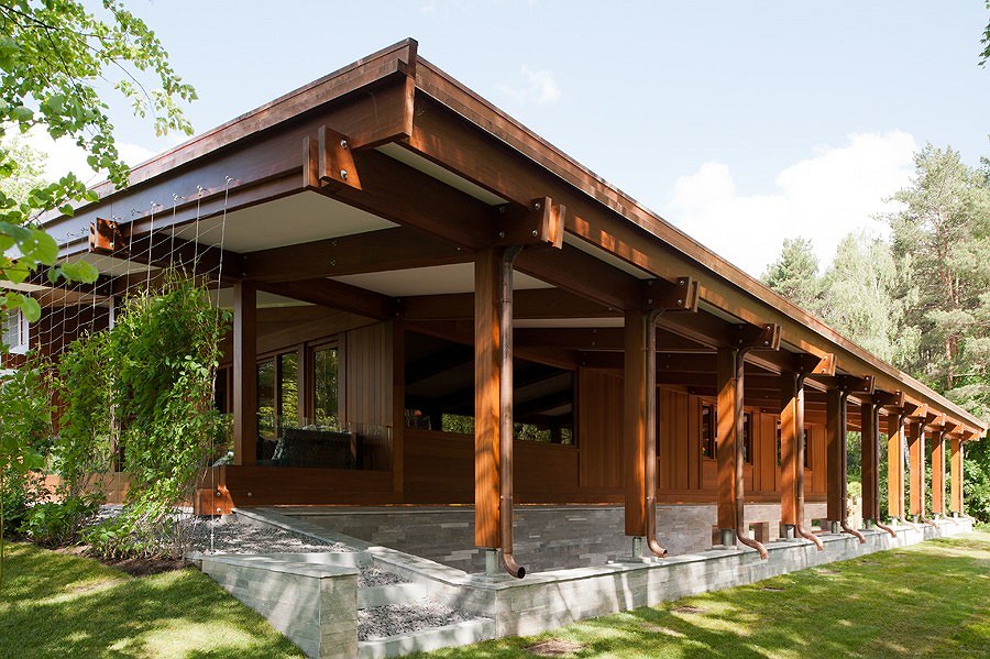
The building itself,
with its almost perfectly square layout, presents an example of architecture
that is austere and laconic. It was also not by chance, incidentally, that the
rectangular volume with a single-pitched roof appeared here - according to
Totan Kuzembaev, it is meant to remind people about the cafe that was here way
back under the Soviet times. The new house even repeats the proportions of the
building that once existed, its dimensions, and, to some extent, its
architectural solution - for example, it "borrows" the glass facade,
hidden under the awning of the sloping roof - but it is made out of the
materials of a far better quality and far more ecologically friendly.

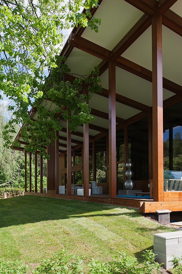
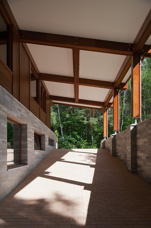
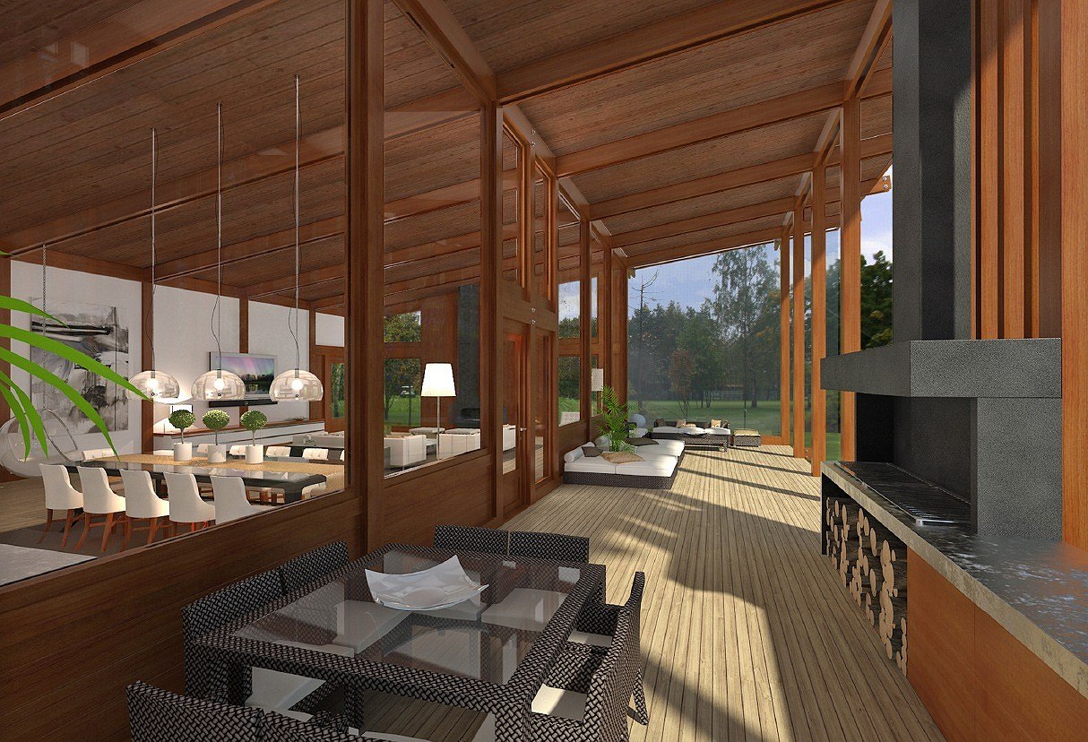
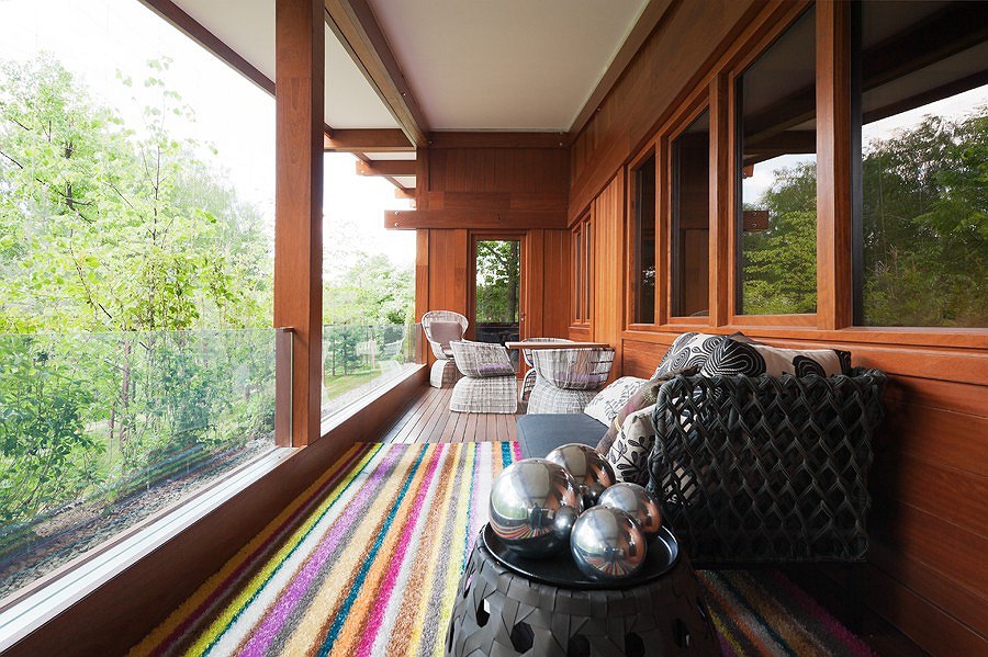
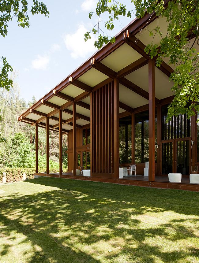
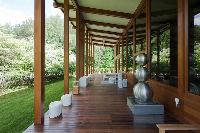
"House Next to Hole
10" sports an awning over the open terrace that also serves as the patio
where barbecue parties can be made. The array of elegant columns skirting the
edge of the wooden floor of the terrace marks the conditional boundary between
the building and its natural environment. The small partition made of wooden
strips, placed in the center, makes this boundary more palpable - and at the
same time this is the only screen that conceals the inhabitants' privacy from
prying eyes because the panoramic glass of the facade unsuspectingly opens the
residential space of the house to the picturesque woods.
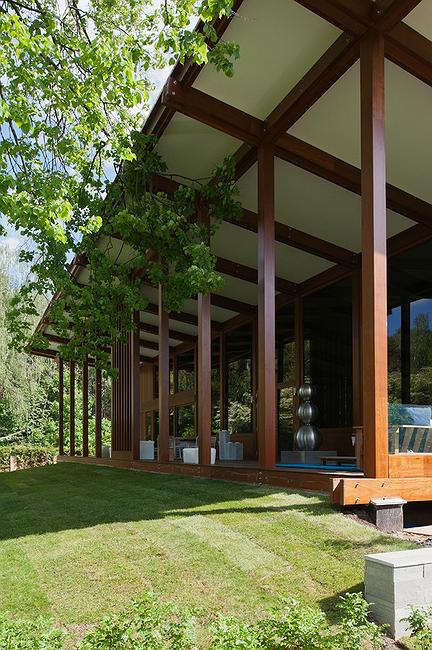
Beyond the array of
columns, the slope takes a sharp turn downwards, thanks to which the house
looks taller and more elegant, even though there is only one fully-fledged
above-ground story in it (there is also a basement floor and a loft, though).
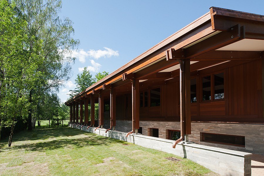
The facades are finished with tinted veneer sheets by the Italian company
"Pagano" that is a long-standing partner of Pirogovo Resort. Speaking
of the advantages of this kind of finish, Totan Kuzembaev notes its incredibly
warm texture that the Italians give to the wood, and its great consumer
properties.
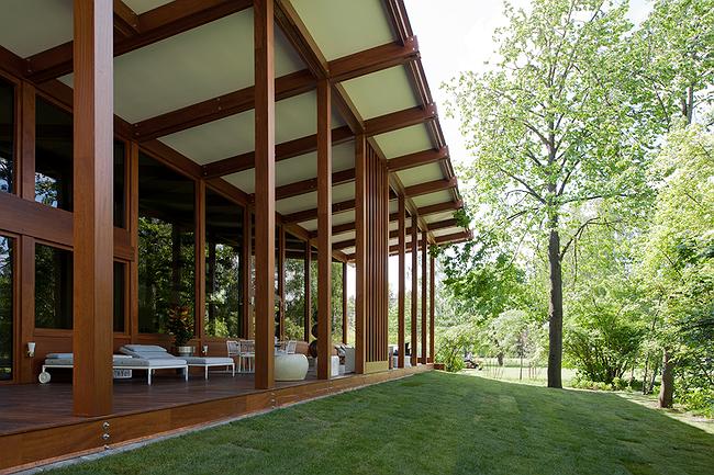
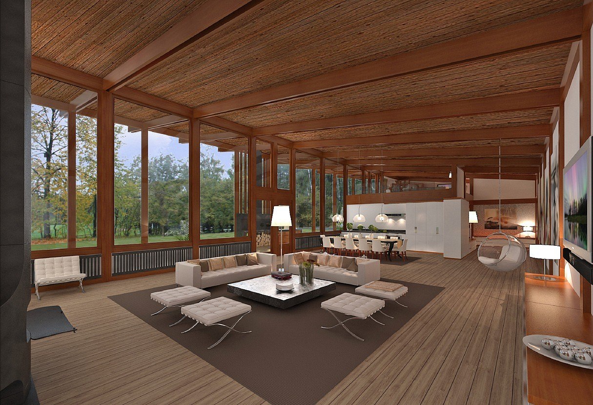
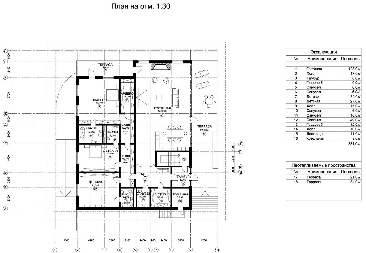
To the left of the main
facade, there is the drive-in ramp that leads to the basement floor where the
garage, the gym, and the sauna are situated. The first floor is occupied
by spacious guest bedrooms, a dining room, a kitchen, and a large living room
with a void. The loft, which is accessible by a compact stairway, can be turned
into a library or a study. It should be mentioned that the authors looked to
come up with a planning solution as flexible and as relaxed as possible, also
capable of changing in accordance with the inhabitants' needs. This house was
originally intended for sale, so the architects were not restrained by some
demanding commissioner's exact requirements - as Totan Kuzembaev shares, the
designers really enjoyed the freedom of action that they were granted, at the
same time trying to use the space as efficiently as possible. Hence, for
example, the large bedrooms for children (over 30 Sam each), the single living
room with plenty of light, and the huge window openings instead of dead walls.
This same idea to leave
the future owners with maximum freedom of creative thought accounts for the
almost Japanese minimalism of the indoor solutions. These are mostly white
walls and plaster slab ceilings, traversed by girders of dark wood. But these
only serve more to enhance the yet-unspoiled by the decoration features of the
indoor space that is filled with light and harmony of proportion. The furniture
and the designer elements that presently form the indoor decoration are
provided by the manufacturing companies and are, just as the house itself, also
available for sale. The future owner will be able to decide for himself or
herself how to fill in his or her house, and for some reason it seems that he
will inevitably prefer the austere and stylish simplicity that goes so well
with Totan Kuzembaev architecture.


