This March,
“Atrium” architectural bureau became one of the ten winners of the second stage
of the competitive bid for building “
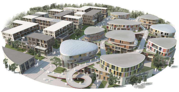
In their project, the “Atrium” architects from the very start accentuated Jean
Pistre’s two-tier compositional idea: even early on, in their first-stage
project each building consisted of a pair of two-storey volumes, put on top of
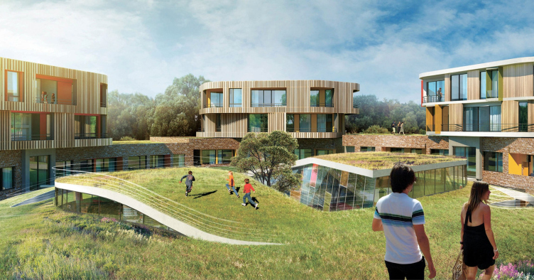
one another. This is why the mini-town became a two-level one, with “upper”
houses getting landings, grass lawns, and even hanging pedestrian footpaths of
their own. Also, the first-audition project already included splitting the
mini-town in two not only vertically but horizontally as well: into houses with
sharp corners versus houses with rounded ones. This theme graphically reflected
the main message of the entire “
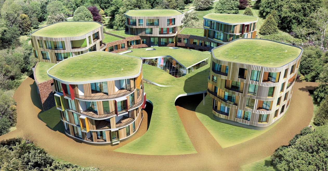
In the final second-audition project the architects were able to keep all the
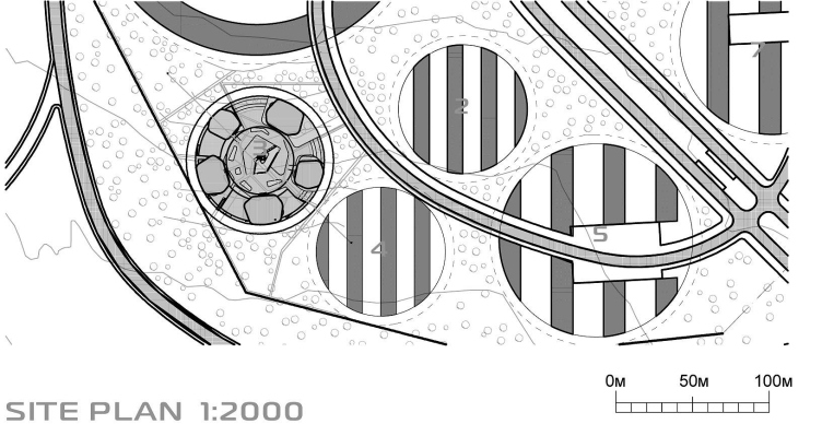
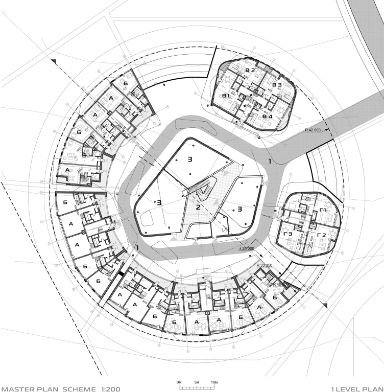
named themes, tightly packing them into the area of the small circle. One half
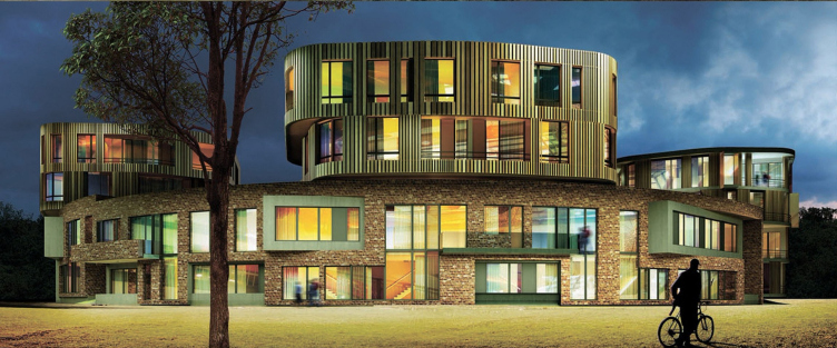
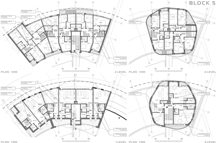
of the “islet” is formed by the “horseshoe” of the first tier: the array of
brick-faced two-storey townhouses, arching in fan-like fashion along the
perimeter of the land site and pierced with two narrow pedestrian footpaths. On
the ground floor, all the entrances, lobbies, and staircases are neatly grouped
on the yard side while the large windows command the forest view. The roof of
the “horseshoe” is going to be green, and upon this roof the architects placed
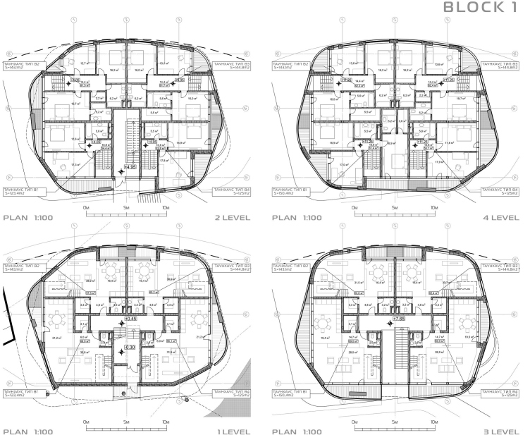
the three “tower” houses – the streamlined, almost cylindrical, volumes. Their shape
has a technogenic look: the mismatching outlines of the stories resemble fragments
of some mechanism that reflects Skolkovo’s innovation theme.
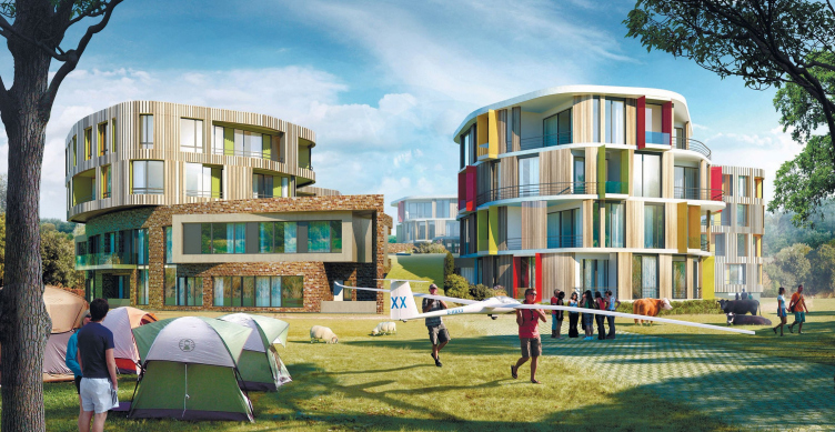
The two other four-storey towers were placed onto the other half of the circle,
this time without the "brutal-looking" base: they also have two tiers
of residential premises. Their tall rounded volumes flank the main driving
entrance to the territory of the area - not unlike in some medieval castle.
What can serve as the wall of the castle in this case is the horseshoe-shaped
brick building. This wall is not totally blind, though, the colors of the place
are quite lively, and the atmosphere is far from medieval - you may get a
fleeting memory of some guided tour to an old European city, which will sure
put you in a positive state of mind.
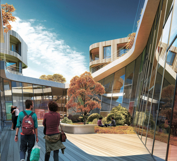
Apart from the residential quarters, the specifications included a
"children's club", a library, and, of course, a parking garage. All
of this the authors of the project placed in the central part of the
"islet", turning it into a man-made hill. This hill is in effect not
a hill but a few buildings with a gently sloping green roof that simulates the
natural relief. Along the perimeter, closer to the townhouses where the green
roof goes down, the architects placed the driveway and the parking garage, in
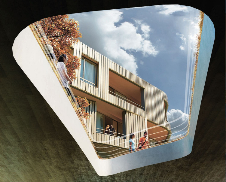
the center, around the light well of the courtyard - the library and the
"children's club". The whirlpool of walls inclined towards the
sunshine, lets the premises get enough of sunlight.
Two-Tier Life
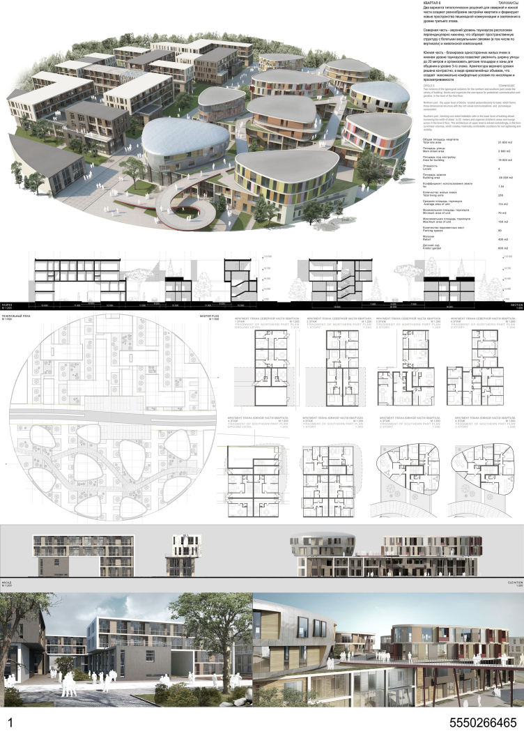
On of the projects that won the bid for Skolkovo’s “Technology Park” residential area is the townhouse quarter by Vera Butko and Anton Nadtochiy. It looks very much like a sculpture of some giant mechanism and, obviously, echoes the profession of its future inhabitants.
