По-русски

Flexibility and Acuteness of Modernity

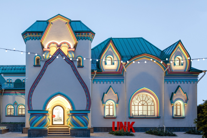
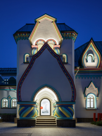
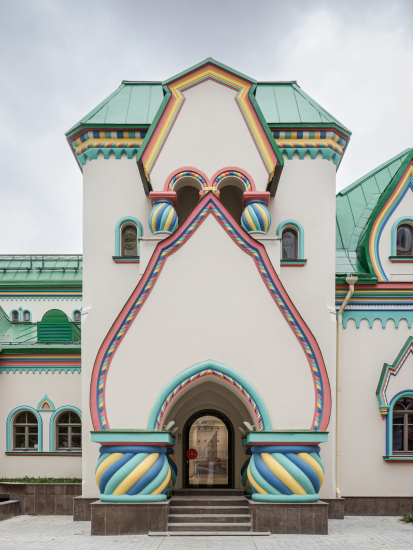
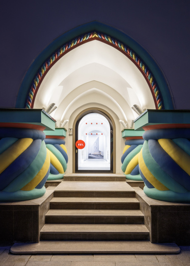
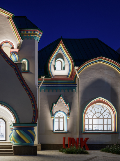
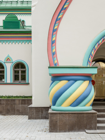
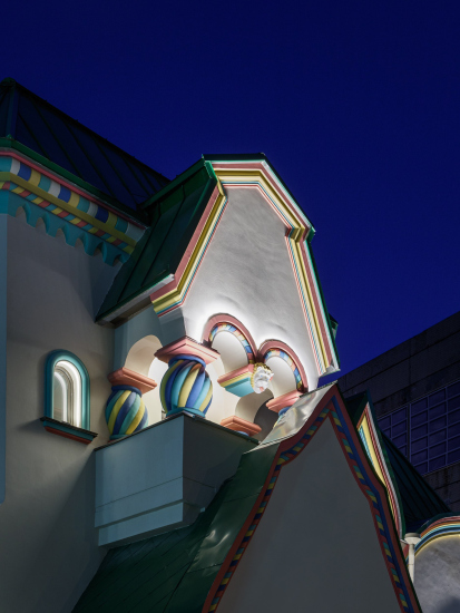
Luxurious, fluid, large “kokoshniks” and spiral barrel columns, as if made from colorful chewing gum: there seem to be no other mansion like this in Moscow, designed in the “Neo-Russian-Modern” style. And the “Teremok” on Malaya Kaluzhskaya, previously somewhat obscure, has “come alive with new colors” and gained visibility after its restoration for the office of the “architectural ecosystem” as the architects love to call themselves. It’s evident that Julius Borisov and the architects at UNK put their hearts into finding this new office and bringing it up to date. Let’s delve into the paradoxes of this mansion’s history and its plasticity. Spoiler: two versions of modernity meet here, both balancing on the razor’s edge of “what’s current”.

05 September 2024
Object
mainImg
UNK architects moved into their new office on Malaya Kaluzhskaya in August 2023, with its grand opening timed to coincide with the start of summer, Julius Borisov’s birthday – the founder of the ecosystem turned 50 – and the company’s 25th anniversary. The celebration was lively: they played the balalaika and treated the guests to red caviar.

For such an exotic Russian-style delicacy, there was – and still is – a fitting reason: UNK set up their office in a neo-Russian mansion from the early 20th century, built in 1911. Once, the head office of UNK was located on rented premises at the “Soyuz” factory, where the Luzhniki Collection residential complex is currently under construction. After that, the team was scattered all across Moscow, searching for “their home” and considering various options. While potential locations varied greatly, it is said that Julius Borisov insisted on a historical mansion. Indeed, modernists often enjoy working in historic buildings.

  • zooming
    The UNK office, Sherwood Mansion. 2024
    Copyright: Photo © Sergey Volokitin / provided by UNK
  • zooming
    The UNK office, Sherwood Mansion. 2024
    Copyright: Photo © Sergey Volokitin / provided by UNK


The mansion is the work of architect Sherwood. And here’s where the confusion begins – though it’s minor and easy to unravel. To their credit, UNK have created a detailed chronology of the mansion’s history – in the dining room, right on the wall, as is now trendy at exhibitions. They’ve also illustrated the mansion’s story with photographs, making the office feel like an exhibition in itself.

So, the confusion! It could arise, for instance, from the fact that the mansion is associated with architect Sherwood, but the project’s author was actually architect Nikolai Dmitrievich Butusov. At the time of the mansion’s completion, Butusov was 47 years old and Sherwood was 44. Both were young architects who had worked in eclecticism, neoclassicism, and modernism, and their biographies likely still await dedicated historians. Moving on: Vladimir Sherwood is not the one who designed the Historical Museum, but his son, Vladimir Vladimirovich, who, for example, created the neoclassical Titov revenue house on Old Square, located at the beginning of Ilinka Street. The Russian Sherwood architects were descendants of an English textile machine mechanic, William Sherwood, and the plot on Malaya Kaluzhskaya, now home to UNK, was the ancestral estate of his descendants. William received the plot after arriving in Moscow in 1809. In Russia, William became Vasily, and he had four sons and one daughter. One son, Ivan, who was born in England, is known for informing Alexander I about the Decembrist uprising, for which Nicholas I later added the title “Verny” (Faithful) to his surname. Another son, Joseph, was the father of Vladimir Sherwood and the grandfather of both sculptor Sergey Vladimirovich and architect Vladimir Vladimirovich. Once you start digging into architect dynasties, you can really get buried...

In 1812, William Sherwood’s house on Malaya Kaluzhskaya burned down during the Moscow fire and was later rebuilt. At some point – though probably not as early as 1813 – the Sherwood house became a wooden “Teremok” executed in a pseudo-Russian style.

The previous, wooden, Sherwoods′ Teremok in 1885; photo on display in the UNK office
Copyright: Photo © Sergey Volokitin / provided by UNK


In the mid-19th century, the house was surrounded by the Bromley factory. The factory was largely military, producing lathes for barrel turning and grenade casing, as well as ammunition. In Soviet times, it was known as “Krasny Proletariy” (Red Proletarian). Interestingly, Vladimir Sherwood Jr. was one of the architects of the Bromley factory. However, it was Nikolai Butusov who built the stone mansion. Why? We still don’t know.

Why am I telling you all this? Well, at the very least, to point out that UNK chose a location with significant, even familial, architectural history for their “nest”. It’s easy to notice that among the photos on the ground floor, the Sherwood family is placed alongside Julius Borisov’s family and colleagues – continuity is not only acknowledged but also emphasized.

Nevertheless, the architecture of “Teremok” itself is no less interesting. It appeared shortly before World War I and is an example of a fully developed “Neo-Russian” (or “Russian Revival”) style. There is almost nothing left of the pseudo-Russian style – except for the idea of giving this architectural monument a second life, revitalizing and reinterpreting it. This is not a colorful, fragmented, or even red-brick house with a “set-piece” design. It was influenced not only by the Diaghilev Seasons, Bilibin, and Vasnetsov; it represents a certain sum of reinterpreted ideas. Its forms are cohesive, large, and fluid; it’s a high-level example of modernism. You can see that the style here has reached a certain conclusion, standing at the threshold not only of historical upheavals but also of 20th-century art. This isn’t a fake imitation of 17th century chambers – this is a fairy-tale house, a theater house, or a stage set if you will.

  • zooming
    The UNK office, Sherwood Mansion. 2024
    Copyright: Photo © Sergey Volokitin / provided by UNK
  • zooming
    The UNK office, Sherwood Mansion. 2024
    Copyright: Photo © Sergey Volokitin / provided by UNK


  • zooming
    The UNK office, Sherwood Mansion. 2024
    Copyright: Photo © Sergey Volokitin / provided by UNK
  • zooming
    The UNK office, Sherwood Mansion. 2024
    Copyright: Photo © Sergey Volokitin / provided by UNK


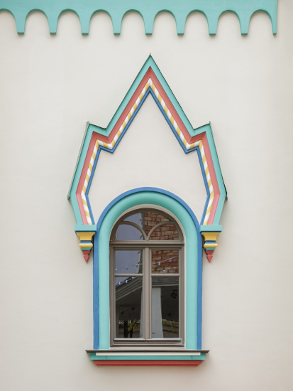
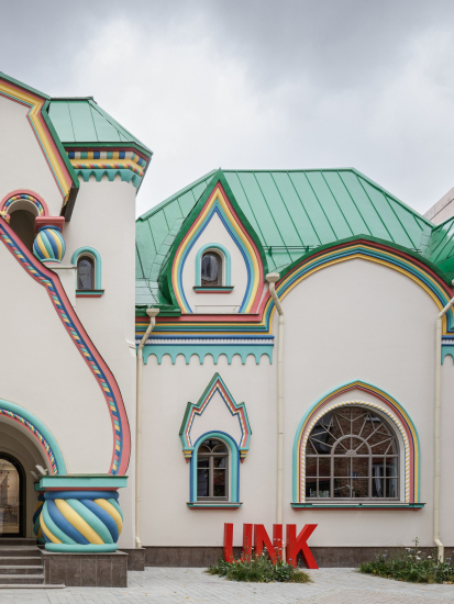
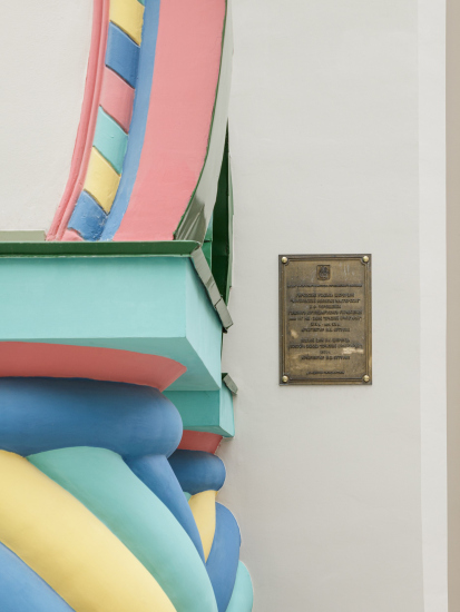
Before the restoration, Teremok was, for some reason, painted yellow with green highlights; however, its original color scheme was white with colorful details, much like the nearby Church of St. Nicholas in Khamovniki. The architects at UNK told me that they initially planned to paint the facades entirely white. But during the façade restoration, they discovered the original color scheme and, after consultations with the Department of Cultural Heritage of Moscow, they decided to reproduce it true to the original. As a result, we now see the mansion’s facades as they were originally designed in 1911.

The facades are adorned with lively, colorful details. It must be said that this was a successful outcome: it highlights how positively contemporary this 1911 building is.

To some extent, Butusov’s Teremok even seems postmodern. Just look at the spiral, barrel-like columns on the porch – they look as if they were made from colorful 1980s chewing gum. Hundertwasser also comes to mind.

  • zooming
    The UNK office, Sherwood Mansion. 2024
    Copyright: Photo © Sergey Volokitin / provided by UNK
  • zooming
    The UNK office, Sherwood Mansion. 2024
    Copyright: Photo © Sergey Volokitin / provided by UNK


  • zooming
    The UNK office, Sherwood Mansion. 2024
    Copyright: Photo © Sergey Volokitin / provided by UNK
  • zooming
    The UNK office, Sherwood Mansion. 2024
    Copyright: Photo © Sergey Volokitin / provided by UNK


In short, Teremok stands as an example of modernism that had reached the “revolutionary” boundary and was ready to engage with contemporary art.

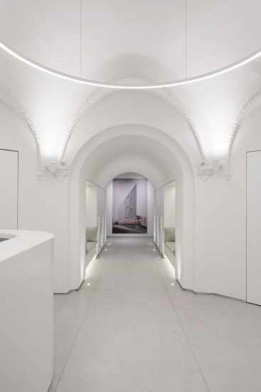
This is exactly what happens in the interior, where the architects were given free rein to fully explore the use of white.

“Our interior is like an egg” UNK architects say. And that’s quite accurate: you step inside, and it feels like entering a giant eggshell; images of spaceships (or even paradise?) from the movies come to mind. Everything is white, round, and glowing, and the edges and joints of the forms are often barely distinguishable. You really feel like a chick – it’s tempting to joke that we’ve entered the “egg of contemporary art”, or in this case, architecture. The egg is a metaphor with great potential; it’s enough to recall that in many myths, the world is born from an egg, making it an apt image for architectural creativity, which gives birth to both volume and space “out of nothing”, or at least out of some kind of passive matter.

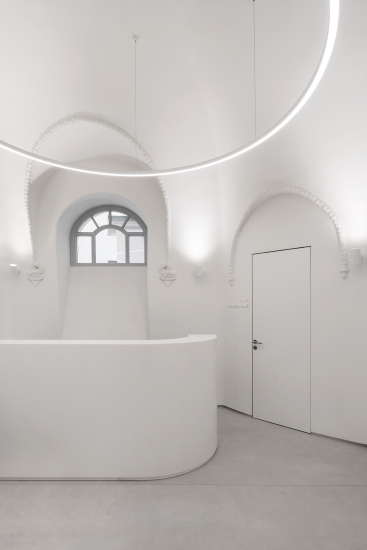
These numerous “roundings” are part of Butusov’s original architecture but were also added in a few places: for instance, in the curved reception desk in the entrance hall, or in elements like plumbing fixtures, round tables, and circular and disc-shaped lamps. The designers amplified the potential of these curves, particularly with the help of disc lamps, bringing the abstraction of the circle to the forefront.


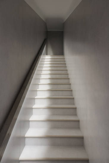
The whiteness is further emphasized by the lighting, including fixtures built into the floor or the handrail of the staircase leading down. The plasticity of the interior is quite unique: there are many curved surfaces, yet they don’t feel heavy, solid, or even corporeal. On the contrary, thanks to the whiteness and lighting, the structure feels ethereal, almost virtual, like something out of a film or video game, or as if it’s made from a sheet of white paper. In this way, another metaphor comes to mind, replacing the eggshell – the metaphor of a blank sheet, or perhaps a screen, an architectural “canvas” on which, or “within which”, ideas and forms are born.

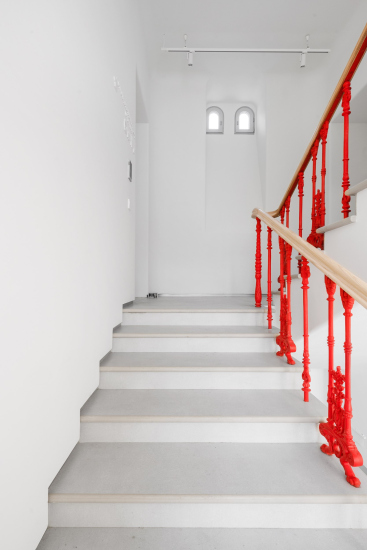
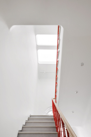
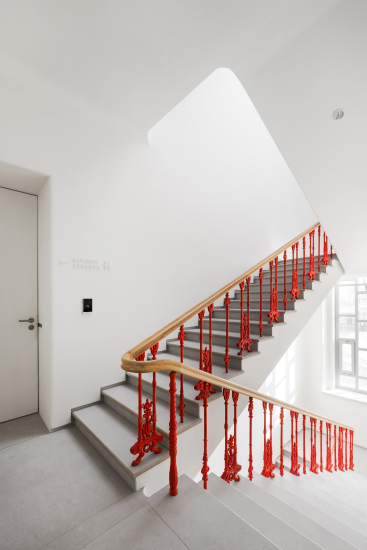
Light, whiteness, and curving shapes are particularly noticeable on the staircase, where the architects introduced skylights, creating a “crescendo” in the development of the interior’s design.

It’s here, on the staircase, that we suddenly realize there is color in the interior. Color appears on a historical element – the cast-iron railings – and predictably, it’s bright red, UNK’s signature color. However, this red seems to lean towards a somewhat “Soviet” scarlet hue, likely due to the abundance of light streaming in from all sides.

  • zooming
    The UNK office, Sherwood Mansion. 2024
    Copyright: Photo © Sergey Volokitin / provided by UNK
  • zooming
    The UNK office, Sherwood Mansion. 2024
    Copyright: Photo © Sergey Volokitin / provided by UNK


Nevertheless, this accent is quite appropriate and even serves as the structural core of the building. Strictly speaking, a staircase is almost always the core of the building – functionally, symbolically, or both. Here, it seems all the elements come together, including the “shaft” of light: from the natural daylight streaming through the skylights to the delicate glow of the handrail’s lighting, leading down to the basement. As you descend, it might even seem like the light is spilling onto the steps from above, though that’s not the case. But the idea is carried through quite consistently.

  • zooming
    The UNK office, Sherwood Mansion. 2024
    Copyright: Photo © Sergey Volokitin / provided by UNK
  • zooming
    The UNK office, Sherwood Mansion. 2024
    Copyright: Photo © Sergey Volokitin / provided by UNK


I should note that while the façade’s “Russian Revival” style is very modern, flexible, and streamlined to a high degree of novelty, while the historical decor elements preserved inside are quite traditional and lean towards the 19th century. The cast-iron balusters of the stair railings are beautiful but relatively standard for their time; there’s no modernist fluidity in them, except perhaps a hint of Hoffmann’s “goat legs”. Maybe that’s why they were chosen as the color accent – because their form stands out from the flexible plasticity of the interior?

Another historical element, the relief nervures copied by Butusov from the Terem Palace and adorning the edges of the dome’s vaults in the entrance vestibule, were left white by the UNK architects. As a result, you don’t notice them when entering Teremok, but rather when leaving it.

  • zooming
    The UNK office, Sherwood Mansion. 2024
    Copyright: Photo © Sergey Volokitin / provided by UNK
  • zooming
    The UNK office, Sherwood Mansion. 2024
    Copyright: Photo © Sergey Volokitin / provided by UNK


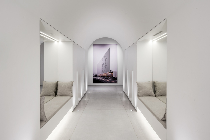
When you enter, you first see two mirrors vis-a-vis, a familiar but always striking way to expand the space, and a photograph of the “Akademik” business center at the end of the corridor beneath the cylindrical vault.

  • zooming
    The UNK office, Sherwood Mansion. 2024
    Copyright: Photo © Sergey Volokitin / provided by UNK
  • zooming
    The UNK office, Sherwood Mansion. 2024
    Copyright: Photo © Sergey Volokitin / provided by UNK


This photograph is quite appropriate here. It not only directly shows that you’ve entered the architects’ office, but it also subtly introduces the incoming visitor to its conceptual structure. The office is built around UNK’s milestone projects – and Julius Borisov constantly emphasizes that his mission is to work with unique objects – thus, the navigation is organized on a “project-to-project” basis. Each meeting room has a name: “Saturday,” “Akademik”, “Atom”, “Orbital”. All of this is reflected on signs, which are everywhere, embossed and also white.

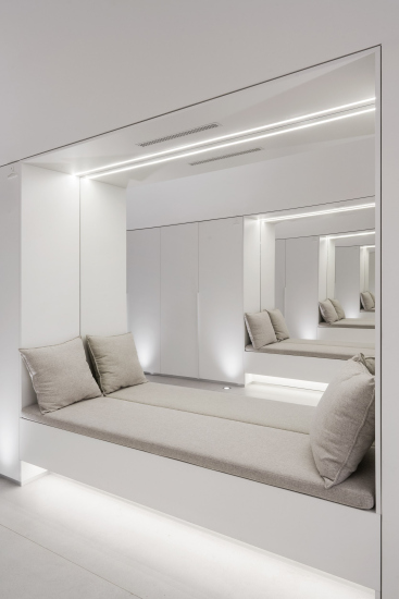
Color is present here not just as the scarlet accent of the railings. Since UNK has significant experience in designing office and public interiors, they followed modern trends in their own office as well: downstairs, in addition to a dining area, there is a public space with an amphitheater, and on all floors, starting from the entrance, there are cozy recesses for private conversations. Throughout, the pristine white is complemented by the natural greenery of plants from the “winter garden”, light wood accents, and fabric of similar hues on the sofas. The sofas don’t clash with the main theme; instead, they blend into the evenly glowing space and enhance it. In their curious “neutral” way, the sofas also enliven the inner space of the mansion.


Ultimately, the choice of the mansion turned out to be a good one.

And not only because the architects gained possession of a flashy-looking and interesting monument of Moscow architecture, which they restored, and which you feel more and more like visiting like an exciting guided tour of both history and modernity. And not even because they now also have a luxurious courtyard where the summer presentation of the new office took place, and inside there is not only a workspace but also a public area with an amphitheater and a large screen for lectures, a dining area with a kitchen, and many cozy “corners” for conversations, as is customary in modern office interiors. There is more to it than that!

In addition to all of the “common decencies” of the modern office that are perhaps worthy of mentioning, yet are hardly worthy of any excessive praise, the key aspect of this project is the intriguing dialogue between understanding architectural form as such and the search for modern identity. This building, back in its time, was at the forefront of novelty, designed in the spirit of Russian Revival, which was one of the trending styles back then. Needless to say, after coming full circle, the architectural agenda (or at least one of its agendas) has once again returned to questions of identity. Today, for those who dare to engage in such experiments, this search is even more relevant than it was a hundred years ago, but it takes place within a contemporary paradigm. In Julius Borisov’s projects, such experiments haven’t been noticed yet, but in their new office, UNK architects provide a more nuanced answer to the same question: by settling into a historic mansion in the “Neo-Russ” style, they conceptualized its interiors as ultra-modern, while still creating a clear stylistic connection between the building’s interiors and façades. Being here, you can feel that there are 112 years between them, yet they are like kindred spirits, continuing the same theme of flexible novelty, whiteness, and cohesive form. And that’s when it becomes clear how much our times have in common. It dawns on you that the theme that was set over a century ago continues to evolve even now.

In other words, you realize at this point that there is a certain mystery embedded in the very word combination “modern architecture”. It shouldn’t be taken too literally.

05 September 2024

Headlines now
A Unique Representative
The recently concluded year 2024 can be considered the year of completion for the “Garden Quarters” residential complex in Moscow’s Khamovniki. This project is well-known and, in many ways, iconic. Rarely does one manage to preserve such a number of original ideas, achieving in the end a kind of urban planning Gesamtkunstwerk. Here is a subjective view from an architecture journalist, with an interview with Sergey Skuratov soon to follow.
Field of Life
The new project by the architectural company PNKB (an acronym for “Design, Research, and Advisory Bureau”), led by Sergey Gnedovsky and Anton Lyubimkin, for the Kulikovo Field Museum is dedicated to the field as a concept in its own right. The field has long been a focus of the museum’s thorough and successful research. Accordingly, the exterior of the new museum building is gentler than that of its predecessor, which was also designed by PNKB and dedicated specifically to the historic battle. Inside, however, the building confidently guides the visitor from a luminous atrium along a spiral path to the field – interpreted here as a field of life.
A Paper Clip above the River
In this article, we talk with Vitaly Lutz from the Genplan Institute of Moscow about the design and unique features of the pedestrian bridge that now links the two banks of the Yauza River in the new cluster of Bauman Moscow State Technical University (MSTU). The bridge’s form and functionality – particularly the inclusion of an amphitheater suspended over the river – were conceived during the planning phase of the territory’s development. Typically, this approach is not standard practice, but the architects advocate for it, referring to this intermediate project phase as the “pre-AGR” stage (AGR stands for Architectural and Urban Planning Approval). Such a practice, they argue, helps define key parameters of future projects and bridge the gap between urban planning and architectural design.
Living in the Architecture of One’s Own Making
Do architects design houses for themselves? You bet! In this article, we are examining a new book by TATLIN publishing house. This book – unprecedented for Russia – features 52 private homes designed and built by contemporary architects for themselves. It includes houses that are famous, even iconic, as well as lesser-known ones; large and small, stylish and eccentric. To some extent, the book reflects the history of Russian architecture over the past 30 years.
A City Block Isoline
Another competition project for a residential complex on the banks of the Volga in Nizhny Novgorod has been prepared by Studio 44. A team of architects led by Ivan Kozhin concluded that using a regular block layout in such a location would be inappropriate and developed a “custom design” approach: a chain of parceled multi-section buildings stretching along the entire embankment. Let’s explore the features and advantages of this unconventional method.
Competition: The Price of Creativity?
Any day now, we’re expecting the results of a competition held by the “Samolet” development group for a plot in Kommunarka. In the meantime, we share the impressions of Editor-in-Chief Julia Tarabarina, who managed to conduct a public talk. Though technically focused on the interaction between developers and architects, the public talk turned into a discussion about the pros and cons of architectural competitions.
Terraced Design
The “River Park” residential complex has confidently and securely shaped the Nagatinsky Backwater shoreline. Featuring a public embankment, elevated courtyards connected by pedestrian bridges, and brick façades, the development invites exploration of its nuanced response to the surrounding context, as well as hints of the architects’ megalithic design thinking.
A Kremlin’s Core and Meteorite Fragments
We continue our coverage of the competition projects for the residential district that the development company GloraX plans to build along the embankment of the Rowing Channel in Nizhny Novgorod. ASADOV Architects approached the concept through a deep dive into local identity, using storytelling to pinpoint a central idea for the design: the master plan and composition are imagined as if a meteorite had struck a “proto-Kremlin”. Sounds weird? Find more details below!
The Volga Regatta
GloraX plans to develop a residential complex spanning 14 hectares along the Volga River in Nizhny Novgorod. The winning design in a closed-door competition, created by GORA Architects, features housing typologies ranging from townhouses to terraced high-rise slabs, a balance of functions, diverse ways of engaging with the water, and even a dedicated island (no less!) for the city residents.
Life Plans
The master plan for the residential district “Prityazheniye” (“Gravity”) in Naberezhnye Chelny was developed by the architectural company A.Len, taking into account the specific urban planning context and partially implemented solutions of the first phase. However, the master plan prioritized its own values: a green framework, a system of focal points, a hierarchy of spaces, and pedestrian priority. After this, the question of what residents will do in their neighborhood simply doesn’t arise.
A New Track
We took a thorough look at D_Station, a railcar repair depot dating back to 1906, recently reconstructed while preserving its century-old industrial structure, upon the project by Sergey Trukhanov and T+T Architects. Though work on the interiors – set to house restaurants and public spaces – is still underway, the building’s exterior already offers plenty to see. Visitors can explore the blend of old and new brickwork, appreciate the architect’s unique interpretation of ruin aesthetics, and enjoy the newly built pedestrian route that connects the Citydel Business Center’s arches to Kazakova Street.
Four Different Surveys
The “Explore the City” competition, organized this year by the Genplan Institute of Moscow, stands out as a pretty unconventional one for the architectural field but aligns perfectly well with the character of urban planning work. The winning project analyzed contemporary residential complexes, combining urban planning insights with a realtor’s perspective to propose a hybrid approach. Other entries explored public centers, motivations for car ownership, and housing vacancy rates. A fifth participant withdrew. Here’s a closer look at the four completed works.
Scheduled Evolution
ASADOV Architects unveiled the EvyCenter pavilion, a microcultural hub for fostering personal growth, organizing workshops, and doing gymnastics. Additionally, this pavilion serves as a prototype for a scalable country house, drawing inspiration from the “Loskutok” project, and constructed from CLT panels in a factory. This marks the beginning of a developer project initiated by the architectural firm (sic!), which is seeking partners to expand both small Evy settlements and even larger Evy cities, which are, according to Andrey Asadov, aimed at fostering the “evolutionary” development of the people who will inhabit them.
The Golden Crown
The concept for a dental clinic in Yekaterinburg, developed by CNTR Studio, revolves around the idea of a “mouth full of gold”: pristine white porcelain stoneware walls are complemented by matte brass details. To avoid an overly literal interpretation, the architects focused on the building’s proportions, skillfully navigating between sunlight requirements and fire safety regulations.
Flexibility and Integration
Not long ago, we covered the project for the fourth phase of the ÁLIA residential complex, designed by APEX. Now, we’ve been shown different fence concepts they developed to enclose the complex’s private courtyards, incorporating a variety of public functions. We believe that the sheer fact that the complex’s architects were involved in such a detail as fencing speaks volumes.
A Step Forward
The HIDE residential complex represents a major milestone for ADM architects and their leaders Andrey Romanov and Ekaterina Kuznetsova in their quest for a fresh high-rise aesthetic – one that is flexible and layered, capable of bringing vibrancy to mass and silhouette while shaping form. Over recent years, this approach has become ADM’s “signature style”, with the golden HIDE tower playing a pivotal role in its evolution. Here, we delve into the project’s story, explore the details of the complex’s design, and uncover its core essence.
Gold in the Sands
A new office for a transcontinental company specializing in resource extraction and processing has opened in Dubai. Designed by T+T Architects, masters of creating spaces that are contemporary, diverse, flexible, and original, this project exemplifies their expertise. On the executive floor, a massive brass-clad partition dominates, while layered textures of compressed earth create a contextually resonant backdrop.
Layers and Levels of Flight
This project goes way back – Reserve Union won this architectural competition at the end of 2011, and the building was completed in 2018, so it’s practically “archival”. However, despite being relatively unknown, the building can hardly be considered “dated” and remains a prime example of architectural expression, particularly in the headquarters genre. And it’s especially fitting for an aviation company office. In some ways, it resembles the Aeroflot headquarters at Sheremetyevo but with its own unique identity, following the signature style of Vladimir Plotkin. In this article, we take an in-depth look at the United Aircraft Corporation (UAC) headquarters in the Moscow agglomeration town of Zhukovsky, supplemented by recent photographs from Alexey Naroditsky – a shoot that became only recently possible due to the fact that improvements were finally made in the surrounding area.
Light and Shadow
In this article, we delve into the architectural design of the “Chaika” house by DNK ag architects, which was recently completed in 2023 as part of the collection of signature designs at ZILArt. As is well-known, all the buildings in this complex follow a design code, yet each one is distinct. This particular building stands out not only for its whiteness and minimalism but also for the refined use of a limited number of techniques that, together, create what can confidently be called synergy.
Casus Novae
A master plan was developed for a large residential area with a name of “DNS City”, but now that its implementation began, the plan has been arbitrarily reformatted and replaced with something that, while similar on the surface, is actually quite different. This is not the first time such a thing happens, but it’s always frustrating. With permission from the author, we are sharing Maria Elkina’s post.
Treasure Hunting
The GAFA bureau, in collaboration with Tegola and Arkhitail, organized an expedition to the island of Kilpola in Karelia as part of Moskomarkhitektura’s “Open City” festival. There, amidst moss and rocks, the students sought answers to questions like: what is the sacred, where does it dwell, and what sustains it? Assisting the participants in this quest were landscape engineer Evgeny Levin, artist Nicholas Roerich, a moose, and the lack of cellular connection. Here’s how the story unfolded.
Depths of the Earth, Streams of Water
In the Malaya Okhta district, the Akzent building, designed by Stepan Liphart, was constructed. It follows a classic tripartite structure, yet it’s what you might call “hand-drawn”: each façade is unique in its form and details, some of which aren’t immediately noticeable. In this article, we explore the context and, together with the architect, delve into how the form was developed.
Fir Tree Dynamics
The “Airports of Region” holding is planning to build an airport in Karachay-Cherkessia, aiming to make the Arkhyz and Dombay resorts more accessible to travelers. The project that won in an invitation-only competition, submitted by Sergey Nikeshkin’s KPLN, blends natural imagery inspired by the shape of a conifer seed, open-air waiting spaces, majestic large trees, and a green roof elevated on needle-like columns. The result is both nature-inspired and WOW.
​A Brick Shell
In the process of designing a clubhouse situated among pine trees in a prestigious suburban area near Moscow, the architectural firm “A.Len” did the façade design part. The combination of different types of brick and masonry correlates with the volumetric and plastique solutions, further enhanced by the inclusion of wood-painted fragments and metal “glazing”.
Word Forms
ATRIUM architects love ambitious challenges, and for the firm’s thirtieth anniversary, they boldly play a game of words with an exhibition that dives deep into a self-created vocabulary. They immerse their projects – especially art installations – into this glossary, as if plunging into a current of their own. You feel as if you’re flowing through the veins of pure art, immersed in a universe of vertical cities, educational spaces – of which the architects are true masters – and the cultural codes of various locations. But what truly captivates is the bold statement that Vera Butko and Anton Nadtochy make, both through their work and this exhibition: architecture, above all, is art – the art of working with form and space.
Flexibility and Acuteness of Modernity
Luxurious, fluid, large “kokoshniks” and spiral barrel columns, as if made from colorful chewing gum: there seem to be no other mansion like this in Moscow, designed in the “Neo-Russian-Modern” style. And the “Teremok” on Malaya Kaluzhskaya, previously somewhat obscure, has “come alive with new colors” and gained visibility after its restoration for the office of the “architectural ecosystem” as the architects love to call themselves. It’s evident that Julius Borisov and the architects at UNK put their hearts into finding this new office and bringing it up to date. Let’s delve into the paradoxes of this mansion’s history and its plasticity. Spoiler: two versions of modernity meet here, both balancing on the razor’s edge of “what’s current”.
Yuri Vissarionov: “A modular house does not belong to the land”
It belongs to space, or to the air... It turns out that 3D printing is more effective when combined with a modular approach: the house is built in a workshop and then adapted to the site, including on uneven terrain. Yuri Vissarionov shares his latest experience in designing tourist complexes, both in central Russia and in the south. These include houseboats, homes printed from lightweight concrete using a 3D printer, and, of course, frame houses.
​Moscow’s First
“The quality of education largely depends on the quality of the educational environment”. This principle of the last decade has been realized by Sergey Skuratov in the project for the First Moscow Gymnasium on Rostovskaya Embankment in the Khamovniki district. The building seamlessly integrates into the complex urban landscape, responding both to the pedestrian flow of the city and the quiet alleyways. It skillfully takes advantage of the height differences and aligns with modern trends in educational space design. Let’s take a closer look.
Looking at the Water
The site of Villa Sonata stretches from the road to the water’s edge, offering its own shoreline, pier, and a picturesque river panorama. To reveal these sweeping views, Roman Leonidov “cut” the façade diagonally parallel to the river, thus getting two main axes for the house and, consequently, “two heads”. The internal core – two double-height spaces, a living room and a conservatory, with a “bridge” above them – makes the house both “transparent” and filled with light.
The White Wing
Well, it’s not exactly white. It’s more of a beige, white-stone structure that plays with the color of limestone – smoother surfaces are lighter, while rougher ones are darker. This wing unites various elements: it absorbs and interprets the surrounding themes. It responds to everything, yet maintains a cohesive expression – a challenging task! – while also incorporating recognizable features of its own, such as the dynamic cuts at the bottom, top, and middle.