По-русски

​The Red Building

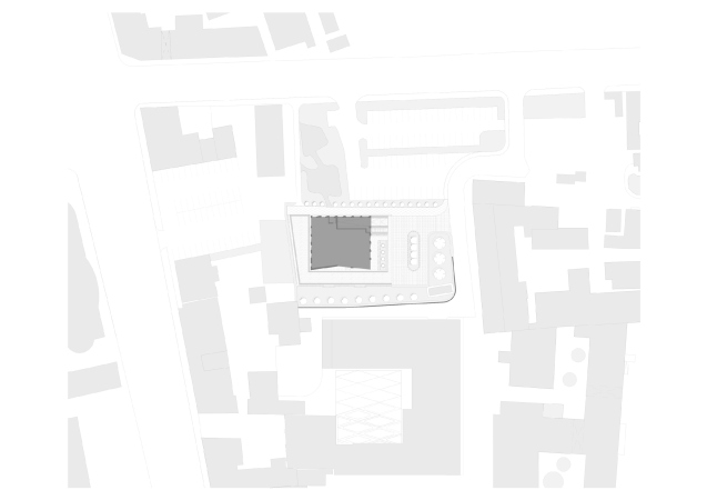
The area of Novoslobodskaya has received Maison Rouge – an apartment complex designed by ADM, which continues the wave of renovation, started by the Atmosphere business center, from the side of the Palikha Street.

24 March 2021
Object
mainImg
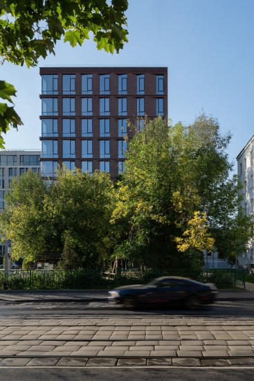
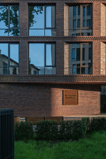
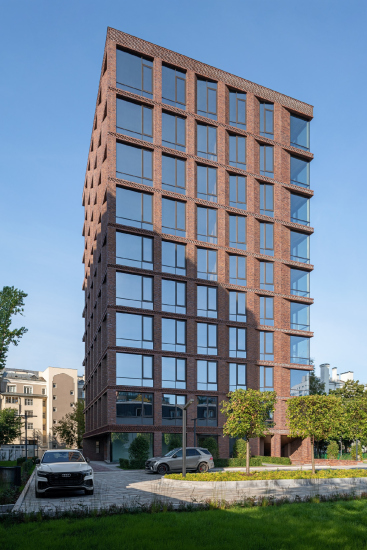
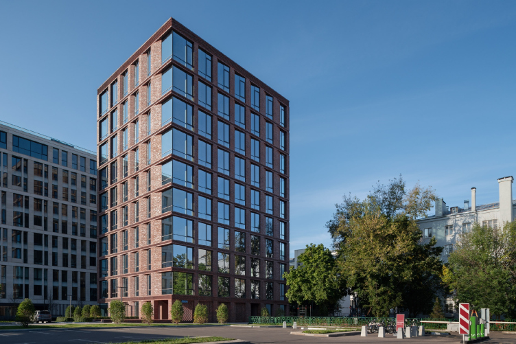
The Palikha Street is very quiet and very “Moscow” in its character: probably, this feeling appears thanks to the tramway lines and the surrounding low-rise construction, interspersed with rather green yards. The street does not have a continuous redline – it is now and then interrupted by a little park, or a parking lot, or just by a vacant space. Thus, the new premium-class residential complex Maison Rouge, designed by ADM Architects for the developer company MR Group, is plainly visible from Palikha, even though it does step back from the redline, its glass-and-brick confidently assets itself against the background of the neighboring buildings.

  • zooming
    “Maison Rouge” residential complex
    Copyright: Photograph © Yaroslav Lukyanchenko / provided by ADM architects
  • zooming
    “Maison Rouge” residential complex
    Copyright: Photograph © Yaroslav Lukyanchenko / provided by ADM architects


The immediate context essentially consists of one building, designed and built by the same authors, Andrey Romanov and Ekaterina Kuznetsova, and coated by light-colored stone – the Nouveau building of the residential complex Renome. It should be said that ADM Architects have been working with the city area, which lies between the Palikha, Sushchevskaya, and Novoslobodskaya streets, for already about a decade – they started in 2011 from reconstructing the buildings of the XIX weaving factory for the Atmosphere business center, then Renome appeared. Maison Rouge is the most recent building here – its project appeared in2017. “This is quite an independent project – Andrey Romanov emphasizes – It’s got a different client, and a different architectural solution.”

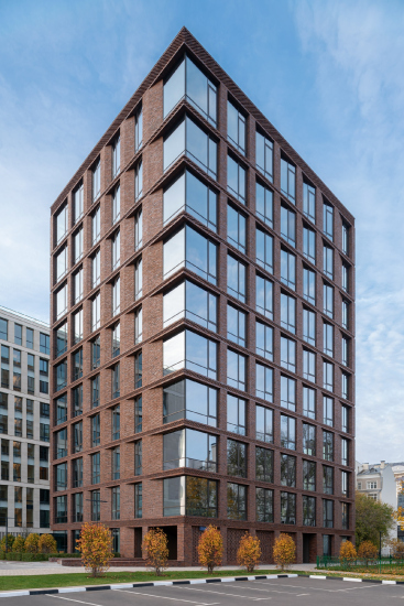
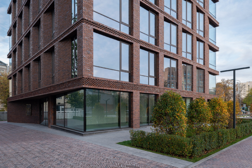
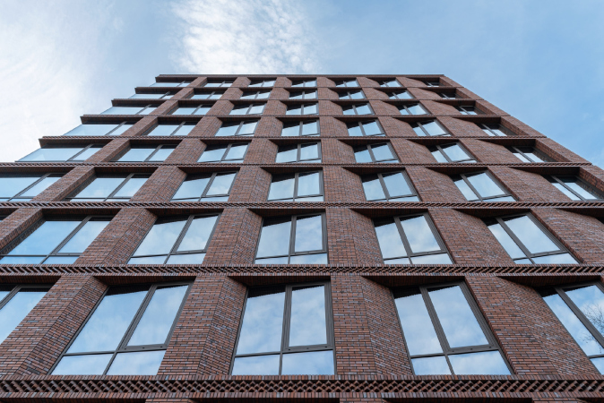
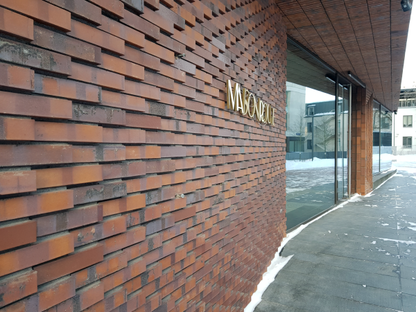
The house does indeed look more modern against its context: the crystal-clear volume, livened up by asymmetric “gradient” of the facade verticals, large windows reaching to the floor, expensive German bricks, little and of varying tones, with inclusions of textured masonry – all of these do not leave a shadow of doubt in the relevance of the architectural solution.

  • zooming
    “Maison Rouge” residential complex
    Copyright: Photograph © Yaroslav Lukyanchenko / provided by ADM architects
  • zooming
    “Maison Rouge” residential complex
    Copyright: Photograph © Yaroslav Lukyanchenko / provided by ADM architects


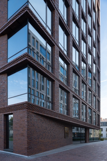
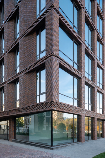
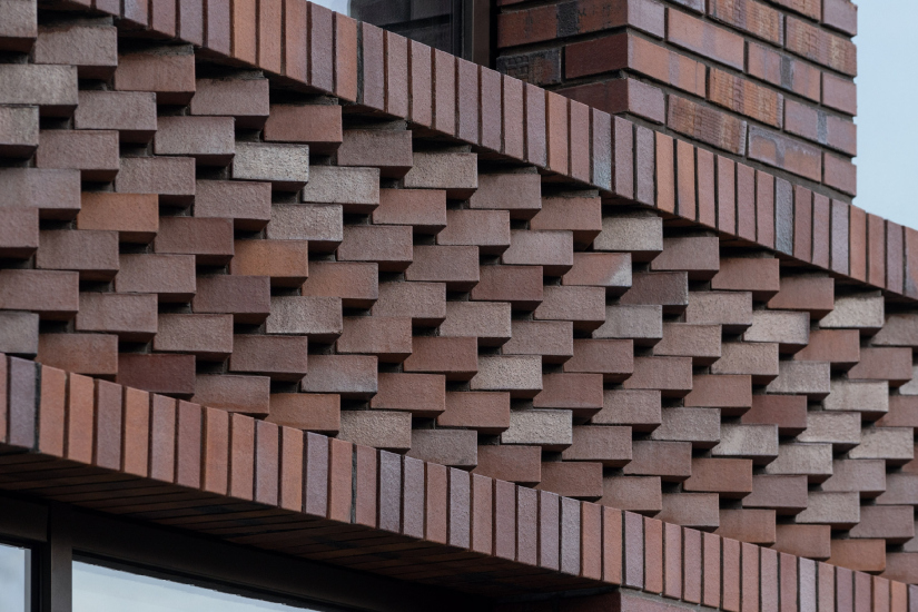
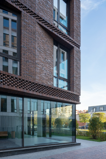
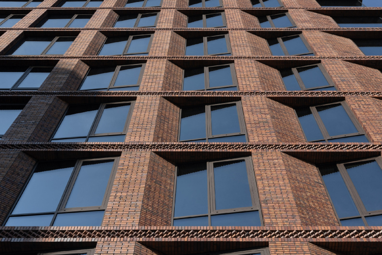
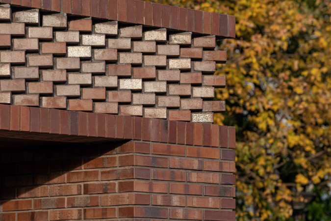
Unlike in the neighboring building, which belongs to the Renome housing complex, the Maison Rouge windows are not grouped in pairs vertically, and the game of plastique unfolds in a quite different direction. The stability of the form is ensured by the thin horizontals of intermediate belts between the floors: they all are accentuated by the textured herringbone masonry, which reacts perfectly well to the contrastive play of light and shade – a solution that is a direct opposite of the smooth intermediate friezes of Renome. Belts of equal height dissect the floors at clear and regular intervals; only two belts are thicker – the topmost and the bottommost one, the latter corresponding to the floor of the second story.

  • zooming
    “Maison Rouge” residential complex
    Copyright: Photograph © Yaroslav Lukyanchenko / provided by ADM architects
  • zooming
    “Maison Rouge” residential complex
    Copyright: Photograph © Yaroslav Lukyanchenko / provided by ADM architects


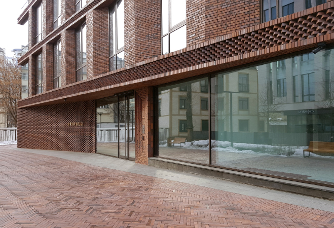
The basement mold that you would normally expect on the ground level is virtually nonexistent, or, rather, it is minimal, only adjusting the fluctuations between the floor level on the inside and the gradually lowering pavement on the outside: the glass of the first floor literally grows from the ground – this technique makes it possible to build the visual connection between the inner space of the lobby with the world outside and present the volume as light and ethereal. 

  • zooming
    “Maison Rouge” residential complex
    Copyright: Photograph © Yaroslav Lukyanchenko / provided by ADM architects
  • zooming
    “Maison Rouge” residential complex
    Copyright: Photograph © Yaroslav Lukyanchenko / provided by ADM architects


The dynamic plastique is ensured by the verticals. If we are to look at each of the walls en face, we will see that on the left side the width of the piers increases, a single-sided chamfer appears, which gradually becomes less and less sloping, and the windowpane, growing narrower, also turns at an angle – a peculiar wave runs over each of the facades, which, nonetheless, does not violate the external surface of the wall. The plan of the building looks like a rectangle of very soft proportions, almost a square, and this is the reason why the facades are almost identical: there are five piers on the lateral facades, and six on the longitudinal ones. The direction of the faceted wave is also the same everywhere – it circles the perimeters of the building, enshrouding it in a peculiar “vortex”. But then again, this can only be seen on the plan.

  • zooming
    “Maison Rouge” residential complex
    Copyright: Photograph © Yaroslav Lukyanchenko / provided by ADM architects
  • zooming
    Plans of the 4-8 floors. “Maison Rouge” residential complex
    Copyright: © ADM


The corners of the building, however, which could also have been designed identical, got a diagonal difference – two of them are “fastened” with a vertical mold, and two others are completely made of glass. If we are to take a look at the plan once again (overlooking some minor technical details), we could see that it is composed of two identical right-angled triangles, turned to one another at a 180-degree angle, and “joined” along their hypotenuses, the sharp angles constituting the halves of the glass corners of the house, the floor plan consisting of two similar larger and two similar smaller apartments. This geometrical game of figures of similarity gives the design some additional internal logic.

The northeast open corner is turned to the Palikha Street and functions a little bit like a facade accent – an element that attracts the gaze of the passers-by.

“Maison Rouge” residential complex
Copyright: Photograph © Yaroslav Lukyanchenko / provided by ADM architects


When looking at the facades from the pedestrian’s position, the “wave” rather works for a variety of perception from different angles: sometimes the glitter of glass is more noticeable, sometimes the brick surfaces. When viewed from the bottom up, the edges are projected onto the protrusions of the intermediate floors in a zigzag pattern, making the observer take interest in the internal logic of the sequential changing pattern.

“Maison Rouge” residential complex
Copyright: Photograph © Yaroslav Lukyanchenko / provided by ADM architects


And the essence of the facade plastique in this case consists in finding the optimal balance between the weightless glass and the sturdy brick “matter”, bringing them harmoniously together. 

The brick chamfers, so important for facade plastique, get a response in the design of the entrance group. It is turned to the south and to the center of the block, which allowed maximum illumination of the quiet area in front of the door with sunlight reflected by the stained glass window. The entrance itself is a triangular niche stretching the entire width of the facade: on the left, there is an extended bevel with embossed brickwork, on the right it is mostly glass. The brick slope is reflected in the glass and, when viewed from a certain angle, reality and reflection add up to form a sharp illusory “nose”.

  • zooming
    1 / 5
    “Maison Rouge” residential complex
    Copyright: Photograph © Yaroslav Lukyanchenko / provided by ADM architects
  • zooming
    2 / 5
    “Maison Rouge” residential complex. Location plan
    Copyright: © ADM
  • zooming
    3 / 5
    Plan of the 1st floor. “Maison Rouge” residential complex
    Copyright: © ADM
  • zooming
    4 / 5
    “Maison Rouge” residential complex
    Copyright: Photograph © Yaroslav Lukyanchenko / provided by ADM architects
  • zooming
    5 / 5
    The main entrance. “Maison Rouge” residential complex
    Copyright: Photograph: Archi.ru


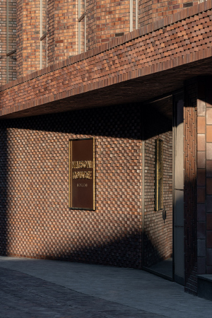
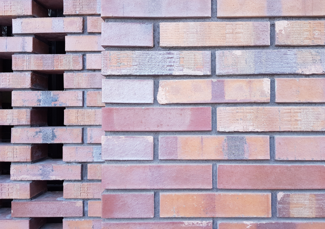
On the opposite, northern, side there is an entrance to the ramp leading to the underground parking garage; it is covered with a lattice of bricks arranged in a checkerboard pattern.

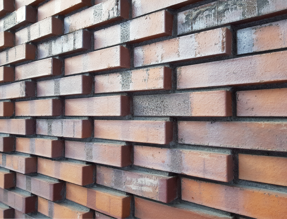
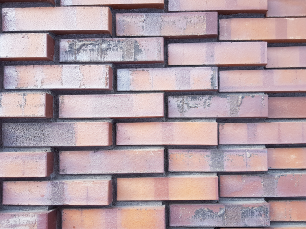
The brick itself – an expensive German clinker mounted on a subsystem – is a separate topic, since in this case it is used as the main material and is responsible for the building’s name (Maison Rouge means Red House), as well as for the texture, imagery, and for the expensive “glamorous” look of the facade, glittering in the sun with metallic splashes in unison with the glitter of the window panes. The color of the brick was originally planned as a wine-red; in the implemented version it took on a slightly more muted terracotta shade, but due to the different colors and inclusions, in different lighting conditions, it looks sometimes brown, and sometimes pink.

  • zooming
    1 / 5
    “Maison Rouge” residential complex
    Copyright: Photograph © Yaroslav Lukyanchenko / provided by ADM architects
  • zooming
    2 / 5
    “Maison Rouge” residential complex / masonry examples
    Copyright: Photograph: Archi.ru
  • zooming
    3 / 5
    “Maison Rouge” residential complex / masonry examples
    Copyright: Photograph: Archi.ru
  • zooming
    4 / 5
    “Maison Rouge” residential complex / masonry examples
    Copyright: Photograph: Archi.ru
  • zooming
    5 / 5
    “Maison Rouge” residential complex / brickwork examples
    Copyright: Photograph: Archi.ru


The brick also accentuates the contextual nature of the building – all the old Moscow houses around it, although stuccoed, are brick on the inside. At the same time, if we are to look at Maison Rouge from the Héritage building of the Renome residential complex, we cannot but notice some parallels between these two brick volumes: they both flank a volume of light stone, forming a well-orchestrated composition, united by the same authorship.

But then again, Maison Rouge is separated from the neighboring Renome both by a fence and a slight (about one meter) height drop. There is no single in-block space forming between them, even though you can indeed walk through the block from end to end (we will note in passing that the guards of the Renome residential complex recently stopped an attempt by one of the authors of this article to pass through the grounds from Palikha to Novoslobodskaya; but the Maison Rouge site is open to the city and is perceived as pleasant and friendly: security here is provided by other, more modern means).

The new project is essentially an apartment building, which does not necessitate for a highly developed yard, and the surrounding territory is quite small. However, there are city sights adjoining to it, which were improved in accordance with the municipal program. The architects proposed initial sketches, the department implemented them, and the authors are generally satisfied with the result – the house eventually acquired, in addition to its own small (0.14 hectare) plot, a pleasant environment of trees, bushes and benches. The territory from the Palikha side is not fenced off, and the building, in a win-win situation, merges with the city space. On the other hand, the red Klinker paving around the Maison Rouge refers to its own landscaping and, on the one hand, marks the boundaries of the plot, and on the other, it figuratively supports the main theme: a brick house is surrounded by a brick pavement; walking around it, we also feel the Klinker bricks underneath our feet, and the city begins to feel like a church floor of the XVII century, paved in a “herringbone” pattern. 

But then again, all the historical and contextual associations are no more than conditional, and are essentially based on the sheer fact of working with the brick texture. But even the Klinker brick does not leave a shadow of doubt in the contemporary nature of the solution. Furthermore, the very fact that the architects opted for this kind of brick and carefully worked with it, creating the brick “skin” of the house, where each turn of the brickwork demonstrates the integrity of the terracotta texture is part of the trend of Moscow architecture of the last 15 years.

So, the building is “in trend”, and, in addition, it formed a confident accent both from the side of the Palikha Street, where Maison Rouge fills in a small lacuna, and on the side of the Novoslobodskaya Street, where the volume is plainly visible in the break of the redline, in the stead of the former marketplace. This, basically, is what the whole project was all about: about bringing some compositional logic to the dense and chaotic city block, and expanding the landscaped public space.

24 March 2021

Headlines now
The Golden Crown
The concept for a dental clinic in Yekaterinburg, developed by CNTR Studio, revolves around the idea of a “mouth full of gold”: pristine white porcelain stoneware walls are complemented by matte brass details. To avoid an overly literal interpretation, the architects focused on the building’s proportions, skillfully navigating between sunlight requirements and fire safety regulations.
Flexibility and Integration
Not long ago, we covered the project for the fourth phase of the ÁLIA residential complex, designed by APEX. Now, we’ve been shown different fence concepts they developed to enclose the complex’s private courtyards, incorporating a variety of public functions. We believe that the sheer fact that the complex’s architects were involved in such a detail as fencing speaks volumes.
A Step Forward
The HIDE residential complex represents a major milestone for ADM architects and their leaders Andrey Romanov and Ekaterina Kuznetsova in their quest for a fresh high-rise aesthetic – one that is flexible and layered, capable of bringing vibrancy to mass and silhouette while shaping form. Over recent years, this approach has become ADM’s “signature style”, with the golden HIDE tower playing a pivotal role in its evolution. Here, we delve into the project’s story, explore the details of the complex’s design, and uncover its core essence.
Gold in the Sands
A new office for a transcontinental company specializing in resource extraction and processing has opened in Dubai. Designed by T+T Architects, masters of creating spaces that are contemporary, diverse, flexible, and original, this project exemplifies their expertise. On the executive floor, a massive brass-clad partition dominates, while layered textures of compressed earth create a contextually resonant backdrop.
Layers and Levels of Flight
This project goes way back – Reserve Union won this architectural competition at the end of 2011, and the building was completed in 2018, so it’s practically “archival”. However, despite being relatively unknown, the building can hardly be considered “dated” and remains a prime example of architectural expression, particularly in the headquarters genre. And it’s especially fitting for an aviation company office. In some ways, it resembles the Aeroflot headquarters at Sheremetyevo but with its own unique identity, following the signature style of Vladimir Plotkin. In this article, we take an in-depth look at the United Aircraft Corporation (UAC) headquarters in the Moscow agglomeration town of Zhukovsky, supplemented by recent photographs from Alexey Naroditsky – a shoot that became only recently possible due to the fact that improvements were finally made in the surrounding area.
Light and Shadow
In this article, we delve into the architectural design of the “Chaika” house by DNK ag architects, which was recently completed in 2023 as part of the collection of signature designs at ZILArt. As is well-known, all the buildings in this complex follow a design code, yet each one is distinct. This particular building stands out not only for its whiteness and minimalism but also for the refined use of a limited number of techniques that, together, create what can confidently be called synergy.
Casus Novae
A master plan was developed for a large residential area with a name of “DNS City”, but now that its implementation began, the plan has been arbitrarily reformatted and replaced with something that, while similar on the surface, is actually quite different. This is not the first time such a thing happens, but it’s always frustrating. With permission from the author, we are sharing Maria Elkina’s post.
Treasure Hunting
The GAFA bureau, in collaboration with Tegola and Arkhitail, organized an expedition to the island of Kilpola in Karelia as part of Moskomarkhitektura’s “Open City” festival. There, amidst moss and rocks, the students sought answers to questions like: what is the sacred, where does it dwell, and what sustains it? Assisting the participants in this quest were landscape engineer Evgeny Levin, artist Nicholas Roerich, a moose, and the lack of cellular connection. Here’s how the story unfolded.
Depths of the Earth, Streams of Water
In the Malaya Okhta district, the Akzent building, designed by Stepan Liphart, was constructed. It follows a classic tripartite structure, yet it’s what you might call “hand-drawn”: each façade is unique in its form and details, some of which aren’t immediately noticeable. In this article, we explore the context and, together with the architect, delve into how the form was developed.
Fir Tree Dynamics
The “Airports of Region” holding is planning to build an airport in Karachay-Cherkessia, aiming to make the Arkhyz and Dombay resorts more accessible to travelers. The project that won in an invitation-only competition, submitted by Sergey Nikeshkin’s KPLN, blends natural imagery inspired by the shape of a conifer seed, open-air waiting spaces, majestic large trees, and a green roof elevated on needle-like columns. The result is both nature-inspired and WOW.
​A Brick Shell
In the process of designing a clubhouse situated among pine trees in a prestigious suburban area near Moscow, the architectural firm “A.Len” did the façade design part. The combination of different types of brick and masonry correlates with the volumetric and plastique solutions, further enhanced by the inclusion of wood-painted fragments and metal “glazing”.
Word Forms
ATRIUM architects love ambitious challenges, and for the firm’s thirtieth anniversary, they boldly play a game of words with an exhibition that dives deep into a self-created vocabulary. They immerse their projects – especially art installations – into this glossary, as if plunging into a current of their own. You feel as if you’re flowing through the veins of pure art, immersed in a universe of vertical cities, educational spaces – of which the architects are true masters – and the cultural codes of various locations. But what truly captivates is the bold statement that Vera Butko and Anton Nadtochy make, both through their work and this exhibition: architecture, above all, is art – the art of working with form and space.
Flexibility and Acuteness of Modernity
Luxurious, fluid, large “kokoshniks” and spiral barrel columns, as if made from colorful chewing gum: there seem to be no other mansion like this in Moscow, designed in the “Neo-Russian-Modern” style. And the “Teremok” on Malaya Kaluzhskaya, previously somewhat obscure, has “come alive with new colors” and gained visibility after its restoration for the office of the “architectural ecosystem” as the architects love to call themselves. It’s evident that Julius Borisov and the architects at UNK put their hearts into finding this new office and bringing it up to date. Let’s delve into the paradoxes of this mansion’s history and its plasticity. Spoiler: two versions of modernity meet here, both balancing on the razor’s edge of “what’s current”.
Yuri Vissarionov: “A modular house does not belong to the land”
It belongs to space, or to the air... It turns out that 3D printing is more effective when combined with a modular approach: the house is built in a workshop and then adapted to the site, including on uneven terrain. Yuri Vissarionov shares his latest experience in designing tourist complexes, both in central Russia and in the south. These include houseboats, homes printed from lightweight concrete using a 3D printer, and, of course, frame houses.
​Moscow’s First
“The quality of education largely depends on the quality of the educational environment”. This principle of the last decade has been realized by Sergey Skuratov in the project for the First Moscow Gymnasium on Rostovskaya Embankment in the Khamovniki district. The building seamlessly integrates into the complex urban landscape, responding both to the pedestrian flow of the city and the quiet alleyways. It skillfully takes advantage of the height differences and aligns with modern trends in educational space design. Let’s take a closer look.
Looking at the Water
The site of Villa Sonata stretches from the road to the water’s edge, offering its own shoreline, pier, and a picturesque river panorama. To reveal these sweeping views, Roman Leonidov “cut” the façade diagonally parallel to the river, thus getting two main axes for the house and, consequently, “two heads”. The internal core – two double-height spaces, a living room and a conservatory, with a “bridge” above them – makes the house both “transparent” and filled with light.
The White Wing
Well, it’s not exactly white. It’s more of a beige, white-stone structure that plays with the color of limestone – smoother surfaces are lighter, while rougher ones are darker. This wing unites various elements: it absorbs and interprets the surrounding themes. It responds to everything, yet maintains a cohesive expression – a challenging task! – while also incorporating recognizable features of its own, such as the dynamic cuts at the bottom, top, and middle.
Urban Dunes
The XSA Ramps team designed and built a three-part sports hub for a park in Rostov-on-Don, welcoming people of all ages and fitness levels. The skate plaza, pump track, and playground are all meticulously crafted with details that attract a diverse range of visitors. The technical execution of the shapes and slopes transforms this space into a kind of sculptural composition.
Proportional Growth
The project for the fourth phase of the ÁLIA residential area has been announced. The buildings are situated on an elongated plot – almost a “ray” that shoots out from the center of the area towards the river. Their layout reflects both a response to Moscow’s architectural preferences over the past 15 years, shifting “from blocks to towers”, and an interpretation of the neighboring business park designed by SOM. Additionally, the best apartments here are not located at the very top but closer to the middle, forming a glowing “waistline”.
The “Staircase” Building
In designing the “Details” residential complex in New Moscow, Rais Baishev spiced up the now-popular Moscow theme of a “courtyard” building with an idea drawn from the surrealist drawings by Maurits Escher. He envisioned the stepped silhouettes and descending slopes as a metaphysical mega-staircase, creating a key void within the courtyard that gave the project an internal “spine”. This concept is felt both in the building’s silhouette and on its façades.
Projection of the Quarter
No one doubted that the building that Vladimir Plotkin designed as part of the “Garden Quarters” would be the most modernist of all. And it turned out just that way: while adhering to the common design code, the building successfully combines brick and white stone, rhythmically responding to the neighboring building designed by Ostozhenka, yet tactfully and persistently making a few statements of its own. This includes the projection of the ideal urban development composition “14–9–6”, which can be found right next door, mathematical calculations, including those for various types of terraces (and perhaps the only reminder of the Soviet past of the Kauchuk rubber factory!), and the white “cross-stitch” pattern of the façade grid.
Domus Aurea
In this issue, we examine the “Tessinsky-1” house, designed by Sergey Skuratov and completed in 2023. Located in the middle of the Serebryanicheskaya Embankment district, at the intersection of its main streets, this house assumes a sort of “nodal” role: it not only responds to everything around it and preserves many memories of the former EMA factory within itself, but it weaves all this into a newly directed pattern, reconciling bright “gold” and dark-colored brick, largely with the help of the new, modern-yet-archaic Columba brick, which, come to think about it, is the most precious element here.
The Chimney of Nikola-Lenivets
In this issue, we are examining the “Obelisk House” designed by KATARSIS and built for the Arkhstoyanie 2023 festival. However, it was only finished later on, and this is why we are examining it now. It seems to us that after the “Obelisk House” appeared in Nikola-Lenivets, a dialogue and a few inner connections appeared between the temporary structures built here. These houses no longer look like “accidental neighbors”, more of which below.
​Periscope by the Bay
The jury awarded the second place in the competition for a public and cultural center in Petropavlovsk-Kamchatsky to the companies GORA (“Mountain”) and M4. In the consortium’s proposal, the building resembles a sperm whale with a calf swimming next to it or a periscope, whose lenses capture the most spectacular views from the surrounding landscape.
From Arcs to Dolmens
While working on the competition project for Petropavlovsk-Kamchatsky, ASADOV Architects prioritized the value of the natural and urban environment, aiming to preserve the balance of the location while minimizing the resemblance of the volume that they designed to a “traditional building”. The task was challenging, and the architects created three versions, one of which having been developed after the competition, where their main proposal took third place. However, the point of interest here is not the competition result but the continuity of creative thinking.
Hide and Seek
The ID Moskovskiy house, designed by Stepan Liphart in St. Petersburg, in the courtyards near Moskovskiy Avenue beyond the Obvodny Canal and recently completed, is notable for several reasons. Firstly, it has been realized with considerable accuracy, which is particularly significant as this is the first building where the architect was responsible not only for the facades but also for the layouts, allowing for better integration between the two. On the other hand, this building is interesting as an example of the “germination” of new architecture in the city: it draws on the best examples from the neighborhood and becomes an improved and developed sum of ideas found by the architect in the surrounding context.
The Big Twelve
Yesterday, the winners of the Moscow Mayor’s Architecture Award were announced and honored. Let’s take a look at what was awarded and, in some cases, even critique this esteemed award. After all, there is always room for improvement, right?
Above the Golden Horn
The residential complex “Philosophy” designed by T+T architects in Vladivostok, is one of the new projects in the “Golubinaya Pad” area, changing its development philosophy (pun intended) from single houses to a comprehensive approach. The buildings are organized along public streets, varying in height and format, with one house even executed in gallery typology, featuring a cantilever leaning on an art object.
Nuanced Alternative
How can you rhyme a square and space? Easily! But to do so, you need to rhyme everything you can possibly think of: weave everything together, like in a tensegrity structure, and find your own optics too. The new exhibition at GES-2 does just that, offering its visitor a new perspective on the history of art spanning 150 years, infused with the hope for endless multiplicity of worlds and art histories. Read on to see how this is achieved and how the exhibition design by Evgeny Ace contributes to it.
Blinds for Ice
An ice arena has been constructed in Domodedovo based on a project by Yuri Vissarionov Architects. To prevent the long façade, a technical requirement for winter sports facilities, from appearing monotonous, the architects proposed the use of suspended structures with multidirectional slats. This design protects the ice from direct sunlight while giving the wall texture and detail.