Archi.ru:
– When we take Zaryadye Park project as a whole, what do you consider to be its main features?
Charles Renfro, Diller Scofidio + Renfro:
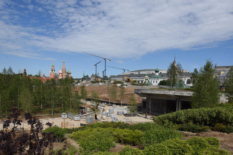
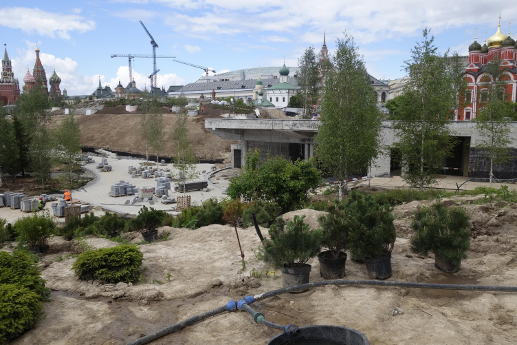
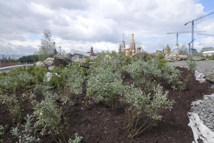
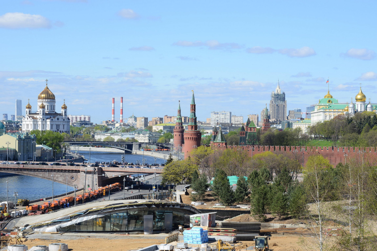
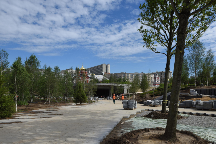
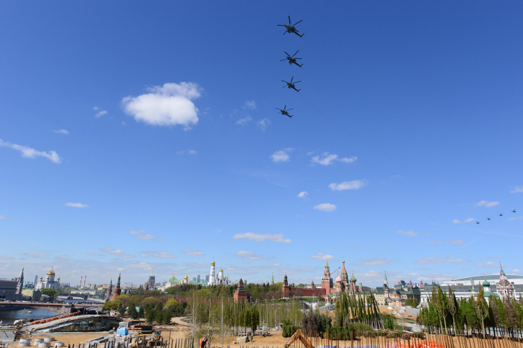
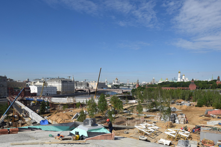
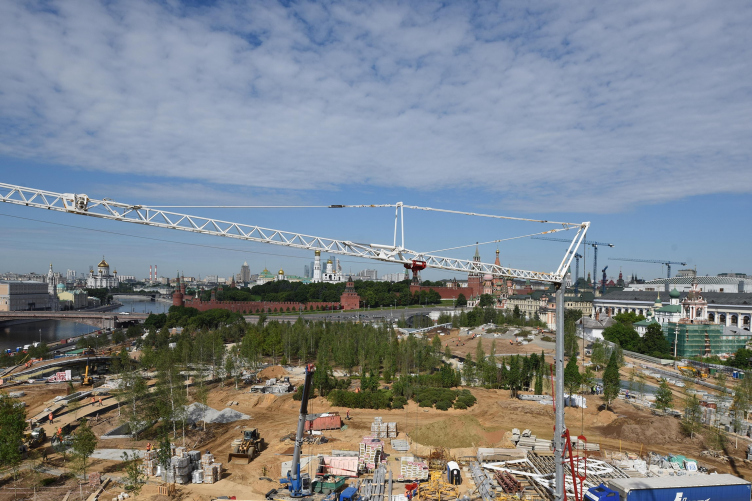
– From my point of view, the park is not about any one particular place but about a set of encounters that, taken together, form a new kind of experience that’s completely unique. It begins in a very critical way – meaning the front door. Although the park is very porous, you can enter it in at many points, but we imagine that majority of the people will enter the park from the Red Square, at the northwest corner close to St. Basil’s Cathedral. That’s where we establish the kind of mood and atmosphere shift that we hope the park can achieve, through something that we have termed “wild urbanism”. This is a specific overlay and merger of the urban conditions of Red Square and the surrounding blocks of Moscow with the natural environments that are found around Moscow and around Russia. This is a kind of doubling up of environmental quality – one natural and one man-made. There are many other places in the park that further elaborate on the idea of environmental augmentation, in such a way that one is outside, but with a different experience of nature. It does not feel exactly like a forest, but rather like a new kind of landscape that is made specifically for this place. While we believe that the park is distinct from Moscow, it’s natural, you can lose yourself there. It’s also a place where visitors rediscover Moscow, through lookouts and visual connections that are unusual; these vantage points, on the top of the hill, or hanging out over the river, or adjacent to the city streets within this kind of protected natural environment, are new and did not previously exist. The park is a place apart from Moscow, but actually it rooted in Moscow as well. In that regard, it recalls our studio’s work on the High Line park in New York, which is elevated 30 feet above the city streets but is also visually connected to every part of New York. It is actually a way to re-engage with the city.
Ken Haines, Hargreaves Associates:
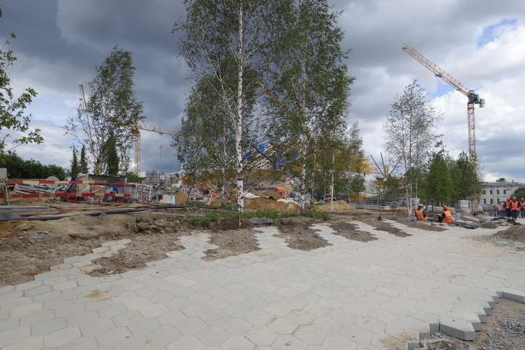
– What we think is special, different, and unique about this park is the integration of architecture and landscape, and the blurring of boundaries and lines. On a large scale, with buildings tucked into the topography, and also at a detailed level, with the way that paving doesn’t have a distinct edge. It is integration of paving and planting, not paving with a curb and then planting; it’s integrational at multiple levels.
– At first, when you presented your competition project, it was, I suppose, the most spectacular of all the finalists’ works. It was quite a brave thing to propose something like this in the heart of Moscow, considering the historical context, UNESCO site, and so on. What was your goal when you did it? Did you think that Moscow needed something spectacular – like an amusement park?
Charles Renfro:
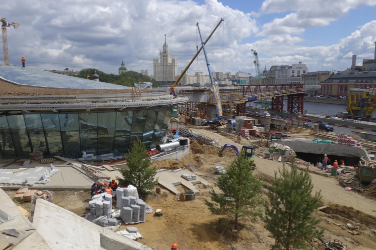
– I would answer this in three ways. One way is to say that the brief for the project contained a lot of enclosed space that would be traditionally made as a building. And, in fact, we have a lot of enclosed space underneath the surface of the park. So, the first response was to not put buildings on the park, and to come up with a system that integrates landscape and architecture in such a way that the built form is for the most part hidden. In certain views, it’s completely gone, and, in other views, it reveals itself as the building fronts. Our tactical solution was to make the built enclosed form less present. We believe that we came up with a completely unique response to this site, and to the program for enclosed spaces, where landscape and architecture are merged, and a kind of new formal language emerged. That new formal language achieves two things: it brings a kind of unmistakable contemporaneity to the center of Moscow – there is a great deal of glazing, and of long-span and cantilevered structures. The design is very subdued, in that it’s underneath the landscape; it doesn’t have much of a skyline presence, and doesn’t compete with the existing monuments of Moscow. At the same time, it doesn’t sound shy. It doesn’t say: “You know, I am not something new!” It says: “I am actually this new way of dealing with the problem”. The approach acknowledges the historic features of central Moscow by not sitting on the land and exerting itself in iconic ways as built form. Some of the other competition entries placed buildings on the site, and made extravagant formal gestures; our entry was quite innovative and striking, but it purposefully did not compete with the UNESCO heritage site of the Kremlin and St. Basil’s. The goal was to create an experience for the city which complements the architectural experience of the rest of Moscow.
– But the bridge is iconic, I suppose? It asserts itself.
Charles Renfro:
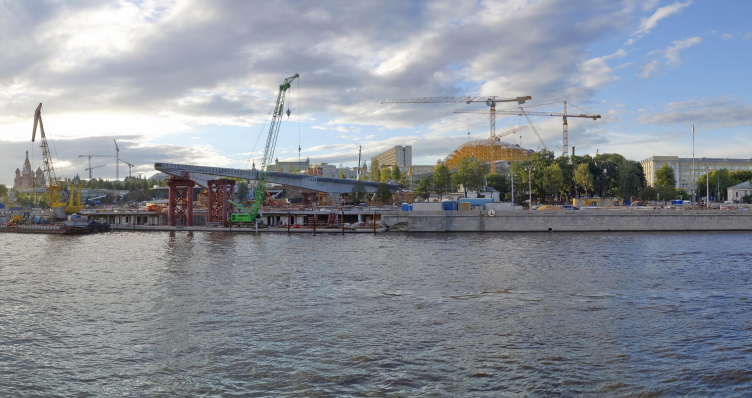
– The bridge is definitely something one can take a picture of, but it is not a bridge in the traditional sense; it doesn’t go from Point A to Point B. However, the bridge is positioned over the river to give people a completely unique experience of the water, being suspended some 10 meters above it. Its intention is to make a place to experience the city while on it, and not to look out or to think of it as the new icon of the park. Undoubtedly, it will receive a lot of attention. By the way, one of the things that has happened since we started working with the local contractors is that the building system changed into concrete, which gave it more mass, compared to the lightness of the steel bridge proposed in the original competition entry. This has resulted in a more imposing character; we don’t think it’s necessarily bad, it’s just different from our original intent.
– I see. And what about other changes? Perhaps, something that you changed while working on this project or something that changed because of some other forces?
Charles Renfro:
– If you look at the competition entry and what’s being built, all of the essential elements are there, including the different landscapes and their particular relationships to one another. We’re very pleased that it’s turned out this way. On the other hand, as is normal in any complex urban project that has many layers, there are forces at work that didn’t come to light until the project moved forward. For instance, the entire elevation of the park has risen several meters, and that, in effect, gave some of the elements of the architecture more presence than they were conceived of in the competition phase. The benefit to that elevation change is that there are more places in the park where you feel you’re linked to the city. But changes like this were dimensional and elevational, and not conceptual. We also would love to have been able to work more on the passive energy systems that were in the original plan. Many of them are not in place – the way that the architecture itself has been built into the landscape to trap heat and to let sun in, and to keep elements like the rain and snow off of you – that feature is still there. We initially proposed some systems of ground source heat, water circulation, and other various measure, that were taken out of the project for cost reasons – typical things that happen to projects – but those elements are totally invisible. And, frankly, the way that these spaces will feel and work is much the way we anticipated when we won the competition.
– But I suppose that now, after all these changes, the park wouldn’t get any sustainability awards and certificates? Or is it possible still?
Charles Renfro:
– This park is so much more sustainable than the Hotel Rossiya was (laughs) that actually I think it will get the highest level on that point alone. It’s unclear if the project qualifies for LEED or BREEAM points. Even in our altered environment the objective wasn’t to be a demonstrational project for sustainable systems. The objective was to show how humans can feel and observe and be conscious of passive systems. It is more of a demonstration project, to show people how the sun feels when it’s captured, and to reveal other sensory qualities.
Brian Tabolt, Diller Scofidio + Renfro:
– We were really interested in redirecting energy that was on the site, and then using it as a building material for the experiences. We proposed more active systems that were to be powered by a photovoltaic array on the site, that would actually harvest energy and use it for heating and cooling in the off-seasons. The photovoltaic array is actually still part of the grid shell; it will be used to power some of the lighting and other elements of the park. There is a lot of sustainable things about the park; it’s meant to be a repeat-visit place where visitors go back to again. It becomes a part of the city life; we were less interested in checklists of sustainability, and more interested in experiencing and engaging with energy, redirecting it throughout the year, and using the climate’s experiences. The passive shaping of the park creates cooler and warmer spaces.
David Chacón, Diller Scofidio + Renfro:
– One ideal that originally attracted our studio to the competition was the brief‘s stipulation that mandated that the park that would be used throughout the entire twelve months of the year. The attraction was not for spectacle design that would only exist for tourists. In winter, the park will be filled with locals, children, pensioners; it will be Moscow’s citizenry that will use the park.
– It’s also a very interesting question – this all-season experience: it’s a problem for every Moscow park – because of the shorter daytime and the harsh weather – especially during the twilight it could be very cold, and so on. What kind of measures are there for the winter experience, so to say?
Charles Renfro:
– The design to make augmented climates reveals our ambition to expand the comfortable spaces to the outside areas, and not just behind closed doors as you would normally expect. We’ve been trying to do that using passive means – with solar radiation, heat capture, and wind block. But we do have destinations within the park - one is a restaurant, the other is a market – which we imagine will be active year round. This concept is based on certain types of markets, like Chelsea Market in New York City; it’s not a mall and it has a vibrant market place feel with bespoke culinary items. There is also a large education center for children which will be used year round. The last element is the media center exhibiting the landscapes and cityscapes of Russia; this is a more tourist-oriented attraction, it’s the closest pavilion to Red Square. The philharmonic hall, which our studio did not design, has year round programming. People are coming there 250 nights a year, and, while that’s not in the middle of the park, it certainly gets people to the park. It can be thought of as a leisure center, where people go to listen to a symphony and then walk across the park to the restaurant.
Brian Tabolt:
– I would like to explain why there is a merger of architecture and landscape in the park. We were exploring various forms of shelter in relation to the cold environment, and imagining as a starting point that one could move through this outdoor space, but never be too far from a spot that would provide shelter from the cold. That could be standard trees that block the wind, or large overhangs that almost all the pavilions have. These features shelter visitors from the snow, the wind, or the rain – creating experiences that are not quite inside and not quite outside. We very deliberately and evenly distributed those elements throughout the park, meaning that it is not an expanse of park with the buildings clustered in one place. One can go into the park, and find a way to one of these cabins – they are like cabins, or caves in the woods – spend a little time there, warm up, and come back out into the park. This is how visitors could stay in the park for longer than an hour before feeling cold.
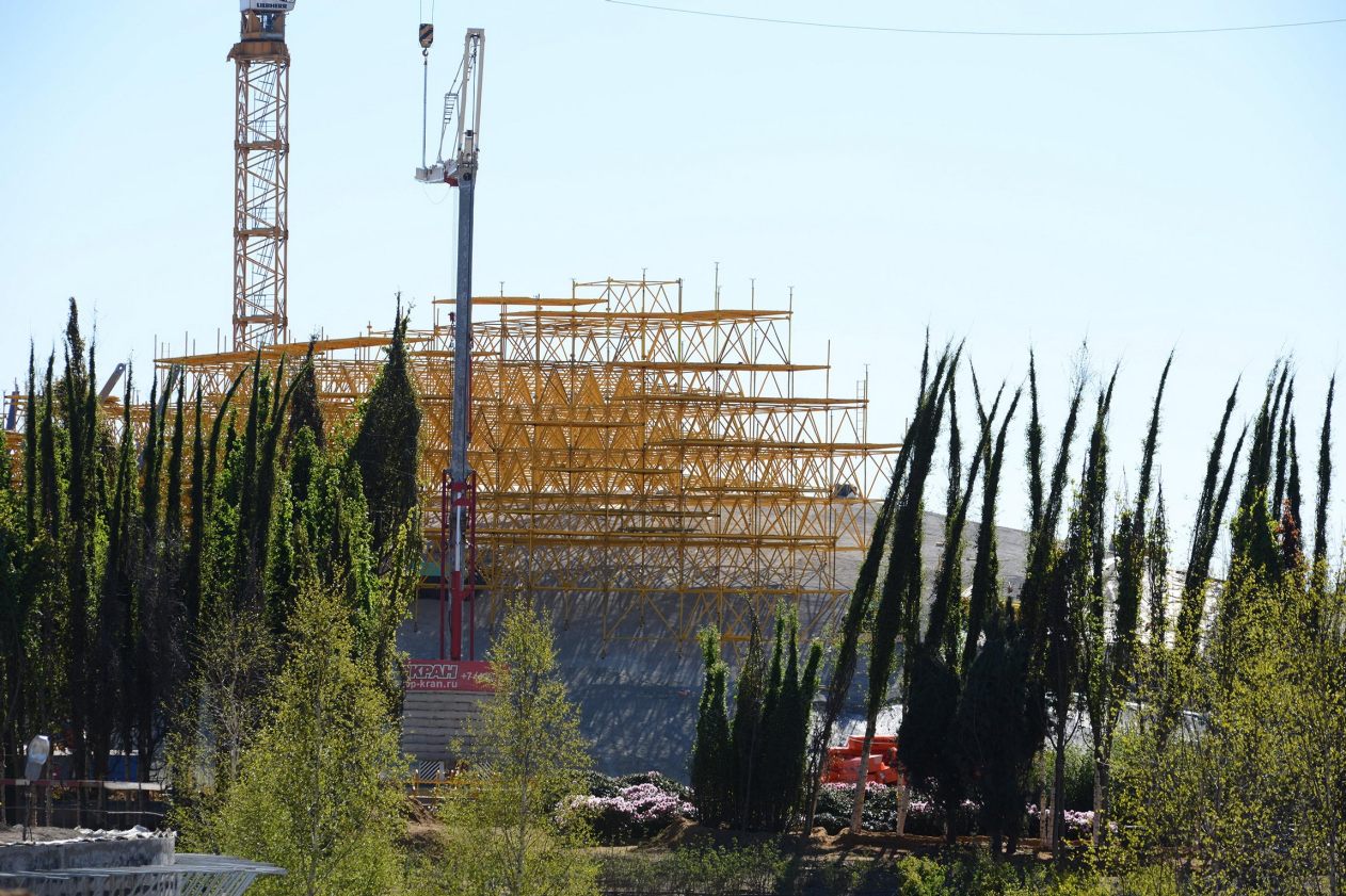
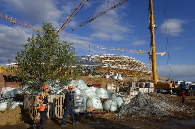
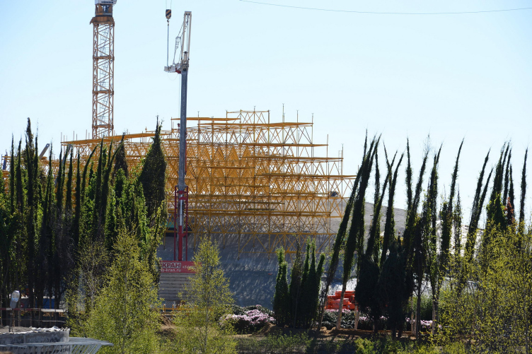
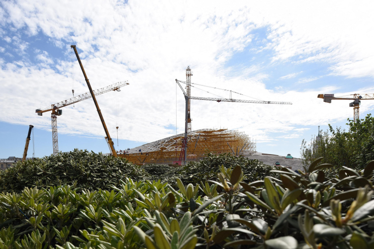
We worked closely with the engineering teams of Buro Happold and Transsolar to design the large grid shell over the philharmonic hall. Even though it’s completely open on the sides, the geometry between the shell and the hill captures and traps the heat of the sun during the day and makes this a warm bubble at the top. It works as a greenhouse with no doors. Visitors will walk up to the top, without going through a door, and will get warmer as they ascent. It won’t be a sunbathing spot, but one will be able to remove their coat and remain comfortable sitting and looking through the grid shell at the park, the Kremlin and St. Basil’s – even on a cold day.
– What do you think about the philharmonic hall project?
Charles Renfro:
– We actually have not had much involvement in the design of the philharmonic hall. We established a location for it and its attitude towards the park in the competition scheme, and that has been very much followed through in the final design. We are very appreciative that the concept has been held to, and even shocked in a way that the concept that we established – which was to have the building read as serious piece of architecture from the street side and as a serious piece of park from the other side – that’s a fairly radical concept – has been followed through. TPO “Reserve” has been designing the hall: they are a very good firm, and we worked with them on resolving the issues of the joint between the park and the philharmonic hall.
– In our climate zone, there are no leaves in autumn and winter and early spring, so the image of the park is completely different during the wintertime. How did you deal with it?
Ken Haines:
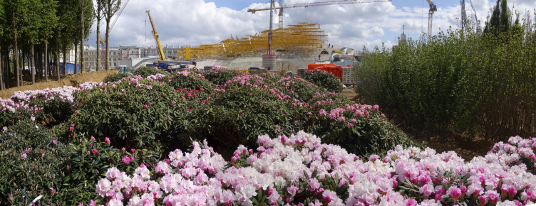
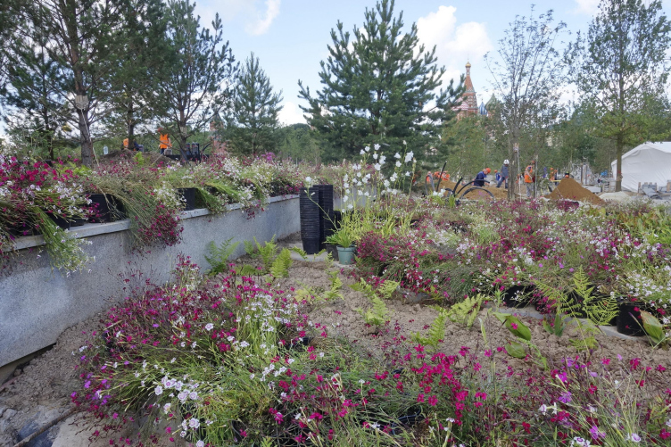
– I think we have a very interesting palette here, interesting for all of four seasons. For example, the birch trees: beautiful white bark in winter, stunning in itself, and very attractive for that reason alone. Also, these trees have really beautiful yellow leaves in the fall. The park will have a lot of perennials and grasses. Even in winter, grasses have a color and a structure to them. When they are not covered by snow, they move in the wind. There will be flowers in spring, movement in summer, a different color in fall, the structure in winter.
Charles Renfro
– And there’s a large section of evergreen trees as well that will stay green throughout the year, so there’s quite a bit of variety already.
– Did you take into account the difficult environmental problems of Moscow when you designed your park?
Ken Haines:
– Are you talking about the air quality?
– Air quality, but also the problem with the de-icing agents that are very harmful for plants.
Ken Haines:
– We did spend time talking about the operations and maintenance of the park, and, specifically, the snow removal, and how to do that in a way that will work with the plants instead of against the plants. Specifically, we talked about not using salt, which is bad for plants, and using alternative methods to remove snow and other products that don’t do the damage to plants. There are glycol products and other non-salt products that we recommended early on in the process. In terms of mechanical systems, we recommended brushing instead of plowing snow, because the plows do a lot of damage. The brushers are kinder and friendlier to paving systems.
– You have mentioned High Line at the start. I suppose, it is one of the most famous parks in the world now. Has the experience of designing High Line influenced your Zaryadye project?
Charles Renfro:
– Absolutely: it operated as a starting point for thinking about the way to make a new kind of park in a very dense urban environment. At the High Line, we invented a paver that allowed the green to grow through, referencing the ruin that the High Line was before we transformed it into a park. The way the paving works with the greenery was one of the initial thoughts we had about Zaryadye Park. Zaryadye Park is a field, rather than a linear park like the High Line, and in that field the paving would sometimes envelope the trees, sometimes split, sometimes turn into very soft pathways; in these ways it would constantly be transitioning between hard and soft and green. That was a starting point for us in terms of how to think about the park design. The other sentiment is that we love the way the High Line works as a sentinel, the place to see the city in a different way. I actually don’t think of the High Line as a park per se. I think of it as a viewing device first and foremost, that happens to have planting on it. People go there not to look at the trees and the greenery, but to really be in the city. And, thinking of Zaryadye Park and its central location in Moscow, we wanted to make sure that this was a park that to get lost in and think that you’re in a new kind of nature, but also be a place to rediscover the city. While it’s apart from Moscow, it actually is a part of Moscow, and very central to the way we want people to experience the center of Moscow now.
– Zaryadye is quite a large project, and also it took a long time to be completed…
Charles Renfro:
– Actually, not at all! (laughs) It’s not that big, and it actually happened very quickly!
– But, anyway, I suppose, you’ve got some experience of working as an architect in Russia. What are the main differences between American and Russian architectural practice?
Charles Renfro:
– Let me set the record straight first and foremost – we won the competition, and we did the master plan, and we also did the concept design for the park. However, since then we are actually design advisors to the project, and our Russian collaborators are the architects of the park. So, our experience is quite different here as it would be in America, where we would have had a hand in every bit of the design, detailing, and construction observation. We didn’t, at this park: we’ve been sort of high-level observers and advisors to help the team make the park align with the concept that we had; we’ve done quite a good job, considering that the profession, the building services, and the industry are not quite as advanced here as what one finds in Western Europe and America. There’s been a learning curve in a lot of respects, in order to achieve the design objectives. With this park, I think, there’s been a huge leap of faith and in understanding some advanced systems and technical expertise that we helped to bring to the table.
Brian Tabolt:
– There’s been a very optimistic spirit on the site – that’s been exciting. Even though there have been smaller landscape projects around Moscow, it’s really the first new major park here for a long time. So there’s not a lot of park experience or landscape experience for anybody. It’s amazing how much of original ambitions of the design were carried through so far. Even though the American processes in architecture and construction are very careful, procedural, and orderly – and that can be great and often gives us a great deal of control – it’s also slow and laborious, and sometimes risk averse. We were excited to find in Moscow a willingness to realize this quite ambitious project in a very short amount of time. I think it would have been harder to do this in the United States within this timeframe, with this kind of scale and complexity preserved.
Charles Renfro: “We wanted to create a park that you could get lost in and also rediscover the city there.”
Diller Scofidio + Renfro and Hargreaves Associates, who together with Citymakers form the design consortium responsible for the Zaryadye Park architectural and landscape concept, discuss the creation, transformation, and realization of their project that is pivotal for Moscow.
