По-русски

A Cute "Garden" Town

Located not far away from the Kurskaya metro station, the Maly Poluyaroslavsky Alley got a new nursery school built upon the project by Asadov Bureau - a fine example of out-of-the-box thinking when it comes to designing preschool facilities in the nation's capital.

12 May 2016
Object
mainImg

Custom-designed nursery schools and kindergartens are still quite a rarity for the nation's capital, as much as they are for any other Russian city or town, and thus are generally perceived as a luxury one could only possibly dream of. However, people who live in the vicinity of the Kurskaya and Chkalovskaya metro stations were lucky to get one: the Maly Poluyaroslavsky Alley got a nursery school that was custom-designed by Asadov Bureau. As a matter of fact, this was a case when a virtue was made out of necessity - squeezed from all sides by the buildings of this old Moscow neighborhood, the tiny land plot was initially meant to get a standard municipal preschool facility. However, placing a standard building in this tiny area and meeting, at the same time, all the necessary construction requirements proved to be clearly impossible. It was at that point that the city announced a competition that was subsequently won by one of Moscow's oldest private schools, "Shkola Sotrudnichestva" ("School of Cooperation") - and Asadov Bureau landed a commission that was as challenging as it was exciting to work on. 

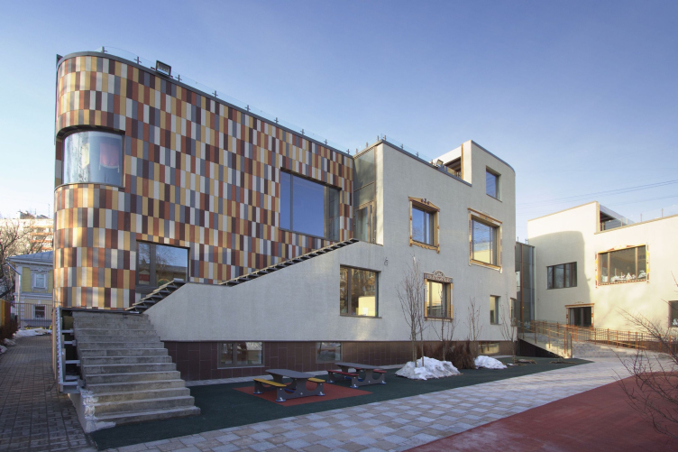
Nursery school in the Maly Poluyaroslavsky Alley. Construction, 2016 © Asadov Bureau
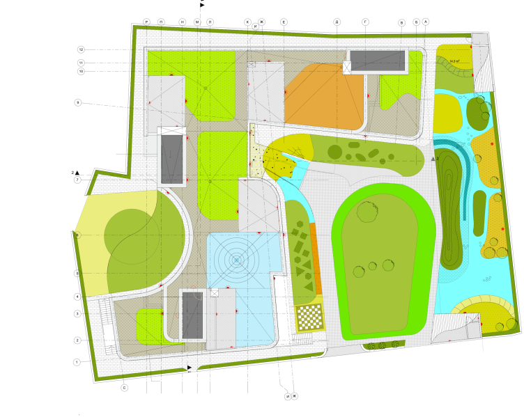
Nursery school in the Maly Poluyaroslavsky Alley. Master plan © Asadov Bureau


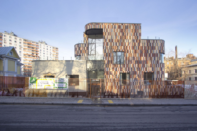
Nursery school in the Maly Poluyaroslavsky Alley. Construction, 2016 © Asadov Bureau


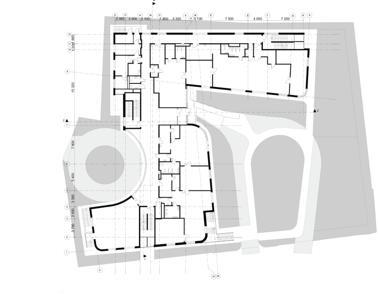
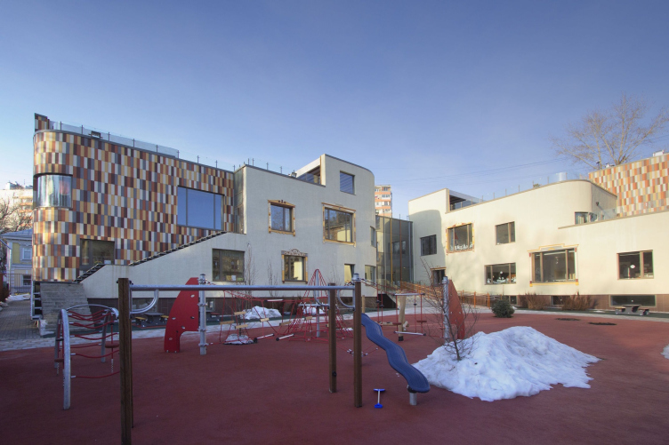
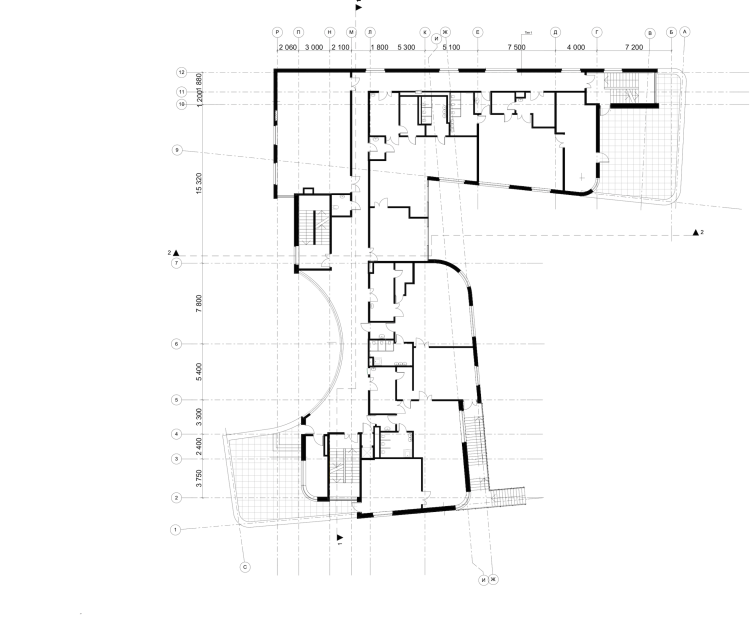
According to the company's leader, Andrew Asadov, the architectural concept of the building developed by degrees, in the course of the architects solving the problems of meeting this or that requirement that regulate the construction of preschool facilities in this country. Not a single solution in the architectural image of the building is accidental, each and every one of them being conditioned by this or that necessity. For example, the two-part form and the situation of the volume on the land plot have been dictated by the optimum orientation by the cardinal points. As one can see from the plan, the building consists of two wings perpendicular to one another. One wing stretches along the north border of the plot, the other - along the west one. The two parts protect the yard from the most unpleasant winds, at the same time opening it from the east and from the south. The maximum number of windows that let as much sunlight as possible into the children's rooms, also opens up to the south and east sides - which allowed the architects to meet the rigorous insolation requirements. (According to Moscow construction rules and regulations for preschool educational facilities, the maximum allowed orientation of the windows of the children's rooms on the cardinal points must be within a range of 85 to 275 degrees but 180 degrees is considered optimum, i.e. the windows are turned exactly southward). 

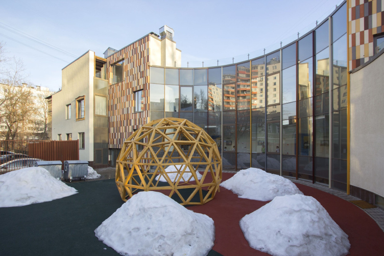
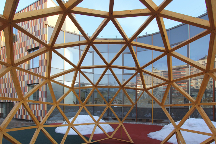
The beautiful-looking semicircular glass insert on the west façade owes its appearance to the necessity of finding, next to the emergency exit, enough room for the fire engine turnaround area. 

Nursery school in the Maly Poluyaroslavsky Alley. Construction, 2016 © Asadov Bureau


Nursery school in the Maly Poluyaroslavsky Alley. Construction, 2016 © Asadov Bureau


Nursery school in the Maly Poluyaroslavsky Alley. Plan of the 1st floor © Asadov Bureau


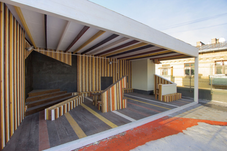
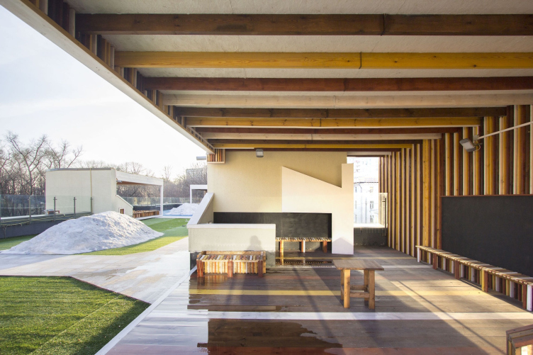
The small area of the land plot also significantly influenced the design of the kindergarten. What was left from the construction blueprint was still not enough to provide each group of children with a walking area of their own (again, according to Moscow Construction Rules and Regulations, it is 108 square meters for children under 3 years old, 80 square meters for children from 3 to 7 years old, plus verandas with an area of 40 square meters, plus a common playground 250 square meters). So it comes as no surprise that the authors of the project placed the extra walking areas and the verandas on the building's usable roofs. Interesting is the fact that there are such "roof" areas both on the level of the second and third floors. All this conditioned the recognizable look of the building: both of its wings descend in steps, very much like a ship's decks. The "ship" associations also appear thanks to the rounded contours of the walls and the railings on the roofs. 

Nursery school in the Maly Poluyaroslavsky Alley. Construction, 2016 © Asadov Bureau


The authors liken the new kindergarten building to their earlier "Loskutki" ("Quilts") project: a concept of a low-rise urban settlement, based on the self-organization principles very much like those of a medieval town. "Loskutki" are notable for their nonlinear asymmetric plan where each block is in fact a miniature town; diversity of forms and decoration techniques, and ultimately, forming of a rather dense but at the same time human-friendly environment with a multitude of convenient social connections inside each quarter. And the starting point that gives momentum to this social and cultural process is this thought-out architectural organization of the urban area. 

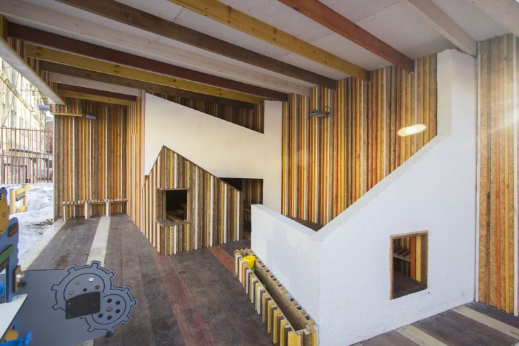
The kindergarten on the Maly Poluyaroslavsky Alley - with its sophisticated system of roofs of different height, changing its look when viewed from different angles, with windows spread unevenly over the building's façades - could also easily become part of such "quilted" city area. This, however, is but one side of the story. On the other side, the entire complex - with the playground and the verandas that are there both on the ground and on the roofs - looks like a miniature version of "Loskutki" settlement. This, again, is achieved at the expense of the building's dramatic multilevel appearance: upon the verandas, the architects designed a "playground" environment that resembles a toy town with silhouettes of imaginary houses, just as multilevel and multicolored as the building itself. Thus, this "run-through" design ties the main building and its verandas together to become a single "fairy tale town" complex.

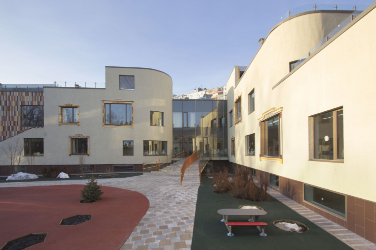
Nursery school in the Maly Poluyaroslavsky Alley. Construction, 2016 © Asadov Bureau


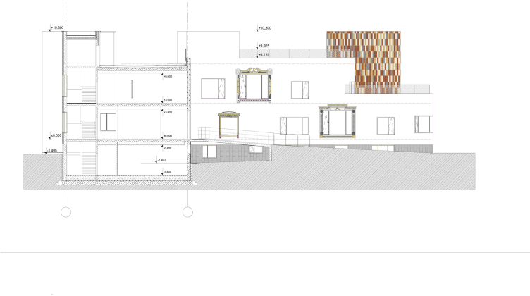
Nursery school in the Maly Poluyaroslavsky Alley. Section view © Asadov Bureau


The landscaping solution of the land site is visually connected to the architectural one. The "rounded" planning of the trails echoes the rounded outlines of the building. They are also accentuated by smooth man-made knolls that were made in order to avoid the monotony of the flat terrain. However, the architects opted out of supplying the roofs with any plants or artificial terrain so as not to make the construction work too complicated. They limited themselves to colorful rubber mats. 

Nursery school in the Maly Poluyaroslavsky Alley. Construction, 2016 © Asadov Bureau


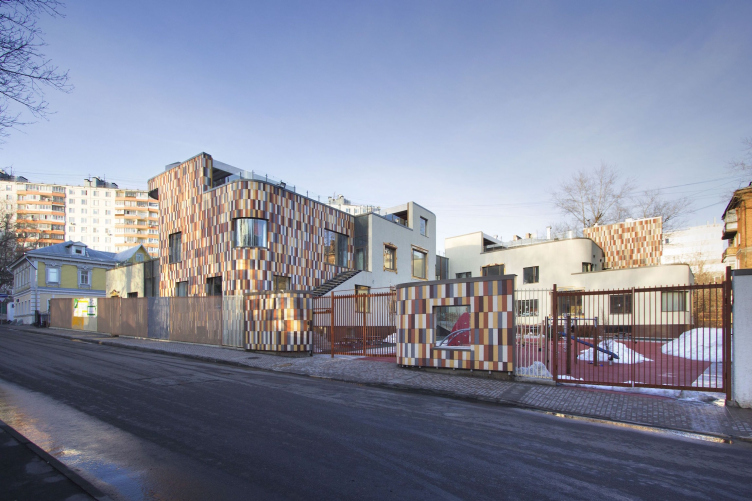
The façades got a very emotional finish, in the best sense of the word. Most of the walls are covered with champagne-colored stucco. This is a great background for the several volumes covered with multicolored terra-cotta tiles. Their tonality ranges from the light-sand to dark crimson, with an odd fraction of gray. The same color solution was chosen for the verandas, only here everything is made of wood painted with wood stain of various shades. While in the main building the color sections of the façades are visually fractured into peculiar pixels - in accordance with the "tile" format - the verandas took on a striped look: at the expense of the painted pillars that support the roofs, and the wall-decorating laths.

Nursery school in the Maly Poluyaroslavsky Alley. Construction, 2016 © Asadov Bureau


Nursery school in the Maly Poluyaroslavsky Alley. Construction, 2016 © Asadov Bureau


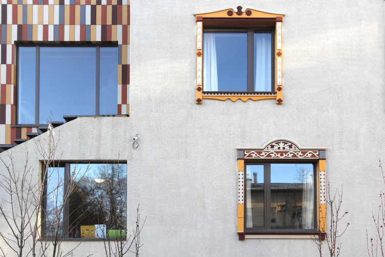
The façade windows that overlook the playground are placed at different distances from one another, and there is yet another thing that meets the eye - the windows are also of different size, some being taller and wider, some - lower abs narrower, which, again, brings in an informal twist to the building's look. One could say that the principle of "Loskutki" - uniting unlike buildings into a single "painting" - in this case is recreated in the compositing of the window apertures on the façades.

Nursery school in the Maly Poluyaroslavsky Alley. Construction, 2016 © Asadov Bureau


The idea of decorating the windows with wooden carved window surrounds also originates from the "Loskutki" concept. An important role was also played by the customers from "School of Cooperation". They took an active part in choosing the facade finishes and it was them who proposed to look for interesting designs of the window surrounds. Ultimately, not only all the surrounds turned out to be different - each one of them is a collective image of the window surround characteristic for this or that region of Russia. These images were designed based on the collection of the online museum of window surrounds that has for years been developed by the Moscow photographer Ivan Khafizov. Then, the surrounds were brought into reality by the hereditary woodcarver from a remote region of Russia, Yakov Velnikov. Ultimately, the decor of the façades turns into something like an educational project: if one is to approach them creatively, such windows could become a starting point for teaching the kinds interesting local lore and geography.

Nursery school in the Maly Poluyaroslavsky Alley. Window surrounds. Construction, 2016 © Asadov Bureau


The inside planning of the nursery school building was developed in accordance with the applicable standards, according to which each group of children is to have a certain set of premises of their own: a locker room, a playroom, a dining room, a bedroom, a buffet room, and a bathroom. On the first floor, next to the entrance, there is a large hall with panoramic glazing. The hall flows into a wide semicircular corridor (also glazed), this corridor being the contour that appeared due to the necessity of making the turnaround point outside. On the inside, the architects got a fair number of rooms of curvilinear irregular contours - which can become an extra amusement point for the children. Besides the three above-ground levels, there is also a basement floor that contains the maintenance rooms and some of the management offices. 

Thus, the strict constraints set by the Moscow Construction Rules and Regulations for preschool facilities did not in the least prevent the architects of Asadov Bureau from creating a project with a whole bunch of original solutions. One even gets an impression that the restrictions - both legal and territorial - became an interesting challenge for the architects and gave extra momentum to their creative insights. 
Nursery school in the Maly Poluyaroslavsky Alley. Plan of the 2nd floor © Asadov Bureau


12 May 2016

Headlines now
Four Different Surveys
The “Explore the City” competition, organized this year by the Genplan Institute of Moscow, stands out as a pretty unconventional one for the architectural field but aligns perfectly well with the character of urban planning work. The winning project analyzed contemporary residential complexes, combining urban planning insights with a realtor’s perspective to propose a hybrid approach. Other entries explored public centers, motivations for car ownership, and housing vacancy rates. A fifth participant withdrew. Here’s a closer look at the four completed works.
Scheduled Evolution
ASADOV Architects unveiled the EvyCenter pavilion, a microcultural hub for fostering personal growth, organizing workshops, and doing gymnastics. Additionally, this pavilion serves as a prototype for a scalable country house, drawing inspiration from the “Loskutok” project, and constructed from CLT panels in a factory. This marks the beginning of a developer project initiated by the architectural firm (sic!), which is seeking partners to expand both small Evy settlements and even larger Evy cities, which are, according to Andrey Asadov, aimed at fostering the “evolutionary” development of the people who will inhabit them.
The Golden Crown
The concept for a dental clinic in Yekaterinburg, developed by CNTR Studio, revolves around the idea of a “mouth full of gold”: pristine white porcelain stoneware walls are complemented by matte brass details. To avoid an overly literal interpretation, the architects focused on the building’s proportions, skillfully navigating between sunlight requirements and fire safety regulations.
Flexibility and Integration
Not long ago, we covered the project for the fourth phase of the ÁLIA residential complex, designed by APEX. Now, we’ve been shown different fence concepts they developed to enclose the complex’s private courtyards, incorporating a variety of public functions. We believe that the sheer fact that the complex’s architects were involved in such a detail as fencing speaks volumes.
A Step Forward
The HIDE residential complex represents a major milestone for ADM architects and their leaders Andrey Romanov and Ekaterina Kuznetsova in their quest for a fresh high-rise aesthetic – one that is flexible and layered, capable of bringing vibrancy to mass and silhouette while shaping form. Over recent years, this approach has become ADM’s “signature style”, with the golden HIDE tower playing a pivotal role in its evolution. Here, we delve into the project’s story, explore the details of the complex’s design, and uncover its core essence.
Gold in the Sands
A new office for a transcontinental company specializing in resource extraction and processing has opened in Dubai. Designed by T+T Architects, masters of creating spaces that are contemporary, diverse, flexible, and original, this project exemplifies their expertise. On the executive floor, a massive brass-clad partition dominates, while layered textures of compressed earth create a contextually resonant backdrop.
Layers and Levels of Flight
This project goes way back – Reserve Union won this architectural competition at the end of 2011, and the building was completed in 2018, so it’s practically “archival”. However, despite being relatively unknown, the building can hardly be considered “dated” and remains a prime example of architectural expression, particularly in the headquarters genre. And it’s especially fitting for an aviation company office. In some ways, it resembles the Aeroflot headquarters at Sheremetyevo but with its own unique identity, following the signature style of Vladimir Plotkin. In this article, we take an in-depth look at the United Aircraft Corporation (UAC) headquarters in the Moscow agglomeration town of Zhukovsky, supplemented by recent photographs from Alexey Naroditsky – a shoot that became only recently possible due to the fact that improvements were finally made in the surrounding area.
Light and Shadow
In this article, we delve into the architectural design of the “Chaika” house by DNK ag architects, which was recently completed in 2023 as part of the collection of signature designs at ZILArt. As is well-known, all the buildings in this complex follow a design code, yet each one is distinct. This particular building stands out not only for its whiteness and minimalism but also for the refined use of a limited number of techniques that, together, create what can confidently be called synergy.
Casus Novae
A master plan was developed for a large residential area with a name of “DNS City”, but now that its implementation began, the plan has been arbitrarily reformatted and replaced with something that, while similar on the surface, is actually quite different. This is not the first time such a thing happens, but it’s always frustrating. With permission from the author, we are sharing Maria Elkina’s post.
Treasure Hunting
The GAFA bureau, in collaboration with Tegola and Arkhitail, organized an expedition to the island of Kilpola in Karelia as part of Moskomarkhitektura’s “Open City” festival. There, amidst moss and rocks, the students sought answers to questions like: what is the sacred, where does it dwell, and what sustains it? Assisting the participants in this quest were landscape engineer Evgeny Levin, artist Nicholas Roerich, a moose, and the lack of cellular connection. Here’s how the story unfolded.
Depths of the Earth, Streams of Water
In the Malaya Okhta district, the Akzent building, designed by Stepan Liphart, was constructed. It follows a classic tripartite structure, yet it’s what you might call “hand-drawn”: each façade is unique in its form and details, some of which aren’t immediately noticeable. In this article, we explore the context and, together with the architect, delve into how the form was developed.
Fir Tree Dynamics
The “Airports of Region” holding is planning to build an airport in Karachay-Cherkessia, aiming to make the Arkhyz and Dombay resorts more accessible to travelers. The project that won in an invitation-only competition, submitted by Sergey Nikeshkin’s KPLN, blends natural imagery inspired by the shape of a conifer seed, open-air waiting spaces, majestic large trees, and a green roof elevated on needle-like columns. The result is both nature-inspired and WOW.
​A Brick Shell
In the process of designing a clubhouse situated among pine trees in a prestigious suburban area near Moscow, the architectural firm “A.Len” did the façade design part. The combination of different types of brick and masonry correlates with the volumetric and plastique solutions, further enhanced by the inclusion of wood-painted fragments and metal “glazing”.
Word Forms
ATRIUM architects love ambitious challenges, and for the firm’s thirtieth anniversary, they boldly play a game of words with an exhibition that dives deep into a self-created vocabulary. They immerse their projects – especially art installations – into this glossary, as if plunging into a current of their own. You feel as if you’re flowing through the veins of pure art, immersed in a universe of vertical cities, educational spaces – of which the architects are true masters – and the cultural codes of various locations. But what truly captivates is the bold statement that Vera Butko and Anton Nadtochy make, both through their work and this exhibition: architecture, above all, is art – the art of working with form and space.
Flexibility and Acuteness of Modernity
Luxurious, fluid, large “kokoshniks” and spiral barrel columns, as if made from colorful chewing gum: there seem to be no other mansion like this in Moscow, designed in the “Neo-Russian-Modern” style. And the “Teremok” on Malaya Kaluzhskaya, previously somewhat obscure, has “come alive with new colors” and gained visibility after its restoration for the office of the “architectural ecosystem” as the architects love to call themselves. It’s evident that Julius Borisov and the architects at UNK put their hearts into finding this new office and bringing it up to date. Let’s delve into the paradoxes of this mansion’s history and its plasticity. Spoiler: two versions of modernity meet here, both balancing on the razor’s edge of “what’s current”.
Yuri Vissarionov: “A modular house does not belong to the land”
It belongs to space, or to the air... It turns out that 3D printing is more effective when combined with a modular approach: the house is built in a workshop and then adapted to the site, including on uneven terrain. Yuri Vissarionov shares his latest experience in designing tourist complexes, both in central Russia and in the south. These include houseboats, homes printed from lightweight concrete using a 3D printer, and, of course, frame houses.
​Moscow’s First
“The quality of education largely depends on the quality of the educational environment”. This principle of the last decade has been realized by Sergey Skuratov in the project for the First Moscow Gymnasium on Rostovskaya Embankment in the Khamovniki district. The building seamlessly integrates into the complex urban landscape, responding both to the pedestrian flow of the city and the quiet alleyways. It skillfully takes advantage of the height differences and aligns with modern trends in educational space design. Let’s take a closer look.
Looking at the Water
The site of Villa Sonata stretches from the road to the water’s edge, offering its own shoreline, pier, and a picturesque river panorama. To reveal these sweeping views, Roman Leonidov “cut” the façade diagonally parallel to the river, thus getting two main axes for the house and, consequently, “two heads”. The internal core – two double-height spaces, a living room and a conservatory, with a “bridge” above them – makes the house both “transparent” and filled with light.
The White Wing
Well, it’s not exactly white. It’s more of a beige, white-stone structure that plays with the color of limestone – smoother surfaces are lighter, while rougher ones are darker. This wing unites various elements: it absorbs and interprets the surrounding themes. It responds to everything, yet maintains a cohesive expression – a challenging task! – while also incorporating recognizable features of its own, such as the dynamic cuts at the bottom, top, and middle.
Urban Dunes
The XSA Ramps team designed and built a three-part sports hub for a park in Rostov-on-Don, welcoming people of all ages and fitness levels. The skate plaza, pump track, and playground are all meticulously crafted with details that attract a diverse range of visitors. The technical execution of the shapes and slopes transforms this space into a kind of sculptural composition.
Proportional Growth
The project for the fourth phase of the ÁLIA residential area has been announced. The buildings are situated on an elongated plot – almost a “ray” that shoots out from the center of the area towards the river. Their layout reflects both a response to Moscow’s architectural preferences over the past 15 years, shifting “from blocks to towers”, and an interpretation of the neighboring business park designed by SOM. Additionally, the best apartments here are not located at the very top but closer to the middle, forming a glowing “waistline”.
The “Staircase” Building
In designing the “Details” residential complex in New Moscow, Rais Baishev spiced up the now-popular Moscow theme of a “courtyard” building with an idea drawn from the surrealist drawings by Maurits Escher. He envisioned the stepped silhouettes and descending slopes as a metaphysical mega-staircase, creating a key void within the courtyard that gave the project an internal “spine”. This concept is felt both in the building’s silhouette and on its façades.
Projection of the Quarter
No one doubted that the building that Vladimir Plotkin designed as part of the “Garden Quarters” would be the most modernist of all. And it turned out just that way: while adhering to the common design code, the building successfully combines brick and white stone, rhythmically responding to the neighboring building designed by Ostozhenka, yet tactfully and persistently making a few statements of its own. This includes the projection of the ideal urban development composition “14–9–6”, which can be found right next door, mathematical calculations, including those for various types of terraces (and perhaps the only reminder of the Soviet past of the Kauchuk rubber factory!), and the white “cross-stitch” pattern of the façade grid.
Domus Aurea
In this issue, we examine the “Tessinsky-1” house, designed by Sergey Skuratov and completed in 2023. Located in the middle of the Serebryanicheskaya Embankment district, at the intersection of its main streets, this house assumes a sort of “nodal” role: it not only responds to everything around it and preserves many memories of the former EMA factory within itself, but it weaves all this into a newly directed pattern, reconciling bright “gold” and dark-colored brick, largely with the help of the new, modern-yet-archaic Columba brick, which, come to think about it, is the most precious element here.
The Chimney of Nikola-Lenivets
In this issue, we are examining the “Obelisk House” designed by KATARSIS and built for the Arkhstoyanie 2023 festival. However, it was only finished later on, and this is why we are examining it now. It seems to us that after the “Obelisk House” appeared in Nikola-Lenivets, a dialogue and a few inner connections appeared between the temporary structures built here. These houses no longer look like “accidental neighbors”, more of which below.
​Periscope by the Bay
The jury awarded the second place in the competition for a public and cultural center in Petropavlovsk-Kamchatsky to the companies GORA (“Mountain”) and M4. In the consortium’s proposal, the building resembles a sperm whale with a calf swimming next to it or a periscope, whose lenses capture the most spectacular views from the surrounding landscape.
From Arcs to Dolmens
While working on the competition project for Petropavlovsk-Kamchatsky, ASADOV Architects prioritized the value of the natural and urban environment, aiming to preserve the balance of the location while minimizing the resemblance of the volume that they designed to a “traditional building”. The task was challenging, and the architects created three versions, one of which having been developed after the competition, where their main proposal took third place. However, the point of interest here is not the competition result but the continuity of creative thinking.
Hide and Seek
The ID Moskovskiy house, designed by Stepan Liphart in St. Petersburg, in the courtyards near Moskovskiy Avenue beyond the Obvodny Canal and recently completed, is notable for several reasons. Firstly, it has been realized with considerable accuracy, which is particularly significant as this is the first building where the architect was responsible not only for the facades but also for the layouts, allowing for better integration between the two. On the other hand, this building is interesting as an example of the “germination” of new architecture in the city: it draws on the best examples from the neighborhood and becomes an improved and developed sum of ideas found by the architect in the surrounding context.
The Big Twelve
Yesterday, the winners of the Moscow Mayor’s Architecture Award were announced and honored. Let’s take a look at what was awarded and, in some cases, even critique this esteemed award. After all, there is always room for improvement, right?
Above the Golden Horn
The residential complex “Philosophy” designed by T+T architects in Vladivostok, is one of the new projects in the “Golubinaya Pad” area, changing its development philosophy (pun intended) from single houses to a comprehensive approach. The buildings are organized along public streets, varying in height and format, with one house even executed in gallery typology, featuring a cantilever leaning on an art object.