По-русски

A Museum That Reaches for the Stars

A museum above the park, a park of a museum, or the museum building as an exhibit in its own right... Three versions of the contest project of the Science Museum in the city of Tomsk - by Asadov Architectural Bureau.

23 March 2015
Object
mainImg

Organized by SAR bureau, the international contest for the architectural and town-planning concept of the Science Museum in Tomsk took place in the autumn of 2014 under the motto "science for people" - the new museum must become part of the large-scale project named "Tomskie Naberezhnye" ("Tomsk Embankments"). We recently featured the contest-winning project by "Studio 44". Asadov Architectural Bureau came up with as many as three versions of the museum building. One of them, entitled "Per Aspera Ad Astra" got awarded the "conditional" second prize by the judging panel: formally, there was no awarding any "places" in the contest, but in the judging process this project was one of the two that were considered to become the winner. 

When asked about their work on this project, the Asadovs say that the unique and significant for the function of the museum on the one hand, and the officially protected park area on the other urged them to search for the most incredible and unconventional solutions. Indeed, the three versions proposed by the architects demonstrate totally different approaches to solving their task. 

Version 1 - "Oblako" ("Cloud")
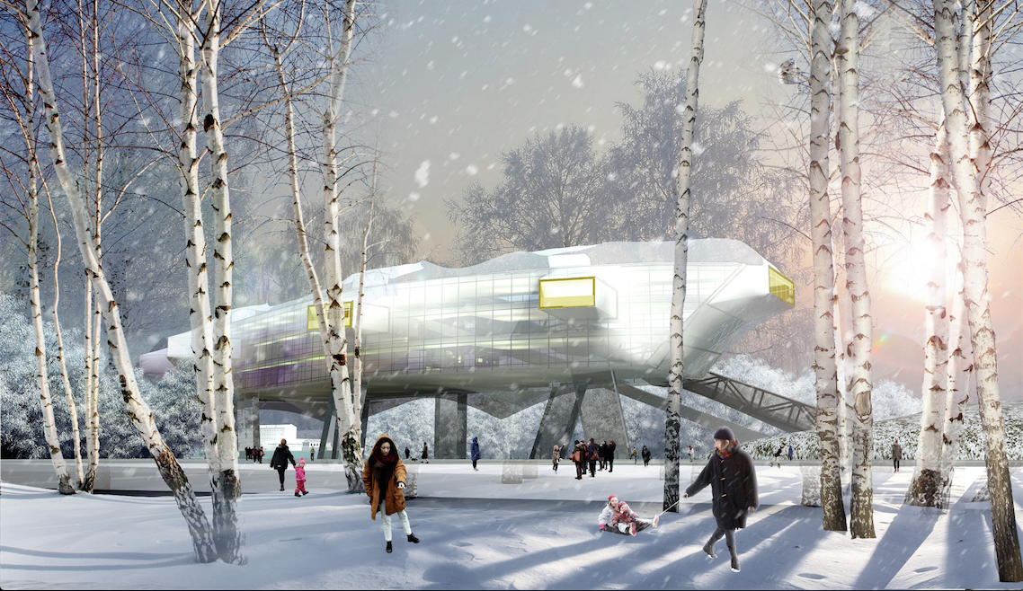
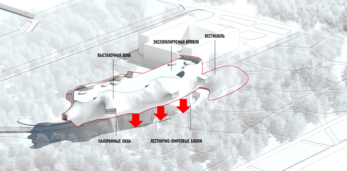
The project is based on the idea of preserving the park one hundred percent intact and placing the museum immediately above the surface of the lake. Neatly packed into a casing of metallic net, a lightweight irregularly shaped volume with outstanding cantilevers of the expo areas and the rectangles of sightseeing bull's eyes of windows covers the water area like a cloud. What is left ashore is only the hill of the entrance group, barely visible in the surrounding landscape. The structure looks like some sort of a starship that is moored to the embankment with a thin chain of the escalator leading from the lobby to the exposition hall. Apart from these moving-stairs, the only thing that connects the "Cloud" to the ground is the fire escape stairways together with the passenger and freight elevators. The feeling of an "alien" spaceship is strengthened by the presence of an open-air sightseeing platform at the top - situated on the usable roof. 

Probably, this look wound best suit not so much a science museum as a science FICTION museum... But then again, who knows where the dividing line between the two lies nowadays?

Science and Technology Museum in Tomsk © Asadov Architectural Bureau
zooming
Science and Technology Museum in Tomsk ("Cloud" version) © Asadov Architectural Bureau


zooming
Science and Technology Museum in Tomsk ("Cloud" version) © Asadov Architectural Bureau


Version 2 - "Kholm" ("Hill")
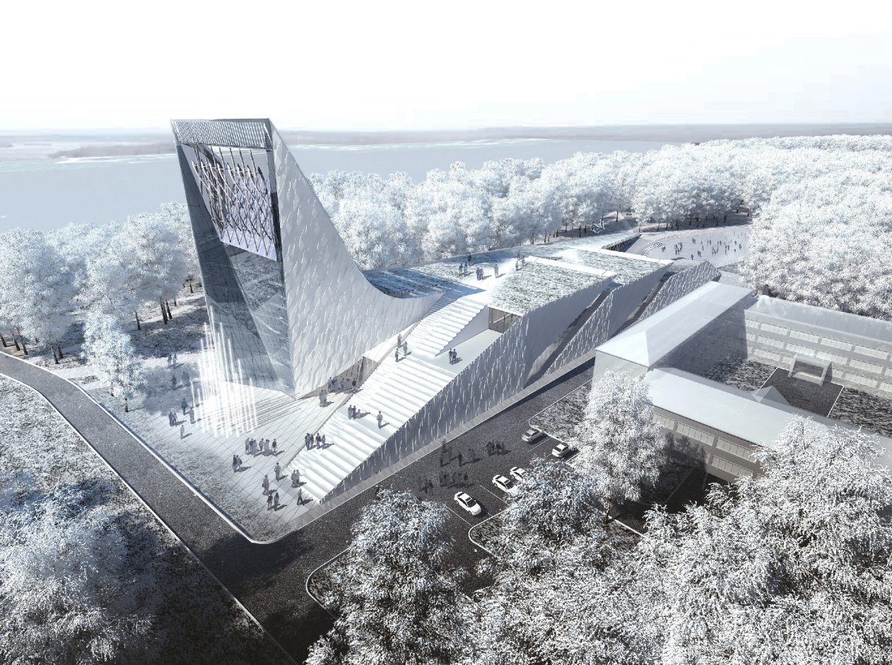
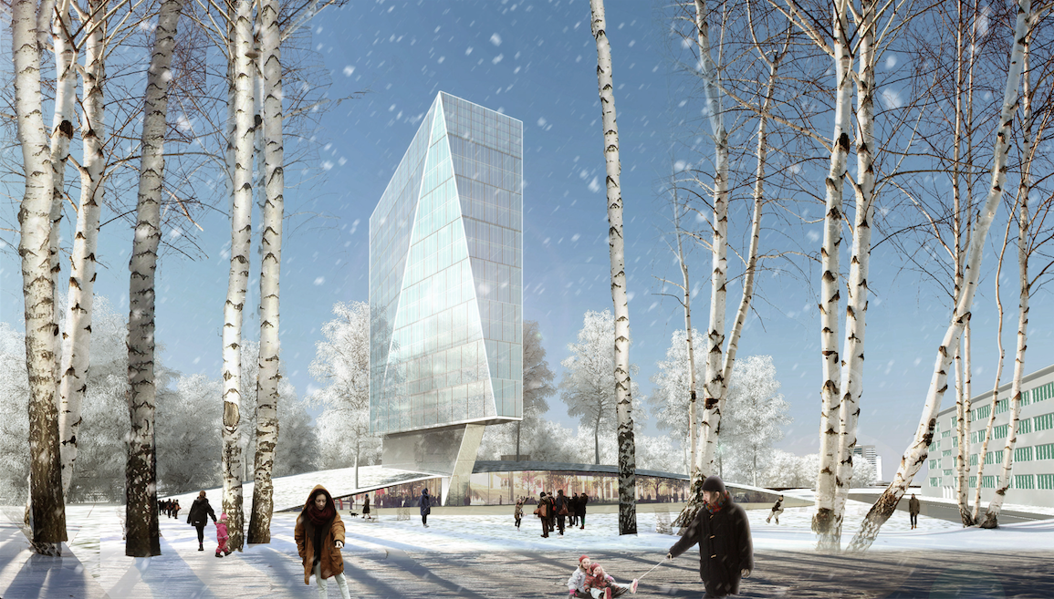
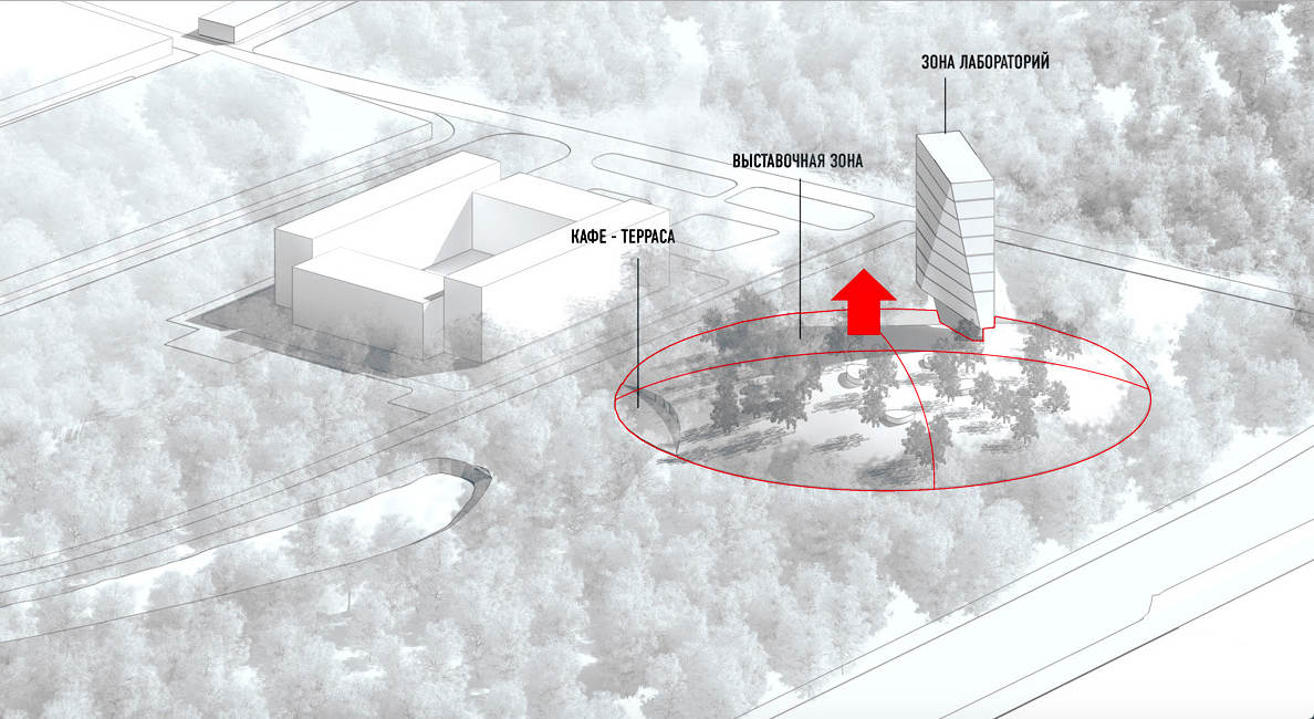
This version was created parallel to "Cloud", and the authors consider it to be an alternative option. As opposed to Version 1, it is based on the idea of maximally "dissolving" the object in the surroundings. Leaving the entrance virtually in the same place, the architects "stepped back" from the shore and "about-faced" the museum complex 180 degrees. The idea of the "entrance hill" transformed into the solution that consists in hiding the whole main volume of the museum inside of it. Sunken-in below the ground level and overgrown with newly-planted trees, the museum "hill" simply mimicries to mix with the park. The only thing that gives its presence away is the soaring transparent wind-sail of the laboratory block whose glass facade reflects, like a giant mirror, the surrounding landscape by day and becomes a media screen showing installations if mathematic algorithms by night. 

zooming
Science and Technology Museum in Tomsk ("Hill" version) © Asadov Architectural Bureau


zooming
Science and Technology Museum in Tomsk ("Hill" version) © Asadov Architectural Bureau


Version 3 - "Per Aspera Ad Astra"
Thus, the two first versions presented two mutually exclusive approaches - a museum ABOVE the park or a PARK of a museum. The third version must be the attempt to either reconcile them or find a third path whose advantages could outweigh the advantages of either of the projects. 

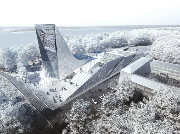
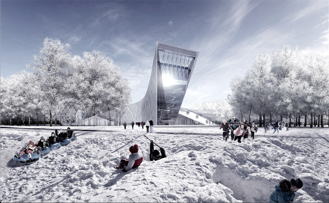
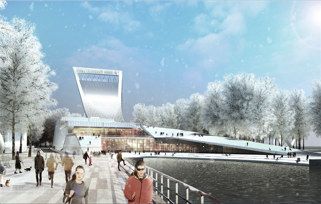
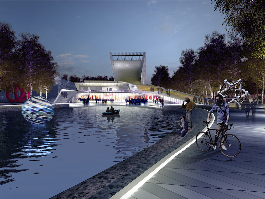
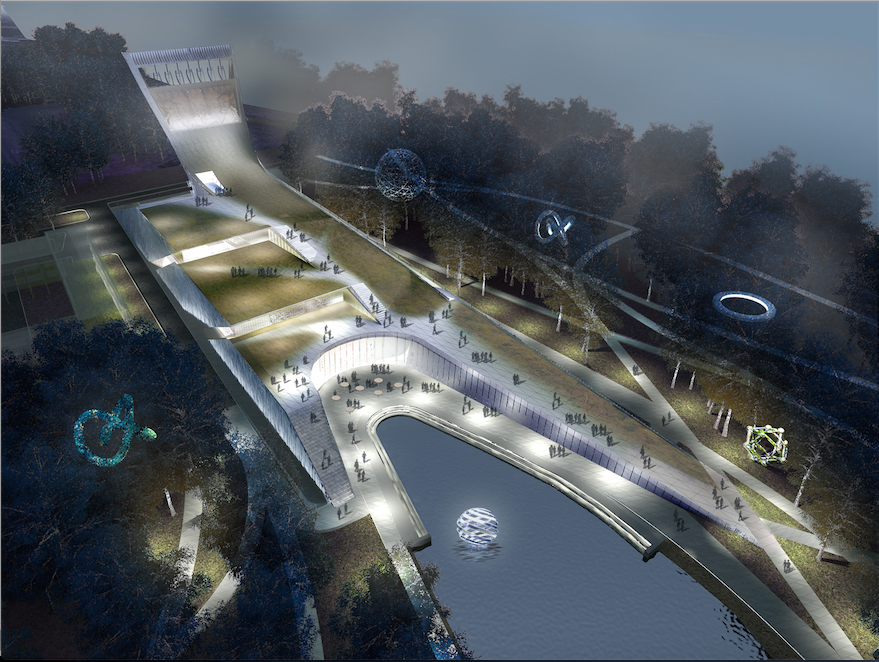
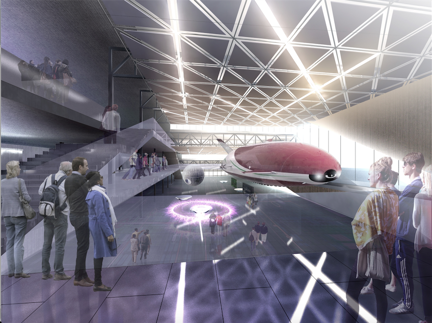
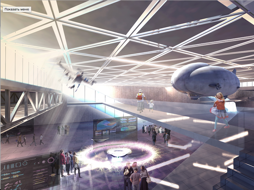
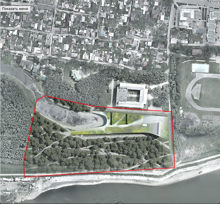
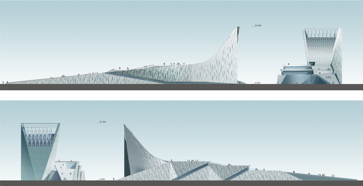
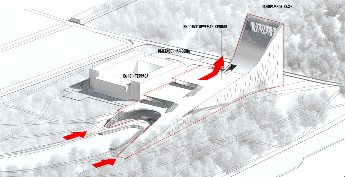
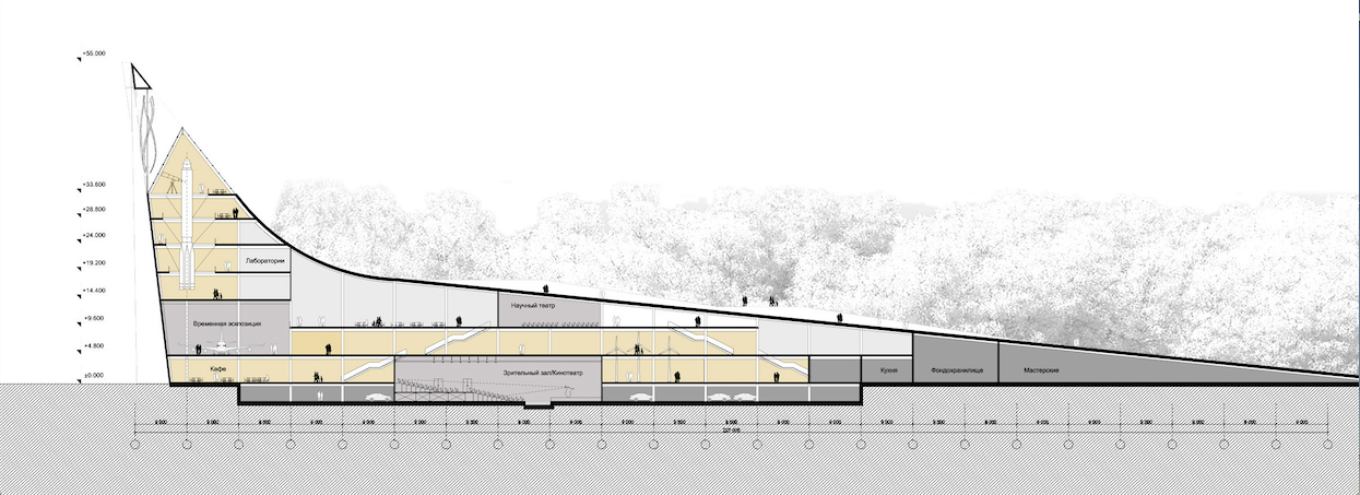
In order to keep the tact as intact as possible, the architects pushed the building end-to-end to the building of the university and stretched it between the lake and the access driveway. According to the authors, "imbibing all the "juices of the landscape", the museum gradually gains height and then soars upward like a lighthouse tower". In this version, pretty much everything becomes part of the exposition - from the facade down to the last valve in the ventilation system. The multiple folding of the surface of the outside walls is achieved by using thick aluminum panels that work in contrast with the smooth surface of the stained glass. The extra green roofs do not require any special maintenance. They also provide for the building extra protection from the noise, overcooling and overhearing decreasing the loads on the air conditioning and heating systems. And these systems, it must be said, are truly state-of-the-art, using all the innovative techniques you could possibly think of. Not only do they provide for every little detail but the architects vividly demonstrate it: with a whole number of ingenious solutions, the museum's engineering infrastructure is turned into an interactive installation the work of which the visitors of the museum will be able to observe at special displays. 

zooming
Science and Technology Museum in Tomsk © Asadov Architectural Bureau


zooming
Science and Technology Museum in Tomsk © Asadov Architectural Bureau


zooming
Science and Technology Museum in Tomsk © Asadov Architectural Bureau


zooming
Science and Technology Museum in Tomsk © Asadov Architectural Bureau


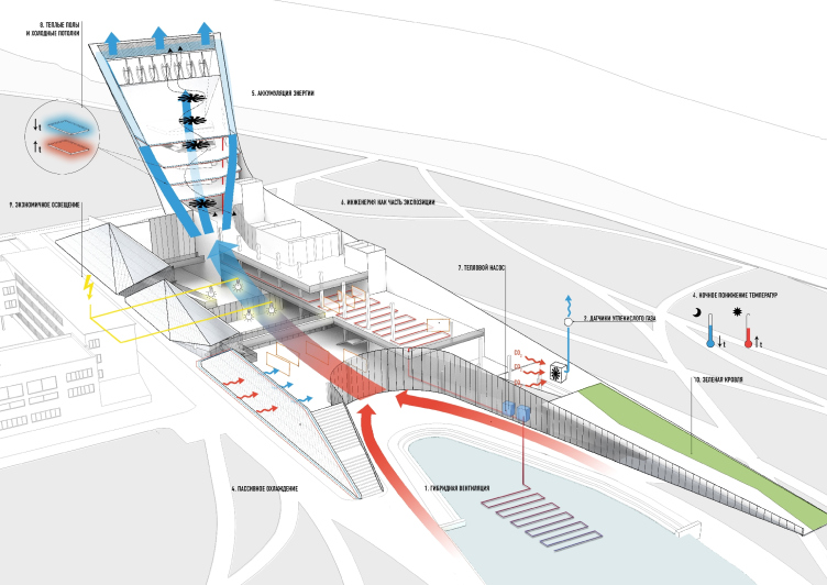
For the sake of so-fashionable today energy conservation, the Asadovs and their engineering partners, Engex company, use everything they can, including the air ventilation system with adjustable airflow that is triggered by the CO2 sensors. The shape of the complex provides for the possibility of hybrid ventilation with the use of the "earth channel" running along the lake, and the "sun tube" whose role is played by the volume of the tower. When the air passes through the "earth channel", it cools or heats which reduces its processing costs. The temperature difference inside and outside creates the thrusts that provides the motion amplified by the "sun tube". When the natural thrust is not enough, the electrical fans turn on automatically. This cancels the necessity to use the habitual air conditioning units on the roof that ruin the look of the building. 

The project even provides for the fact that when the natural ventilation is on there is a possibility of producing the power at the expense of spinning the blades of the fan by the airflow in the "sun tube". This helps to accumulate energy. And the absence of any paintings or incunabula in the exposition gives the opportunity to lower the energy costs at the expense of lowering the temperatures if the halls during the non-working hours and in the nighttime... In a nutshell, the very building of the museum is a science/technology exhibit in its own right. There is science for people in action. 

zooming
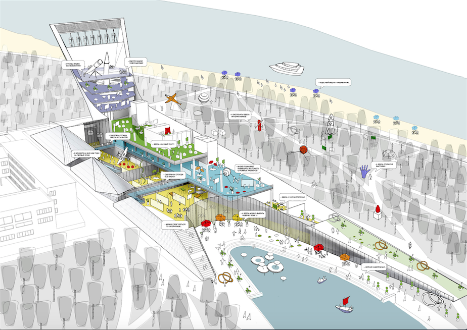
Layout © Asadov Architectural Bureau


Diagram of engineering elements © Architectural Bureau


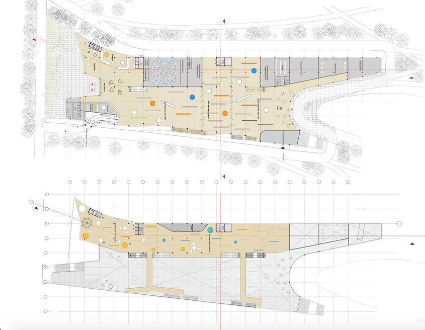
The expo space is organized in accordance with the enfilade principle that gradually opens up all the expositions to the visitor. Starting from the main entrance, the people pass through all the halls and towards the lake - it is perfectly viewable behind the stained glass opened up into the park - then they get up onto the second level from where one can cast an eye over the way that he has made and then move on. On this second level, the transformer conference hall/scientific theater is situated. The climax of the exposition is the multi-height space inside the tower where the bulky exhibits are situated. Ascending the ramp that adjoins the scientific labs, you inevitably end up at the top level with a panoramic cafe and an observatory. From the south side, there are solar collectors and win-driven generators here that produce the power for the building - the interactive addition to the exposition. 

The park becomes a natural continuation of the museum collection: the new network of trails connects the platforms to the exhibits and forms a single educational and recreational space. The surface of the lake turns into a platform for scientific experiments connected with water. The part of the embankment located "at the tail" of the museum is transformed into an active public space that is used for organizing open-air workshops and seminars. The roof of the museum continues the street exposition, enlarging the space of the park and providing extra emergency exits from the museum halls. 

zooming
Science and Technology Museum in Tomsk. Interior © Asadov Architectural Bureau


zooming
Science and Technology Museum in Tomsk. Interior © Asadov Architectural Bureau


Strange though it may seem, it is the roof that endows the building with such unbelievable possibilities and forms its unusual, eye-catching silhouette that the judging panel considered to be the solution that is slightly unfit for the Siberian climate. But then again, the authors defined their way themselves: "Per Aspera Ad Astra". In a quite up-to-date manner, conserving the energy, it simultaneously challenges the nature when it comes to the climatic difficulties, making a daring "nose" at it, one that reminds the Rocket Monument on Moscow's Star Boulevard, soaring upward into the space - a sure sign of the "1960's" progressivist approach to science. 
zooming
Location plan © Asadov Architectural Bureau
zooming
Science and Technology Museum in Tomsk © Asadov Architectural Bureau
zooming
Science and Technology Museum in Tomsk. Interior © Asadov Architectural Bureau
zooming
Section view © Asadov Architectural Bureau
zooming
Plan © Asadov Architectural Bureau


23 March 2015

Headlines now
Four Different Surveys
The “Explore the City” competition, organized this year by the Genplan Institute of Moscow, stands out as a pretty unconventional one for the architectural field but aligns perfectly well with the character of urban planning work. The winning project analyzed contemporary residential complexes, combining urban planning insights with a realtor’s perspective to propose a hybrid approach. Other entries explored public centers, motivations for car ownership, and housing vacancy rates. A fifth participant withdrew. Here’s a closer look at the four completed works.
Scheduled Evolution
ASADOV Architects unveiled the EvyCenter pavilion, a microcultural hub for fostering personal growth, organizing workshops, and doing gymnastics. Additionally, this pavilion serves as a prototype for a scalable country house, drawing inspiration from the “Loskutok” project, and constructed from CLT panels in a factory. This marks the beginning of a developer project initiated by the architectural firm (sic!), which is seeking partners to expand both small Evy settlements and even larger Evy cities, which are, according to Andrey Asadov, aimed at fostering the “evolutionary” development of the people who will inhabit them.
The Golden Crown
The concept for a dental clinic in Yekaterinburg, developed by CNTR Studio, revolves around the idea of a “mouth full of gold”: pristine white porcelain stoneware walls are complemented by matte brass details. To avoid an overly literal interpretation, the architects focused on the building’s proportions, skillfully navigating between sunlight requirements and fire safety regulations.
Flexibility and Integration
Not long ago, we covered the project for the fourth phase of the ÁLIA residential complex, designed by APEX. Now, we’ve been shown different fence concepts they developed to enclose the complex’s private courtyards, incorporating a variety of public functions. We believe that the sheer fact that the complex’s architects were involved in such a detail as fencing speaks volumes.
A Step Forward
The HIDE residential complex represents a major milestone for ADM architects and their leaders Andrey Romanov and Ekaterina Kuznetsova in their quest for a fresh high-rise aesthetic – one that is flexible and layered, capable of bringing vibrancy to mass and silhouette while shaping form. Over recent years, this approach has become ADM’s “signature style”, with the golden HIDE tower playing a pivotal role in its evolution. Here, we delve into the project’s story, explore the details of the complex’s design, and uncover its core essence.
Gold in the Sands
A new office for a transcontinental company specializing in resource extraction and processing has opened in Dubai. Designed by T+T Architects, masters of creating spaces that are contemporary, diverse, flexible, and original, this project exemplifies their expertise. On the executive floor, a massive brass-clad partition dominates, while layered textures of compressed earth create a contextually resonant backdrop.
Layers and Levels of Flight
This project goes way back – Reserve Union won this architectural competition at the end of 2011, and the building was completed in 2018, so it’s practically “archival”. However, despite being relatively unknown, the building can hardly be considered “dated” and remains a prime example of architectural expression, particularly in the headquarters genre. And it’s especially fitting for an aviation company office. In some ways, it resembles the Aeroflot headquarters at Sheremetyevo but with its own unique identity, following the signature style of Vladimir Plotkin. In this article, we take an in-depth look at the United Aircraft Corporation (UAC) headquarters in the Moscow agglomeration town of Zhukovsky, supplemented by recent photographs from Alexey Naroditsky – a shoot that became only recently possible due to the fact that improvements were finally made in the surrounding area.
Light and Shadow
In this article, we delve into the architectural design of the “Chaika” house by DNK ag architects, which was recently completed in 2023 as part of the collection of signature designs at ZILArt. As is well-known, all the buildings in this complex follow a design code, yet each one is distinct. This particular building stands out not only for its whiteness and minimalism but also for the refined use of a limited number of techniques that, together, create what can confidently be called synergy.
Casus Novae
A master plan was developed for a large residential area with a name of “DNS City”, but now that its implementation began, the plan has been arbitrarily reformatted and replaced with something that, while similar on the surface, is actually quite different. This is not the first time such a thing happens, but it’s always frustrating. With permission from the author, we are sharing Maria Elkina’s post.
Treasure Hunting
The GAFA bureau, in collaboration with Tegola and Arkhitail, organized an expedition to the island of Kilpola in Karelia as part of Moskomarkhitektura’s “Open City” festival. There, amidst moss and rocks, the students sought answers to questions like: what is the sacred, where does it dwell, and what sustains it? Assisting the participants in this quest were landscape engineer Evgeny Levin, artist Nicholas Roerich, a moose, and the lack of cellular connection. Here’s how the story unfolded.
Depths of the Earth, Streams of Water
In the Malaya Okhta district, the Akzent building, designed by Stepan Liphart, was constructed. It follows a classic tripartite structure, yet it’s what you might call “hand-drawn”: each façade is unique in its form and details, some of which aren’t immediately noticeable. In this article, we explore the context and, together with the architect, delve into how the form was developed.
Fir Tree Dynamics
The “Airports of Region” holding is planning to build an airport in Karachay-Cherkessia, aiming to make the Arkhyz and Dombay resorts more accessible to travelers. The project that won in an invitation-only competition, submitted by Sergey Nikeshkin’s KPLN, blends natural imagery inspired by the shape of a conifer seed, open-air waiting spaces, majestic large trees, and a green roof elevated on needle-like columns. The result is both nature-inspired and WOW.
​A Brick Shell
In the process of designing a clubhouse situated among pine trees in a prestigious suburban area near Moscow, the architectural firm “A.Len” did the façade design part. The combination of different types of brick and masonry correlates with the volumetric and plastique solutions, further enhanced by the inclusion of wood-painted fragments and metal “glazing”.
Word Forms
ATRIUM architects love ambitious challenges, and for the firm’s thirtieth anniversary, they boldly play a game of words with an exhibition that dives deep into a self-created vocabulary. They immerse their projects – especially art installations – into this glossary, as if plunging into a current of their own. You feel as if you’re flowing through the veins of pure art, immersed in a universe of vertical cities, educational spaces – of which the architects are true masters – and the cultural codes of various locations. But what truly captivates is the bold statement that Vera Butko and Anton Nadtochy make, both through their work and this exhibition: architecture, above all, is art – the art of working with form and space.
Flexibility and Acuteness of Modernity
Luxurious, fluid, large “kokoshniks” and spiral barrel columns, as if made from colorful chewing gum: there seem to be no other mansion like this in Moscow, designed in the “Neo-Russian-Modern” style. And the “Teremok” on Malaya Kaluzhskaya, previously somewhat obscure, has “come alive with new colors” and gained visibility after its restoration for the office of the “architectural ecosystem” as the architects love to call themselves. It’s evident that Julius Borisov and the architects at UNK put their hearts into finding this new office and bringing it up to date. Let’s delve into the paradoxes of this mansion’s history and its plasticity. Spoiler: two versions of modernity meet here, both balancing on the razor’s edge of “what’s current”.
Yuri Vissarionov: “A modular house does not belong to the land”
It belongs to space, or to the air... It turns out that 3D printing is more effective when combined with a modular approach: the house is built in a workshop and then adapted to the site, including on uneven terrain. Yuri Vissarionov shares his latest experience in designing tourist complexes, both in central Russia and in the south. These include houseboats, homes printed from lightweight concrete using a 3D printer, and, of course, frame houses.
​Moscow’s First
“The quality of education largely depends on the quality of the educational environment”. This principle of the last decade has been realized by Sergey Skuratov in the project for the First Moscow Gymnasium on Rostovskaya Embankment in the Khamovniki district. The building seamlessly integrates into the complex urban landscape, responding both to the pedestrian flow of the city and the quiet alleyways. It skillfully takes advantage of the height differences and aligns with modern trends in educational space design. Let’s take a closer look.
Looking at the Water
The site of Villa Sonata stretches from the road to the water’s edge, offering its own shoreline, pier, and a picturesque river panorama. To reveal these sweeping views, Roman Leonidov “cut” the façade diagonally parallel to the river, thus getting two main axes for the house and, consequently, “two heads”. The internal core – two double-height spaces, a living room and a conservatory, with a “bridge” above them – makes the house both “transparent” and filled with light.
The White Wing
Well, it’s not exactly white. It’s more of a beige, white-stone structure that plays with the color of limestone – smoother surfaces are lighter, while rougher ones are darker. This wing unites various elements: it absorbs and interprets the surrounding themes. It responds to everything, yet maintains a cohesive expression – a challenging task! – while also incorporating recognizable features of its own, such as the dynamic cuts at the bottom, top, and middle.
Urban Dunes
The XSA Ramps team designed and built a three-part sports hub for a park in Rostov-on-Don, welcoming people of all ages and fitness levels. The skate plaza, pump track, and playground are all meticulously crafted with details that attract a diverse range of visitors. The technical execution of the shapes and slopes transforms this space into a kind of sculptural composition.
Proportional Growth
The project for the fourth phase of the ÁLIA residential area has been announced. The buildings are situated on an elongated plot – almost a “ray” that shoots out from the center of the area towards the river. Their layout reflects both a response to Moscow’s architectural preferences over the past 15 years, shifting “from blocks to towers”, and an interpretation of the neighboring business park designed by SOM. Additionally, the best apartments here are not located at the very top but closer to the middle, forming a glowing “waistline”.
The “Staircase” Building
In designing the “Details” residential complex in New Moscow, Rais Baishev spiced up the now-popular Moscow theme of a “courtyard” building with an idea drawn from the surrealist drawings by Maurits Escher. He envisioned the stepped silhouettes and descending slopes as a metaphysical mega-staircase, creating a key void within the courtyard that gave the project an internal “spine”. This concept is felt both in the building’s silhouette and on its façades.
Projection of the Quarter
No one doubted that the building that Vladimir Plotkin designed as part of the “Garden Quarters” would be the most modernist of all. And it turned out just that way: while adhering to the common design code, the building successfully combines brick and white stone, rhythmically responding to the neighboring building designed by Ostozhenka, yet tactfully and persistently making a few statements of its own. This includes the projection of the ideal urban development composition “14–9–6”, which can be found right next door, mathematical calculations, including those for various types of terraces (and perhaps the only reminder of the Soviet past of the Kauchuk rubber factory!), and the white “cross-stitch” pattern of the façade grid.
Domus Aurea
In this issue, we examine the “Tessinsky-1” house, designed by Sergey Skuratov and completed in 2023. Located in the middle of the Serebryanicheskaya Embankment district, at the intersection of its main streets, this house assumes a sort of “nodal” role: it not only responds to everything around it and preserves many memories of the former EMA factory within itself, but it weaves all this into a newly directed pattern, reconciling bright “gold” and dark-colored brick, largely with the help of the new, modern-yet-archaic Columba brick, which, come to think about it, is the most precious element here.
The Chimney of Nikola-Lenivets
In this issue, we are examining the “Obelisk House” designed by KATARSIS and built for the Arkhstoyanie 2023 festival. However, it was only finished later on, and this is why we are examining it now. It seems to us that after the “Obelisk House” appeared in Nikola-Lenivets, a dialogue and a few inner connections appeared between the temporary structures built here. These houses no longer look like “accidental neighbors”, more of which below.
​Periscope by the Bay
The jury awarded the second place in the competition for a public and cultural center in Petropavlovsk-Kamchatsky to the companies GORA (“Mountain”) and M4. In the consortium’s proposal, the building resembles a sperm whale with a calf swimming next to it or a periscope, whose lenses capture the most spectacular views from the surrounding landscape.
From Arcs to Dolmens
While working on the competition project for Petropavlovsk-Kamchatsky, ASADOV Architects prioritized the value of the natural and urban environment, aiming to preserve the balance of the location while minimizing the resemblance of the volume that they designed to a “traditional building”. The task was challenging, and the architects created three versions, one of which having been developed after the competition, where their main proposal took third place. However, the point of interest here is not the competition result but the continuity of creative thinking.
Hide and Seek
The ID Moskovskiy house, designed by Stepan Liphart in St. Petersburg, in the courtyards near Moskovskiy Avenue beyond the Obvodny Canal and recently completed, is notable for several reasons. Firstly, it has been realized with considerable accuracy, which is particularly significant as this is the first building where the architect was responsible not only for the facades but also for the layouts, allowing for better integration between the two. On the other hand, this building is interesting as an example of the “germination” of new architecture in the city: it draws on the best examples from the neighborhood and becomes an improved and developed sum of ideas found by the architect in the surrounding context.
The Big Twelve
Yesterday, the winners of the Moscow Mayor’s Architecture Award were announced and honored. Let’s take a look at what was awarded and, in some cases, even critique this esteemed award. After all, there is always room for improvement, right?
Above the Golden Horn
The residential complex “Philosophy” designed by T+T architects in Vladivostok, is one of the new projects in the “Golubinaya Pad” area, changing its development philosophy (pun intended) from single houses to a comprehensive approach. The buildings are organized along public streets, varying in height and format, with one house even executed in gallery typology, featuring a cantilever leaning on an art object.