По-русски

Brick in Milk

Contest proposal of a residential house on the Vernadskogo Avenue, done by "Sergey Skuratov Architects".

15 May 2014
Object
mainImg
Architect:
Sergey Skuratov
Object:
Residential (apartment) house of deluxe class
Russia, Moscow, Vernadskogo Avenue, 4

Project Team:
Leader of the author team: Sergey Skuratov. Architects: N.Demidov, I.Ilin. With the participation of A.Panev, A.Gvozdikov, I.Golubev.

2013 — 2013

OAO "Institute of Public and Utility Sector"
Residential house (apartments) of deluxe class © Sergey Skuratov Architects

The project covered in this issue was developed in the middle of last year for a closed architectural contest. Besides "Sergey Skuratov Architects", the list of participants also included "Project Meganom" and "Tsimailo, Lyashenko and Partenrs" - but the winner never was announced. The customer simply changed his mind and decided not to announced the results - so, all the projects got laid by. In this article, we present to our readers Sergey Skuratov's version of what the residential house on the Vernadskogo Avenue might have looked like. 

Residential house (apartments) of deluxe class © Sergey Skuratov Architects

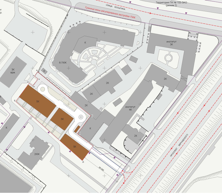
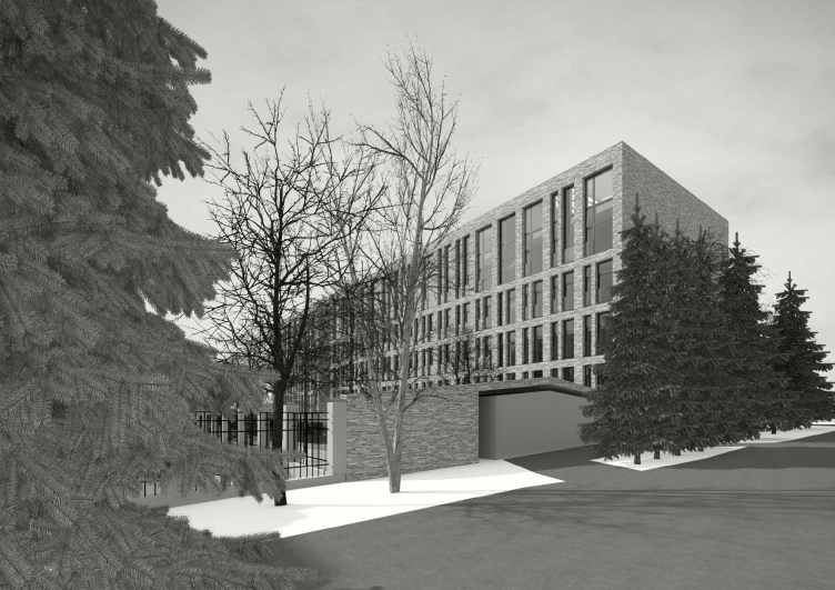
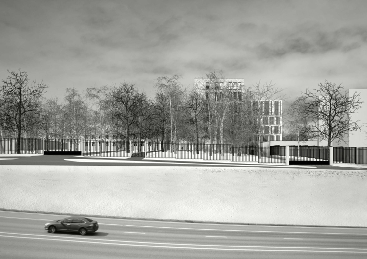
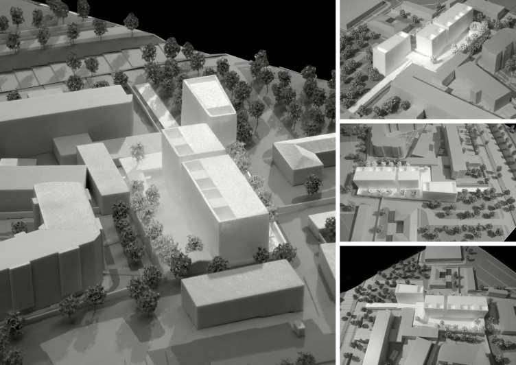
The land site, one that became the object of the contest, is located between the park areas of the Sparrow Hills sightseeing platform, Moscow State University, and the former "Young Pioneers Palace". Most of its territory borders on the Leninogorsk reservoir, and it is only from the north that it neighbors on the residential complex "Monolith" (Kosygina St., 19) and the Institute of Public and Utility Sector. From the future tenants' point of view, this place is practically the perfect one for the construction of a nice cozy "club" house: almost downtown, abundance of lush vegetation, and great views from the windows, ones to be envied at. More that that: the customer was able to get the approvals for building a direct driveway to the territory of the future complex from the Vernadskogo Avenue - which means that the tenants will have at their disposal one of the most convenient thoroughfares of Moscow's southeast. Besides the top-of-the-line requirements to the class of the designed housing, the contestants were quite predictably limited in the building's height: the house was not to violate the already-existing views of this area, and, preferably, be completely hidden behind the trees that grow along the avenue. Sergey Skuratov meets this specification to a letter. 
Residential house (apartments) of deluxe class © Sergey Skuratov Architects

Residential house (apartments) of deluxe class © Sergey Skuratov Architects

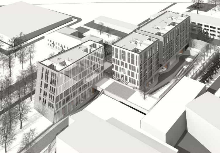
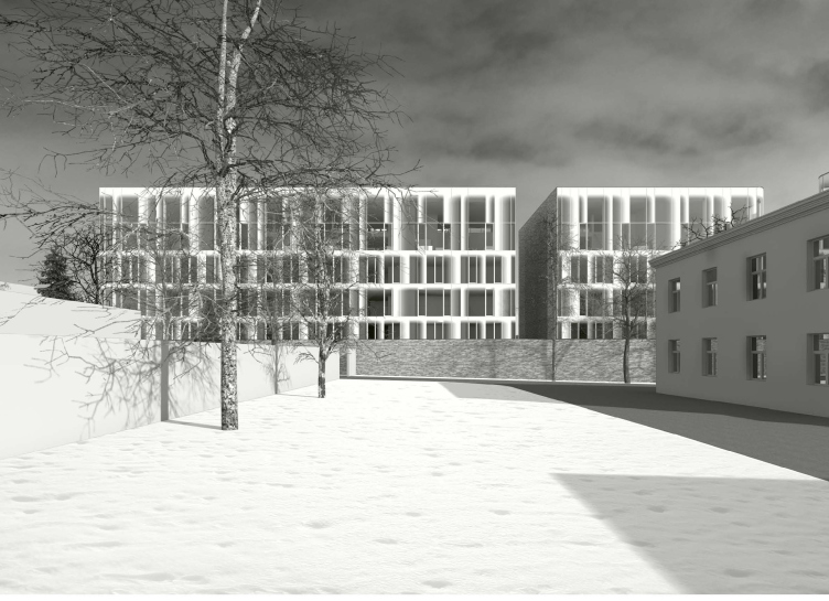
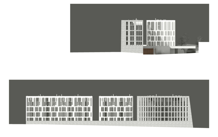
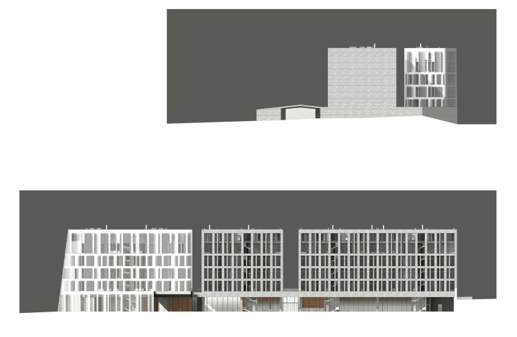
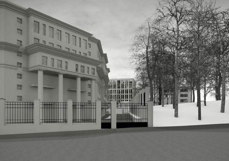
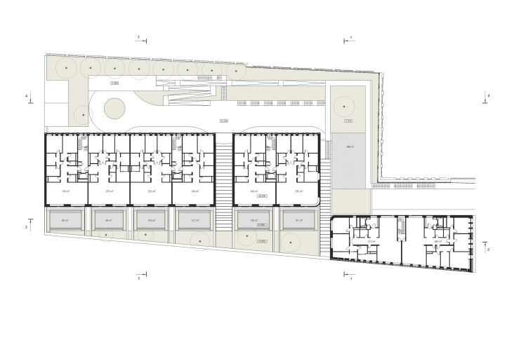
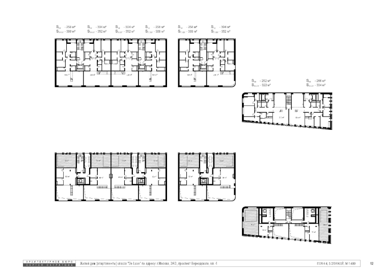
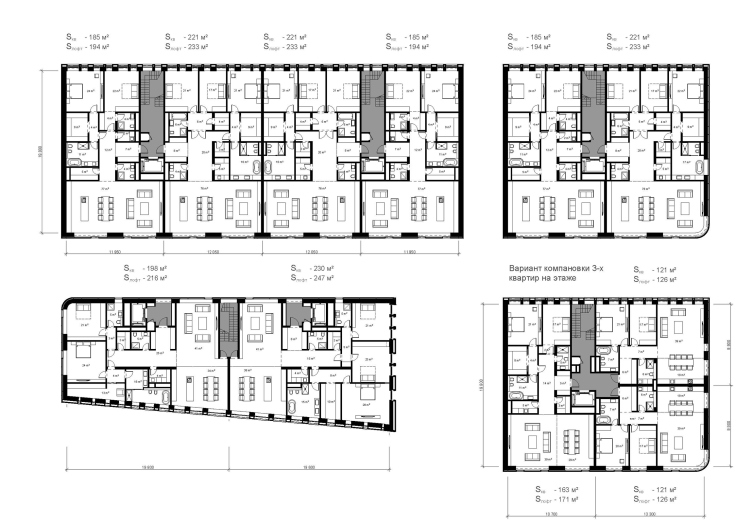
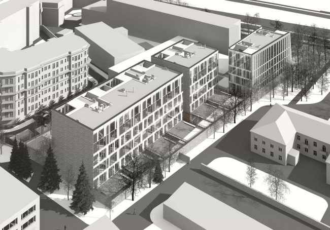
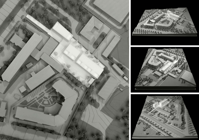
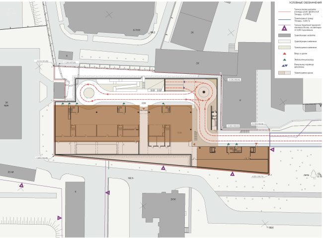
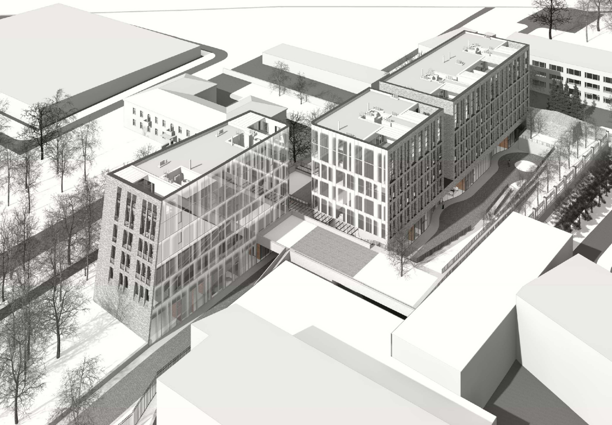
Oriented onto the Vernadskogo Avenue, the land site is in fact situated perpendicular to it, widening as it distances the highway - and the same town-planning logic is used by Sergey Skuratov in designing the complex. First of all, this is a tripartite structure that helped to avoid creating, under the limited height conditions, a monotonous "squatting" volume. What the architect does is design three buildings - the narrower one in fact fixes the driving entrance from the avenue, while the two other ones are located deeper in the site along its central axis. 
Residential house (apartments) of deluxe class © Sergey Skuratov Architects

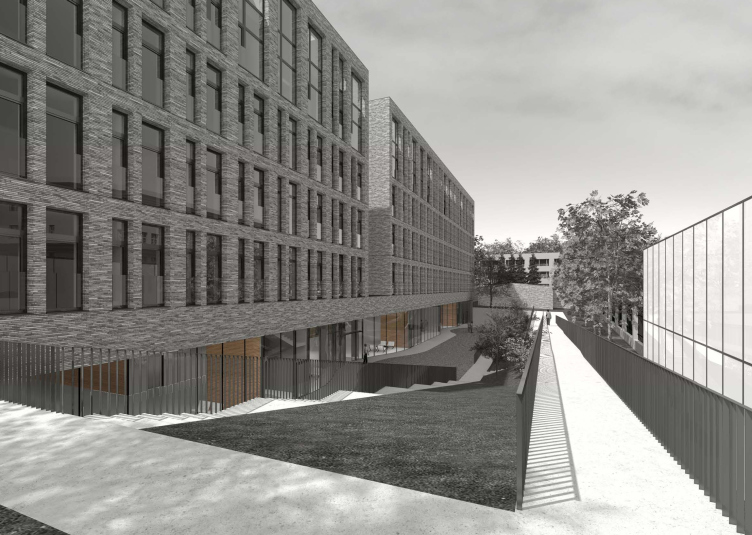
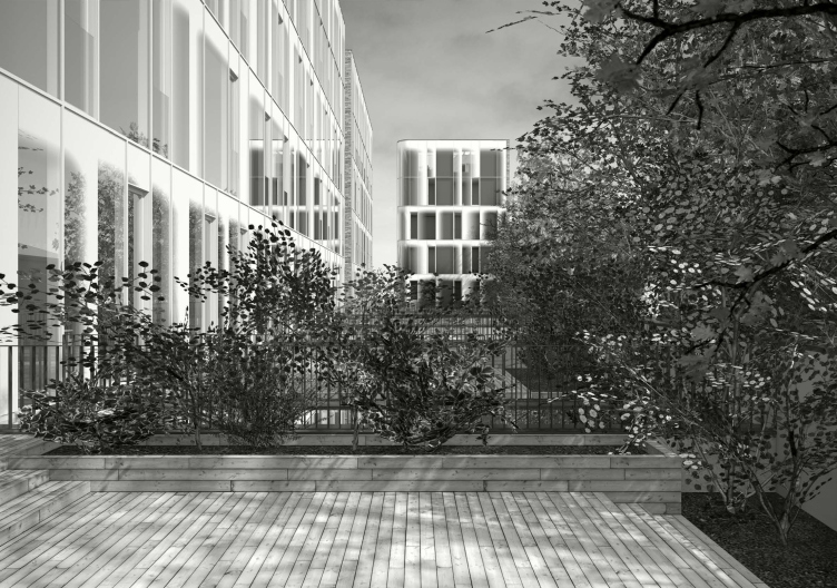
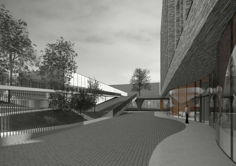
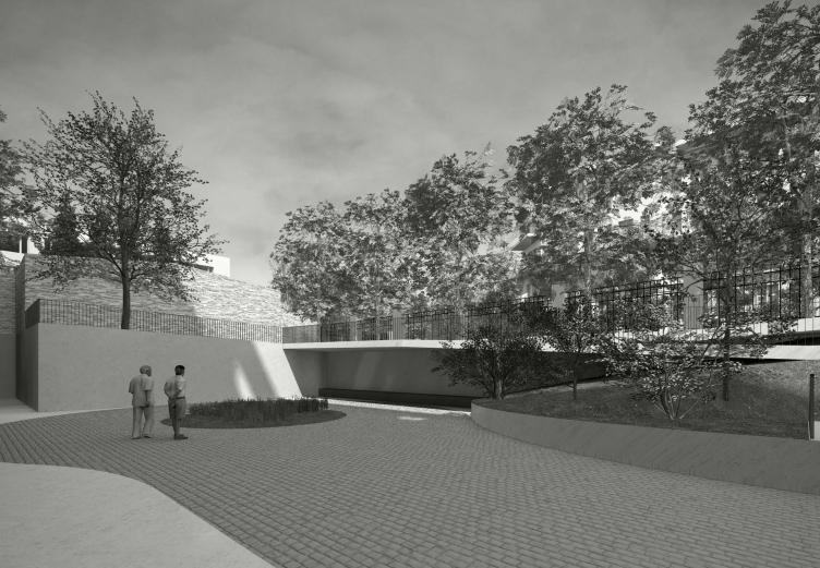
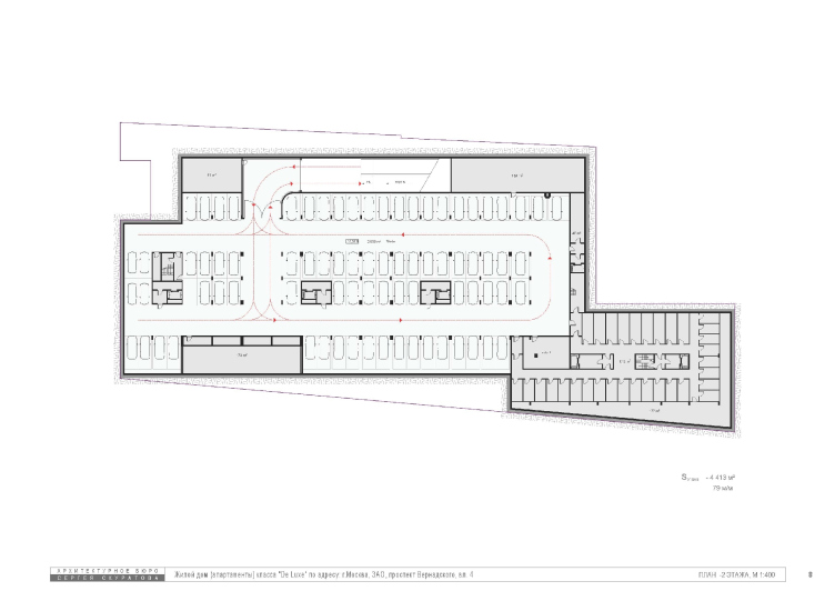
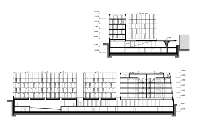
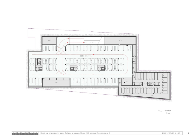
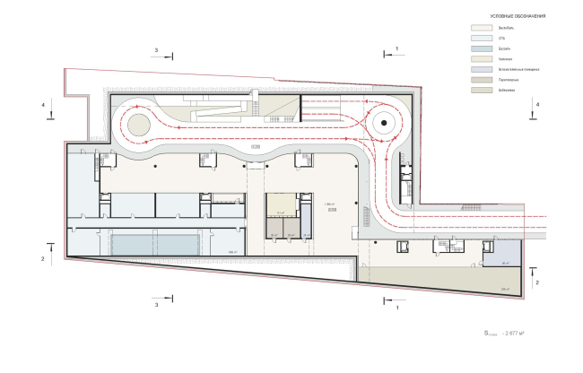
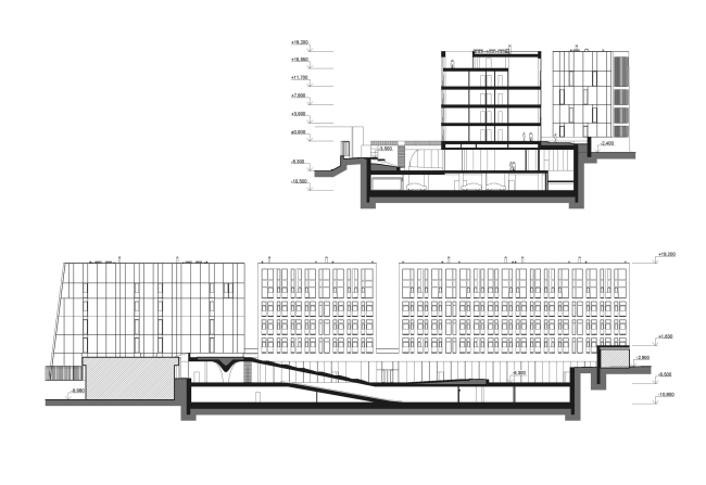
Set in such manner, the shift of the volumes in respect to one another becomes not only the most important compositional but also the architectural theme of the project: first of all, the complex gets both "outside" and "inside" facades that are designed totally differently, and, second of all, the territory set by the first building gets a more intimate status than the rest of the yard that stretches along the two other houses. From this standpoint, what really played into the hands of the architects was the height difference that the site had in it: the 5.5 meter drop in the direction of the avenue allows for creating a single stylobate - only the two further buildings grow from it in the usual manner, while with the "street" building it merges into one. Due to this, immediately on the side of the prospect, the complex gets the driving entrance into the underground parking garage that eliminates the risk of a car pile-up in the yard territory, while the yard itself is designed on two levels as a complex system of open and closed territories. 

Residential house (apartments) of deluxe class © Sergey Skuratov Architects
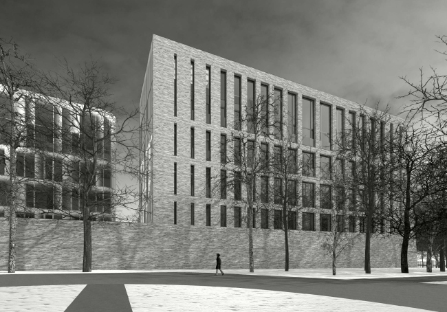
Residential house (apartments) of deluxe class © Sergey Skuratov Architects

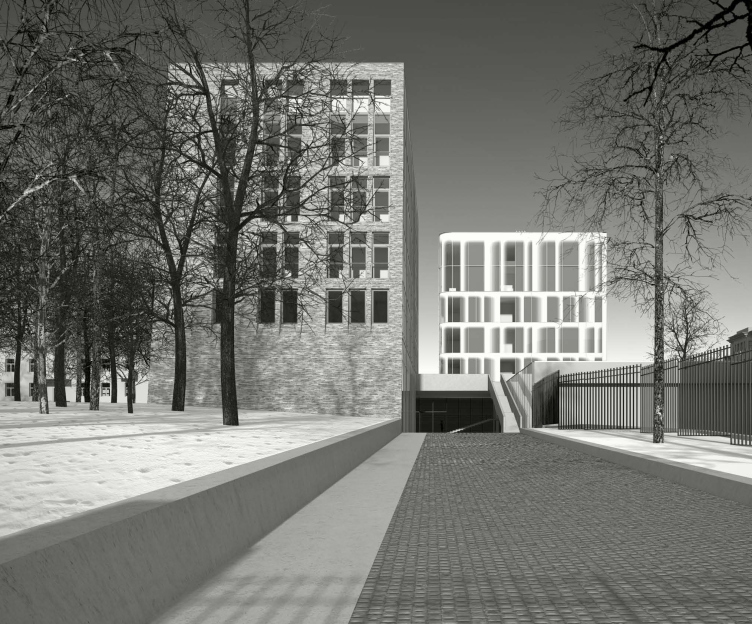
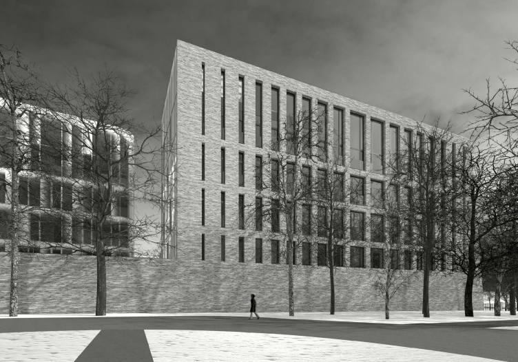
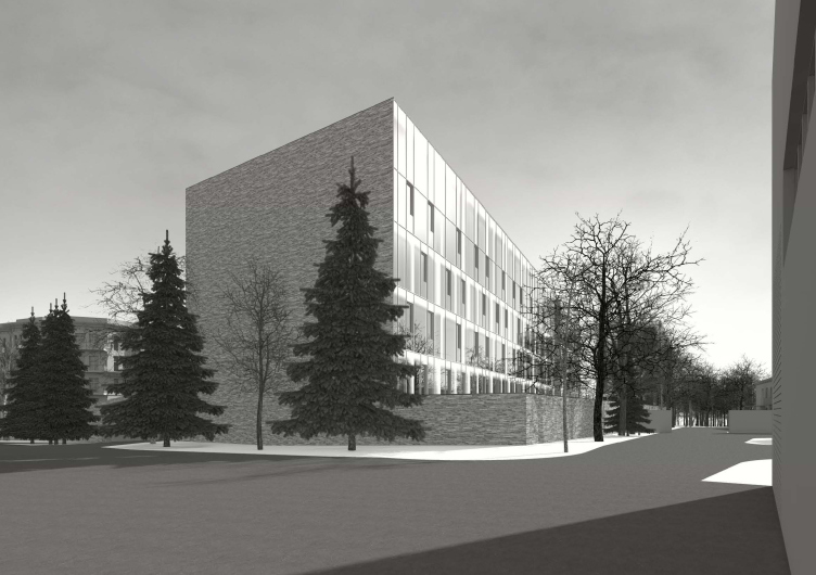
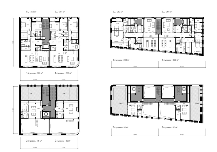
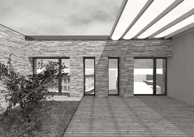
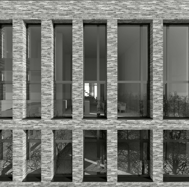
The theme of the relief drop also showed up in the architectural design of the narrow building. Getting on the plan a trapeze shape (Skuratov places it exactly following the borders of the "appendix"), it gets a bit wider specifically in the direction of the avenue. And the architect endows this literally high-profile facade with a perceptible tilt: the house looks as if it were wincing away from the highway not wanting to have anything to do with it. And, because its first level is actually a stylobate, the architect designs the "bottom" in as massive manner as possible, using the solid brickwork. Higher up, the armor gets slit with the rather narrow verticals of the windows that start stretching only on the sidewall facade to become truly panoramic ones. 

Residential house (apartments) of deluxe class © Sergey Skuratov Architects

Residential house (apartments) of deluxe class © Sergey Skuratov Architects

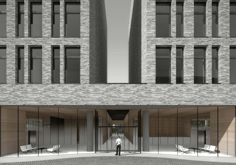
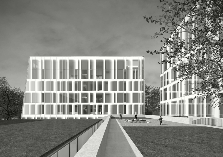
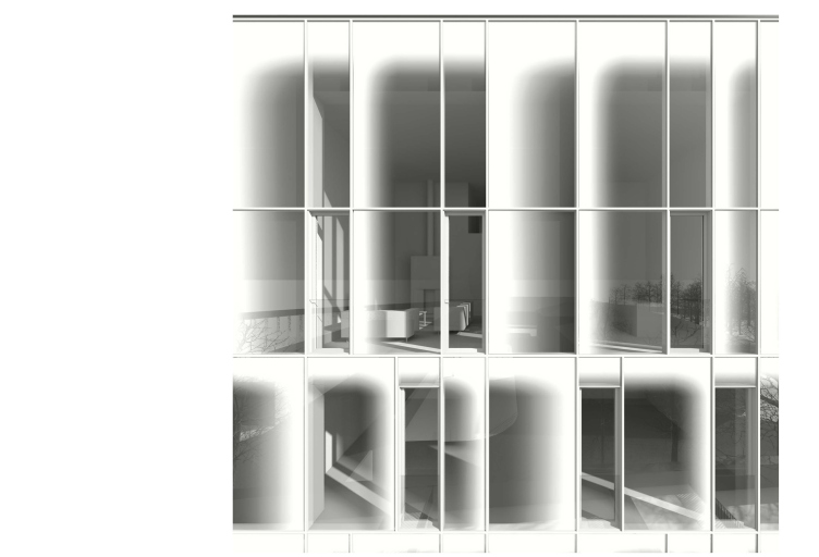
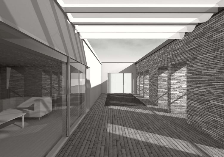
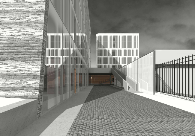
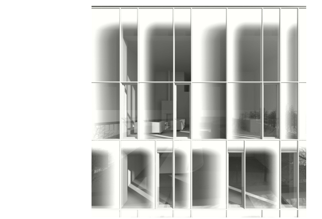
In a similar fashion the architect also designs the "outside" facades of the two other buildings with which they face their neighbors - the residential the institute buildings. As for the impregnable fortress walls, Sergey Skuratov proposed to execute them from Flemish brick Kolumba manufactured by the Danish company Petersen Tegl, and then couple it with glass, at some places transparent and in some places fading into opaque and then into milky white. Precisely in this way the inside facades are designed - the ones that are turned onto the most intimate part of the territory - the little gardens of the first floor apartments. 

Residential house (apartments) of deluxe class © Sergey Skuratov Architects

Residential house (apartments) of deluxe class © Sergey Skuratov Architects

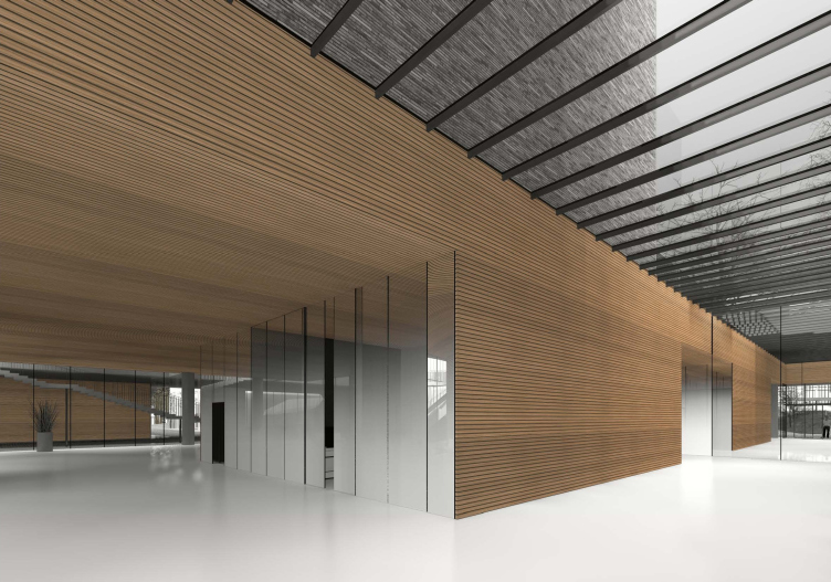
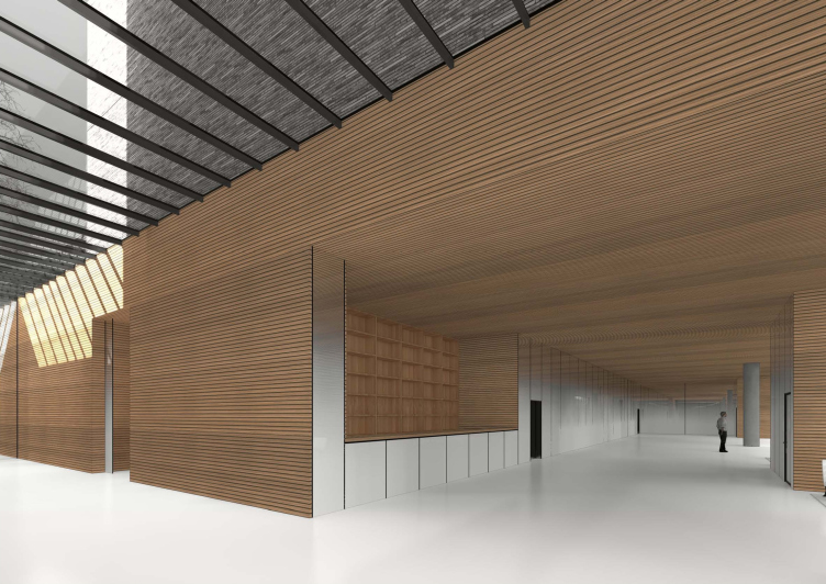
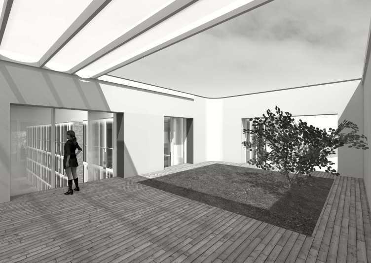
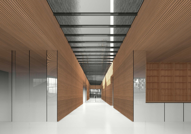
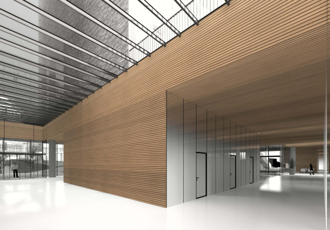
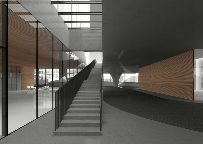
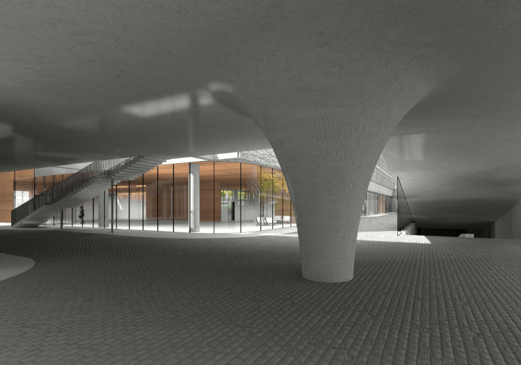
Special mention should be given to the interrelation of the three buildings between one another. In the places where the trapeze and the square-plan "middle" building look at each other with their milky facades, the architect rounds down the sharp corners, thus making the glass part of the buildings look even more ethereal. On the other hand, the interrelation between the second and the third buildings manifests itself in the solid surfaces of the fire walls: the thing is that the avenue-farthest house is twice as long as the middle one, and this length-to-length ratio allowed for placing, specifically underneath this "ravine", the central entrance to the complex. Naturally, the roof above it is made totally transparent and the resulting breathtaking "water well" beautifully complements ten interior of the public area. And to these, one must mention, the architects gave their special loving attention. 

Residential house (apartments) of deluxe class © Sergey Skuratov Architects

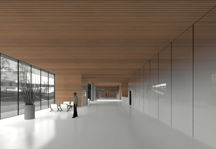
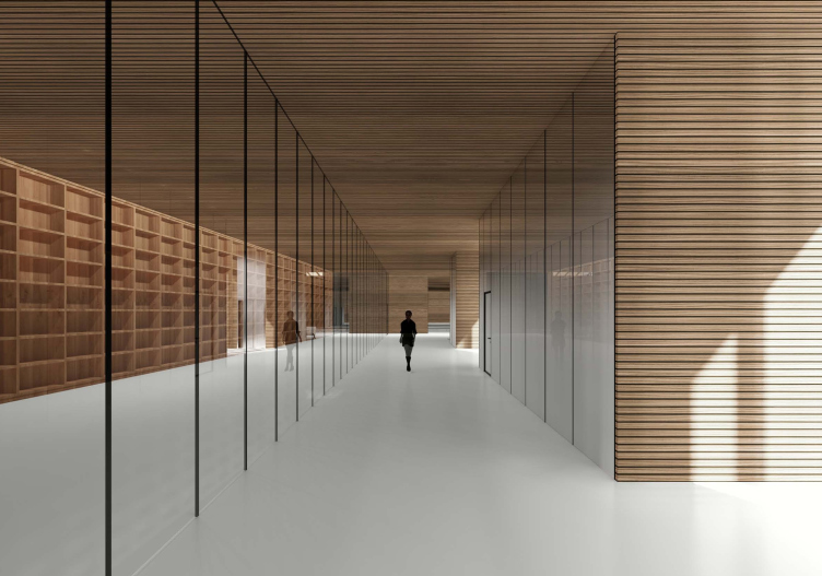
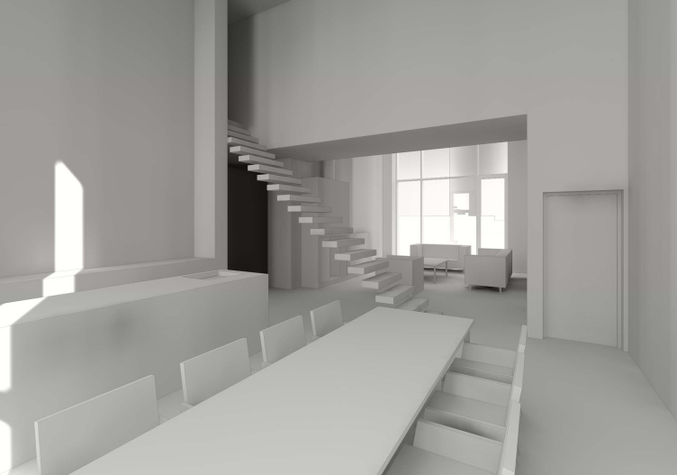
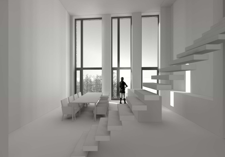
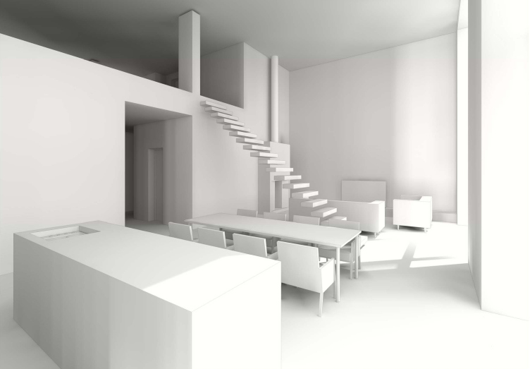
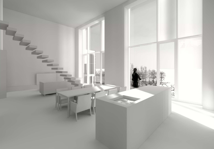
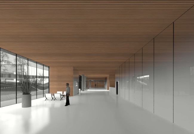
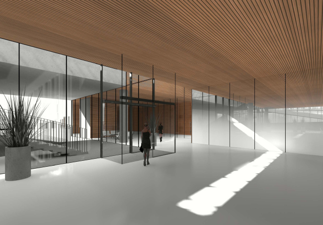
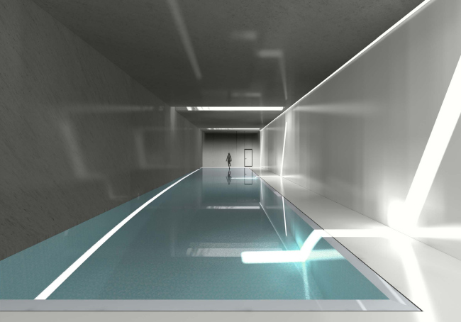
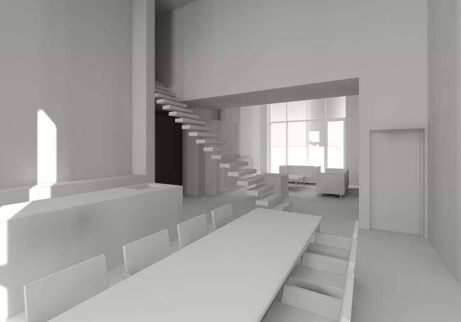
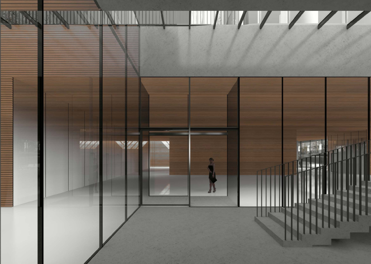
And, while the architecture of the complex is dominated by austere geometry (the new building enters its context cool, calm, and collected), the interior, on the other hand, is reigned by the theme of borders dissolving. The interiors of the apartments are not just laconic - they take to the limit the "everything you need, nothing you don't" idea that, as we know, can only be implemented in the day-to-day life by really wealthy people. The refined whiteness of the private residential territories is framed by the more "material" interiors of the public areas. Here, the white is also present but it does not prevail here just as unrivaled: the dazzling-white walls bleed into the walls of milky glass, while the latter, in turn, becomes more and more transparent closer to the ceiling. Thus fragile, as if thinning, matter is offset with the warm monolith of the natural wood - it is used to decorate the ceilings, some of the walls, and the interiors of the library that, upon the architect's initiative, got included into the first-floor premises and became the "the logic intellectual finale of this particular typology". The entrance lobby is separated from the street by a tall glass wall that arches in a graceful wave, not only shifting the border between the inner and the outer, but also giving the entrance area softer outlines that give away the true kind face of this seemingly "aloof" house. 

Residential house (apartments) of deluxe class © Sergey Skuratov Architects

Residential house (apartments) of deluxe class © Sergey Skuratov Architects
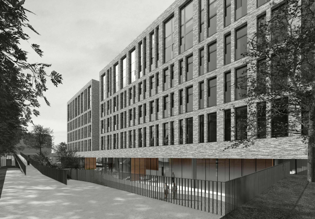
Residential house (apartments) of deluxe class © Sergey Skuratov Architects

Residential house (apartments) of deluxe class © Sergey Skuratov Architects
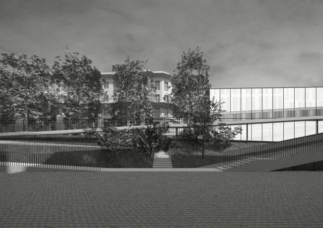
Residential house (apartments) of deluxe class © Sergey Skuratov Architects


Residential house (apartments) of deluxe class © Sergey Skuratov Architects

Residential house (apartments) of deluxe class © Sergey Skuratov Architects

Residential house (apartments) of deluxe class © Sergey Skuratov Architects
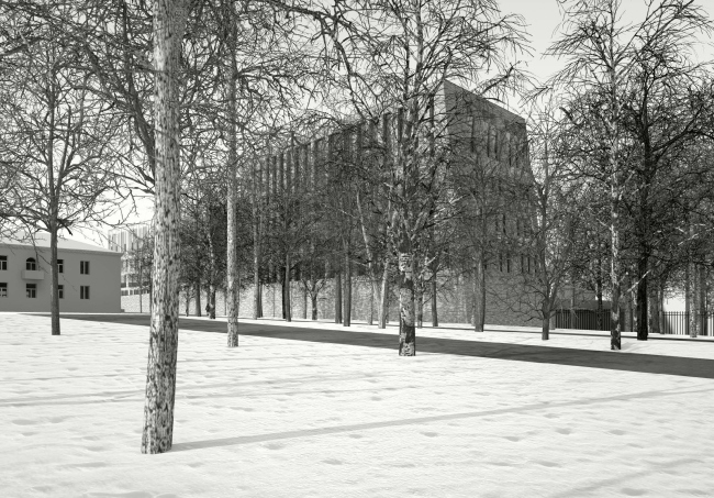
Residential house (apartments) of deluxe class © Sergey Skuratov Architects

Residential house (apartments) of deluxe class © Sergey Skuratov Architects

Residential house (apartments) of deluxe class © Sergey Skuratov Architects
Residential house (apartments) of deluxe class © Sergey Skuratov Architects
Residential house (apartments) of deluxe class © Sergey Skuratov Architects
Residential house (apartments) of deluxe class © Sergey Skuratov Architects

Residential house (apartments) of deluxe class © Sergey Skuratov Architects

Residential house (apartments) of deluxe class © Sergey Skuratov Architects

Residential house (apartments) of deluxe class © Sergey Skuratov Architects
Residential house (apartments) of deluxe class © Sergey Skuratov Architects

Residential house (apartments) of deluxe class © Sergey Skuratov Architects
Residential house (apartments) of deluxe class © Sergey Skuratov Architects
Residential house (apartments) of deluxe class © Sergey Skuratov Architects
Residential house (apartments) of deluxe class © Sergey Skuratov Architects
Residential house (apartments) of deluxe class © Sergey Skuratov Architects
Residential house (apartments) of deluxe class © Sergey Skuratov Architects

Residential house (apartments) of deluxe class © Sergey Skuratov Architects

Residential house (apartments) of deluxe class © Sergey Skuratov Architects

Residential house (apartments) of deluxe class © Sergey Skuratov Architects
Residential house (apartments) of deluxe class © Sergey Skuratov Architects

Residential house (apartments) of deluxe class © Sergey Skuratov Architects

Residential house (apartments) of deluxe class © Sergey Skuratov Architects

Residential house (apartments) of deluxe class © Sergey Skuratov Architects

Residential house (apartments) of deluxe class © Sergey Skuratov Architects
Residential house (apartments) of deluxe class © Sergey Skuratov Architects
Residential house (apartments) of deluxe class © Sergey Skuratov Architects
Residential house (apartments) of deluxe class © Sergey Skuratov Architects

Residential house (apartments) of deluxe class © Sergey Skuratov Architects
Residential house (apartments) of deluxe class © Sergey Skuratov Architects
Residential house (apartments) of deluxe class © Sergey Skuratov Architects

Residential house (apartments) of deluxe class © Sergey Skuratov Architects

Residential house (apartments) of deluxe class © Sergey Skuratov Architects

Residential house (apartments) of deluxe class © Sergey Skuratov Architects
Architect:
Sergey Skuratov
Object:
Residential (apartment) house of deluxe class
Russia, Moscow, Vernadskogo Avenue, 4

Project Team:
Leader of the author team: Sergey Skuratov. Architects: N.Demidov, I.Ilin. With the participation of A.Panev, A.Gvozdikov, I.Golubev.

2013 — 2013

OAO "Institute of Public and Utility Sector"

15 May 2014

Headlines now
The Golden Crown
The concept for a dental clinic in Yekaterinburg, developed by CNTR Studio, revolves around the idea of a “mouth full of gold”: pristine white porcelain stoneware walls are complemented by matte brass details. To avoid an overly literal interpretation, the architects focused on the building’s proportions, skillfully navigating between sunlight requirements and fire safety regulations.
Flexibility and Integration
Not long ago, we covered the project for the fourth phase of the ÁLIA residential complex, designed by APEX. Now, we’ve been shown different fence concepts they developed to enclose the complex’s private courtyards, incorporating a variety of public functions. We believe that the sheer fact that the complex’s architects were involved in such a detail as fencing speaks volumes.
A Step Forward
The HIDE residential complex represents a major milestone for ADM architects and their leaders Andrey Romanov and Ekaterina Kuznetsova in their quest for a fresh high-rise aesthetic – one that is flexible and layered, capable of bringing vibrancy to mass and silhouette while shaping form. Over recent years, this approach has become ADM’s “signature style”, with the golden HIDE tower playing a pivotal role in its evolution. Here, we delve into the project’s story, explore the details of the complex’s design, and uncover its core essence.
Gold in the Sands
A new office for a transcontinental company specializing in resource extraction and processing has opened in Dubai. Designed by T+T Architects, masters of creating spaces that are contemporary, diverse, flexible, and original, this project exemplifies their expertise. On the executive floor, a massive brass-clad partition dominates, while layered textures of compressed earth create a contextually resonant backdrop.
Layers and Levels of Flight
This project goes way back – Reserve Union won this architectural competition at the end of 2011, and the building was completed in 2018, so it’s practically “archival”. However, despite being relatively unknown, the building can hardly be considered “dated” and remains a prime example of architectural expression, particularly in the headquarters genre. And it’s especially fitting for an aviation company office. In some ways, it resembles the Aeroflot headquarters at Sheremetyevo but with its own unique identity, following the signature style of Vladimir Plotkin. In this article, we take an in-depth look at the United Aircraft Corporation (UAC) headquarters in the Moscow agglomeration town of Zhukovsky, supplemented by recent photographs from Alexey Naroditsky – a shoot that became only recently possible due to the fact that improvements were finally made in the surrounding area.
Light and Shadow
In this article, we delve into the architectural design of the “Chaika” house by DNK ag architects, which was recently completed in 2023 as part of the collection of signature designs at ZILArt. As is well-known, all the buildings in this complex follow a design code, yet each one is distinct. This particular building stands out not only for its whiteness and minimalism but also for the refined use of a limited number of techniques that, together, create what can confidently be called synergy.
Casus Novae
A master plan was developed for a large residential area with a name of “DNS City”, but now that its implementation began, the plan has been arbitrarily reformatted and replaced with something that, while similar on the surface, is actually quite different. This is not the first time such a thing happens, but it’s always frustrating. With permission from the author, we are sharing Maria Elkina’s post.
Treasure Hunting
The GAFA bureau, in collaboration with Tegola and Arkhitail, organized an expedition to the island of Kilpola in Karelia as part of Moskomarkhitektura’s “Open City” festival. There, amidst moss and rocks, the students sought answers to questions like: what is the sacred, where does it dwell, and what sustains it? Assisting the participants in this quest were landscape engineer Evgeny Levin, artist Nicholas Roerich, a moose, and the lack of cellular connection. Here’s how the story unfolded.
Depths of the Earth, Streams of Water
In the Malaya Okhta district, the Akzent building, designed by Stepan Liphart, was constructed. It follows a classic tripartite structure, yet it’s what you might call “hand-drawn”: each façade is unique in its form and details, some of which aren’t immediately noticeable. In this article, we explore the context and, together with the architect, delve into how the form was developed.
Fir Tree Dynamics
The “Airports of Region” holding is planning to build an airport in Karachay-Cherkessia, aiming to make the Arkhyz and Dombay resorts more accessible to travelers. The project that won in an invitation-only competition, submitted by Sergey Nikeshkin’s KPLN, blends natural imagery inspired by the shape of a conifer seed, open-air waiting spaces, majestic large trees, and a green roof elevated on needle-like columns. The result is both nature-inspired and WOW.
​A Brick Shell
In the process of designing a clubhouse situated among pine trees in a prestigious suburban area near Moscow, the architectural firm “A.Len” did the façade design part. The combination of different types of brick and masonry correlates with the volumetric and plastique solutions, further enhanced by the inclusion of wood-painted fragments and metal “glazing”.
Word Forms
ATRIUM architects love ambitious challenges, and for the firm’s thirtieth anniversary, they boldly play a game of words with an exhibition that dives deep into a self-created vocabulary. They immerse their projects – especially art installations – into this glossary, as if plunging into a current of their own. You feel as if you’re flowing through the veins of pure art, immersed in a universe of vertical cities, educational spaces – of which the architects are true masters – and the cultural codes of various locations. But what truly captivates is the bold statement that Vera Butko and Anton Nadtochy make, both through their work and this exhibition: architecture, above all, is art – the art of working with form and space.
Flexibility and Acuteness of Modernity
Luxurious, fluid, large “kokoshniks” and spiral barrel columns, as if made from colorful chewing gum: there seem to be no other mansion like this in Moscow, designed in the “Neo-Russian-Modern” style. And the “Teremok” on Malaya Kaluzhskaya, previously somewhat obscure, has “come alive with new colors” and gained visibility after its restoration for the office of the “architectural ecosystem” as the architects love to call themselves. It’s evident that Julius Borisov and the architects at UNK put their hearts into finding this new office and bringing it up to date. Let’s delve into the paradoxes of this mansion’s history and its plasticity. Spoiler: two versions of modernity meet here, both balancing on the razor’s edge of “what’s current”.
Yuri Vissarionov: “A modular house does not belong to the land”
It belongs to space, or to the air... It turns out that 3D printing is more effective when combined with a modular approach: the house is built in a workshop and then adapted to the site, including on uneven terrain. Yuri Vissarionov shares his latest experience in designing tourist complexes, both in central Russia and in the south. These include houseboats, homes printed from lightweight concrete using a 3D printer, and, of course, frame houses.
​Moscow’s First
“The quality of education largely depends on the quality of the educational environment”. This principle of the last decade has been realized by Sergey Skuratov in the project for the First Moscow Gymnasium on Rostovskaya Embankment in the Khamovniki district. The building seamlessly integrates into the complex urban landscape, responding both to the pedestrian flow of the city and the quiet alleyways. It skillfully takes advantage of the height differences and aligns with modern trends in educational space design. Let’s take a closer look.
Looking at the Water
The site of Villa Sonata stretches from the road to the water’s edge, offering its own shoreline, pier, and a picturesque river panorama. To reveal these sweeping views, Roman Leonidov “cut” the façade diagonally parallel to the river, thus getting two main axes for the house and, consequently, “two heads”. The internal core – two double-height spaces, a living room and a conservatory, with a “bridge” above them – makes the house both “transparent” and filled with light.
The White Wing
Well, it’s not exactly white. It’s more of a beige, white-stone structure that plays with the color of limestone – smoother surfaces are lighter, while rougher ones are darker. This wing unites various elements: it absorbs and interprets the surrounding themes. It responds to everything, yet maintains a cohesive expression – a challenging task! – while also incorporating recognizable features of its own, such as the dynamic cuts at the bottom, top, and middle.
Urban Dunes
The XSA Ramps team designed and built a three-part sports hub for a park in Rostov-on-Don, welcoming people of all ages and fitness levels. The skate plaza, pump track, and playground are all meticulously crafted with details that attract a diverse range of visitors. The technical execution of the shapes and slopes transforms this space into a kind of sculptural composition.
Proportional Growth
The project for the fourth phase of the ÁLIA residential area has been announced. The buildings are situated on an elongated plot – almost a “ray” that shoots out from the center of the area towards the river. Their layout reflects both a response to Moscow’s architectural preferences over the past 15 years, shifting “from blocks to towers”, and an interpretation of the neighboring business park designed by SOM. Additionally, the best apartments here are not located at the very top but closer to the middle, forming a glowing “waistline”.
The “Staircase” Building
In designing the “Details” residential complex in New Moscow, Rais Baishev spiced up the now-popular Moscow theme of a “courtyard” building with an idea drawn from the surrealist drawings by Maurits Escher. He envisioned the stepped silhouettes and descending slopes as a metaphysical mega-staircase, creating a key void within the courtyard that gave the project an internal “spine”. This concept is felt both in the building’s silhouette and on its façades.
Projection of the Quarter
No one doubted that the building that Vladimir Plotkin designed as part of the “Garden Quarters” would be the most modernist of all. And it turned out just that way: while adhering to the common design code, the building successfully combines brick and white stone, rhythmically responding to the neighboring building designed by Ostozhenka, yet tactfully and persistently making a few statements of its own. This includes the projection of the ideal urban development composition “14–9–6”, which can be found right next door, mathematical calculations, including those for various types of terraces (and perhaps the only reminder of the Soviet past of the Kauchuk rubber factory!), and the white “cross-stitch” pattern of the façade grid.
Domus Aurea
In this issue, we examine the “Tessinsky-1” house, designed by Sergey Skuratov and completed in 2023. Located in the middle of the Serebryanicheskaya Embankment district, at the intersection of its main streets, this house assumes a sort of “nodal” role: it not only responds to everything around it and preserves many memories of the former EMA factory within itself, but it weaves all this into a newly directed pattern, reconciling bright “gold” and dark-colored brick, largely with the help of the new, modern-yet-archaic Columba brick, which, come to think about it, is the most precious element here.
The Chimney of Nikola-Lenivets
In this issue, we are examining the “Obelisk House” designed by KATARSIS and built for the Arkhstoyanie 2023 festival. However, it was only finished later on, and this is why we are examining it now. It seems to us that after the “Obelisk House” appeared in Nikola-Lenivets, a dialogue and a few inner connections appeared between the temporary structures built here. These houses no longer look like “accidental neighbors”, more of which below.
​Periscope by the Bay
The jury awarded the second place in the competition for a public and cultural center in Petropavlovsk-Kamchatsky to the companies GORA (“Mountain”) and M4. In the consortium’s proposal, the building resembles a sperm whale with a calf swimming next to it or a periscope, whose lenses capture the most spectacular views from the surrounding landscape.
From Arcs to Dolmens
While working on the competition project for Petropavlovsk-Kamchatsky, ASADOV Architects prioritized the value of the natural and urban environment, aiming to preserve the balance of the location while minimizing the resemblance of the volume that they designed to a “traditional building”. The task was challenging, and the architects created three versions, one of which having been developed after the competition, where their main proposal took third place. However, the point of interest here is not the competition result but the continuity of creative thinking.
Hide and Seek
The ID Moskovskiy house, designed by Stepan Liphart in St. Petersburg, in the courtyards near Moskovskiy Avenue beyond the Obvodny Canal and recently completed, is notable for several reasons. Firstly, it has been realized with considerable accuracy, which is particularly significant as this is the first building where the architect was responsible not only for the facades but also for the layouts, allowing for better integration between the two. On the other hand, this building is interesting as an example of the “germination” of new architecture in the city: it draws on the best examples from the neighborhood and becomes an improved and developed sum of ideas found by the architect in the surrounding context.
The Big Twelve
Yesterday, the winners of the Moscow Mayor’s Architecture Award were announced and honored. Let’s take a look at what was awarded and, in some cases, even critique this esteemed award. After all, there is always room for improvement, right?
Above the Golden Horn
The residential complex “Philosophy” designed by T+T architects in Vladivostok, is one of the new projects in the “Golubinaya Pad” area, changing its development philosophy (pun intended) from single houses to a comprehensive approach. The buildings are organized along public streets, varying in height and format, with one house even executed in gallery typology, featuring a cantilever leaning on an art object.
Nuanced Alternative
How can you rhyme a square and space? Easily! But to do so, you need to rhyme everything you can possibly think of: weave everything together, like in a tensegrity structure, and find your own optics too. The new exhibition at GES-2 does just that, offering its visitor a new perspective on the history of art spanning 150 years, infused with the hope for endless multiplicity of worlds and art histories. Read on to see how this is achieved and how the exhibition design by Evgeny Ace contributes to it.
Blinds for Ice
An ice arena has been constructed in Domodedovo based on a project by Yuri Vissarionov Architects. To prevent the long façade, a technical requirement for winter sports facilities, from appearing monotonous, the architects proposed the use of suspended structures with multidirectional slats. This design protects the ice from direct sunlight while giving the wall texture and detail.